What Dropbox does
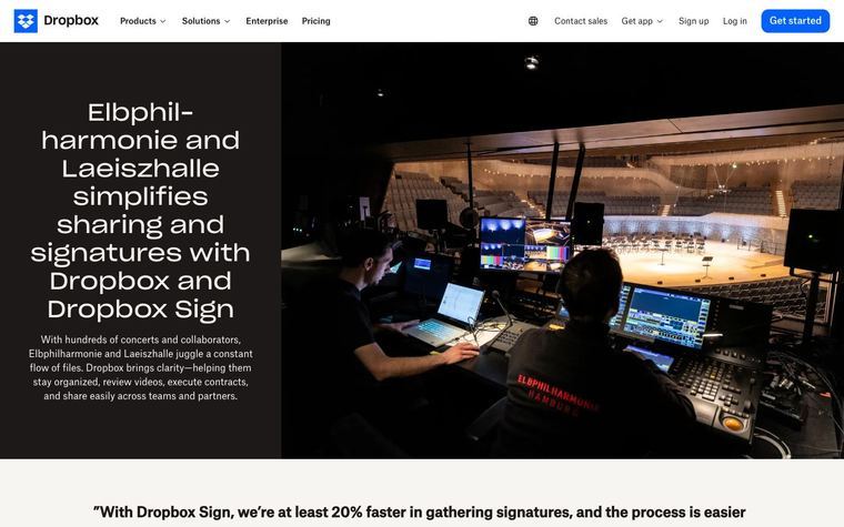
Dropbox's brand guidelines split imagery into four types, each with a job: photography for real-world customer stories, illustration for explaining abstract, complex or dry concepts, product visuals for specific functionality, and customer files for enriching a customer's story. Illustration uses simple, charming scenes and metaphors for product or service descriptions, onboarding flows, and softening an error message. The illustration library comes in three tiers: Hero Illustrations (example: Collaboration Top-Down Table), Spot Illustrations (example: AI Boxes) and Mini Illustrations (example: Share Paper).
Dropbox's system, as published
- Tiers
- Hero Illustrations, Spot Illustrations, Mini Illustrations
- Tier Examples · Hero
- Collaboration Top-Down Table
- Tier Examples · Spot
- AI Boxes
- Tier Examples · Mini
- Share Paper
- Imagery Types · Photography
- real-world examples, customer stories
- Imagery Types · Illustration
- abstract, complex, or dry concepts; onboarding; error messages
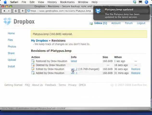
- Imagery Types · Product Visuals
- specific product functionality
- Imagery Types · Customer Files
- enriching a customer's story
Why it works
Illustration is kept for ideas a photo or a screenshot can't show, so it never competes with real product UI. Three fixed sizes let the same metaphor scale from a page hero down to an inline marker.
Best for
Software and service companies explaining abstract or dry concepts: onboarding flows, product descriptions, empty and error states, feature pages
What breaks it
- Illustrating something a real photo or the product UI would show better
- Inventing a new drawing per tier instead of simplifying one
- Mixing tiers at the same size on one page
Sources
- brand.dropbox.com: Imagery page: the four image types, when to use illustration, and the hero/spot/mini tiers
Steal it for your brand
The same system, written in your colors, type and shapes. Nothing of Dropbox's look comes with it.
The recipe
- Decide first whether the idea is abstract; if a photo or a product screenshot can show it, use that instead of an illustration.
- Pick one metaphor per idea and draw it at the tier the slot needs: hero for a section lead, spot for a card or empty state, mini beside a line of text.
- Fill the main object with
palette.accent, the supporting object withpalette.accent secondary, and the ground withpalette.surface; outline inpalette.inkatstyle.border widthpx. - Keep the same metaphor recognisable across tiers: the mini is the spot with detail removed, not a new drawing.
- On an error message, use a spot or mini to soften it; never a hero.
What you'll need
- The concepts the piece must explain
- The customer's palette with at least an accent
Recipe as JSON
{
  "recipe": {
    "tiers": {
      "hero": {
        "use": "page or section lead",
        "width_ratio_of_column": 1
      },
      "spot": {
        "use": "feature card, empty state, onboarding step",
        "width_ratio_of_column": 0.4
      },
      "mini": {
        "use": "inline marker beside a line of text",
        "size_ratio_to_body_line": 2
      }
    },
    "fill_primary": "{palette.accent}",
    "fill_secondary": "{palette.accent_secondary}",
    "fill_neutral": "{palette.surface}",
    "line": "{palette.ink}",
    "stroke_px": "{style.border_width}",
    "corner_px": "{style.radius} * 0.25",
    "use_for": [
      "abstract or complex concepts",
      "onboarding",
      "error and empty states"
    ],
    "not_for": [
      "real customer stories (use photography)",
      "specific product functionality (use product UI)"
    ]
  },
  "fallbacks": {
    "palette.accent_secondary": "{palette.accent}",
    "style.border_width": 2,
    "palette.surface": "{palette.paper}",
    "style.radius": 8
  },
  "steps": [
    "Decide first whether the idea is abstract; if a photo or a product screenshot can show it, use that instead of an illustration.",
    "Pick one metaphor per idea and draw it at the tier the slot needs: hero for a section lead, spot for a card or empty state, mini beside a line of text.",
    "Fill the main object with {palette.accent}, the supporting object with {palette.accent_secondary}, and the ground with {palette.surface}; outline in {palette.ink} at {style.border_width}px.",
    "Keep the same metaphor recognisable across tiers: the mini is the spot with detail removed, not a new drawing.",
    "On an error message, use a spot or mini to soften it; never a hero."
  ]
}
See it working
- Dropbox: The illustration section with hero, spot and mini examples side by side with photography and product visuals
The lesson
Draw one illustration style at three fixed sizes, and use it only for ideas a photo or product shot cannot show.
The move
Three labeled tiers sit side by side. "Hero Illustrations" is a top-down table of hands, laptops and coffee cups in black linework with purple laptops. "Spot Illustrations" (AI Boxes) shows purple pages above a drawn box, and "Mini Illustrations" is a single hand holding a purple shape.
Why it works
- Our readBlack outline plus one purple fill carries across all three tiers, so the small mark still looks like part of the big scene.
- Our readNaming the tiers Hero, Spot and Mini tells a designer which size to pick before they open a file.
- Vendor claimDropbox's brand guidelines use illustration to explain abstract, complex or dry concepts, and keep photography for real customer stories. (source)
What not to copy
Don't borrow the hand-drawn purple look, which is Dropbox's. Keep the rule: name your sizes, share one line weight and one accent color, and draw only where a photo or UI can't explain.