What Atlassian does
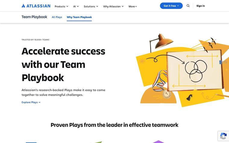
Atlassian's design system defines three in-product illustration types. Spots represent a single concept for empty states, error states and celebrating big wins; colorful spots add emphasis while neutral spots suit common tasks and less celebratory moments. Low-fidelity UI explains onboarding, feature tours and complex workflows using basic shapes, sharp corners and mostly gray tones. Ambient patterns are background texture for messages or promotional areas. The guide says to decide first whether an illustration is needed, not to overuse them, not to use collage-style or purely decorative images in product (collage is for marketing pages), and not to put real screenshots in product.
Atlassian's system, as published
- Types · Spot
- single concept; empty, error, celebration
- Types · Low Fidelity Ui
- onboarding, spotlight tours, complex workflows; basic shapes, sharp corners, mostly gray
- Types · Ambient Pattern
- background texture for messages and promo areas
- Spot Color Modes
- colorful (emphasis), neutral (routine tasks)
- Collage
- marketing and landing pages only
Why it works
Each type has one job, so nobody draws a scene where a pattern would do. Saving the colorful version for big wins keeps routine screens calm.
Best for
Product teams and B2B software: empty states, error states, onboarding tours, feature spotlights, promotional banners
What breaks it
- Real screenshots inside the product (screen within a screen)
- Collage or purely decorative imagery in product
- Using the colorful spot on routine screens
Sources
- atlassian.design: Illustration foundations: the three types, color guidance, do and don't
Steal it for your brand
The same system, written in your colors, type and shapes. Nothing of Atlassian's look comes with it.
The recipe
- Ask first whether the screen needs an illustration; prefer an icon, copy or a pattern when one will do.
- For one concept in an empty or error state, draw a spot: neutral fills in
palette.ink mutedonpalette.surfacefor routine moments,palette.accentonly for a real win. - To explain a workflow or tour, draw low-fi UI: plain rectangles with square corners filled
palette.surface, linedpalette.border, with only the element being explained inpalette.accent. - For a banner that needs texture but no concept, lay an ambient pattern in
palette.borderoverpalette.paperat half opacity. - Keep illustrations beside the copy they support, never replacing it.
What you'll need
- Which screens or pieces need imagery and what each must explain
Recipe as JSON
{
  "recipe": {
    "spot": {
      "fill_emphasis": "{palette.accent}",
      "fill_routine": "{palette.ink_muted}",
      "ground": "{palette.surface}",
      "line": "{palette.ink}",
      "emphasis_when": [
        "first success",
        "milestone",
        "launch"
      ],
      "routine_when": [
        "empty state",
        "error",
        "common task"
      ]
    },
    "lowfi_ui": {
      "fill": "{palette.surface}",
      "line": "{palette.border}",
      "highlight": "{palette.accent}",
      "corner_px": 0,
      "highlight_share": 0.1
    },
    "ambient_pattern": {
      "fill": "{palette.border}",
      "ground": "{palette.paper}",
      "opacity": 0.5
    }
  },
  "fallbacks": {
    "palette.ink_muted": "{palette.ink}",
    "palette.border": "{palette.ink_muted}",
    "palette.surface": "{palette.paper}"
  },
  "steps": [
    "Ask first whether the screen needs an illustration; prefer an icon, copy or a pattern when one will do.",
    "For one concept in an empty or error state, draw a spot: neutral fills in {palette.ink_muted} on {palette.surface} for routine moments, {palette.accent} only for a real win.",
    "To explain a workflow or tour, draw low-fi UI: plain rectangles with square corners filled {palette.surface}, lined {palette.border}, with only the element being explained in {palette.accent}.",
    "For a banner that needs texture but no concept, lay an ambient pattern in {palette.border} over {palette.paper} at half opacity.",
    "Keep illustrations beside the copy they support, never replacing it."
  ]
}
See it working
- Atlassian: Spot, low-fidelity UI and ambient pattern examples with do and don't cases
The lesson
Give every illustration type a single job and a rule for when it appears, so designers choose by task and never by taste.
The move
The Illustrations page lists "Spot", "Low-fidelity UI" and "Ambient pattern", plus a "Choosing the right illustration type (quick reference)" link. The Spot section says to use spots for empty states, error states, or celebrating big wins, with colorful spots for emphasis and neutral ones for common tasks. A best-practice link warns against collage or decorative-only images in product.
Why it works
- Our readTying spots to screen states (empty, error, big wins) turns style into a lookup a designer can apply without a review.
- Our readReserving color for celebratory moments keeps ordinary screens quiet, so color means something when it shows up.
- Our readThe explicit "don't" about decorative-only images gives reviewers a clear reason to say no.
What not to copy
Their drawings, palette and gallery are Atlassian's. Copy the structure: a short list of types, one job for each, and a rule about when the loud version is allowed.