The lesson
Turn a competitor comparison into three named buying criteria, then repeat those criteria in the proof sections below.
The move
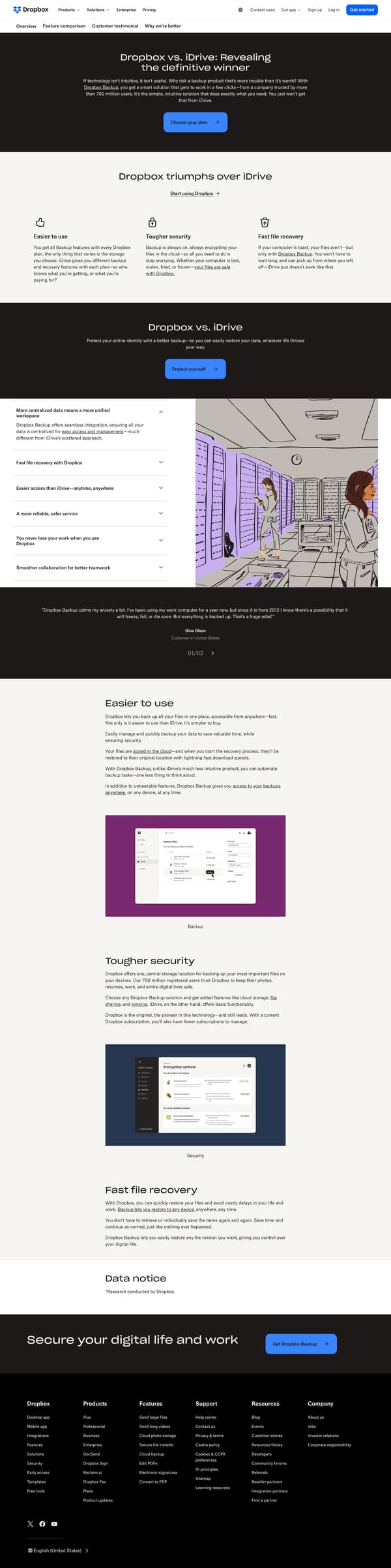
The page opens with “Dropbox vs. iDrive: Revealing the definitive winner,” a short argument that backup should be intuitive, and a “Choose your plan” button. It then states “Dropbox triumphs over iDrive” and introduces three comparison pillars: “Easier to use,” “Tougher security,” and “Fast file recovery.” A middle section adds a broader “Dropbox vs. iDrive” claim, shows two customer testimonials, then expands each pillar into longer copy about buying, backup, security, and restore. It closes with “Secure your digital life and work” and a “Get Dropbox Backup” call to action.
Why it works
- Our readThe hero names iDrive directly and frames the choice around backup being intuitive, so the reader knows the comparison standard before seeing features.
- Our readThree simple claims, “Easier to use,” “Tougher security,” and “Fast file recovery,” give the page a short mental checklist instead of a long table.
- Our readCustomer quotes sit before the deeper feature sections, so the page breaks up Dropbox's own claims with buyers describing backup relief and access.
What not to copy
Don't copy the winner-takes-all language unless your brand can make a direct competitor claim that fits your market. Keep the three-pillar structure that turns a comparison into a small set of buying criteria.
More from Dropbox




More landing pages








Steal it for your brand.
Tell us what you want to make. We’ll talk through how to put these ideas to work for your brand.