The lesson
Lead a competitor page with the practical tradeoff, then use the table to prove breadth before explaining the few features that matter most.
The move
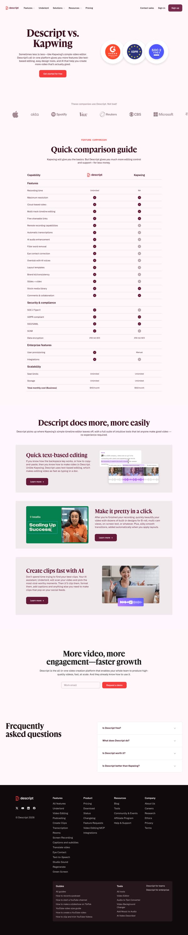
The page opens with “Descript vs. Kapwing” and the line “Sometimes less is less,” followed by a “Get started for free” call to action and a row of customer logos. A “Quick comparison guide” table compares capabilities, security and compliance, enterprise features, storage, and total monthly cost. Below, “Descript does more, more easily” breaks the argument into “Quick text-based editing,” “Make it pretty in a click,” and “Create clips fast with AI,” each with a short explanation and a “Learn more” link. It closes with “More video, more engagement, faster growth,” a “Request a demo” button, and FAQs about Descript, its free tier, and whether it is better than Kapwing.
Why it works
- Our readThe hero names Kapwing directly and states the tradeoff in plain terms, so the reader knows this is a choice between a simple editor and a broader creation platform.
- Our readThe comparison table mixes creative features, security, enterprise features, and cost, which lets different buyers find their own reason to keep reading.
- Our readThe feature sections after the table turn the checklist into three concrete ideas: edit by text, apply designs, and create clips with AI.
What not to copy
Don't copy the dismissive competitor tone unless it fits your brand voice. Keep the structure of a direct comparison table followed by a few expanded product advantages.
More from Descript






More landing pages








Steal it for your brand.
Tell us what you want to make. We’ll talk through how to put these ideas to work for your brand.