
The lesson
Open a competitor page with the few differences you want buyers to remember, then spend the body proving only those differences.
The move
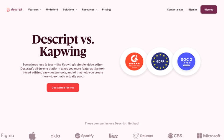
The hero says "Descript vs. Camtasia" and frames the choice around making enterprise video "more efficiently," with a "Get started for free" button and security badges beside it. A logo row leads into "Quick comparison guide," a table comparing Descript against "Camtasia with Audiate" across features, security and compliance, and enterprise features. The rest of the page argues three selected gaps under "Descript helps you make video fast and in the cloud. Camtasia doesn’t.": translation into "20+ languages," AI-generated clips, and cloud-based hosting. It closes with "More video, more engagement, faster growth," a demo CTA, and FAQs that restate the main claims.
Why it works
- Our readThe table gives buyers a fast yes-or-no scan before asking them to read the longer argument.
- Our readPulling three table rows into full sections keeps the page from becoming a giant checklist and makes the remembered differences clear.
- Our readThe FAQ directly answers "Is Descript better than Camtasia?" so the comparison keeps its claim in plain language through the end.
What not to copy
Don't copy the blunt competitor callouts unless your page can support them with specific feature differences. Keep the table-first structure followed by a short set of expanded proof sections.
More from Descript






More landing pages








Steal it for your brand.
Tell us what you want to make. We’ll talk through how to put these ideas to work for your brand.