The lesson
Use the comparison table to prove the range, then use short sections below it to explain the few differences that should change the buyer's mind.
The move
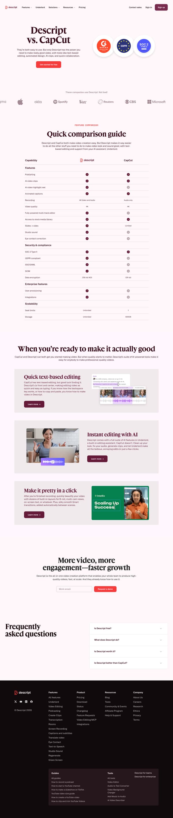
The page opens with "Descript vs. CapCut" and the line "They’re both easy to use," followed by a free-start CTA and a row of customer logos. A "Quick comparison guide" table then compares CapCut and Descript across publishing, recording, video quality, security and compliance, enterprise features, seat limits, and storage. Below, "When you’re ready to make it actually good" turns the comparison into a product argument, with sections for "Quick text-based editing," "Instant editing with AI," and "Make it pretty in a click." It closes with a team-oriented CTA, "More video, more engagement, faster growth," then an FAQ that directly asks whether Descript is free, worth it, and better than CapCut.
Why it works
- Our readThe first screen makes the comparison simple: both tools are easy, but Descript claims the extra power for better-looking and better-sounding video.
- Our readThe feature table mixes creative needs with enterprise details, so a reader sees editing, publishing, security, storage, and scalability in one pass.
- Our readAfter the table, the page stops listing features and explains the practical difference in three short sections: text-based editing, AI editing, and one-click design polish.
What not to copy
Don't copy the direct "better than" tone unless your brand can support it in the rest of the page. Keep the structure of a fast hero claim, a broad comparison table, and short follow-up sections that explain the most important differences in everyday language.
More from Descript






More landing pages








Steal it for your brand.
Tell us what you want to make. We’ll talk through how to put these ideas to work for your brand.