The lesson
Name the feature in the opening frame so viewers know exactly what changed before the explanation starts.
The move
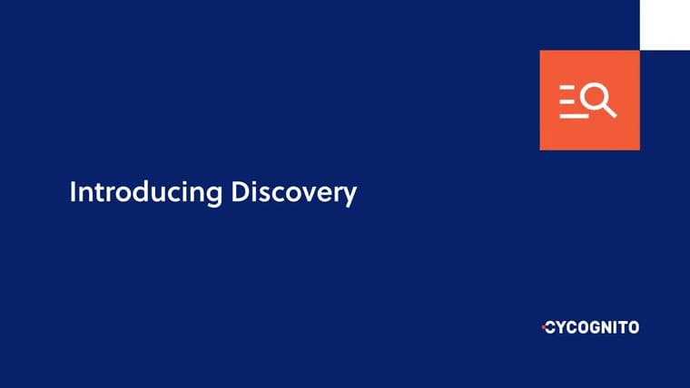
The poster uses a plain dark-blue brand field with the words “Introducing Prioritization” set large on the left. A simple product-style icon sits in the upper right, with the CyCognito wordmark small in the lower right. The title repeats the same direct naming: “Introducing CyCognito Prioritization.”
Why it works
- Our readThe opening frame spends no time on mood-setting; it makes the launch subject clear immediately.
- Our readThe sparse layout gives the feature name the most weight, which helps a technical audience orient before details arrive.
- Our readThe icon gives the abstract capability a small visual handle without turning the launch into a full brand film.
What not to copy
Skip the generic blue software-poster look if your category is already full of it. Keep the direct “Introducing [feature]” framing and make the first frame do the positioning work.
More from Cycognito
More launch videos








Steal it for your brand.
Tell us what you want to make. We’ll talk through how to put these ideas to work for your brand.