
The lesson
Name the tool the customer replaced in the sidebar, then state each headline result against that tool so the reader sees the before and after in one line.
The move
The headline 'How Flex Slashed Close Times by 70% While Unlocking Deeper Financial Visibility with Campfire' sits beside a 'See a demo' button, above a full-width Flex logo panel. A left sidebar gives About Flex, Industry, Stage, and 'Legacy Incumbent: QuickBooks', while the main column opens with three stat tiles ('3 days to close books', '60K transactions', '67% lower headcount'), a bullet recap and a quote from Brian Ehrlich. The story then runs through 'About', 'Challenge', 'Solution' and 'Results' sections, with a Brian Ehrlich quote after Challenge and after Solution, and ends with a 'Keep Reading' card and a 'See Campfire in action' demo block.
Why it works
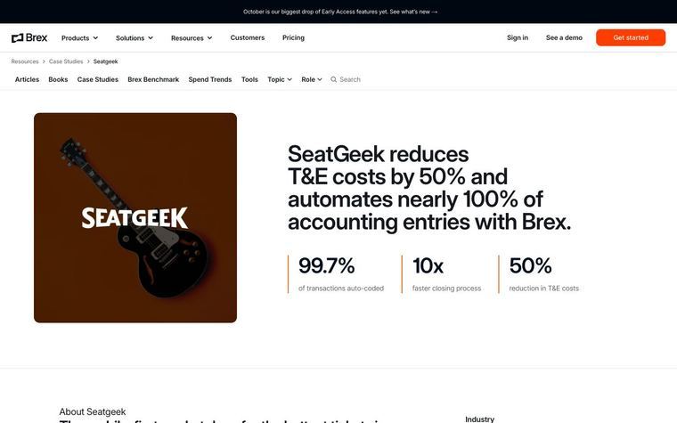
- Our readThe 'Legacy Incumbent' field tells a buyer still on the same tool that this story is about their own situation before they read a paragraph.
- Our readEach stat tile carries a short context line, such as 'Vs. 10 On QuickBooks' on the close-time tile or 'Mapped Automatically Each Month' on the transactions tile, so the number is read with its frame rather than as a standalone claim.
- Our readThe Challenge section lists specific tasks, such as manual tagging for attribution reporting and consolidating company files into one spreadsheet, which lets a finance reader check whether they share the problem.
What not to copy
Don't copy Flex's funding figures, the QuickBooks comparison, or the point that the director had used Campfire in a previous role. Keep the sidebar with industry, stage and replaced tool, the three stat tiles with context lines above the story, and the About, Challenge, Solution, Results order with a quote between sections.
More from Campfire


More case studies
Steal it for your brand.
Tell us what you want to make. We’ll talk through how to put these ideas to work for your brand.