
The lesson
Lead a comparison page with the one difference your buyer feels first, then let them recalculate it for their own situation.
The move
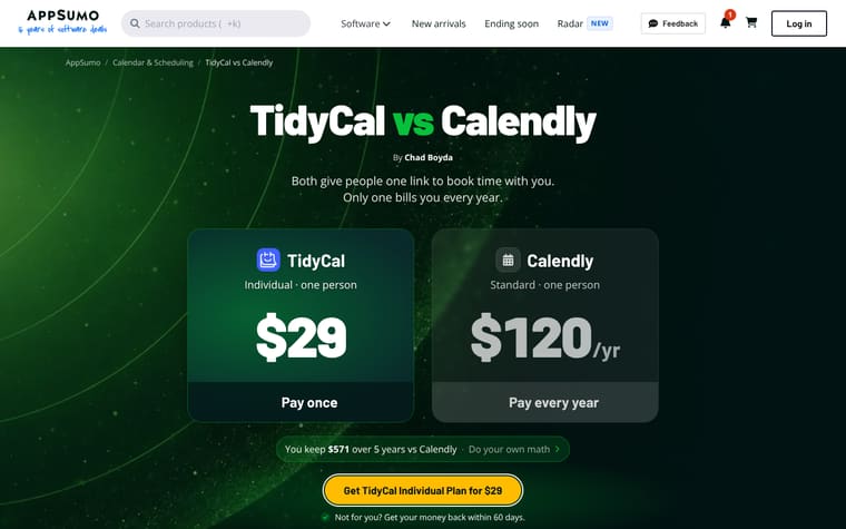
The page opens with "SendFox vs Mailchimp" and the line "Both send your newsletter and your welcome emails. Only one bills you every month." Two large cards put "SendFox Lifetime deal, 5,000 contacts" at "$29" beside "Mailchimp Standard plan, 5,000 contacts" at "$1,200/yr", followed by "Try your list size" and a "Get SendFox for $29" button. It then moves into "SendFox vs Mailchimp at a glance", a savings calculator under "See how much you keep", a plain "What's the catch?" section, fit cards, reasons people pick SendFox, and a feature-by-feature table.
Why it works
- Our readThe first screen reduces the comparison to a monthly bill versus a one-time payment before asking the reader to study features.
- Our readThe calculator changes the claim from a fixed headline into a personal exercise with list size, email frequency and time controls.
- Our readThe page names SendFox limits in "What's the catch?" before the feature table, so the comparison feels less like a one-sided attack.
What not to copy
Don't copy the price-led attack unless your difference is this easy to see and defend. Keep the pattern of a sharp hero claim, a buyer-controlled calculator, and a candid limits section before the feature table.
More from AppSumo






More landing pages








Steal it for your brand.
Tell us what you want to make. We’ll talk through how to put these ideas to work for your brand.