
The lesson
Lead a competitor page with the one tradeoff buyers can understand before they read the feature table.
The move
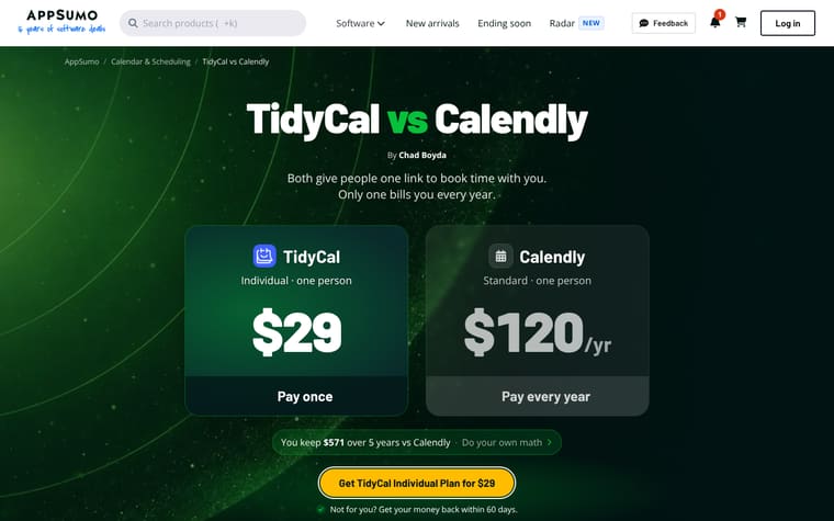
The page opens with “BreezeDoc vs DocuSign” and the line “Both get your contracts signed. Only one bills every person, every year.” Two large price cards compare BreezeDoc at “$19” with DocuSign at “$360/yr,” followed by “You keep $1,781 over 5 years” and a “Get BreezeDoc for $19” button. It then moves through an “at a glance” table, a savings calculator under “See how much you keep,” a “$19 once? What's the catch?” proof section, fit cards, customer quotes, and a feature-by-feature comparison.
Why it works
- Our readThe first screen reduces the comparison to payment model, document limit, and team cost, so a reader does not have to decode a long table first.
- Our readThe calculator lets the reader change team size, document use, payment type, and time period, which makes the price claim feel inspectable instead of only asserted.
- Our readThe page gives DocuSign clear wins for health data, company sign-in, Salesforce, and regulated work, which makes the recommendation feel bounded rather than blanket.
What not to copy
Don't copy the aggressive price contrast unless your offer really has a simpler payment model. Keep the structure of a blunt hero comparison, an adjustable savings section, and an honest section on when the competitor fits better.
More from AppSumo






More landing pages








Steal it for your brand.
Tell us what you want to make. We’ll talk through how to put these ideas to work for your brand.