
The lesson
Put a side-by-side before-and-after list near the top so the reader sees each old pain matched to its fix before the story starts.
The move
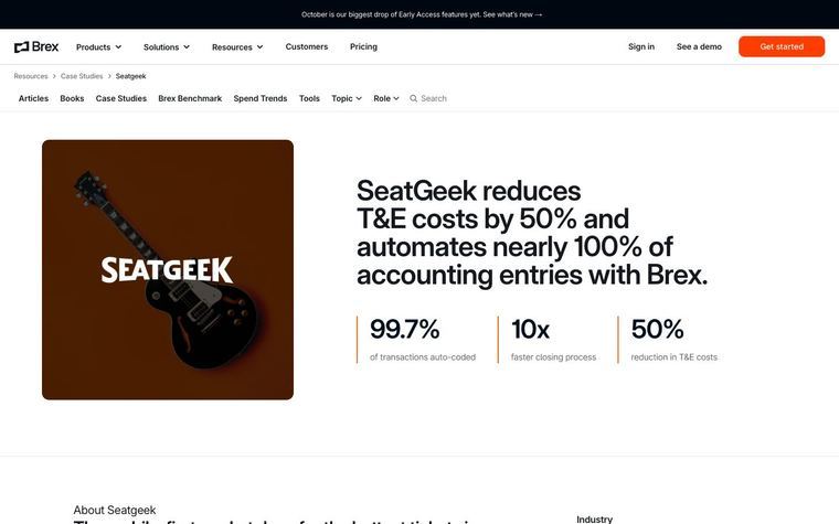
The headline sits above three stat tiles: "1.3 days" late against a UK average of 8.3, "97%" of invoices never overdue, and "95%" of collections by Direct Debit. A sticky left menu (Intro, At a glance, Before and after, The challenge, The solution, The results) runs beside a video, a firmographic card (website, client, region, size, software, products used) and a two-sentence summary. "At a glance" profiles the founders and the 37 fixed-fee services, then a "Before Adfin" list of four pains sits above a "With Adfin" list of four matching fixes. Challenge, Solution (three subheads, each with a quote) and Results follow, closing on a sources line that names the platform data and the UK benchmark.
Why it works
- Our readSetting the 1.3 days figure against a UK average of 8.3 gives the reader a benchmark, so the number means something without further explanation.
- Our readThe four before-and-after pairs line up one to one, so a skimmer gets the whole argument without reading the challenge and solution sections.
- Our readThe closing sources line says where each figure comes from, which makes the headline numbers easier for a finance buyer to trust.
What not to copy
Don't copy REPRESENT's mandate-before-engagement-letter angle, the Xero reconciliation details or the card-fee pass-on point. Keep the benchmarked stat bar, the sticky section menu with the firmographic card, the paired before-and-after lists, a quote under each solution subhead and a sources line at the end.
More from Adfin


More case studies


Steal it for your brand.
Tell us what you want to make. We’ll talk through how to put these ideas to work for your brand.