Resolution
Every visual and word points at a problem resolved: the brand page frames its whole system around moving customers from challenge to resolution. Published
Brand book
Resolution as a colour. Zendesk keeps almost everything black, white and green-black, and saves one bright Matcha for the moment of action, so the eye always lands on the button that resolves something. Our reading

How much dark green appears: a page can run nearly all white or alternate Fern bands and green-glow panels.
Source: zendesk.com
Our engine's setting, built from their rules.
Cover the logo. It should still read as Zendesk: Licorice and white with one Matcha button, soft 40px cards, a warm photo of a person with a chat card.
Put another service vendor's logo on it. If the Matcha-on-Licorice action, the Fern bands and the resolution story feel out of place, it is Zendesk enough; if not, it is generic.
The AI-first service platform that resolves customer and employee issues faster, with AI agents that improve with every resolution. Observed
Every visual and word points at a problem resolved: the brand page frames its whole system around moving customers from challenge to resolution. Published
AI agents improve with every resolution and can automate up to 80% of interactions. Observed
Security, governance and reliability for service leaders scaling AI. Observed
One system for customer service, employee service and contact center, with no complex tooling. Observed
Automate up to 80% of interactions with Zendesk AI agents.
AI that gets smarter with every resolution.
Zendesk was created to bring calm to the chaotic world of customer service; its About page jokes that it was born on a desk that was really a door, or a kitchen table (paraphrase). The 2025 brand refresh rebuilt the palette around Licorice, Coconut and Matcha, a tribute to the original Zendesk green.
Life is better when shared customer experiences are painless, frictionless and helpful (paraphrase of the About page).
PublishedCategory. AI-first customer service platform (hero eyebrow: "AI-powered customer service platform") Observed
Intercom, Salesforce and Freshdesk (the footer's Compare links)
Zendesk is an AI-powered service platform built for the full service lifecycle, backed by 80,000+ customers and more than 19 years of expertise (paraphrase).
Automate up to 80% of interactions with Zendesk AI agents. Observed
The only AI-first service platform Observed
The homepage leads with a number and an outcome ("up to 80%", "4.8B+ resolutions") and repeats one idea in every band: AI that improves with every resolution. Sections end on a Matcha action.
Source: zendesk.comzendesk.com/why-zendeskzendesk.com/company/brand-guidelines
Faster resolutions. Stronger loyalty. Better outcomes.
Revolutionize your omnichannel CX with our best-in-class AI!
Service is emotional; copy that sounds calm and human mirrors the experience the product promises.
ConfidentIncludedCredible
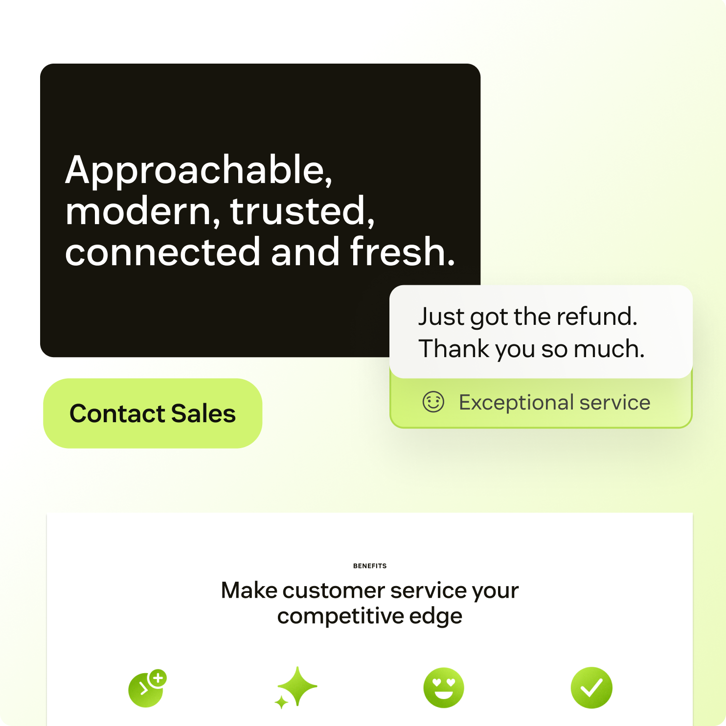
Zendesk publishes three feelings for its copy (confident, included, credible) and a three-part rule: brief, focused, human. Its voice card adds five attributes: approachable, modern, trusted, connected, fresh.
resolutionresolveAI agentsserviceconnectionhuman
Source: zendesk.com/company/brand-guidelines
Source: zendesk.com/company/brand-guidelinesgarden.zendesk.com/patterns/buttonsgarden.zendesk.com/content

Logo files are Zendesk's, downloadable from its brand portal; third-party use needs a license or written permission.
The primary logo is called the biggest visual identifier; restricting the symbol keeps the wordmark doing the naming.
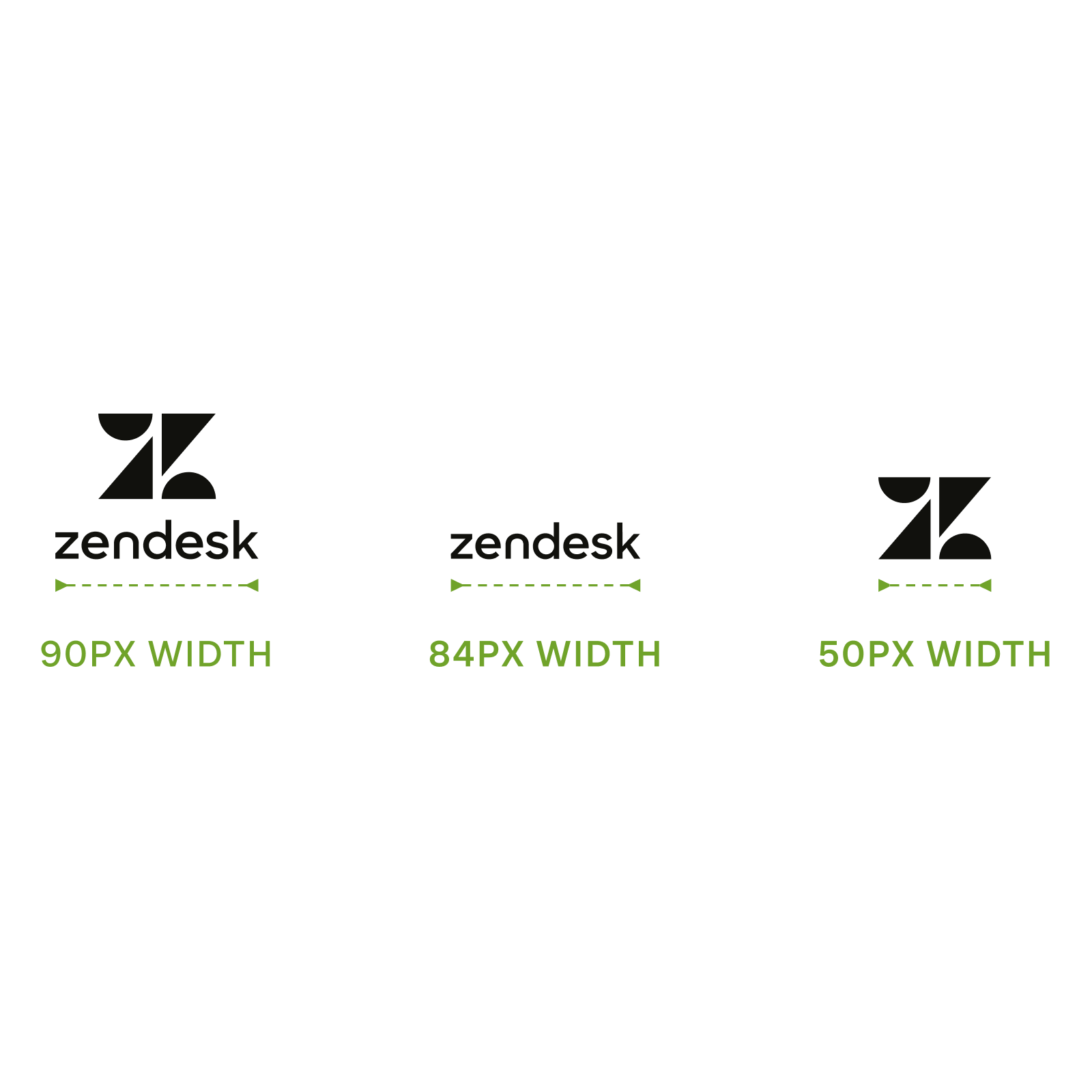
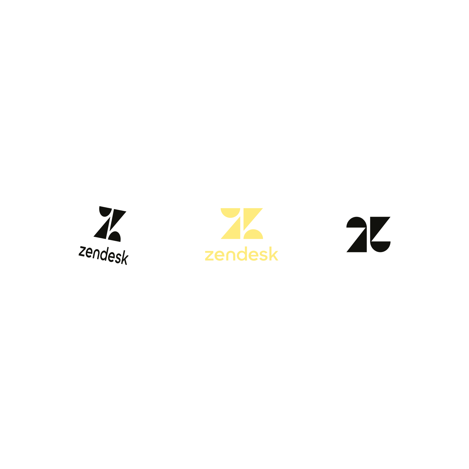
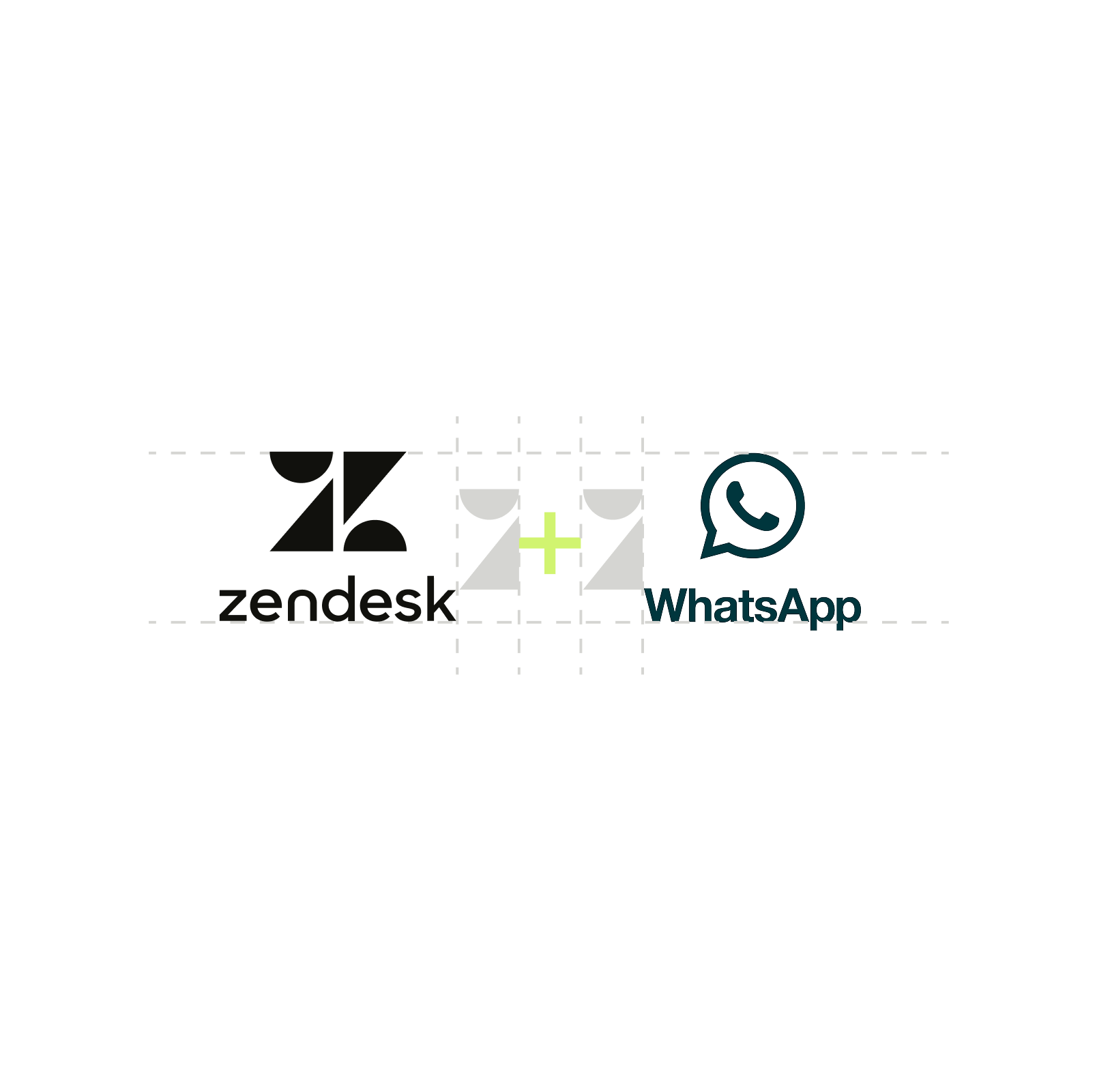
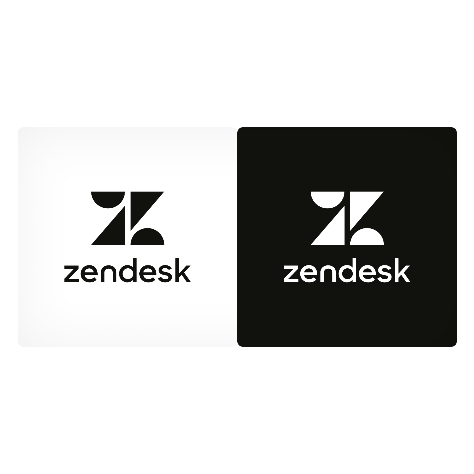
| Variations | primary, wordmark, Z symbol |
|---|---|
| Colours | Licorice #11110D or Coconut #FFFFFF |
| Minimum width | 90px primary / 84px wordmark / 50px symbol |
| Clear space | not published |
Three published variations: the primary logo (Z symbol over the "zendesk" wordmark), the wordmark alone, and the Z symbol alone. The symbol is two shapes, a half-circle-topped triangle pair, read as a Z. On the homepage the primary logo sits top left in the header; on phone only the wordmark shows.
Not published: clear space around the logo; print minimum sizes.
Resolve more, faster
Black and white leave room for photography of people; Matcha marks resolution, the brand's core idea, and recalls the original Zendesk green.
| Coconut | #FFFFFF |
|---|---|
| Licorice | #11110D |
| Matcha | #D1F470 |
| Fern | #203524 |
| Shamrock | #2D4C33 |
| Cactus | #A1D78F |
| Pineapple | #FEEB7E |
| Sesame | #F5F5F2 |
A black-and-white foundation (Coconut, Licorice) with one bright accent (Matcha) and five secondary colours: two deep greens (Fern, Shamrock), a soft green (Cactus), a soft yellow (Pineapple) and an off-white (Sesame). The homepage uses Coconut grounds, Sesame cards, Fern and Licorice dark bands and Matcha only on buttons and chips.
Not published: proportions or ratios; contrast pairings; a muted text colour.
Source: zendesk.com/company/brand-guidelinesgarden.zendesk.com/design/color
Automate up to 80% of interactions with Zendesk AI agents.
One family at four weights keeps the system quiet so photography and the Matcha button carry the energy.
| Their face | Use | License | Open stand-in |
|---|---|---|---|
| Vanilla Sans | Headlines 500, sentence case | Proprietary (Zendesk); not published or downloadable | Figtree Closest rendered match of 27 open candidates on letterforms and line width (within 2.5%); weights mapped up to match ink. See typography.calibration |
| Vanilla Sans | Body 400, buttons and nav 600, eyebrows 700 | Proprietary (Zendesk) | Figtree Same family as display |
| Real face | Vanilla Sans (proprietary) |
|---|---|
| Stand-in | Figtree (Google Fonts, OFL), weights mapped up |
| Hero | 68px / 43px phone, 1.05 |
| H2 | 42px / 30px, 1.15 |
| Body | 16px / 15px, 1.45 |
The brand page does not publish a typeface. The site sets everything in Vanilla Sans, a proprietary geometric-humanist sans: headlines 500, body 400, buttons and nav 600, eyebrows 700 uppercase. Headlines are sentence case with no negative tracking.
Not published: typeface name; type scale; licence.
Source: zendesk.com
Matcha on Licorice · every primary call to action, chips and the one accent link per page
Do Large rounded rectangles (40px radius at desktop and phone, 32px on the hero, 16px for small cards) in Sesame, Fern or a 5% Licorice tint with a hairline; flat, no shadows. The guide's own imagery uses the same soft-cornered frames.
Soft 40px containers · content cards, event card, banners, image frames
Do Dark sections are green-black, not neutral: flat Fern #203524 bands, Shamrock #2D4C33 panels, and a radial glow from #355E34 into Licorice at the bottom centre of product panels. Headlines on them are Sesame #F5F5F2.
Fern and glow-green dark bands · report, final CTA, event card, product panels
Do A warm, natural-light photo of one person, with white chat cards (avatar, name, short message; an AI agent card with green checks) floating over a corner. The guide: photography shows moments of connection made possible because something was resolved; product imagery shows capabilities in action.
People with a floating conversation · hero and brand imagery
AI that gets smarter with every resolution.
One green word · section headlines and big numbers
Specimens use sample copy, not Zendesk’s.
The rounded shapes and chat cards make the brand feel like a conversation; the glows add direction without new colours.
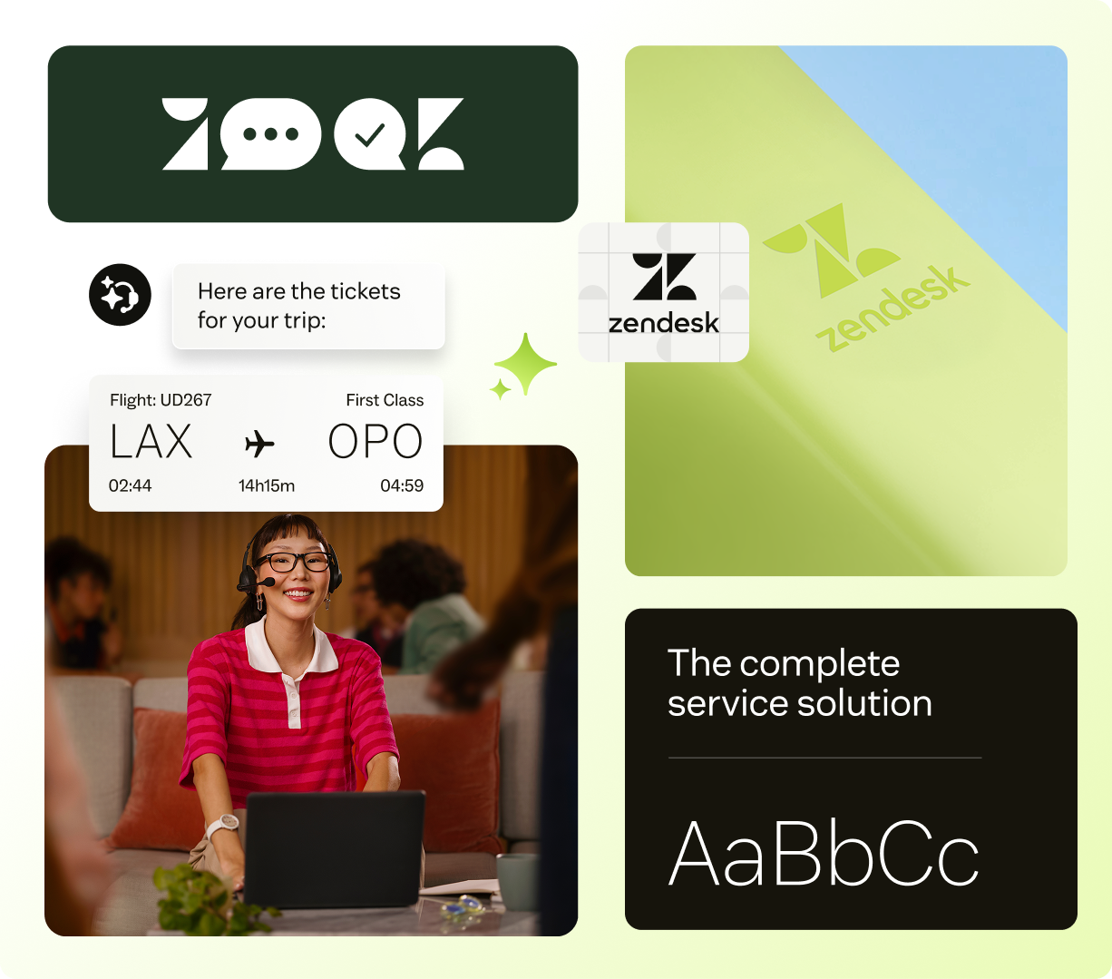
The guide says simple forms create clarity while gradients and shapes signal the path forward. On the site that means soft 40px rounded containers, Matcha-to-white glows behind brand imagery, white chat cards floating over photos, and glyphs drawn from the Z symbol's half-circles and triangles (the "Z...QK" letter icons on the brand page).
Deriving icons from the logo makes even a smile or a sparkle read as Zendesk.

The icon system is built from the primary logo: geometric shapes with rounded and sharp edges, grid-based and precisely spaced, simple enough to be universally recognised, with fresh metaphors. Product UI icons (Garden) are 16px stroke by default, 12px in compact spaces, fill for selected states.
Not published: brand icon grid size and stroke weight.
Source: zendesk.com/company/brand-guidelinesgarden.zendesk.com/design/icons
Zendesk does not publish an illustration style.
Zendesk does not publish an illustration style. Its brand page shows product imagery (UI cards composited with photos) and icon art instead; the homepage uses product UI renders where another brand would use illustration.
Not published: an illustration style.
Showing the human after the problem is solved sells resolution without showing the software.


Photography shows people in moments of connection made possible because something was resolved: relatable, compelling stories. The homepage hero is a warm, sunlit portrait (a woman in green headphones on a train); the brand page uses a smiling cyclist with a phone. Natural light, warm tones, a single subject, often holding a phone.
The homepage animates chat conversations (Rive canvases with static PNG fallbacks), rolls stat numbers up like an odometer, and fades buttons and link underlines over 0.6s on a symmetric ease.
The homepage animates chat conversations (Rive canvases with static PNG fallbacks), rolls stat numbers up like an odometer, and fades buttons and link underlines over 0.6s on a symmetric ease. Video work starts from Zendesk's Baseline Animation Kit, which is not public.
Not published: motion principles, durations or easing.
A 1102px container with 88px band padding, inset rounded cards and centred section headlines. White bands alternate with Fern bands and big Sesame or Fern cards; the hero is itself an inset rounded photo card.
Measured from zendesk.com/company/brand-guidelines's Zendesk's public brand resources page and its embedded images, the Garden design system (garden.zendesk.com) for product UI rules, and measurements of the homepage (www.zendesk.com) at 1440 and 390, 2026-10-31.
| Measure | Desktop | Phone |
|---|---|---|
| Page margin | 169px | 16px |
| Section padding | 88px | 48px |
| Hero text width | max 656px, centered | full width |
| Card gap | 24px | 24px |
| Navigation | 110px | 110px |
Hero H1 (Vanilla Sans 500)
Vanilla Sans · 68px (phone 43) · line 1.05 · weight 560
Section H2 (Vanilla Sans 500)
Vanilla Sans · 42px (phone 30) · line 1.15 · weight 560
Stat number (Vanilla Sans 500)
Vanilla Sans · 72px (phone 56) · line 1 · weight 560
Card / band title H3 (Vanilla Sans 500)
Vanilla Sans · 26px (phone 22) · line 1.25 · weight 560
Footer contact line (Vanilla Sans 500)
Vanilla Sans · 42px (phone 30) · line 1.15 · weight 560
Body (Vanilla Sans 400)
Vanilla Sans · 16px (phone 15) · line 1.45 · weight 460
Strong body: quote, card titles, tab labels (Vanilla Sans 600)
Vanilla Sans · 16px (phone 15) · line 1.45 · weight 640
Button label (Vanilla Sans 600)
Vanilla Sans · 18px · line 1.556 · weight 640
Nav link (Vanilla Sans 600)
Vanilla Sans · 16px · line 1.44 · weight 640
Eyebrow (Vanilla Sans 700 uppercase, +0.75px)
Vanilla Sans · 14px (phone 12) · line 1.3 · tracking 0.5px · weight 780
Small: announcement, utility links, footer links (Vanilla Sans 400)
Vanilla Sans · 14px (phone 13) · line 1.5 · weight 460
Countdown digits (Vanilla Sans 300)
Vanilla Sans · 32px · line 1 · weight 300
One or two sentences on what this does for the reader.
One or two sentences on what this does for the reader.
Big content cards (event, timeline, product pair, testimonial, pricing, OSD) are radius 40; resource cards radius 16; testimonial image radius 20; no shadows anywhere
How Zendesk’s own landing pages are built, observed on zendesk.com, 2026-10-31. The full measurements are in spec.md.
How our engine applies Zendesk's system per format. Our recipe from their rules, not something Zendesk publishes. Level = how much dark green and Matcha the format carries.
| Format | What they did | Source |
|---|---|---|
| Brand resources page | Logo, colour, photography, iconography, product imagery and voice summary with download links | zendesk.com/company/brand-guidelines |
| Format | Loudness | Must appear | What varies |
|---|---|---|---|
| Landing page | Build it the way www.zendesk.com is built (kit.spec.page, homepage voice): Licorice announcement bar, white sticky two-row header with the primary logo, an inset 32px-radius photo hero darkened on the left with a floating chat card, Licorice logo band, 40px-radius Sesame/Fern cards, Fern full-bleed bands, Matcha primary + ghost secondary buttons (radius 16), Licorice footer | which sections and how many cards; a lighter all-white page for simple pages | |
| Deck | Coconut slides with Licorice type, one Fern or Licorice title slide, Matcha only for the key number or call to action, people photography | how many dark slides | |
| Social post | One person photo or a chat card on Fern, sentence-case 500 headline, Matcha accent | photo vs product imagery | |
| White ground, Licorice text, one Matcha button, primary logo top left | a Sesame card for the main offer |
 Efficiently Route, Prioritize & Solve Support Tickets w/…Google · Jul 2022 – now
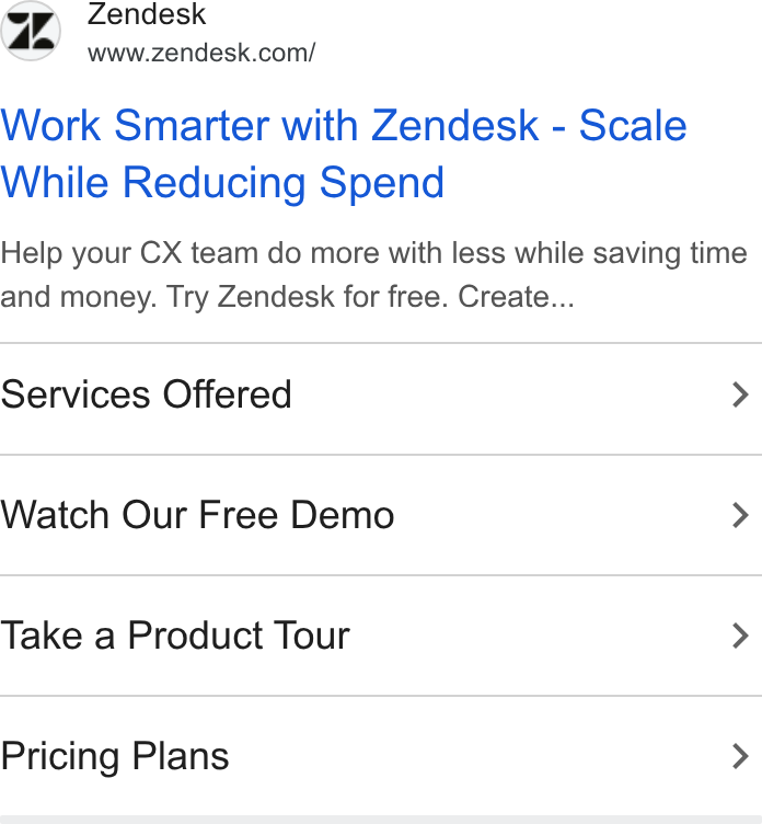 Help your CX team do more with less while saving time…Google · Apr 2023 – now
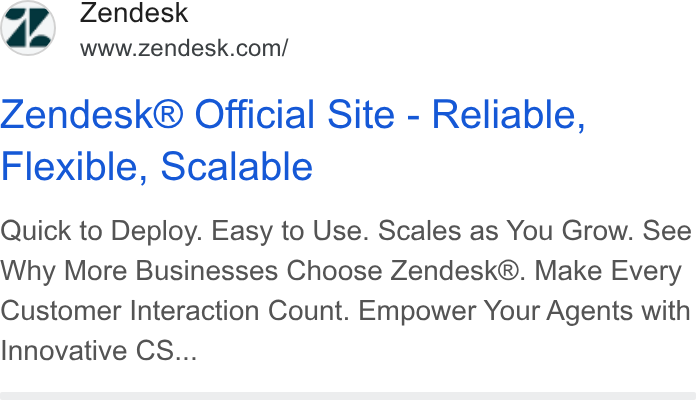 Quick to DeployGoogle · Oct 2021 – now
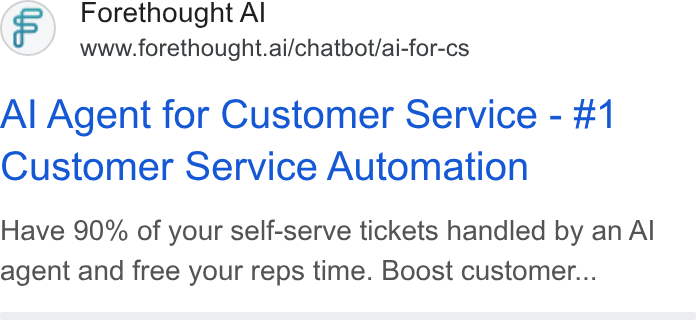 Have 90% of your self-serve tickets handled by an AI…Google · Nov 2024 – now
Source: zendesk.com/company/brand-guidelinesgarden.zendesk.com/patterns/buttonsgarden.zendesk.com/design/color
Your name and logo, Zendesk’s system.
Use this kit for my brand Use this brand in Claude
Get your brand audit Put your brand in Claude What goes in a brand book
Each value is marked published, observed, our reading or our recipe, with its source. Checked 2026-10-31. Not affiliated with Zendesk.