Designed for everyone
Great software should work with minimal setup: accessible, fast, secure and easy, simple and predictable at its core (paraphrase). Published
Brand book
Jazz on a quiet page. WordPress.org keeps type, color and layout strict and nearly monochrome, then allows one improvised gesture (a Blueberry brush stroke, a pencil arrow, a 120px Light CTA) so an open source project feels human, not corporate. Our reading

Where a page sits between jazzy/expressive and minimal/clean: the homepage and About page carry strokes and hand marks; download and documentation pages stay functional (published in the 2022 homepage post).
Our engine's setting, built from their rules.
Every 'WordPress' has a capital P.
No Mrs Eaves or Dalliance outside the logo.
Links and primary buttons are Blueberry #3858E9; no other blue on WordPress.org pages.
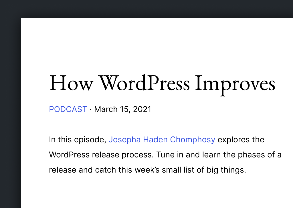
Headings are EB Garamond 400, never bold.
W/2 clear space around the logo, official files only.
No WordPress in a product, company or domain name; no trademark in ads.
The open source publishing platform of choice for millions of websites, from creators and small businesses to enterprises. Observed
Great software should work with minimal setup: accessible, fast, secure and easy, simple and predictable at its core (paraphrase). Published
WordPress is GPL software, built and improved by a worldwide community of contributors (paraphrase). Published
Contributors around the globe give their time so anyone has a voice (paraphrase). Published
Flexible design tools and blocks, real-time editing, and a plugin library for whatever a site needs (paraphrase). Observed
Meet WordPress
One platform, a universe of possibilities
Build for yourself, not by yourself
Wear the internet you make
Mike Little and Matt Mullenweg forked b2/cafelog in 2003 to make an elegant personal publishing system. It grew into the GPL-licensed platform of choice for millions of sites, built by developers, designers, scientists and bloggers, usable out of the box and deeply customizable.
Run the program for any purpose.
PublishedStudy how it works and change it.
PublishedRedistribute it.
PublishedDistribute your modified versions.
PublishedCategory. Open source publishing platform; blog tool, publishing platform and CMS (page title) Observed
Not published: WordPress.org names no competitors.
WordPress is the open source publishing platform behind millions of websites, from creators and small businesses to enterprises. It began in 2003, is licensed under the GPL, and is built by a worldwide community of contributors.
Democratize publishing Published
the freedom to build. the freedom to change. the freedom to share. Published
Meet WordPress Observed
Build for yourself, not by yourself Observed
Wear the internet you make Observed
democratize publishing
The mission is 'democratize publishing', backed by the four GPL freedoms. The homepage sells three verbs (Design, Build, Extend), a showcase of famous sites, the community, learning resources and the latest release.
Source: wordpress.org/aboutwordpress.org
Plain words for a project used by first-time bloggers and enterprises alike; freedom and community are the recurring ideas because the GPL is the product's foundation.
WelcomingPlainOpenQuietly jazzy
There is no voice guide. The About page states the stance: WordPress is designed for everyone, open source, welcoming and inclusive, with the mission 'democratize publishing'. Homepage copy is short, plain and benefit-led, in sentence case. The trademark policy and core code supply the only hard rules: always 'WordPress' with a capital P, and specific product names to avoid.
open sourcepublishingfreedomcommunityeveryoneblocksbuildsharedemocratize
WordpressHosted WordPressManaged WordPress Hosting
Not published: tone of voice; word list; grammar and punctuation guide.
Source: wordpress.org/aboutwordpress.orgwordpressfoundation.org/trademark-policydeveloper.wordpress.org/reference/functions/capital_p_dangit








Logo files downloaded from wordpress.org/about/logos/ and the identity handbook page. Use within the WordPress Foundation trademark policy.
One measure, the height of the W mark, sets every proportion and margin, so each lockup reads as the same mark at any size.
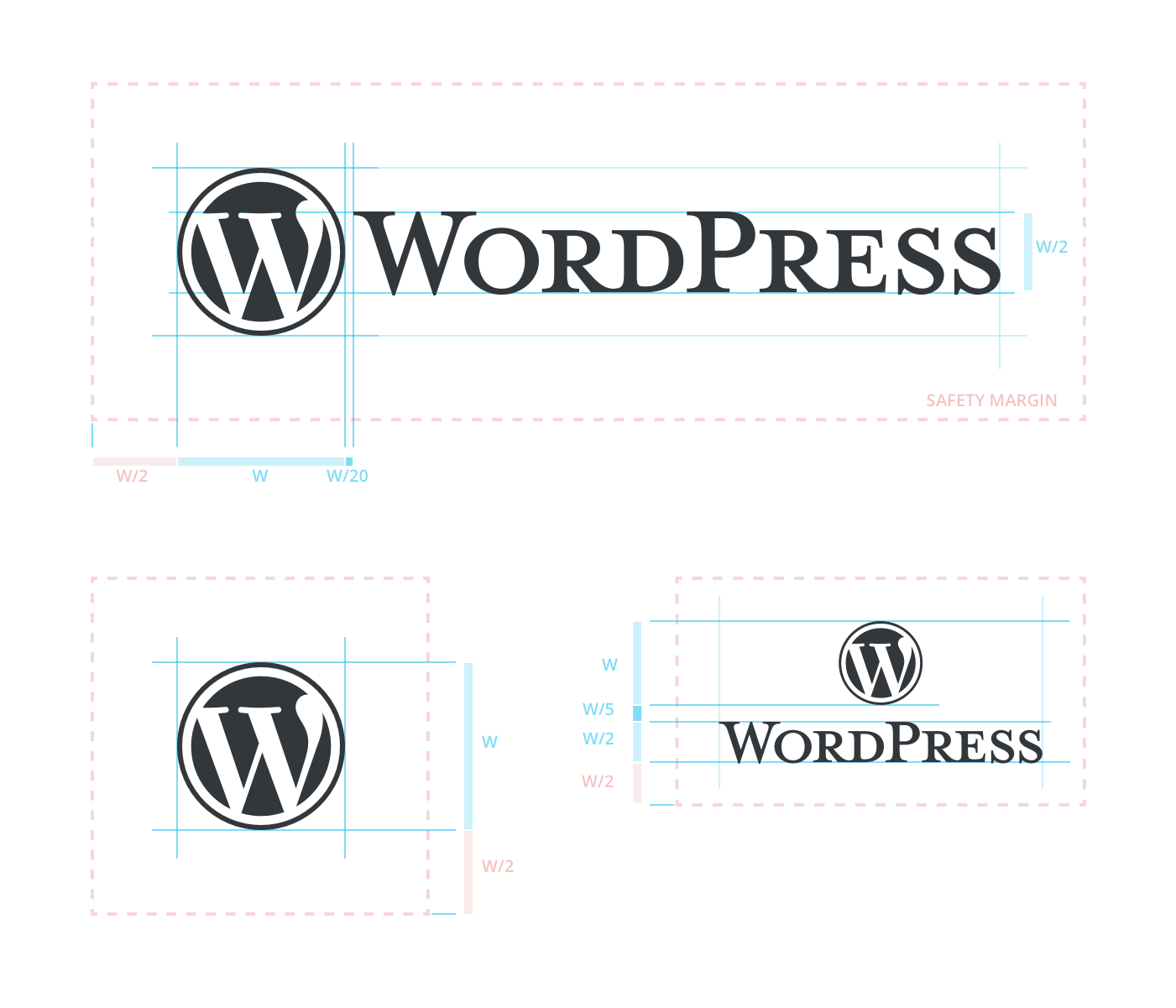

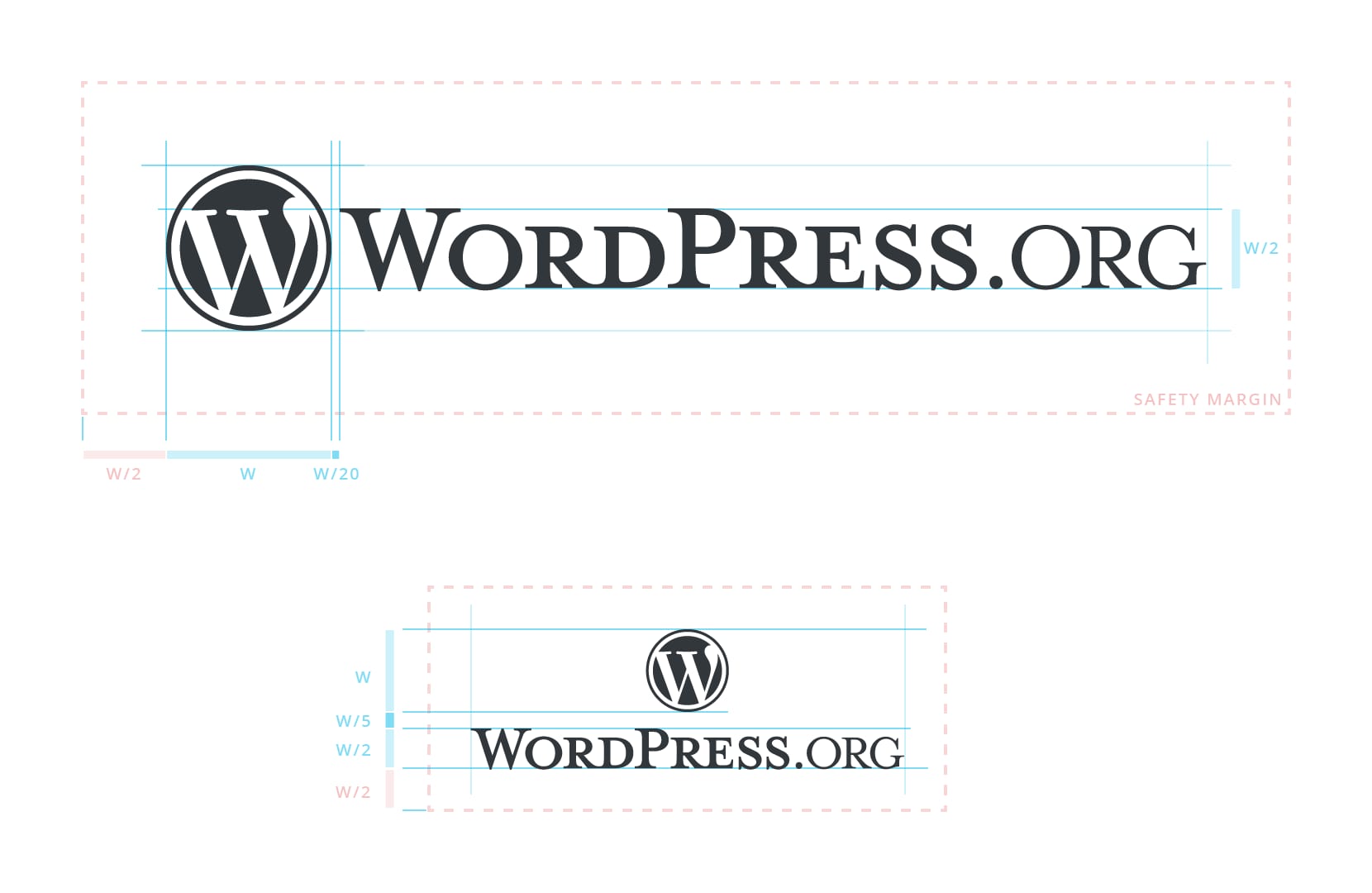
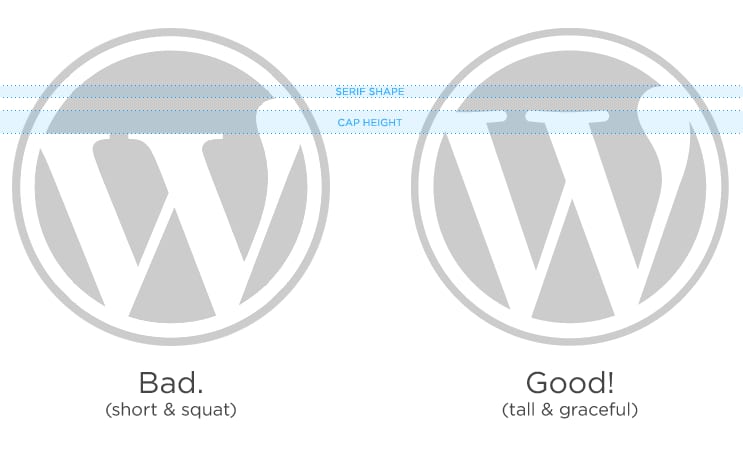
One measure, the height of the W mark, sets every proportion and margin, so each lockup reads as the same mark at any size. The serif W's tall, graceful shape is what fakes get wrong.
| Unit | W = height of the W mark |
|---|---|
| Wordmark height | W/2 |
| Clear space | W/2 all sides |
| Mark-to-word gap | W/20 horizontal; W/5 stacked |
| Colors | Base Gray #32373C; white |
| Minimum size | not published |
| Owner | WordPress Foundation; commercial licence via Automattic |
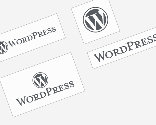
The logotype is the W mark plus the 'WordPress' wordmark. Jason Santa Maria drew it in 2005 from two Emigre faces (Mrs Eaves Small Caps for the word, Dalliance as the influence for the W); Matt Miklic refined it and Hugo Baeta rebalanced it for the handbook. Five downloads are published (standard, vertical alternative, word mark, W mark, simplified), each in Base Gray or white, and WordPress.org adds a .org suffix on the same metrics.
Source: make.wordpress.org/design/handbook/design-guide/foundations/identitymake.wordpress.org/design/handbook/design-guide/wordpress-org/wordpress-org-identitywordpress.org/about/logoswordpressfoundation.org/trademark-policy
A near-monochrome page lets one vibrant blue do all the signalling; the redesign post says that blue echoes the Gutenberg editor, so the marketing site and the product feel like one thing.
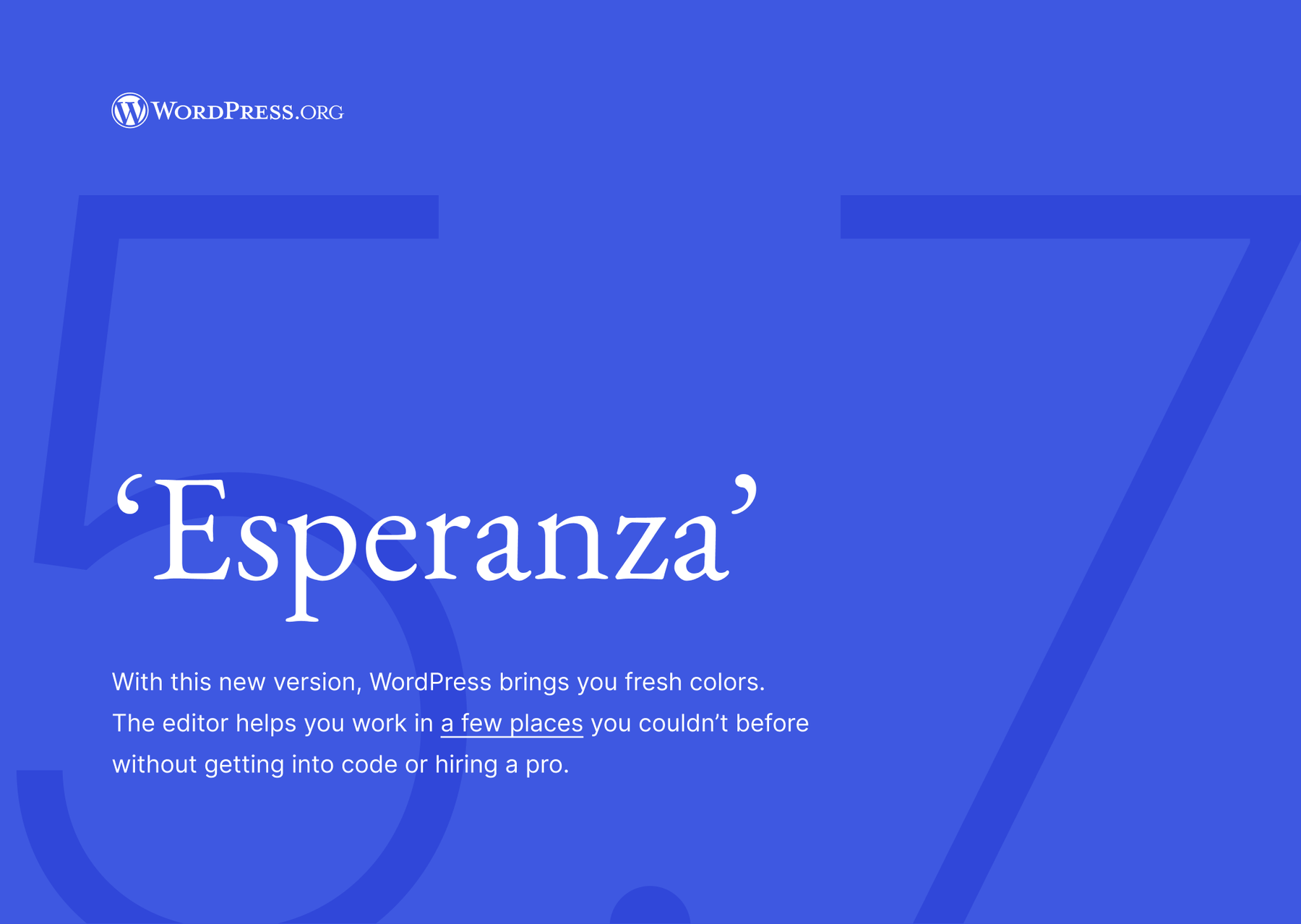
| Accent | Blueberry #3858E9 |
|---|---|
| Text | Charcoal #1E1E1E |
| Ground | White #FFFFFF / Light Grey 2 #F6F6F6 |
| Dark | Charcoal #1E1E1E, Charcoal 2 #23282D |
| Alpha tokens | White 15% #FFFFFF26, Black 15% #00000026 |
| Proportions | not published |
Two palettes are published. The handbook's Colors page keeps the classic set (WordPress Blue #0073AA and Medium Blue, six grays from Ultra Dark Gray to Light Silver Gray, six auxiliary accents) and says a new WordPress.org palette is being explored in Figma. That newer palette is published as the WordPress.org theme's tokens: a Charcoal ramp, two light greys, a Blueberry ramp led by #3858E9, and four accent families (Pomegranate, Acid Green, Lemon, Purple) with tints. The live site is almost entirely White, Light Grey 2 and Charcoal, with Blueberry carrying every link and button.
Source: make.wordpress.org/design/handbook/design-guide/foundations/colorsgithub.com/WordPress/wporg-parent-2021/blob/trunk/source/wp-content/themes/wporg-parent-2021/theme.jsonmake.wordpress.org/design/2021/06/03/redesign-of-wordpress-org-newsmake.wordpress.org/accessibility/handbook/current-projects/use-of-color
Democratize publishing
Garamond's book serif gives headings the elegance of the logotype's small caps without using it; Inter, chosen in the 2021 redesign for screen reading, keeps everything functional.
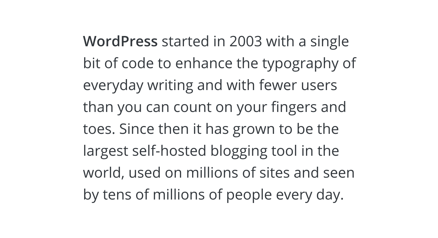
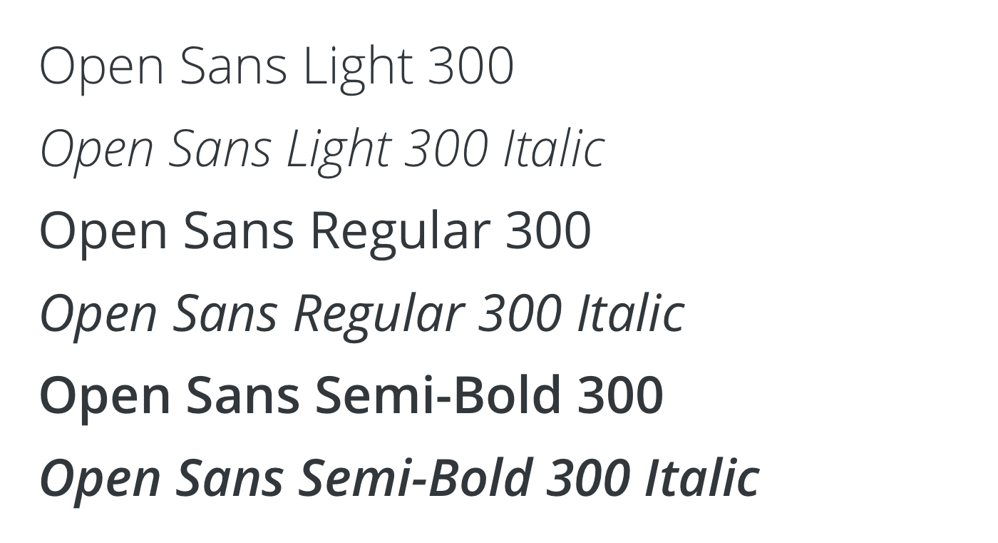
Garamond's book serif gives headings the elegance of the logotype's small caps without using it; Inter, chosen in the 2021 redesign for screen reading, keeps everything functional. The redesign post says Open Sans's quirks weren't helping readability.
| Their face | Use | License | Open stand-in |
|---|---|---|---|
| EB Garamond | All headings H1-H6, Regular 400 only | Open (SIL OFL 1.1) | EB Garamond (the real face; file in fonts/) |
| Inter | Paragraphs, UI, buttons (Semi Bold), subtitles (uppercase), the 120px Light CTA | Open (SIL OFL 1.1) | Inter (the real face; file in fonts/) |
| IBM Plex Mono | Code (theme monospace token); the About page uses Courier Prime instead | Open (SIL OFL 1.1) | |
| Mrs Eaves Small Caps (Emigre) | The 'WordPress' wordmark only | Proprietary (Emigre); logotype only, not supplied | |
| Dalliance (Emigre) | Influence for the W mark only | Proprietary (Emigre); logotype only, not supplied | |
| Open Sans | Classic WordPress text face: Light 300, Regular 400, Semi-Bold 600, each with italic; replaced on WordPress.org by Inter in the 2021 redesign | Open (SIL OFL 1.1, Google Fonts) |
| Display | EB Garamond 400 |
|---|---|
| Text | Inter 300/400/600/700 + italics |
| Mono | IBM Plex Mono (theme token) |
| Logotype | Mrs Eaves Small Caps, Dalliance (Emigre) |
| Classic | Open Sans 300/400/600 + italics |
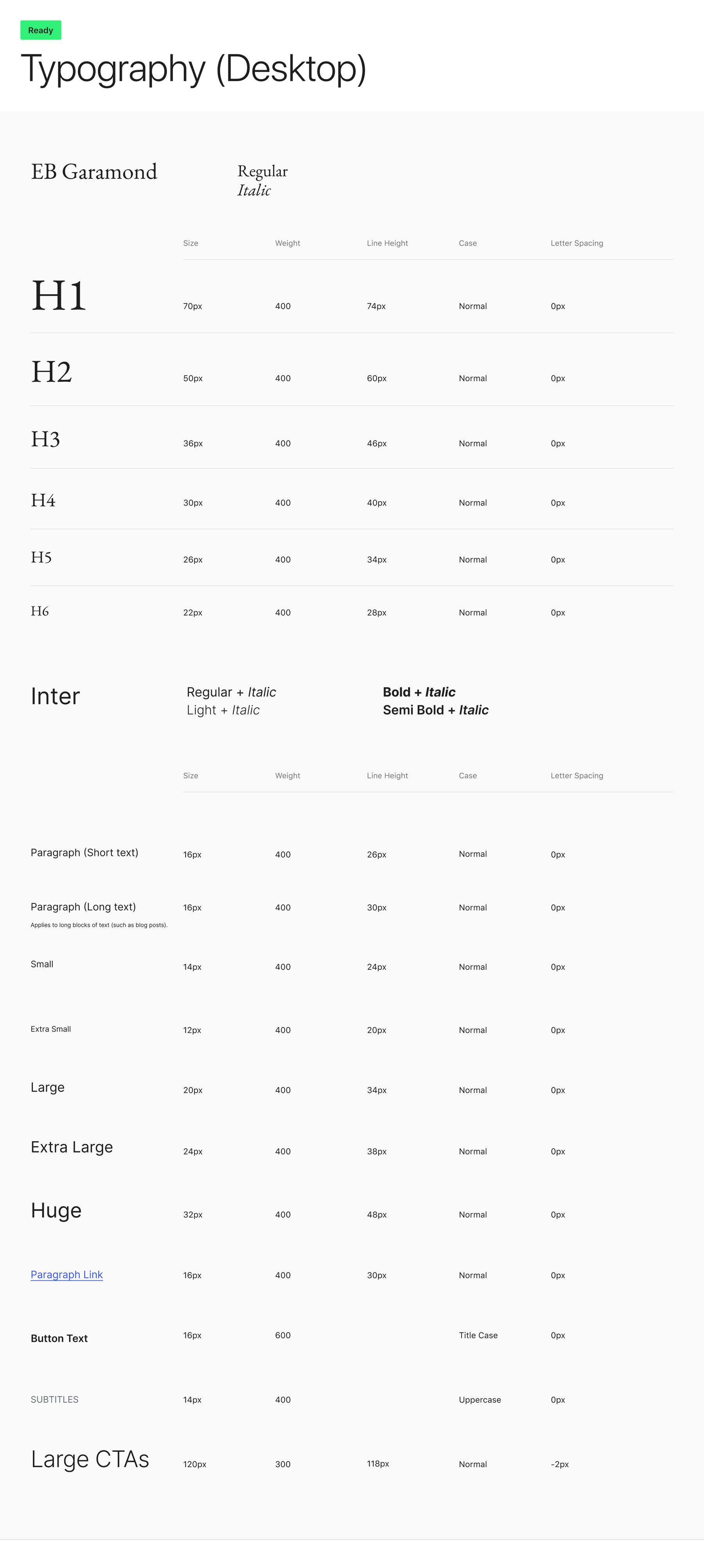
| H1 | 70/74 desktop and phone (homepage, observed 2026-10-31) |
| Body | 16/30 long, 16/26 short |
| Large CTA | 120/118, 300, -2px |
The guide names four faces with strict jobs. Mrs Eaves Small Caps and Dalliance belong to the logotype alone. WordPress.org sets headings in EB Garamond and text in Inter, with a full desktop scale published as a chart. Open Sans (Light, Regular, Semi-Bold and italics) is the classic text face, kept on the page as 'Classic typography'.
Source: make.wordpress.org/design/handbook/design-guide/foundations/typographygithub.com/WordPress/wporg-parent-2021/blob/trunk/source/wp-content/themes/wporg-parent-2021/theme.jsonmake.wordpress.org/design/2021/06/03/redesign-of-wordpress-org-news
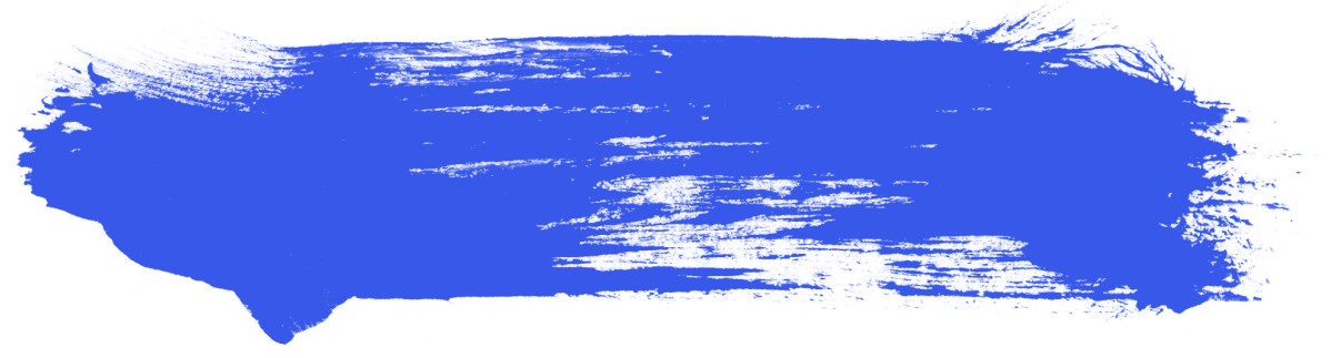
Do One dry-brush paint stroke in Blueberry #3858E9 on white, painted left to right with ragged ends, as the one expressive gesture on a calm page; the jazz 'paint strokes' of the 2021 redesign.
The Blueberry brush stroke · Homepage hero beside 'Meet WordPress'; as a 16px rule element in content (custom.brush-stroke)
Do EB Garamond Regular 400 at the published scale (70/50/36/30/26/22), sentence case, balanced wrap, with Inter for everything else.
Garamond headings, never bold · Every H1 to H6 on WordPress.org
Do Inter Light 300 at 120px, 118px leading, -2px tracking, white, as the page's last word.
The huge Light CTA · Closing 'Get started' band on Charcoal 2 #23282D
Do Documentary black-and-white photos of real WordPress people at events.
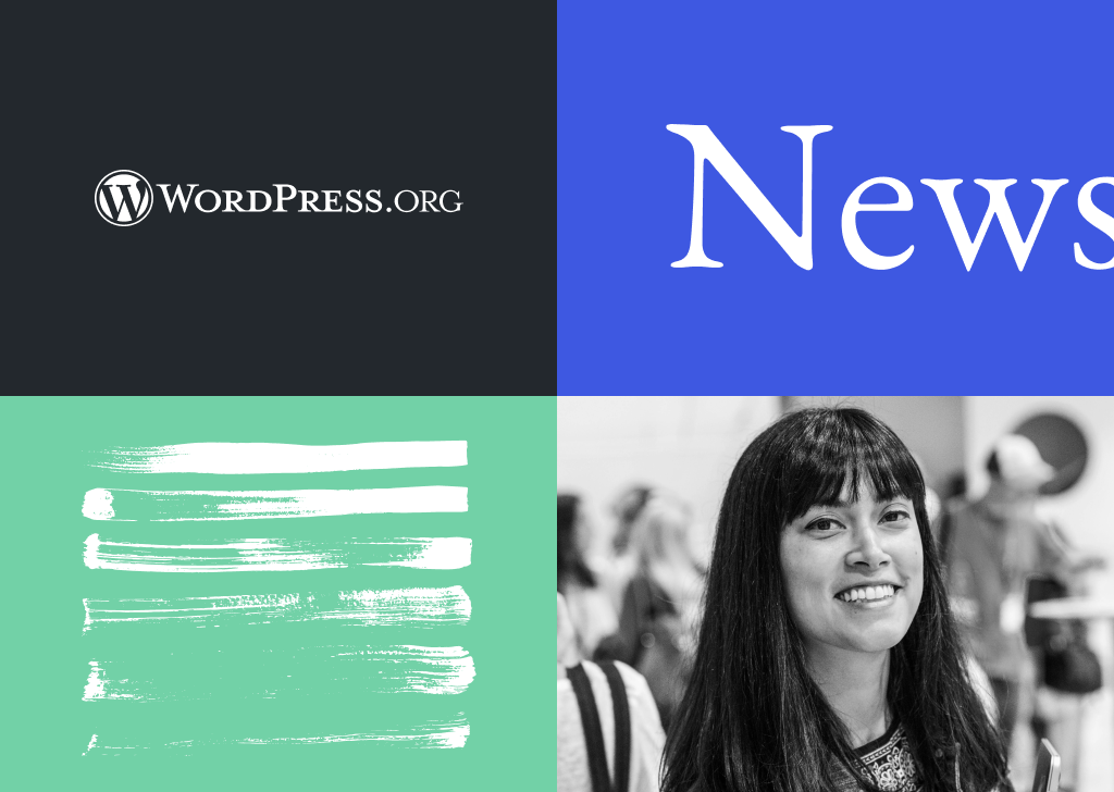
Black-and-white people · Community photography on the homepage and the News redesign
Do Pencil-style arrows, underlines and circles with a typewriter mono (Courier Prime) on a warm #F0EDE7 ground and huge lowercase Inter headings.
Hand-drawn marks and typewriter text · The About page
Specimens use sample copy, not WordPress’s.
A single hand-made gesture against strict, quiet typography gives warmth and personality without competing with content, the 'jazzy versus minimal' balance the homepage post describes.
| Brush-stroke rule | 16px tall (custom.brush-stroke) |
|---|---|
| Radius | 2px buttons/fields; 0 cards |
| Separator | 150px wide, 30px vertical margin |
The 2021 News redesign set the graphic language: a 'jazzy' look taken from jazz album art, carried by stroke shapes, type, layout and color because imagery on the blog is sparse. On today's site that shows as one Blueberry dry-brush stroke in the homepage hero, a 16px brush-stroke rule token in the theme, square-cornered cards with 1px light grey borders, and on the About page pencil-style arrows and circles.
Source: make.wordpress.org/design/2021/06/03/redesign-of-wordpress-org-newsmake.wordpress.org/design/2022/07/27/project-update-wordpress-org-homepage-and-download-page-mockupsgithub.com/WordPress/wporg-parent-2021/blob/trunk/source/wp-content/themes/wporg-parent-2021/theme.jsonwordpress.orgwordpress.org/about
Strict grid and stroke rules keep thousands of contributor-made icons consistent in wp-admin, where they are judged in context.
| Grid | 24px (Dashicons 20px) |
|---|---|
| Stroke | 1.5px (Dashicons 2px) |
| Corners | 1px, 2px where appropriate |
| Style | facing, flat |
Current WordPress Icons live in Storybook and the WordPress Design Library in Figma. They sit on a 24px grid with 1.5px lines and 1-2px corners, front-facing and flat. Dashicons, the classic admin set, are deprecated but still available: 20px grid, 2px lines, 1px corners, friendly rounded edges, angled to the right.
Source: make.wordpress.org/design/handbook/design-guide/foundations/iconographydeveloper.wordpress.org/resource/dashiconsmake.wordpress.org/design/2024/11/07/announcing-the-new-wordpress-design-system-figma-librarywordpress.github.io/gutenberg
Showing the real editor UI keeps the product honest; the brush and pencil marks supply the human touch.
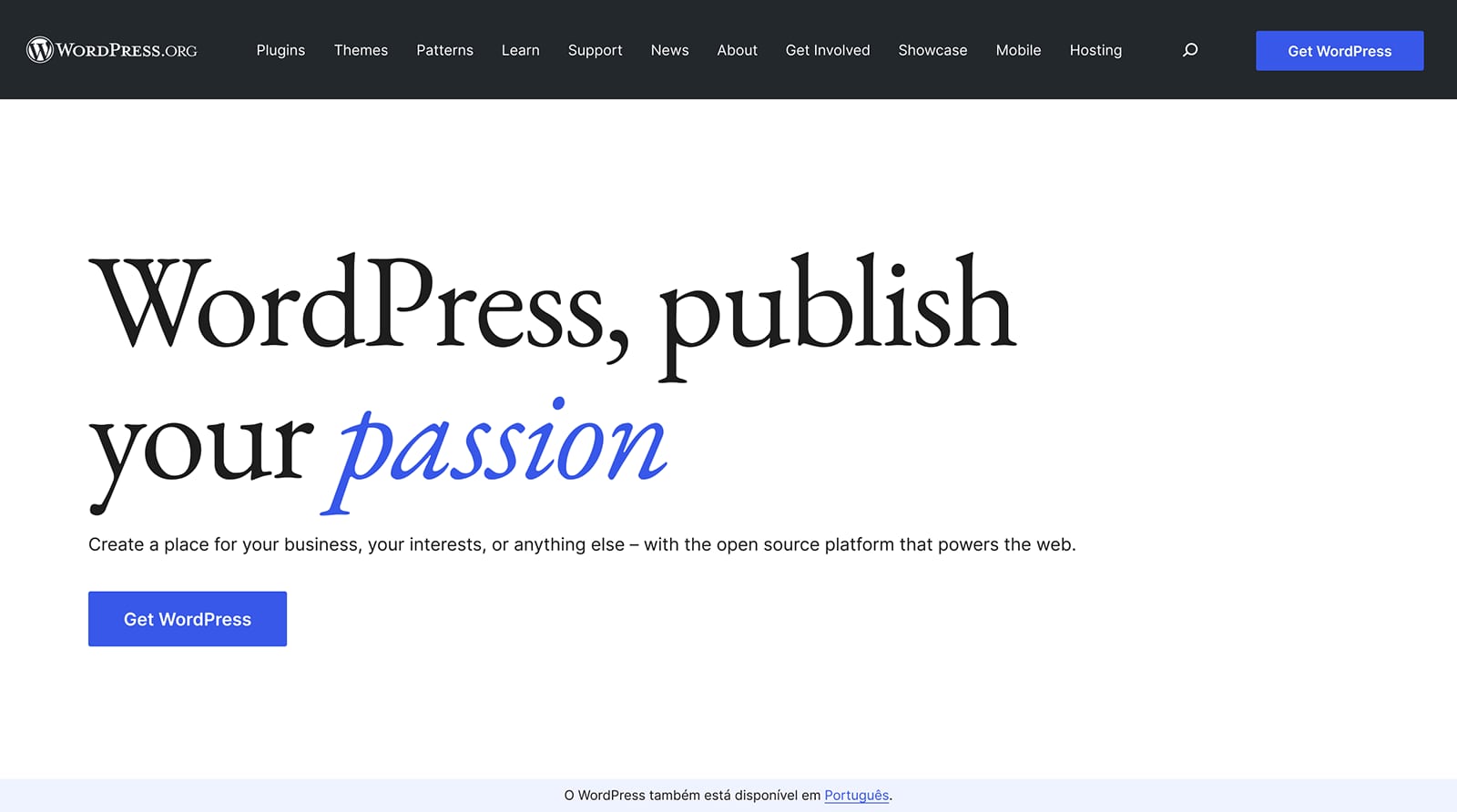
No illustration guidance is published. The redesign posts reference jazz album artwork as the mood, and the site uses brush strokes, hand-drawn arrows and product UI renderings (editor toolbars, block inserter tiles) instead of illustrations.
Not published: illustration style; illustration palette.
Source: make.wordpress.org/design/2021/06/03/redesign-of-wordpress-org-newsmake.wordpress.org/design/2022/07/27/project-update-wordpress-org-homepage-and-download-page-mockupswordpress.org
Monochrome photos of real contributors sit calmly next to a near-monochrome palette and let Blueberry stay the only color.
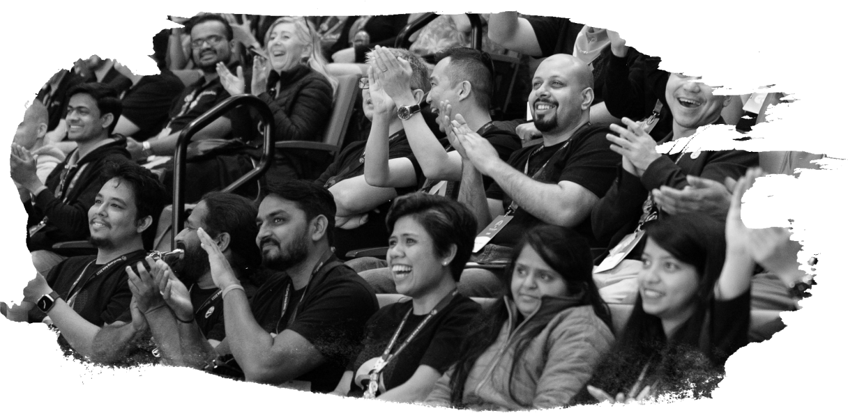
No photography guidance is published. Community photography on the homepage is black and white (its alt text says so), and the 2021 News redesign used black-and-white portraits from WordPress events.
Not published: photo treatment; cropping rules.
Source: wordpress.orgmake.wordpress.org/design/2021/06/03/redesign-of-wordpress-org-news
The handbook publishes no grid. The WordPress.org theme does: a 680px content column, a 1160px wide column, 80px edge spacing, a spacing scale from 10px to clamp(80px, 13.33vw, 160px), and 30px base margins. Pages are built in the block editor, so sections are full-width groups that alternate White, Light Grey 2 and Charcoal.
Measured from wordpress.org's Playwright on the live page at 1440x900 and 390x844 (2026-10-31): computed styles, bounding boxes, hover states and the theme's CSS rules.
| Measure | Desktop | Phone |
|---|---|---|
| Page margin | 140px | 20px |
| Section padding | 80px | 80px |
| Hero text width | max 555px, centered | full width |
| Card gap | 40px | 40px |
| Navigation | 71px | 71px |
Hero H1 'Meet WordPress'
EB Garamond · 70px · line 1.05 · weight 400
Dark-band H2 (showcase)
EB Garamond · 50px (phone 30) · line 1.2 · weight 400
Section H2 (release, community, news, merch)
EB Garamond · 36px (phone 26) · line 1.28 · weight 400
Closing CTA 'Get started'
Inter · 120px (phone 52) · line 1 · tracking -2px · weight 300
Card and sub-section title (Design, Build, Extend; Build for yourself)
Inter · 18px · line 1.88 · weight 700
News post title
Inter · 18px · line 1.3 · weight 600
Body short text (ledes, card copy)
Inter · 16px · line 1.625 · weight 400
Link paragraph (stacked text links)
Inter · 16px · line 1.875 · weight 400
Button label
Inter · 16px · line 1.3 · weight 600
Nav link / header button
Inter · 14px · line 1.71 · weight 400
News meta (category caps + date)
Inter · 14px · line 1.875 · weight 400
Footer link
Inter · 14px (phone 16) · line 1.9 · weight 400
Phone menu item
Inter · 21px · line 1.95 · weight 400
How WordPress’s own landing pages are built, observed on wordpress.org, 2026-10-31. The full measurements are in spec.md.
Source: github.com/WordPress/wporg-parent-2021/blob/trunk/source/wp-content/themes/wporg-parent-2021/theme.jsonmake.wordpress.org/design/2022/07/27/project-update-wordpress-org-homepage-and-download-page-mockupsmake.wordpress.org/meta/2022/08/01/developing-the-redesigned-home-and-download-pages
How our engine applies WordPress's system to each format. This is our recipe from their published rules and their own pages, not something WordPress publishes.
| Format | Loudness | Must appear | What varies |
|---|---|---|---|
| Landing page | Build it the way wordpress.org is built: white page, global header with the W mark and a Blueberry 'Get WordPress' button, EB Garamond 400 headline left-aligned with an Inter lede, one Blueberry brush stroke in the hero, sections alternating White and Light Grey 2, a Charcoal band, a closing 'Get started' band on Charcoal 2 with the 120px Inter Light CTA, Charcoal 2 footer with the trademark line; 2px-radius Blueberry buttons, square cards | which sections and how many cards; the About-page register (Linen ground, lowercase Inter headings, typewriter text, pencil marks) for mission or story pages | |
| Deck | White or Charcoal slides, EB Garamond titles, Inter text, Blueberry for the one highlight, logo with W/2 clear space | a Blueberry title slide with a brush stroke; black-and-white photos | |
| Social post | Blueberry or Charcoal ground, one Garamond line, white W mark or logotype | brush stroke or release artwork tiles from the accent families | |
| Email / newsletter | White ground, Garamond headline, Inter 16/30 body, Blueberry links underlined, one Blueberry button | a Light Grey 2 news block | |
| Blog post (News) | 680px column, Inter 16/30 long-text setting, Garamond headings, Blueberry underlined links | a brush-stroke rule between sections | |
| Event / WordCamp page | Name and logo only with Foundation permission; never in a domain name | black-and-white community photos and accent tints |
Source: make.wordpress.org/design/handbook/design-guide/foundations/identitymake.wordpress.org/design/handbook/design-guide/foundations/typographymake.wordpress.org/design/handbook/design-guide/foundations/iconographywordpressfoundation.org/trademark-policywordpress.org/about/logos
Your name and logo, WordPress’s system.
Use this kit for my brand Use this brand in Claude
Get your brand audit Put your brand in Claude What goes in a brand book
Each value is marked published, observed, our reading or our recipe, with its source. Checked 2026-10-30. Not affiliated with WordPress.