The system
Fixed, everywhere

- #0254EC as the only action colour
- Poppins heads in #393F49 with DM Sans body
- Full-pill buttons
- White ground with only short blue strips and a #25242F footer
- Wizard/sparkle line-art illustration
- Proof bands (logo wall, reviews, analysts)
The one thing that varies
Illustration subject changes per section (cloud pipeline, gnome on a pole, agents) while staying blue/pink line art.
How loud each format gets
Silent
QuietLink card / blog cover
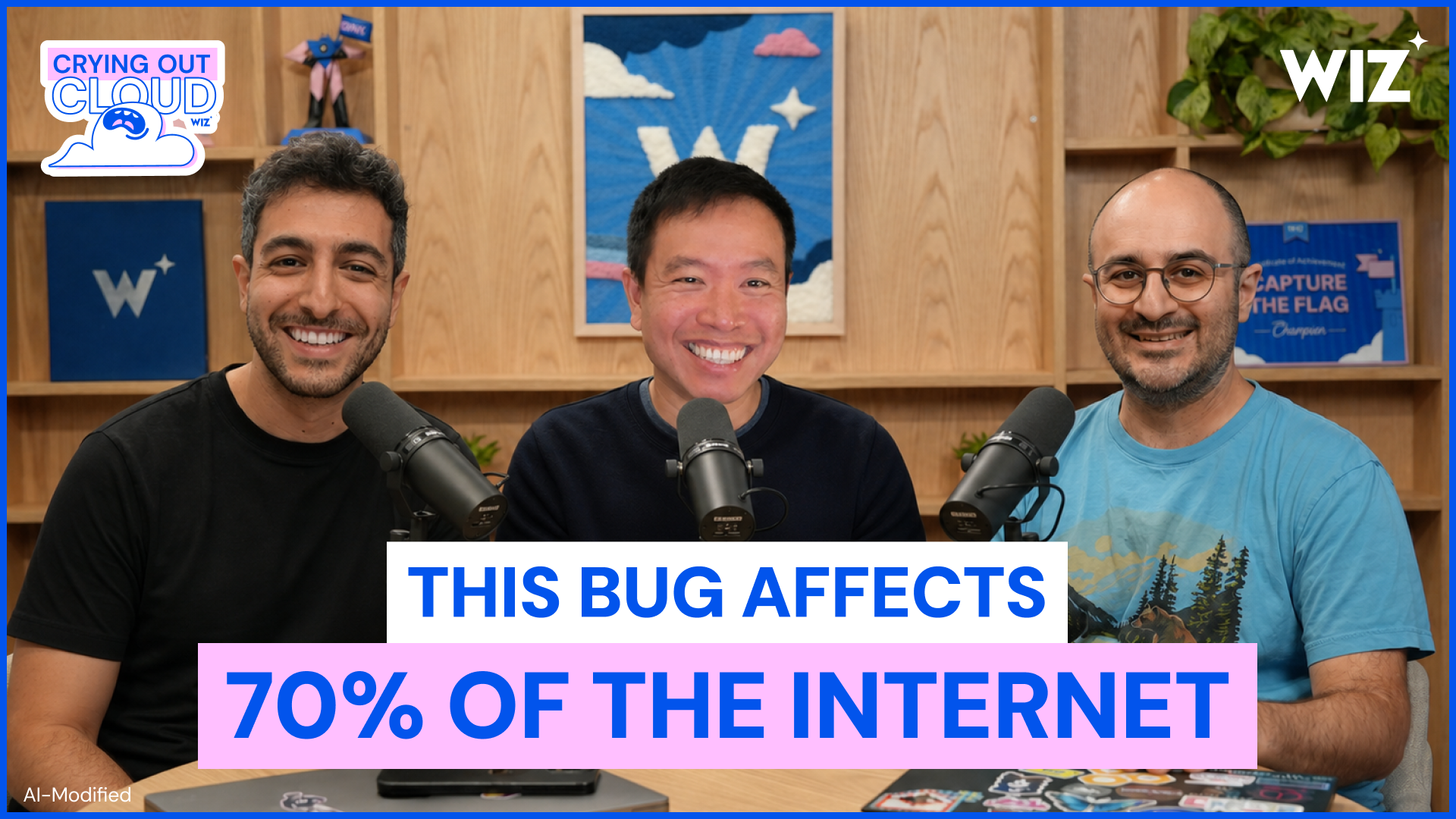
CalmVideo thumbnail: Crying Out Cloud podcast
WarmLanding pageSocial postPaid social ad: lead magnet
Loud
Loudest
Our engine's setting, built from their rules.
Every piece passes 7 checks
One blue
#0254EC is the only action colour; pink #FFC6F8 never carries text on white.
Real faces
Heads are Poppins 600 in #393F49 (not black); body is DM Sans.
Pills
Every CTA is a full pill with an arrow or chevron.
Logo
Only the media-kit files: blue on light, white on blue/dark; star stays on the Z.
Illustration
Art is thin blue line work with pale-blue/pink fills and wizard/sparkle motifs, never dark cyber stock.
Proof
Every number is one Wiz publishes (65% Fortune 100, 916 reviews, analyst reports) with its source.
Ground
Page stays mostly white; blue only as short strips; footer #25242F.
Strategy
Wiz connects code, cloud, and runtime into one agentic cybersecurity platform (paraphrase of the home meta description). Observed
Full spec
- For Observed
- Security teams, CISOs and developers at enterprises from startups to the Fortune 100 (paraphrase of /customers and testimonials).
- Problem Observed
- Traditional security was built for a slower era, scanning in silos; it does not scale when AI ships code 100x faster (paraphrase).
- Mission Observed
- Help organizations create secure cloud and AI environments that accelerate their businesses (paraphrase).
Proof behind each pillar
Story Observed
CEO Assaf Rappaport: Wiz believes security should accelerate progress, combining cloud understanding with context across code, cloud and runtime (paraphrase).
Category. The world's leading Cloud and AI Security Platform (Newsroom lead); also "AI-Application Protection Platform" (Wiz AI-APP) on /platform Observed
Why them
- Context: one security graph across code, cloud and runtime Observed
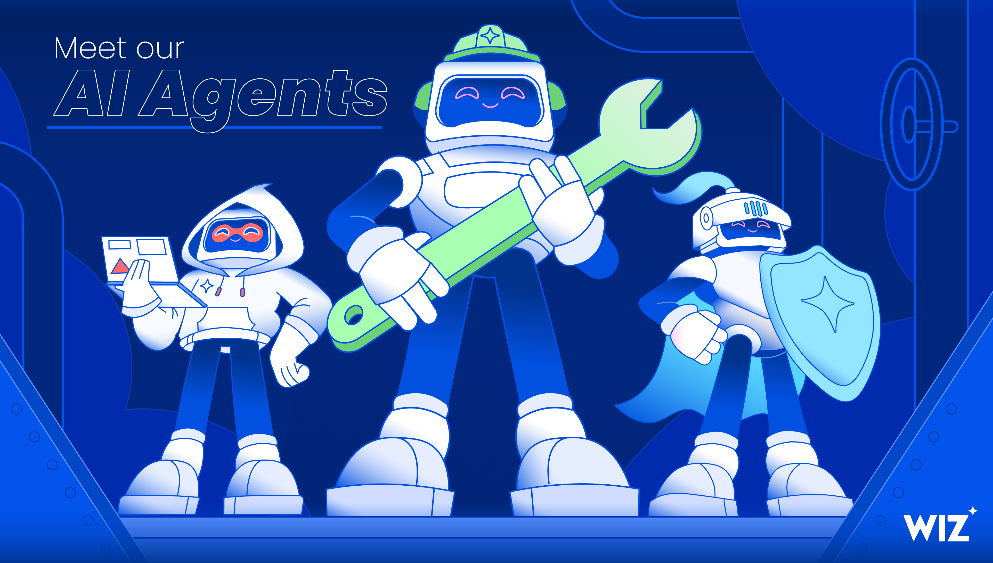
- AI agents (Red, Blue, Green) that find, investigate and fix Observed
- Agentless setup praised in reviews (paraphrase of customer review copy) Observed
Boilerplate Observed
Wiz is a cloud and AI security platform, now part of Google Cloud, on a mission to help organizations create secure cloud and AI environments across all major clouds (paraphrase of the about page; no published press boilerplate found).
Taglines
Protect Everything You Build and Run Observed
AI alone doesn't make security faster. Context does. Observed
A new operating model for AI-era security Observed
Security at AI speed, powered by context. Observed
Wiz secures the AI frontier Observed
We're reinventing cloud & AI security from the inside out Observed
Your cloud & AI security HQ Observed
Go ahead. Mention us. Observed
Come Make Some Magic at Wiz Observed
Personality and voice
Confidentbut not Fear-mongeringObserved
Playfulbut not ChildishObserved
Clearbut not Jargon-heavyObserved
Brightbut not Dark cyberObserved
Full spec
- Write in the third person
- Hero and product heads often use Title Case; section heads mix Title and sentence case.
- Short uppercase eyebrows sit above heads.
- Repeats "context", "code, cloud, and runtime" and "AI" as the core vocabulary.
- Uses "&" in category names and short labels.
- CTAs are two or three words.
- Lead with a hard number from customers or reviewers.
confidenttechnicalplain-spokenplayful at the edges
- we/you
- Title Case heroes
- uppercase eyebrows
- context vocabulary
- & in labels
- two-word CTAs
- numbers first
- observed (Meta ads): offer headlines name the asset with a type tag, "[Cheat Sheet] Claude Code Security Best Practices", "[Free Template] AI Security Board Report Template", and the creative repeats the type as a pink eyebrow ("CHEAT SHEET", "[TEMPLATE]")
- Product copy is direct and benefit-led; culture pages lean into a wizard/magic pun system ("Wizards", "Come Make Some Magic at Wiz", "Wizneyland").
- Proof is constant: Fortune 100 share, review counts, analyst reports, named CISOs.
Logo




All-caps geometric WIZ wordmark with the four-point star at the top right of the Z.

Full spec
All-caps geometric WIZ wordmark with the four-point star at the top right of the Z. Blue on white in the nav; white on blue/dark in artwork; the star alone as favicon and footer mark. Media kit supplies blue, white and two square tile versions.
- Use blue #0254EC on white or white on blue/dark; the pack offers no other colourways (published).
- Keep the star attached to the Z; the star may stand alone as the mark (observed).
Color
White ~63% of desktop home, light pink/blue gradient bands ~18%, #25242F footer ~8%, #0254EC strips ~3%.
Full spec
White ~63% of desktop home, light pink/blue gradient bands ~18%, #25242F footer ~8%, #0254EC strips ~3%. Text: #717783 most common, then #25242F, #393F49, #0254EC.
Typography
Protect Everything You Build and Run
Poppins 600 heads (48.8/62 hero, 31.9/43 section), DM Sans 400 body 16.9/26.4, uppercase blue eyebrows in DM Sans 500-600, uppercase grey footer labels with 0.7px tracking.
Full spec
Poppins 600 heads (48.8/62 hero, 31.9/43 section), DM Sans 400 body 16.9/26.4, uppercase blue eyebrows in DM Sans 500-600, uppercase grey footer labels with 0.7px tracking. A Crimson Pro italic line appears once.
| Their face | Use | License | Open stand-in |
|---|---|---|---|
| Poppins | All headings, 600 weight | Open (SIL OFL, Google Fonts) | |
| DM Sans | Body, buttons, nav, footer | Open (SIL OFL, Google Fonts) | |
| Crimson Pro | One italic serif line on home | Open (SIL OFL, Google Fonts) |
- Heads Poppins 600 #393F49, tracking normal.
- Body DM Sans 400 #25242F; secondary #717783.
- Eyebrows uppercase #0254EC.
Graphic elements
Do Poppins 600 head in #393F49 with one key word or phrase in #0254EC; the hero word also carries a very pale #FFE8FC hand-drawn highlighter stroke (35px desktop, 20px phone) behind its lower-middle. Never #FFC6F8 at full strength behind text..
One blue word in the head · Home H1 ("Everything"), "Recognized market leader by top analysts", "Wiz secures the AI frontier" (whole head)
Do #0254EC full pill, white DM Sans 500 16-18px, 40-48px tall, 22px side padding, trailing arrow/chevron; hero pairs it with a pill email input (#CBD5E1 1px border)..
Blue pill CTA with arrow · Nav, hero, every section CTA
Do Thin #0254EC/#6195FF line drawings with flat fills in pale blue #B8D3FF and pink #FFC6F8; recurring pointed wizard hat, clouds and four-point sparkles..
Wizard-hat line illustration · Hero hands-and-cloud, CTA strip gnome, "Driving Outcomes" figure, footer mascot, Meet our AI Agents art
Do The Wiz star (four concave points) in #0254EC or white, 8-32px, placed off the corners of CTAs and on blue bands..
Four-point sparkle star · Logo star, favicon, scattered on blue bands, footer mark, AI product title bars
Do Linear gradient from #FFC6F8 at 40% to #EAF1FF at 25-40% over white, direction to top-left or bottom-right (classes gradient-light-tl/br)..
Pink-to-pale-blue wash bands · "A new development reality", reviews, analyst, "Ready to see Wiz in action?" bands
Do #0254EC ground, white Poppins 600 31.9px head, #FFC6F8 eyebrow, pink pill CTA, a pinkish glow in the right corner and sparkles..
Short full-bleed blue strip · "Schedule a call with a Wiz expert" (133px desktop), ratings band (162px)
Specimens use sample copy, not Wiz’s.
Pill CTAs and pill email inputs, cards with 1px pale borders and 8-16px radius, product UI mockups framed with a solid blue title bar and the sparkle, review cards with blue double-quote glyphs, G2 badge row, carousel dots (blue active, #EAF1FF inactive).
Iconography
Blue line icons with rounded strokes and sparkles; product tab icons (Code, Cloud, Defend) grey when inactive.
Full spec
Blue line icons with rounded strokes and sparkles; product tab icons (Code, Cloud, Defend) grey when inactive. Footer social icons are white solid glyphs.
Illustration
Hand-drawn feeling vector line art: thin blue outlines, flat pale-blue and pink fills, white highlights; recurring characters (wizard-hat gnome, robot agents in hats/helmets), clouds, hands, sparkles.



Full spec
Hand-drawn feeling vector line art: thin blue outlines, flat pale-blue and pink fills, white highlights; recurring characters (wizard-hat gnome, robot agents in hats/helmets), clouds, hands, sparkles. Marketing images (event banners, agent art) use the same characters on saturated blue with pink type.
Photography
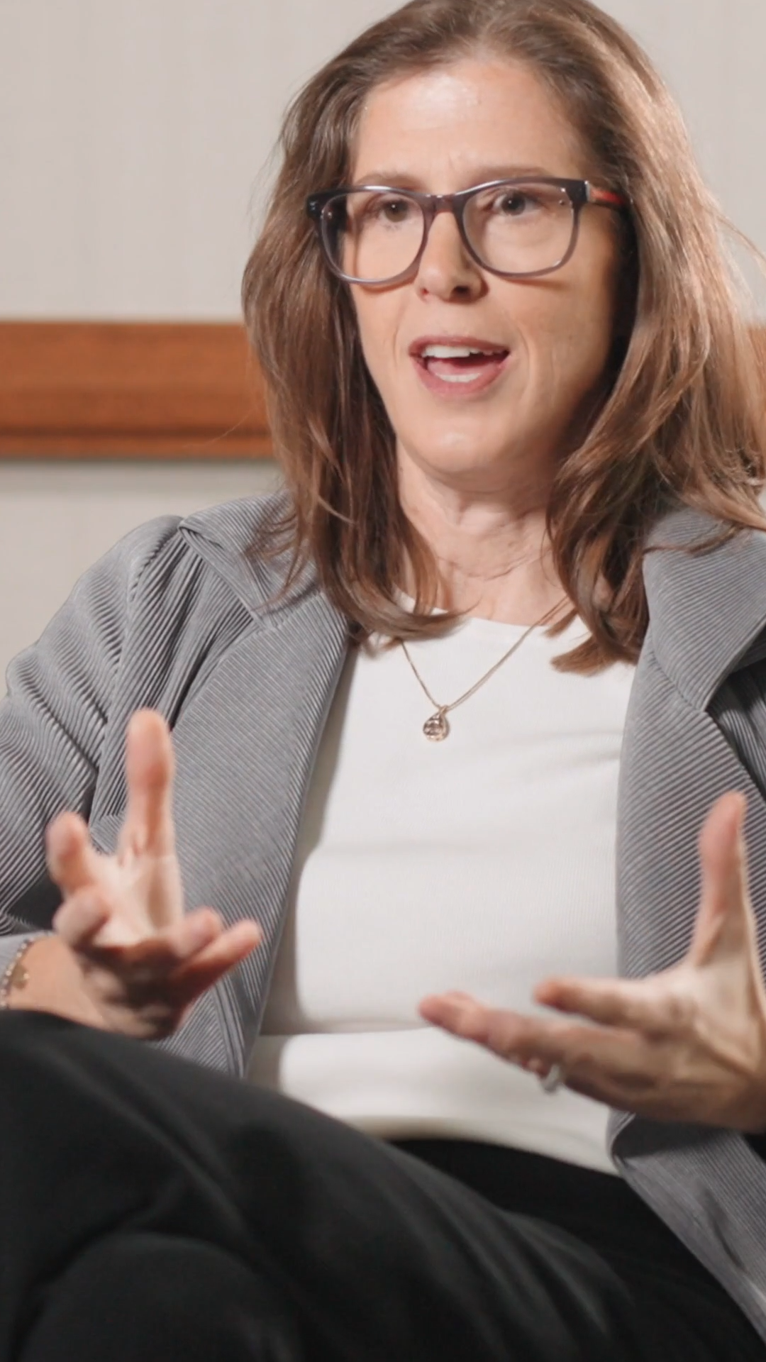
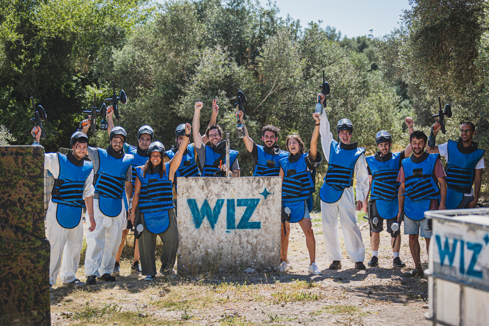
Two kinds: (1) customer video testimonials, 9:16 stills of executives seated against dark warm studio backdrops, shallow depth of field, logo top-left and name/title bottom-left in white with a pink title; (2) culture photos on careers: candid, natural light, people laughing in offices, team events in branded blue gear.




Full spec
Two kinds: (1) customer video testimonials, 9:16 stills of executives seated against dark warm studio backdrops, shallow depth of field, logo top-left and name/title bottom-left in white with a pink title; (2) culture photos on careers: candid, natural light, people laughing in offices, team events in branded blue gear. Podcast thumbnails pair three hosts with bold boxed captions in blue and pink.
- Real people, real customers, named; no stock models.
- Dark studio for customer video, bright candid for culture.
Interface & layout
The page, band by band
Hero
Logo wall
Operating model + product tabs
Meet the agents
AI-Powered Code-to-Cloud Defense
Blue CTA strip
How Wiz helps
Video testimonials
Wiz secures the AI frontier
User reviews marquee
Analyst recognition
Ready to see Wiz in action?
Buttons
Full spec
1440 desktop with a 1092px content column (174px margins); nav 64px white; hero two columns (copy left, illustration right); centred section heads; logo wall in a 9-column grid; long white page punctuated by gradient wash bands and two short blue strips; dark #25242F footer with four columns and a podcast promo. Phone stacks to one column, 16-32px gutters.
Measured from wiz.io home, newsroom, about, customers, careers, platform, pricing; media-kit logo pack; site CSS tokens; 2026-11-10's headless Playwright at 1440x900 and 390x844, computed styles per band (measure/*.json) plus targeted probes of nav, cards and footer (measure/extra/), 2026-11-10.
Spacing
| Measure | Desktop | Phone |
|---|---|---|
| Page margin | 174px | 32px |
| Section padding | 90px | 58px |
| Hero text width | max 482px, centered | full width |
| Card gap | 20px | 20px |
| Navigation | 65px | 65px |
Type, at size
Hero head
Poppins · 48.8px (phone 33.3) · line 1.27 · weight 600
Large section head
Poppins · 37.5px (phone 28.4) · line 1.3 · weight 600
Section head
Poppins · 31.9px (phone 22.8) · line 1.35 · weight 600
Light head (Meet the agents)
Poppins · 41.2px · line 1.14 · weight 400
Card / column head
Poppins · 24.4px (phone 24) · line 1.38 · weight 600
Blue column head
Poppins · 21.6px (phone 18.5) · line 1.39 · weight 600
Outcome number
Poppins · 52px · line 1.15 · weight 700
Newsroom H1
Poppins · 62px · line 1.19 · weight 600
Lead / caption
DM Sans · 18.7px (phone 18) · line 1.5 · weight 400
Body
DM Sans · 16.9px (phone 16) · line 1.56 · weight 400
Eyebrow (uppercase #0254EC)
DM Sans · 16.9px (phone 16) · line 1.56 · weight 500
Small / card copy
DM Sans · 14px · line 1.43 · weight 400
Nav link
DM Sans · 14px (phone 16) · line 1.43 · weight 500
Hero button
DM Sans · 18px · line 1.56 · weight 500
Section button
DM Sans · 16px · line 1.5 · weight 500
Footer label (uppercase)
DM Sans · 14px · line 1.43 · tracking 0.7px · weight 600
- Shadow
- Almost none; soft pink glow behind some cards.
- Density
- Airy: white ground, centred section heads, ~100-130px between bands on desktop, content column 1092px wide.
- Buttons
- Full pill (radius 9999px). Primary: #0254EC fill, white DM Sans 500, 48px tall with 22px side padding (hero) or 40px (section), trailing arrow or chevron. On the blue band: #FFC6F8 pill with #0254EC text. Tertiary: #0254EC text link weight 600 with a chevron, no fill. Form submit is the one square-ish button (radius 8px).
Page anatomy
How Wiz’s own landing pages are built, observed on wiz.io/%20(home,%20the%20offer%20page)%20with%20https://www.wiz.io/newsroom%20as%20the%20second%20page, 2026-11-10. The full measurements are in spec.md.
- Navigation
- White 64px bar: blue WIZ logo left, six 14px grey menu triggers, then underlined utility links, search, language and a small blue pill "Get a demo" right. No border or shadow at rest.
- Hero
- Two columns on white: left a 2-line Poppins 600 Title Case head with one blue highlighted word, a 5-line body paragraph ending in a bold two-word line, and an inline email pill + blue pill CTA; right a large blue/pink line-art illustration (hands drawing a code pipeline around a cloud).
- Logo wall
- Proof strip right under the hero: one centred caption and two rows of nine customer logos.
- Reviews (G2)
- Two-column proof block: left eyebrow, 2-line head, six G2 award badges, star rating, blue pill; right a rounded pale-pink G2 grid chart.
- Storytelling slider (A new development reality)
- A wide rounded pale-pink card holding a 4-slide story: italic serif line + sentence on the left, line-art gnome holding a "SHIFT HAPPENS" sign on the right, clouds along the bottom, pager dots.
- Operating model + product tabs
- Two-column intro (head + pill left, lead + paragraph + blue bold line right), then a three-tab switcher (Code / Cloud / Defend) over a 12px-radius blue-outlined card showing the product and a mock product UI.
- Meet the agents
- Centred light-weight head, three underline tabs, then a left copy card + blue quote card and a right product-screen card.
- AI-Powered Code-to-Cloud Defense
- Centred head over one large product-UI demo frame (Ask AI chat left, attack-path graph right).
- Blue CTA strip
- Short full-width #0254EC band: gnome illustration overlapping the top edge on the left, pink kicker + white head centred-left, pink pill right.
- How Wiz helps
- Centred head, one wide flow diagram, then four equal columns with blue uppercase-styled heads and bulleted lists.
- Video testimonials
- Centred head over an edge-to-edge carousel of 9:16 video cards: customer logo top-left, name and pink title bottom-left, white round arrow bottom-right.
- Wiz secures the AI frontier
- Big all-blue head left with copy and partner logos right, then a vertical tab list left and a framed product screenshot right.
- User reviews marquee
- Light gradient band: blue eyebrow + centred head, two rows of quote cards drifting left together as one marquee, centred pill.
- Analyst recognition
- Head with one blue phrase, then a carousel of large white cards: analyst logo, report title, subtitle, sentence, pill, and the report chart on the right.
- Ratings band
- Short full-width #0254EC band with two white rating chips and a white text link, sparkles at both sides.
- Driving Outcomes
- Left head, three columns each led by a pink-washed stat bar, a Poppins tagline, a quote, attribution and customer logo; tall gnome-stack illustration on the right.
- Ready to see Wiz in action?
- Final CTA band on a light gradient: centred head, a blue-outlined product demo video card flanked by line-art clouds, centred pill.
- Footer
- #25242F footer: white star mark left, three link columns with grey caps labels, language picker and four social icons right; hairline; copyright left and legal links right. A podcast promo with a giant mascot sits below inside the same dark ground.
In use
Full spec
Built from wiz.io pages and the brand's own marketing images; Deck and Email not shown.
Our setting for each format
| Format | Loudness | Must appear | What varies |
|---|---|---|---|
| Landing page | White ground, Poppins 600 #393F49 head with one #0254EC word, DM Sans body, blue pill "Get a demo" with arrow, wizard line-art illustration right of the hero, logo wall with "Trusted by more than 65% of Fortune 100 companies", pink-to-pale-blue wash bands, one short blue CTA strip with a pink pill, #25242F footer with the white star. | ||
| Social post | Flat #0254EC square; title block at the top (eyebrow in pink caps, 2-3 line white headline); one supplied line-art illustration filling the lower half and cropped by the edge; white pill button with #0254EC text and a pink under-edge; white WIZ wordmark, often printed on the illustrated book cover or in a corner. | Title block left-aligned (cheat sheet, playbook, template) or centred (field guide, starter pack); eyebrow optional, pink, caps or bracketed "[TEMPLATE]"; dark #1C1B21 ground for Research/MCP pieces; logo top-left, bottom-left, bottom-right or on the book cover; button may be dropped (AI Security Board Report Template). Blog link cards (no button) remain the model for a 16:9 link share. | |
| Link card / blog cover | Based on Wiz's own 16:9 marketing images on wiz.io (Virtual Summit banner, Meet our AI Agents, podcast thumbnails): saturated #0254EC ground with sunburst or line-art scene, white WIZ wordmark with star top-left or bottom-right, big type in pink #FFC6F8 or white, one illustration character or shield, sparkles. Actual social feeds not reviewed (see gaps). | ||
| Paid social ad: lead magnet | Same family as the Social post row: flat #0254EC (or #1C1B21) square, eyebrow + 2-3 line white headline, line-art object lower half, white pill with pink under-edge, white WIZ. | ||
| Video thumbnail: Crying Out Cloud podcast | Studio photo of the hosts and guest at mics; a two-line ALL CAPS caption (a claim or the guest's quote) in stacked highlight boxes, first line white box with #0254EC text, second line pink box; Crying Out Cloud badge top-left; white WIZ top-right; thin #0254EC frame. |
Rules
Do
Don’t
Steal this kit
Your name and logo, Wiz’s system.
Comes with you
- Color roles and how much of each
- Type pairing, with open fonts
- Voice rules the writing check enforces
- Icon, photo, illustration and motion recipes
- The strategy frame, to fill with yours
Stays yours
- Your name and logo
- Your proof: numbers, customers, quotes
- Your purpose and claims. Theirs aren’t yours to make
Talk about my brand Use this brand in Claude
Hand it to a developer
- spec.mdEvery value and rule
- tokens.cssCSS variables
- tokens.jsonDesign tokens (DTCG)
- kit.jsonWhat our engines read
Your brand next
Get your brand audit Put your brand in Claude What goes in a brand book
What Wiz doesn’t publish
- No written brand guidelines: the Newsroom Media Kit offers files only (logo pack, headshots, office photos, product images, B-roll, footage), no usage rules, clear space, minimum size or colour specs beyond what the logo files contain.
- Media-kit Product images (28 MB) and Office and team photos (65 MB) zips were not downloaded; photo examples come from site pages instead.
- No published press boilerplate found on /newsroom or the two Company News posts checked; boilerplate is a paraphrase of /about.
- Deck: no Wiz slides seen on its own pages.
- Email: no Wiz email seen.
- Hero illustration is a Lottie animation; the saved SVG is one serialized frame.
- Crimson Pro is declared and seen once; its intended role is not stated by Wiz.
- Button hover/pressed states were not captured (no interaction beyond scrolling and opening the phone menu).
- Footer shows no postal address or phone number; none recorded.
- Social feeds: instagram.com/wiz_io and x.com/wiz_io show a login wall to a headless browser (no posts readable); linkedin.com excluded by rule. Social post anatomy is derived from 7 on-site og:image cards, not observed posts.
- Portrait (1080x1350) posts: no evidence Wiz posts portrait; no portrait row added.
- Library: Wiz publishes no stock photography of customers or device shots (product appears as flat UI screens and SVG widgets), no photographic textures (its patterns are vector clouds and gradients), and no pricing figures; leave device-mockup, customer-people and photo-texture slots out.
- Ready to see Wiz in action? demo video is a Vimeo embed (1171892702); only a static frame was captured. Request the video file from Wiz if motion is needed.
Each value is marked published, observed, our reading or our recipe, with its source. Checked 2026-11-10. Not affiliated with Wiz.