Free and independent
Knowledge without ads or paywalls, paid for mostly by readers, so it stays independent. Observed
Brand book
Knowledge looks open. Everything a volunteer needs is free (Montserrat, Source Serif, the palettes, the templates), colour comes in flat blocks anyone can reproduce, and even the image credits are part of the page. Our reading

Which palette colours lead: each affiliate (and each campaign) picks its own 4-6, and the Foundation site rotates them section by section.
Source: meta.wikimedia.org/wiki/Brand/colourswikimediafoundation.org
Our engine's setting, built from their rules.
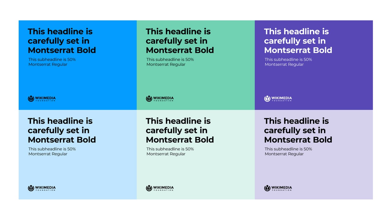
White text only on strong red, blue, green, dark green or purple; black on everything else
Black or white, Montserrat wordmark, clear space 1x small circle, 36 px minimum
Every image credited with title, author, source and licence
Plain English, sentence case, no please/sorry/just/simply
For everyone who reads, writes or relies on Wikipedia, the Wikimedia Foundation is the nonprofit that keeps it free, reliable and independent, because it is funded by readers and built by volunteers rather than run for profit. Our reading
Knowledge without ads or paywalls, paid for mostly by readers, so it stays independent. Observed
Volunteers from all backgrounds write, check and fix Wikipedia; the Foundation supports them. Observed
Reliable information at internet scale, in hundreds of languages, used by students and chatbots alike. Observed
Legal and advocacy work to protect access to free knowledge. Observed
We support human knowledge
Built for people, by people
Help expand human knowledge
Knowledge is human.
Founded in 2003, the Foundation hosts Wikipedia and the other Wikimedia projects and supports the hundreds of thousands of volunteers who edit them. The Wikimedia brandmark shows a vaguely human figure raising its arms in celebration; the Foundation logo, drawn in 2005 by Neolux, shows a figure holding an open book.
Images and stories should communicate knowledge
PublishedRepresentative and diverse, without tokenising people or cultures
PublishedShared moments between people; a Wikimedia family album
PublishedCategory. Nonprofit that hosts Wikipedia and the Wikimedia projects Observed
Ad-funded platforms and paywalled publishersAI chatbots that answer without attribution
The Wikimedia Foundation is the nonprofit that hosts Wikipedia and the other Wikimedia projects. It supports the volunteers who write and check them, the technology that keeps them fast and private, and the legal and policy work that protects everyone's right to free knowledge.
We support human knowledge Observed
Imagine a world in which every single human being can freely share in the sum of all knowledge. Published
Built for people, by people Observed
The homepage leads with the Foundation's job ("We support human knowledge"), proves it with five numbers, then turns every section into an invitation: donate, edit, participate, advocate, subscribe.
Source: wikimediafoundation.orgwikimediafoundation.org/who-we-arewikimediafoundation.org/about/missionmeta.wikimedia.org/wiki/Brand/Create
Refresh the page to load the data
Please try simply refreshing the page to load the data
Copy is translated into hundreds of languages and read by people who need to trust it, so clarity and neutrality beat cleverness.
NeutralClearWarmTrustworthyJoyful
Plain, neutral and warm. Codex sets the rules for UI copy (plain English, no idioms, no please/sorry/just, neutral point of view); the homepage speaks as "we" to "you" in short declarative sentences with no exclamation marks.
free knowledgeopen knowledgesum of all human knowledgereliable informationvolunteersnonprofithuman knowledge
pleasesorrysimplywhitelistblacklistinvalid
Source: doc.wikimedia.org/codex/latest/style-guide/voice-and-tone.htmldoc.wikimedia.org/codex/latest/style-guide/writing-for-copy.htmlmeta.wikimedia.org/wiki/Brand/logo
Source: doc.wikimedia.org/codex/latest/style-guide/writing-for-copy.htmldoc.wikimedia.org/codex/latest/style-guide/voice-and-tone.htmlwikimediafoundation.org


Logo files are Wikimedia trademarks, shown for study; use is subject to the trademark policy.
One-colour marks work everywhere, from favicons to merch, and leave colour to the content.
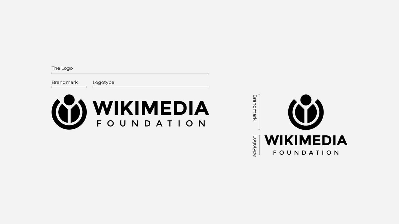
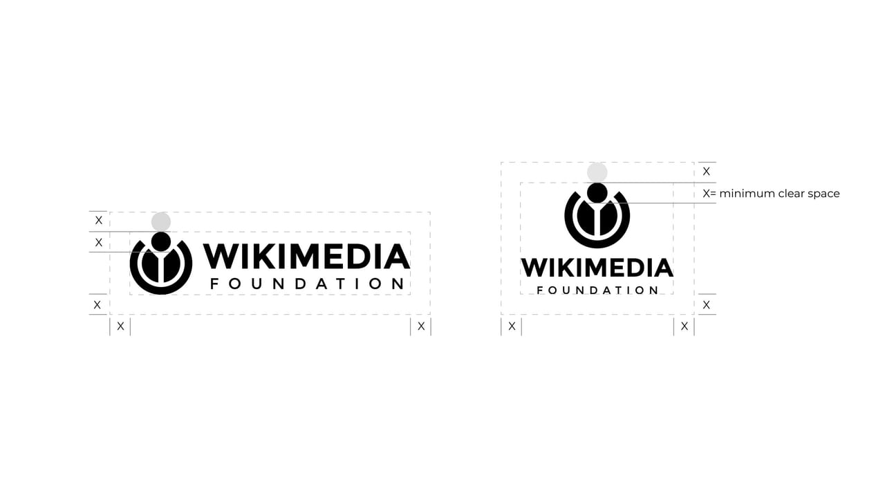
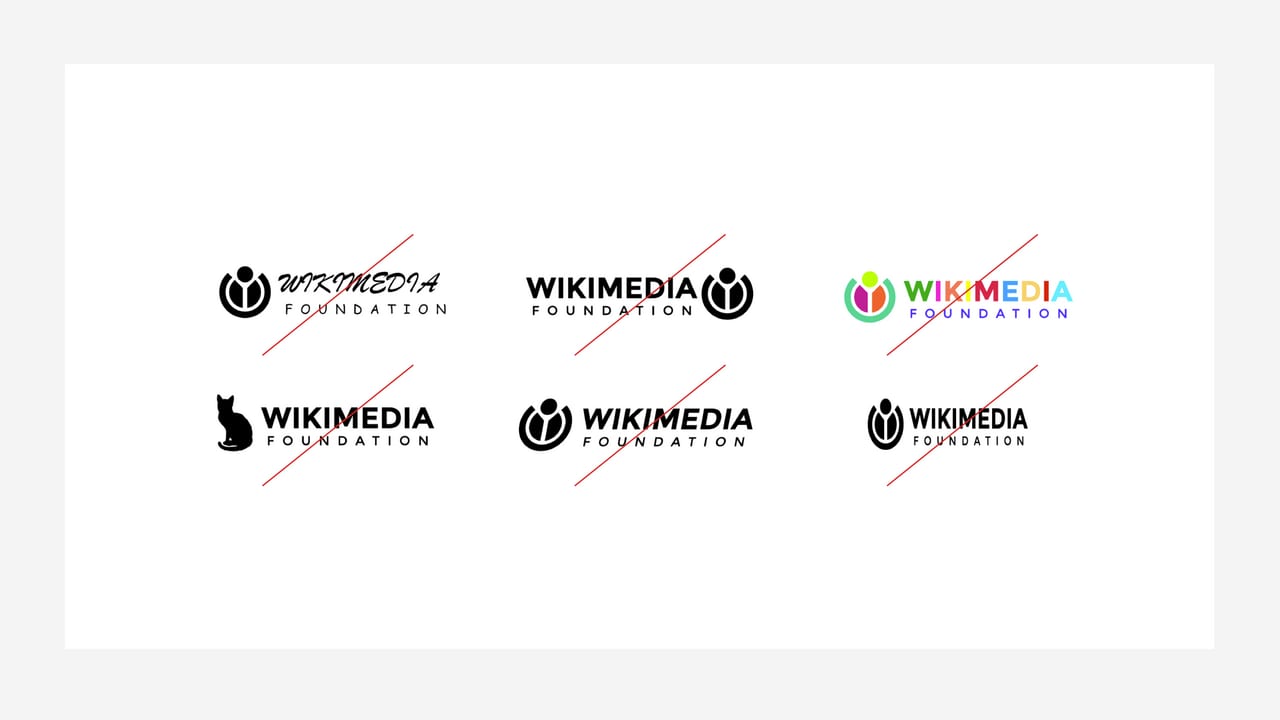
| Versions | horizontal, vertical; brandmark alone |
|---|---|
| Colours | black, white |
| Clear space | 1x small-circle height |
| Minimum size | 36 px / 12 mm wide |
The Foundation logo is the brandmark (a figure holding an open book, drawn in 2005 by Neolux) plus WIKIMEDIA / FOUNDATION in Montserrat, in a horizontal and a vertical version, only in black or white. The wider movement shares the Wikimedia brandmark (a figure raising its arms) and a tricolour Community logo for user groups.
Source: meta.wikimedia.org/wiki/Brand/logofoundation.wikimedia.org/wiki/Policy:Trademark_policy
A shared palette keeps a decentralised movement recognisable while letting each affiliate pick 4-6 colours that fit their culture.
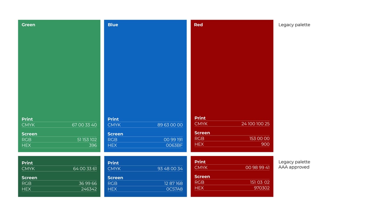
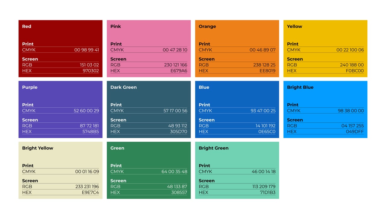
| Core | FFFFFF, 000000, 404040, 7F7F7F, BFBFBF |
|---|---|
| Legacy | 339966, 0063BF, 990000; AAA 246342, 0C57A8, 970302 |
| Creative strong | 970302, E679A6, EE8019, F0BC00, 5748B5, 305D70, 0E65C0, 049DFF, E9E7C4, 308557, 71D1B3 |
| Creative light | E5C0C0, F9DDE9, FBDFC5, FBEEBF, D5D1EC, CBD6DB, C3D8EF, C0E6FF, F9F9F0, CBE0D5, DBF3EC |
Three palettes: Core (black, white and three greys), Legacy (the movement's green, blue and red, each with an AAA version for white text) and Creative (11 strong colours from community groups and the Wikipedia 20 birthday, each with a light tint). The site runs on white and black, with Blue AAA for links and the donation bar, Green AAA for Donate, strong colours for action cards and light tints for highlight chips and band grounds.
Not published: colour proportions or ratios; which colour is the primary for the Foundation itself.
Source: meta.wikimedia.org/wiki/Brand/colourswikimediafoundation.org
We support human knowledge
Open-licensed fonts anyone in the movement can download; Montserrat's width reads well big and translates well.
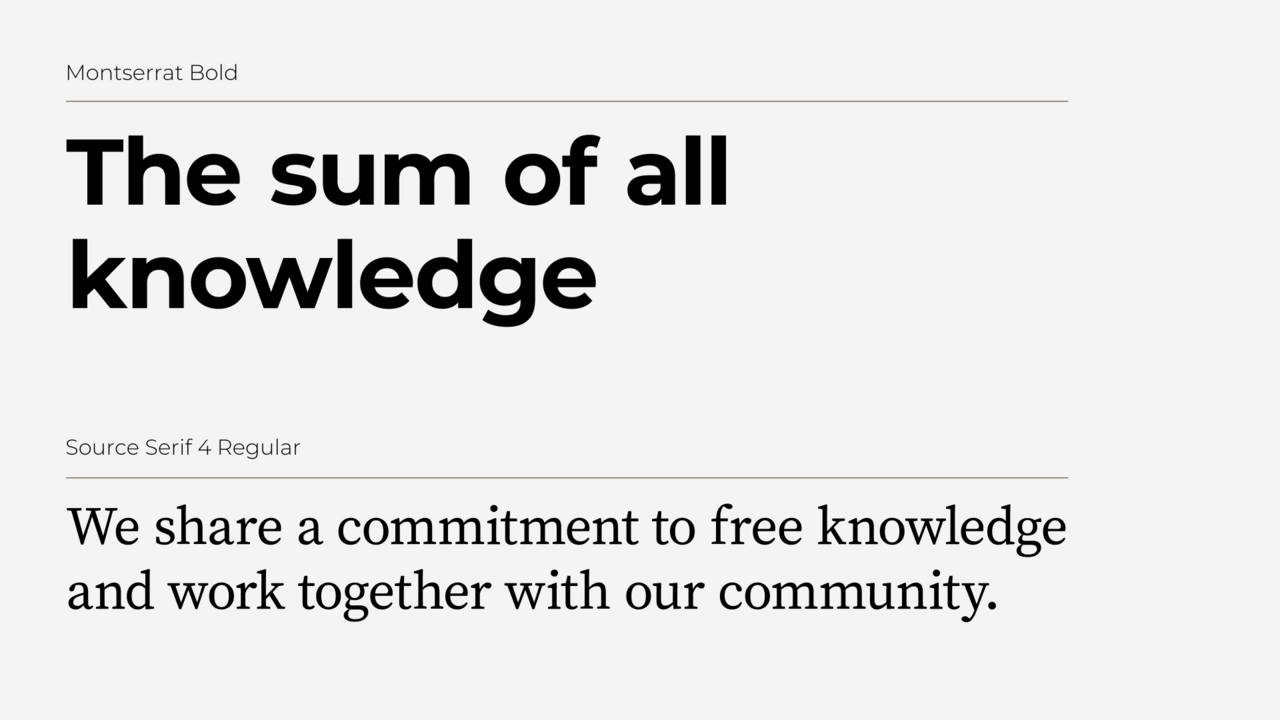

| Their face | Use | License | Open stand-in |
|---|---|---|---|
| Montserrat | Logo wordmark, headlines, stat numbers, post titles | SIL Open Font License 1.1 (Google Fonts) | Montserrat The real face is open: load Montserrat itself from Google Fonts (weights 400, 600, 700, 900). |
| Inter | Site body, nav, buttons, meta (observed). The guide names Source Serif 4 for extended body copy | SIL Open Font License 1.1 (Google Fonts) | Inter The site's own body face, open: load Inter itself (400, 600, 700). |
| Source Serif 4 | Long-form body copy in print and documents (not used on the website) | SIL Open Font License 1.1 (Google Fonts) | Source Serif 4 Open: load Source Serif 4 itself. |
| Display | Montserrat 700 (OFL) |
|---|---|
| Body (guide) | Source Serif 4 400 |
| Body (site) | Inter 400/600/700 |
| Non-Latin | Noto |
Two free faces: Montserrat (wide, large x-height, humanist touches) for the logo, headlines and branded content, and Source Serif 4 for long reading. Noto covers non-Latin scripts. The website pairs Montserrat headings with Inter for body, nav and buttons.
Source: meta.wikimedia.org/wiki/Brand/Typographydoc.wikimedia.org/codex/latest/style-guide/typography.htmlwikimediafoundation.org
We support human knowledge
One word in a colour chip · the hero headline (and the guide's own campaign posters)
Do Flat Legacy and Creative strong colours as whole surfaces, each carrying white Montserrat Bold (on Green AAA #246342, Red #990000, Blue AAA #0C57A8, Purple #5748B5, Blue #0063BF) or black text (on Yellow #F0BC00). Radius 4px or full-bleed; no gradients, no shadows. Each block one colour; neighbours never repeat a colour.
Saturated movement-colour blocks · action cards, donation bar, subscribe band, volunteer panel
Do Every image carries its title, author and licence (TASL), linked to the source; Commons files get the Commons icon. On a landing page: a full-width off-white (#F9F9F0) band of small thumbnails with credits in three columns.
Credit every image · a Photo credits block before the footer, and captions
Do Continuous, fluid, uniform pen-like black stroke, not too thick, with one flat palette colour or a circular shape behind; light ink/pencil texture at most; used large and in one colour.
Hand-drawn line illustration with one colour · stats, spot illustrations
Do Core palette carries the frame: black logo and type on white, white reverse logo on Black 75 #404040; colour enters in blocks, chips and photos, never in the logo.
Black, white and the logo in black · nav, headings, logo
Specimens use sample copy, not Wikimedia’s.
The content is the brand; graphics stay simple enough for any volunteer to reproduce.
No ornament system: the recognisable pieces are flat colour blocks, the coloured highlight chip on one word, hand-drawn line illustrations, the puzzle-piece globe from Wikipedia, and attribution credits. The guide also borrows Wikipedia's diff interface as a storytelling device.
Source: meta.wikimedia.org/wiki/Brand/Typographywikimediafoundation.org
Neutral, universal symbols that work across cultures and right-to-left scripts.
Codex icons: monochrome, geometric, front-facing outlines on a 20 dp canvas with a 2 dp stroke, sharp corners, freely licensed.
Source: doc.wikimedia.org/codex/latest/style-guide/icons.html
Feels made by people, which is the point of the movement.
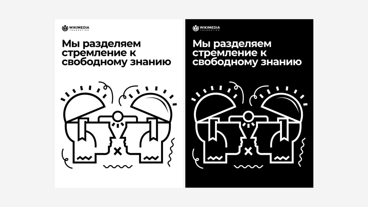

Line illustrations from the Wikipedia 20 campaign by Karabo Poppy Moletsane and Jasmina El Bouamraoui: continuous, uniform pen-like strokes, hand-made feel, often one colour or a circle of colour behind.
An insider's family album builds trust and shows the community behind the content.

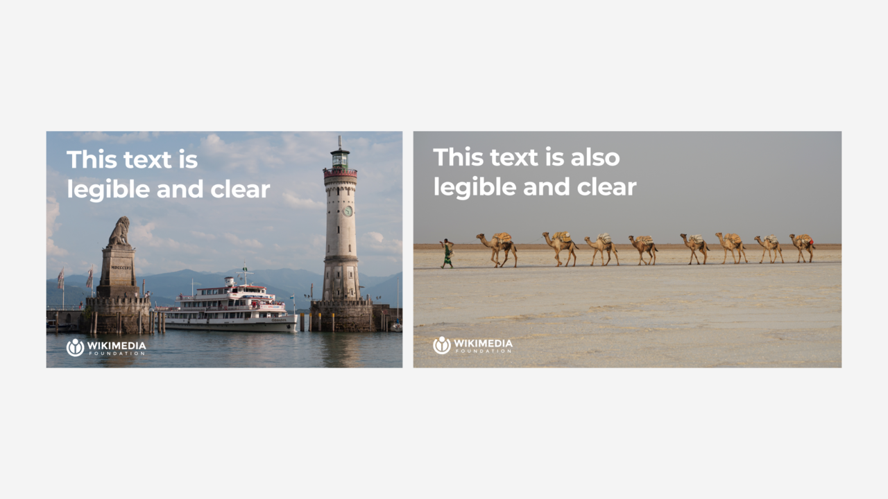
Real moments at events: people engaged with each other and with Wikipedia, not looking at the camera; natural light, bright saturated colour, imperfect framing allowed.
Source: meta.wikimedia.org/wiki/Brand/Imagerymeta.wikimedia.org/wiki/Brand/Attribution
Calm interfaces for reading; a sound logo identifies Wikimedia knowledge in voice assistants and audio.
Motion is minimal in UI (Codex: 100 ms and 250 ms transitions) and the brand's richest motion asset is sonic: a 4-second sound logo with 2 s and 1 s cutdowns.
Source: doc.wikimedia.org/codex/latest/design-tokens/transition.htmlmeta.wikimedia.org/wiki/Brand/logowikimediafoundation.org
We support human knowledge
A 1200px container with 120px margins at 1440, sections in alternating white, lavender, yellow and off-white bands, intro rows with a heading column and a paragraph column, and grids of 3 x 373 or 4 x 288.
Measured from wikimediafoundation.org's Playwright computed styles at 1440 and 390 on 2026-10-31, plus the theme CSS and the brand pages on Meta-Wiki.
| Measure | Desktop | Phone |
|---|---|---|
| Page margin | 120px | 17px |
| Section padding | 80px | 43px |
| Hero text width | max 580px, centered | full width |
| Card gap | 16px | 16px |
| Navigation | 76px | 76px |
Hero and campaign H2
Montserrat · 48px (phone 33.27) · line 1.333 · weight 700
Stat number
Montserrat · 48px (phone 33.27) · line 1.333 · weight 600
Section H2, action-card label
Montserrat · 32px (phone 24.64) · line 1.25 · weight 700
Post title
Montserrat · 24px (phone 20.32) · line 1.4 · weight 600
Hero lead
Montserrat · 24px (phone 20.32) · line 1.333 · weight 400
Photo credits heading
Montserrat · 24px (phone 20.32) · line 1.333 · weight 600
Donation appeal
Montserrat · 20px (phone 18.16) · line 1.4 · weight 700
Body large (section intros, stats, card copy)
Inter · 20px (phone 18.16) · line 1.4 · weight 400
Button
Inter · 20px (phone 18.16) · line 1.25 · weight 700
Nav and footer links
Inter · 16px (phone 18.16) · line 1.5 · weight 600
Body (volunteer bio, footer text)
Inter · 16px (phone 14.16) · line 1.5 · weight 400
Credit link
Inter · 16px (phone 14.16) · line 1.4 · weight 400
Meta (category, credit author, consent, legal)
Inter · 14px · line 1.4 · weight 400
How Wikimedia’s own landing pages are built, observed on wikimediafoundation.org, 2026-10-31. The full measurements are in spec.md.
Source: wikimediafoundation.orgdoc.wikimedia.org/codex/latest/style-guide/typography.html
Turns the Wikipedia globe into a pattern anyone recognises. Our reading
Gave the movement a reusable, human illustration language. Our reading
How loud the system gets by format. Landing pages follow the homepage: black and white frame, colour in blocks and chips.
| Format | What they did | Source |
|---|---|---|
| Social templates | Canva templates for Facebook, Instagram, X and WhatsApp formats | meta.wikimedia.org/wiki/Brand/Create |
| Presentations | Google Slides affiliate template | meta.wikimedia.org/wiki/Brand/Create |
| Logos | Figma templates for affiliate logos | meta.wikimedia.org/wiki/Brand/Create |
| Documents | Letterhead and digital document templates | meta.wikimedia.org/wiki/Brand/Create |
| Format | Loudness | Must appear | What varies |
|---|---|---|---|
| Landing page | Black horizontal logo top left, Montserrat Bold headings, Inter body, one highlighted word, flat colour-block bands, Photo credits band before a #404040 footer | Which palette colours fill the bands and cards | |
| Social post | Montserrat Bold headline, subhead ~50% Montserrat Regular, logo bottom left, palette ground | Ground colour, photo or illustration | |
| Presentation | Affiliate template, Montserrat, logo | Accent colour | |
| Product UI | Codex tokens, components and icons | none | |
| Audio and video | Sound logo at the end, after all other audio | Cutdown length |
Source: meta.wikimedia.org/wiki/Brand/logometa.wikimedia.org/wiki/Brand/coloursmeta.wikimedia.org/wiki/Brand/Imagerymeta.wikimedia.org/wiki/Brand/Attributionmeta.wikimedia.org/wiki/Brand/Create
Your name and logo, Wikimedia’s system.
Use this kit for my brand Use this brand in Claude
Get your brand audit Put your brand in Claude What goes in a brand book
Each value is marked published, observed, our reading or our recipe, with its source. Checked 2026-10-31. Not affiliated with Wikimedia.