Compliance from the start
Principles, guidance and code meet Section 508 and 21st Century IDEA requirements out of the box. Published
Brand book
Trust through sameness. USWDS makes every government site look and behave alike on purpose (official banner on top, identifier at the bottom, token-only color that passes contrast by arithmetic) so a citizen recognizes an official, accessible site before reading a word. Our reading

Which token families fill the theme roles: agencies swap primary/secondary/accent families and typefaces in settings (the docs site itself uses Public Sans where the default theme uses Source Sans Pro and Merriweather).
Source: designsystem.digital.gov/design-tokens/color/theme-tokensdesignsystem.digital.gov/documentation/settingsdesignsystem.digital.gov/about/key-benefits
Our engine's setting, built from their rules.
Cover the star. It should still read as USWDS: the flag banner on top, blue and red flat buttons, Public Sans, and the dark identifier at the foot.
Every text/ground pair differs by 50+ grades (40+ for large text); no meaning carried by color alone.
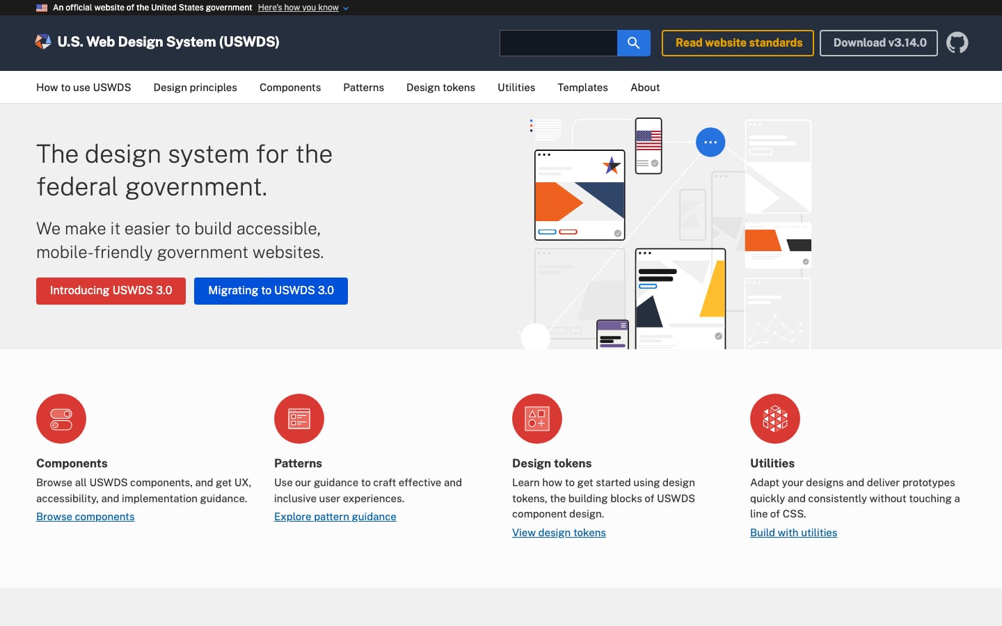
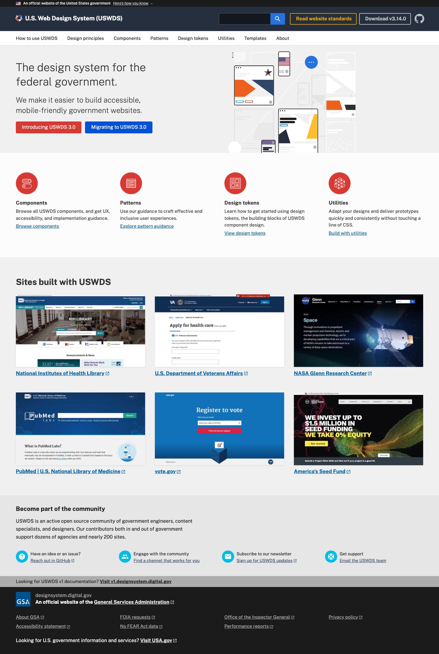
The design system for the federal government. Observed
Principles, guidance and code meet Section 508 and 21st Century IDEA requirements out of the box. Published
Don't reinvent buttons and forms; consistent experiences across government build trust. Published
Five design principles give any team a shared starting agreement. Published
Spend less time building from scratch; every system improvement reaches every site. Published
Content managers, designers and developers share solutions in the open. Published
Any team's improvement is shared, multiplied and compounded across government. Published
The design system for the federal government.
Sites built with USWDS
Become part of the community
Created in 2015 by 18F and the U.S. Digital Service, guided by staff from CFPB, FDA, VA, SSA, Education, IRS and GSA. Now maintained by GSA TTS's Digital Services Division.
Research and test with real people from the start of every decision.
PublishedBe reliable, consistent and honest; identify as government; protect data.
PublishedBuild accessibility into every decision, beyond the legal minimum.
PublishedStart from shared solutions so experiences stay consistent across agencies and devices.
PublishedMeasure, collect feedback and keep improving.
PublishedProduct value: specific enough to be practical, general enough to extend.
PublishedCategory. A government design system: principles, guidance and code (a toolkit), maintained as open source by GSA. Published
Building components and patterns from scratch for each site (the "redesign treadmill").
USWDS gives government teams principles, guidance and code for building accessible, mobile-friendly websites. It was created in 2015 by 18F and the U.S. Digital Service and is a product of GSA's Technology Transformation Services.
The design system for the federal government. Observed
We make it easier to build accessible, mobile-friendly government websites. Observed
Focus on your mission, not your markup. Published
The homepage leads with a category claim ("The design system for the federal government.") and a plain benefit line about accessible, mobile-friendly websites. Key benefits frame six pillars for making the case to management, from compliance to stewardship.
Source: designsystem.digital.govdesignsystem.digital.gov/about/key-benefitsdesignsystem.digital.gov/how-to-use-uswdsdesignsystem.digital.gov/documentation/accessibility
Plain, instructive language serves the broadest public and doubles as accessibility practice (the principles tie plain language to trust).
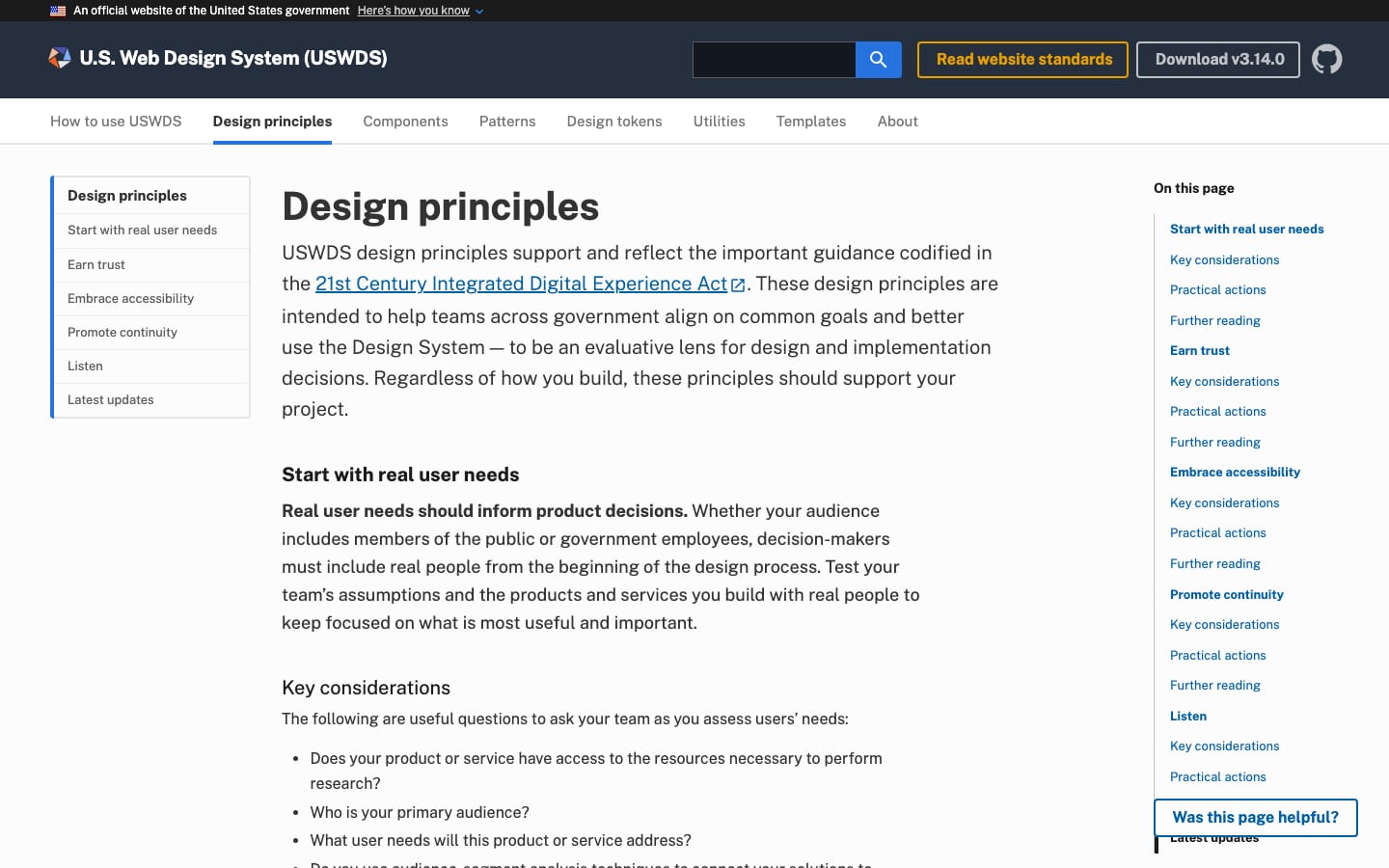
reliableconsistenthonestplain
USWDS has no standalone voice guide. Its voice shows in the design principles and component guidance: bold imperative lead-ins ("Start early.", "Lead with a verb.") followed by one or two plain sentences, "we" speaking to "you", sentence case throughout.
accessiblemobile-friendlyuser needstrustcontinuityplain language
Source: designsystem.digital.gov/design-principlesdesignsystem.digital.gov/about/product-values
| Tone | reliable, consistent, honest (Earn trust) |
|---|---|
| Person | we to you (observed) |
| Case | sentence case |
| Buttons | verb first, short |
Source: designsystem.digital.gov/design-principlesdesignsystem.digital.gov/about/product-valuesdesignsystem.digital.gov/components/buttondesignsystem.digital.gov/components/typography


Files from the docs site (/assets/img/uswds-logo/, /img/gsa-logo.svg). USWDS publishes no usage rules for its own logo.
A star echoes the flag without copying it; the identifier rule keeps product logos from masquerading as agency identity.
| Header size | 24px star (1.5rem) before wordmark (observed) |
|---|---|
| Identifier logo | SVG or 120px+ tall image |
| Star colors | #81aefc, #4d52af, #ee601d, #f6bd9c, #2e2e2e |
The USWDS mark is a five-point star built from five separate triangles in light blue, indigo, orange, peach and charcoal, set at 24px before "U.S. Web Design System (USWDS)" in Public Sans Bold in the dark header. A dark-ground version swaps the charcoal point to light gray. The identifier at the foot carries the parent agency (GSA) logo, not the product logo.
Not published: clear space; minimum size; misuse examples for the USWDS star.
Source: designsystem.digital.govdesignsystem.digital.gov/components/identifierdesignsystem.digital.gov/assets/css/styles.css
Download
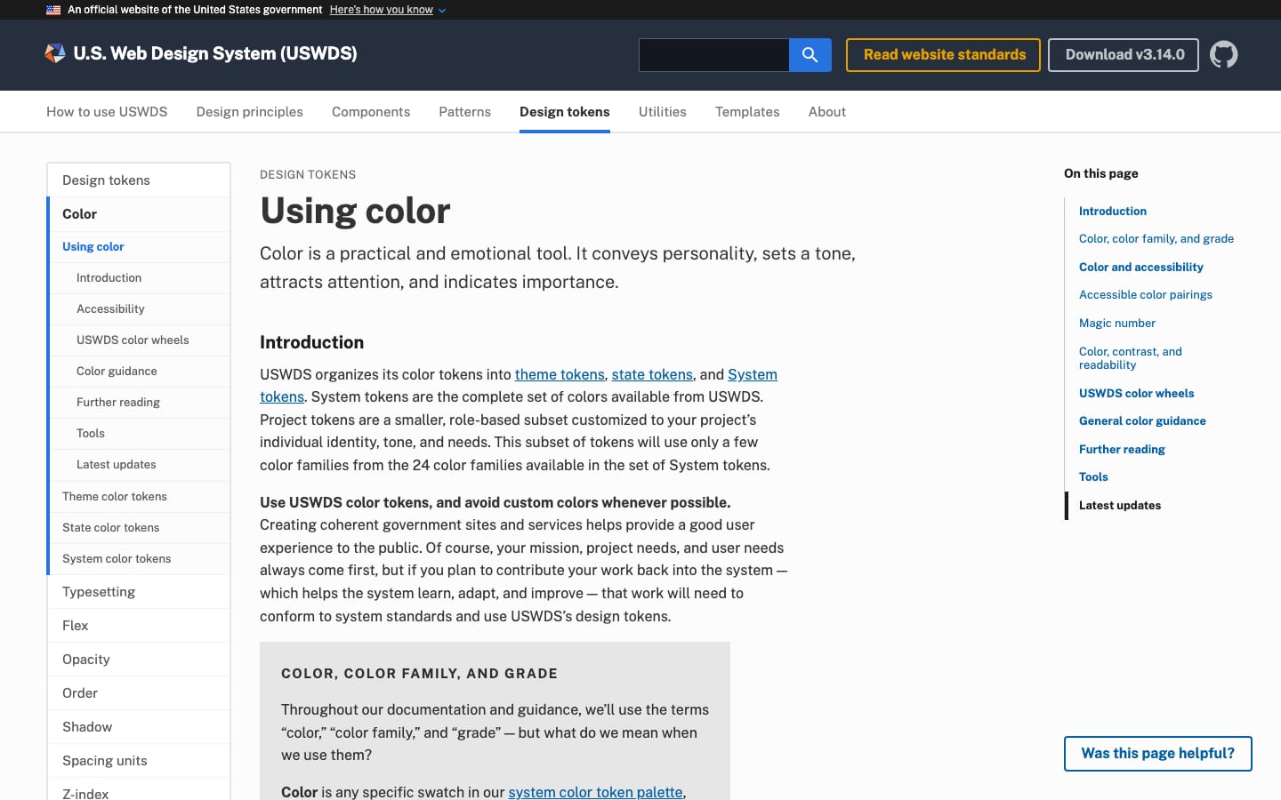
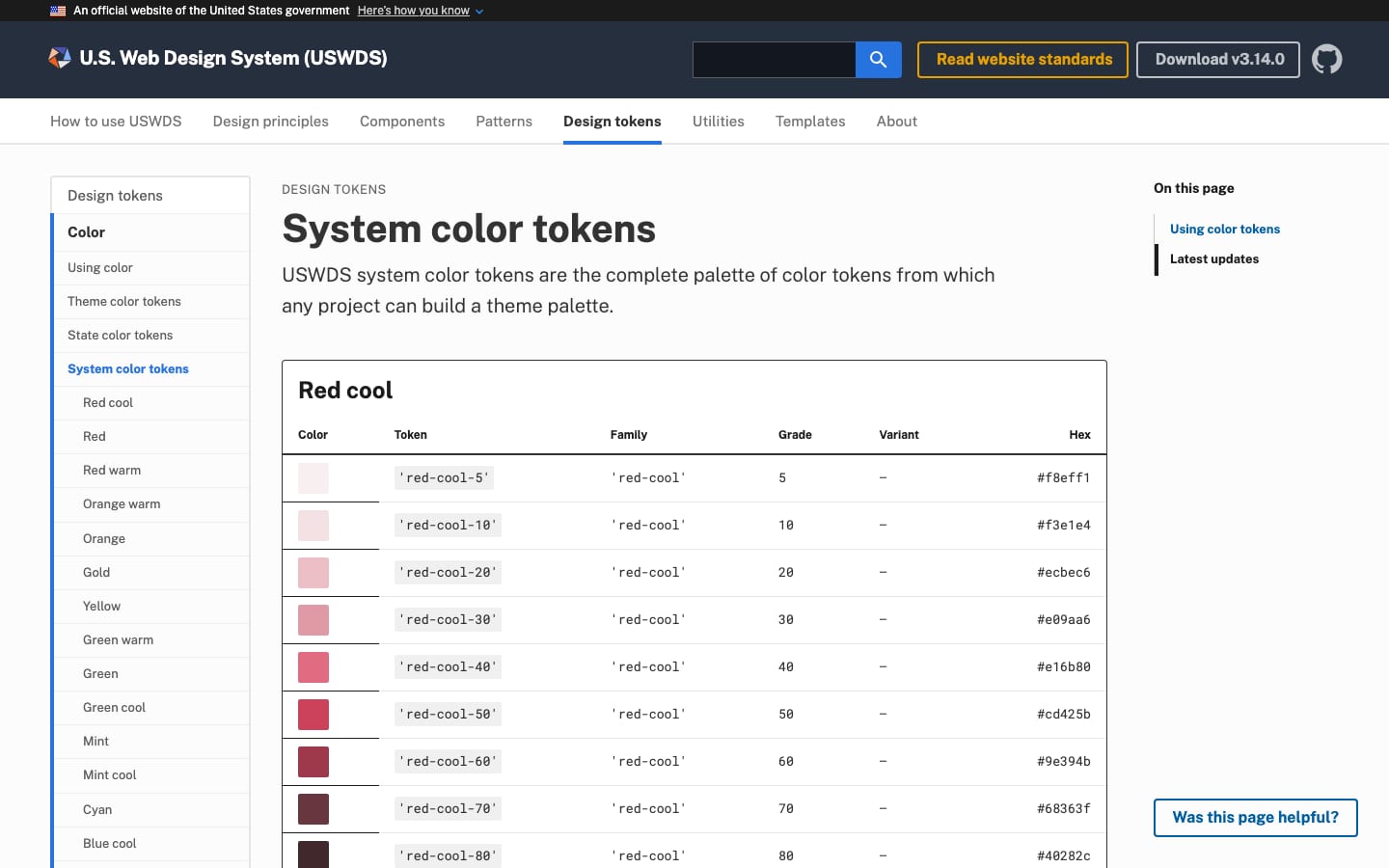
Because grades share luminance ranges across families, the grade difference alone predicts contrast: teams pick accessible pairs without a checker.
| Primary | blue-60v #005ea2 |
|---|---|
| Secondary | red-50 #d83933 |
| Ink | gray-90 #1b1b1b |
| Proportion | 60 / 30 / 10 (non-base) |
| Contrast | magic number 50+ for AA |
A system palette of 24 hue families (plus vivid variants), each graded 5-90 on a regularized lightness scale, feeds role-based theme tokens (base, primary, secondary, accent-cool, accent-warm) and state tokens (info, error, warning, success, emergency, disabled). Defaults: primary blue-60v #005ea2, secondary red-50 #d83933, ink gray-90 #1b1b1b.
Source: designsystem.digital.gov/design-tokens/color/overviewdesignsystem.digital.gov/design-tokens/color/system-tokensdesignsystem.digital.gov/design-tokens/color/theme-tokensdesignsystem.digital.gov/design-tokens/color/state-tokens
The design system for the federal government.
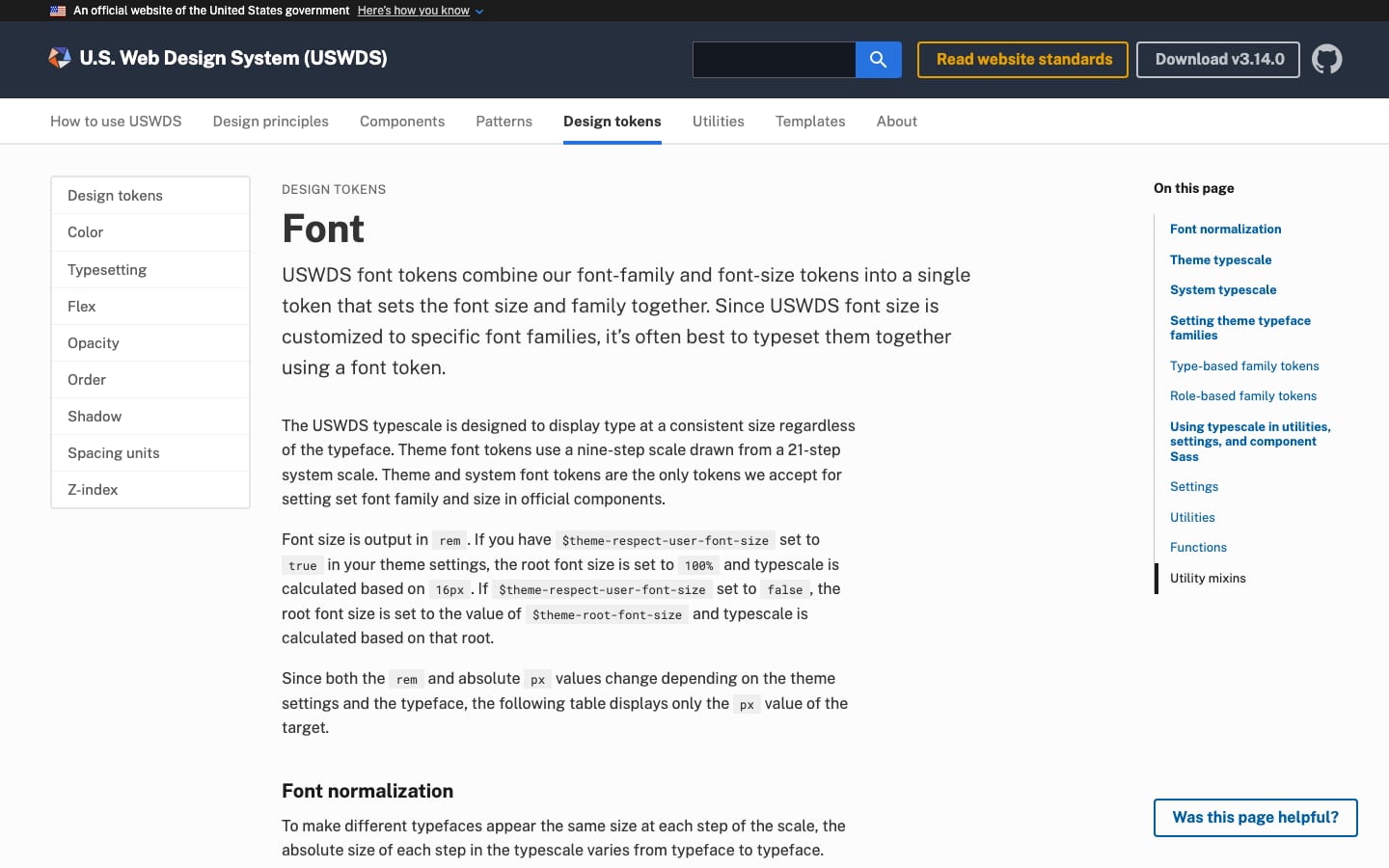
Normalization lets agencies swap typefaces without breaking layouts; neutral sans faces keep interfaces tool-like.
| Their face | Use | License | Open stand-in |
|---|---|---|---|
| Public Sans | The docs site's face for headings, nav, prose and footer; hero h1 36px weight 200; section heads bold 700 | Open: SIL OFL 1.1 (Libre Franklin) with GSA changes dedicated CC0 | Public Sans Real face is open; ships in the fonts folder. |
| Public Sans | Docs site prose 16px / 1.6 | Open: SIL OFL 1.1 | Public Sans Real face is open. |
| Roboto Mono | Code role (default theme) | Open: Apache 2.0 | Roboto Mono Real face is open. |
| Source Sans Pro | Default theme sans: body and UI (buttons) in an out-of-the-box USWDS site | Open: SIL OFL 1.1 | |
| Merriweather | Default theme serif: headings and alt role in an out-of-the-box USWDS site | Open: SIL OFL 1.1 |
| Display (docs site) | Public Sans 200, 36px hero h1 |
|---|---|
| Body (docs site) | Public Sans 400, 16px / 1.6 |
| Default theme | Merriweather headings, Source Sans Pro body |
| Weights | light 300, normal 400, bold 700 |
| Line heights | 1, 1.15, 1.35, 1.5, 1.62, 1.75 |
| Measure | 44, 60, 64, 68, 72, 88ex |
Four open faces ship with USWDS: Public Sans (its own), Source Sans Pro, Merriweather, Roboto Mono. The default theme sets headings in Merriweather and body/UI in Source Sans Pro; the docs site itself runs on Public Sans, with thin 200-weight hero type and bold 700 section heads. Size tokens are normalized so each step looks the same in any supported face.
Source: designsystem.digital.gov/components/typographydesignsystem.digital.gov/design-tokens/typesetting/fontdesignsystem.digital.gov/design-tokens/typesetting/overviewdesignsystem.digital.gov/design-tokens/typesetting/line-heightdesignsystem.digital.gov/design-tokens/typesetting/font-weightdesignsystem.digital.gov/design-tokens/typesetting/letterspacingdesignsystem.digital.gov/design-tokens/typesetting/measuredesignsystem.digital.gov/documentation/settings
An official website of the United States government
Official government banner · top of every page, directly after the skip link
Looking for U.S. government information and services? Visit USA.gov
Identifier footer · the very bottom of every page, below the site footer
Do pick only USWDS tokens; pair text and ground by grade difference ("magic number") of 50+ for AA body text (40+ for large text, 70+ for AAA); primary/secondary/accent in roughly 60/30/10 proportion of non-base color.
Token-only, grade-checked color · every color on the page
Download
Solid 4px-radius buttons in primary blue and secondary red · primary actions; the homepage hero pairs secondary red #d83933 and primary-vivid #0050d8
Specimens use sample copy, not U.S. Web Design System’s.
Every element maps to a component in the system, so the brand is the system in use.


| Icon circle | 72px circle, white icon (graphic list, observed) |
|---|---|
| Radius | sm 2, md 4, lg 8, pill |
| Shadow 1 | 0 1px 4px rgba(0,0,0,.1) |
The recognizable furniture is functional: the official banner strip with the flag, a dark header band, 72px solid circles holding white line icons (red on the homepage graphic list, cyan in the community row), flat 4px-radius buttons, a gray showcase band, and the dark identifier. The homepage hero carries a flat outline illustration of browser windows with orange, navy, yellow and red blocks and a small star.
Source: designsystem.digital.govdesignsystem.digital.gov/components/bannerdesignsystem.digital.gov/components/identifierdesignsystem.digital.gov/design-tokens/shadowdesignsystem.digital.gov/utilities/border
243 icons, mostly from Google Material Icons plus USWDS additions, delivered as an SVG sprite.

243 icons, mostly from Google Material Icons plus USWDS additions, delivered as an SVG sprite. Icons inherit currentColor and scale with font size, with size variants 3-9 units (24-72px).
| Sizes | 24-72px (size-3 to size-9) |
|---|---|
| Color | currentColor |
| Contrast | 3:1 |
| Set | Material Icons (Apache 2.0) + USWDS |
The only illustration is the homepage hero: flat outlined browser frames and phones with blocks of orange, navy, yellow and red, dashed connector lines and a star.
The only illustration is the homepage hero: flat outlined browser frames and phones with blocks of orange, navy, yellow and red, dashed connector lines and a star. The icon guidance says to use illustration, not icons, for visual explanation.
Not published: illustration style guidance.
Source: designsystem.digital.govdesignsystem.digital.gov/components/icon
The homepage uses screenshots of real government sites built with USWDS (NIH Library, VA, NASA Glenn, PubMed, vote.gov, America's Seed Fund) as proof, each with a light shadow.
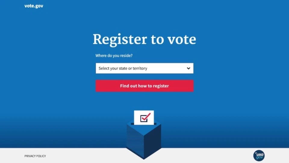
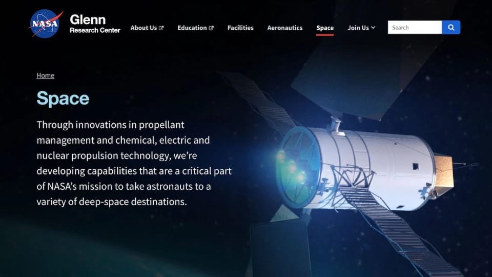
The homepage uses screenshots of real government sites built with USWDS (NIH Library, VA, NASA Glenn, PubMed, vote.gov, America's Seed Fund) as proof, each with a light shadow. No photography guidance is published.
Not published: photography style guidance.
Source: designsystem.digital.govdesignsystem.digital.gov/documentation/accessibility
No motion tokens or easing are published.
No motion tokens or easing are published. Accessibility guidance asks teams to avoid flashing and repetitive animation, and USWDS disables nonessential header transitions under reduced-motion.
Not published: durations; easing curves.
Source: designsystem.digital.gov/documentation/accessibilitydesignsystem.digital.gov/components/header
A mobile-first 12-column flexbox grid in a container capped at 1024px (desktop), with 16px side padding on phones and 32px at desktop. Spacing comes from an 8px unit. Landing pages follow the published template: extended header, hero, graphic list, buttons, grid, medium footer.
Measured from designsystem.digital.gov's Read from designsystem.digital.gov guidance pages (fetched 2026-10-30) and the site stylesheet /assets/css/styles.css.
| Measure | Desktop | Phone |
|---|---|---|
| Page margin | 52px | 16px |
| Section padding | 64px | 32px |
| Hero text width | max 480px, centered | full width |
| Card gap | 32px | 32px |
| Navigation | 128px | 128px |
Hero H1
Public Sans · 36px · line 1.3 · weight 200
Hero lead
Public Sans · 24px · line 1.4 · weight 200
Section H2 (showcase)
Public Sans · 28px · line 1.2 · weight 700
Footer H2
Public Sans · 20px · line 1.2 · weight 700
Site title (header)
Public Sans · 20px (phone 15.04) · line 1.2 · tracking -0.2px · weight 700
Graphic list head
Public Sans · 16.96px · line 1.5 · weight 700
Showcase caption link
Public Sans · 16.96px · line 1.6 · weight 700
Body (footer paragraph)
Public Sans · 16px · line 1.6 · weight 400
Graphic list body / link
Public Sans · 15.04px · line 1.5 · weight 400
Primary nav link
Public Sans · 15.04px (phone 16) · line 1 · weight 400
Required links (identifier)
Public Sans · 15.04px (phone 16) · line 1.4 · weight 400
Community item head / link
Public Sans · 14.08px · line 1.4 · weight 400
Button label
Public Sans · 16px · line 0.9 · weight 700
Gov banner
Public Sans · 12px · line 1.2 · weight 400
How U.S. Web Design System’s own landing pages are built, observed on designsystem.digital.gov, 2026-10-30. The full measurements are in spec.md.
Source: designsystem.digital.gov/utilities/layout-griddesignsystem.digital.gov/design-tokens/spacing-unitsdesignsystem.digital.gov/templates/landing-pagedesignsystem.digital.gov/documentation/settings
How our engine applies USWDS to each format: our recipe from their published tokens and components.
| Format | What they did | Source |
|---|---|---|
| agency websites | NIH Library, VA, NASA Glenn, PubMed, vote.gov and America's Seed Fund are shown as sites built with USWDS. | designsystem.digital.gov |
| landing page template | Published template: extended header, hero, graphic list, buttons, grid, medium footer. | designsystem.digital.gov/templates/landing-page |
| Format | Loudness | Must appear | What varies |
|---|---|---|---|
| Landing page | Follow kit.spec.page (the designsystem.digital.gov homepage, observed 2026-10-30): official #1b1b1b gov banner; #252f3e header with the USWDS star, "U.S. Web Design System (USWDS)" in Public Sans 700, search and two 2px-ring outline buttons; white 48px sticky nav of 8 links; #f0f0f0 hero with a Public Sans 200 36px h1, 200 24px lead and two flat 4px-radius buttons (#d83933, #0050d8) beside the line illustration; a 4-up graphic list of 72px red circle icons with bold heads and underlined #005ea2 links on #fcfcfc; a #f0f0f0 3x2 showcase of 16:9 screenshots with bold external links; a #e6e6e6 community band with #00bde3 icon circles; a #adadad v1 strip; the #1b1b1b GSA identifier with required links. 1400px container with 32px padding, 64px section padding, 8px unit. | theme families and typeface (the default theme uses Source Sans Pro/Merriweather and a 1024px container), number of graphic list items and showcase sites, hero illustration | |
| Documentation page | Banner, header, side navigation, Public Sans prose at 16px/1.6 within measure 2-5, tokens tables, identifier | section depth | |
| Form or transaction | Default components untouched, step indicator, plain labels, primary button with a verb | none beyond theme color | |
| Slide deck | White or #f0f0f0 grounds, Public Sans, primary blue and secondary red used 60/30, sentence case | accent use |
Source: designsystem.digital.gov/design-principlesdesignsystem.digital.gov/design-tokens/color/overviewdesignsystem.digital.gov/components/bannerdesignsystem.digital.gov/components/identifierdesignsystem.digital.gov/documentation/accessibilitydesignsystem.digital.gov/maturity-model
Your name and logo, U.S. Web Design System’s system.
Use this kit for my brand Use this brand in Claude
Get your brand audit Put your brand in Claude What goes in a brand book
Each value is marked published, observed, our reading or our recipe, with its source. Checked 2026-10-30. Not affiliated with U.S. Web Design System.