Ride
Request a ride, hop in, and go (paraphrase of the Ride card). Observed
Brand book
Uber makes the interface the brand. A black page, white type and a working request form say more than any color could, so color is left to the products (Eats green) and to real photos of people on the move. Our reading

Photography and product color carry the variety; product sub-brands (Eats green) bring their own color but only on their own assets.
Source: assets.uber.com/document/468assets.uber.com/document/431
Not published as a ratio. Measured share of the uber.com homepage height at 1440: about 70% black ground, 15% white ground, 15% photography; no colored grounds..
Two voices. The homepage is plain and functional; campaign film and end cards ("On our way") are warmer. Levels are our reading.
Our engine's setting, built from their rules.
Cover the wordmark. It should still read as Uber: a black page, dark pills, one white button, bold sentence-case type and candid photos.
Put another company's name on it. If nothing but the name changed, the pill controls, black-white bands and product-colored photos are missing.
Uber is a digital platform connecting people with independent drivers and couriers, not a ride or delivery company (paraphrase). Published
Request a ride, hop in, and go (paraphrase of the Ride card). Observed
Meals, groceries and same-day packages from the same app. Observed
Drive, deliver or use specialized skills on your own schedule. Observed
Control and insight for company travel and meal programs. Observed
Go anywhere
Explore what you can do with Uber
How to request a ride
Planning your next getaway?
Uber replaced its 2016 bit-and-atom icon with a plain wordmark in September 2018 (Wolff Olins with type studio MCKL), adding the custom Uber Move typeface and a black-and-white core. The "On our way" platform and Uber's first sonic identity followed on July 26, 2024.
Category. Mobility, delivery and travel platform: rides, Uber Eats, Courier, Reserve, Rent, Uber for Business, and since GO-GET 2026 hotels. Observed
Uber is a technology platform that connects people with independent drivers who drive with Uber and couriers who deliver with Uber Eats (paraphrase of the co-marketing messaging rule).
More ways to use Uber
Get member savings on rides and delivery
Earn with Uber
All the benefits of Uber, reimagined for business
It’s easier in the apps
On our way
Inspire possibilities
The guide publishes how to talk about Uber more than what to say: Uber is a digital platform connecting people with independent drivers and couriers, never a ride or delivery company. Partner copy goes to Brand Desk for approval (3-5 business days). The homepage message is a list of doors: Go anywhere, Explore, How to request, Earn, Business, apps.
Your Uber ride is here
Your Uber is here
Request a ride
Call an Uber
The voice gets out of the way of the task; warmth is reserved for film.
PlainHelpfulBrief
Short, sentence-case, practical. Buttons are two or three words (See prices, Sign up now, Learn more); body sentences explain one benefit each. Banned and approved phrase lists are published.
Request a rideRequest an Uber rideBook a rideYour ride is hereYour Uber ride is hereYour driverUber Cash
Call an UberBook an UberUber is hereUber savingsUber purchasesUber to the event
Source: assets.uber.com/document/468uber.com/us/en
| Approved | Request a ride; Book a ride; Your ride is here; Your driver |
|---|---|
| Not approved | Call an Uber; Book an Uber; Uber is here; Uber savings |
Source: assets.uber.com/document/468


Logos shown from Uber's brand portal and Brandfetch for reference. Uber is a trademark of Uber Technologies Inc. Not affiliated, and not for download.
Partner | Uber
Uber | Partner
The 2018 identity brought the name back after users asked where the U went; a plain wordmark works in every market.


| Clear space | height of the U |
|---|---|
| Lockup spacing | width of the U each side of the line |
| Colors | black #000000 or white #FFFFFF |
A wordmark only: "Uber" in custom letterforms, black on light and white on dark. Clear space equals the height of the U. Partner lockups put the partner first, a line glyph between, spaced one U width each side. App icons are the white wordmark on a black rounded square (iOS), square or circle (Android). The logo is never localized.
Source: assets.uber.com/document/468assets.uber.com/document/431assets.uber.com/document/471
See prices
With only black and white, the interface reads as Uber anywhere, and product color stays a signal of the product.

Two core colors for Uber: black and white, published with HEX, RGB, CMYK and PMS. Uber Eats adds a third, Uber Eats green #06C167, restricted to the Eats app icon, badges, gift cards, bags and gifs. uber.com builds every surface from black, white and a short grey ramp (#111111, #292929, #4A4A4A, #AFAFAF, #EFEFEF, #F6F6F6).
Not published: Grey ramp values (observed on uber.com only); A color ratio.
Source: assets.uber.com/document/468assets.uber.com/document/468uber.com/us/en
On our way
Go anywhere
GO ANYWHERE
A transit-signage grotesque owned outright keeps the voice consistent across 70+ markets.
| Their face | Use | License | Open stand-in |
|---|---|---|---|
| Uber Move | Headlines, the wordmark-style text logo, end-card tagline | Proprietary to Uber (drawn with MCKL for the 2018 identity). The brand portal lists font packages (Global, English and Monospace collections); not an open font | Outfit 660 Within 1% of the real line width and ink on two measured lines, with the same round bowls; x-height 6% short (see Typography calibration) |
| Uber Move Text | Body, labels, buttons, nav pills | Proprietary (Uber) | Public Sans 400 / 600 Within 0.5% of the real line widths, 6-9% more ink so titles, pills and buttons keep their firmness (see Typography calibration) |
| Hero | 52/64 desktop, 36/44 phone |
|---|---|
| Section | 36/44 desktop, 28/36 phone |
| Body | 16/24 |
| CJK | Uber Move Japanese; Source Han Sans for Chinese and Korean |
Uber Move for headlines and Uber Move Text for everything else, both proprietary. The portal distributes font packages (Global, English, Monospace collections, plus Uber Move Japanese and Source Han Sans for CJK). On uber.com, headings render bold (from the 600 file) with normal tracking; body is 16/24.
Source: assets.uber.com/document/398assets.uber.com/document/431uber.com/us/en
Glyphs stay quiet inside pills; the 3D illustrations make each product door recognizable at a glance.
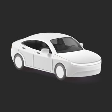
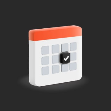
Small filled glyphs in UI (pin, clock, chevrons, navigation arrow, globe, circle and square trip markers), and full-color 3D product illustrations (car, calendar, luggage, key fob, teen, courier) on the Explore cards.
Renders keep products concrete; people and places are shown in photos.
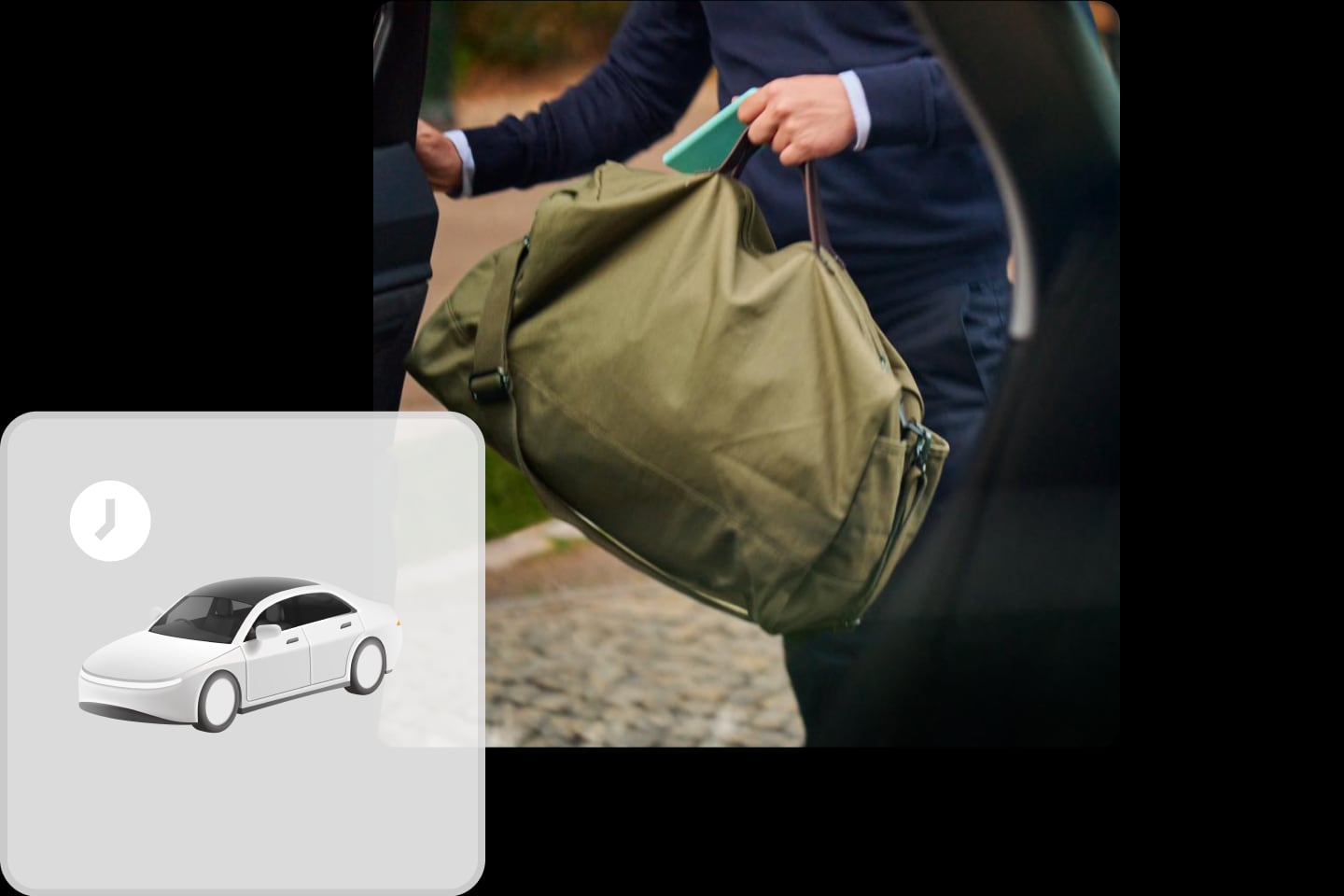
Illustration on uber.com is limited to 3D product renders and a few composites (photo plus icon tile). The illustration chapter of the identity system is behind sign-in.
Not published: Illustration guidelines (behind sign-in).
Source: uber.com/us/en
People on the move are the product; candid moments sell reliability without saying it.
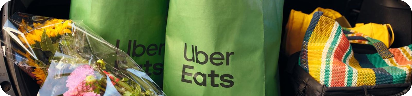

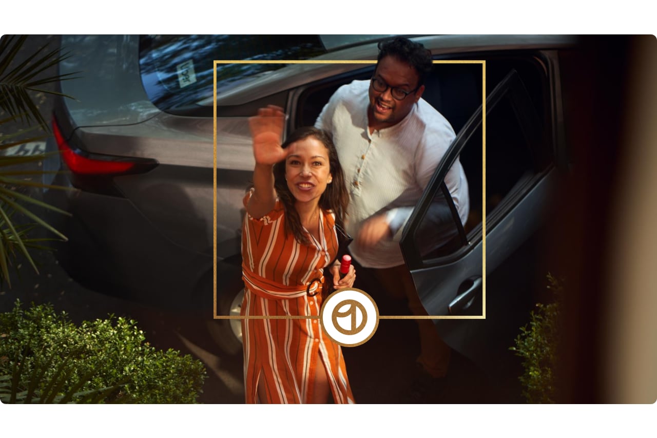
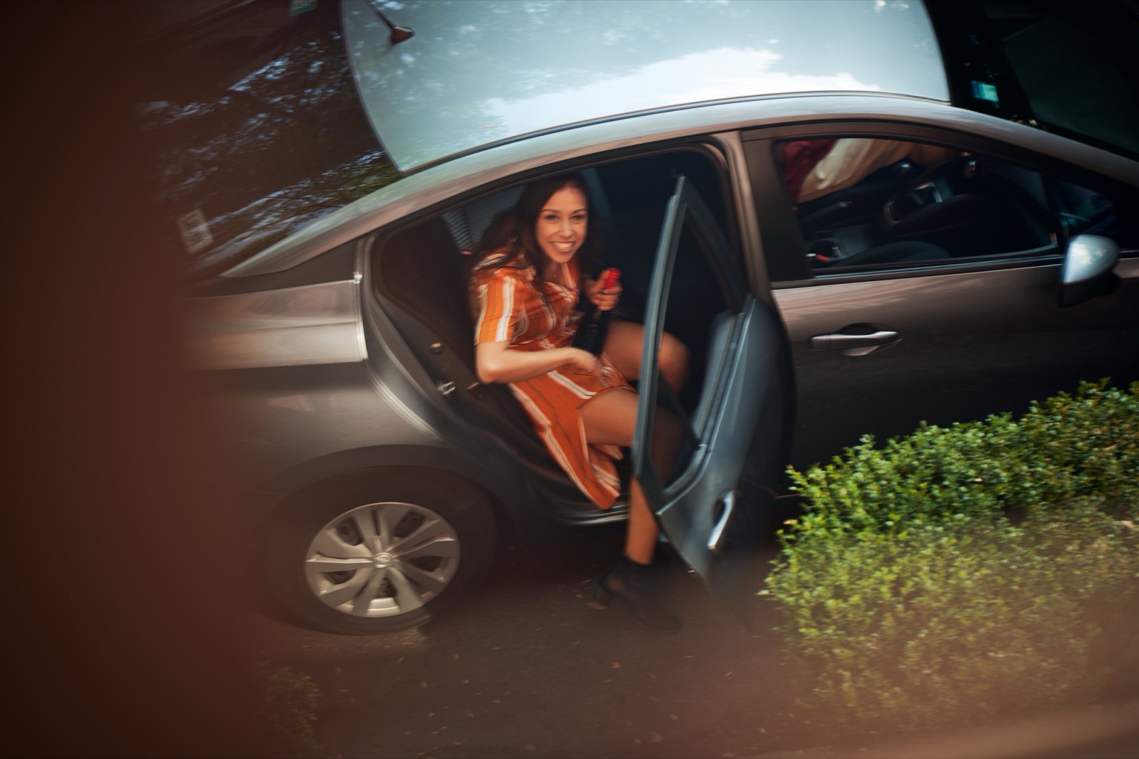
Candid, warm, mid-action photos of real-looking people in cities and cars: hands with phones, luggage, a smiling driver seen through glass, food from above. Product color shows up naturally (green Eats bags). Frames are square-cornered rectangles, wide 1152x270 banners with rounded corners, or a circle crop.
The app moves; the website stays still so the task stays clear.
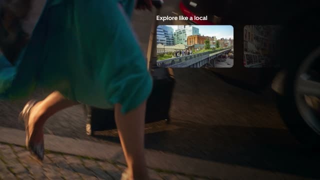

UI motion is minimal: a 0.2s linear wash on buttons and a 0.5s ease-out underline. Brand motion is video and gif: an autoplaying travel film and a green line that draws down between sections. End cards may carry the sonic ID.
Do Nav items are #111111 pills 36px tall, 999px radius, 12px side padding, 14px semibold #FCFCFC, 4px apart; only Sign up flips to white with black text. The hero repeats the language: a #EFEFEF "Pickup now" pill, #F6F6F6 fields with 8px corners, a white 8px-radius See prices button. Square-cornered cards appear only for QR blocks..
Every control is a pill on black · the nav and all hero controls
Do Ground is #000000 from the nav to the More ways band, switches to #FFFFFF for Uber Eats and Uber One, then returns to #000000 for Earn, Business, apps and the footer. Each switch happens behind a full-width 1152x270 photo banner with 40px (Eats) corners: the ground changes color at a straight horizontal line passing behind the photo (at its middle for the Eats banner, 68px below its top for the family banner), so the photo bridges the two grounds..
Black page, one white interruption · uber.com/us/en homepage, top to bottom
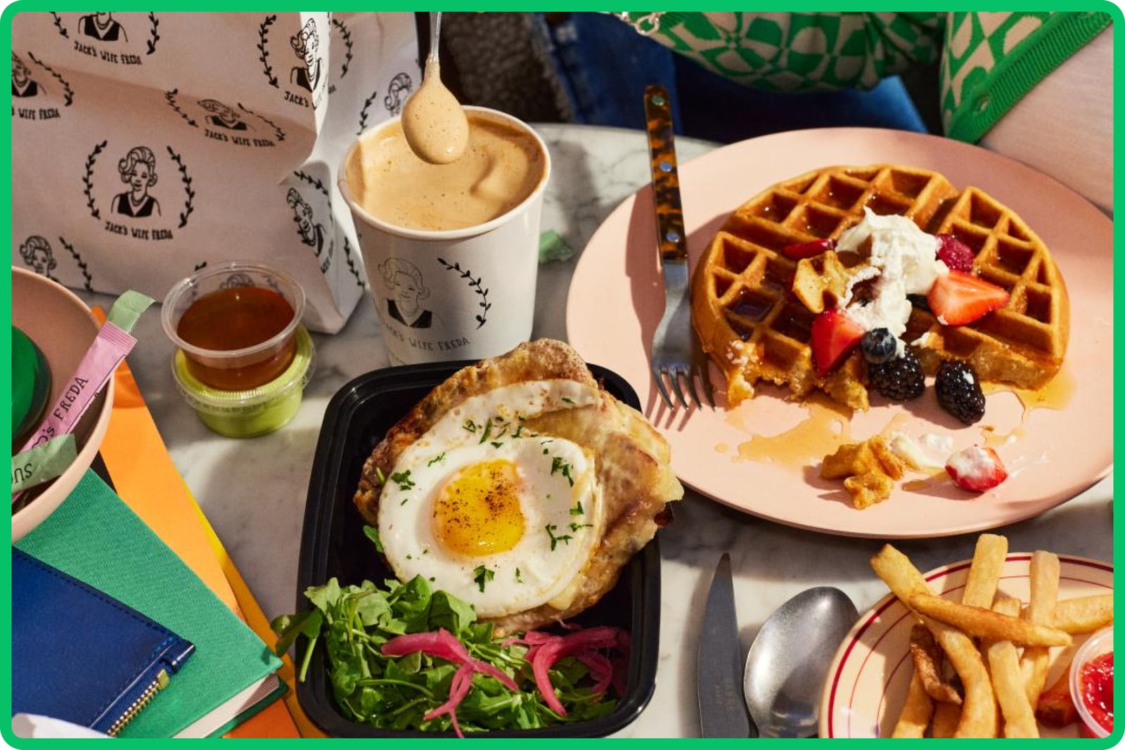
Do Uber Eats green (#06C167) appears only as a 4px frame baked into the Eats photos and on the bags; the Earn photos carry a 4px #276EF1-like blue frame; Uber One carries a thin gold square line and its badge. The CSS never colors anything but black, white and greys. Use the supplied images as-is: never redraw the frame in CSS..
Product color lives inside the photo · Eats and Earn rows
Do A filled circle marks the start and a filled square marks the end of a trip: Uber Move glyphs on either side of the "On our way" tagline, sized to the tagline; on the site, a 16px black dot icon (pickup) and 16px black square icon (dropoff) joined by a 1px line..
Circle and square journey glyphs · end cards (guide) and the pickup/dropoff fields (site)
Specimens use sample copy, not Uber’s.
A 1152px content column (144px margins at 1440) under a wider 1280px nav. Bands alternate split (459px text + 558px media), three-up (360px) and two-up (558px), each with 64px padding; ground switches happen behind wide rounded photo banners. Phones collapse to 24px margins and carousels.
Measured from uber.com/us/en's computed styles, bounding boxes and hover/focus states at 1440 and 390 in headless Chromium, 2026-10-29; images downloaded from their original tb-static.uber.com files.
| Measure | Desktop | Phone |
|---|---|---|
| Page margin | 144px | 24px |
| Section padding | 64px | 40px |
| Card gap | 18px | 18px |
| Navigation | 64px | 64px |
Hero headline (h1)
Uber Move · 52px (phone 36) · line 1.23 · weight 660
Section headline (h2)
Uber Move · 36px (phone 28) · line 1.22 · weight 660
QR card title
Uber Move · 24px · line 1.33 · weight 660
Item title
Uber Move Text · 18px · line 1.33 · weight 600
Body
Uber Move Text · 16px · line 1.5 · weight 400
Button label
Uber Move Text · 16px · line 1.25 · weight 600
Location label
Uber Move Text · 16px (phone 14) · line 1.25 · weight 600
Explore card title
Uber Move Text · 16px (phone 12) · line 1.25 · weight 600
Explore card description
Uber Move Text · 12px · line 1.67 · weight 400
Pill label
Uber Move Text · 14px · line 1.14 · weight 600
Footer link
Uber Move Text · 14px · line 1.43 · weight 400
Legal
Uber Move Text · 12px · line 1.67 · weight 400
How Uber’s own landing pages are built, observed on uber.com/us/en, 2026-10-29. The full measurements are in spec.md.
Source: uber.com/us/en
The line is what every rider sees in the app when a car is coming, so the campaign borrows the product's best moment. Our reading
The event film is reused as a product door, not a banner ad. Our reading
One wordmark people recognized replaced an abstract mark they didn't. Our reading
How our engine applies Uber's system to each format. This is our recipe built from their rules, not something Uber publishes. Level = how far toward the campaign end (warm film, tagline) from the functional end.
| Format | What they did | Source |
|---|---|---|
| website | uber.com homepage: black page, pill nav, ride request form hero, product bands, black footer. | uber.com/us/en |
| end card | 16:9, 1:1 and 9:16 end cards in black, Eats green or white, wordmark plus "On our way". | assets.uber.com/document/431 |
| app icon | White wordmark on a black rounded square (iOS), square or circle (Android). | assets.uber.com/document/468 |
| co-marketing | Partner-led lockups and approved offer copy for merchants and partners. | assets.uber.com/document/468 |
| Eats packaging | Green delivery bags, gift cards and stickers with the black Eats logo. | assets.uber.com/document/468 |
| Format | Loudness | Must appear | What varies |
|---|---|---|---|
| Landing page | Black 64px nav of #111111 pills with one white Sign up pill; black hero with a 52px two-word headline and one white 8px-radius CTA; product bands in a 1152 column; one white interruption bridged by a rounded photo banner; black footer with four link columns | which product bands follow the hero, and whether the hero has a form or a photo | |
| Deck | Black slides, white bold sentence-case headlines, one photo per slide, end on the wordmark and "On our way" | white slides for data | |
| Social post | Full-bleed candid photo, short white headline, end on the wordmark | square or story crop | |
| Black header with white wordmark, white body, black 8px button | one hero photo |
Source: assets.uber.com/document/468assets.uber.com/document/468assets.uber.com/document/431
Your name and logo, Uber’s system.
Use this kit for my brand Use this brand in Claude
Get your brand audit Put your brand in Claude What goes in a brand book
Each value is marked published, observed, our reading or our recipe, with its source. Checked 2026-10-29. Not affiliated with Uber.