Neutral by design
Work across models and tech stacks; no single-vendor lock-in. Published
Brand book
A developer brand that dresses down. Twilio keeps the page one dark ink color and the type plain, then lets two small things carry the identity: the red logo and red numbers, and blue pills that always mean "build now". The voice adds the personality, so a seasonal theme can sit on top without touching the system. Our reading

the campaign layer: theme, photography, puns and the stat display face change with the season (Halloween 2026 at time of study)
Source: twilio.com/en-us
Our engine's setting, built from their rules.
Cover the logo. It should still read as Twilio: one ink page, blue pills, red numbers and product UI fragments.
Red appears only on the logo, numbers and badges; never on a button.
Run the word list: no click, leverage, easy, e.g.; sentence case throughout.
The customer engagement platform for builders: channels, context and AI in one platform. Our reading
Work across models and tech stacks; no single-vendor lock-in. Published
Scale, security and compliance for global interactions. Published
Simple APIs and building blocks developers adapt. Published
Analyst recognition for CPaaS and customer engagement. Observed
Reaching a business shouldn't be a nightmare
Building blocks for every conversation
Build for the AI era. Build with Twilio.
Founded in 2008 to bring communications to the cloud; now a platform combining channels, contextual data and AI orchestration (paraphrase).
Listen to and build with customers
PublishedCuriosity first; turn uncertainty into possibility
PublishedDo what we say; high standards
PublishedCollective success; debate, then commit
PublishedTransparent, candid, respectful
PublishedCategory. CPaaS and customer engagement platform (CEP) Observed
Single-vendor suites that lock in a model or stack (their framing)
Twilio is a customer engagement platform that combines communication channels, contextual data and AI orchestration so businesses can build conversations with humans and AI agents (paraphrase of the company page).
Build for the AI era. Build with Twilio. Published
Don't wait for change. Build it. Published
Reaching a business shouldn't be a nightmare Observed
The homepage sells building blocks for conversations: products as cards, proof from customers and analysts, and a free start everywhere. The Why Twilio page states three pillars: neutral, trusted at scale, extensible.
Source: twilio.com/en-us/why-twiliotwilio.com/en-us/companytwilio.com/en-us
A voice for developers: plain words, precise claims, a little fun when the moment allows it.
conversationalthoughtfulreliablequirky
Paste publishes the brand team's four voice principles (conversational, thoughtful, reliable, quirky) and a tone spectrum (direct, balanced, casual) chosen by situation. The product style guide and word list are detailed and machine-checkable.
buildersconversationscontextchannelsplatform
clickleverageeasye.g.etc.log in
Source: paste-dsys.com/foundations/content/voice-and-tonepaste-dsys.com/foundations/colorstwilio.com/en-us
Source: paste-dsys.com/foundations/content/voice-and-tonepaste-dsys.com/foundations/content/product-style-guidepaste-dsys.com/foundations/content/word-list

Twilio's logo rules (clear space, minimum size, misuse) live in its login-gated brand library (library.twilio.com, Bynder). Its public trademark guidelines only forbid altering or imitating the marks.
The four-dot bug reads at tiny sizes and works alone as an app icon.
The logo is a red circular bug with four dots plus a lowercase wordmark. On twilio.com it is full red on the white nav and all white in the dark footer.
Not published: clear space and minimum size (in the login-gated brand library).
With one dark ground and one action color, the red logo and red numbers become the only bright marks, so they carry the brand.
| Page ground | #000D25 (observed) |
|---|---|
| Action | #1866EE (observed); Paste blue-60 #0263E0 (published) |
| Red | logo #F22F46, numbers #EF223A, Paste red-60 #DB132A |
Paste's tokens publish full alias ramps (blue, red, gray, green, orange, purple, yellow) and say Twilio Red is reserved for moments of impact while blue marks everything interactive. The homepage applies this on a single ink ground: #000D25 everywhere, #1866EE for actions, #EF223A for numbers.
Not published: color proportions; marketing palette hex values (homepage values are observed).
Source: paste-dsys.com/foundations/colorsgithub.com/twilio-labs/paste/blob/main/packages/paste-design-tokens/tokens/aliases/color-palette.ymltwilio.com/en-us
Build for the AI era. Build with Twilio.
Few weights, each with one job, so hierarchy reads at a glance.
| Their face | Use | License | Open stand-in |
|---|---|---|---|
| Whitney SSm (twilio.com headlines, 700) | Headlines 700: hero 56/66, section 40/52, card titles 20/32 | Commercial (Hoefler&Co. / Typography.com web font). Paste names Twilio Sans Display as the brand display face | Open Sans Measured closest of 28 open faces against Whitney on twilio.com: width within 2.4%, x-height within 1.3%; at 750 the bold matches width and ink |
| Whitney SSm (twilio.com text, 400-600) | Body 400, buttons and links 500, captions 600 | Commercial (Hoefler&Co.). Paste names Twilio Sans Text for UI text | Open Sans Same calibration; 400 with +0.01em tracking |
| Twilio Sans Mono | Code samples (300 on the homepage) | Twilio's own face (self-hosted on twilio.com for Paste); not an open licence | JetBrains Mono Open coding mono with a similar light weight |
| Buffalo (campaign stat face) | Customer-story stat numbers only | Commercial display face (licence not published) | Oxanium Square, chamfered heavy forms like Buffalo; 800 at 80px with 5px tracking matches its rendered width |
Paste names Twilio Sans as a super family of Display, Text and Mono: Display Extrabold for brand moments, Text Semibold for headings, Text Regular for body, Text Medium for small type, Mono for code. The live marketing site still renders Whitney SSm with Twilio Sans Mono for code.
Not published: a marketing type scale (sizes observed); Twilio Sans files or licence.
Source: paste-dsys.com/foundations/typographygithub.com/twilio-labs/paste/blob/main/packages/paste-design-tokens/tokens/themes/twilio/aliases/font-family.ymltwilio.com/en-us
Reaching a business shouldn't be a nightmare
One dark ink page · the whole homepage, hero to footer
Do action is always Blue 500 #1866EE as a filled pill (radius 50px, 40px tall, 16px/500 white); the second action is the same pill as a 2px white ring or a white text link with a 2px underline. Red never carries an action.
Blue pills on navy · every call to action
Do Red light #EF223A on big numbers only: blocky stat face (Buffalo; Oxanium stand-in) for customer stats, 64px bold for analyst counts. Paste reserves Twilio Red for moments of impact (illustration, logo, iconography).
Red is for numbers · customer-story stats and analyst counts, the New badge, the logo
Do each product is shown as a fragment of real UI (a profile card, a channel switcher, a flowchart) in white-outlined dark panels with tiny red accents, inside a 368x460 rounded #191E36 panel (Paste's "medium scene" idea: real UI screens blended with people and graphic elements).
Product UI as illustration · the six product cards
Do photos of people using phones, cut to a slanted trapezoid with rounded corners and a navy bottom fade, white customer logo, red stat, white 600 caption; they run edge to edge in a continuous carousel.
Trapezoid photo cards · customer stories carousel
Specimens use sample copy, not Twilio’s.
Rounded, friendly shapes soften a technical product.
Twilio's recognizable elements are few: the red four-dot bug, full-pill buttons, 20px-radius navy cards, white-outlined UI fragments with thin red accents, and photos cut into shapes.
Source: twilio.com/en-uspaste-dsys.com/foundations/illustrations
Quiet icons keep attention on copy and product UI.
Paste ships a single UI icon set; on the homepage icons are thin 1px rounded outlines in white (checks, plus, arrows) and ink in the nav.
Not published: icon grid and stroke spec for marketing icons.
Showing real UI makes an API company's product visible.
Paste lists three illustration types curated by the Brand team: spot illustrations (literal, for empty and error states), medium scenes (real UI screens with people and graphic elements) and photo illustrations (photography blended with illustration, mostly for marketing).
People and phones make "conversations" concrete; the cool grade keeps photos inside the ink palette.
Homepage photography (observed): real people with phones, in cool teal-and-navy grading, cut into shapes (trapezoid cards, a cut-out inside a red hexagon outline). The Halloween campaign uses cinematic horror stills.
Not published: a photography guideline (in the gated brand library).
Source: twilio.com/en-us
Short, plain transitions; motion shows the product working (typing code), not decoration.
Observed: 0.3s ease-in-out on button color and ring changes, 0.18s on card hovers, a continuously scrolling stories carousel and a self-typing code sample.
Not published: motion principles or easing tokens.
Source: twilio.com/en-us
Paste publishes an 8px spacing grid with a 4px baseline, "friendship" spacing (closer means related), a 1232px max content width and about 712px text width. The homepage uses a 1200px container at 120px margins, 3-column 368px grids with 48px gaps and 64px band padding.
Measured from twilio.com/en-us's computed styles, element boxes and canvas font measurement in headless Chromium at 1440x900 and 390x844 after a full scroll (lazy images loaded).
| Measure | Desktop | Phone |
|---|---|---|
| Page margin | 120px | 32px |
| Section padding | 64px | 64px |
| Hero text width | max 576px, centered | full width |
| Card gap | 48px | 48px |
| Navigation | 112px | 112px |
Hero H1
Whitney SSm (twilio.com headlines, 700) · 56px (phone 34) · line 1.18 · tracking -1.68px · weight 750
Section H2
Whitney SSm (twilio.com headlines, 700) · 40px (phone 28) · line 1.3 · tracking -0.8px · weight 750
Analyst number (4x, 5x)
Whitney SSm (twilio.com headlines, 700) · 64px · line 1.3 · tracking -1.92px · weight 750
Analyst claim
Whitney SSm (twilio.com text, 400-600) · 28px · line 1.286 · weight 400
Lead paragraph
Whitney SSm (twilio.com text, 400-600) · 20px (phone 18) · line 1.6 · tracking 0.2px · weight 400
Card title (product)
Whitney SSm (twilio.com headlines, 700) · 20px (phone 18) · line 1.6 · weight 750
Card body (product)
Whitney SSm (twilio.com text, 400-600) · 18px (phone 16) · line 1.556 · tracking 0.18px · weight 400
Stat caption
Whitney SSm (twilio.com text, 400-600) · 18px (phone 16) · line 1.556 · weight 600
Button label
Whitney SSm (twilio.com text, 400-600) · 16px (phone 14) · line 1.5 · weight 550
Nav link / footer link
Whitney SSm (twilio.com text, 400-600) · 14px (phone 12) · line 1.43 · weight 400
Footer column heading
Whitney SSm (twilio.com text, 400-600) · 14px (phone 16) · line 1.43 · weight 500
Utility / legal
Whitney SSm (twilio.com text, 400-600) · 12px · line 1.5 · weight 500
Code
Twilio Sans Mono · 16px · line 1.5 · weight 300
Customer stat (Oxanium stand-in for Buffalo)
Whitney SSm (twilio.com text, 400-600) · 80px · line 0.525 · tracking 5px · weight 800
How Twilio’s own landing pages are built, observed on twilio.com/en-us, 2026-10-31. The full measurements are in spec.md.
Source: paste-dsys.com/foundations/spacing-and-layoutpaste-dsys.com/foundations/elevationtwilio.com/en-us
The system is neutral enough that a theme reads as a costume over it. Our reading
How our engine applies Twilio's system to each format. Our recipe from their published rules and the homepage, not something Twilio publishes.
| Format | What they did | Source |
|---|---|---|
| Marketing site | Ink page, pill CTAs, product UI cards | twilio.com/en-us%20(2026-10-31) |
| Product UI (Console) | Paste components, light default theme, Twilio Sans, blue-60 actions | paste-dsys.com |
| Format | Loudness | Must appear | What varies |
|---|---|---|---|
| Landing page | Build it the way twilio.com is built (kit.spec.page, homepage voice): white two-strip header with the red logo; every band on #000D25; Open Sans (Whitney stand-in) bold sentence-case headlines; Blue #1866EE pill CTAs with a ring or underlined-link secondary; product UI images in rounded navy panels; red #EF223A only on numbers; footer on ink with small-caps column heads | which sections and how many cards; a seasonal theme in copy and photography | |
| Deck | Ink or white grounds, bold sentence-case titles, blue for links and calls to action, red for the key number | photography and product UI fragments | |
| Product UI | Paste tokens and components; blue-60 actions; red only for errors and destructive actions | illustration in empty and welcome states | |
| White body, ink headline, one blue pill CTA, red logo | one hero image |
 Be a builderGoogle, Meta, LinkedIn · Jan 2026 – now
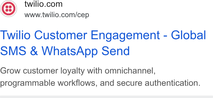 Customer engagement platformGoogle, Meta, LinkedIn · Mar 2026 – now
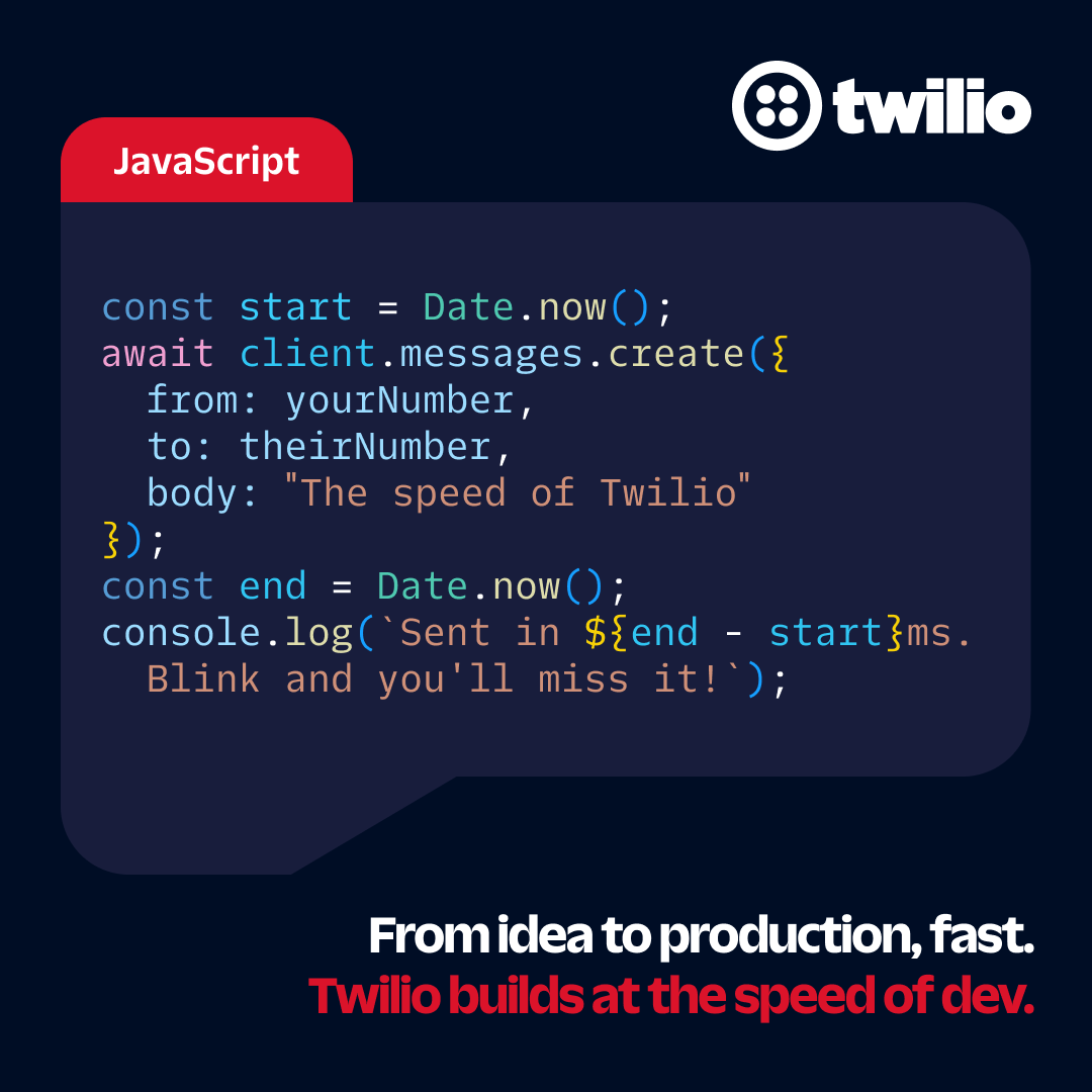 DevelopersMeta, LinkedIn · Feb 2026 – now
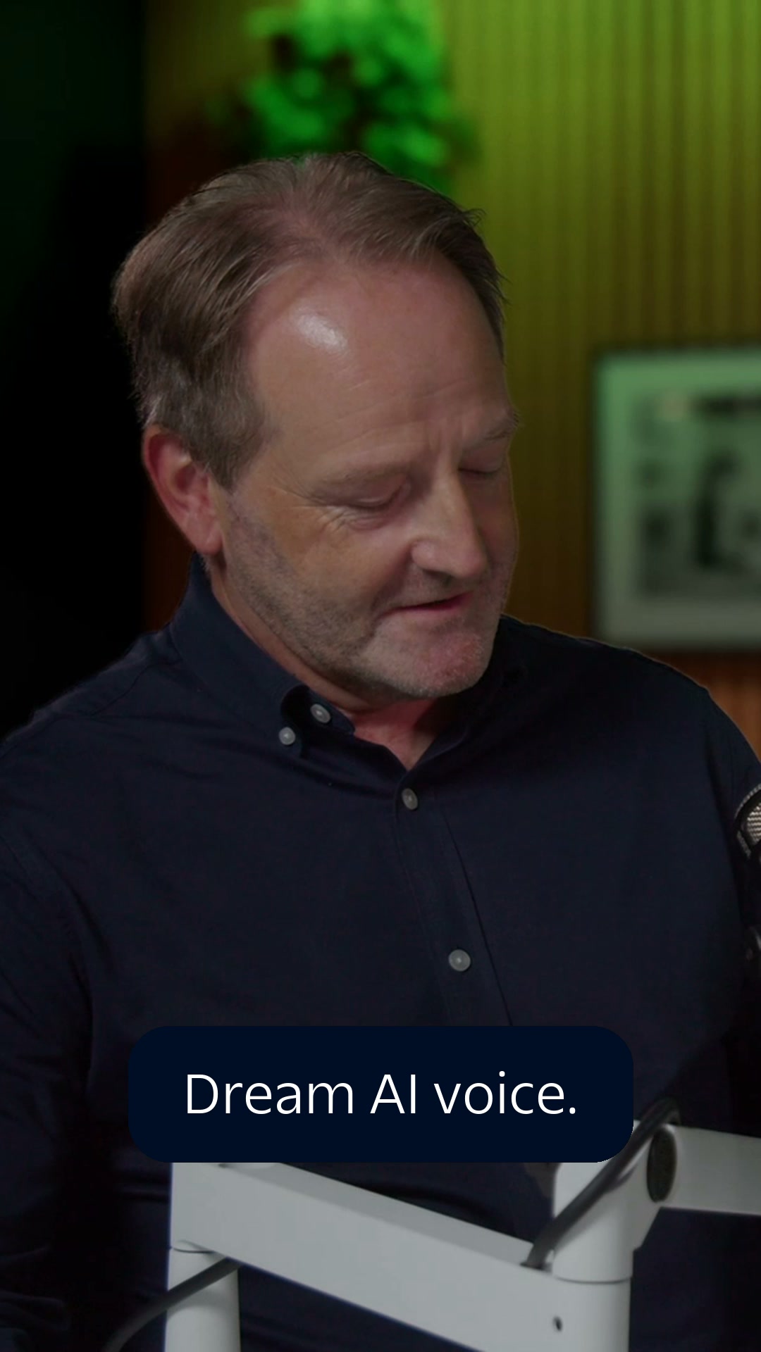 Voice Reimagined The Rise of Voice AIMeta, LinkedIn · Oct 2026 – now
Source: paste-dsys.com/foundations/colorspaste-dsys.com/foundations/typographypaste-dsys.com/foundations/illustrationspaste-dsys.com/foundations/content/product-style-guidetwilio.com/en-us
Your name and logo, Twilio’s system.
Use this kit for my brand Use this brand in Claude
Get your brand audit Put your brand in Claude What goes in a brand book
Each value is marked published, observed, our reading or our recipe, with its source. Checked 2026-10-31. Not affiliated with Twilio.