The system
Fixed, everywhere

- #141414 Space Black ground (published)
- Off White weight-300 sentence-case heads
- Purple-to-UV 45deg gradient on square mono CTAs
- Mint mono uppercase eyebrows
- Star mark + Temporal wordmark, white, top-left
- Square corners
The one thing that varies
The illustration in each section: neon block scenes, architecture diagrams, product UI or code, chosen to show that section's idea.
Every piece passes 9 checks
Dark only
Ground is Space Black #141414; no white or light backgrounds (published rule).
Logo
White (or Off White) lockup on dark, never recolored UV or gradient; capital-T clear space; never faded.
Gradient CTAs
Primary buttons are square, Noto Sans Mono, filled with the 45deg #B664FF to #444CE7 gradient.
Light heads
Heads are Aeonik weight 300 (or calibrated stand-in), sentence case, Off White; no bold heads.
Mono details
Eyebrows, buttons, tags and code are Noto Sans Mono; eyebrows uppercase mint #59FDA0.
Sourced numbers
Every number is one the site states, with its page; customer count follows the brand boilerplate (more than 4,000).
Illustration palette
Illustrations use only UV, magenta, mint and lavender blocks with grain on black, square-cornered.
Measured beats fundamentals
Where the Design fundamentals disagree with Temporal's measured styles, the measured value wins: inline links #34D399 (not #687DFF); captions/meta #92A4C3 and lead/body #CACBF9 (not #F8FAFC); body weight Aeonik 300 = Google Sans Flex 200 (not 400); section padding 64px per row band (not 144px); measured tracking 0 on heads and +0.2px on body (stand-in: minus 0.0047em; never -0.022em).
Real copy
A homepage rebuild uses the verbatim copy in the page anatomy (feature rows, use-case cards, talk cards, testimonial quotes, proof rows); never paraphrase a quote or write teaser copy in its place.
Strategy
An open-source Durable Execution platform that keeps applications and AI agents running through failures, self-hosted or on Temporal Cloud (paraphrase). Observed
Code-first Workflows
100% open source
Two hosting paths
AI infrastructure
Full spec
- For Observed
- Developers and platform engineering teams; nav targets AI and Financial Services by industry, Platform Engineering and Startups by audience (paraphrase).
- Problem Observed
- Distributed systems fail; teams write reconciliation, retry and state-machine code by hand (paraphrase).
- Mission Observed
- Join us on our mission to transform how applications are built.
Proof behind each pillar
Story Observed
Founders Samar Abbas and Maxim Fateev built Amazon SWF, Azure Durable Task Framework and Cadence at Uber before founding Temporal (paraphrase).
Values
Category. Durable Execution / workflow orchestration platform, now framed as AI infrastructure (paraphrase). Observed
Why them
- Code-first: Workflows written in the developer's own language Observed
- MIT-licensed open source Observed
- "Either way, we never see your code." Observed
Boilerplate Published
Open-source platform for building and running capable applications, from business-critical systems to long-running AI agents; Durable Execution preserves state so work survives failures; run it yourself or on Temporal Cloud (paraphrase of the published 77-word boilerplate).
Taglines
The world’s best AI runs on Temporal Observed
Build applications the way OpenAI, Lovable, Replit, Cursor, and Retool do with our open-source platform. Add agentic capabilities to any application with your framework of choice. Observed
Watch a Workflow recover from failure Observed
Write code as if failure doesn’t exist Observed
You have to see it to believe it Observed
Global enterprises and top startups choose Temporal Observed
Fully battle tested, 9 years in production Observed
Build invincible applications Observed
Build invincible apps with Temporal’s open source durable execution platform. Observed
Run Temporal reliably at any scale Observed
Life as a Temporalite Observed
Personality and voice
Developer-nativebut not CorporateObserved
Confidentbut not BoastfulObserved
Wrybut not StiffObserved
Calm about failurebut not AlarmistOur reading
Full spec
- Headlines are sentence case with no end period.
- Speaks to the developer as "you/your"; "we/our" only for the company and its SDKs.
- Names the failure first, then the fix: short lists of things that break, then what Temporal does.
- Product concepts are capitalized as proper nouns: Workflow, Activities, Durable Execution, Temporal Service, Temporal Cloud.
- Serial (Oxford) comma in lists.
- Short, dry developer jokes in card copy; contractions are normal.
- Eyebrows are short uppercase phrases set in mono above the head.
- The logo only ever appears in Space Black, Off White, or standard black and white.
- Do not use white or light backgrounds; use Space Black (developers love a good dark mode).
ConfidentDeveloper-directWryResilient
- Tone is our reading of site copy (inferred). The brand page publishes no voice attributes.
- Recurring words: durable, failure, reliable, invincible, recover, Workflow, open source, AI agents.
Logo


White horizontal lockup (star mark + wordmark) top-left in the header at 172x44; the white mark on a purple-to-UV gradient tile as favicon and OG card.
Full spec
White horizontal lockup (star mark + wordmark) top-left in the header at 172x44; the white mark on a purple-to-UV gradient tile as favicon and OG card. The brand page offers horizontal, vertical and mark-only lockups in white and black as PNG, EPS and SVG, shown on UV tiles.
- The logo only ever appears in Space Black, Off White, or standard black and white (published)
- At least a capital T’s worth of clear space around the logo (published)
- No ghosting or fading without Temporal design team approval (published)
Color
Three published colors.
Full spec
Three published colors. Space Black carries nearly the whole page; Off White is type; UV is the announcement strip and, paired with purple #B664FF, the gradient on every CTA. Lavender #CACBF9 body, Slate #92A4C3 muted, Mint #59FDA0 eyebrows, Green #34D399 links. Magenta, mint and UV meet only inside illustrations. One full-bleed spectrum image band (blue-purple-red-orange) appears twice on home.
- Our primary color, UV, should be used when possible (published)
- Do not use white or light backgrounds; use Space Black (published)
Typography
The world’s best AI runs on Temporal
Aeonik light (300) for every head at 64px desktop / 40px phone, 1.1 leading; lead copy 24/38.4 light in lavender.
Full spec
Aeonik light (300) for every head at 64px desktop / 40px phone, 1.1 leading; lead copy 24/38.4 light in lavender. Noto Sans Mono for buttons, eyebrows, code and diagram labels. No bold heads anywhere.
| Their face | Use | License | Open stand-in |
|---|---|---|---|
| Aeonik | All heads at weight 300; card heads 400 | Proprietary (Aeonik by CoType; served only as temporal.io webfonts, not on Google Fonts); open stand-in Google Sans Flex, calibrated by rendering (ink, glyph shape and line breaks) | |
| Aeonik | Body and lead at weight 300 | Proprietary; open stand-in Google Sans Flex, calibrated by rendering (ink, glyph shape and line breaks) | |
| Noto Sans Mono | Buttons, eyebrows, code, diagram labels | Open (Google Fonts) |
Graphic elements
Do #141414 ground on about 80-85% of the home page with no band color changes; 64px weight-300 Off White #F8FAFC sentence-case heads; 24px Lavender #CACBF9 lead. Published rule: no white or light backgrounds..
Space Black, all the way down · Every page ground, cards, footer
Do Square corners; linear-gradient(45deg, #B664FF 0%, #444CE7 100%); Noto Sans Mono 16px weight 500 Off White; 44px nav / 56px hero. Secondary: #141414 fill in a 2px UV-purple gradient border..
UV-purple gradient square button · Nav Try Free, hero Get Started for Free, Watch a Demo, every primary CTA
Do Noto Sans Mono 16px weight 600 uppercase #59FDA0 (12px phone), then a 64/70.4 Aeonik 300 head, left-aligned in the left half, illustration in the right half..
Mint mono eyebrow over a light giant head · Section openers on home (HOW IT WORKS, AS RELIABLE AS GRAVITY, DEPLOY IT YOUR WAY)
Do Flat rectangles in UV #444CE7, magenta #FF6BFF and mint #59FDA0 with film grain, thin #31325C grid lines, pixel smiley laptops, four-point star sparkles, white line icons inside magenta squares; square corners..
Neon block illustrations on black · Right column beside every home section
Do Full-bleed image band (customer-hype-bg.avif under noise-texture.svg): blue at left through purple and red to orange at right; centred 64px light white head with square Space Black buttons in gradient borders, or white testimonial cards with a hard black offset shadow..
Grainy spectrum band · Testimonial band and closing "Build invincible applications" CTA
Do stars.avif (contain, 0 0) + grid-perspective.avif (cover, position 0 0, blend overlay) over linear-gradient(254deg, #211B4E 27.97%, #141414 100%); 44px UV #444CE7 announcement strip above the nav; centred 64px head..
Starfield hero · Home hero (also About, Careers, Cloud heroes)
Specimens use sample copy, not Temporal’s.
Square cards with 1px #243349 borders; square gradient buttons; dashed green environment boxes and UV service boxes in diagrams; starfield and perspective-grid hero texture; film grain on gradients; white testimonial cards with hard black offset shadows on the spectrum band.
Iconography
Small duotone line icons with gradient strokes (mint/magenta/lavender) above use-case heads; outline style, round-ish joins, about 1.5-2px stroke at 24-28px (estimated from screenshot).
Illustration
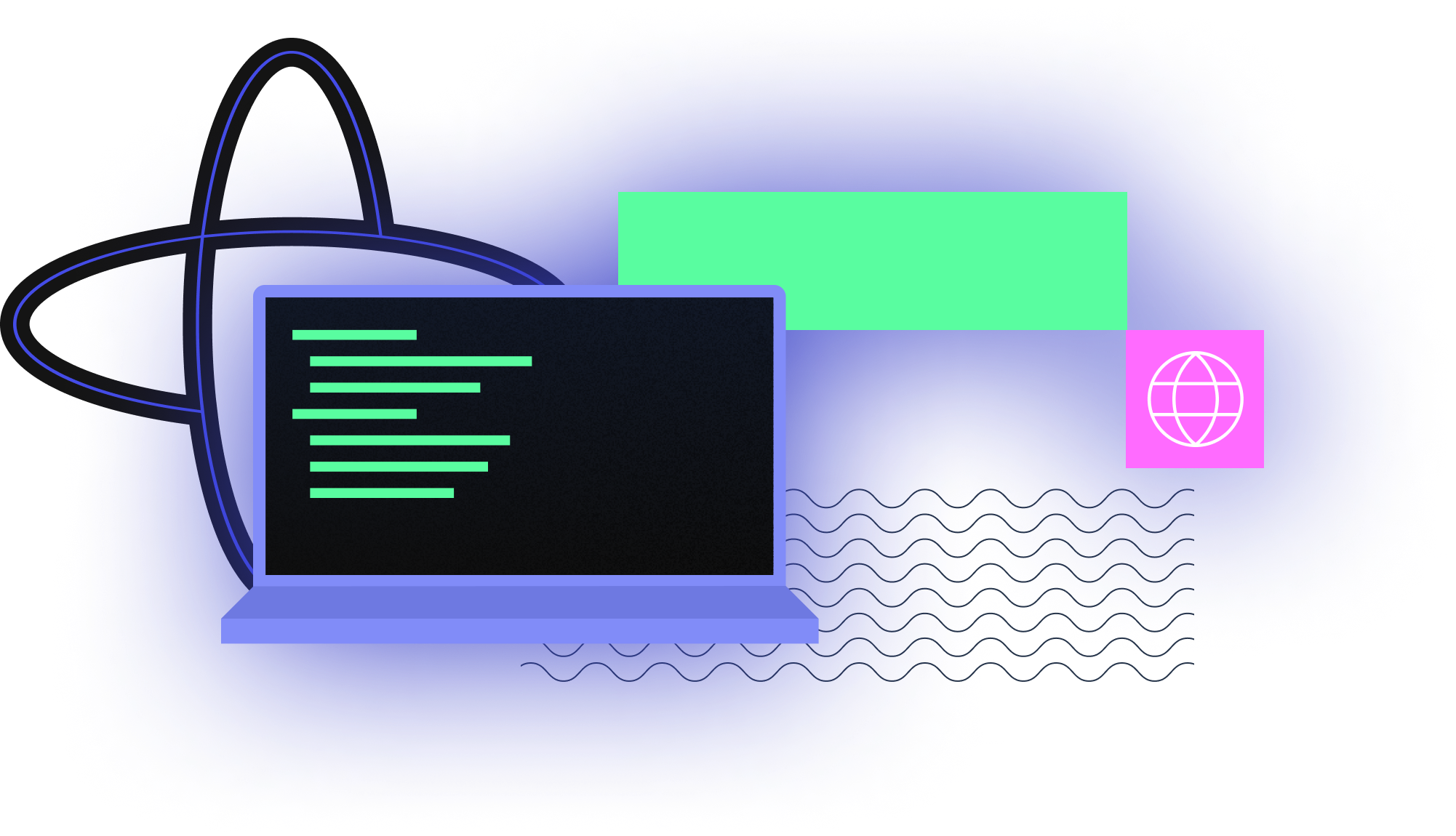
Flat geometric scenes on black: overlapping rectangles in UV, magenta and mint with grain gradients, thin navy grid lines, pixel-art smileys on laptop screens, four-point sparkles echoing the logo, a hexagon with the mark for "battle tested".




Full spec
Flat geometric scenes on black: overlapping rectangles in UV, magenta and mint with grain gradients, thin navy grid lines, pixel-art smileys on laptop screens, four-point sparkles echoing the logo, a hexagon with the mark for "battle tested". Architecture diagrams use the same palette with mono labels.
- Square-cornered blocks, no rounded blobs
- Grain on color fills
- Palette limited to UV, magenta, mint, lavender on Space Black
Photography
Sparse.

Full spec
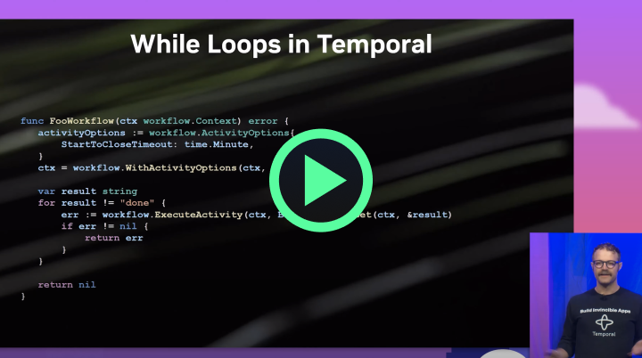
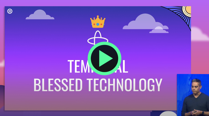
Sparse. Leadership portraits outdoors in natural light, casual shirts, waist-up (brand page); conference talk thumbnails with speakers on stage; 56px circular customer headshots on testimonial cards. Photos sit in square frames beside text, never behind it.
- Real people (founders, customer speakers), never stock
- Square frames; no text over photos
Interface & layout
The page, band by band
Announcement strip
Navigation
Hero
Logo marquee
Workflow demo
Feature rows x7
Use-case grid
Customer talks
Testimonials
Proof rows x3
Buttons
Full spec
Centred hero head; then alternating left-text / right-illustration rows on one continuous Space Black ground; a 3-column grid of square bordered use-case cards; 4 video cards; spectrum band with two testimonial cards; closing spectrum CTA; 5-column footer with uptime status and newsletter field.
Measured from temporal.io's headless Playwright computed styles and element geometry at 1440x900 and 390x844, plus hover states, on 2026-11-10.
Spacing
| Measure | Desktop | Phone |
|---|---|---|
| Page margin | 135px | 20px |
| Section padding | 64px | 20px |
| Hero text width | max 1036px, centered | full width |
| Card gap | 20px | 20px |
| Navigation | 80px | 80px |
Type, at size
Hero H1 and every section head
Aeonik · 64px (phone 40) · line 1.1 · tracking -0.3px · weight 200
Demo section H2
Aeonik · 48px (phone 32) · line 1.1 · tracking 0.25px · weight 200
Card heads (use cases, customer talks)
Aeonik · 32px (phone 26) · line 1.1 · tracking 0.17px · weight 400
Lead and body paragraphs
Aeonik · 24px (phone 18) · line 1.6 · tracking 0.09px · weight 200
Footer column heads and uptime line
Aeonik · 20px (phone 18) · line 1.25 · tracking -0.09px · weight 400
Nav links, footer links
Aeonik · 16px · line 1.5 · tracking -0.08px · weight 200
Announcement strip and utility links
Aeonik · 14px · line 1.43 · tracking -0.07px · weight 400
Copyright and legal links
Aeonik · 12px · line 1.33 · tracking -0.06px · weight 200
Section eyebrow (uppercase)
Noto Sans Mono · 16px (phone 12) · line 1.25 · weight 600
Button labels
Noto Sans Mono · 16px (phone 14) · line 1.5 · weight 500
Demo panel labels, language tabs, nav group labels
Noto Sans Mono · 14px · line 1.43 · weight 400
Footer status pill
Noto Sans Mono · 12px · line 1.25 · weight 300
- Shadow
- None on UI except the testimonial cards: white cards with a hard black offset block shadow (no blur) over the spectrum band (observed in screenshot ref/slices/home-desk-04.png).
- Density
- Generous: one idea per band, 64px light heads left-aligned beside an illustration on the right, long Space Black runs with no band color changes.
- Buttons
- Square corners (radius 0). Primary: linear-gradient(45deg, #B664FF 0%, #444CE7 100%) fill, Off White Noto Sans Mono 16px weight 500 label, 2px transparent border; 44px tall in nav (8px 16px padding), 56px in the hero (14px 24px). Secondary: Space Black fill inside a 2px UV-to-purple gradient border (Log In, closing CTA buttons), or plain mono text link (Run Locally).
Page anatomy
How Temporal’s own landing pages are built, observed on temporal.io, 2026-11-10. The full measurements are in spec.md.
- Navigation
- 80px Space Black bar, sticky at top 0: white horizontal logo left, five centred text links, then search and GitHub icons and two square mono buttons on the right.
- Hero
- Centred one-line light 64px head, a two-line lavender lead, and a gradient button plus a mono text button, on a starfield-and-perspective-grid band that glows purple top-right and green bottom-left.
- Customer logo marquee
- One row of 24px-tall white customer wordmarks scrolling left continuously, edge to edge.
- Workflow demo
- Centred 48px head and lead, then a large framed interactive demo: scenario tabs, a code panel with language tabs, a console, and an event timeline.
- Feature rows (x7)
- Seven consecutive two-column rows (seven, not six): left a 64px light head and lavender paragraphs (optionally a mint mono eyebrow above, a button or green inline links below), right an illustration. Text always left, art always right.
- Use-case card grid
- Left-aligned 64px head, then a 3x3 grid of square bordered cards, each a 32px gradient icon, a 32px head and lavender copy.
- Customer talk cards
- Left-aligned 64px head, then four equal video cards: 16:9 thumbnail with a green play button, a 32px head, and a mono "Watch ... talk" link with a UV arrow.
- Testimonial spectrum band
- Full-bleed grainy spectrum (blue, purple, red, orange) carrying two white quote cards with hard black offset shadows.
- Proof rows (x3)
- Three more text-left / art-right rows, each opened by a mint mono eyebrow.
- Closing CTA spectrum band
- Centred one-line 64px head with three square secondary buttons, on the same grainy spectrum.
- Footer
- Space Black footer: status pill and uptime line left with a newsletter field right, then five link columns, then one legal row with social icons right.
In use
Full spec
How the system carries across formats, from temporal.io and its brand page only.
Our setting for each format
| Format | Loudness | Must appear | What varies |
|---|---|---|---|
| Landing page | 44px UV #444CE7 announcement strip; #141414 header with white logo top-left, 16px nav at 60% white, gradient Try Free + gradient-border Log In; starfield hero (#211B4E-to-#141414 gradient) with centred 64px light head, 24px lavender subhead, gradient CTA + mono text link; logo marquee; alternating text/illustration rows with mint mono eyebrows; bordered square card grid; spectrum band for testimonials and the closing CTA; footer with uptime status, newsletter and 5 link columns. | ||
| Social post | Mint #59FDA0 mono tag flush to the top edge, top-left; one Aeonik-light Off White sentence-case headline, left-aligned, top-anchored; white horizontal logo bottom-left; one square mono uppercase button bottom-right; ground is the dark-violet-to-UV gradient with thin topographic contour lines and grain. | Ground variant (dark violet to UV, or lavender to Purple #B664FF); button fill (Signal yellow #FECB2F, Off White #F8FAFC or Space Black #141414, chosen for contrast); button word (READ MORE, LEARN MORE). Announcements swap the tag and button for a partner lockup and black-and-white photos (Oso card); series covers (Durable Digest) use a centred head inside a tiled block grid. | |
| Paid ad: Cloud offer | Space Black #141414 ground under a thin UV grid; white Temporal lockup top-left; light left-aligned headline in the top half with one accent phrase (magenta, lavender or mint); one product visual (code window, Cloud UI or stepped outlined server racks) anchored bottom-right and cropped by the edge; a soft UV/mint/lime corner glow. | ||
| Paid ad: guide download (EDA campaign) | Scoped to the Event-Driven Architectures guide campaign: centred logomark, centred 2-line light title, mono uppercase subline, square mono button (outlined or UV-to-purple gradient), thin corner crop marks, near-black grid with UV/mint edge glows. | ||
| Sponsorship ad: Crystal Palace series | Scoped to the Crystal Palace FC shirt sponsorship: Temporal lockup + club crest split by a hairline; light headline 'The platform behind software that never fails'; mono caps subline naming the sponsorship; small square UV-to-red gradient 'LEARN MORE' button; deep navy/magenta/red ground with either the sponsored kit photo or line-drawn eagle constellations. | ||
| Event ad: Replay 2026 series | Scoped to Replay '26 (the Replay sub-brand): black starfield with concentric rings; mono caps kicker top-centre; huge centred condensed caps headline; lime pill button; REPLAY wordmark bottom-left and lime mono 'MAY 5-7, 2026 SAN FRANCISCO, CA' bottom-right; no Temporal logo. |
Ads
 Event-Driven Architectures: A better way forwardLinkedIn
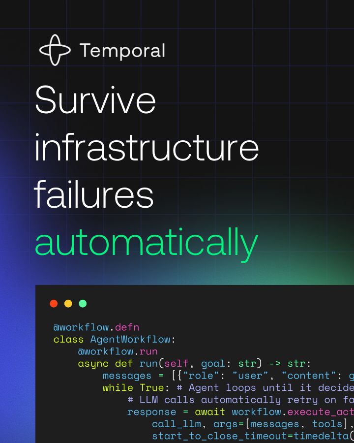 Platform engineering building reliable platform automation wLinkedIn · Sep – Nov 2026
 Guide to Modernizing Systems in Financial ServicesLinkedIn · Oct – Nov 2026
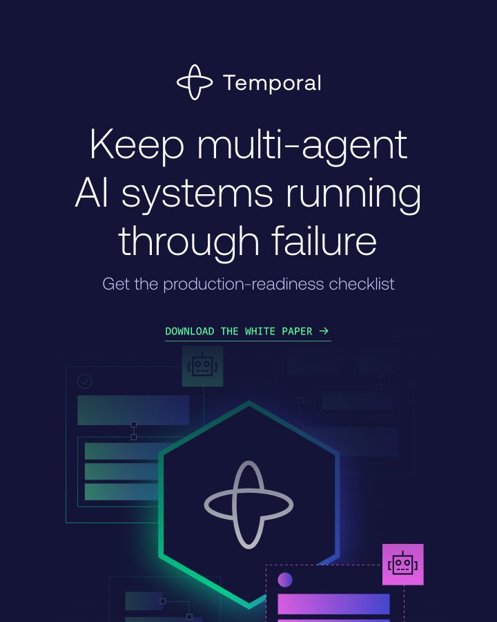 Durable orchestration for multi agent AI systemsLinkedIn · Oct – Nov 2026
- Campaign walk: fully managed in minutesad → landing page → Free sign-up
Rules
Do
Don’t
Steal this kit
Your name and logo, Temporal’s system.
Comes with you
- Color roles and how much of each
- Type pairing, with open fonts
- Voice rules the writing check enforces
- Icon, photo, illustration and motion recipes
- The strategy frame, to fill with yours
Stays yours
- Your name and logo
- Your proof: numbers, customers, quotes
- Your purpose and claims. Theirs aren’t yours to make
Talk about my brand Use this brand in Claude
Hand it to a developer
- spec.mdEvery value and rule
- tokens.cssCSS variables
- tokens.jsonDesign tokens (DTCG)
- kit.jsonWhat our engines read
Your brand next
Get your brand audit Put your brand in Claude What goes in a brand book
What Temporal doesn’t publish
- The brand page mentions "brand guidelines" but links no guidelines document; only logo files, three colors, boilerplate, portraits and two short rule lists are published.
- No published secondary palette: purple #B664FF, mint, magenta, lavender and slate are observed only.
- No published voice attributes, banned words or naming rules beyond the logo/color rules.
- Customer count conflicts: brand boilerplate says more than 4,000; About says 2,900+.
- Leadership portraits zip (temporal-leadership.zip) not downloaded; only the founders photo shown on the brand page was saved.
- Deck: no deck or presentation examples on the site.
- Email: no email or newsletter examples visible (newsletter signup only).
- Icon stroke weight estimated from screenshots, not measured.
- Aeonik is proprietary: the stand-in Google Sans Flex is calibrated by ink, glyph overlap and exact line breaks, not a licensed match.
- Nav dropdown panel fill and the active-trigger underline color were read from a screenshot only; not measured.
- Focus, active and disabled button states were not measured; only hover was exercised.
- No public postal address or phone number appears on the home page or its footer.
- The GitHub stars count (24,310 on 2026-11-10) and the system-status label (PARTIALLY DEGRADED SERVICE at capture) are live values that change.
- Social post: Temporal's Instagram and X posts were not checked (this run uses no logins, and linkedin.com is off-limits). The social anatomy comes from 6 of Temporal's own og:image share cards (1200x628) found on temporal.io blog posts; the 1080 square canvas is derived from them.
- Social post, portrait (1080x1350): no portrait posts observed, so no portrait row.
- Share-card headline size and the contour-line opacity are estimated from pixels (cap height 62px, line pitch 103px at 1200; line brightness about 114 on a ground of about 32), not read from a source file.
- DNA: spectrum band gradient stops and the gradient-border width on secondary buttons were read from screenshots, not measured.
- Library: Temporal publishes no product device shots or lifestyle photography of people at work, and only two real product UI screens (Web UI workflow list and detail); no standalone pattern files beyond card gradients and share-card backgrounds; photography is events (Replay) and team culture only. Leave device/office/customer-at-work photo slots out rather than draw them.
- measure/*.json found 0 bands (its detector did not match the Svelte DOM); the page anatomy was measured with a separate headless Playwright probe at 1440 and 390 on 2026-11-10.
- Workflow-demo bar lengths at rest (Workflow Running about 60px, send_email about 45px) and the progress-fill length (about 100px) are read from the reference screenshot of an animation frame; they change as the run plays.
Each value is marked published, observed, our reading or our recipe, with its source. Checked 2026-11-10. Not affiliated with Temporal.