Just Postgres
Every project is a full Postgres database: portable, extensible, with Row Level Security built in. Observed
Brand book
A developer tool that shows its work. Supabase keeps everything neutral and technical (hairlines, line drawings, real code) so the single green reads as 'live', and its copy says exactly what happens. Our reading

Light or dark: the site follows the visitor's system theme and both are first-class. The guide sets no level of color; customer story cards may take the customer's own colors.
Our engine's setting, built from their rules.
Cover the bolt. It should still read as Supabase: near-white or near-black grays, one green, Manrope two-tone headlines, hairline cards, gray line drawings with green dots, and real code.
Put another backend vendor's logo on it. If the green-as-live-signal, the code-as-image and the plain, specific copy wouldn't look out of place, it's generic and goes back.
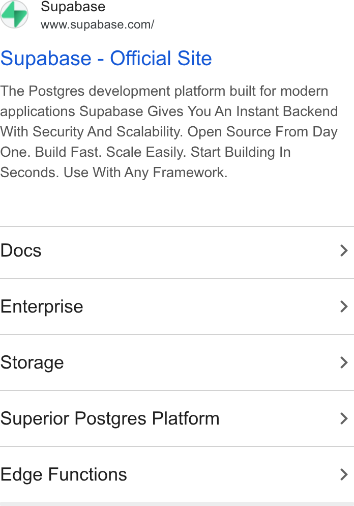
The Postgres development platform: start with a Postgres database and add Auth, Data APIs, Edge Functions, Realtime, Storage and Vector. Observed
Every project is a full Postgres database: portable, extensible, with Row Level Security built in. Observed
Auth, Data APIs, Edge Functions, Realtime, Storage and Vector, each best of breed, integrated as one platform. Observed
Start fast, and the same stack carries you to scale. Observed
Built in the open, never locked in, and you can self-host. Observed
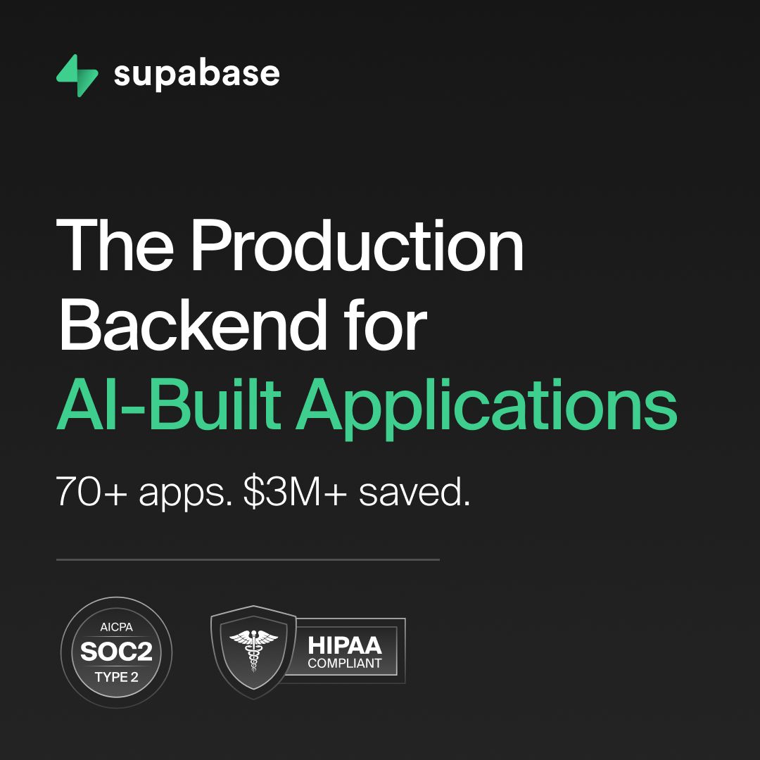
Security and compliance credentials for regulated and enterprise work. Our reading
Supabase is an open source company, built in the open on Postgres and existing open source tools, which it sponsors. It is fully remote, with a strong affinity for open source maintainers and ex-founders, and describes itself as one of the world's fastest growing open source developer communities.
Great developer tools should be transparent, inspectable and owned by the community (paraphrase of the homepage open source band).
ObservedRead, contribute, self-host; every project is portable Postgres (paraphrase).
ObservedCopy and UI help developers complete tasks quickly (paraphrase).
PublishedCategory. Postgres development platform (backend as a service on Postgres); press has called it the open source Firebase alternative Observed
Firebase (the footer offers 'Switch from Firebase').Neon (the footer offers 'Switch from Neon').MongoDB (a homepage story migrates off it).
Supabase is the Postgres development platform: every project is a full Postgres database with Authentication, instant Data APIs, Edge Functions, Realtime, Storage and Vector embeddings. It is built in the open, and developers can self-host it.
Build in a weekend, scale to millions Observed
The Postgres Development Platform Observed
Use one or all. Best of breed products. Integrated as a platform. Observed
The homepage runs one promise ('Build in a weekend, scale to millions') and lets the product grid, real code and named customer stories carry the proof. Claims are short and concrete; the community quote wall does the enthusiasm the house copy avoids.
Source: supabase.comsupabase.com/companysupabase.com/open-source
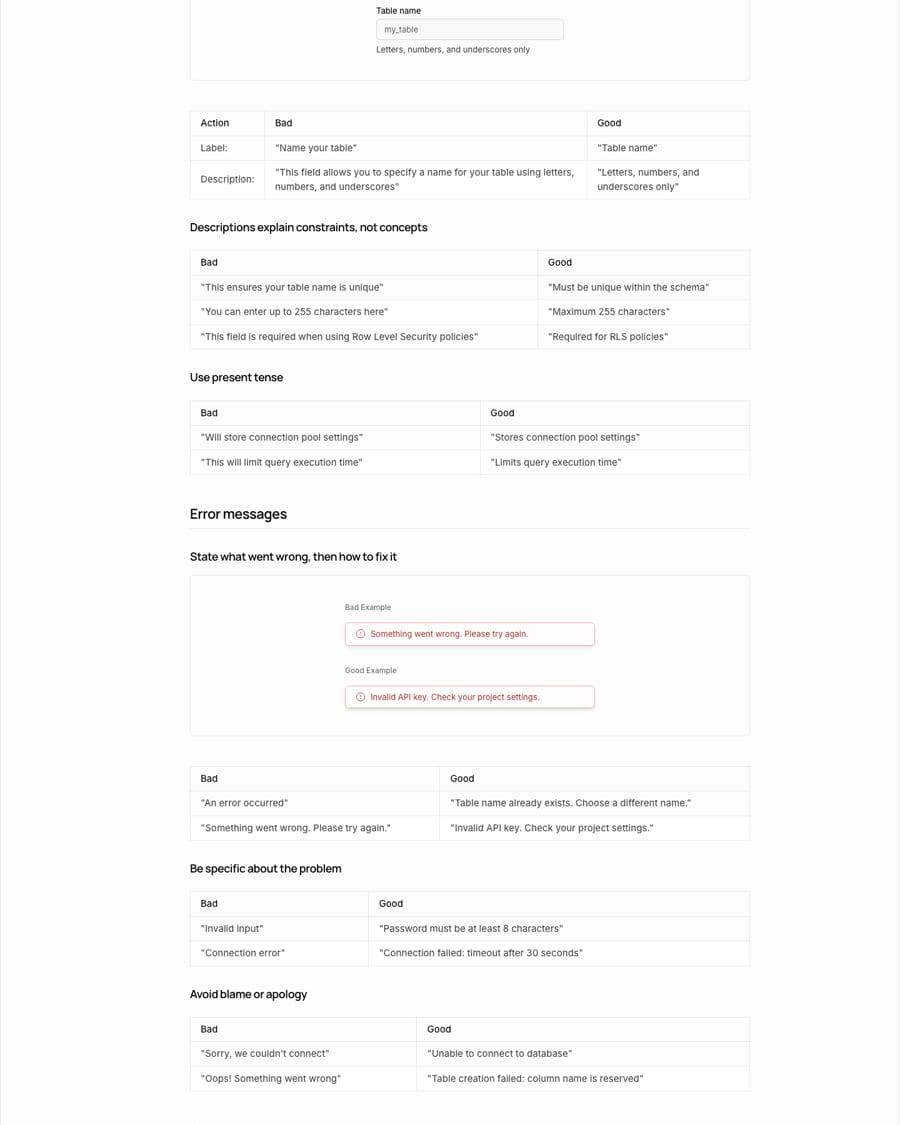
Invalid API key. Check your project settings.
Oops! Something went wrong.
Copy that tells a developer exactly what happened and what to do next is the fastest UI there is.
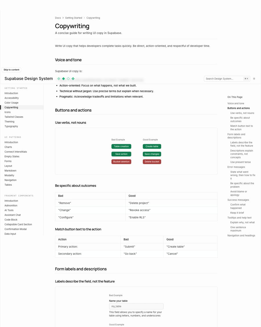
DirectAction-orientedTechnical without jargonPragmatic
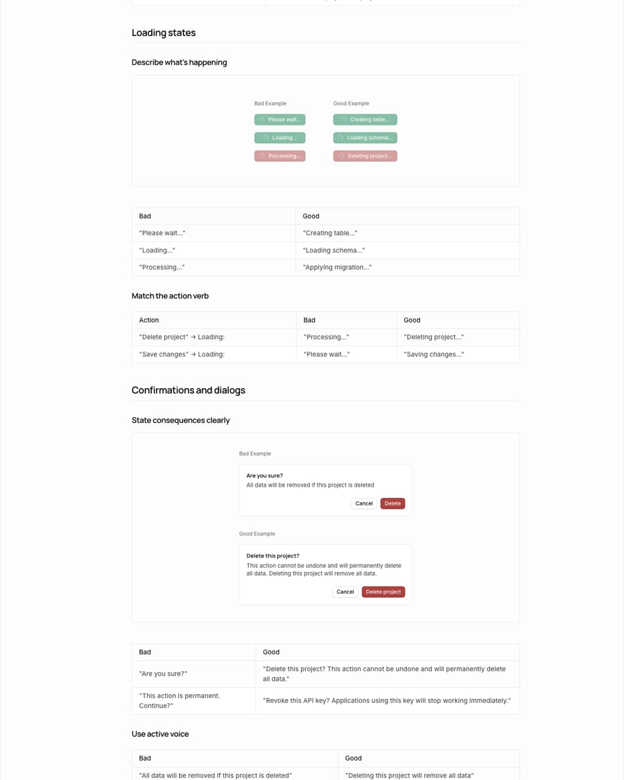
Supabase publishes a concise UI copywriting guide: four tone traits, then bad/good pairs for buttons, labels, errors, success, tooltips, headings, empty and loading states, confirmations, and a short banned list (easily, simply, powerful, vague verbs). It ends with a six-question checklist.
PostgresDatabaseAuthEdge FunctionsRealtimeStorageVectorData APIsRLS
SupaBaseSupa BasePostgreSQL (say Postgres)easily / simply / powerful (UI copy)Sorry / OopsSubmit (as a button label)italics for emphasis
Source: supabase.com/design-system/docs/copywritingsupabase.com
| Tone | Direct, action-oriented, technical without jargon, pragmatic |
|---|---|
| Case | sentence; title case for nav page names |
| Auth words | Sign in, Sign out, Sign up |
| Product names | Database, Auth, Storage, Edge Functions, Realtime, Vector |
| Formatting | inline code for technical terms; bold sparingly; no italics |
| Checklist | action verb, specific, completable, no marketing, sentence case, one sentence |
Source: supabase.com/design-system/docs/copywritingsupabase.com/design-system/docs/accessibilitysupabase.com/brand-assets


Official files from supabase.com/brand-assets (and the Connect Supabase buttons from Supabase's own storage), downloaded 2026-10-30. All use explicit hex fills (no currentColor); the one-color black file uses the SVG default black. Supabase and the Supabase logo are trademarks of Supabase Inc.; use them only to refer to Supabase. Shown for reference. Not affiliated.
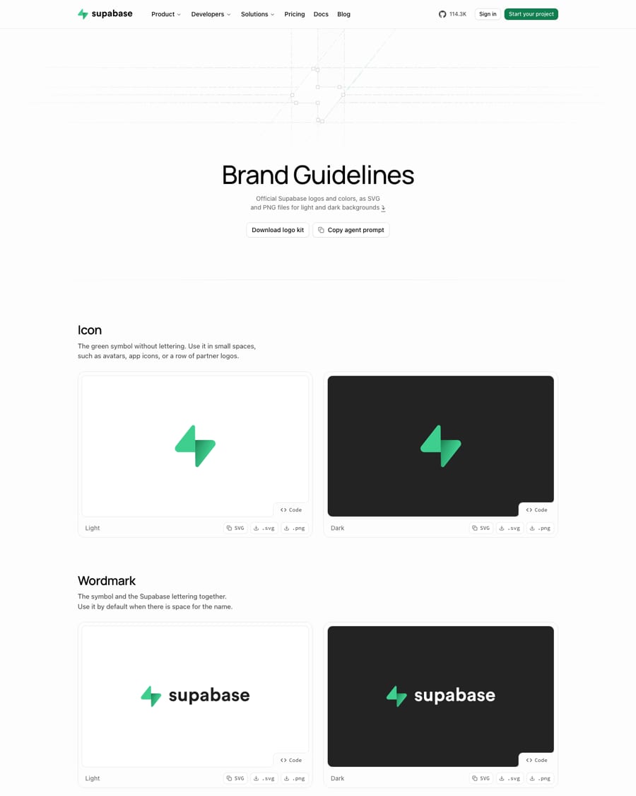
A bolt for speed in Supabase green, shipped as ready files with copy-paste code, so nobody has to rebuild or recolor it.
| Lockups | Icon; Wordmark (light, dark); One-color wordmark (black, white) |
|---|---|
| Embed size (brand page code) | Icon 23x24; Wordmark 124x24; one-color 123x24; Connect button 156x31 |
| Clear space | not published |
| Minimum size | not published |
| Colors | #3ECF8E symbol with a #249361 gradient; #1F1F1F or white lettering |
Two marks: the Icon (the green lightning-bolt symbol alone) and the Wordmark (symbol plus lowercase supabase lettering), each in a green version for light and dark grounds, and a one-color wordmark in black or white. Every wordmark file includes the symbol; there is no lettering-only file. All files have transparent backgrounds and already carry the logo colors.
Not published: clear space; minimum size; placement; co-branding lockup.
Start your project
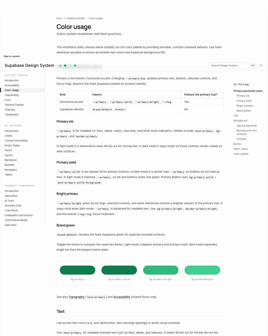
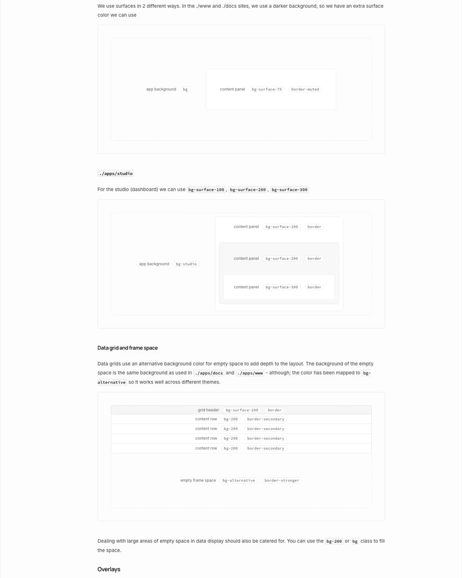
Neutral grounds make the one green unmistakable; separating identity green from text green keeps it accessible.
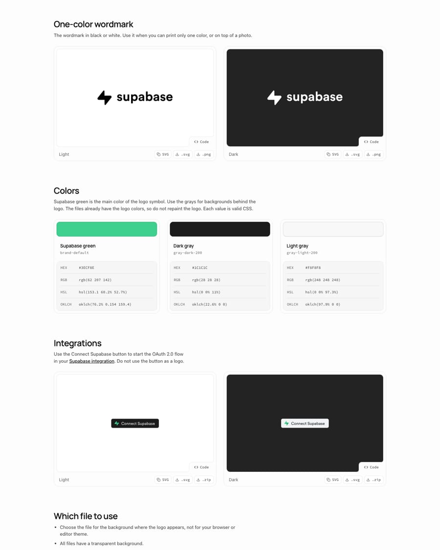
| Supabase green | #3ECF8E brand-default |
|---|---|
| Dark gray | #1C1C1C gray-dark-200 |
| Light gray | #F8F8F8 gray-light-200 |
| Primary (light) | oklch(0.525 0.12 157.5) = #0E7E4E |
| Proportions | not published |
The brand page publishes three colors with HEX, RGB, HSL and OKLCH: Supabase green #3ECF8E (the logo symbol), Dark gray #1C1C1C and Light gray #F8F8F8 (backgrounds behind the logo). The design system splits green in two: a fixed brand green for identity, and a functional primary that darkens in light mode for readable text and buttons. Everything else is neutral grays plus sparing destructive and warning accents.
Not published: color proportions or ratios; a marketing palette beyond the three logo colors.
Source: supabase.com/brand-assetssupabase.com/design-system/docs/color-usagesupabase.com/design-system/docs/tailwind-classessupabase.com/%20homepage%20stylesheet%20(frontend-assets.supabase.com/www/.../_next/static/css,%20fetched%202026-10-30)
Build in a weekend, scale to millions
A friendly geometric display over a neutral workhorse sans, with code as a third voice: approachable, but plainly a developer tool.
| Their face | Use | License | Open stand-in |
|---|---|---|---|
| Manrope | Headlines and card titles: 500 hero, 600 sections, sentence case, normal tracking | Open (SIL OFL 1.1), Google Fonts | none The real face is open and ships in the fonts folder; no stand-in needed. |
| Inter | Body, nav, buttons, forms; weight 450 on the variable axis | Open (SIL OFL 1.1) | none Real face, open. |
| Source Code Pro | Code, commands, token values, uppercase meta labels | Open (SIL OFL 1.1), Adobe | none Real face, open. |
| Display | Manrope 500 (hero 46px/1.0), 600 (section 34px/1.11) |
|---|---|
| Body | Inter 450, 16/24 lead, 14 card copy |
| Mono | Source Code Pro |
| UI scale (typography.css) | h1 text-2xl tracking-tight; h2 text-xl; h3 text-base; h4 text-sm medium; meta text-xs mono uppercase tracking-wider |
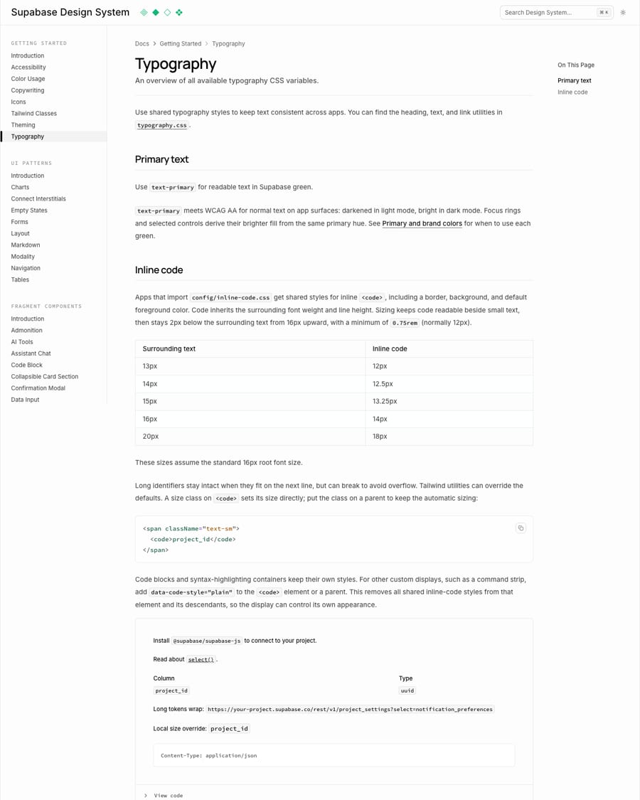
| Inline code | 13>12, 14>12.5, 15>13.25, 16>14, 20>18 px |
| Licences | all SIL OFL 1.1 |
Three open faces, all from the site CSS: Manrope for headings (--font-heading), Inter for body and UI (--font-sans) and Source Code Pro for code and meta labels (--font-mono). Headlines are medium weight (500 hero, 600 section), sentence case, normal tracking; body is Inter at 450 on the variable axis. The design system's typography.css maps h1 to text-2xl tracking-tight, h2 text-xl, h3 text-base, h4/h5 text-sm medium, and a mono uppercase meta style.
Source: supabase.com/design-system/docs/typographygithub.com/supabase/supabase/blob/master/packages/config/typography.csssupabase.com/%20homepage%20stylesheet%20(frontend-assets.supabase.com/www/.../_next/static/css,%20fetched%202026-10-30)supabase.com
Build in a weekend Scale to millions
Build in a weekend Scale to millions
Two-tone headline · hero and every section H2 on the homepage and the brand page's closing band
Use one or all. Best of breed products.
Use one or all. Best of breed products.
Dark words inside muted copy · product cards and the 'Use one or all.' line
Storage
Storage
Hairline product bento · the product grid below the hero, template cards, the logo wall
$ supabase functions deploy
$ supabase functions deploy
Code and terminal as the picture · Edge Functions card, 'Use Supabase with React' sample, mono labels
Specimens use sample copy, not Supabase’s.
Engineering drawings and real code say 'tool for builders'; green dots make the brand appear only where something is live.
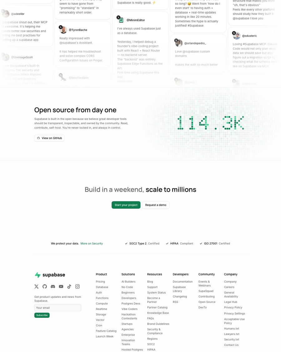
| Card | near-white, 1px hairline border, 16px radius |
|---|---|
| Illustration | gray linework, green dots |
| Code chip | rounded, mono, green command |
| Dot matrix | green squares spelling the GitHub star count |
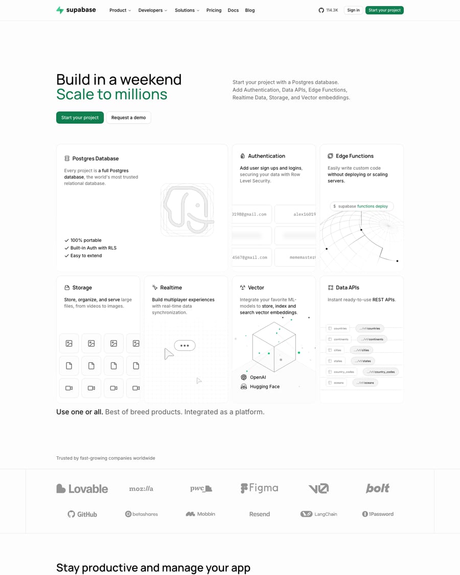
Recognizable without the logo: a near-white page of hairline-bordered cards, thin grayscale line drawings with a few green dots, real code in Source Code Pro, two-tone Manrope headlines, and a GitHub star counter drawn as a green dot matrix.
Source: supabase.com
Plain outline icons that inherit text color keep the UI quiet and consistent; the text does the work.
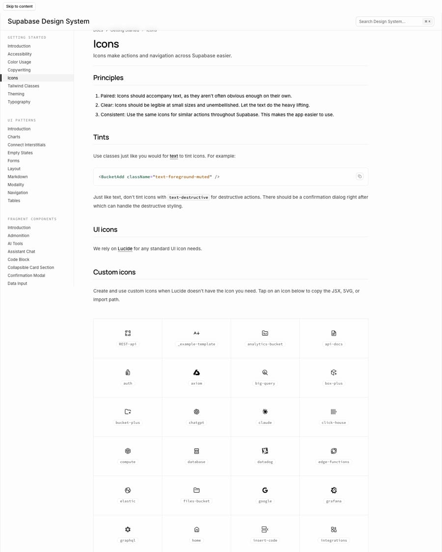
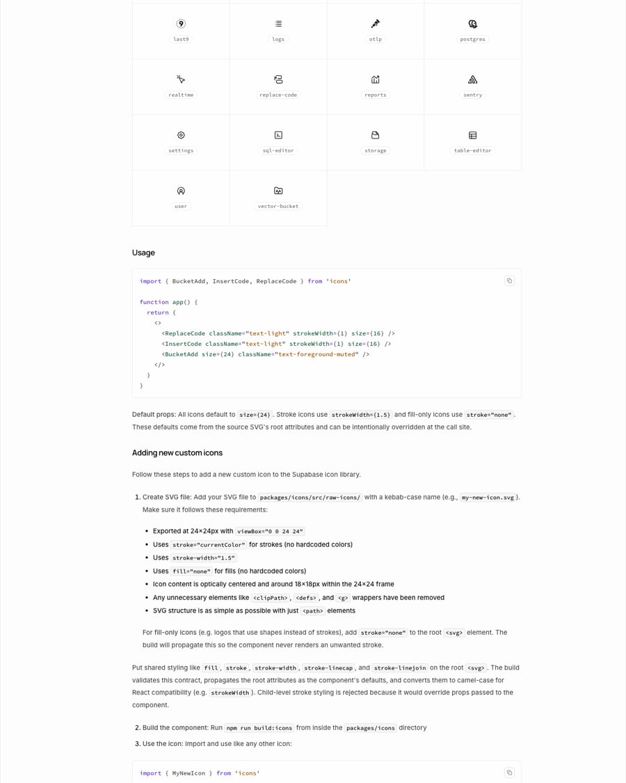
| Library | Lucide + custom set |
|---|---|
| Frame | 24x24, content ~18x18 |
| Stroke | 1.5 default; 1 at 16px in usage |
| Caps/joins | round |
| Color | currentColor |
| Labels | aria-label for meaningful icons, aria-hidden for decorative |
Lucide for every standard UI icon; a small custom set (database, auth, storage, edge functions, realtime, vector, buckets, integrations) for what Lucide lacks. Icons are 24x24 with about 18x18 of content, 1.5 stroke, round caps and joins, currentColor only, built from plain paths.
Source: supabase.com/design-system/docs/iconssupabase.com/design-system/docs/accessibility
It explains the product mechanically, the way an engineer would sketch it.
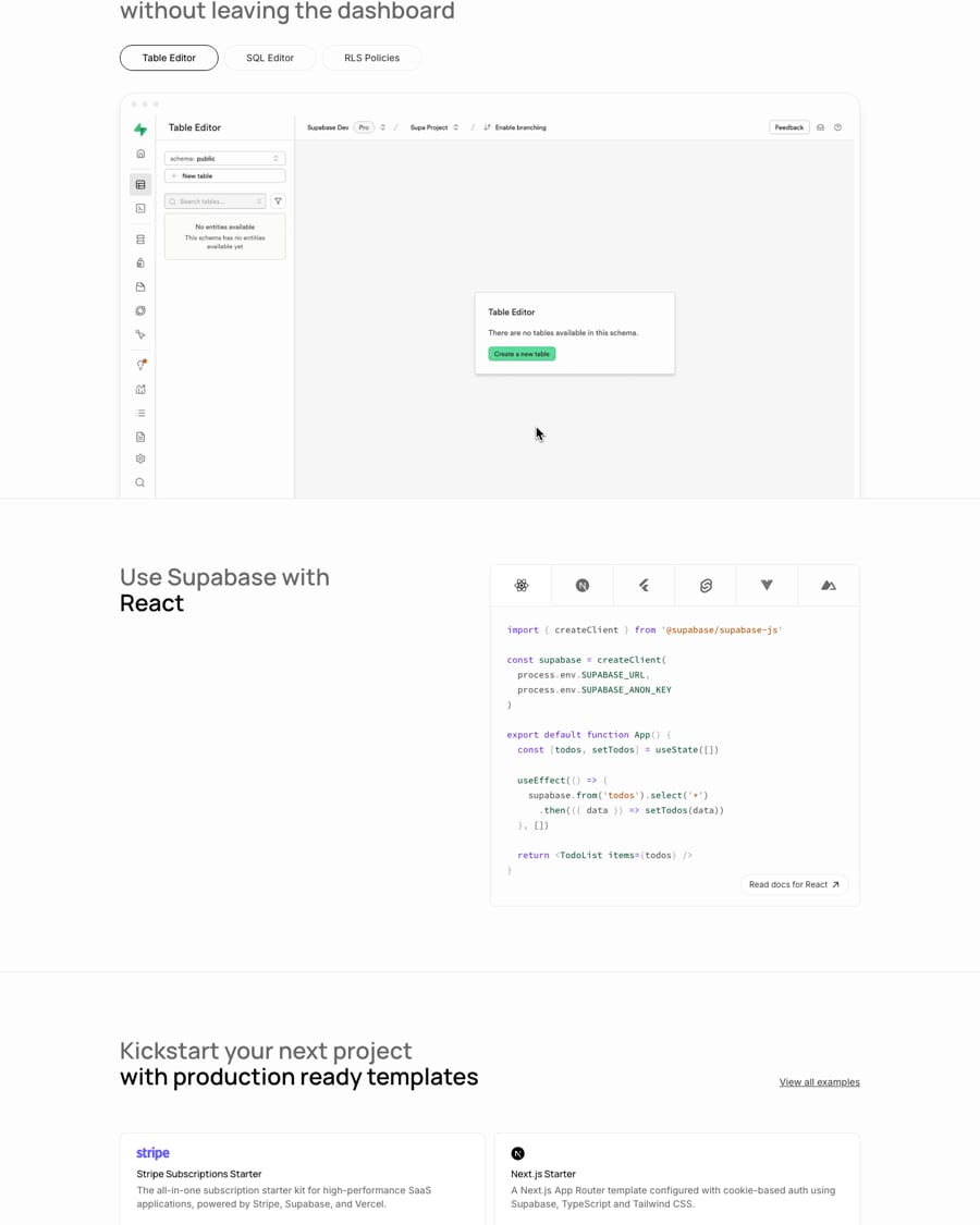
| Guideline | not published (observed) |
|---|---|
| Line | thin gray |
| Accent | green dots |
No published illustration guideline. On the homepage, illustration is technical line drawing: a Postgres elephant outline, a wireframe globe for Edge Functions, a cube of vector points, table-to-endpoint diagrams for Data APIs, all in gray hairlines with green dots, plus faithful product UI screenshots (Table Editor).
Source: supabase.com
The product and the community are the picture.
| Guideline | not published |
|---|---|
| Use | avatars only (observed) |
Supabase uses almost no photography: small circular avatars on community posts and customer quotes. The brand page notes the one-color wordmark is for use over a photo. No photo guideline is published.
Marketing pages sit in a centered column on a near-white ground with sections separated by full-width hairlines; a sticky top nav with the wordmark left and Sign in / Start your project right; a security strip and a dense multi-column footer close every page. The design system's layout page is for the Studio app: PageContainer widths small, default and full, breadcrumbs first, actions where the user is looking.
Measured from supabase.com/brand-assets's Supabase publishes no PDF guide. Read from supabase.com/brand-assets (logos, 3 colors, name and usage rules), the design system docs at supabase.com/design-system/docs (color usage, typography, icons, copywriting, accessibility, theming, Tailwind classes, layout pattern), the homepage stylesheet's theme tokens, packages/config/typography.css on GitHub, and the homepage and company pages, all fetched 2026-10-30..
| Measure | Desktop | Phone |
|---|---|---|
| Page margin | 176px | 24px |
| Section padding | 96px | 64px |
| Card gap | 12px | 12px |
| Navigation | 65px | 65px |
Hero H1
Inter · 46px (phone 34) · line 46px · weight 500
Section H2/H3 (two-tone)
Inter · 34px (phone 22) · line 37.78px · weight 600
Story quote
Inter · 22px (phone 18) · line 30.25px · weight 450
Bento closing line
Inter · 22px (phone 18) · line 29.33px · tracking -0.16px · weight 450
Card title
Inter · 16px · line 24px · weight 600
Footer column heading
Inter · 15px · line 22.5px · weight 600
Template title
Inter · 14px · line 20px · weight 500
Hero lead / community lead
Inter · 16px · line 24px · weight 450
Tweet text
Inter · 15px · line 22.5px · weight 450
Body / card copy / links
Inter · 14px · line 20px · weight 450
Button label (38px buttons)
Inter · 14px (phone 15) · line 20px · weight 500
Nav item
Inter · 14px (phone 15) · line 16px · weight 500
Small button / pill / caption
Inter · 12px · line 16px · weight 500
Code
Inter · 13px · line 22.1px · weight 500
Menu eyebrow
Inter · 12px · line 16px · weight 400
One or two sentences on what this does for the reader.
One or two sentences on what this does for the reader.
Card: 10.67px corners on the surface band, 12px apart.
How Supabase’s own landing pages are built, observed on supabase.com, 2026-10-30. The full measurements are in spec.md.
Source: supabase.com/design-system/docs/ui-patterns/layoutsupabase.com
How our engine applies Supabase's system to each format. This is our recipe built from their published rules and homepage, not something Supabase publishes. Level = how much green and illustration a format carries (0 neutral, 5 heavy).
| Format | What they did | Source |
|---|---|---|
| Integration button | Connect Supabase button (dark and light) for starting the OAuth 2.0 flow in third-party integrations, 156x31 | supabase.com/brand-assets%20(Integrations) |
| Product UI | Studio pages built from PageContainer, breadcrumbs, PageHeader and PageSection, sized small/default/full | supabase.com/design-system/docs/ui-patterns/layout |
| Format | Loudness | Must appear | What varies |
|---|---|---|---|
| Landing page | Build it per kit.spec.page (light theme): #FDFDFD page and sticky 65px nav (wordmark, 6 nav items, 26px Sign in + green Start your project); Manrope 46/46 hero in two lines (ink + #0E7E4E) with a muted 16px Inter lead bottom-aligned at right and a 38px primary + secondary pair; a 12-column bento of #FFFFFF product cards (gradient hairline border, radius 16px, grey line illustrations); grey logo wall in a hairline band; two-tone Manrope 34px section headings (muted setup, ink payoff); real code in Source Code Pro 13px; story accordion; tweet wall; one-line two-tone closing CTA; light footer with security strip. Sections separated by full-bleed rgba(3,3,3,0.08) hairlines, not ground changes. Homepage voice for headlines and card copy; product-UI copywriting rules for every UI string | which product cards and sections; dark theme (#1C1C1C/#141414 grounds, #3ECF8E as the green) when the page is for a dark context | |
| Deck | Wordmark top left, Manrope sentence-case headlines in two tones, Inter body, hairline frames, real code or product UI as visuals | light or dark ground | |
| Proposal page | Near-white, Inter body, Manrope headings, one green CTA, proof as named customers and numbers | a code sample when the buyer is technical | |
| Social post | Dark gray or near-white ground, one green, a Manrope two-tone line, a real snippet or line drawing | dark or light | |
| Plain, sentence case, specific subject and CTA verb, wordmark at top | one green button | ||
| Error message | What went wrong, then how to fix it; no apology, no exclamation | inline code for the technical term |
Source: supabase.com/brand-assetssupabase.com/design-system/docs/copywritingsupabase.com/design-system/docs/color-usagesupabase.com/design-system/docs/accessibilitysupabase.com/terms
Your name and logo, Supabase’s system.
Use this kit for my brand Use this brand in Claude
Get your brand audit Put your brand in Claude What goes in a brand book
Each value is marked published, observed, our reading or our recipe, with its source. Checked 2026-10-30. Not affiliated with Supabase.