Financial infrastructure for growth
(paraphrase) one platform to accept payments, run billing and banking, and build custom revenue models at any scale Observed
Brand book
Stripe looks like precise engineering with a sense of wonder: quiet, light type and hairline structure signal infrastructure you can trust, while the luminous wave and real UI signal ambition and craft. Our reading

the artwork inside each section: the gradient wave, product UI on pastel gradients, particle/data-viz fields, or customer photography
approximate, from band heights at 1440 in measure/home-desk.json; blurple under 2%.
Our engine's setting, built from their rules.
#533AFD appears only on buttons, links and the favicon; button labels white on blurple; no blurple grounds.
Headings are Söhne (or the stand-in) weight 300, sentence case, negative tracking; nothing heavier than 400.
Section headings pair a slate claim with a #64748D (or #839BC8 on navy) continuation in the same size.
Structure is 1px #E5EDF5 guide lines and dividers; shadows only under floating product UI.
Slate or blurple on light, white on dark, unaltered, never with ™/® or merged with other marks.
Imagery is the gradient wave, real Stripe UI or framed customer photography; no stock illustration.
Every number matches a Stripe page and carries its year ($1.9T in 2025); banking mentions keep the not-a-bank footnote.
Financial infrastructure to grow your revenue. Observed
(paraphrase) one platform to accept payments, run billing and banking, and build custom revenue models at any scale Observed
(paraphrase) consistent speed and uptime even at peak traffic Observed
(paraphrase) APIs, SDKs, docs, an MCP server and AI developer tools, plus no-code and pre-integrated paths Observed
(paraphrase) used by half the Fortune 100 and most of the Forbes AI 50 Observed
(paraphrase) Stripe builds programmable financial infrastructure, rethinking from first principles how financial services work so any business can start and scale more easily and cheaply; it reinvests heavily in its technology, ships upgrades daily, and publishes ideas (Stripe Press) it thinks advance economic and technological progress.
Category. (paraphrase) financial services platform / economic infrastructure for the internet, now framed as 'the economic infrastructure for AI' Observed
(paraphrase) Stripe is a technology company that builds economic infrastructure for the internet. Businesses of every size, from new startups to public companies, use its software to accept payments and manage their businesses online. Dual headquarters in San Francisco and Dublin, with offices in London, Paris, Singapore, Tokyo and elsewhere.
Financial infrastructure to grow your revenue. Observed
Financial infrastructure to grow your revenue. Accept payments, handle business banking, and implement custom revenue models—from your first transaction to your billionth. Observed
Flexible solutions for every business model. Observed
The backbone of global commerce Observed
Building the economic infrastructure for AI Observed
Reliable, extensible infrastructure for every stack. Observed
Ready to get started? Observed
Our mission is to increase the GDP of the internet Observed
Implement the conditions for prosperity Observed
We obsess over payments so our customers don’t have to Observed
Ideas for progress Observed
precisecalmambitiousplain-spoken
infrastructuregrowglobalbuildplatformscalerevenue
Source: stripe.comstripe.com/newsroom/informationstripe.com/customers


The newsroom (stripe.com/press redirects there; stripe.com/newsroom/brand-assets redirects to /newsroom/information) is the brand page: it ships a logo kit (wordmark in slate, blurple, white as SVG and PNG), Powered by Stripe badges and leadership photos, with one colour rule, and points to the Marks Usage Terms (stripe.com/legal/marks) for do's and don'ts. No clear-space or minimum-size rule is published.
(our reading) a sturdy, low-contrast wordmark that reads as dependable and lets the page's light type breathe
Lowercase bold 'stripe' wordmark with a slanted cut on the 'i'/'p'. Slate in the homepage nav (60x25 SVG, fill var(--hds-color-text-solid)); white on imagery and the OG share card; blurple in the kit. The mark alone (white slanted bar on a blurple rounded square) is used only as the favicon/app icon.
Source: stripe.com/newsroom/informationstripe.com/legal/marksstripe.com
(our reading) a cool, near-monochrome system so the single action colour and the artwork carry all the energy
White page, slate #061B31 headings with #64748D second beats, #50617A body, #E5EDF5 hairlines. Blurple #533AFD lives only in buttons, links and the favicon. One navy #0D1738 band for developers (and the announcement bar), an indigo time-of-day gradient stats band, and a #F8FAFD footer zone. Saturated orange/pink/violet appears only inside artwork (the wave, bento gradients).
Source: stripe.com
Financial infrastructure to grow your revenue.
(our reading) a light grotesk at large sizes reads as refined and technical
| Their face | Use | License | Open stand-in |
|---|---|---|---|
| Söhne | commercial (Klim Type Foundry); not open. Stand-in: Geist 420 (calibrated, kit.typography.display.calibration.remeasure). Inter is not used. | ||
| Söhne | commercial; not open | ||
| Source Code Pro | open (OFL) |
Söhne variable (sohne-var) everywhere. Display weight 300: 56/57.7 (-1.4px) stats, 48/55.2 (-0.96px) hero, 32/35.2 (-0.64px) every section H2, 26/29.12 (-0.26px) every H3 (split headers, bento titles, developer sub-heads), 22/24.2 card and news titles; phone 34/35, 22/26.4 H2, 20/24 H3. Body 300: 18/25.2 leads, 16/22.4 body, 14/19.6 nav and notes; 400 for buttons, nav, lead-ins and footer headings.
Source: stripe.com
Do #533AFD fill with white 16px weight-400 label, 4px radius, 48px tall, 24px side padding and a small chevron; outline variant = transparent with 1px #B9B9F9 border and #533AFD label.
Blurple is the only action colour · every primary button, secondary button labels/borders, text links, the favicon square
Do sohne-var weight 300, sentence case, tight negative tracking (-0.02em at 48px); first sentence #061B31, continuation in #64748D (or #839BC8 on navy) at the same size; hero 48/55.2 at 1440, 34/35 on phone.
Light Söhne headlines in two beats · hero H1 and every section H2
Do silky, fine-striated ribbon of orange #FF6118 > magenta/pink > violet > periwinkle on white; behind the hero it sits under the headline and tints the second clause through a hard-light blended copy of the H1.
The flowing gradient wave · hero (right two-thirds, bleeding off the top/right edge), OG share card, Sessions banner, platform graphic, developer wave
Do white page with 1px #E5EDF5 vertical guide lines at the content edges (1232px content at 1440, 104px inset) and horizontal #E5EDF5 dividers between sections; cards are white with a 1px #E5EDF5 border and 6px radius.
Hairline page frame on white · whole homepage
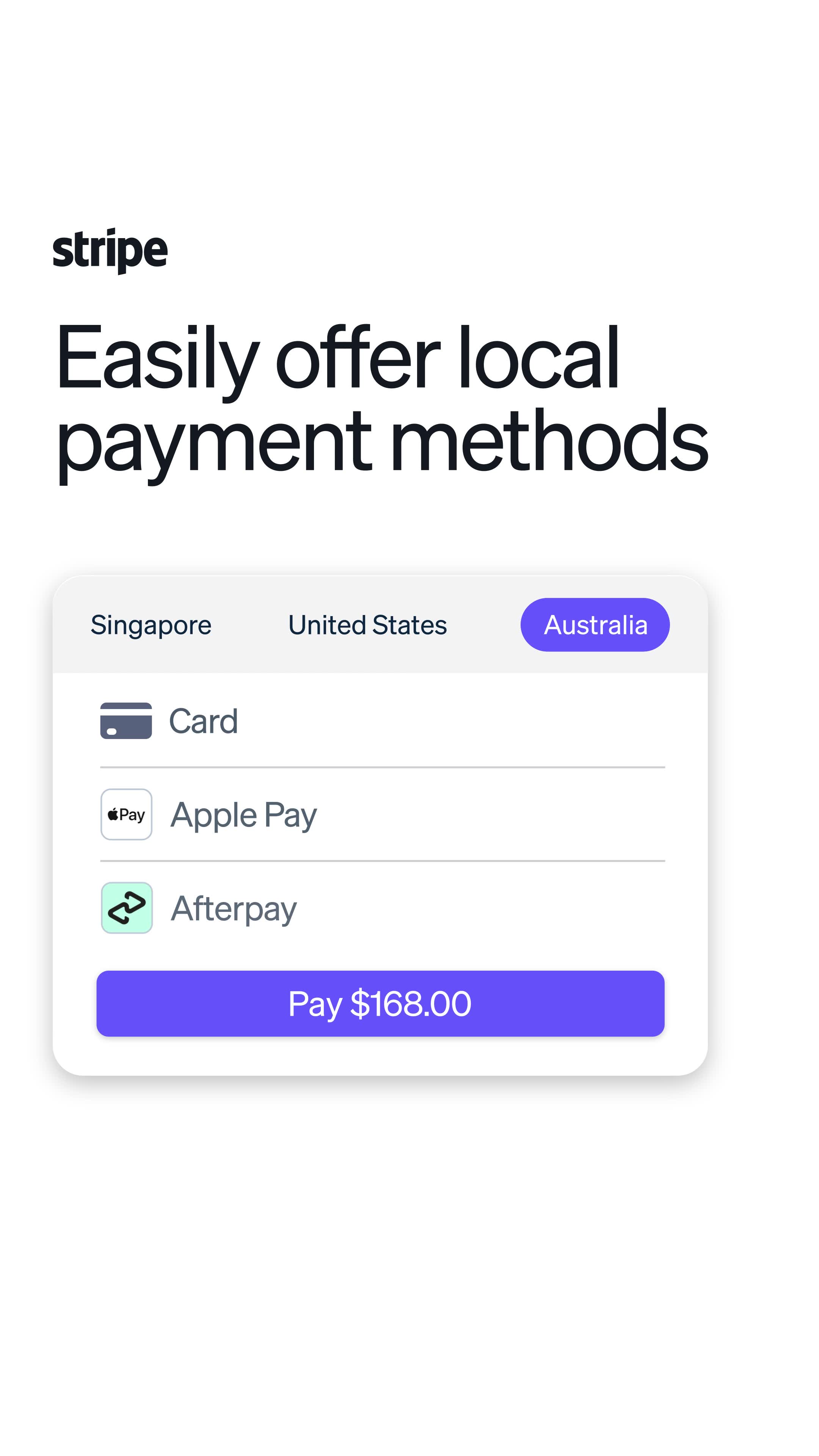
Do pixel-real Stripe checkout, terminal, card and dashboard UI (12px sohne text, #1A2C44) floating on soft pastel gradient or particle fields, with blue-tinted soft shadows.
Real product UI as illustration · bento cards, platform graphic, developer band
Do #0D1738 ground, white first beat + #839BC8 second beat headings, #A3B5D6 body, blurple primary button and a blurple-outline secondary; dotted-line integration diagram and a pink-violet line-wave.
Navy developer band · between the testimonial row and 'What’s happening'
Specimens use sample copy, not Stripe’s.
4px blurple buttons with chevrons; outline secondary buttons with #B9B9F9 border; 40px icon boxes with #D6D9FC border; bento cards (white, 1px #E5EDF5, 6px radius, small expand button top right); accordion customer stories with logo tile, '+' toggles on #E2E4FF; stat rows with large light numerals; carousels with square arrow buttons; a floating 'Chat now' sales card bottom right.
Source: stripe.com
24px line-style glyphs drawn as fills with a blurple gradient (#7F7DFC > #533AFD > #4032C8), boxed in a 40px square with a 1px #D6D9FC border and 4px radius; 16px currentColor UI glyphs (stroke 1.75); 5x8 chevrons after CTAs.
Source: stripe.com
Two families.



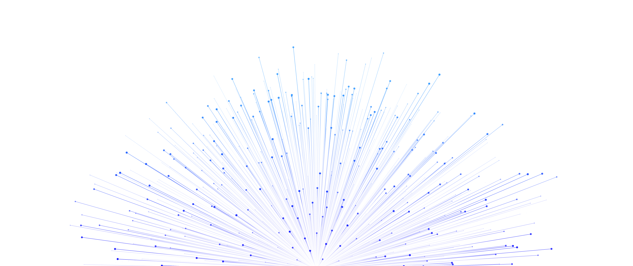



Two families. (1) The gradient wave: fine-striated silk ribbons of orange, pink, magenta, violet and periwinkle, used in the hero, OG card, Sessions banner, platform graphic and developer band. (2) Real Stripe UI (checkout, terminal, issuing card, dashboard tables, code editor) floating over pastel gradients, particle globes and radial line bursts.
(our reading) customer photography stages the business, not the person at a laptop

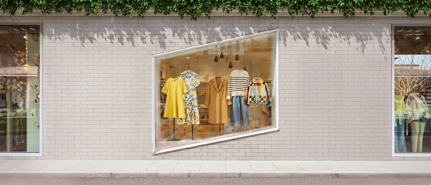
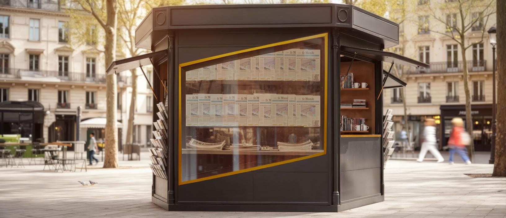

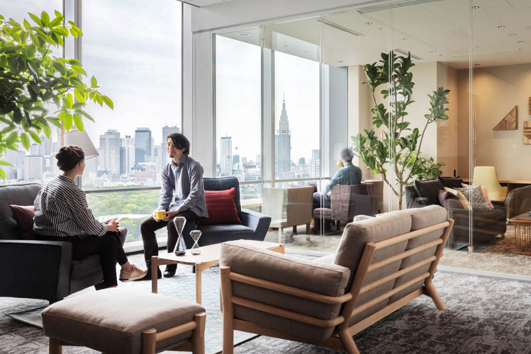


Used sparingly and always framed: wide, bright, natural-colour scenes for customer stories (aerial street with a yellow car for Hertz, boutique window for URBN, Paris kiosk for Le Monde), an event stage shot under a gradient for Sessions, an airy Stripe office and studio portraits of leaders on the newsroom, and bold art-directed covers for startup stories. Photos sit in 6px-radius frames, never full-bleed bands; text never sits on photos except the Sessions banner heading.
1232px content column at 1440 (104px margins) inside vertical hairline guides; hero text block indented to x=208. Section heads left-aligned with a lead paragraph in the right half; 3-up feature rows; bento grid (2+1, 3, 1 wide); centred only for the stats band and testimonials. Phone: 16px margins, single column, full-width buttons.
Measured from stripe.com's computed styles of every band at 1440 and 390 (measure/), :root CSS custom properties (--hds-color-*), inline SVG attributes and page probes with headless Playwright; logo kit from the newsroom.
| Measure | Desktop | Phone |
|---|---|---|
| Page margin | 104px | 16px |
| Section padding | 96px | 56px |
| Hero text width | max 1024px, centered | full width |
| Card gap | 16px | 16px |
| Navigation | 76px | 76px |
Stats H2
Söhne · 56px (phone 34) · line 1.03 · tracking -1.4px · weight 300
Hero H1
Söhne · 48px (phone 34) · line 1.15 · tracking -0.96px · weight 300
Banner H2 / big numerals
Söhne · 48px (phone 28) · line 1.03 · tracking -0.96px · weight 300
Section H2 (two-beat)
Söhne · 32px (phone 22) · line 1.1 · tracking -0.64px · weight 300
Subsection H3 / card title / quote
Söhne · 26px (phone 20) · line 1.12 · tracking -0.26px · weight 300
Card / news title
Söhne · 22px (phone 18) · line 1.1 · tracking -0.22px · weight 300
Closing lead
Söhne · 20px (phone 18) · line 1.4 · tracking -0.2px · weight 300
Section lead
Söhne · 18px (phone 16) · line 1.4 · weight 300
Body
Söhne · 16px · line 1.4 · weight 300
Button / callout link
Söhne · 16px · line 1 · weight 400
Nav link / small
Söhne · 14px · line 1.4 · weight 400
Eyebrow / fine print
Söhne · 12px · line 1.45 · weight 300
Code
Source Code Pro · 12px · line 2 · weight 500
How Stripe’s own landing pages are built, observed on stripe.com/%20(2026-11-10), 2026-11-10. The full measurements are in spec.md.
Source: stripe.com
how the brand carries across formats
| Format | Loudness | Must appear | What varies |
|---|---|---|---|
| Landing page | Navy #0D1738 announcement bar, white nav with slate wordmark and a blurple 'Contact sales' button. Left-aligned two-beat Söhne 300 hero headline (slate then wave-tinted), live metric line above it, blurple primary + outline secondary buttons, the gradient wave bleeding off the top right, a hairline logo strip. Then a two-beat section head, bento cards of real product UI, a gradient stats band, customer accordion, navy developer band, news carousel, #F8FAFD closing CTA and footer. | ||
| Social share card | Logo-only cards: no headline, no button. Family A: logo-white.svg centred at about 31% of the width on the full-bleed striated wave. Family B: slate wordmark | section name lockup centred on #F6F9FC with a diagonal wave wedge rising from the bottom-left. | A news headline card also exists (og:image of https://stripe.com/newsroom/news/agentic-commerce-suite, 3200x1600): wordmark top-left, a 3-line slate headline left at about 5% of the width, product UI right on #F6F9FC with vertical hairlines. It uses the legacy newsroom colours and a heavier cut; the Social post rows adapt it to the homepage system. | |
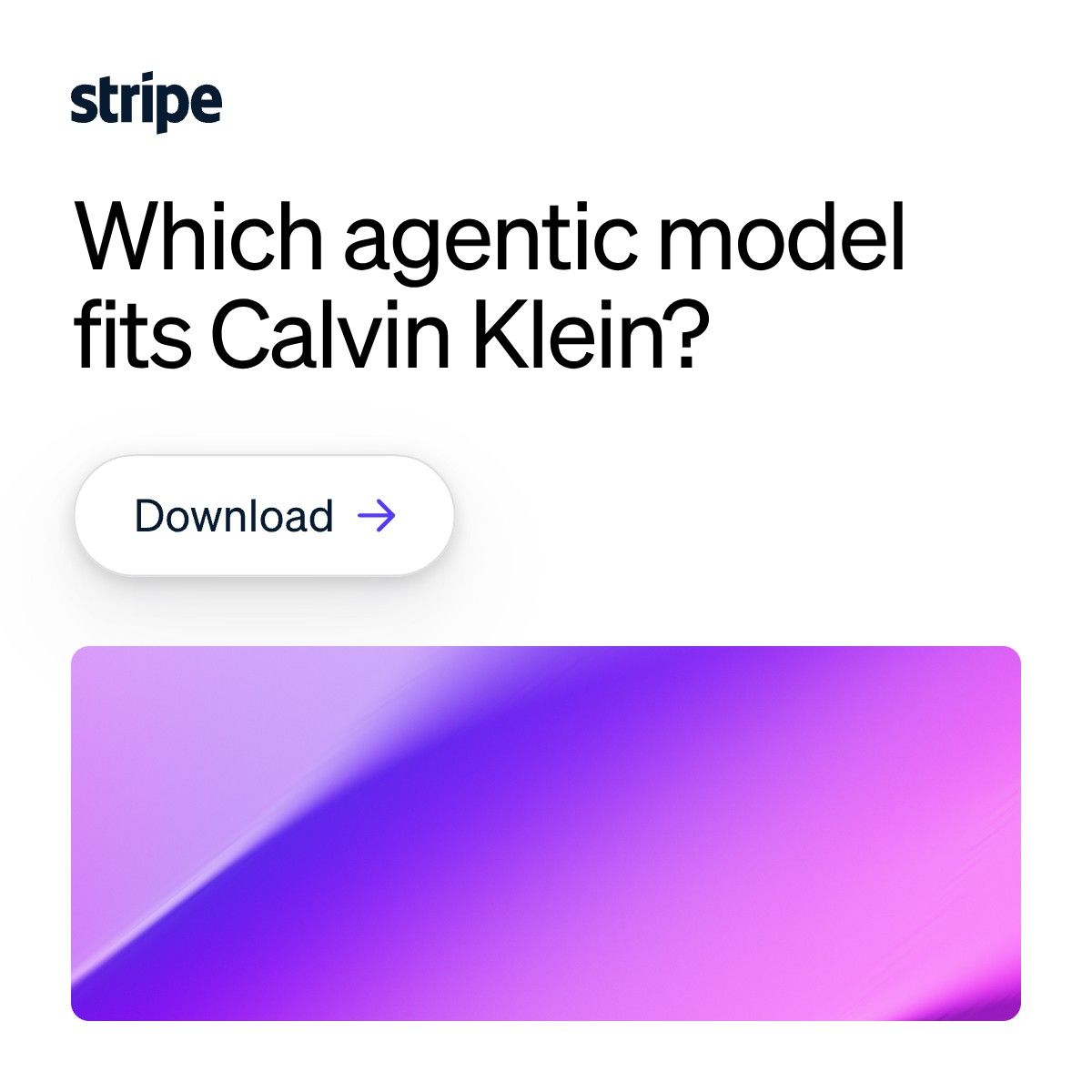
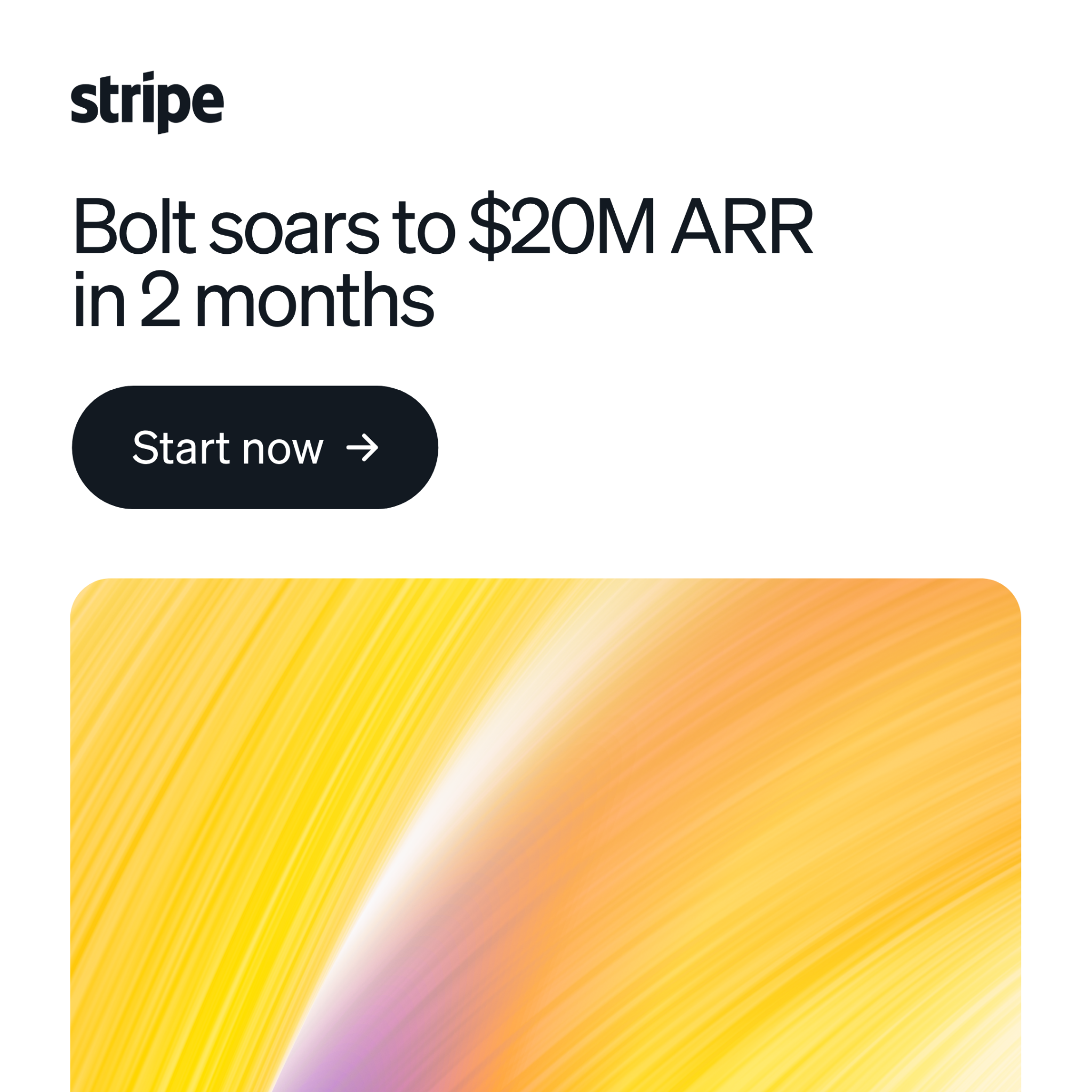
| Social post | White #FFFFFF ground; slate wordmark top-left; a light sentence-case headline of 2-4 lines left-aligned under it in #0D1216 (homepage two-beat grey continuation allowed); one plain text link or one near-black pill; a rounded card of the striated wave filling the bottom half and bleeding off the bottom edge, inset to the margins. | Full-bleed variant (ads family B): striated pink-violet gradient over the whole canvas with all type white and a white text link. Split variant (ads family C): wave band across the top half with a hard edge, text on white below. Product variant: one real product-UI card bleeding off the right and bottom over the wave ground. | |
| Social post, portrait | Same system as the square post, taller: white ground, the wave at the page's own 1:1 size bleeding off the top right, slate wordmark top-left, a two-beat weight-300 72px headline bottom-left, one optional #50617A line, no button. | Night variant for developer or infrastructure news: #0D1738 ground, logo-white.svg, headline #FFFFFF then #839BC8, ill-developer-wave.png cropped across the top 55% instead of the hero wave. Announcement variant (from the agentic-commerce OG card): replace the wave with one real product-UI crop (bento assets) in the top-right 60%, white cards with a 1px #E5EDF5 border and 6px radius at post scale 9px. | |
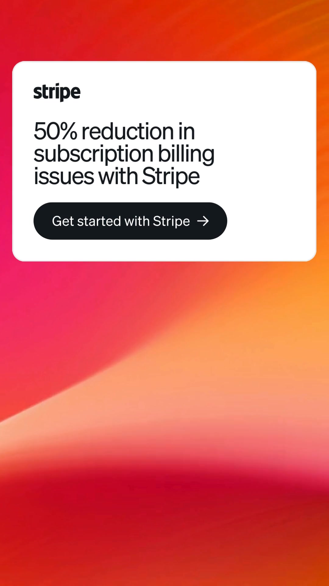
| Paid social ad | Wordmark top-left at x 40/600 (about 14% of the width); a light-weight sentence-case headline of 2-4 lines left-aligned on the same 40px margin; a text link with arrow or one near-black pill as the only CTA; the striated wave is the only image device besides real product UI. | ||
| Video thumbnail: customer story | Full-bleed photo of the customer's place or people; either a centred white customer-logo | stripe lockup with a thin vertical rule and no headline, or (paid) a 3-line white headline with a navy pill. | ||
| Video thumbnail: Cheeky Pint series | Series-only: host and guest two-shot in the dark pub set, cream Cheeky Pint script logo top centre, guest role in light sans over the name in tall condensed caps. | ||
| App Store screenshot | White-to-violet vertical wash; 2-3 line slate headline top-left; one or two real phone frames of the Dashboard app bleeding off the bottom. |
 RetailLinkedIn · Sep – Nov 2026
 Payments platformMeta · Mar 2026 – now
 PaymentsMeta · Aug 2026 – now
 BillingMeta · Mar 2026 – now
Source: stripe.com/newsroom/informationstripe.com/legal/marks
Your name and logo, Stripe’s system.
Talk about my brand Use this brand in Claude
Get your brand audit Put your brand in Claude What goes in a brand book
Each value is marked published, observed, our reading or our recipe, with its source. Checked 2026-11-10. Not affiliated with Stripe.
Tell us what you want to make. We’ll talk through how to put these ideas to work for your brand.