People and agents together
Humans and AI agents work in the same place, coordinated by Slackbot. Our reading
Brand book
One mark, many parts. Slack's octothorpe breaks into the pills and bubbles that frame its photos, pattern its ads and move in its motion, so even a shape on a webinar banner reads as Slack. Our reading

From plain (white page, aubergine band, product UI) to expressive (brand-shape patterns, secondary colors, illustration, animated emoji), chosen by how much delight the moment allows.
Source: web.archive.org/web/20240524235353/https://brand.slackhq.com/brand-shapesweb.archive.org/web/20240223230547/https://brand.slackhq.com/colorweb.archive.org/web/20240415160102/https://brand.slackhq.com/emoji
Slack publishes no color ratio. Not published; the brand center says lead with aubergine for big moments and avoid adding many extra colors..
One voice. The brand center publishes the voice; the homepage shows it in a product-led setting. Levels are our reading.
Our engine's setting, built from their rules.
Cover the logo. It should still read as Slack: aubergine somewhere, rounded pill or bubble geometry, real Slack UI, sentence-case copy that sounds like a helpful coworker.
Put Teams' or Google's logo on it. If the aubergine, the octothorpe shapes and the product UI don't feel borrowed, it's generic.
No ampersands, no Oxford commas, caps only on buttons and eyebrows, no secondary color used as text.
Slack is the productivity platform that empowers everyone with no-code automation, seamless search and knowledge sharing, and connected teams (paraphrase of the short boilerplate). Published
Humans and AI agents work in the same place, coordinated by Slackbot. Our reading
Work is organized in open, searchable channels instead of inboxes. Our reading
No-code workflows by click or by code. Our reading
Measured ROI and productivity gains. Our reading
All your people and AI agents working together
Slack connects your team. Slackbot multiplies what they can do.
Reimagine what’s possible with AI and agents
What’s new in Slack
Slack launched in 2013 with an 11-color octothorpe logo. On January 16, 2019 it launched a simpler four-color octothorpe built with Michael Bierut and Pentagram, whose speech-bubble and pill shapes became the brand shapes. Slack became a Salesforce company; its logo now carries 'from Salesforce' and its site uses Salesforce typefaces.
Category. AI work platform: page title reads 'AI Work Platform & Productivity Tools'. Observed
Email and Microsoft Teams: 'Bring conversations out of the inbox' and a Slack-vs-Teams promo card on the homepage.
Slack is on a mission to make people's working lives simpler, more pleasant and more productive. It is the productivity platform for customer companies, with no-code automation, seamless search and knowledge sharing, and connected teams; as part of Salesforce it is integrated into Customer 360 (paraphrase of the long boilerplate).
All your people and AI agents working together Observed
Where Work Happens Published
Where the future works Published
Slack is your digital HQ Published
Meet Slackbot: AI for the whole team
One search to rule them all.
It all starts with a channel.
When talking is easier than typing…
Bring conversations out of the inbox.
Anyone can automate in Slack.
From Atlassian to Zoom.
The most innovative companies run their business in Slack
Slack reimagines work for Anthropic at the speed of AI
We’re in the business of growing businesses
Millions of people love working in Slack
Your Slack deep dive starts here
See all you can accomplish in Slack
The brand center states a mission (simpler, more pleasant, more productive working lives) and two boilerplates. The 2026 homepage has moved the story to people and AI agents working together, with Slackbot as the coordinator, and backs it with a footnoted stats band.
Source: web.archive.org/web/20240406034403/https://brand.slackhq.com/about-slackslack.com
Bring conversations out of the inbox
This Is Not How We Do Headlines at Slack.
Send a Slack message
Just Slack me
Clarity is framed as courtesy: respecting the reader's time is the brand.

ClearConciseHuman
The guide's voice is a friendly, intelligent coworker: clear, concise, human. It publishes five copy principles and a strict style sheet: sentence case, no Oxford comma, no ampersands, no headline periods, caps only for buttons and eyebrows. The homepage is shorter and more product-led, and ends many feature headlines with a period.
Slack messagesSlack collaboration softwareintegrated with SlackSlack Platform Partner
SlackingSlackersSlack's (possessive)Slacks (plural)I ❤️ Slackbot (emoji for words)DHQ IRL (abbreviations)
Source: web.archive.org/web/20240223225820/https://brand.slackhq.com/writingweb.archive.org/web/20240524223821/https://brand.slackhq.com/brand-values
| Voice | Clear, concise, human |
|---|---|
| Copy principles | Don't make me think; Be approachable; Make it memorable; Respect our readers; Be compelling |
| Style | AP, Merriam-Webster |
| Homepage scope | slack.com 2026-10-29: product claims, CAPS buttons, footnoted stats |
Source: web.archive.org/web/20240223225820/https://brand.slackhq.com/writingweb.archive.org/web/20240524223821/https://brand.slackhq.com/brand-valuesweb.archive.org/web/20240415160102/https://brand.slackhq.com/emojislack.comslack.design/articles/slack-content-design-in-the-age-of-ai






Logos shown from Slack's own site and archived brand center for reference. Slack is a trademark of Slack Technologies, LLC, a Salesforce company. Not affiliated, and not for download.
Full-color logo on aubergine
Full-color logo on Slack yellow
Pentagram rebuilt the 2013 eleven-color mark on a grid so it reproduces cleanly at any size.



| Clear space | mark width each side; minimum one pill |
|---|---|
| Small logo | 50-90px wide |
| Small mark | 15-20px wide |
| Wordmark face | Hellix Bold |
| Lockup entity names | Hellix Regular |
| Backgrounds | white, black, aubergine |
The logo is the four-color octothorpe, the slack name (set in Hellix Bold) and 'from Salesforce' with the cloud. Clear space is published two ways: the logo mark's width on each side (brand center) and at least one pill of the octothorpe (brand terms). A small horizontal logo exists for 50-90px widths; the small mark for 15-20px. slack.com's nav mark SVG now draws the octothorpe in brighter colors than the guide's four.
Source: web.archive.org/web/20240417082758/https://brand.slackhq.com/logoweb.archive.org/web/20240223223946/https://brand.slackhq.com/brand-architectureslack.com/terms-of-service/slack-brandslack.com/media-kit
Where work happens
Where work happens
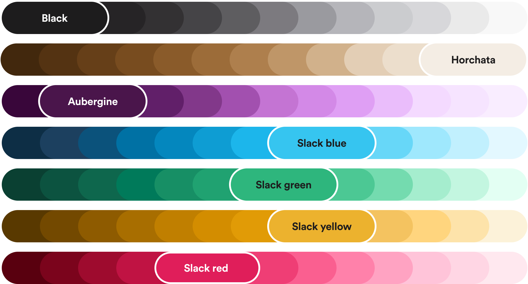
Aubergine is the most recognizable Slack color; fixed text pairings keep every combination accessible.


| Aubergine | #4A154B, PMS 2623 C, white text |
|---|---|
| Horchata | #F4EDE4, PMS 7604 C at 80%, black text |
| Black | #1D1C1D |
| Logo colors | #36C5F0, #2EB67D, #ECB22E, #E01E5A |
Eight core colors: aubergine and horchata lead, the four logo colors are go-to accents, black and white are text. An extended tonal scale runs light to dark for each core hue; pairings sit 1-2 steps apart. Fourteen secondary colors serve photography and illustration and never carry text. Every swatch publishes HEX, RGB, CMYK and PMS plus its approved text color. slack.com uses its own purples (#481A54, #730394, #9602C7) and #181818 text.
Not published: Extended core scale hex values (shown only as an image); A color ratio; Grays for UI or muted text.
Source: web.archive.org/web/20240223230547/https://brand.slackhq.com/colorslack.com
All your people and AI agents working together
All your people and AI agents working together
all your people and ai agents
Typeface alignment with Salesforce lets slides and pages move between the two brands.

| Their face | Use | License | Open stand-in |
|---|---|---|---|
| Salesforce Avant Garde | slack.com headlines and buttons; slide titles ('Avant Garde Demi SFD') | Proprietary to Salesforce (not an open font) | Poppins 600 Rendered-line calibration on slack.com (2026-10-30): Poppins 600 at -0.035em (stat digits -0.012em) is within 0.0-3.0% of the real width, 0.5-2.2% of its ink and 0.2% of its x-height on 64, 50 and 24px lines, and it shares the real face's circular bowls and single-storey 'a' and 'g' (Inter matched width but not the letter shapes) |
| Salesforce Sans | slack.com body, labels, the 'from Salesforce' line | Proprietary to Salesforce | Open Sans 400 / 650 (bold) / 600 / 300 Within 0.1% of the real 18px body line width and 0.5% of its ink; bold labels at Open Sans 650 within 0.7-2.6% width. Humanist forms like the real face |
| Larsseit | Brand center headlines and pull quotes (Thin Italic) | Commercial, not open | |
| Slack Circular | Brand center body, eyebrows, attributions; Cyrillic Circular for Russian | Custom cut of Circular, not open | |
| Hellix | The slack name in the logo (Bold); lockup entity names (Regular) | Commercial | |
| Lato | Product and UI screens, reacji counts | Open (SIL OFL) | |
| Inter / Helvetica Neue / Tazugane / Noto Sans | Google Slides / email / Japanese / Korean and Chinese | Mixed |
| Display (site) | Salesforce Avant Garde 700, 64/68 hero |
|---|---|
| Body (site) | Salesforce Sans 400, 18/28 |
| Headline (2024 guide) | Larsseit Bold |
| Body (2024 guide) | Slack Circular |
| Product UI | Lato |
| Japanese | Tazugane; Noto Sans in UI |
The 2024 brand center set headlines in Larsseit Bold (H1 36/41, H2 24/30, H3 18/22.5, H4 12/15, 125% leading) and body in Slack Circular (10/14, 140%); Larsseit Thin Italic for pull quotes; Lato for product UI. The 2024 presentations page moved slides to Salesforce's Avant Garde Demi and Salesforce Sans, and slack.com now renders Salesforce-Avant-Garde and Salesforce-Sans throughout.
Source: web.archive.org/web/20240415160055/https://brand.slackhq.com/typographyweb.archive.org/web/20240617065201/https://brand.slackhq.com/presentationsslack.com
Icons explain; emoji and illustration add personality, so icons stay plain.
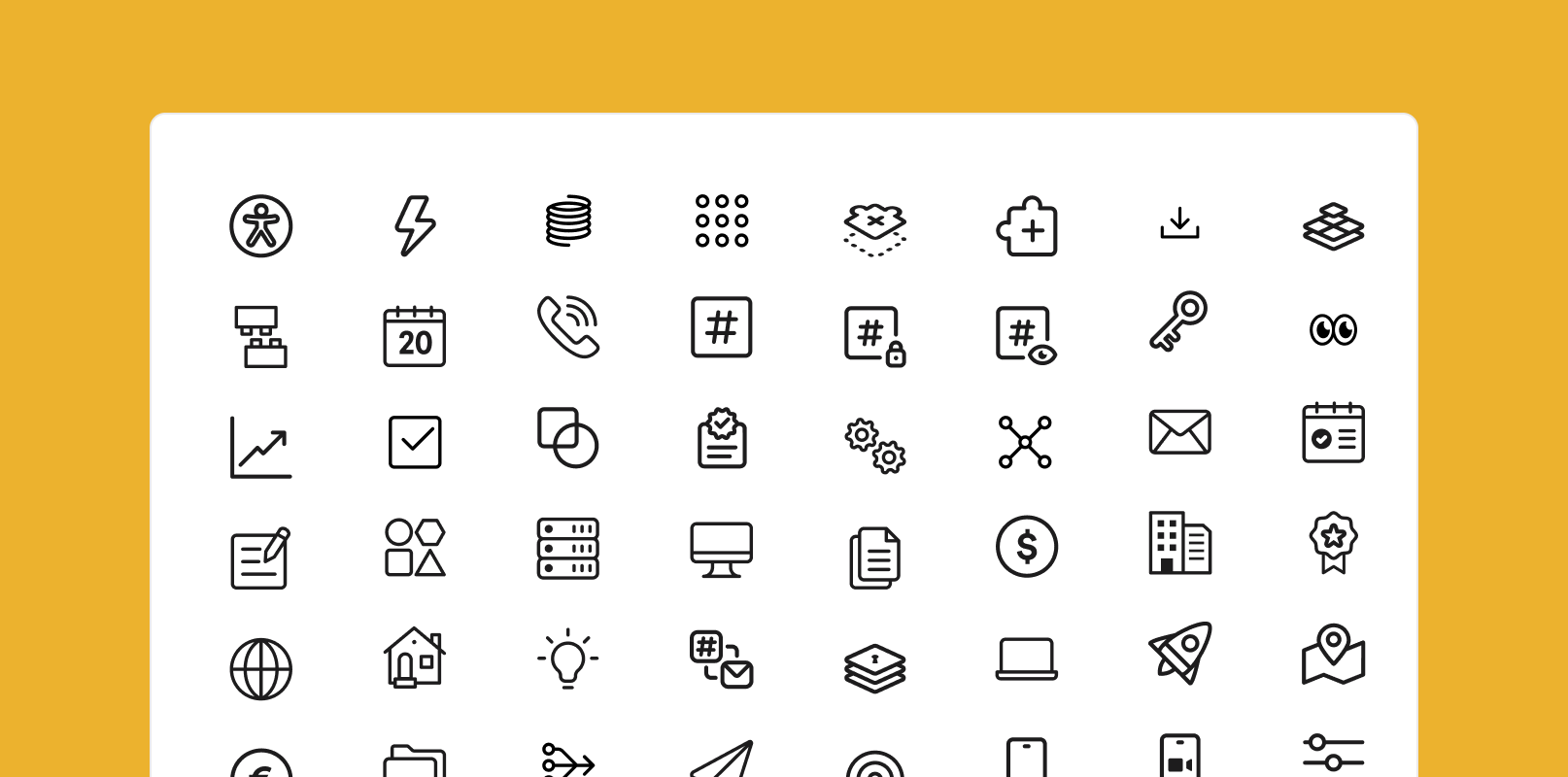
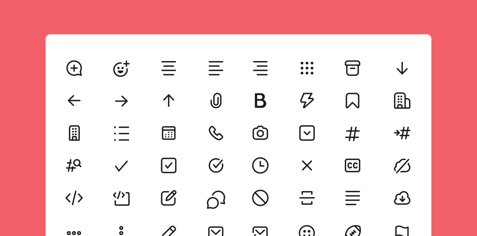
Two libraries, brand and product, in black or white only, placed on core or secondary grounds, inside brand shapes or circles. Always paired with copy. 'Icons are nuts and bolts; emoji are bells and whistles.'
Source: web.archive.org/web/20240415164202/https://brand.slackhq.com/icons
Restricting illustration to a purpose keeps it from becoming wallpaper.
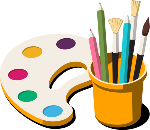
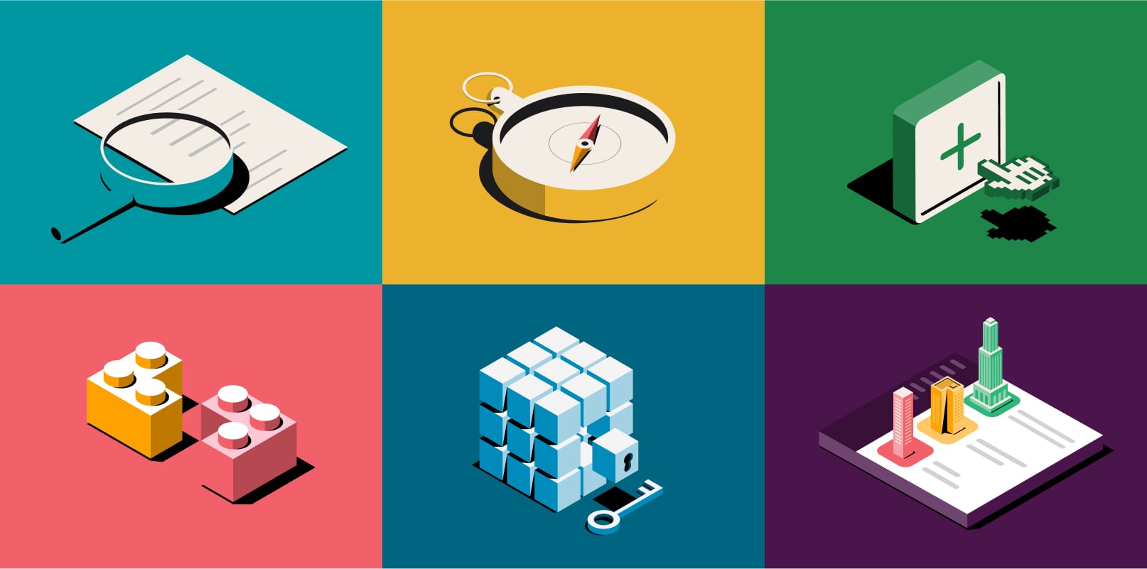
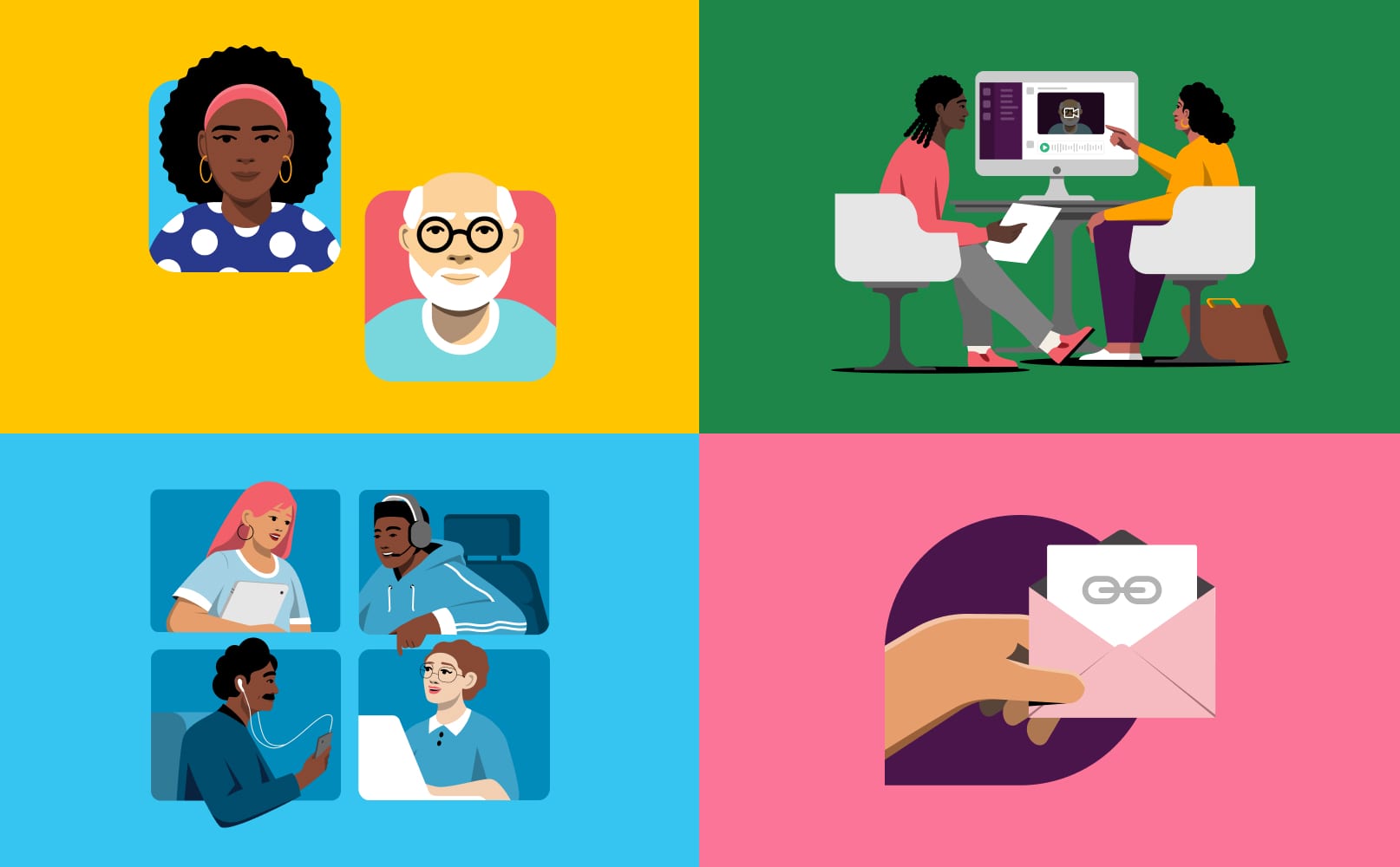

Bold, dimensional, elevated and unexpected: isometric objects shaded with tints, shades and black shadows; people of many skin tones with vibrant hair and clothes. Illustrations must serve education, acknowledgement, clarity or humanity, never decoration; the library is gated for that reason.
Source: web.archive.org/web/20240415161304/https://brand.slackhq.com/illustration
Simple, well-lit pictures read the same at a glance as the copy.

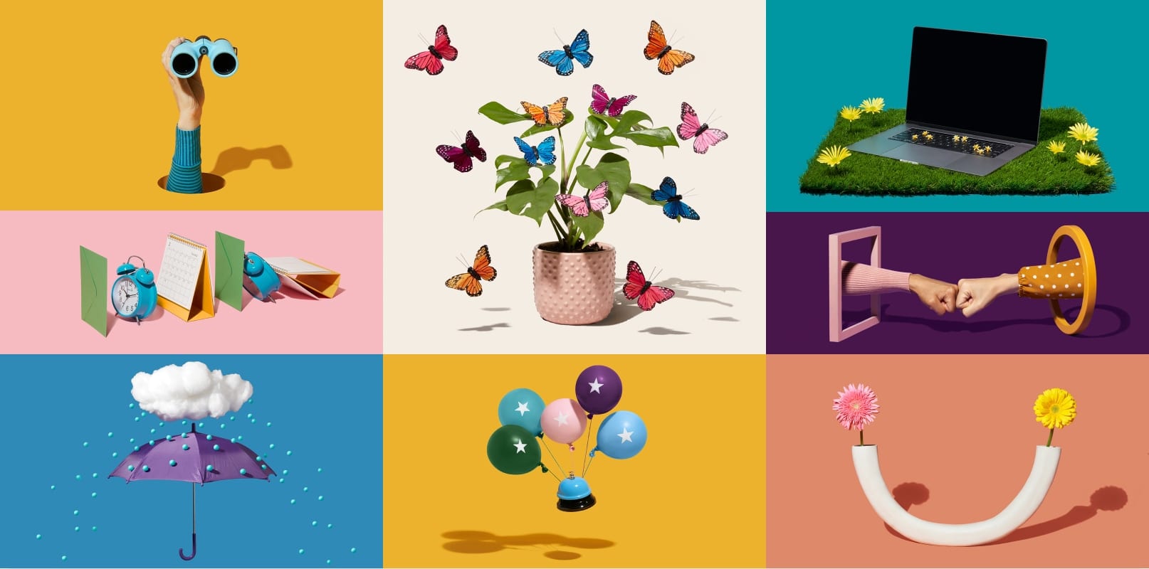

Three styles: personas on secondary-color grounds, simple still life with sharp shadows, and calm lifestyle scenes in natural light. The aim is relatable, aspirational and delightful; clear, concise and human like the voice.
Source: web.archive.org/web/20240223225521/https://brand.slackhq.com/photography
Motion directs attention; 'playful, not silly' keeps it professional.


Engaging, purposeful, clear, delightful. Staging, overshoot, follow-through and anticipation; easing used when needed, with no strict values. Brand shapes animate as accents, transitions and fills. Titles slide up from a mask; phrases word by word; never letter by letter. Hard or match cuts only.
Source: web.archive.org/web/20240223222418/https://brand.slackhq.com/motion
Do Two shapes from the logo: the pill (stretchable) and the chat bubble (scale proportionally only); the circle only when both are present or as a mask. Built on a grid, rotated only in 90-degree steps, solid by default, stroke sparingly. Images anchor to the bottom of a shape and may break out of its top or side. Monochrome patterns use a tint 1-2 steps from the ground..
Shapes cut from the octothorpe · containers behind photos and illustrations, patterns, backgrounds, motion fills
Do Aubergine (#4A154B published; #481A54 on slack.com) carries the big brand moments with white text; horchata adds warmth. The aubergine product sidebar should feature in most UI screens..
Aubergine for the big moment · dark bands, hero banners, the product sidebar in UI screens
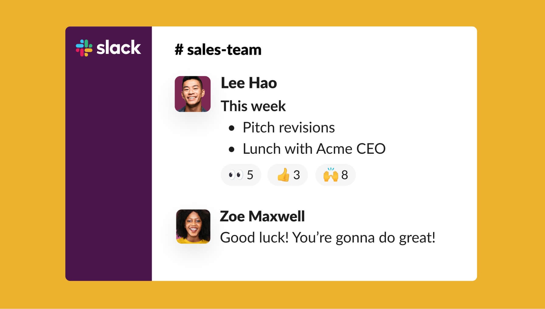
Do Accurate Slack UI at one of three fidelities (high, simplified, abstracted), with Lato, licensed JoyPixels emoji and approved personas. On slack.com the hero is an 800x548 product video with 8px corners; feature tabs pair a 24px purple headline with a product video..
The product is the hero image · hero and feature bands
Specimens use sample copy, not Slack’s.
slack.com at 1440: a 1230px content column (105px margins), a centered hero with a 64px headline, two buttons and an 800px product video; then an aubergine feature band, a three-up news row, three tabbed feature sections with product video, a customer row, an aubergine stats band, G2 badges, a four-up resource row and an aubergine sign-up band before the footer. Phones run 16px margins. The brand center publishes no grid; brand shapes sit on a grid by default.
Measured from slack.com's Playwright at 1440x900 and 390x844 with a desktop Chrome UA on 2026-10-29, the OneTrust banner hidden and the reference variant forced (body class s-cta-refresh removed; see the hero CTA note); computed styles plus pixel samples of the reference screenshots.
| Measure | Desktop | Phone |
|---|---|---|
| Page margin | 105px | 16px |
| Section padding | 96px | 36px |
| Hero text width | max 923px, centered | full width |
| Card gap | 48px | 48px |
| Navigation | 80px | 80px |
Hero headline (h1)
Salesforce Avant Garde · 64px (phone 32) · line 1.0625 · tracking -2.24px · weight 600
Section headline (h2, big)
Salesforce Avant Garde · 50px (phone 28) · line 1.12 · tracking -1.75px · weight 600
Section headline (h2, small)
Salesforce Avant Garde · 32px (phone 28) · line 1.25 · tracking -1.12px · weight 600
Card and item title
Salesforce Avant Garde · 24px (phone 22.4) · line 1.25 · tracking -0.84px · weight 600
Hero tab pill
Salesforce Avant Garde · 22px (phone 18) · line 1.27 · tracking -0.77px · weight 600
Big stat number
Salesforce Avant Garde · 80px · line 1.05 · tracking -0.96px · weight 600
Proof stat number
Salesforce Avant Garde · 64px (phone 48) · line 1 · tracking -0.768px · weight 600
Body large
Salesforce Sans · 18px · line 1.555 · weight 400
Body
Salesforce Sans · 16px · line 1.5 · weight 400
Bold label
Salesforce Sans · 16px · line 1.375 · tracking 0.2px · weight 650
Button (CAPS)
Salesforce Sans · 14px · line 1.29 · tracking 0.798px · weight 650
Nav link
Salesforce Sans · 15px · line 1.55 · weight 650
Badge
Salesforce Sans · 12px · line 1.33 · weight 650
Caption
Salesforce Sans · 12px · line 1.55 · weight 400
Card meta
Salesforce Sans · 14px · line 1.3 · tracking 0.1px · weight 400
Footer head
Salesforce Sans · 14px · line 1.55 · tracking 0.8px · weight 650
Footer link
Salesforce Sans · 14px · line 1.55 · weight 400
Quote
Salesforce Sans · 18px · line 1.4 · weight 300
Eyebrow (phone only)
Salesforce Sans · 14px · line 1.25 · tracking -0.112px · weight 650
How Slack’s own landing pages are built, observed on slack.com, 2026-10-29. The full measurements are in spec.md.
Source: slack.comweb.archive.org/web/20240524235353/https://brand.slackhq.com/brand-shapes

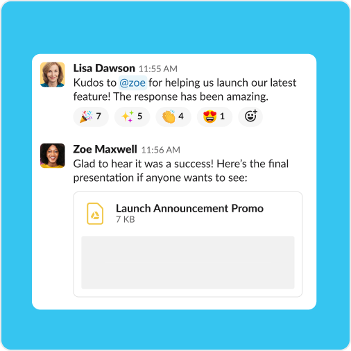
Kept the equity of the hash that starts every channel name while making it reproducible at any size and on any ground. Our reading
Turned a chat app into a place: the HQ metaphor sold Slack as where work lives when offices emptied. Our reading
Positions the existing channel model as the home for agents instead of a new tool. Our reading
How our engine applies Slack's system to each format. This is our recipe built from their rules, not something Slack publishes. Level = how far toward the expressive end (illustration, shapes, many colors).
| Format | What they did | Source |
|---|---|---|
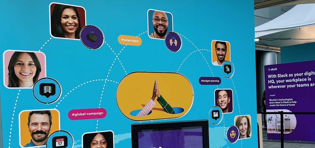
| event | Event wall in Slack blue with persona photos in circles, dotted connector lines and channel pills. | web.archive.org/web/20240223230547/https://brand.slackhq.com/color |
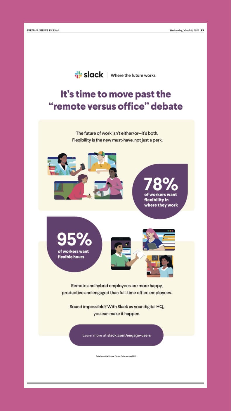
| banner ad | Aubergine banner: lockup with 'Where the future works', white headline 'Get more done in a digital HQ', smiling emoji. | web.archive.org/web/20240415160055/https://brand.slackhq.com/typography |
| webinar promo | Horchata ground, logo top left, caps WEBINAR eyebrow, black headline, aubergine CAPS button, clock photo in a yellow pill shape. | web.archive.org/web/20240524235353/https://brand.slackhq.com/brand-shapes |
| presentation | Slack version of the Salesforce corporate template: paired lockup on content slides, Slack from Salesforce on cover and thank-you slides, blue icons. | web.archive.org/web/20240617065201/https://brand.slackhq.com/presentations |
| website | slack.com: centered hero, product video, aubergine bands, stats with footnotes. | slack.com |
| UI screens | High fidelity, simplified and abstracted UI with the aubergine sidebar, for landing pages, social, video and decks. | web.archive.org/web/20240415151455/https://brand.slackhq.com/ui |
| Format | Loudness | Must appear | What varies |
|---|---|---|---|
| Landing page | Follows the homepage voice and anatomy (kit.spec.page): fixed white nav with rectangular CAPS buttons; centered sentence-case 64px headline, one 18px subline, GET STARTED (filled #730394) + FIND YOUR PLAN (outlined) at 4px radius; logo strip; real product UI video over a lilac circle; #481A54 bands on white for the AI switcher, stats and closing CTA; feature carousels with a purple open title and an 876x600 screenshot; footnoted stats; the full footer | how many feature carousels (the homepage has four) and which proof block (stats band, G2 badges, customer stories) carries the middle | |
| Deck | Slack template rules: Avant Garde titles, Sans body, 14pt minimum, paired lockup on content slides | illustrations and emoji from the template set | |
| Proposal page | White page, aubergine for the one big moment, product UI over illustration | a horchata band for warmth | |
| Ad | Logo top left, sentence-case headline, one CAPS button, a pill or chat-bubble container | secondary-color ground behind a persona | |
| Social post | Brand shapes on a grid, black or white text only | animated emoji and illustration | |
| Helvetica Neue, aubergine button, plain copy | one illustration with a purpose |
 Small businessMeta · Aug 2026 – now
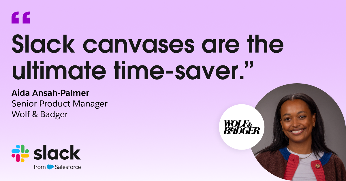
 Wolf & Badger’s new must-haveLinkedIn · Sep – Nov 2026
 SlackbotMeta · Aug 2026 – now
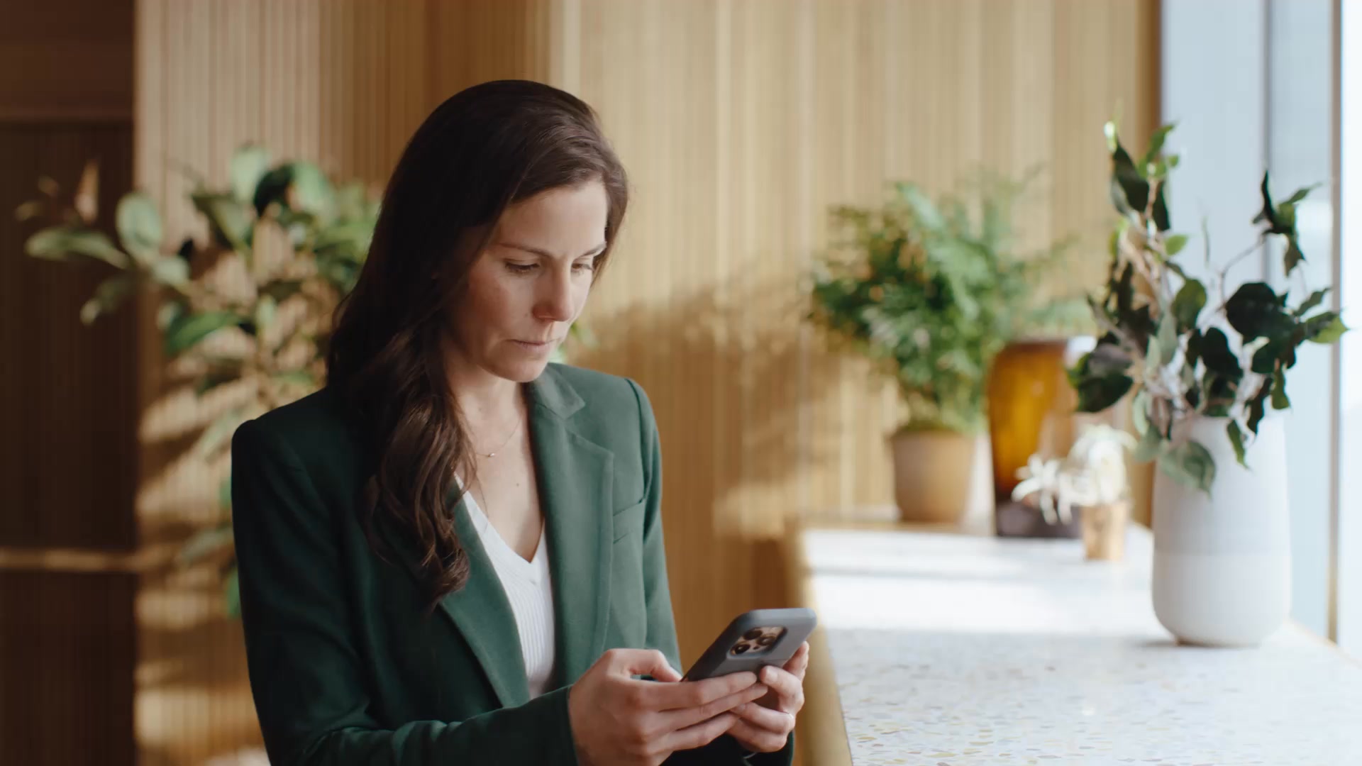 Collaborate externallyMeta · Nov 2026 – now
Source: slack.com/terms-of-service/slack-brandslack.com/media-kitweb.archive.org/web/20240223223946/https://brand.slackhq.com/brand-architecture
Your name and logo, Slack’s system.
Use this kit for my brand Use this brand in Claude
Get your brand audit Put your brand in Claude What goes in a brand book
Each value is marked published, observed, our reading or our recipe, with its source. Checked 2026-10-29. Not affiliated with Slack.