Increase the lifetime value of your customers
Go beyond customer service to drive revenue growth. Observed
Brand book
Sierra sells AI agents to the most conservative, regulated companies in the world, so the brand removes everything that looks like AI hype: one quiet weight, one natural green, white space, and real people in soft daylight. The nature cues (a pinecone logo, foliage gradients, the name itself, the grassy Mossy voice orb) make the technology feel organic and human rather than synthetic; the restraint makes it feel trustworthy enough for a bank. Our reading

The image ground: a documentary photo/video, a blurred nature gradient, or light product UI on pale blue, chosen per section; the type and green never change.
Approximate share of the desktop home page by band area.
#006838 appears only in the logo and primary pill buttons; no green headlines, no second accent; text uses #222222 / #302E2D / #716F6C / #625E5B.
All type is GT America Regular (stand-in Instrument Sans 400) with hero -0.02em and section -0.01em tracking; nothing bold, nothing in caps.
Buttons are full pills (40px nav/small, 56px CTA); cards are 16px radius with at most a 1px #E4E0DC border.
Photos are natural-light moments of real people or objects; graphic grounds are blurred grainy nature gradients; no stock tech, robots, or purple AI gradients.
Big heads are paired fragments with full stops; section heads sentence case without stops; outcome language; no exclamation marks; "AI agent", never "chatbot".
Every number, customer, quote or badge appears on sierra.ai or Sierra's blog; otherwise cut it.
Page-like work ends with "Discover what Sierra can do for you" plus a green Learn more pill, then the #F6F5F3 footer with the green lockup.
A conversational AI agent platform for large, regulated businesses that is sold on outcomes: one agent across every channel that resolves real customer jobs, built and improved by AI, priced only when it delivers. Our reading
Go beyond customer service to drive revenue growth. Observed
Build powerful AI agents quickly—with or without engineering support. Observed
Deploy a single agent across chat, SMS, WhatsApp, email, voice, and ChatGPT. Observed
Ensure you only pay for the value Sierra delivers with outcome-based pricing. Observed
Better outcomes. Built on Sierra.
Standout customer experiences. Stronger growth.
Pay for a job well done
Use AI to improve your AI
(paraphrase) Earn trust through accountability, empathy, quality and responsiveness; make AI accessible, safe and useful.
Observed(paraphrase) Drive customer outcomes, not technical milestones; everyone spends time with customers.
Observed"We get the details right" (paraphrase: from the words on the page to the system architecture; good taste; fix what isn't right).
Observed"We know we don't have the luxury of patience. We play to win."
Observed(paraphrase) Balance and intensity are compatible; aim to be the best technology company for parents.
ObservedCategory. Conversational AI platform for businesses / customer experience AI platform Observed
(paraphrase) Sierra, which calls itself the leading customer experience AI platform, lets companies build an AI agent once and deploy it on web, mobile, chat, email and voice; agents resolve problems and complete complex tasks, from originating a mortgage to settling an insurance claim.
Better outcomes. Built on Sierra. Observed
Better customer experiences. Built on Sierra. Observed
Standout customer experiences. Stronger growth. Observed
The leading conversational AI platform for businesses. Observed
The agent-building agent Observed
Use AI to improve your AI Observed
Turn conversations into outcomes Observed
Happier customers. Better business outcomes. Observed
Hear from leaders in applied AI Observed
The best platform and partner on your AI journey Observed
Discover what Sierra can do for you Observed
Who we are and why we're here. Observed
Hi, we're Sierra.
Who we are and why we're here.
Oh, thanks for letting me know. Let's set that up.
No endless hold music. No frustration. Just better customer experiences, built on Sierra.
What makes voice design so essential?
Discover what Sierra can do for you
Better outcomes. Built on Sierra.
Supercharge your support with AI!
Pay for a job well done
Outcome-Based Pricing Model
Hi, we're Sierra.
Sierra is a leading provider of chatbot solutions.
Revolutionary AI chatbots that transform customer support!
Better customer experiences. Built on Sierra.
Our cutting-edge platform leverages AI to optimize your agents.
Use AI to improve your AI
calmconfidenthumanplainspoken
outcomesbettercustomer experiencesAI agentsmore humantrustpersonalconversationsoutcome-based pricing
exclamation markschatbot (never used; Sierra says AI agent)Title Case section headsbold weights in copy
Source: sierra.aisierra.ai/aboutsierra.ai/careerssierra.ai/blog/mossy
Source: sierra.aisierra.ai/careerssierra.ai/aboutadstransparency.google.com/advertiser/AR01214606907243757569youtube.com/@Sierra-Platform




Logo versions and misuse rules are Sierra's own, from sierra.ai/using-our-brand; placements are observed on sierra.ai.
A pinecone mark beside SIERRA in spaced capitals, with published rules.





A pinecone mark beside SIERRA in spaced capitals, with published rules. Sierra's brand page calls the symbol a pinecone and the logo the symbol plus wordmark, used in full colour whenever possible: forest green #006838 on light grounds; inverted (white symbol and wordmark) on dark or busy grounds, shown on Sierra green; monotone black or white where colour does not work. The symbol alone is shorthand for brand moments such as social avatars, and on the site it is the favicon (#14673A) and app icon; a finer white variant is the agent avatar in the hero chat card (observed).
Source: sierra.ai/using-our-brandsierra.aisierra.ai/blog/mossy
White and warm grey with one forest green.
White and warm grey with one forest green. White carries about three quarters of the home page; #F6F5F3 closes every page (CTA on /blog, footer everywhere). Text is a warm grey ladder: #222222 heads, #302E2D body, #625E5B subs, #716F6C secondary. Forest green #006838 lives only in the logo and primary pill buttons; a leaf green #4AA45C highlights city names on /about. Blue #345EB2 is reserved for the announcement bar, and paler blues (#4584C6, #F3F9FE) stay inside product UI. Colour otherwise comes from photography and nature gradients.
Source: measure/home-desk.json, home-phone.json, about-*, customers-*, blog-* (measured 2026-11-17)computed styles and :root Tailwind theme tokens read headless (Chromium 1440x900, cookie banner rejected) on https://sierra.ai/, 2026-11-17
Better outcomes. Built on Sierra.
GT America Standard Regular for everything, at one weight.
GT America Standard Regular for everything, at one weight. Heads are large and light with slight negative tracking (-0.02em at hero size, -0.01em at section size), centred over sections; body 16/24 in muted warm grey. Medium appears only in the announcement bar lead-in. No caps labels, no mono in live text, no italics. Stand-in: Instrument Sans 400 at the real tracking, except 38px heads at -0.7px.
| Their face | Use | License | Open stand-in |
|---|---|---|---|
| GT America Standard Regular 400 | Every head at one weight | commercial (Grilli Type) | Instrument Sans 400 Width +0.2% mean over six real lines at the real tracking, ink -3.4%, x-height 0.51 vs 0.50em; closest shapes. |
| One face, one weight (GT America Standard Regular 400 for text; Medium 500 rarely) | Body, nav, buttons, captions; Medium only in the announcement lead-in | commercial (Grilli Type) | Instrument Sans 400 (500 for Medium) 16px body line matches to 0.0%; Medium maps to 500 at -1.2% width. |
| GT America Mono Regular/Medium | Loaded site-wide (token text-body-sm-mono 12px) but no live text used it on the pages read; numerals inside product UI artwork are mono | commercial (Grilli Type) | Fragment Mono 400 Calibrated 2026-11-17 against the real woff2: width -0.3%, ink -0.7%; only inside product-UI art. |
Source: measure/home-desk.json, home-phone.json, about-*, customers-*, blog-* (measured 2026-11-17)
Do Pinecone symbol (Sierra's own name for it) beside SIERRA in widely spaced capitals: full colour #006838 on white or #F6F5F3, inverted white on photography or dark grounds, monotone black or white where colour fails (sierra.ai/using-our-brand). Symbol alone for favicon, app icon and social avatars.
Forest-green pinecone lockup · nav top-left on every page (116x40 at x 164, 1440 wide), footer top-left, og image (white), app icon
Do #006838 is the only brand colour in the UI: logo, primary pill buttons, active filter. Text runs #222222 heads / #302E2D body / #716F6C secondary / #625E5B subs on white, closing on a #F6F5F3 CTA + footer. The single exception is the 44px #345EB2 announcement bar.
One green, everything else warm grey · every page
Do GT America Standard Regular 400 for everything (stand-in Instrument Sans 400): hero 65/72 at -0.02em, section heads 44/48 and 38/46 at -0.01em centred, body 16/24. No bold, no caps labels, no italics in UI.
Quiet regular-weight type · all heads and body
Do Full-bleed, naturally lit lifestyle video still of an ordinary person in a tender or everyday moment (parent and sleeping baby; man on a phone outside his house; woman on a park bench). White 65px two-fragment headline bottom-left at the 164px container edge, #F6F5F3 56px pill below, and on the right a frosted translucent card (16px radius, white 20% fill) with the Sierra symbol in a circle and the live agent/customer exchange in 16/24 white centred text.
Documentary photo hero with a living agent card · home hero (700px, full bleed under the nav), og image, customers hero video
Do Out-of-focus, film-grain fields of foliage greens, teal, sky blue and occasionally ochre/coral, like a landscape seen through frosted glass. White GT America text: card head 24/32 top-left at 32px padding, one-line 16/24 benefit bottom-left; on blog covers a centred 2-3 word white title. Small translucent glass UI chips (channel icons, star rating, agent orbit) float in the middle of home cards.
Blurred nature gradients · home feature cards (1112x500 and three 360x450, 16px radius), every blog cover, customer feature band backgrounds
Do Light product UI (white panels, #4584C6 links, green chart lines, GT America Mono numerals) on #F3F9FE panels; a centred head, a 40px outlined product pill with a 14px icon, then two (548px) or four (266px) square tiles with a 16px #302E2D title and 16/24 #716F6C description below. The white page sheet ends in 64px bottom corners over a dotted grid with a stacked #0F4F8A shadow.
Product proof on pale blue, lifted by a soft blue shadow · home Meet Sierra, Ghostwriter, Insights and Horizon bands
Specimens use sample copy, not Sierra’s.
Soft, rounded and mostly borderless.
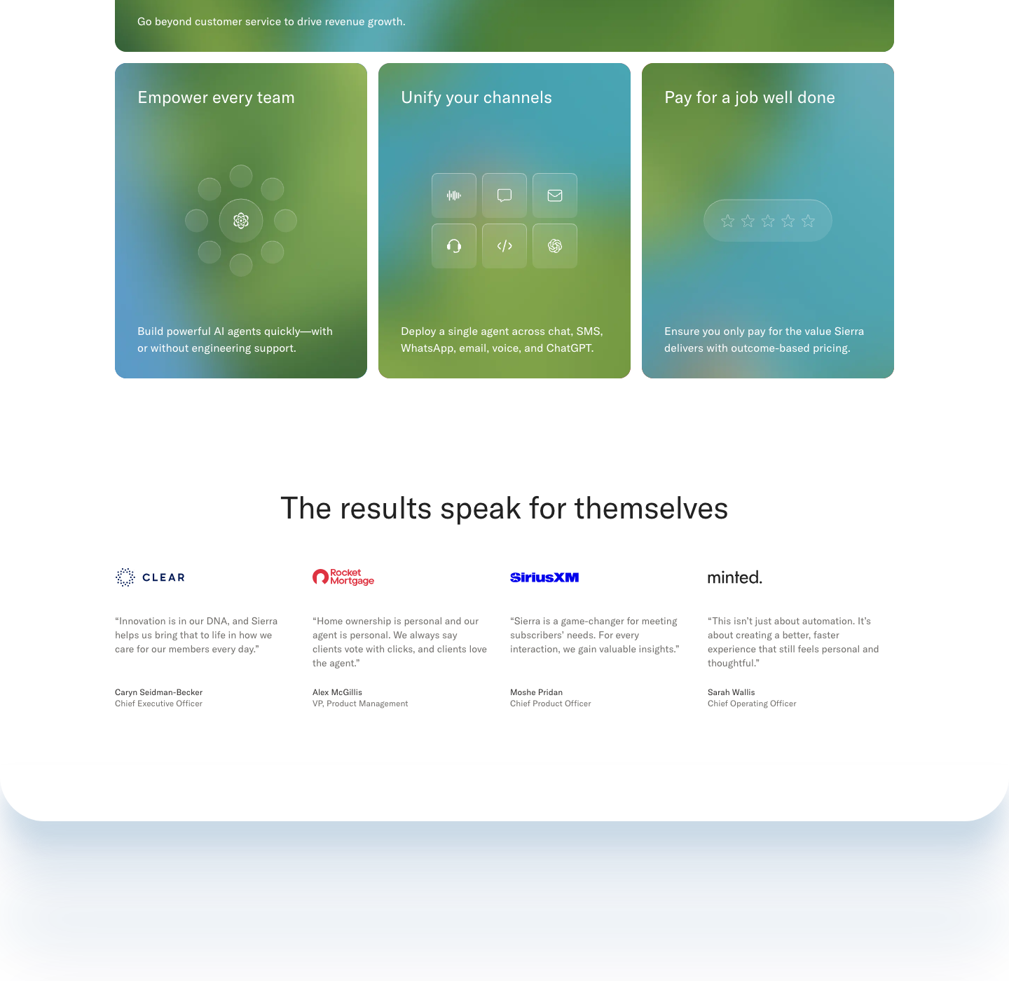
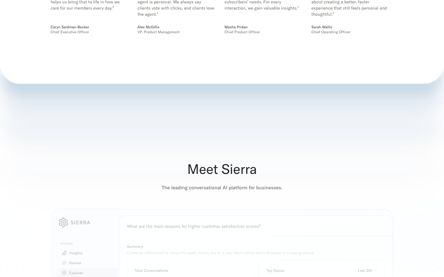
Soft, rounded and mostly borderless. Pill buttons (green primary, #F6F5F3 secondary); 40px outlined product pills with a small icon as section eyebrows; 16px-radius cards (gradient feature cards, #F6F5F3 quote cards with a 1px #E4E0DC border, value accordion rows); a frosted translucent agent-chat card over the hero video; the white page sheet that ends in 64px rounded corners with a soft blue shadow over a dotted grid; greyscale customer logo grid (5 across, 200x40 cells).
Outline icons on a 24px grid with a 2px stroke and round caps and joins, drawn in currentColor: #302E2D on light, #716F6C in the footer, white over photos.


Outline icons on a 24px grid with a 2px stroke and round caps and joins, drawn in currentColor: #302E2D on light, #716F6C in the footer, white over photos. Friendly, simple glyphs (ghost for Ghostwriter, trend arrow for Insights, horizon dome, sprout, headset, pencil with sparkle, lightning, two people). Footer social icons are filled glyphs in #716F6C.
Source: sierra.aisierra.ai/about
No flat drawn illustration.





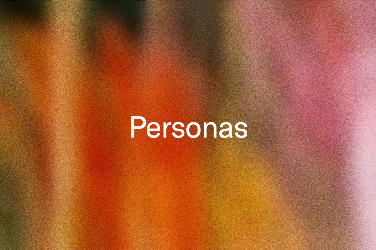
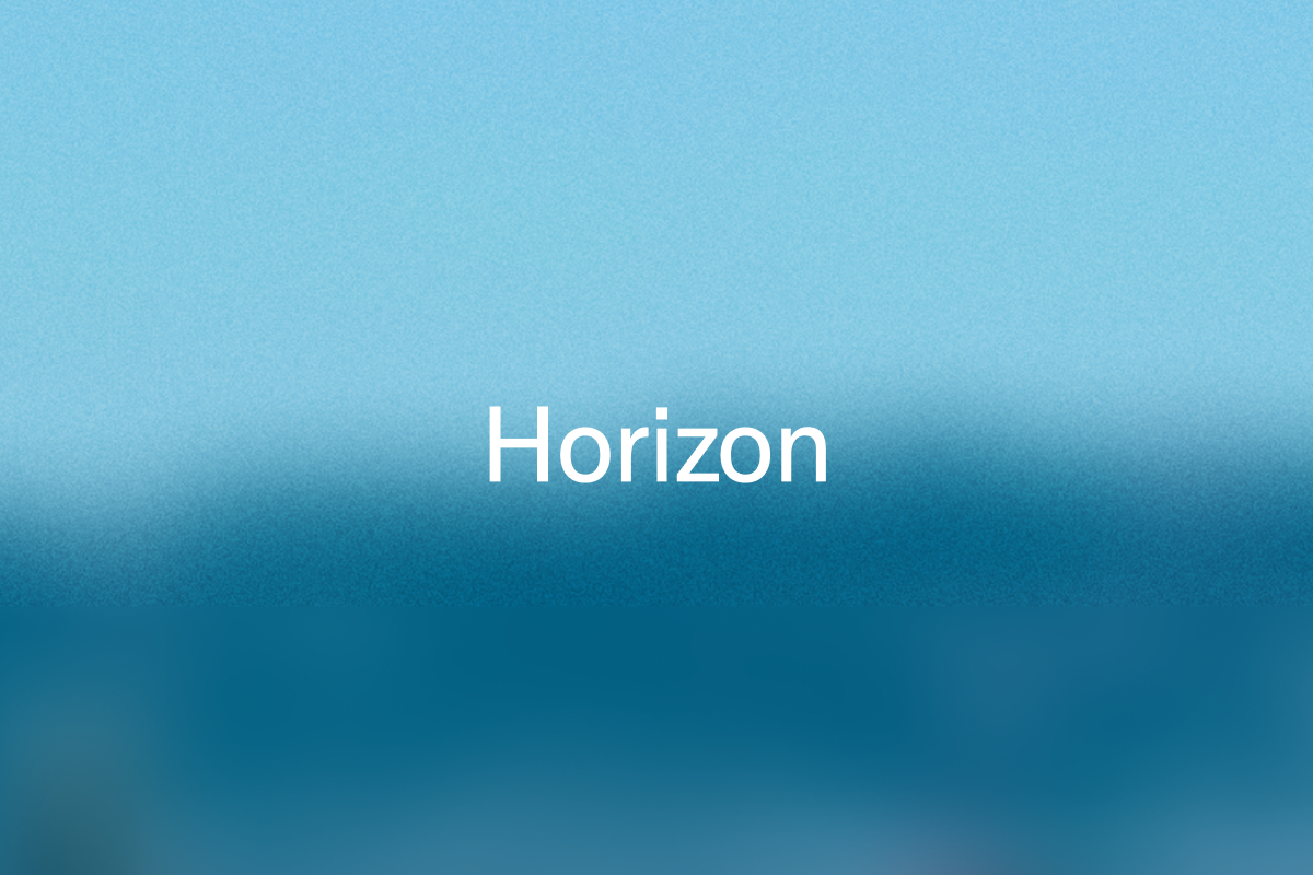



No flat drawn illustration. The graphic language is blurred, grainy colour fields that read as defocused nature (foliage greens, teal water, sky blue, ochre and coral flowers) with visible film grain, used as feature-card grounds and blog covers with white GT America text; glass UI chips float on the home cards. Sierra's own blog says nature is a big part of its visual identity, and its voice orb Mossy is a living ball of grass. One exception: small pastel 3D ghost characters (white, lilac and green) stand for Ghostwriter on its product page.
Source: sierra.aisierra.ai/blogsierra.ai/blog/mossysierra.ai/product/ghostwriter
Documentary lifestyle photography and video in soft natural daylight with true colour: ordinary people in private, everyday moments (a parent holding a sleeping baby, a man on the phone outside his home, a woman on a park bench, a couple on a rooftop), often cropped close or to hands and objects (a florist's apron and tablet, a card held in a sleeve).
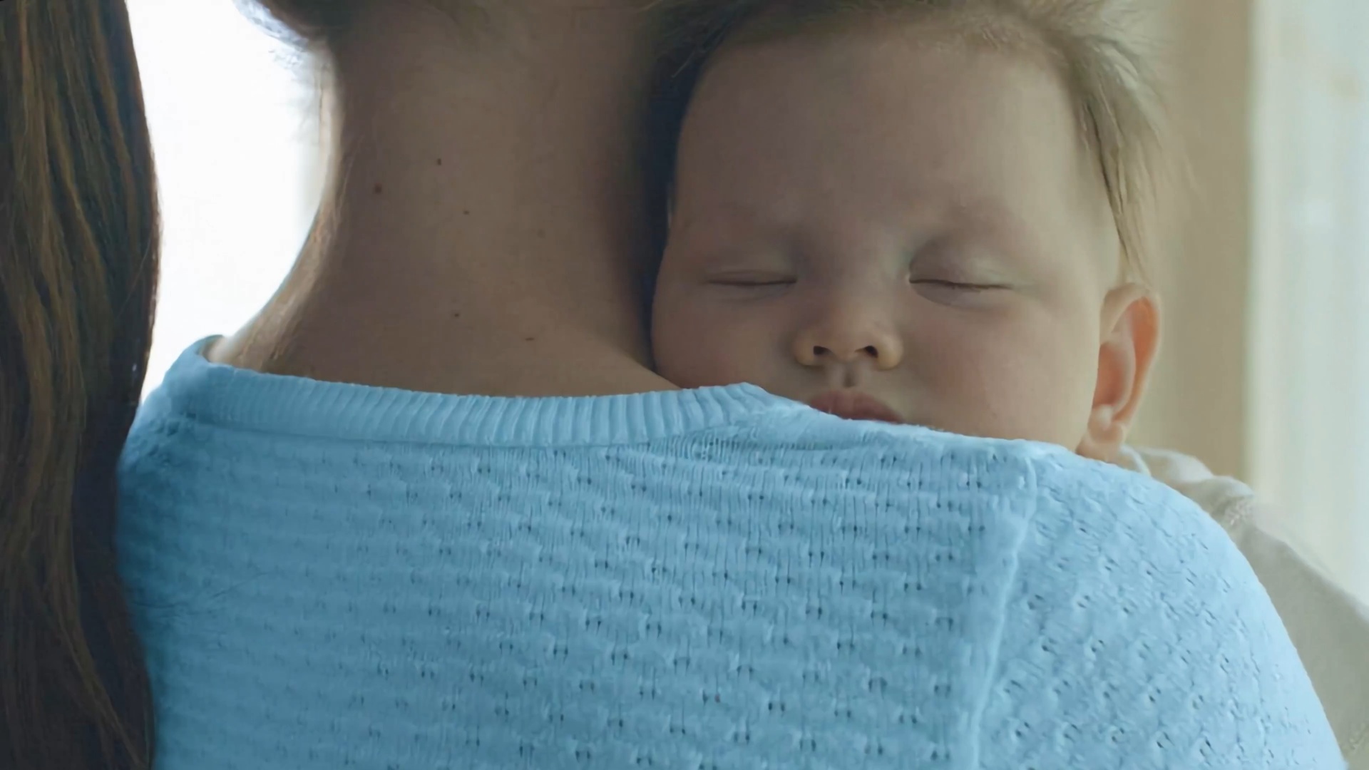

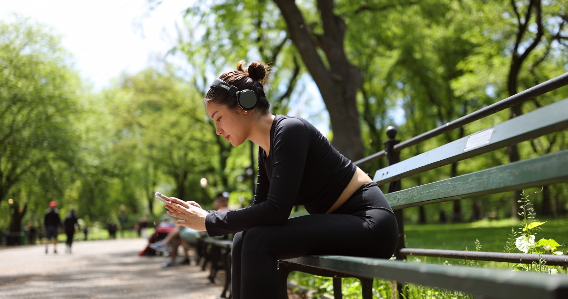



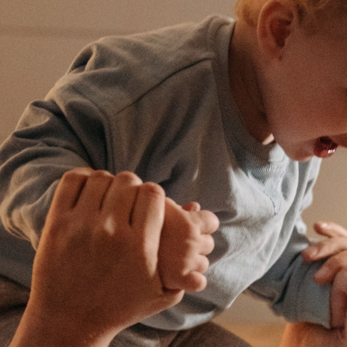


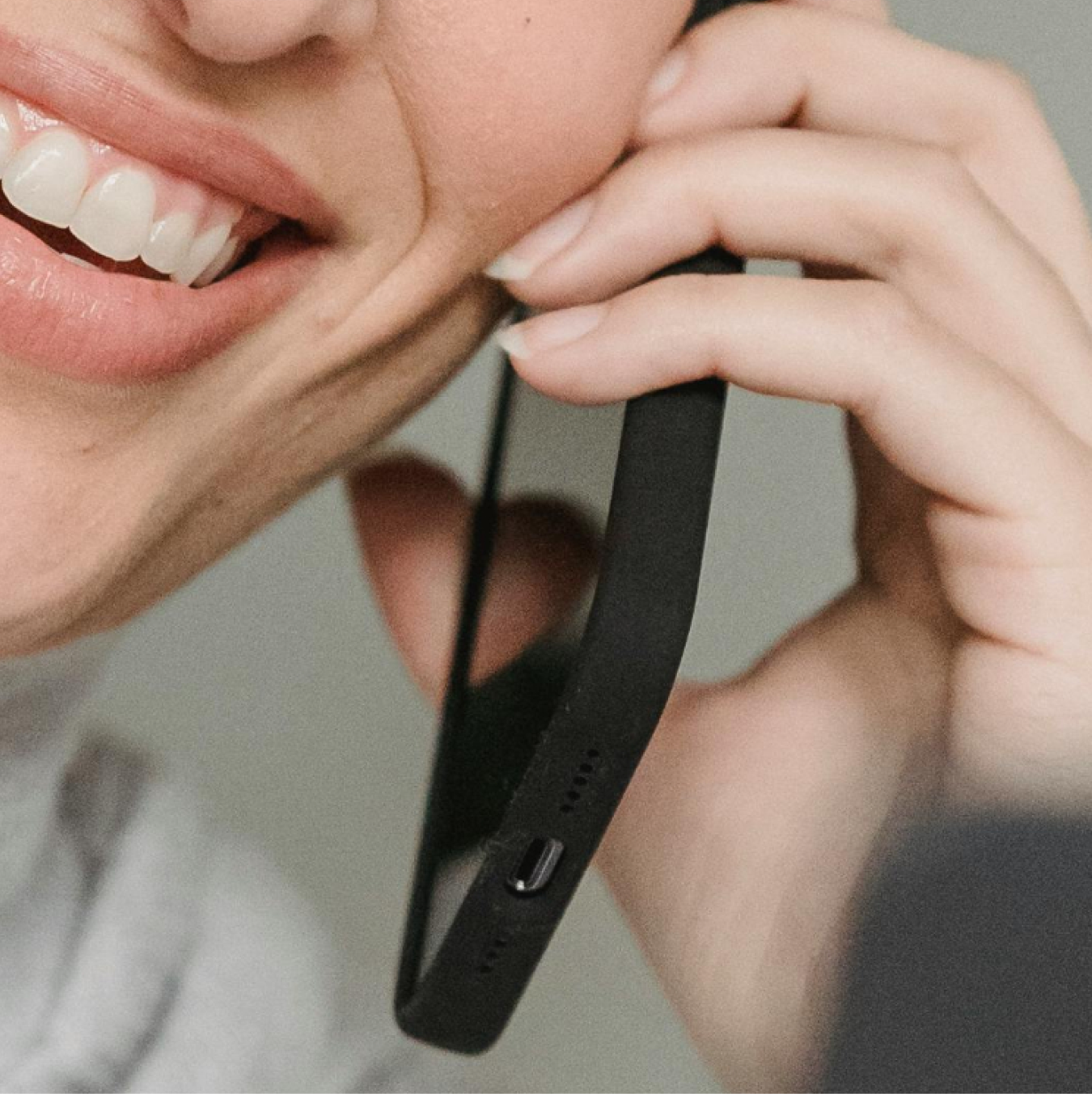

Documentary lifestyle photography and video in soft natural daylight with true colour: ordinary people in private, everyday moments (a parent holding a sleeping baby, a man on the phone outside his home, a woman on a park bench, a couple on a rooftop), often cropped close or to hands and objects (a florist's apron and tablet, a card held in a sleeve). Customer story tiles use the customer's own white logo set over the photo. Company photography (/about) is candid office and founders-walking-in-San-Francisco shots in 16-32px rounded frames. No overlays or tints; text sits on calm areas of the frame.
Centred and spacious. A 44px #345EB2 announcement bar, a 76px white nav (logo left at x 164, four grey links centred, Sign in + green Learn more pill right), a 700px full-bleed video hero, then centred sections in a 1112px content column (1160px max with 24px gutters) with 80px vertical padding: a 5-column greyscale logo grid, the gradient card bento (one wide 1112x500 + three 360x450, 16px gaps), a four-up quote row, the rounded white sheet over Meet Sierra, product bands with two or four square tiles, compliance badges in a row, the closing centred CTA and a #F6F5F3 footer with the logo left and four link columns. Phone: 24px gutters, sections stack, padding 48px.
Measured from sierra.ai's computed styles, CSS media rules and bounding boxes read headless (Chromium) at 1440x900 and 390x844, cookie banner rejected, 2026-11-17.
| Measure | Desktop | Phone |
|---|---|---|
| Page margin | 164px | 24px |
| Section padding | 80px | 48px |
| Card gap | 16px | 16px |
| Navigation | 76px | 76px |
Hero H1 white on video, 2 lines; 65/72 desktop, 32/36 phone (-0.02em)
GT America Standard Regular 400 · 65px (phone 32) · line 1.1077 · tracking -1.3px · weight 400
Section H2 for quotes, Meet Sierra, Trust, closing CTA; 44/48 desktop, 26/30 phone; site CSS -0.44px (-0.01em). Instrument Sans at the same -0.44px matches GT America within +0.3% mean width (re-measured 2026-11-17); phone -0.26px
GT America Standard Regular 400 · 44px (phone 26) · line 1.0909 · tracking -0.44px · weight 400
Section H2 for logo wall, value bento and the three product bands; 38/46 desktop, 24/28 phone; site CSS -0.38px (-0.01em) in GT America. Instrument Sans needs -0.7px (-0.018em) to match its width (+0.4% mean over six real lines, re-measured 2026-11-17); phone -0.44px
GT America Standard Regular 400 · 38px (phone 24) · line 1.2105 · tracking -0.7px · weight 400
Feature card title, white; 24/32 desktop, 20/26 phone; site CSS normal tracking. Instrument Sans at 0 matches within +1.0% mean (re-measured 2026-11-17): keep 0
GT America Standard Regular 400 · 24px (phone 20) · line 1.3333 · weight 400
Mega menu "Product overview" 20/28; phone menu rows 20/26 #625E5B
GT America Standard Regular 400 · 20px · line 1.4 · weight 400
Sub-lines (#625E5B), tile bodies (#716F6C), card benefit lines (white), hero card message; 16/24 desktop, 14/20 phone; Instrument Sans at 0 tracking already matches GT America within 1%: keep 0
One face, one weight (GT America Standard Regular 400 for text; Medium 500 rarely) · 16px (phone 14) · line 1.5 · weight 400
Product tile title 16/24 desktop, 14/20 phone
One face, one weight (GT America Standard Regular 400 for text; Medium 500 rarely) · 16px (phone 14) · line 1.5 · weight 400
Nav links, buttons (small), footer links, quotes; 14/20 desktop, 12/16 phone
One face, one weight (GT America Standard Regular 400 for text; Medium 500 rarely) · 14px (phone 12) · line 1.4286 · weight 400
Quote name and title, mega-menu descriptions; 12/16 desktop, 10/16 phone
One face, one weight (GT America Standard Regular 400 for text; Medium 500 rarely) · 12px (phone 10) · line 1.3333 · weight 400
Numerals inside product UI art only (GT America Mono -> Fragment Mono)
GT America Mono Regular/Medium · 12px · line 1.5 · weight 400
How Sierra’s own landing pages are built, observed on sierra.ai, 2026-11-17. The full measurements are in spec.md.
Source: measure/home-desk.json, home-phone.json, about-*, customers-*, blog-* (measured 2026-11-17)sierra.aisierra.ai/aboutsierra.ai/customerssierra.ai/blog
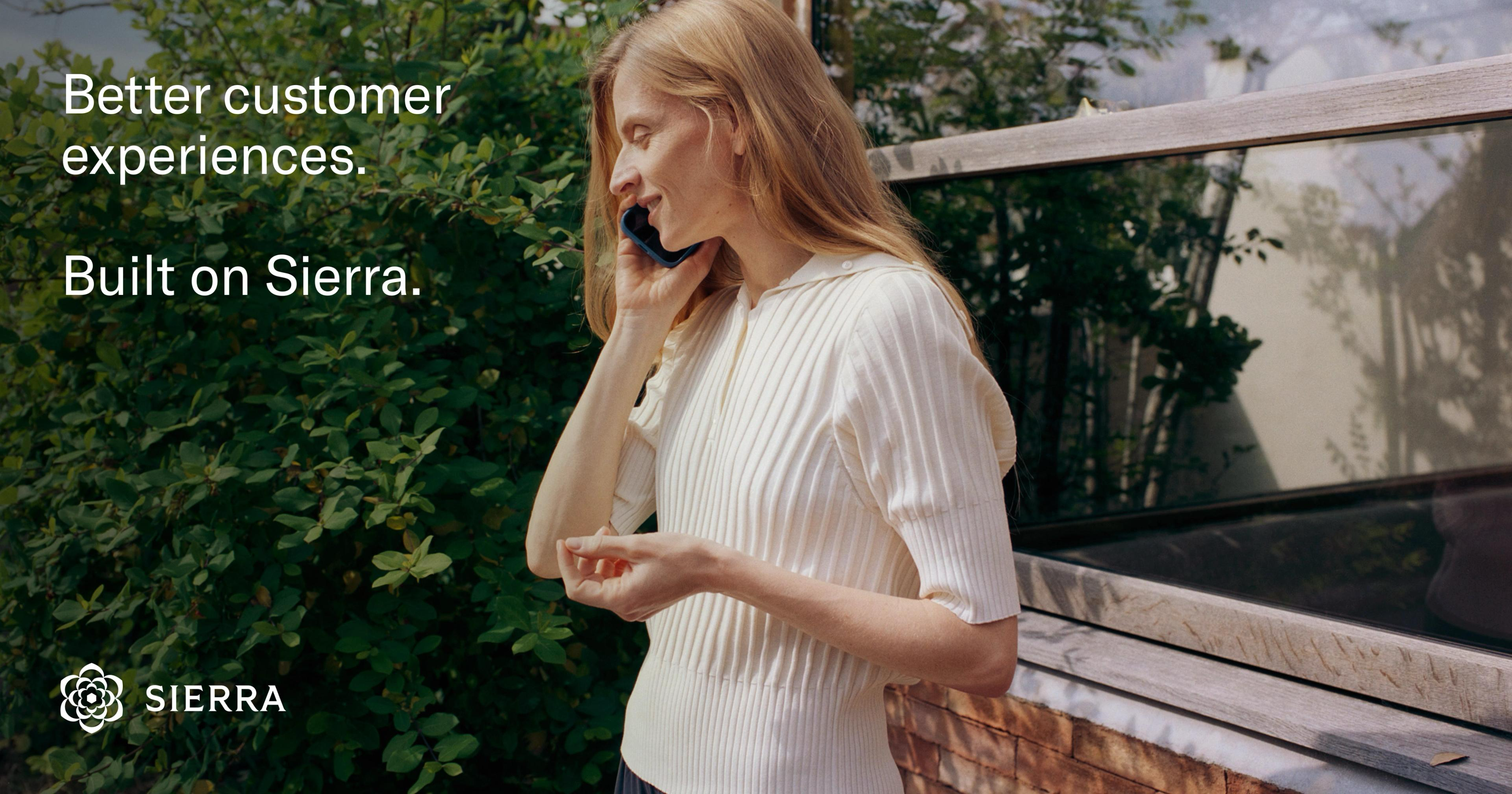

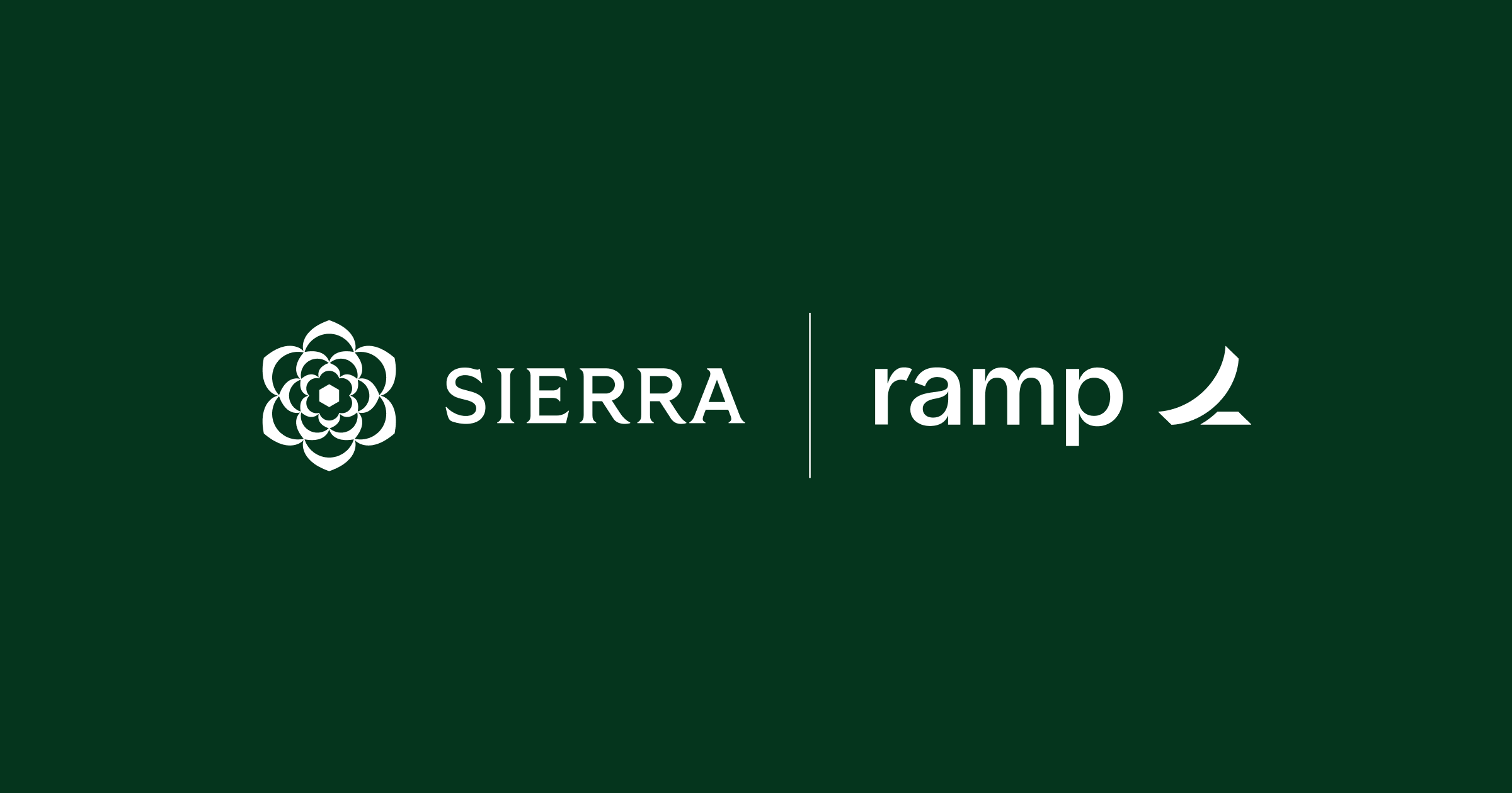



From sierra.ai pages, its og:image share cards on the home, about, customers and product pages and 9 blog posts (2026-11-17). Organic LinkedIn, X and Instagram were walled or absent headless; no decks or emails reviewed.
| Format | Must appear | What varies |
|---|---|---|
| Landing page | Blue #345EB2 44px announcement bar with a one-line announcement and underlined Learn more ->; white nav with the green lockup left, Product / Industries / Customers / Company centred in #716F6C 14px, Sign in and a 40px #006838 Learn more pill right. Full-bleed documentary video hero with a white 65/72 two-fragment headline bottom-left, a #F6F5F3 56px Learn more pill and a frosted agent-chat card on the right. Then centred sections on white: logo grid with a green Customer stories pill; a nature-gradient card bento with white heads; four customer quotes with logos; product bands (centred head, outlined product pill, square UI tiles with title and grey copy); compliance badges; the centred closing CTA "Discover what Sierra can do for you" with a 56px green pill; #F6F5F3 footer. Full geometry, copy and resting states: kit.spec.page. Voice: homepage voice (kit.spec.page.voice_scope); only the H1 may take the two-fragment campaign form. | |
| Social post | One of the two observed families: (A) documentary photo with white headline top-left and white lockup bottom-left, or (B) blurred grainy nature field with a centred white headline and the white lockup centred at the bottom. White GT America Regular (Instrument Sans 400) only, sentence case, never bold. White lockup (logo-on-dark.svg), never the green one on an image. | Family B may carry one 40px subline under the headline. Family A headline may be the two-fragment campaign form with a blank line between fragments. Closest paid family if the post is an ad (observed google-3, google-4): a rounded photo on white with a regular dark headline, a grey subline and one Learn More button; do not use it for announcements. |
| Paid display ad: tall banner | Mint #EAFAF1 ground, bold forest-green #13532D three-line headline, regular green subline, one small video tile, full-width #092A16 Learn More bar. | Subline swaps between "Deploy an AI agent that is empathetic, engaging, and always-on." and "Elevate your customer experience with conversational AI."; glyph tile may be left empty. |
| Paid display ad: responsive photo card | White card with a glyph and "Sierra AI / sierra.ai" header, one rounded photo carrying the brand line, a regular dark headline with a grey subline and a Learn More button. | Photo left with text right (product shot) or photo above with text centred (people shot). |
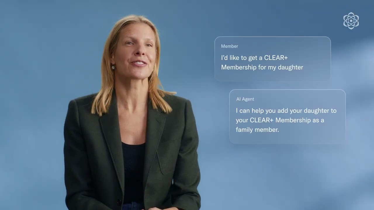
| Video thumbnail: customer story | A customer speaker on a soft amber, sky or ochre gradient with the small white outline glyph top right; no title text. | A pair of frosted-glass chat bubbles (small grey role label, white regular line) may sit right of the speaker; one interview variant uses a lifestyle photo with the white title top right and the lockup bottom right. |
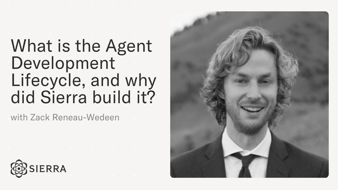
| Video thumbnail: Sierra explainer series | Warm off-white #F6F5F3 ground with a faint dot grid, the question as a left dark regular headline, "with <name>" in grey, the lockup bottom left, a greyscale portrait in a rounded frame on the right. | Headline runs 3 to 4 lines; the portrait is the same person across the series. |
| Case-study share card | Sierra lockup and the customer wordmark in one centred row split by a thin vertical rule (or a thin cross), on a flat colour or a darkened product photo; no headline. | Ground is yellow #EBEB98 with black marks, dark green #05351D with white marks, or a darkened product photo with white marks. |
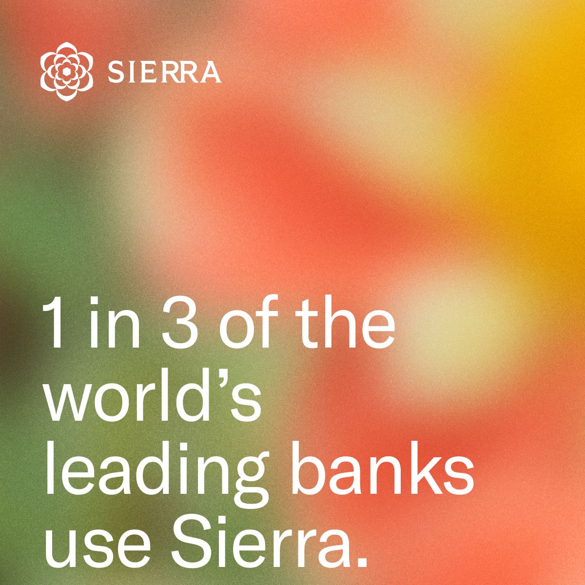 Better outcomes. Built on Sierra.LinkedIn · Nov 2026
 Gartner emerging tech ai vendor race reportLinkedIn · Nov 2026
 No endless hold musicGoogle · May 2025 – now
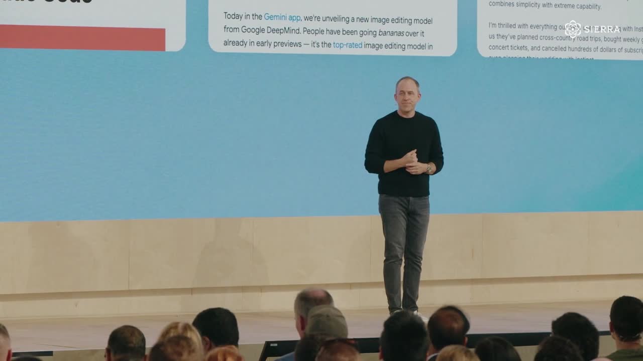 Three questions every leader is facing: - How do you…LinkedIn · Nov 2026
Source: sierra.aisierra.ai/aboutsierra.ai/customerssierra.ai/blog
Your name and logo, Sierra’s system.
Talk about my brand Use this brand in Claude
Get your brand audit Put your brand in Claude What goes in a brand book
Each value is marked published, observed, our reading or our recipe, with its source. Checked 2026-11-17. Not affiliated with Sierra.
Tell us what you want to make. We’ll talk through how to put these ideas to work for your brand.