Sell everywhere
Online and in person, across AI and on social, locally and globally Observed
Brand book
Shopify sells a tool, so it lets merchants be the color. The page is a dark, quiet stage of light type and white pills, and every bright thing on it is a merchant: their storefronts, their products, their faces. Our reading

The chapter ground hue (teal, violet, navy, deep green, graphite) and which merchants are shown
Source: shopify.com
Observed share of the homepage area at 1440, 2026-10-29: dark grounds and cards, imagery, white type and pills. Shopify publishes no ratio.
Shopify publishes tone by situation; the levels are our reading of how much personality each allows.
Our engine's setting, built from their rules.
Cover the logo. It should still read as Shopify: a near-black page, a huge light Inter headline, a white pill, and real merchants as the only color.
Is Shopify green anywhere outside the logo? Take it out.
Swap in another platform's logo. If the merchant stories and two-beat headlines still feel at home, the copy is too generic: name a merchant or a number.
The world's best commerce platform. Observed
Online and in person, across AI and on social, locally and globally Observed
Payments, fulfillment and retail run from one command center Observed
The world's best-converting checkout Observed
Apps, APIs and AI tools to customize everything Observed
Be the next household name
Dream big and build fast on Shopify.
Sell everywhere people shop.
Your brand has entered the chat
Category. Commerce platform: online store, point of sale, checkout, payments and apps in one system Observed
Shopify is a commerce platform for businesses from first sale to enterprise: online store, point of sale, checkout and payments, apps, and an AI assistant, Sidekick.
Show up everywhere. Without going anywhere.
Grow around the world
For anyone from entrepreneurs to enterprise
Meet your secret weapon, Sidekick
Customize everything with apps
Hyperdriven by AI. Commerce to the core.
There's no better place for you to build
The world's best-converting checkout
Rock steady. Blazing fast.
Shopify has your back
Build fast on Shopify
Everything new across Shopify. Every six months.
The homepage runs as a chapter list of short, two-beat headlines: a promise, then a twist ("Show up everywhere. Without going anywhere."). Each chapter names one capability and backs it with a merchant, a number or a product shot.
Source: shopify.com
Product saved
Congrats! You set up your single login for Shopify.
Change the product weight to 0 or more and try again.
Invalid request
Merchants use Shopify to run a business; plain words that respect their time keep trust.
realproactivedynamicguiding
The published voice is real, proactive, dynamic and guiding, each with its "but not" (too tough, pushy, scattered, prescriptive). Tone flexes by situation, from quiet everyday confirmations to careful bad-news messages.
merchantcommercesellbuildgrowstorecheckout
bad requestforbiddenfatalinvalidYou successfully...Congrats!
Source: shopify.dev/docs/apps/design/content/voice-and-tone
Source: shopify.dev/docs/apps/design/content/voice-and-toneshopify.dev/docs/apps/design/contentshopify.dev/docs/apps/design/content/grammar-and-mechanics


Logos shown from Shopify's brand assets page for reference. Shopify and the Shopping Bag are trademarks of Shopify Inc.; their use requires written authorization under its Trademark Usage Guidelines. Not affiliated, and not for download.
Inverted primary logo on a dark ground
Wordmark alone, stretched
The primary logo is The Shopping Bag plus an italic wordmark, in full color wherever possible; the S on the bag is always white.


The primary logo is The Shopping Bag plus an italic wordmark, in full color wherever possible; the S on the bag is always white. An inverted version (white wordmark) is for dark or busy grounds; monotone black or white is for single-color or low-contrast cases, and has a gap in the bag. The bag alone can stand in when the wordmark would be illegible, a full-color logo is nearby, the brand is already established, or space is tiny.
| Minimum size | 80px / 28mm wide |
|---|---|
| Clear space (logo) | x-height of the wordmark |
| Clear space (bag) | 1/2 S |
| Homepage nav | inverted logo 126x36 |
| Homepage footer | white bag 44x50 |
Source: shopify.com/brand-assets
Start for free
Dark, quiet grounds let merchant photography and product UI carry the color; green stays special because it only appears in the logo.
Shopify publishes its colors only inside the logo files: bag green #95BF47 and shadow #5E8E3E, with a white S. The homepage never uses that green in the UI. It is built from dark grounds, a different hue per chapter (#02090A, the #2C007F-to-#000A1D Sidekick gradient, #000A1E navy, #041E18 deep green), white type, one white pill and a mint #36F4A4 for numbers. For product UI, Shopify's app guidance sets roles: green for success, yellow for paused, orange for pending, red only for errors.
Not published: a marketing palette with hex values (only the logo files carry hex); color proportions.
Source: shopify.com/brand-assetsshopify.dev/docs/apps/design/visual-designshopify.com
Be the next household name
Be the next household name
BE THE NEXT HOUSEHOLD NAME
Light weights at big sizes read calm and premium on dark grounds; one family keeps a long page coherent.
| Their face | Use | License | Open stand-in |
|---|---|---|---|
| Shopify-Inter | Every headline, weights 300-330 | Shopify's own build of Inter, served from cdn.shopify.com; its licence is not published (Inter itself is SIL OFL) | Inter Shopify's file is not offered for reuse; open Inter with optical sizing on auto matches it within 0.6% in width and ink at the same weights (see calibration) |
| Shopify-Inter | Body, nav, buttons (weights 400-550) | Shopify's own build of Inter; licence not published | Inter Same file as display; Inter matches within 1.2% width |
| ui-monospace | Stat labels and chips only | the reader's system font | JetBrains Mono System mono varies by device; JetBrains Mono is an open, even-width match for SF Mono |
shopify.com sets everything in one face, Shopify-Inter, a Shopify build of Inter loaded as a variable font. Headlines run light (300 hero, 330 sections) at large sizes with negative tracking; body runs 400-420; buttons 550. Labels for data use the system mono. The app design guide asks for a clear hierarchy: page title largest, headings bolder or larger, never underlined.
Source: shopify.comshopify.dev/docs/apps/design/visual-design
Marketing icons are thin white or mint line glyphs at 14-28px (chevrons, play circle, globe, stat icons).
Marketing icons are thin white or mint line glyphs at 14-28px (chevrons, play circle, globe, stat icons). Product icons come from the Polaris icon set; app guidance asks for icons that clarify actions and are used consistently in lists.
Source: shopify.comshopify.dev/docs/apps/design/visual-design
The homepage has no illustration: product UI, app icons and photos fill every visual slot.
The homepage has no illustration: product UI, app icons and photos fill every visual slot. Shopify's app guidance points to the Polaris illustration guidelines for in-admin illustration.
Not published: a marketing illustration style.
Source: shopify.comshopify.dev/docs/apps/design/visual-design
Photography is real merchants and their products: founders in their studios, cookware on a stove, a toymaker's headquarters, storefront screenshots, all full-color and naturally lit, set in 8-12px rounded frames on dark grounds.

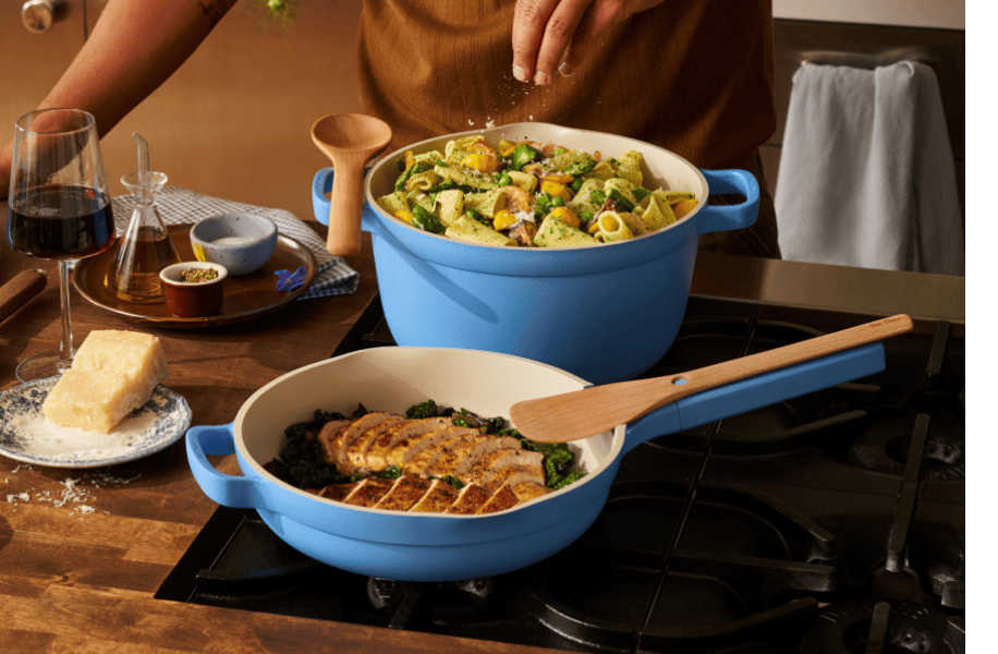

Photography is real merchants and their products: founders in their studios, cookware on a stove, a toymaker's headquarters, storefront screenshots, all full-color and naturally lit, set in 8-12px rounded frames on dark grounds. Video plays in the hero and the AI cards.
Source: shopify.com
Controls change in 150ms (cubic-bezier 0.4, 0, 0.2, 1).
Controls change in 150ms (cubic-bezier 0.4, 0, 0.2, 1). Brand motion is bigger and slower: a looping hero video with a rotating final phrase, a statement that highlights phrase by phrase on scroll, marquee storefronts and app icons, drifting stat chips.
Not published: motion principles or durations in a guide.
Source: shopify.com
Do The whole homepage sits on #02090A, #000A1E navy and #041E18 deep green, never white. Type is white with a muted second color per ground. The only filled control is the white pill (56px, 9999px radius, 18px w550 black); the alternative is the same pill as a 2px white outline.
A near-black page with one white pill · every band from the hero to the footer
Do Headlines run Inter at weight 300-330 (never bold): 96px hero, 56px section heads, 64px closers, all with negative tracking (-0.02 to -0.03em) and sentence case. Stats repeat it: 96px light numerals with a 64px superscript unit. Load Inter WITH its optical-size axis: <link href="https://fonts.googleapis.com/css2?family=Inter:opsz,wght@14..32,100..900&family=JetBrains+Mono:wght@400&display=swap" rel="stylesheet"> and keep font-optical-sizing: auto. Plain "Inter:wght@100..900" loads only the 14pt text cut, which sets headlines about 10% wider than Shopify-Inter and breaks every measured line; with opsz on auto, Inter matches Shopify-Inter within 0.6% at the same weight and tracking.
Light, giant, tightly tracked headlines · hero, section heads, stats
Do A new chapter starts with a full-width band whose top corners are rounded 48px, overlapping the band above by its radius so the corners show the previous ground behind them. Inside bands, cards are 12-16px rounded.
Bands that slide over each other with 48px rounded tops · the statement band over the hero, Sidekick, the deep green run, Build fast
Do Near-black teal for selling (#02090A, #061A1C cards), violet-to-navy for Sidekick (#2C007F to #000A1D), navy for apps and developers (#000A1E, #010624 card), deep green for checkout and reliability (#041E18), graphite for the close. Body text takes a matching muted tint (#9DABAD, #BDBDCA, #99B3AD).
Each chapter gets its own dark hue · the page as a whole
Do #36F4A4 marks numbers and labels only: 12px uppercase mono stat labels, 01-03 step numbers, the 2px rule before a stat footnote. Everything else stays white or muted.
Mint for data, mono for labels · checkout stats, stat chips, step numbers
Specimens use sample copy, not Shopify’s.
A 1260px content box with 90px side margins at 1440 and 16px on phones. Bands are 640-930px tall, each opening with a 56px headline 64px above its content. Chapters change with a 48px-rounded band edge. Cards are 12-16px rounded, three-up at 409px with 16px gaps or 303/606/303 with 24px gaps.
Measured from shopify.com's computed styles, bounding boxes and hover states at 1440 and 390 in headless Chromium, 2026-10-29; images downloaded from their cdn.shopify.com files; video slots as stills from the video files.
| Measure | Desktop | Phone |
|---|---|---|
| Page margin | 90px | 16px |
| Section padding | 128px | 64px |
| Card gap | 16px | 16px |
| Navigation | 72px | 72px |
Hero display (h1)
Shopify-Inter · 96px (phone 56) · line 1.08 · tracking -1.92px · weight 300
Statement headline
Shopify-Inter · 56px (phone 36) · line 1 · tracking -1.68px · weight 330
Section headline (h2/h3)
Shopify-Inter · 56px (phone 36) · line 1.08 · tracking -1.68px · weight 330
Closing headline (centered h2)
Shopify-Inter · 64px (phone 44) · line 1.08 · tracking -1.28px · weight 330
Feature headline (h3)
Shopify-Inter · 44px (phone 30) · line 1.1 · tracking -0.44px · weight 330
Stat number
Shopify-Inter · 96px (phone 56) · line 0.96 · weight 300
Pull quote
Shopify-Inter · 34px (phone 26) · line 1.14 · weight 330
Hero lead
Shopify-Inter · 24px (phone 18) · line 1.3 · tracking -0.48px · weight 400
Card title (h4)
Shopify-Inter · 20px (phone 16) · line 1.3 · weight 450
Body large
Shopify-Inter · 20px (phone 18) · line 1.4 · weight 400
Body
Shopify-Inter · 18px (phone 16) · line 1.4 · weight 400
Body small
Shopify-Inter · 14px · line 1.37 · weight 420
Button
Shopify-Inter · 18px (phone 16) · line 1.56 · weight 550
Nav link
Shopify-Inter · 16px (phone 24) · line 1.5 · weight 420
Footer heading
Shopify-Inter · 20px · line 1 · weight 450
Footer link
Shopify-Inter · 16px · line 1.5 · weight 400
Mono label
ui-monospace · 12px · line 1.33 · weight 400
Step number
Shopify-Inter · 24px (phone 18) · line 1.3 · weight 400
How Shopify’s own landing pages are built, observed on shopify.com, 2026-10-29. The full measurements are in spec.md.
Source: shopify.com
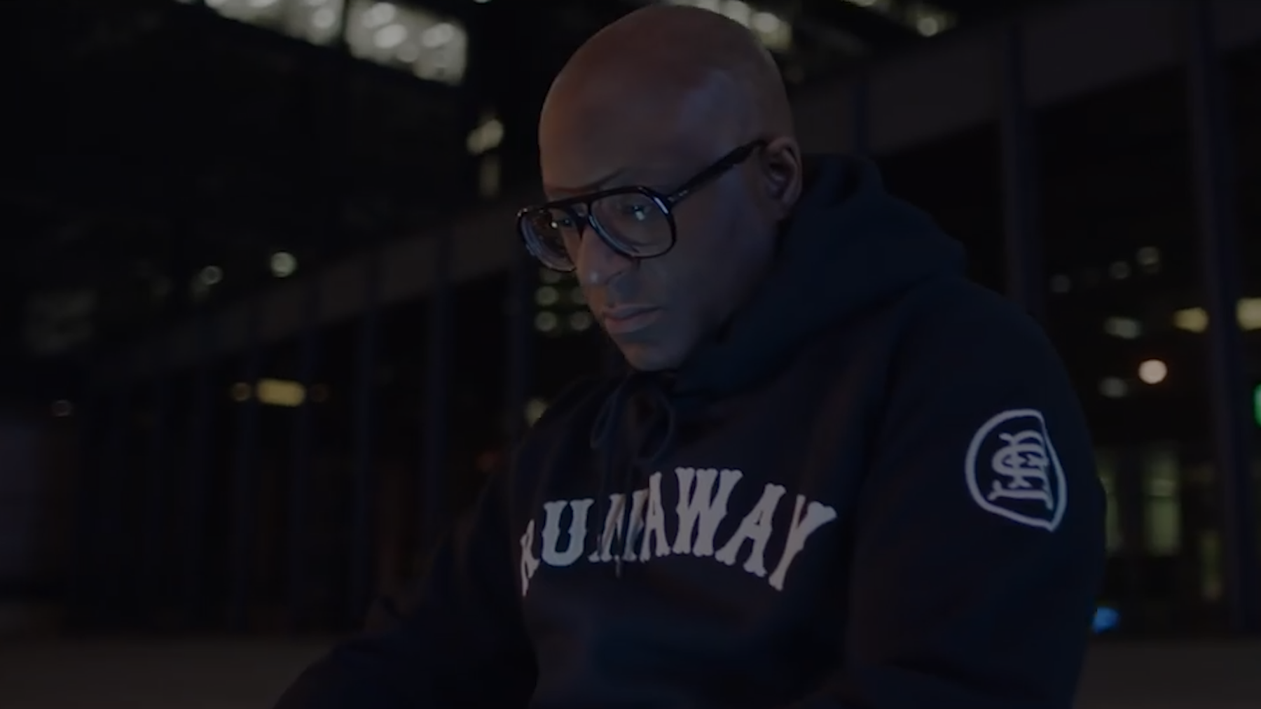
A product changelog becomes a collectible series: each edition gets a name and a look, while the bag and the shelf keep it Shopify. Our reading
The merchant is the hero and the headline is about them, so the platform never has to describe itself first. Our reading
How our engine applies Shopify's system to each format. This is our recipe built from their rules and homepage, not something Shopify publishes.
| Format | What they did | Source |
|---|---|---|
| website | shopify.com homepage: dark chapter bands, merchant storefronts and product UI, white pills. | shopify.com |
| brand assets page | Logo downloads with clear space, minimum size and the do-not list. | shopify.com/brand-assets |
| product UI | Apps inside the Shopify admin follow Polaris and the app design guidelines for color roles, type hierarchy, icons and voice. | shopify.dev/docs/apps/design/visual-design |
| release site | Shopify Editions: a named, twice-yearly product release with its own cover art. | shopify.com/editions |
| Format | Loudness | Must appear | What varies |
|---|---|---|---|
| Landing page | Dark #02090A page, 72px transparent nav over a full-bleed video or photo hero with a 96px light two-line headline and a white pill plus outline pill; chapters on dark hues opened by 48px-rounded band tops; 1260px content box; black footer with four link columns | which chapters follow the hero and which merchants appear | |
| Product UI (in-admin app) | Polaris components, neutral text, color only for status, grade 7 copy | a light touch of brand in illustration | |
| Deck | Dark slides, light Inter headlines, merchant photos, mint only for numbers | chapter hue per section | |
| One white pill CTA, sentence-case headline, merchant proof | hero image | ||
| Error message | Plain words: what happened and how to fix it | none |
 Free trialGoogle, Meta · Feb 2026 – now
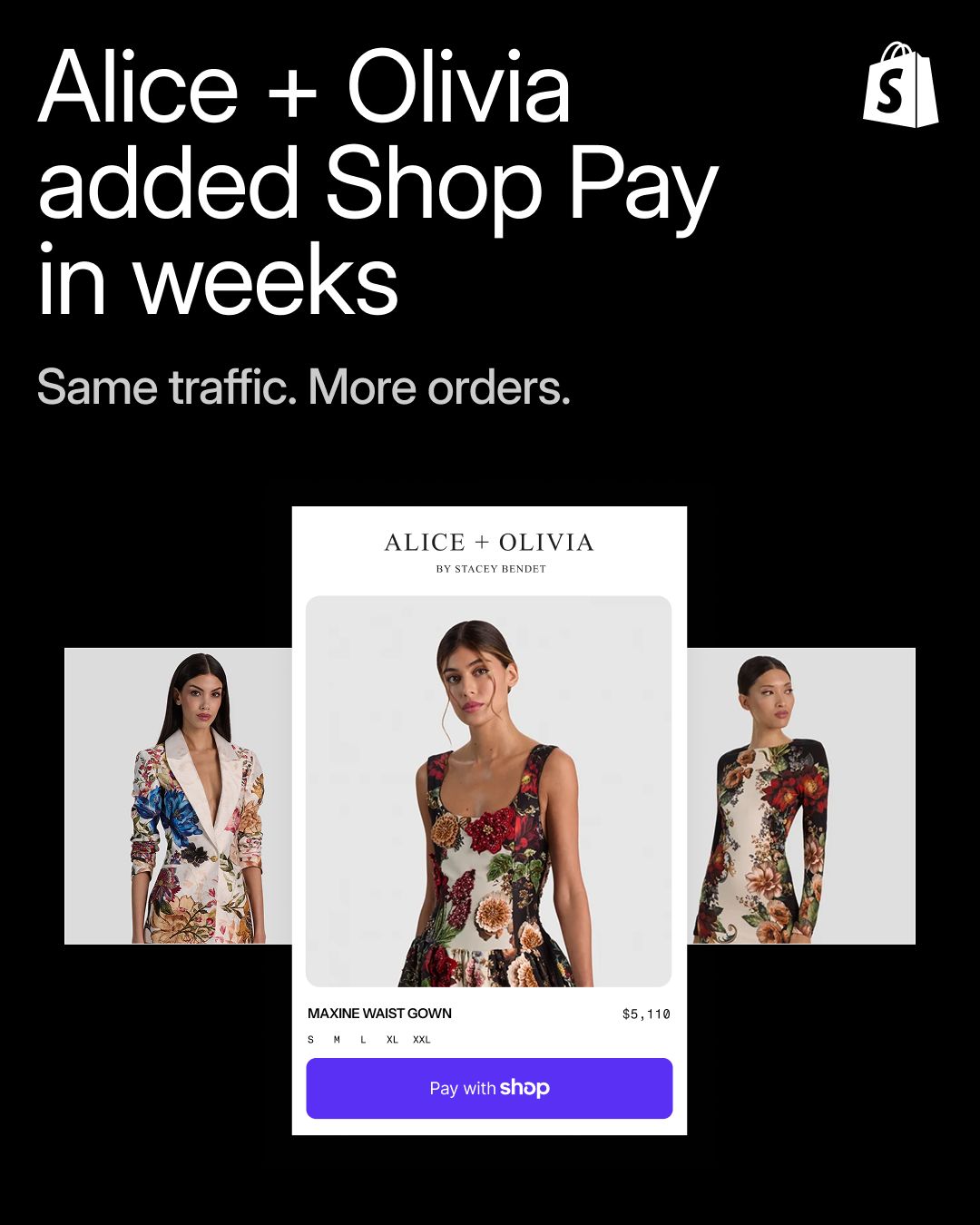 shop pay offer aa75jlLinkedIn · Oct 2026
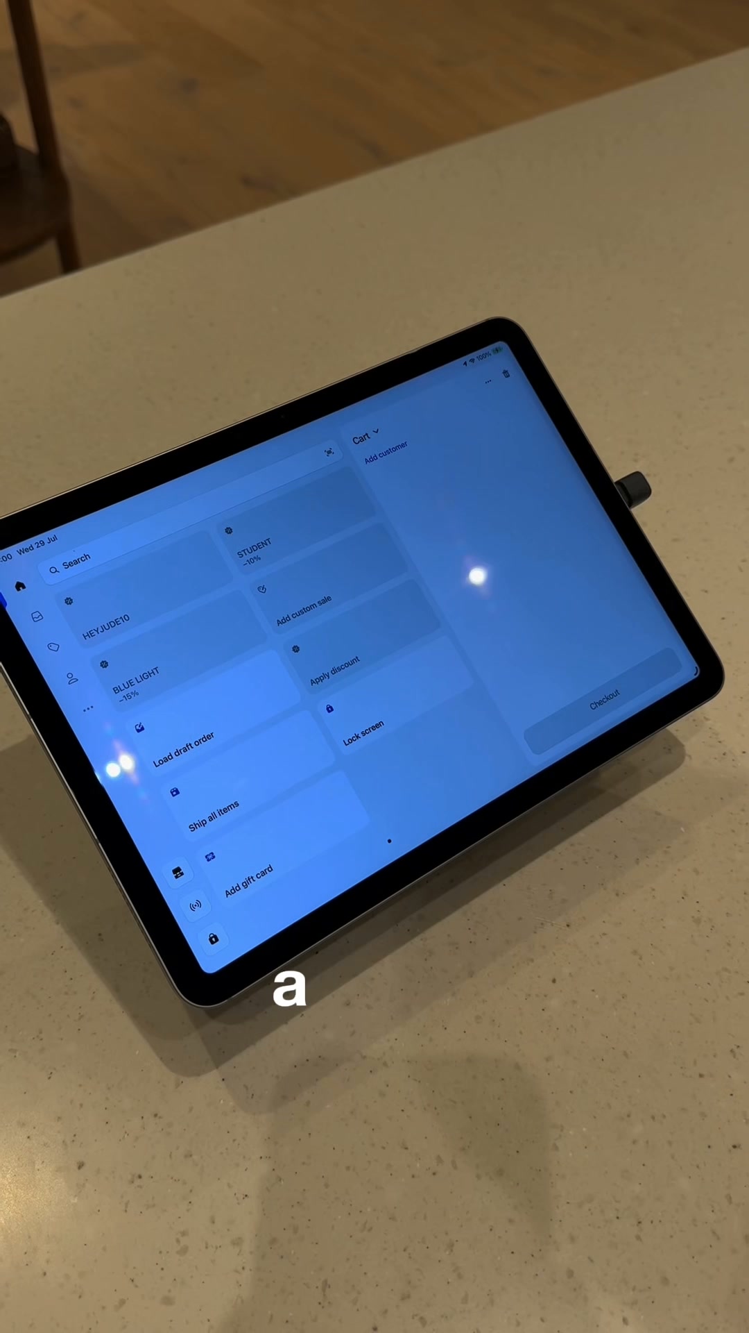 Pos pro yearlyMeta · Sep 2026 – now
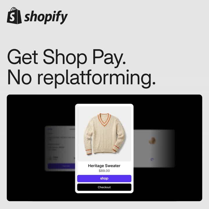 Add Shop Pay to your checkout and go live fastLinkedIn · Oct 2026
Source: shopify.com/brand-assetsshopify.dev/docs/apps/design/visual-design
Your name and logo, Shopify’s system.
Use this kit for my brand Use this brand in Claude
Get your brand audit Put your brand in Claude What goes in a brand book
Each value is marked published, observed, our reading or our recipe, with its source. Checked 2026-10-29. Not affiliated with Shopify.