Unmatched, AI-ready data
Built on billions of insurance-trained, AI-ready data elements, so agents deliver outcomes insurers trust (paraphrase). Observed
Brand book
Shift dresses AI in the clothes of an insurer: a bookish serif and near-black aubergine read as institutional and trustworthy to claims and SIU leaders, while electric purple and the aqua-juniper gradients mark the technology. People photos and 'Insurance is a people business' keep the agents subordinate to human experts. Our reading

Which inset panel carries the middle of the page: the purple-to-aubergine gradient stats panel (home), the #FAFAFF lavender panel (home, about), the #240A40 card (why-shift) or the flat #5134C9 statement band (why-shift).
Source: shift-technology.comshift-technology.com/aboutshift-technology.com/why-shift
Share of the desktop homepage at 1440 by band area, from the measured band heights in kit.spec.page (our count); the gradient stats panel is counted with the purple.
Our engine's setting, built from their rules.
Source Serif 4 600, sentence case, #240A40 (white on dark), exactly one #5134C9 phrase on light grounds.
Source Sans 3 400 #707070 at 18/28 (22/34.2 lead); no black text anywhere.
44px, radius 2px, 12/16 padding, Source Sans 18/400; #5134C9 primary or 1px #240A40 outline; outline white on aubergine.
Aqua/juniper/amber/magenta/coral appear only in icons, 2px rules and animation frames; the only gradient panel is 135deg #5134C9 to #240A40.
Mid-page color sits in inset panels (32px from the edge at 1440, radius 4px); only the closing CTA and footer are full-bleed #240A40.
The SVG wordmark, purple on light and white on dark; never retyped.
Every number, customer, award and quote appears on shift-technology.com (kit.messaging.proof_points).
Shift is the AI platform built only for insurance: agents that transform insurers’ most critical work, with human experts kept in the loop (paraphrase). Observed
Built on billions of insurance-trained, AI-ready data elements, so agents deliver outcomes insurers trust (paraphrase). Observed
More than a decade inside insurer processes, systems and data, so Shift can anticipate and drive lasting transformation (paraphrase). Observed
Human-in-the-loop by design: agents work alongside human experts, and every action is transparent and auditable (paraphrase). Observed
Trusted by leading insurers to turn reactive processes into real-time results: lower losses, faster cycles, better customer experiences (paraphrase). Observed
Agents that transform insurers’ most critical work
Empowering teams to work smarter and serve better
Delivering AI agents when and where it matters most
Agent solutions built for insurance
Founded in Paris in 2014, Shift now has offices in Paris, Boston, Frankfurt, Tokyo, Singapore, London, Madrid, Toronto, Mexico City and Sao Paulo, and works with P&C, travel, health, workers’ compensation and life insurers in 30+ countries (paraphrase of Shift at a glance).
Category. AI agents for insurance; the partners page calls Shift the only AI company solely focused on insurance (paraphrase). Observed
Narrow AI use casesSiloed chatbotsAnother point solutionIndustry-blind AI models
Shift delivers AI agents that transform insurers' most critical work. By combining deep industry expertise and unmatched data resources, Shift provides proven results that have earned the trust of hundreds of the world's leading insurers. Our insurance-grade AI is accurate, explainable, and secure—empowering human experts to move with unmatched speed, total confidence, and a renewed focus on the people they serve.
Agents that transform insurers’ most critical work Observed
Insurance is a people business. Observed
The future of insurance is purpose-built. Observed
United against fraud. Observed
Empowering teams to work smarter and serve better Observed
Learn how Shift can empower your teams to transform their most critical work
Inventing the future of insurance with AI that benefits all
The future of insurance is purpose-built.
You need an agentic platform that understands insurance.
Insurance is a people business. Our mission isn't to automate—it's to empower.
AI agents to empower the SIU
United against fraud. Are you part of the solution?
Trusted by the world’s leading insurers
Work@Shift
Agents that transform insurers’ most critical work
Revolutionary AI that replaces your claims team!
Insurance is a people business. Our mission isn’t to automate—it’s to empower.
Automate claims end to end with zero human touch.
350M+ policyholders globally have benefitted from Shift products
Hundreds of millions of happy customers worldwide
AI-powered fraud detection that automates your SIU.
AI agents to empower the SIU
Shift writes as an insurance specialist to insurance leaders.
Shift writes as an insurance specialist to insurance leaders. The subject is always the insurer’s work and its people; AI is the means, never the hero, which is why heads name a function (claims, SIU, subrogation) and every claim carries a number or a named insurer.
AssuredInsurance-literateHuman-centredPlainProof-led
Short, assured sentences in the insurer’s vocabulary. Heads are sentence case with one purple phrase; Shift is the third person, the reader is you; numbers are the proof; em dashes turn the sentence.
agentsagenticinsurance-grade AIpurpose-builtmost critical workempowerinsurershuman expertshuman-in-the-loopexplainableproven resultstrustedInsurance Data Network (IDN)cross-carrier
Source: shift-technology.comshift-technology.com/aboutshift-technology.com/why-shiftshift-technology.com/solutions/fraud-risk
Source: shift-technology.comshift-technology.com/why-shiftshift-technology.com/solutions/fraud-riskshift-technology.com/about

Shift has one logo: the uppercase SHIFT wordmark.

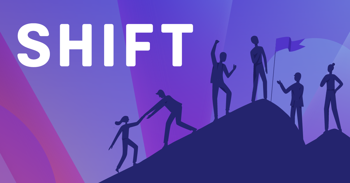
Shift has one logo: the uppercase SHIFT wordmark. Its wide-set geometric letters with rounded stroke ends are served as inline SVG paths: purple #5134C9 on white in the header (95x24), white on #240A40 in the footer (200x51), white on #5134C9 in the share card and on purple-gradient art (careers og:image, YouTube thumbnails). No symbol is used on pages; the favicon is a 16px S.
Source: shift-technology.comshift-technology.com/aboutshift-technology.com/careers
Shift is a white page with one purple accent.
Shift is a white page with one purple accent. White pages (about 42% of desktop home), a #FAFAFF lavender inset panel (about 34%), aubergine #240A40 close (about 14%), one purple-to-aubergine gradient panel (about 6%), and royal purple #5134C9 in buttons, accent words and the video poster (about 4-6%). Text is #240A40 heads and #707070 body.
Source: shift-technology.comshift-technology.com/aboutshift-technology.com/why-shiftshift-technology.com/hubfs/hub_generated/template_assets/1/209203489582/1794950257205/template_main.min.css
Agents that transform insurers’ most critical work
Two open Adobe families do all the work.
Two open Adobe families do all the work. Two Adobe open-source families: Source Serif 4 600 for every head, Source Sans 3 for everything else (Source Sans Pro on nav and button labels). Heads are sentence case, tracking normal, line-height 1.2; body 18/28.
| Their face | Use | License | Open stand-in |
|---|---|---|---|
| Source Serif 4 | Every H1/H2, the CTA head, card-format titles | SIL OFL 1.1; the site's own files ship in fonts/ (SourceSerif4-400/600/700.woff2) | Source Serif 4 itself The real face is open (SIL OFL); no stand-in needed. |
| Source Sans 3 | Body, leads, card titles, stats, footer | SIL OFL 1.1; the site's own files ship in fonts/ (SourceSans3-400/500/600/700.woff2) | Source Sans 3 itself The real face is open (SIL OFL); no stand-in needed. |
| Source Sans Pro | Nav links, button labels, resource filter panel | SIL OFL 1.1; HubSpot-hosted files ship in fonts/ (SourceSansPro-400/600/700.woff2); buttons request the Adobe Fonts (Typekit) build of the same family | Source Sans Pro itself Open (SIL OFL). |
| SHIFT logotype (custom, outlined) | Logo only | Logo artwork; not a font | Plus Jakarta Sans 800 uppercase +0.045em (placeholder only) The logotype is drawn, not typed; the stand-in was calibrated to its rendered width, ink coverage and stem width (kit.typography.other_faces.wordmark_stand_in). |
Source: shift-technology.comshift-technology.com/aboutshift-technology.com/resources/case-studiesshift-technology.com/resources/press
Claims teams that close files faster
Claims teams that close files faster
Serif head with one royal-purple phrase · Every H1 and H2 on light grounds: home, about, why-shift, solution pages, section heads (What our customers are saying, Our investors, In the news)
Do Panel 1376px wide at 1440 (32px from each viewport edge), radius 4px, 48px inner padding, content still on the 96px text line. Ground is one of: linear-gradient(135deg, #5134C9 0%, #240A40 100%), #FAFAFF, #240A40, #5134C9. Only the closing CTA and footer run full-bleed.
Inset 4px-radius panels instead of full-bleed bands · Home stats band (purple-to-aubergine gradient), home solutions panel (#FAFAFF), Why Shift dark card (#240A40) and purple statement band (#5134C9), About investors strip (#FAFAFF)
Do Icons: outline glyphs on a 48 grid, stroke about 3px, square terminals, filled with linear-gradient left-to-right #00C2FF to #00A676 (white versions on dark, #240A40 versions on light UI). Rules: 2px, linear-gradient #01C1FE/#00A677 repeated at background-size 600%, sliding 12s linear infinite; footer uses the full spectrum #00C2FF, #00A676, #FFB547, #E056FD, #FF6B6B.
Aqua-to-juniper gradient icons and 2px living rules · 48px icons in stat rows and feature grids (about at a glance, why-shift difference, security, solution pages); 2px rules beside or under stats; full-spectrum 1px rule above the footer bottom row
See what your adjusters could do next
See what your adjusters could do next
Aubergine close: CTA band then footer · Bottom of every page
Small near-square buttons · Hero CTAs, every Learn more, header Request a demo
Plain grey sentences carry the detail under an aubergine head.
Plain grey sentences carry the detail under an aubergine head.
Grey body under aubergine heads · Every paragraph, lead and quote on light grounds
Specimens use sample copy, not Shift Technology’s.
The graphic kit is small and quiet.
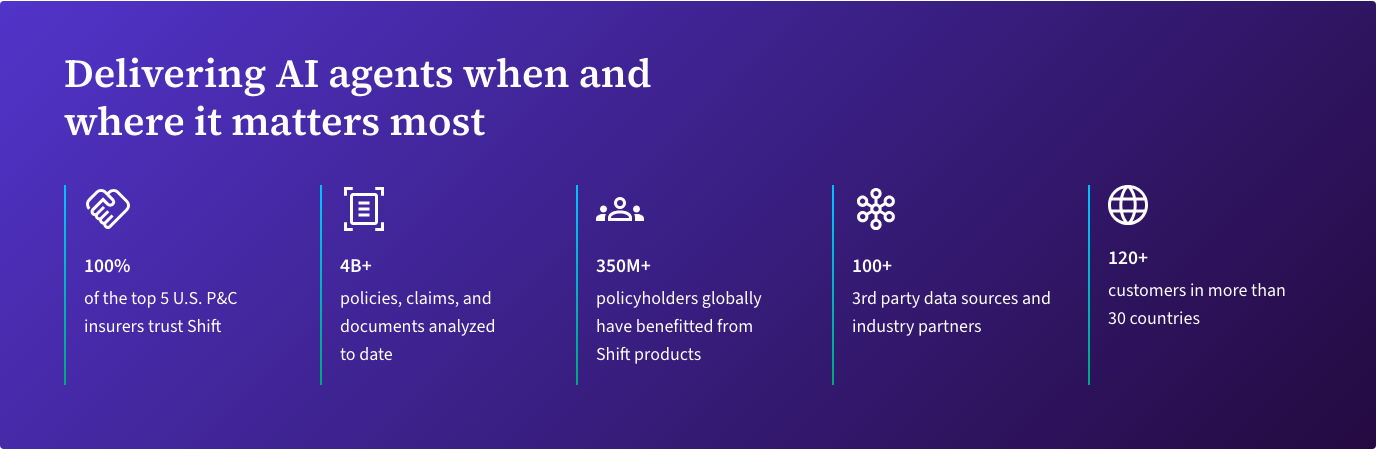


The graphic kit is small and quiet. Inset panels with 4px corners, 2px-radius buttons, 4px-radius image cards in 3-up grids (395x181 at 1440, 32px gaps), the 2px living gradient rule beside stats, round 40px outline carousel arrows (one grey disabled, one #240A40) beside the quotes head, a filter panel with 1px #EBEBEB border on resource indexes, and '»' chevrons before outcome stats on solution pages.
One outline icon set, in three colorways.


One outline icon set, in three colorways. It is a custom-looking 48px set (aqua-juniper gradient, white, aubergine) with sharp corners and about 3px strokes; Font Awesome is used only for social glyphs.
Source: shift-technology.com/aboutshift-technology.com/securityshift-technology.com/why-shift
Shift uses little true illustration.
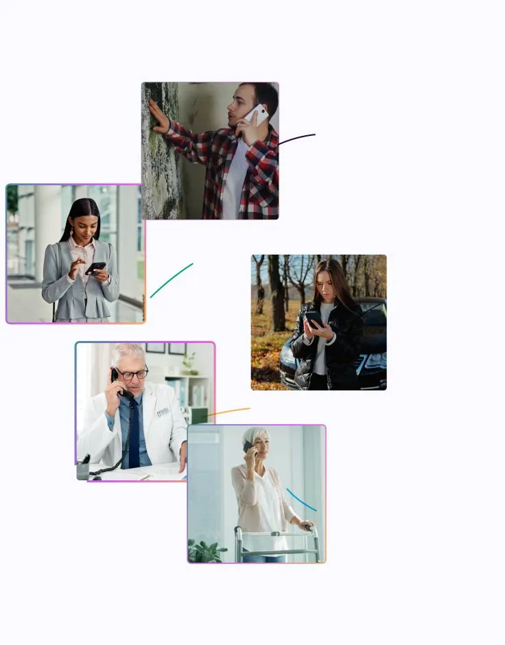
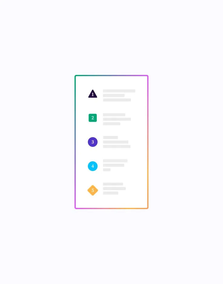
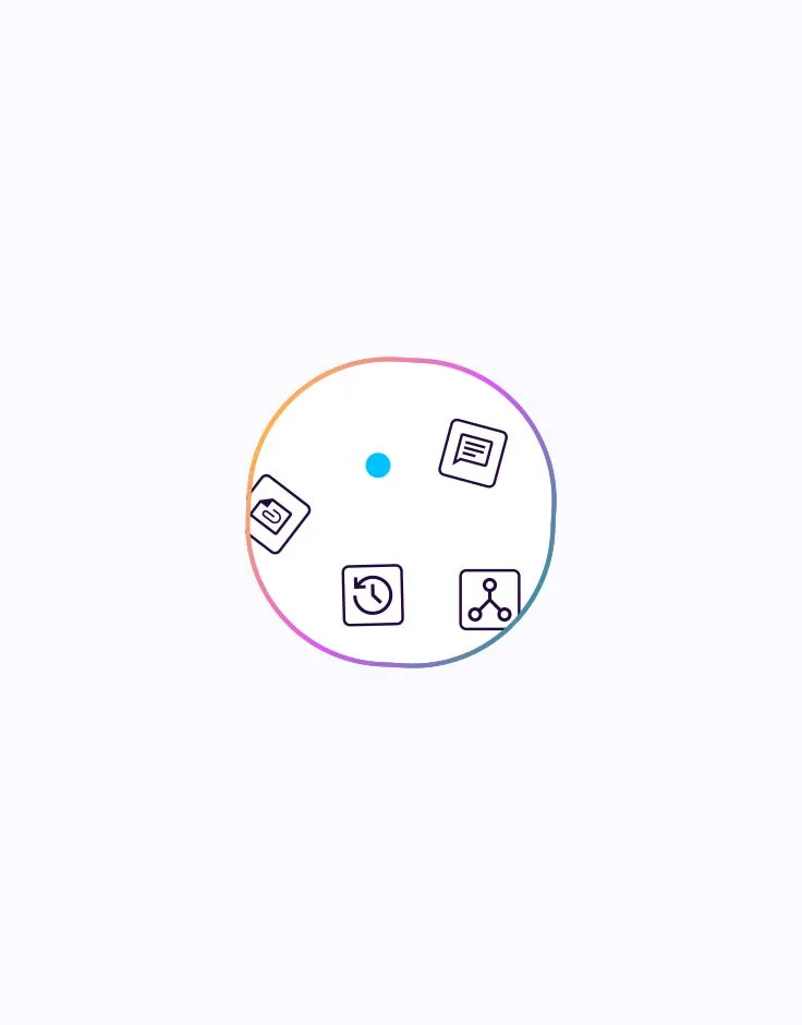
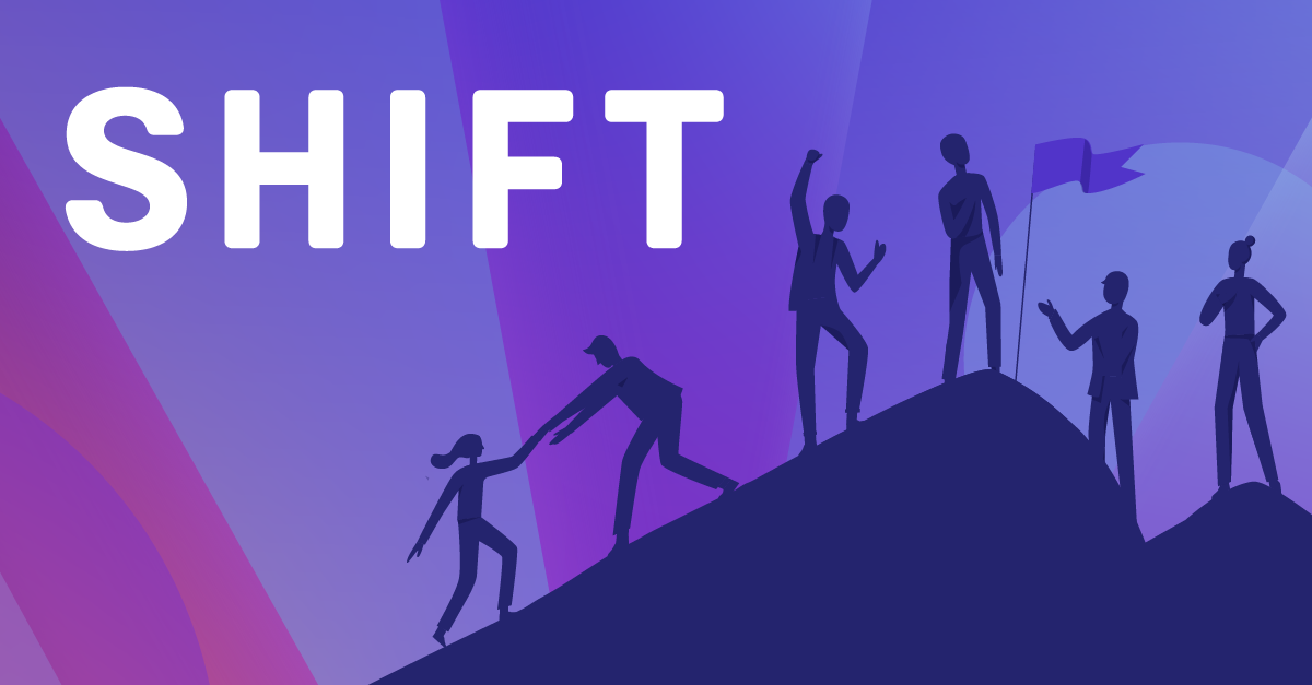
Shift uses little true illustration. The homepage 'pearl' dotLottie tells an agent story with real photos in spectrum-gradient frames, #240A40 line task icons and a white task card with a gradient border, all on #FAFAFF. The careers share card uses flat dark-indigo silhouettes on a purple-pink light-ray ground. Resource cards lean on generic 3D 'AI Agents' laptop renders.
Photography shows people, not technology.
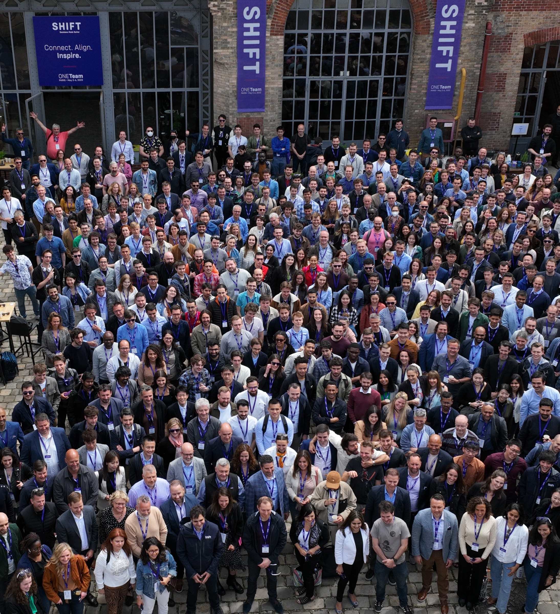
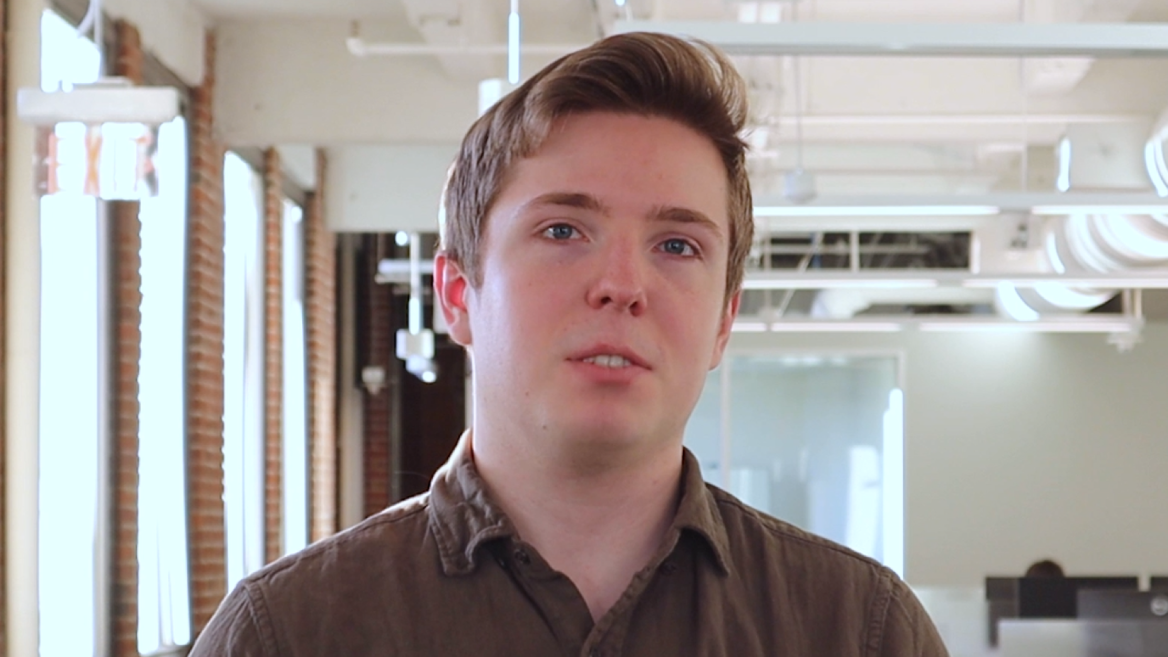


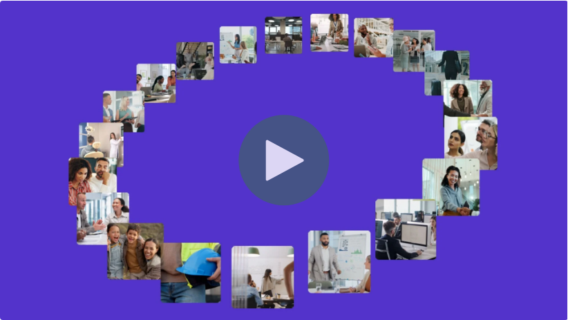
Photography shows people, not technology. People first: everyday policyholders and professionals on phones (homepage animation, video ring), real Shift staff on camera in open offices (case-study videos), executive portraits in window light (news), one huge company group shot (About), and city skylines at dusk for events. Colour is natural and bright, never tinted purple; photos sit in 4px-radius cards or gradient-framed tiles, never under text.
Source: shift-technology.comshift-technology.com/aboutshift-technology.com/resources/case-studiesshift-technology.com/resources/events
A calm, airy page built from inset panels. 12-column feel on a 1248px text measure (x=96 to 1344 at 1440); split heroes with the head left and an image or nothing right; inset 1376px panels; 3-up card grids; 5-up stat rows; generous 80-130px band gaps; 20px phone gutters with everything stacking to one column.
Measured from shift-technology.com's computed styles of every band at 1440 and 390 (npm run fidelity -- measure, 2026-11-17) plus headless probes of the nav, footer, buttons and states.
| Measure | Desktop | Phone |
|---|---|---|
| Page margin | 96px | 20px |
| Section padding | 80px | 50px |
| Hero text width | max 821px, centered | full width |
| Card gap | 32px | 32px |
| Navigation | 89px | 89px |
Page H1
Source Serif 4 · 64px (phone 36) · line 1.2 · weight 600
Section H2
Source Serif 4 · 40px (phone 32) · line 1.2 · weight 600
Hero lead
Source Sans 3 · 22px · line 1.555 · weight 400
Solution title
Source Sans 3 · 22px · line 1.2 · weight 600
Body
Source Sans 3 · 18px · line 1.555 · weight 400
Stat number / card title
Source Sans 3 · 19.6px · line 1.2 · weight 600
Resource card title
Source Sans 3 · 18px (phone 24) · line 1.2 · weight 600
Quote
Source Sans 3 · 16px · line 1.5 · weight 400
Attribution
Source Sans 3 · 18px · line 1.555 · weight 700
Card label
Source Sans 3 · 16px · line 1 · weight 600
Nav link
Source Sans 3 · 18px · line 1.6 · weight 400
Button label
Source Sans 3 · 18px · line 1 · weight 400
Footer head
Source Sans 3 · 18px · line 1.5 · weight 700
Footer link
Source Sans 3 · 14px · line 1.5 · weight 400
Meta line
Source Sans 3 · 14.4px · line 1.944 · weight 300
How Shift Technology’s own landing pages are built, observed on shift-technology.com/%20at%201440x900%20and%20390x844,%20headless%20Chromium%20computed%20styles%20after%20networkidle%20with%20fonts%20loaded%20(measure/home-desk.json,%20home-phone.json%20plus%20live%20probes%20in%20_tmp/anat),%202026-11-17, 2026-11-17. The full measurements are in spec.md.
Source: shift-technology.comshift-technology.com/aboutshift-technology.com/resources/case-studiesshift-technology.com/resources/press



Deck and Email have no observed evidence (no public deck, Milled bot-walled, no newsletter archive found); see gaps. Case-study PDF covers (white SHIFT on a purple header bar, shown on a tablet over a purple gradient) are visible only as cards.
| Format | Loudness | Must appear | What varies |
|---|---|---|---|
| Landing page | White 89px header (purple wordmark left at x=96, Source Sans Pro 18 nav, purple Request a demo button, search, EN-US); split hero with a 64/76.8 Source Serif 4 600 head in #240A40 ending in a #5134C9 phrase, 22/34.2 grey lead, purple + outline buttons; greyscale Trusted by logo row; one centred 821x462 brand video (purple poster, people-photo ring); an inset gradient stats panel with white icons and aqua-juniper rules; an inset #FAFAFF solutions panel; a quote carousel; a 3-up resource card row; full-bleed #240A40 CTA band and footer. | Which inset panel(s) fill the middle; whether the hero has an image at right (About: purple video poster) or white space (home). | |
| Social post | Purple ground with the serif head in white, the wordmark small at bottom-left. | No organic posts or offer ads observed, so no layout is re-measured. Closest observed family: the Webinar resource card (purple ground, wordmark or co-brand lockup top, bold title) and the podcast thumbnail; neither is a post layout. | |
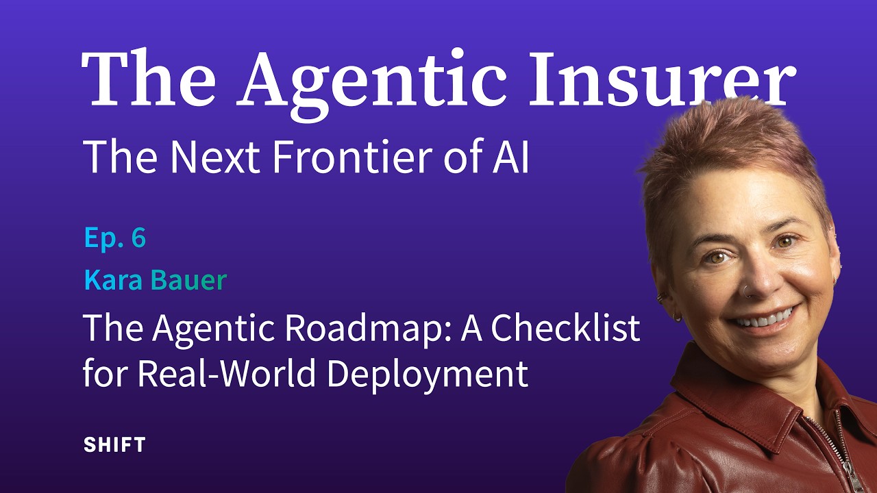
| Podcast thumbnail | Series only: purple-to-darker-purple vertical gradient ground, series title The Agentic Insurer in white Source Serif about 110px across the top, subtitle The Next Frontier of AI in white Source Sans about 60px, Ep. N and guest name in aqua-to-green, episode title two lines white Source Sans about 48px, white SHIFT about 90px wide bottom-left, guest cut-out photo right bleeding off the bottom. | Guest photo and episode text; Ep. 0 uses a diagonal photo panel at right instead of a cut-out. | |
| Paid search ad | Google's text-ad template; headlines name the buyer's problem area (Property & Casualty Claims, Auto Ins. Claims Management, Shift AI Fraud Detection); description built on 'insurance-grade AI solutions optimize every aspect of insurance claims lifecycle'. | ||
| Webinar resource card | Purple left-to-right gradient ground with a light laptop mockup bleeding off the right edge; the screen shows the webinar title slide (SHIFT wordmark or white co-brand lockup top, bold title, optional subtitle and date). | Slide is white with purple text (no partner) or purple with white text (partner lockup). |
Source: shift-technology.comshift-technology.com/aboutshift-technology.com/why-shiftshift-technology.com/solutions/fraud-risk
Your name and logo, Shift Technology’s system.
Talk about my brand Use this brand in Claude
Get your brand audit Put your brand in Claude What goes in a brand book
Each value is marked published, observed, our reading or our recipe, with its source. Checked 2026-11-17. Not affiliated with Shift Technology.
Tell us what you want to make. We’ll talk through how to put these ideas to work for your brand.