Data at Scale
High-quality training data, annotations, and RLHF to power the world's most advanced AI models. Observed
Brand book
Scale sells reliability for high-stakes AI, so it looks like an editorial publication rather than an AI startup: monochrome, one quiet regular-weight typeface, and documentary photos of surgeons, pilots and soldiers instead of glowing networks. Colour is muted and drawn from nature so nothing reads as hype. Our reading

Which single earth-tone colour owns a surface (Evergreen, Atlas, Foundry Tan, Archive Purple or Cloud Slate), one per surface.
Our engine's setting, built from their rules.
Brand colour appears only as a whole ground or a tiny chip; no two brand colours touch; no coloured headline words or stats.
All headlines and body in Aeonik Regular (or Host Grotesk 400 stand-in) with tight negative tracking; no bold heads.
Aeonik Mono / Geist Mono appears only as small uppercase labels, categories, values and legal lines.
Every image shows real people and systems in a real setting; no neural-network art, holograms, glowing data or staged stock.
Official lockup files, black or white only, 1e clear space, symbol alone only at avatar/favicon sizes; partner lockups use the 3e divider.
Sentence-case declaratives with full stops, concrete claims backed by Scale's own numbers, no exclamation marks or hype words.
The company that makes AI reliable enough for the decisions that matter most: the data behind frontier models, the evaluations they are measured against, and applied systems for enterprise and government. Our reading
High-quality training data, annotations, and RLHF to power the world's most advanced AI models. Observed
Rigorous model evaluations and red-teaming to measure, benchmark, and improve AI performance. Observed
Full-stack AI systems that help enterprises and governments build, deploy, and oversee reliable AI. Observed
The world’s most important decisions need reliable AI systems.
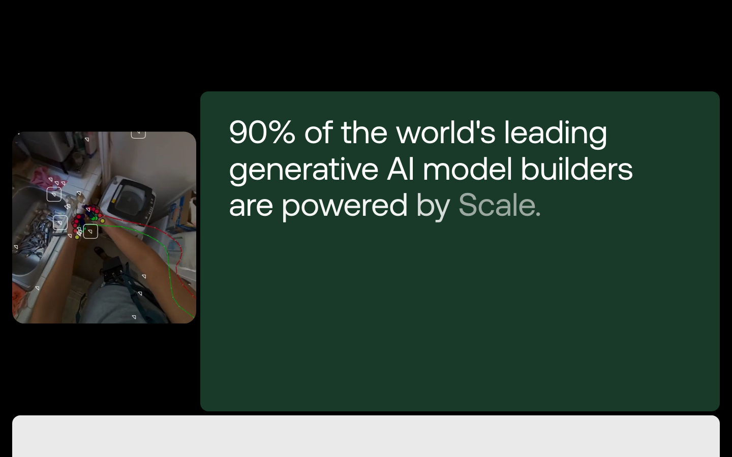
90% of the world's leading generative AI model builders are powered by Scale.
Proven across every industry.
Our legacy, your success.
Devoted to customers' and contributors' success; trust is earned every delivery. (paraphrase)
ObservedWork as one Scale; optimize for the whole. (paraphrase)
ObservedConsistent quality is a structural advantage that changes the economics. (paraphrase)
ObservedFind the inputs that drive most outcomes and execute completely; reject effort without impact. (paraphrase)
ObservedResearch puts Scale at the frontier first, and it brings partners there. (paraphrase)
ObservedConsider the consequences of consequences. (paraphrase)
ObservedCategory. AI data, evaluation and applied AI systems Our reading
Scale provides high-quality data and full-stack technologies that power the world's leading models and enable enterprises and governments to build, deploy, and oversee AI applications that deliver real impact. (paraphrase of the /about intro)
The world’s most important decisions need reliable AI systems. Observed
Reliable AI for the world’s most important decisions Observed
Reliable AI Systems for the World's Most Important Decisions Observed
AI systems that actually work. Observed
The data powering the world's best AI. Observed
How Scale shows up. Published
From the Lab to the real world. The latest from Scale.
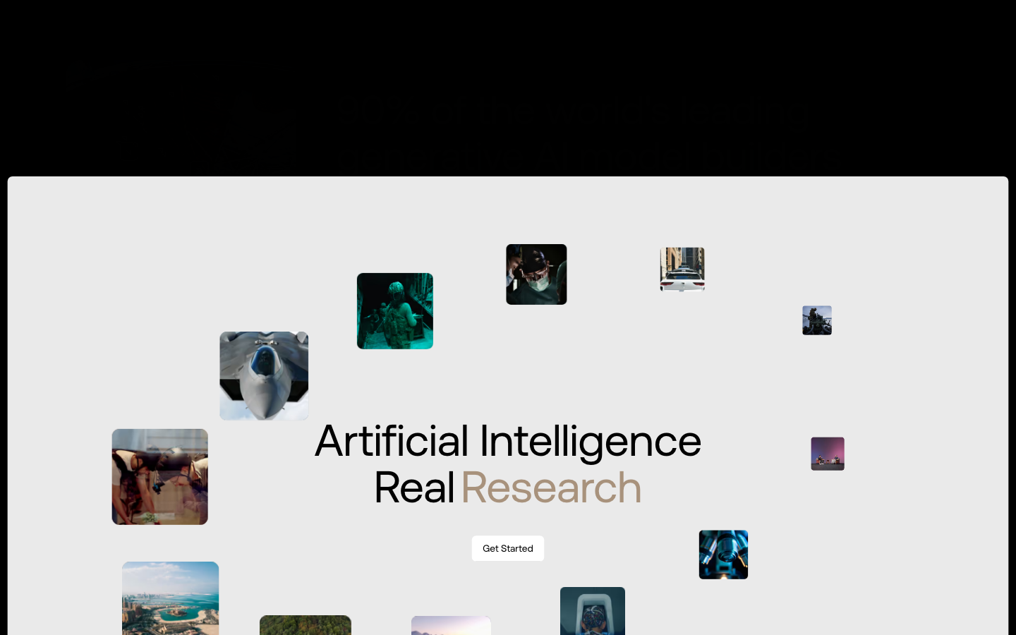
Artificial Intelligence / Real Research
Neutral by default. Signal when it matters.
Introducing Seal Showdown.
The world’s most important decisions need reliable AI systems.
Revolutionary AI That Changes Everything!
90% of the world's leading generative AI model builders are powered by Scale.
The most advanced AI data platform on the planet.
Neutral by default. Signal when it matters.
Our palette is mostly neutral, but we sometimes use colour too.
directconfidentgroundedconsequential
reliablerealmost important decisionsfrontieroutcomeactually workevidencehigh-stakes
vaporwareAI theater / hypeexclamation marksflowery superlatives"revolutionary"-style claims without proof
Source: brand.scale.com/colorscale.com
Source: scale.comscale.com/aboutbrand.scale.com/colorbrand.scale.com/imagery


There is no mark-only file in the zip; the symbol comes from brand.scale.com/scale-2-symbol.svg. old-logo-do-not-use.svg is the guide's "Don't use the old logo" example (the previous "scale" wordmark seen on BAE co-brand art); never use it.
A triangular symbol leads a custom lowercase wordmark.





A triangular symbol leads a custom lowercase wordmark. The symbol is a big down-right triangle plus a small one; the single-stroke "scale" wordmark has rounded terminals. Black on white in the nav; white on black, Evergreen or Slate in co-brand art; symbol alone in the footer.
Black and white do most of the work.


Black and white do most of the work. Black and white about 75% of the home page, Whisper Gray 13%, one Foundry Tan band, one Evergreen card. Accents never touch. One exception on the home page: the cycling last word in "Real Research" is set in Foundry Tan, the only coloured headline word.
The world’s most important decisions need reliable AI systems.
One face, one weight.

One face, one weight. Aeonik Pro Regular for everything, ss02 straight-tailed a; Aeonik Mono caps for labels. Antialiased grayscale smoothing, geometricPrecision rendering.
| Their face | Use | License | Open stand-in |
|---|---|---|---|
| Aeonik Pro Regular (display sizes) | headlines, section heads, statements and the footer sign-off; ss02 on | commercial (CoType Foundry) | Host Grotesk 400 The guide's own approved fallback; calibrated: +2.6-3.4% wide, matching ink at 400; take 0.013em off the tracking. |
| Aeonik Pro Regular (text sizes) | body, nav, buttons, card titles and quotes; ss02 on | commercial (CoType Foundry) | Host Grotesk 400 The guide's own approved fallback; calibrated: +2.6-3.4% wide, matching ink at 400; take 0.013em off the tracking. |
| Aeonik Mono Regular | labels, categories, legal line, values | commercial (CoType Foundry) | Geist Mono 400 The guide's approved mono fallback; 3.3% narrow, add 0.02em. |
Do Black media frame inset 18px from the page sides (x18-1422), painted y88-812 at 1440x900 (1404x724), with 88px of white page below it. Home hero at desktop: SQUARE corners on all four sides (0 radius; the 16px-radius CSS box starts at y75 behind the white nav strip, so its rounding is never seen). Phone: x16-374, y72-774 (358x702), 16px top corners, square bottom corners. Sub-page headers (/about, /data-engine) keep 16px corners. Inside: one darkened photo or video (filter: brightness(0.59) on the supplied still) and one centred white headline, Host Grotesk 400 64/67.2 at -1.39px, two lines.
Inset cinematic media frame · home hero; /about header; brand.scale.com chapter cards
Do Aeonik Regular 400 everywhere from 116px footer line to 14px nav; hierarchy only by size and tight tracking (-0.01em on site, -2% to -3% in the guide). Small Aeonik Mono caps (11-13px, #929292 or #575757) for labels and categories.
One regular-weight face, size makes hierarchy · every page
Do Black, white and grays cover about 90% of a page. A brand colour appears as a whole ground (band or card) with only black or white on it; never two brand colours touching.
Black and white own the page; one earth tone per surface · home closing band (Foundry Tan #A8927C), Mayo card (Evergreen #193A29), Morgan Stanley card (Cloud Slate #839CB2)
Do "Reliable AI for the world’s most important decisions" in white Aeonik 400, 116/116 at -3.26px (Host Grotesk; width-matched to Aeonik), two lines spanning 1392px, below six mono-labelled link columns and the white symbol; LinkedIn and X icons in small dark rounded squares bottom-left, mono caps legal line bottom-right.
Giant footer sign-off · every scale.com page, bottom of the black footer
Do A small rounded square (about 24px) in Foundry Tan, Cloud Slate or Atlas Blue holding the white symbol, followed by the category in mono caps (PUBLIC SECTOR, COMPANY, RESEARCH, PRODUCT), top-left on the card image.
Symbol chip + mono category · home blog grid cards; brand guide icon-chip example
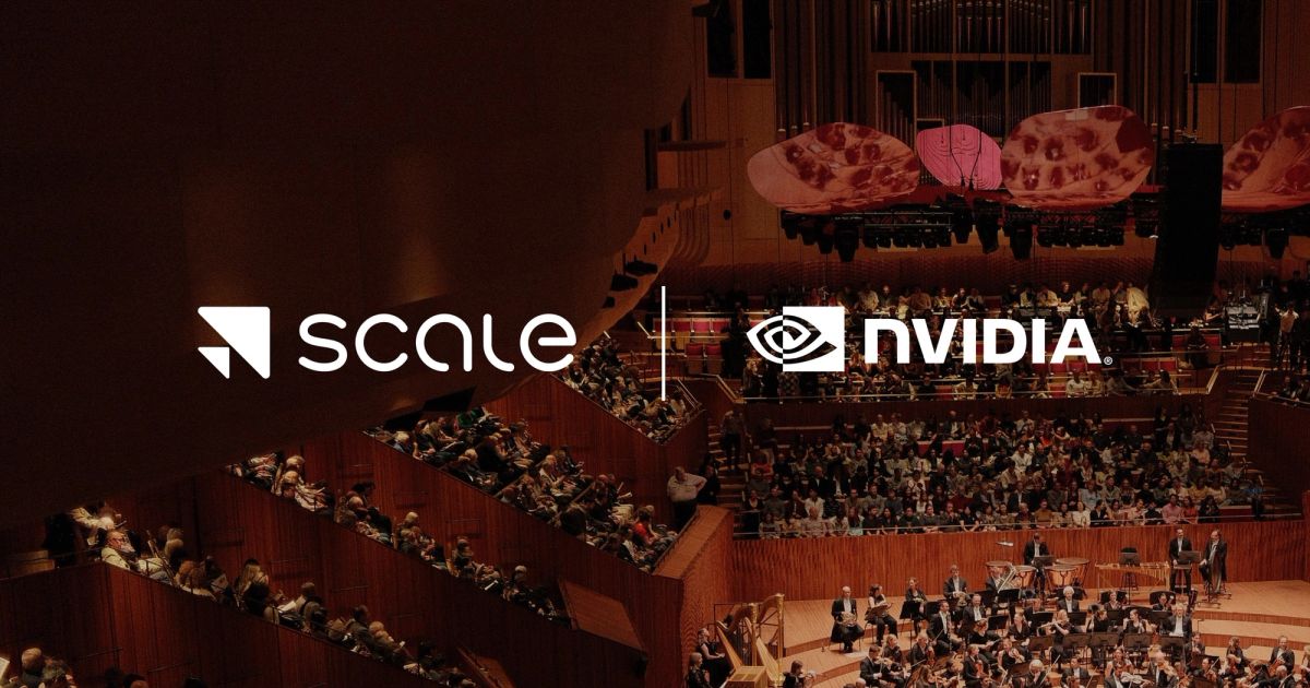
Do Scale horizontal lockup, a thin vertical rule centred in a 3e gap (2e tall), then the partner mark, all one colour on a single brand ground or black.
Partner lockup with divider · co-brand blog images (Mayo Clinic, Morgan Stanley, BAE Systems), og cards
Specimens use sample copy, not Scale AI’s.
Flat grounds and frames carry the page, with no ornament.


Flat grounds and frames carry the page, with no ornament. Square-cornered home hero window at desktop (radius 0; phone 16px top corners only), 16px-radius sub-page header frames and cards, 6-8px buttons, flat grounds without borders or rules, symbol chips on cards, mono caps labels, an outline map line drawing with small black triangles in the tan closing band.
Source: scale.combrand.scale.com/color
Icons are rare and behave like tools.


Icons are rare and behave like tools. Few icons: chevrons in 1px-outlined squares for carousels, a chevron in a white square inside the closing CTA, LinkedIn and X glyphs in white on dark gray rounded squares, the symbol in coloured chips. Guide iconography chapter exists only as a draft ("Tools, not decoration"). The draft chapter asks for "simple geometry, crisp corners, optical balance".
Source: scale.combrand.scale.com JS bundle, draft chapters filtered from the live guide (2026-11-17)
Illustration is rare and always monochrome.
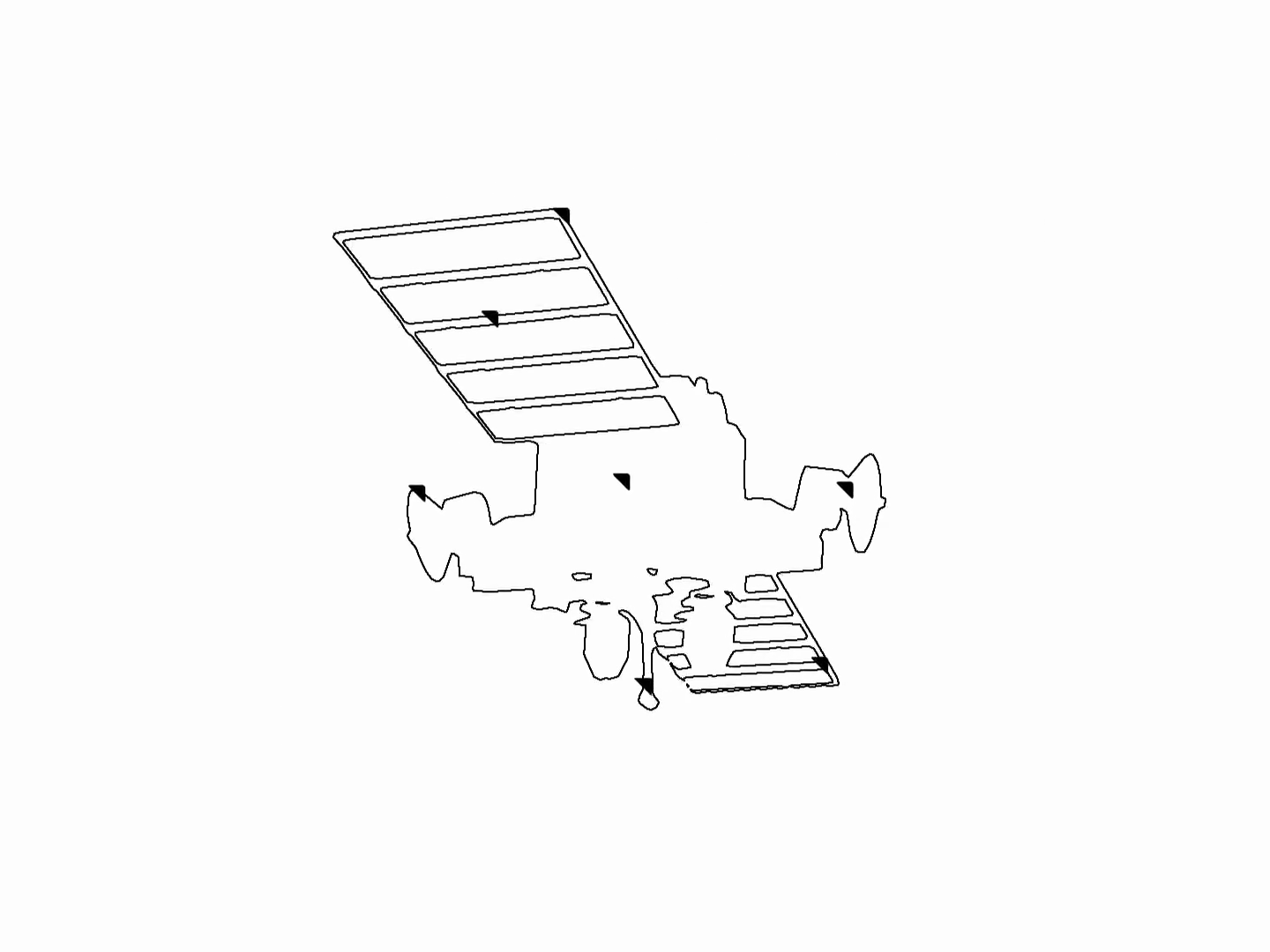
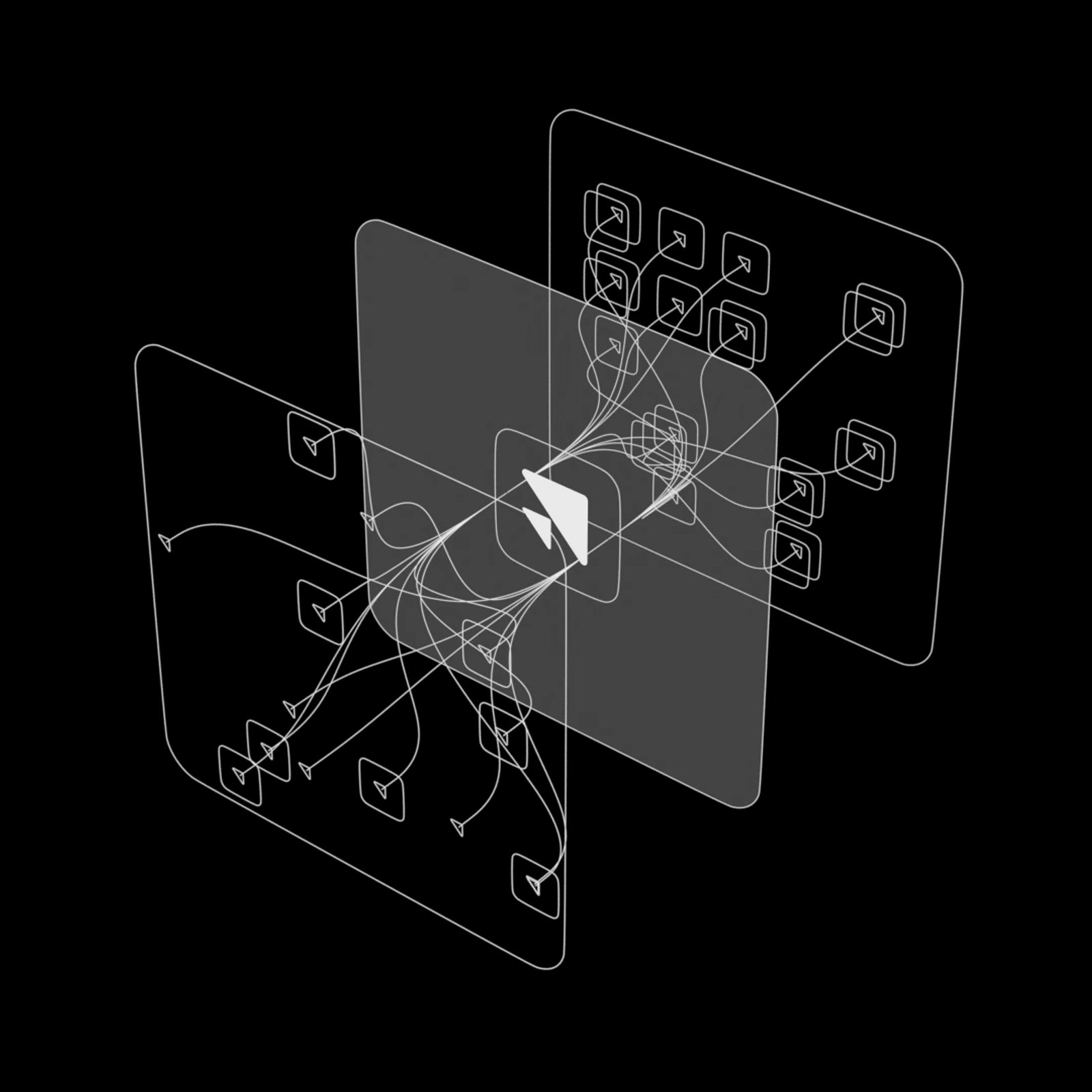

Illustration is rare and always monochrome. The guide has no illustration chapter and prefers photography. The site uses a few technical renders (a white wireframe of stacked planes around the symbol on black; a black-and-white earth of data points; a starfield vortex for Scale Labs), a thin black outline line drawing multiplied onto the tan closing band, careers line art and isometric diagrams. The earth and vortex renders sit close to the imagery chapter's "no glowing data streams" rule; prefer photography.
Source: scale.combrand.scale.com/imagery
Documentary photos of experts at work where decisions happen.
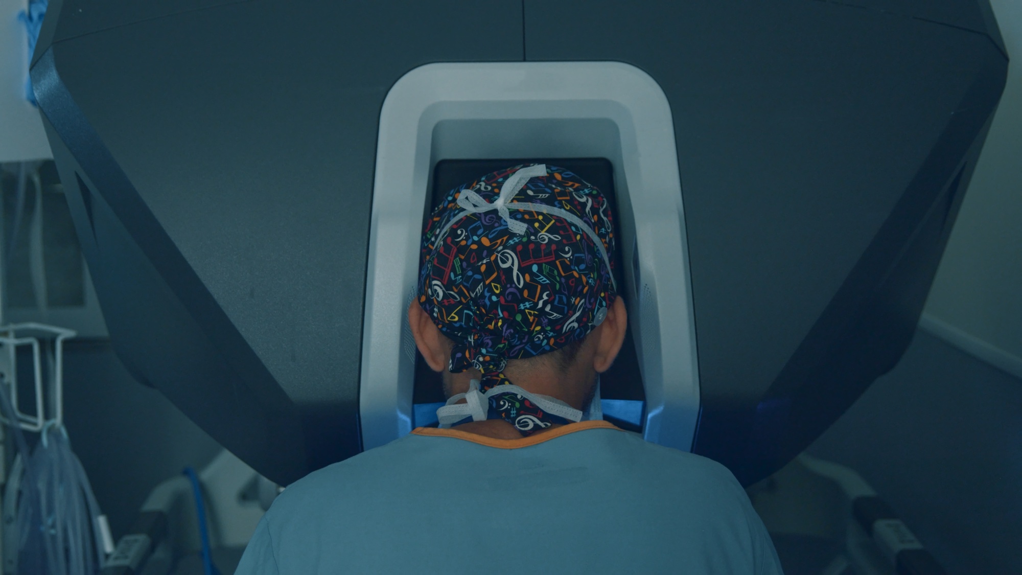
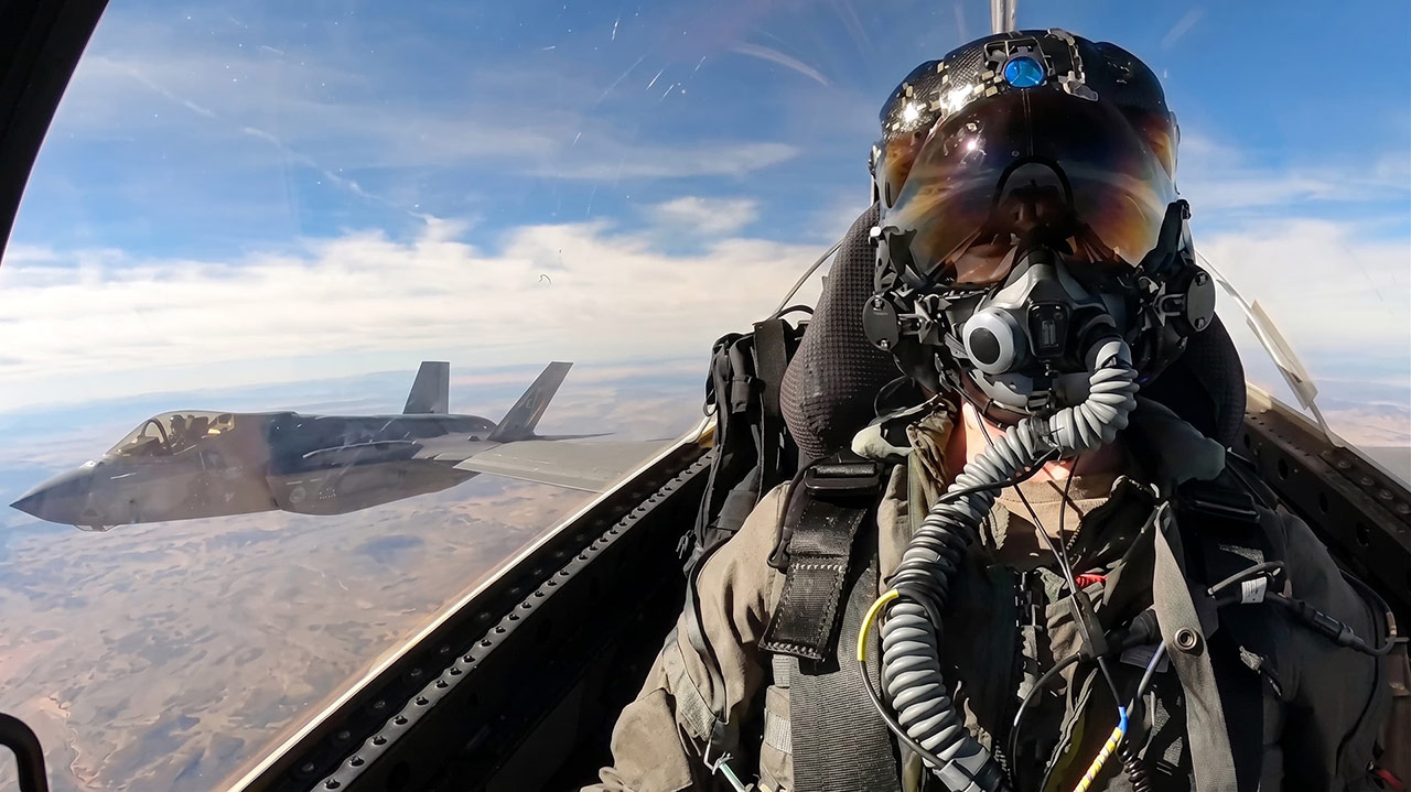
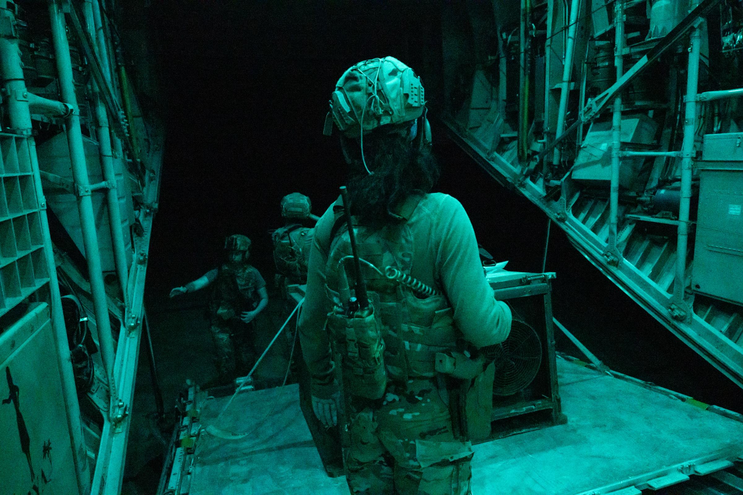

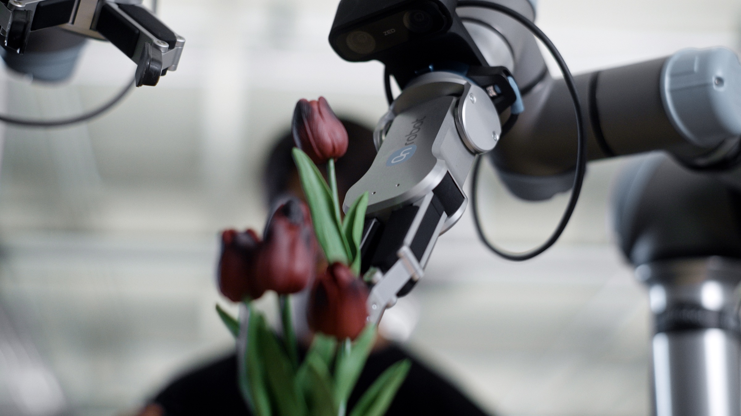



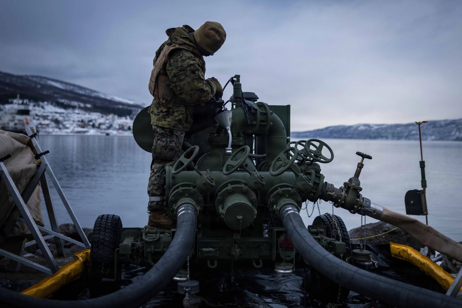



Documentary photos of experts at work where decisions happen. Cinematic, documentary photos and video of experts in high-stakes settings: a surgeon at a robotic console from behind, a fighter pilot in the cockpit, soldiers in a teal-lit aircraft hold, a robot arm holding tulips, an autonomous car in a city street, an oil rig at dusk, a microscope. Natural or practical light, cool muted colour, people and systems in one frame, diagonal and over-the-shoulder crops. Photos sit in 12-16px rounded frames; the hero darkens the photo for a centred white headline; blog cards set white headlines over the photo bottom-left.
One white page, one inset black hero frame, flat bands and a black footer. 1440 desktop: content column about 1159px (x141); hero media inset 18px; static band heights hero 900, quote 900, industries 900, carousel 749, benchmark 862, latest 1313, closing 751, footer 899 (live: 450dvh hero and 200dvh quote pins, animation only); centred 64px section heads; 2- and 3-column card grids with 8px gaps; black footer with five link columns.
Measured from scale.com's headless Playwright computed styles and painted-pixel checks at 1440x900 and 390x844, after scrolling each band into view and waiting for reveals to settle; headless Chromium 1440x900 and 390x844 on 2026-11-17 (measure/home-desk.json, home-phone.json, work/anat*.json).
| Measure | Desktop | Phone |
|---|---|---|
| Page margin | 24px | 24px |
| Section padding | 64px | 48px |
| Hero text width | max 1152px, centered | full width |
| Card gap | 8px | 8px |
| Navigation | 88px | 88px |
Hero H1, white on the media frame [Host Grotesk: desktop -1.39px, phone -0.69px]
Aeonik Pro Regular (display sizes) · 64px (phone 32) · line 1.05 · tracking -1.39px · weight 400
Section display heads ("Artificial Intelligence / Real ___", "From the Lab to the real world.") [Host Grotesk: desktop -1.39px, phone -0.59px]
Aeonik Pro Regular (display sizes) · 64px (phone 28) · line 1.05 · tracking -1.39px · weight 400
Scrolling-quote stat sentence on Evergreen [Host Grotesk: desktop -1.39px, phone -0.69px]
Aeonik Pro Regular (display sizes) · 64px (phone 32) · line 1 · tracking -1.39px · weight 400
Section heads ("We set the benchmark...", "Our legacy, your success.", "Introducing Scale Labs") [Host Grotesk: desktop -1.05px, phone -0.61px]
Aeonik Pro Regular (display sizes) · 40px (phone 24) · line 1.25 · tracking -1.05px · weight 400
"Proven across every industry." [Host Grotesk: desktop -0.84px, phone -0.61px]
Aeonik Pro Regular (display sizes) · 36px (phone 24) · line 1.1 · tracking -0.84px · weight 400
Hero scroll-panel heads; co-brand tile titles [Host Grotesk: desktop -0.71px, phone -0.61px]
Aeonik Pro Regular (display sizes) · 32px (phone 24) · line 1.19 · tracking -0.71px · weight 400
Benchmark card titles and carousel quotes [Host Grotesk: desktop -0.82px, phone -0.61px]
Aeonik Pro Regular (text sizes) · 24px (phone 18) · line 1.5 · tracking -0.82px · weight 400
Closing-band lead [Host Grotesk: desktop -0.46px, phone -0.38px]
Aeonik Pro Regular (text sizes) · 20px (phone 16) · line 1.5 · tracking -0.46px · weight 400
Body copy [Host Grotesk: desktop -0.38px, phone -0.38px]
Aeonik Pro Regular (text sizes) · 16px · line 1.5 · tracking -0.38px · weight 400
Blog tile titles [Host Grotesk: desktop -0.64px, phone -0.64px]
Aeonik Pro Regular (text sizes) · 16px · line 1.375 · tracking -0.64px · weight 400
Hero panel body on black (#C7C7C7) [Host Grotesk: desktop -0.33px, phone -0.33px]
Aeonik Pro Regular (text sizes) · 14px · line 1.43 · tracking -0.33px · weight 400
Button labels (Get Started, Learn More, For Enterprise) [Host Grotesk: desktop -0.22px, phone -0.22px]
Aeonik Pro Regular (text sizes) · 14px · line 1.5 · tracking -0.22px · weight 400
Nav menu triggers [Host Grotesk: desktop -0.04px, phone -0.04px]
Aeonik Pro Regular (text sizes) · 14px · line 1 · tracking -0.04px · weight 400
Footer links, white [Host Grotesk: desktop -0.17px, phone -0.17px]
Aeonik Pro Regular (text sizes) · 14px · line 1.5 · tracking -0.17px · weight 600
Mono eyebrows (APPLICATIONS, DATA), caps
Aeonik Mono Regular · 11px (phone 10) · line 1.5 · tracking 0.11px · weight 400
Footer column labels and legal lines, caps, #575757
Aeonik Mono Regular · 13px (phone 10) · line 1.2 · tracking 0.13px · weight 400
Blog category chip label, caps
Aeonik Mono Regular · 11px · line 1 · tracking 0.77px · weight 400
Footer sign-off, white on black [Host Grotesk: desktop -3.26px, phone -1.13px]
Aeonik Pro Regular (display sizes) · 116px (phone 40) · line 1 · tracking -3.26px · weight 400
How Scale AI’s own landing pages are built, observed on scale.com, 2026-11-17. The full measurements are in spec.md.



How the brand carries by format, from the guide and scale.com (2026-11-17).
| Format | Loudness | Must appear | What varies |
|---|---|---|---|
| Landing page | Black horizontal lockup top-left; white page; inset black hero frame, square at desktop (16px top corners on phone) with real photography and one centred white Regular headline; black footer with the giant sign-off line | Which single earth tone owns the closing band or a feature card | |
| Deck | Horizontal lockup; black, white or one brand colour per slide with only black or white type; Host Grotesk Regular in Google Slides | Which brand colour carries the section; photography for colour interest | |
| Social post | Full-bleed real photograph (darkened 20-25%) or one flat brand ground (Evergreen #193A29 or black); white horizontal lockup top-left; title in a black label box bottom-left; nothing else | Photo vs Evergreen ground; co-brand lockup (Scale | divider | partner) centred instead of the corner logo. Closest observed family (no organic or offer-ad posts exist): the scale.com share card, seen on event, customer and partner cards, a flat Evergreen or darkened-image ground, white lockup, black label box bottom-left (source: observed 2026-11-17, ref/examples/event-1, event-4, case-study-1) | |
| Social post, portrait | Full-bleed real photograph (darkened 20-25%) or one flat brand ground (Evergreen #193A29 or black); white horizontal lockup top-left; title in a black label box bottom-left; nothing else | Photo vs Evergreen ground; co-brand lockup (Scale | divider | partner) centred instead of the corner logo | |
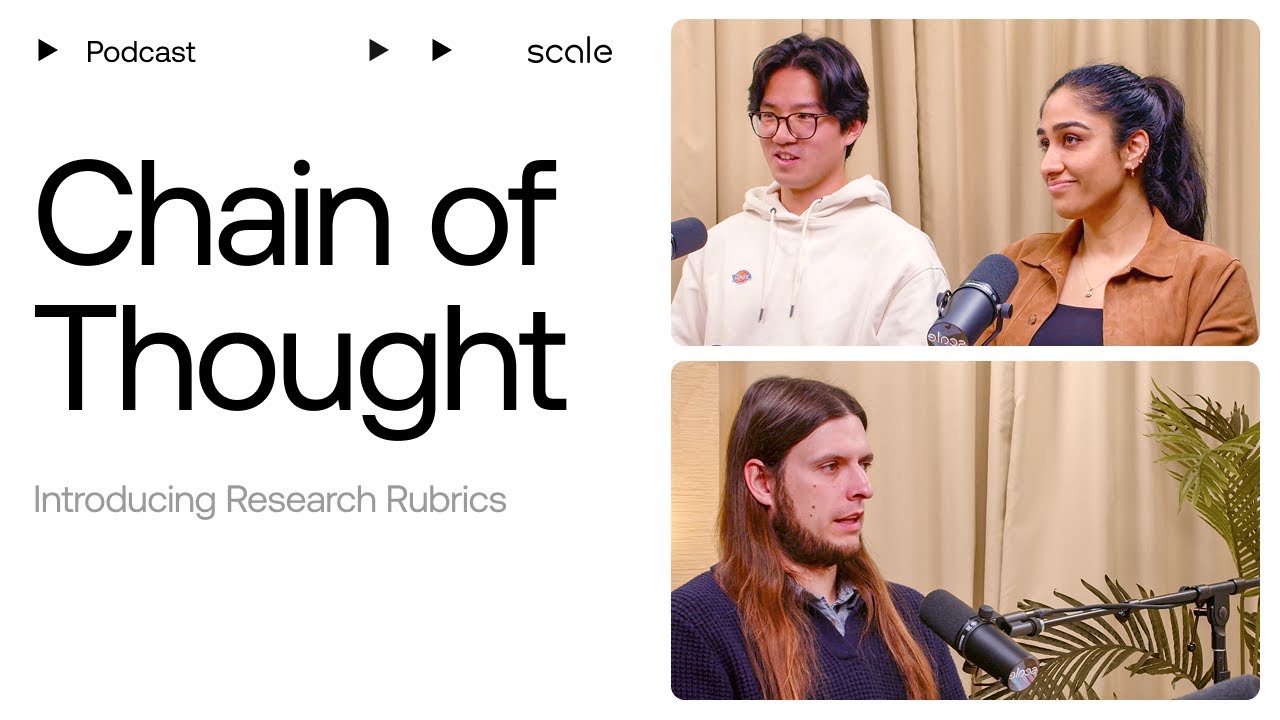
| Video thumbnail, Chain of Thought podcast | White ground; title "Chain of Thought" in huge black Regular type, two lines, left; episode topic in grey, smaller; two stacked rounded photo tiles of real people at microphones on the right; "Podcast" label with play triangles top-left | Whether the topic sits under the title (one line, sentence case) or between its two lines with the grey Scale glyph (caps, two lines); which episode guests appear in the tiles | |
| Event share card | White horizontal lockup; ground is flat Evergreen or a darkened greyscale render; event name in a black label box bottom-left, white Regular type; no other text | Flat Evergreen with centred lockup vs full-bleed render with corner lockup | |
| Partner and customer share card | Co-brand lockup with the Scale horizontal mark and the partner mark at matching height, separated by a thin vertical divider (or a plus on a customer story); dark ground; black label box bottom-left with the title on customer-story cards | Which dark ground (photo, navy globe, gradient); label box present or not |
Source: brand.scale.com/colorbrand.scale.com/typographybrand.scale.com/logobrand.scale.com/imageryscale.com
Your name and logo, Scale AI’s system.
Talk about my brand Use this brand in Claude
Get your brand audit Put your brand in Claude What goes in a brand book
Each value is marked published, observed, our reading or our recipe, with its source. Checked 2026-11-17. Not affiliated with Scale AI.
Tell us what you want to make. We’ll talk through how to put these ideas to work for your brand.