Agentic Enterprise
Humans and AI agents work together, each on what they do best. Observed
Brand book
Friendly enterprise. Salesforce wraps a serious platform story in round shapes (the cloud, pills, domes, 30px cards), a round geometric display face and playful 3D characters, so a CRM for the largest companies feels approachable. Our reading

How much 3D decoration, which product gradients, and whether a band is sky blue or deep blue.
Source: salesforce.com/%20(2026-10-31)
Our engine's setting, built from their rules.
Cover the cloud: it should still read as Salesforce from the round geometric headlines, navy-and-blue two-tone, pills and dome dividers.
Put another CRM's logo on it. If the domes, Cloud Blue grounds and 3D characters still say Salesforce, the system is carrying it.
The #1 AI CRM: one open, trusted platform bringing people, AI agents, apps and data together (paraphrase). Observed
Humans and AI agents work together, each on what they do best. Observed
Trust is the #1 value: guardrails you control, trust built in, not bolted on. Observed
Data, workflows and agents on one platform that works with every AI and app. Observed
Customers of every size and industry succeed with Salesforce. Observed
Opened in 1999 to bring CRM to the cloud as software-as-a-service; founded on the 1-1-1 model (1% of equity, technology and people's time); now positions itself as the platform for the Agentic Enterprise (paraphrase).
The #1 value: ethics and the integrity of the technology.
PublishedHelp customers succeed and become a valued partner.
PublishedEasy-to-use, integrated, scalable products with fast time to value.
PublishedA more inclusive, equitable workplace and world.
PublishedUse the platform to help customers reach environmental goals.
PublishedCategory. AI CRM (customer relationship management) Observed
Fragmented AI experimentation across point tools (paraphrase of the IDC quote on the homepage).
Salesforce is the AI CRM that brings people, AI agents, apps and data together on one open, trusted platform, helping every organization become an Agentic Enterprise (paraphrase).
The homepage repeats one promise (the #1 AI CRM for the Agentic Enterprise) and backs it with product cards, an open-ecosystem panel, values, customer stories and analyst recognition.
Source: salesforce.com/%20(2026-10-31)salesforce.com/company/our-story
Plain words keep a very large product range understandable.
ConfidentOptimisticPlain-spokenCustomer-first
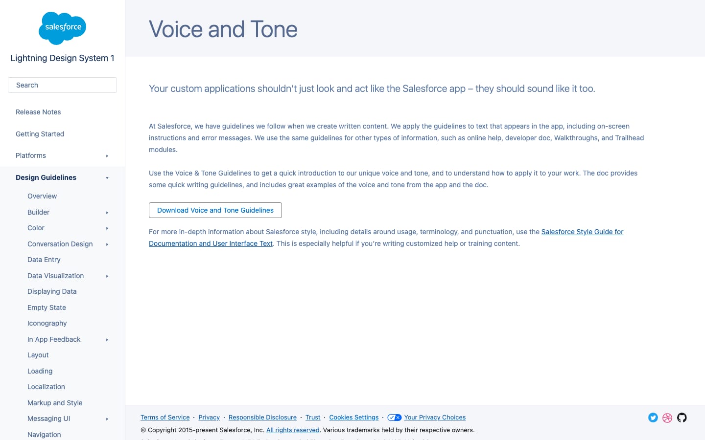
Brand Central publishes only a direction ("tighter, brighter, and bolder"); SLDS links its voice guide as a download. The homepage voice: second person, short sentences, confident claims, spaced dashes, contractions.
Source: brand.salesforce.comv1.lightningdesignsystem.com/kinetics/personalitysalesforce.com/%20(2026-10-31)
Not published: a web version of the current voice and tone guide (download only).
Source: brand.salesforce.comv1.lightningdesignsystem.com/guidelines/voice-and-tonesalesforce.com/%20(2026-10-31)

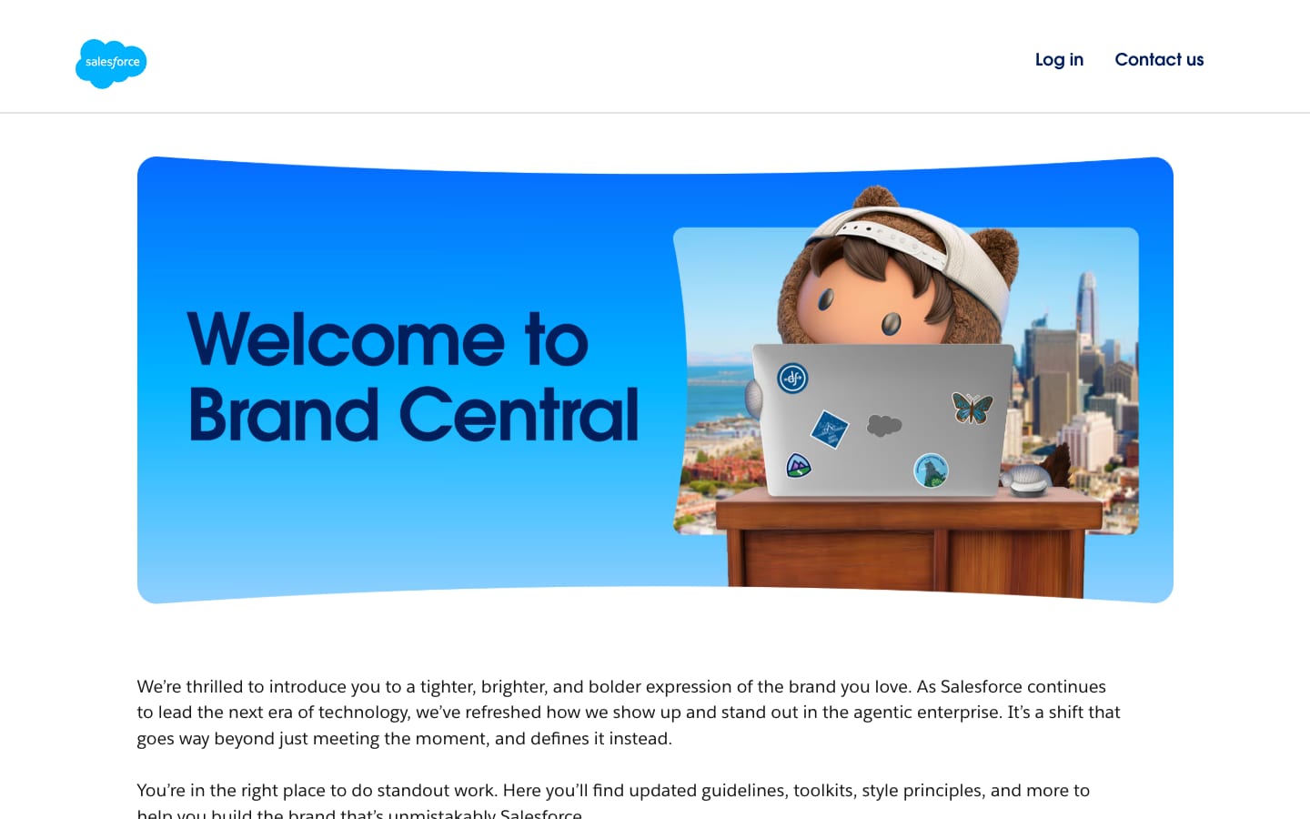
Official artwork is published at brand.salesforce.com (download link to salesforce.widen.net). The files here are the ones the homepage itself serves.
The cloud is the brand's best-known asset, so it always leads.
| Cloud clear space | "sales" height and width |
|---|---|
| Cloud minimum | 40px / 0.75 in |
| Horizontal clear space | cloud shape |
| Horizontal minimum | 96px / 1 in |
| Placements | 8 approved |
Two logos, used in order: the cloud logo (primary, most recognizable) and the horizontal logo for layouts where the cloud can't read.
Source: brand.salesforce.com
Salesforce powers the Agentic Enterprise
Salesforce powers the Agentic Enterprise
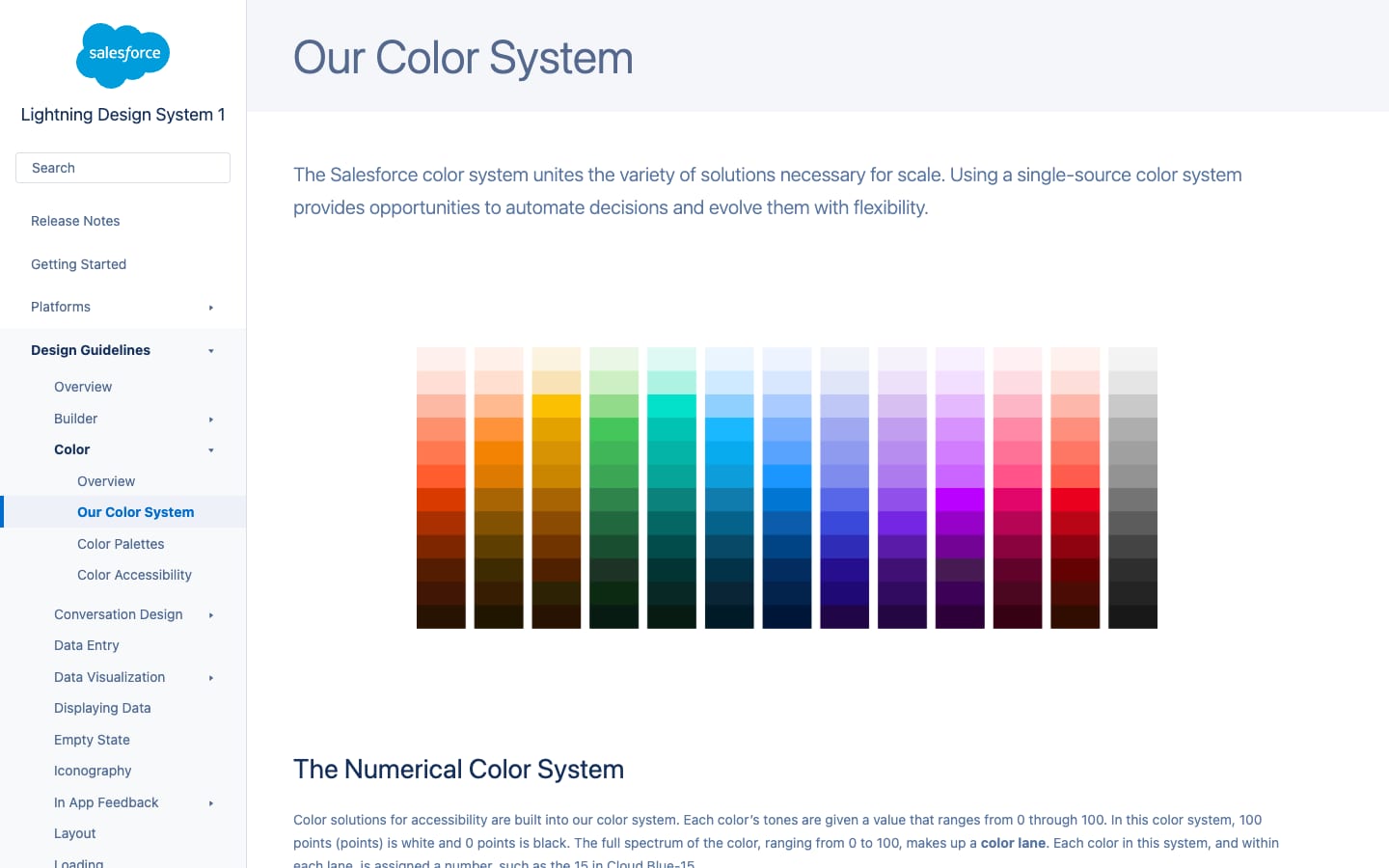
Numbered steps make contrast automatic: 50 points apart passes 4.5:1, 40 points passes 3:1.
| 50-point rule | 4.5:1+ |
|---|---|
| 40-point rule | 3:1+ |
| Button | Blue 50, hover Blue 40 |
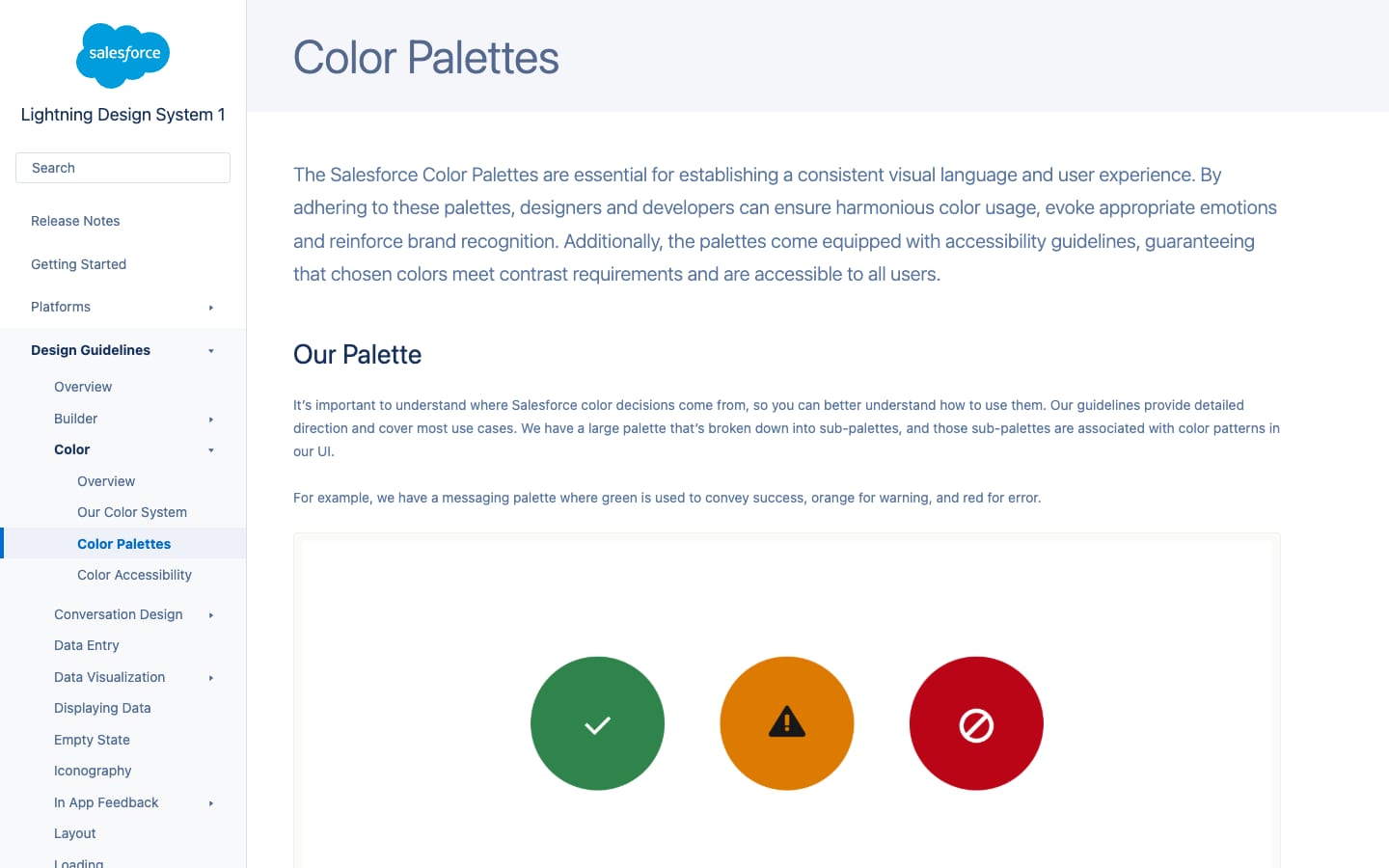
SLDS publishes a numeric color system: 13 hues (blue, cloud blue, green, hot orange, indigo, orange, pink, purple, red, teal, violet, yellow, neutral), each a lane from 10 (dark) to 95, plus white. Primary palette: red, orange, green, blue, cloud blue; secondary adds hot orange, yellow, teal, indigo, purple, violet, pink. The homepage leans on Blue 20 navy, Cloud Blue 95/80 sky grounds, Teal 80 and two brighter blues not in SLDS 1.
Source: v1.lightningdesignsystem.com/guidelines/color/color-palettesv1.lightningdesignsystem.com/guidelines/color/our-color-systemv1.lightningdesignsystem.com/accessibility/global-color-styling-hookssalesforce.com/%20(2026-10-31)
The #1 AI CRM
A round geometric display face echoes the cloud and the pills; a humanist sans keeps body copy readable.
| Their face | Use | License | Open stand-in |
|---|---|---|---|
| ITC Avant Garde Gothic | Headlines, leads in the hero, buttons, eyebrows, chips | Commercial (ITC / Monotype); not open | Poppins Closest x-height (55 vs 56 per 100) and ink at weight 500; 4.9% wider, closed with -0.023em tracking. Calibrated on the live page. |
| Salesforce Sans | Body copy, nav, footer | Proprietary Salesforce face | Open Sans Line width within 1% at 18px; similar humanist forms. |
The marketing site pairs ITC Avant Garde (headlines, buttons, even the hero lead) with Salesforce Sans (body, nav, footer); the FAQ uses a bold "Avant Garde for Salesforce" cut. The display face is used at a single weight.
Not published: typography guidance (the SLDS typography page says new guidelines are coming); licensing terms for Salesforce Sans.
Source: v1.lightningdesignsystem.com/guidelines/typographysalesforce.com/%20(2026-10-31)
Salesforce powers the Agentic Enterprise
The dome divider · every ground change
Salesforce powers the Agentic Enterprise
Salesforce powers the Agentic Enterprise
Two-tone headline · big light-ground H2s and the hero
All-pill buttons · every button
Deploy trusted agents that act with purpose
Deep gradient product cards and 3D characters · product cards, panels, stickers
Specimens use sample copy, not Salesforce’s.
Rounded containers and friendly 3D props make a dense product story feel light.
Dome dividers between every ground change, glass frames, deep gradient product cards with 30px corners, outlined logo pills, and glossy 3D sparkles, Astro and cursor characters.
Source: salesforce.com/%20(2026-10-31)
Consistent grids and strokes keep thousands of icons coherent.
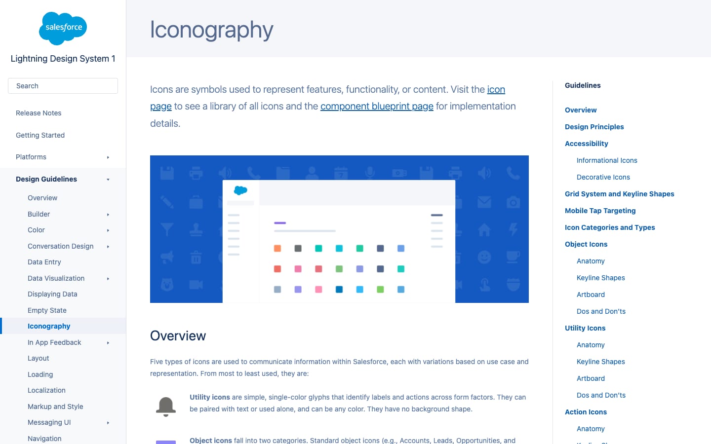
| Grid | 8pt |
|---|---|
| Utility 24 | 2px stroke, 2px radius |
SLDS defines five icon families: utility, object, action, doctype and product. Professional and playful: simple, approachable, legible, with negative space and large rounded corners.
Illustration adds energy and the Ohana spirit without overwhelming (paraphrase).
SLDS empty-state illustrations are friendly scenes used with a short headline and body; the homepage uses glossy 3D renders (sparkles, Astro, hearts, cursors, badges).
Source: v1.lightningdesignsystem.com/guidelines/empty-statesalesforce.com/%20(2026-10-31)
Real customers carry the proof.
Real customers and real stores in video form (Pandora, Williams-Sonoma), under a dark scrim, inside 27px-rounded cards; community photography in the bento.
Not published: a photography guideline.
Source: salesforce.com/%20(2026-10-31)
Motion should speed users up and orient them, and charm only when it helps.
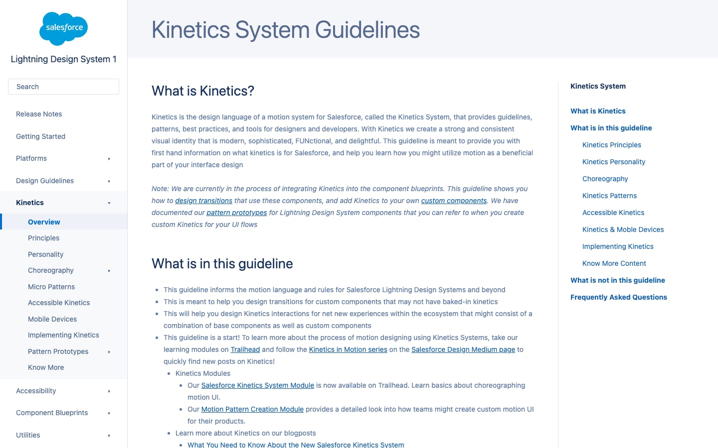
| Durations | 75 / 150 / 250 / 400 / 600ms |
|---|---|
| Ease in-out | cubic-bezier(0.3, 0, 0.15, 1) |
Kinetics: motion is functional, structural and expressive, with four qualities: nimble, sensible, considerate, charismatic. Published duration and easing hooks.
Source: v1.lightningdesignsystem.com/kinetics/implementing-kineticsv1.lightningdesignsystem.com/kinetics/personalityv1.lightningdesignsystem.com/kinetics/choreography/making-things-movev1.lightningdesignsystem.com/kinetics/accessible-kinetics
1152px content column, 144px margins at 1440; centred section headlines; text-left/media-right inside big rounded cards; 64px between stacked cards.
Measured from salesforce.com's Measured with Playwright (headless Chrome, normal user agent) from computed styles at 1440 and 390, 2026-10-31; brand rules from brand.salesforce.com and the Lightning Design System (v1) guidelines..
| Measure | Desktop | Phone |
|---|---|---|
| Page margin | 144px | 16px |
| Section padding | 96px | 64px |
| Hero text width | max 1024px, centered | full width |
| Card gap | 64px | 64px |
| Navigation | 96px | 96px |
Hero H1 / closing H2
Salesforce Sans · 80px (phone 40) · line 1.1 · tracking -3px · weight 500
Section H2 on light / resources
Salesforce Sans · 72px (phone 32) · line 1 · tracking -0.9px · weight 500
Card / panel H2, logo-band H2
Salesforce Sans · 42px (phone 24) · line 1.25 · tracking -0.5px · weight 500
Narrow bento title / demo H2
Salesforce Sans · 32px (phone 24) · line 1.25 · tracking -0.6px · weight 500
Story H3 / quote / sub-H3
Salesforce Sans · 24px (phone 18) · line 1.375 · tracking -0.3px · weight 500
Hero lead
Salesforce Sans · 20px (phone 18) · line 1.5 · tracking -0.24px · weight 500
Column H3 / product label
Salesforce Sans · 18px · line 1.25 · tracking -0.2px · weight 500
Buttons, eyebrows, chips
Salesforce Sans · 16px · line 1.5 · tracking -0.4px · weight 500
Light-section lead
Salesforce Sans · 20px (phone 18) · line 1.5 · weight 400
Card / panel body
Salesforce Sans · 18px (phone 16) · line 1.5 · weight 400
Column body
Salesforce Sans · 16px · line 1.625 · weight 400
Nav links
Salesforce Sans · 16px · line 1.75 · weight 700
Footer links / legal
Salesforce Sans · 12px · line 1.5 · weight 400
FAQ heading
Salesforce Sans · 40px (phone 32) · line 1.2 · tracking -0.32px · weight 700
FAQ question
Salesforce Sans · 20px (phone 16) · line 1.4 · tracking -0.08px · weight 700
How Salesforce’s own landing pages are built, observed on salesforce.com, 2026-10-31. The full measurements are in spec.md.
Source: v1.lightningdesignsystem.com/guidelines/layoutsalesforce.com/%20(2026-10-31)
One clear idea (Agentic Enterprise) told in a lighter, friendlier visual system. Our reading
How our engine applies Salesforce's system to each format: our recipe from their rules and homepage, not something Salesforce publishes.
| Format | What they did | Source |
|---|---|---|
| product UI | The Lightning Design System: the same numbered palette, icon families and Kinetics in the Salesforce app. | v1.lightningdesignsystem.com/guidelines/overview |
| Format | Loudness | Must appear | What varies |
|---|---|---|---|
| Landing page | Build it the way salesforce.com is built (kit.spec.page): white sticky nav, hero blue #022AC0 hero with an 80px white headline whose second line is teal, white and glass pill buttons, a dome divider into Cloud Blue 95, navy two-tone 72px headlines, big rounded gradient cards, a white FAQ and footer. | Which product cards and panels, how many 3D accents, sky-blue or deep-blue middle bands. | |
| Deck | Cloud logo in a corner, navy two-tone headlines on Cloud Blue 95, or white on hero blue; pill-shaped labels. | Gradient card slides for products. | |
| Social | One big two-tone headline, a white pill, one 3D accent. | Ground: hero blue or sky blue. |
Source: brand.salesforce.comv1.lightningdesignsystem.com/guidelines/color/color-palettesv1.lightningdesignsystem.com/guidelines/iconographyv1.lightningdesignsystem.com/kinetics/accessible-kineticssalesforce.com/%20(2026-10-31)
Your name and logo, Salesforce’s system.
Use this kit for my brand Use this brand in Claude
Get your brand audit Put your brand in Claude What goes in a brand book
Each value is marked published, observed, our reading or our recipe, with its source. Checked 2026-10-31. Not affiliated with Salesforce.