Unified employee data
(paraphrase) every app shares one data layer with people at the centre, so automation, reporting and AI have full context Observed
Brand book
A dark, saturated plum gives an HR/payroll product a premium, unmistakable ground, while the warm neutrals and one functional orange keep the pages calm and make every action easy to find. Our reading

the imagery inside each frame: product UI composites, 3D magenta objects or customer portraits
share of the 10,609px desktop homepage by band ground.
#FFA81D appears only on buttons, outline borders and 2px link bars, always with black labels
only #4A0039, #F2EEEB, #FFFFFF and the footer #1C1C1C/#000000 as band grounds; no two plum bands adjacent
one family, sentence case, 500 heads / 400 body, sizes from the type table, body at 70% opacity
4px buttons and inputs, 12px cards and images, 8px testimonial card and pill
every number is one Rippling states, with the customer named
supplied SVG, white on plum, black on light, 127x18 in the nav
Manage your entire workforce on one system Observed
(paraphrase) every app shares one data layer with people at the centre, so automation, reporting and AI have full context Observed
(paraphrase) role-based permissions and approvals defined once and enforced in every app Observed
(paraphrase) business intelligence and AI answers across workforce and business data in one place Observed
(paraphrase) one platform replaces overlapping tools and admin effort Observed
(paraphrase) Started in 2016 in the CEO's basement, went through Y Combinator in 2017, launched its first product in 2018 and grew into a "compound startup" that ships new products regularly.
Category. (paraphrase) workforce management platform unifying HR, IT and Finance; newer copy says "the workforce OS" and "the AI platform" Observed
(paraphrase) Rippling is the AI platform connecting HR, IT and Finance; because data and permissions live in one place, Rippling AI sees the whole business and can act safely. Based in San Francisco, it has raised $1.8B from investors including Kleiner Perkins, Founders Fund, Sequoia and Bedrock, and has been named to the CNBC Disruptor 50, Forbes Cloud 100 and G2's Top Global Software Companies list.
Manage your entire workforce on one system Observed
One platform for all your people, money, and tech Observed
The workforce OS with intelligence built in Observed
Work moves faster when everything runs on one system Observed
We free smart people to work on hard problems Observed
Work will never be the same. Neither will you. Observed
The story of a company rewriting the rules of work Observed
The platform for companies that want to grow faster Observed
plainconfidentbenefit-ledpractical
unifiedautomateworkforceplatformintelligenceglobal
Source: rippling.com
Source: rippling.comrippling.com/careersrippling.com/company/about






The press kit (newsroom > Media resources > Brand logos) ships black and white versions of the full lockup only, as SVG, PNG and EPS. The page says "usage guidelines" but the zip holds no guideline file.
(our reading) the mark reads as ripples and as the R initial; the wide caps keep it legible at 18px
A three-ribbon "RRR" mark followed by RIPPLING in wide capitals. On the homepage it is 127x18px, white over plum and black once the nav turns white. The mark alone appears as the favicon, white on a #7A005D square.
(our reading) one action colour makes the next step obvious on a long page
Plum #4A0039 grounds three full-bleed bands; the hero adds a radial #983569 glow bottom right. Light bands alternate warm greige #F2EEEB and white. Orange #FFA81D appears only on primary buttons, outline-button borders and 2px link bars. Berry #7A005D and #9F1E7A are for small controls and stat units. Footer #1C1C1C on black.
Source: rippling.com
Manage your entire workforce on one system
(our reading) one neutral grotesk keeps a dense product story calm
| Their face | Use | License | Open stand-in |
|---|---|---|---|
| Basel | commercial; not open (Rippling serves it as a self-hosted Next.js font) | ||
| Basel | commercial; not open |
Basel at two weights, 400 and 500, sentence case, no italics or caps. Large heads track tight (-0.72px at 48, -1.5px at 42); text tracks +0.25px.
Source: rippling.com
Do full-bleed #4A0039 with a radial gradient to #983569 in the bottom-right corner (hero); white headlines, 70%-white body; three plum bands per page, never adjacent.
Plum ground with a berry glow · hero, the "Work moves faster" band and the closing CTA
Do #FFA81D fills primary buttons (black label, 4px radius, 54px), draws the 2px border of outline buttons and the 2px bar under Get a demo / Read story links; nothing else on the page is orange except review stars.
Orange is for action only · every button and tertiary link
Do 16/32 Basel 500 black label with a 2px #FFA81D bar flush under it at text width.
Tertiary link with an orange bar · tiles, stat cards, news cards, testimonials, prompt section
Do bands alternate #F2EEEB and #FFFFFF; cards take the other ground (greige cards on white, white cards on greige), radius 12 (testimonial 8); hairlines #CEC1B8.
Warm greige and white alternation · all light bands and cards
30sec
Berry units on stats · testimonial stats
Do #1C1C1C footer panel with 48px rounded bottom corners lifting off a black strip that holds a 1320px faded RIPPLING wordmark (white-to-transparent, 70% opacity) and the centred copyright.
Footer curtain · page end
Specimens use sample copy, not Rippling’s.
2px orange bars under tertiary links, 1px warm hairlines over tiles, 48px berry squares for arrows and play, the play pill, carousel dash indicators, the rounded footer curtain.
Monochrome line glyphs at 16, 20 and 24px (chevrons, arrows, play, sparkle, person, flag), black on light and white on dark; benefit icons sit in 56px white boxes with 8px radius.
Glossy 3D objects rendered in plum and magenta with soft rim light: the six product tiles (heart, laptop, cards, coin stack, app blocks, AI shape), a trophy on a pedestal, isometric app tokens for Data Cloud, abstract plum ribbon waves and objects behind the closing CTA.


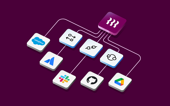

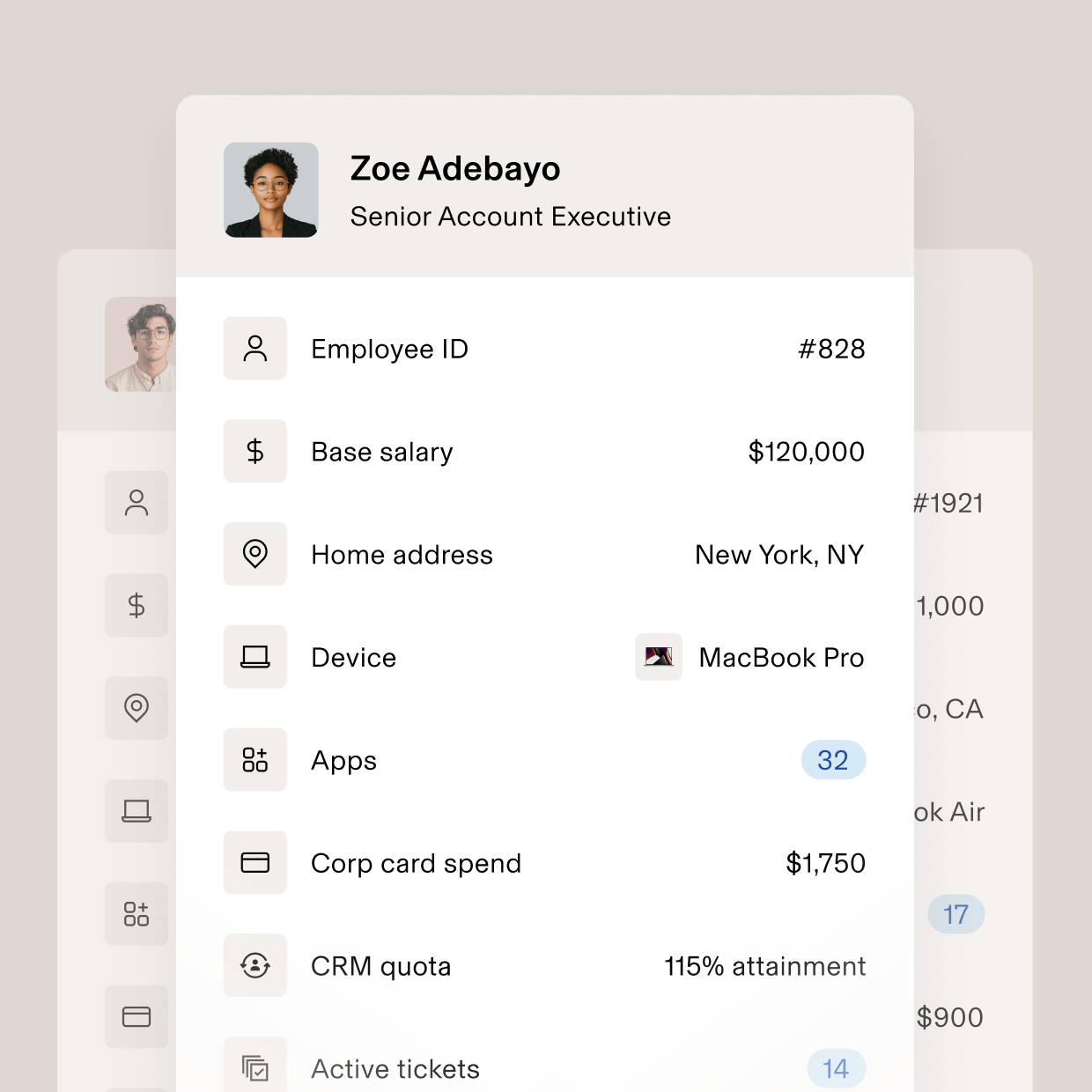
Glossy 3D objects rendered in plum and magenta with soft rim light: the six product tiles (heart, laptop, cards, coin stack, app blocks, AI shape), a trophy on a pedestal, isometric app tokens for Data Cloud, abstract plum ribbon waves and objects behind the closing CTA. Product UI is shown as clean white panels with berry and orange chart accents on taupe grounds.
(our reading) real customers make the numbers believable; the humour stays in the photo, not the copy
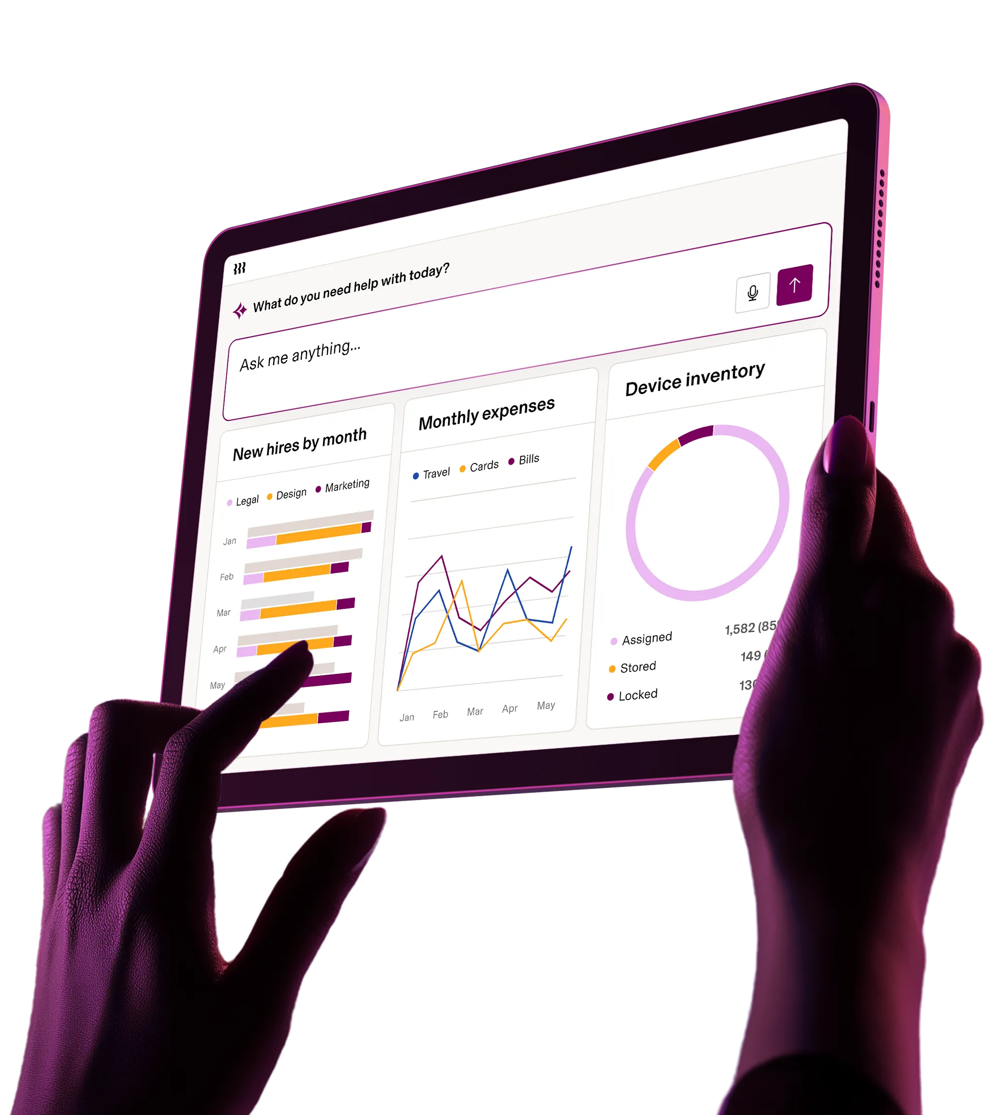


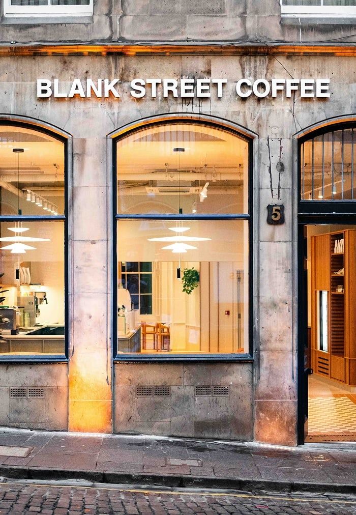
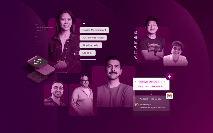
Customer portraits and scenes, cropped tall (about 0.7:1), natural colour, in the customer's own setting: a fitness studio in red light, a Chess.com employee in an inflatable horse costume, an executive against a dark teal curtain. Photos sit edge-to-edge in their frames with no overlays, except a magenta duotone collage on one card. The hero photo is hands holding a tablet, lit magenta against the plum ground.
Source: rippling.com
1440 canvas, 60px margins, 1320 and 1128 containers, 120px band padding, alternating text/image feature rows, carousels for testimonials and news.
Measured from rippling.com's computed styles of every band at 1440 and 390 with Playwright (headless), plus CSS custom properties.
| Measure | Desktop | Phone |
|---|---|---|
| Page margin | 60px | 21px |
| Section padding | 120px | 64px |
| Hero text width | max 620px, centered | full width |
| Card gap | 24px | 24px |
| Navigation | 80px | 80px |
Hero H1
Basel · 48px (phone 36) · line 1.083 · tracking -1.42px · weight 600
Closing CTA H2 and footer demo H2
Basel · 48px (phone 36) · line 1.083 · tracking -1.42px · weight 600
Section H2 (centered band heads, What's new)
Basel · 42px (phone 30) · line 1.143 · tracking -2.3px · weight 600
Feature row H3
Basel · 30px (phone 24) · line 1.2 · tracking -0.5px · weight 600
Tile, card and footer-column title; testimonial quote
Basel · 24px (phone 20) · line 1.25 · tracking -0.15px · weight 600
Stat numeral (testimonial)
Basel · 30px · line 1.2 · tracking -0.5px · weight 600
Lead paragraph
Basel · 18px (phone 16) · line 1.444 · tracking 0.06px · weight 400
List item head (plum river band)
Basel · 18px (phone 16) · line 1.444 · tracking -0.3px · weight 600
Body small (tiles, cards, captions, footer links)
Basel · 15px (phone 14) · line 1.467 · tracking 0.2px · weight 400
Tertiary link (Get a demo, Read story)
Basel · 16px · line 2 · tracking -0.25px · weight 600
Button and nav label
Basel · 15px (phone 14) · line 1 · tracking -0.05px · weight 600
Announcement bar text
Basel · 15px (phone 14) · line 1.467 · tracking -0.05px · weight 600
Fine print (privacy line)
Basel · 12px · line 1.333 · tracking 0.25px · weight 400
How Rippling’s own landing pages are built, observed on rippling.com, 2026-11-04. The full measurements are in spec.md.
Source: rippling.com
How loud the brand runs by format.
| Format | Loudness | Must appear | What varies |
|---|---|---|---|
| Landing page | announcement bar optional; plum hero with white H1 and an orange CTA; alternating greige/white bands; tertiary links with orange bars; customer stats; closing plum CTA; the full footer | which product sections appear and their imagery | |
| Social post | plum glow ground, white lockup top left, a two-line white headline, one white sub line, a rounded photo panel at the bottom; no button | top-right category label; photo subject; the photo panel may be dropped for a text-only post; the panel holds an event photo or Rippling's 3D plum art (cta-3d-background.jpg); for a customer quote, see Paid social ad | |
| Social post, portrait | plum glow ground, white lockup top left, a two-line white headline, one white sub line, optional icon details row, a rounded photo panel in the bottom half; no button | top-right category label (e.g. "Event") and the details row; the photo subject; the panel holds an event photo or Rippling's 3D plum art (cta-3d-background.jpg); for a customer quote, see Paid social ad | |
| Paid social ad | pick the family by the ad's job; customer quote: periwinkle/indigo-to-berry mesh, sparkle top left, RIPPLING × customer lockup top right, 3 to 5 line white quote with hanging open quote, name and title, no button or photo | by job: customer quote (google-1..4, meta-1; bottom-row variant on a peach-to-plum mesh, google-2, google-3); lead magnet on the plum glow or flat berry with an orange Download button and a document mock (meta-2, meta-3); gift-card offer letter on white with a warm halftone glow and a product shot (meta-4, meta-5); 1200 x 628 display: landscape quote with a customer cutout (google-5) or photo plus berry panel with an orange button (google-6) |
Source: rippling.comrippling.com/company/aboutrippling.com/careersrippling.com/customersrippling.com/pricing
Your name and logo, Rippling’s system.
Talk about my brand Use this brand in Claude
Get your brand audit Put your brand in Claude What goes in a brand book
Each value is marked published, observed, our reading or our recipe, with its source. Checked 2026-11-04. Not affiliated with Rippling.
Tell us what you want to make. We’ll talk through how to put these ideas to work for your brand.