The system
Fixed, everywhere

- #14191E Rotina 700 heads, sentence case, tight tracking, usually a closing period
- Near-black 6px rectangular buttons with →
- Pale cyan #AEFCFF somewhere in every page's gradient
- Rounded #14191E footer card with the big off-white wordmark
- Lowercase geometric wordmark
- Translucent white 16px cards, no shadows
The one thing that varies
The vivid gradient family per page: purple (#500087/#B919FF) on home and about, sea blue (#00285A/#057AFF) on EOR and case studies, lime as a highlight.
How loud each format gets
Silent
QuietCustomer quote adApp store screenshot
CalmLanding pageSocial postSocial post, portraitPaid social adBrand campaign ad: "For a world that works"
Warm
Loud
Loudest
Our engine's setting, built from their rules.
Every piece passes 7 checks
Ink only
Headlines, body and buttons are #14191E (or #FAFAFA on dark); no purple, blue or lime text or buttons.
One ramp
The page uses one vivid family in a vertical gradient that includes #AEFCFF; no purple and blue mixed, no flat color bands.
Heads
Every head is 700, sentence case, tight (about -0.02em, leading about 1.0) and normally ends in a period.
Buttons
6px-radius rectangles 48px tall with a → on the primary; no pills, no shadows.
Wordmark
Real lowercase wordmark top-left and again large in a rounded dark footer card; never redrawn or recolored outside ink, off-white or pale cyan.
Proof
Every number is one Remote states (150+, 99%, 4,900+ reviews...) with its source; no invented stats.
Art
Imagery is glossy geometric crystals, product UI cards or cut-out portraits, not stock photography.
Strategy
The financial operating system for the global workforce: payroll, EOR, PEO and contractors on one system of record (paraphrase). Observed
Employer of Record
PEO (US)
Contractors
AI and API
Full spec
- For Observed
- HR, people and finance leaders at startups, mid-market and enterprise companies hiring across borders; sales-led ('Book a demo') (paraphrase).
- Problem Observed
- Staying compliant while local tax codes, labor laws and country rules keep changing, without opening an entity in every country (paraphrase).
- About hero Observed
- Talent is everywhere, opportunity should be too
Proof behind each pillar
Story Observed
Remote removes barriers to international hiring so companies can work with great people wherever they live; the company itself works fully remotely across six continents (paraphrase).
Category. Global employment platform / global employment infrastructure (G2 category 'Global Employment Platforms'). Observed
Why them
- 100% owned entities, no third parties Observed
- In-house payroll, benefits, legal, and HR support Observed
- Uncapped misclassification indemnity on Contractor of Record Observed
- Native integrations inside Workday, Personio and BambooHR, plus API, MCP server and CLI Observed
Boilerplate Observed
The intelligent infrastructure for global employment. EOR, global payroll, contractor management, and compliant payments — worldwide, on one system of record.
Taglines
The financial operating system for the global workforce. Observed
One platform for global payroll, EOR, and contractor management. Available in 150+ countries. Observed
Whoever said it's a small world has never paid a global team. Observed
Every way to hire and pay your workforce. Observed
A single system of record for global employment. Observed
The global employment infrastructure HR leaders build on. Observed
Built for your global team, one hire at a time. Observed
Learn how the world gets paid. Observed
Talk to us before your next pay day. Observed
The intelligent infrastructure for global employment. EOR, global payroll, contractor management, and compliant payments — worldwide, on one system of record. Observed
Employer of Record in 90+ countries. Observed
Hire in days, not months. Observed
Employ globally without creating another entity. Observed
Transparent pricing, from day one. Observed
Talent is everywhere, opportunity should be too Observed
Building infrastructure for a world that works. Observed
Personality and voice
Confidentbut not HedgingObserved
Wrybut not CorporateObserved
Vividbut not MutedObserved
Plainbut not Jargon-heavyObserved
Full spec
- Headlines are full sentences in sentence case and usually end with a period.
- One wry or contrasting line per page, set huge: a turn on a cliche, 'X, not Y', or pay-day humor.
- Reader is 'you/your'; Remote is 'we/our' or 'Remote' in the third person; the two are often paired in one line.
- Serial (Oxford) comma in lists.
- Counts as digits with a trailing plus; the number leads the line.
- CTAs are 2-3 word verb phrases.
- One or two sentence lead under each head, 10-25 words, product terms spelled plainly (EOR, PEO).
ConfidentPlainWryGlobal
- Head = one full sentence with a period
- One wry statement line per page
- Numbers as digits with +
- CTA = verb + object, 2-3 words
- Observed in ads: a setup then a turn - a quoted objection answered ("...isn't realistic..." Said no one with an EOR, ever.), an ellipsis pivot ("...Bolivian labor law... so use an EOR"), or staccato fragments ("New market. New hire. New headache. Same fix.")
- No brand, press-kit or media-kit page exists (remote.com/brand, /press, /newsroom, /media-kit, /press-kit, /brand-assets, /media all return 404, checked 2026-11-10). Voice is read from marketing pages, so every rule is observed, none published.
- Recurring words: global, payroll, compliance/compliant, one system of record, owned entities, infrastructure, workforce, pay/paid.
- Mostly direct product copy with a few wry lines placed as band-sized statements.
Logo


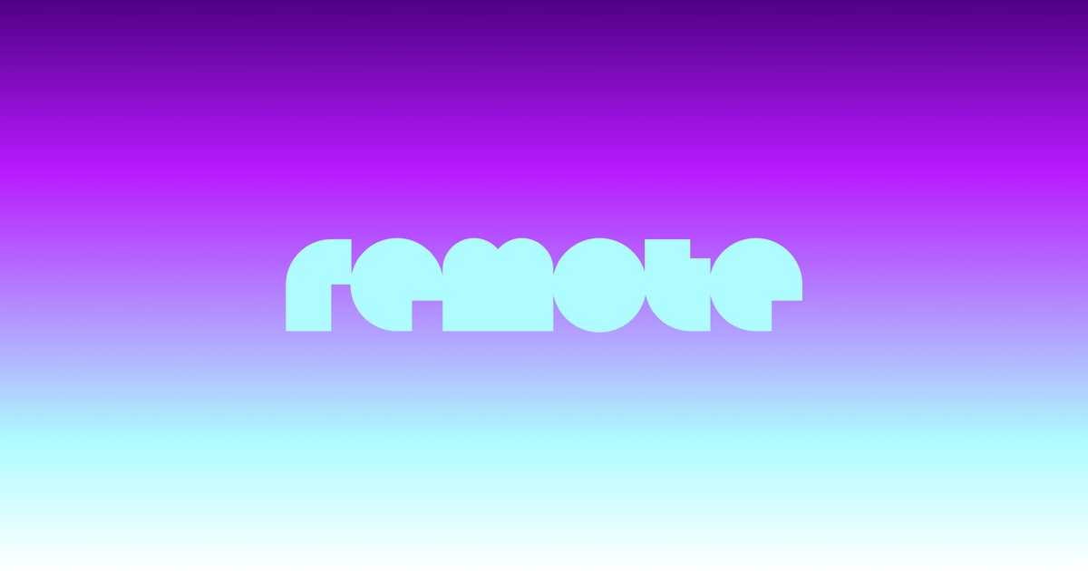
The wordmark is the whole identity: ink 153px top-left on light pages, off-white in the header over dark hero tops, 1312px pale cyan as the home hero, 307px off-white in the footer card.

Full spec
The wordmark is the whole identity: ink 153px top-left on light pages, off-white in the header over dark hero tops, 1312px pale cyan as the home hero, 307px off-white in the footer card. The favicon reduces it to the 'r' on a lime square. No separate symbol appears in the lockup.
- Wordmark top-left in the header, 64px from the edge
- Ink on light, off-white #FAFAFA on dark, pale cyan when it is the hero
- Repeat it large in the dark footer card
Color
Color lives in full-width vertical gradients and in illustrations, not in UI chrome.
Full spec
Color lives in full-width vertical gradients and in illustrations, not in UI chrome. Each page has one vivid family running dark > vivid > cyan > white and back. Text, buttons and the footer card stay #14191E. Lime #A2EB00 appears as a highlight inside cards (Remote Agent panel, EOR pricing card, crystal cores) and the favicon.
Typography
The financial operating system for the global workforce.
One family, Rotina, at three weights.
Full spec
One family, Rotina, at three weights. Heads 700, very tight (Rotina tracking -0.02 to -0.03em; Geist stand-in -0.047 to -0.06em, line-height about 1.0), sentence case with periods; big stats 72px 700 with 16px 300 labels; testimonials 24px 300; body 16/24 400.
| Their face | Use | License | Open stand-in |
|---|---|---|---|
| Rotina | Every headline and big stat numeral at 700 | Proprietary, self-hosted; stand-in Geist (open, and the site's own CSS fallback), to be calibrated | |
| Rotina | Body 400; quotes, stat labels and card subheads 300 | Proprietary; stand-in Geist | |
| Bossa | Declared in the site CSS but not rendered on the sampled pages | Proprietary |
- Heads always 700, never colored
- Leading at or under 1.05 on display sizes
- Light 300 only for quotes, stat labels and subheads
Graphic elements
Do Vertical linear gradients chained band to band. Home: hero #500087 0 > #A012E2 240px > #B919FF 410px > #B38FFF 570px > #AEE5FF 690px > #AEFCFF 780px (the measured static ramp, spec.page.hero.at_rest); bands #AEFCFF > #D3FEFF > white mid-page; back to #AEFCFF > #D893FF; footer ramp #B919FF > #500087. EOR swaps the vivid family: #00285A > #057AFF > #AEFCFF, footer #057AFF > #00285A. Pricing stays light: #AEFCFF > white..
Page-long gradient ramp · Every page: hero, band washes, footer
Do Lowercase geometric 'remote' wordmark spanning the content width in pale cyan (~#C4FAFE fills, an animated Lottie) over the dark top of the gradient; repeated 307px wide in #FAFAFA on the #14191E footer card.
Full-bleed wordmark · Home hero top (1312x239 at 64px margins); dark footer card (307x56); og share image
Do Rotina 700 (stand-in Geist 750 at the type table's tracking: -2.7px at 56, -2.1px at 44, -5.3px at the 88.3px rendered statement), #14191E, sentence case ending in a period; 56px hero / 88.3px rendered statement (96px CSS at scale 0.92) / 44px section on desktop, 28/36.8/26px phone; line-height 0.9-1.03; Rotina tracking -0.02 to -0.03em, Geist -0.047 to -0.06em.
Heavy, tight, period-ended heads · Every headline
Do 48px tall, 6px radius, 12px 24px padding, #14191E fill, #FAFAFA 16px label + →; paired with a 2px #14191E outline twin; inverted #FAFAFA fill on dark grounds.
Near-black 6px buttons with arrows · Every CTA
Do Rendered translucent geometric solids (cubes, ribbons, bursts) in the page's gradient family plus #A2EB00 lime cores, often caged in thin black wireframe cubes; float around big type or bleed off card edges.
Glossy 3D crystal shapes · Home statement band, product icons, segment cards, EOR hero, CTA cards
Do rgba(255,255,255,0.3) fill, 16px radius, hairline outline, no shadow, sitting on the gradient wash so the color shows through.
Translucent cards on color · Feature, product, testimonial and FAQ cards
Specimens use sample copy, not Remote’s.
Translucent white cards (16px radius) on gradient grounds; 4-up stat rows with 72px numerals separated by 1px vertical black rules that fade out downward; G2 rating table with horizontal rules; trust row of check-marked certifications (SOC 2 Type II, ISO 27001, GDPR); logo strip of customer wordmarks in ink; FAQ accordions as stacked translucent cards with + / × toggles, open item outlined in #14191E; dark rounded footer card inset 64px on a gradient ground.
Iconography
Thin outline line icons in small rounded tiles (cyan on EOR/pricing, lilac on about); glossy gradient 'product icons' (rounded squares of crystal shapes) for Global Payroll, EOR, PEO, Contractor Management.


Illustration
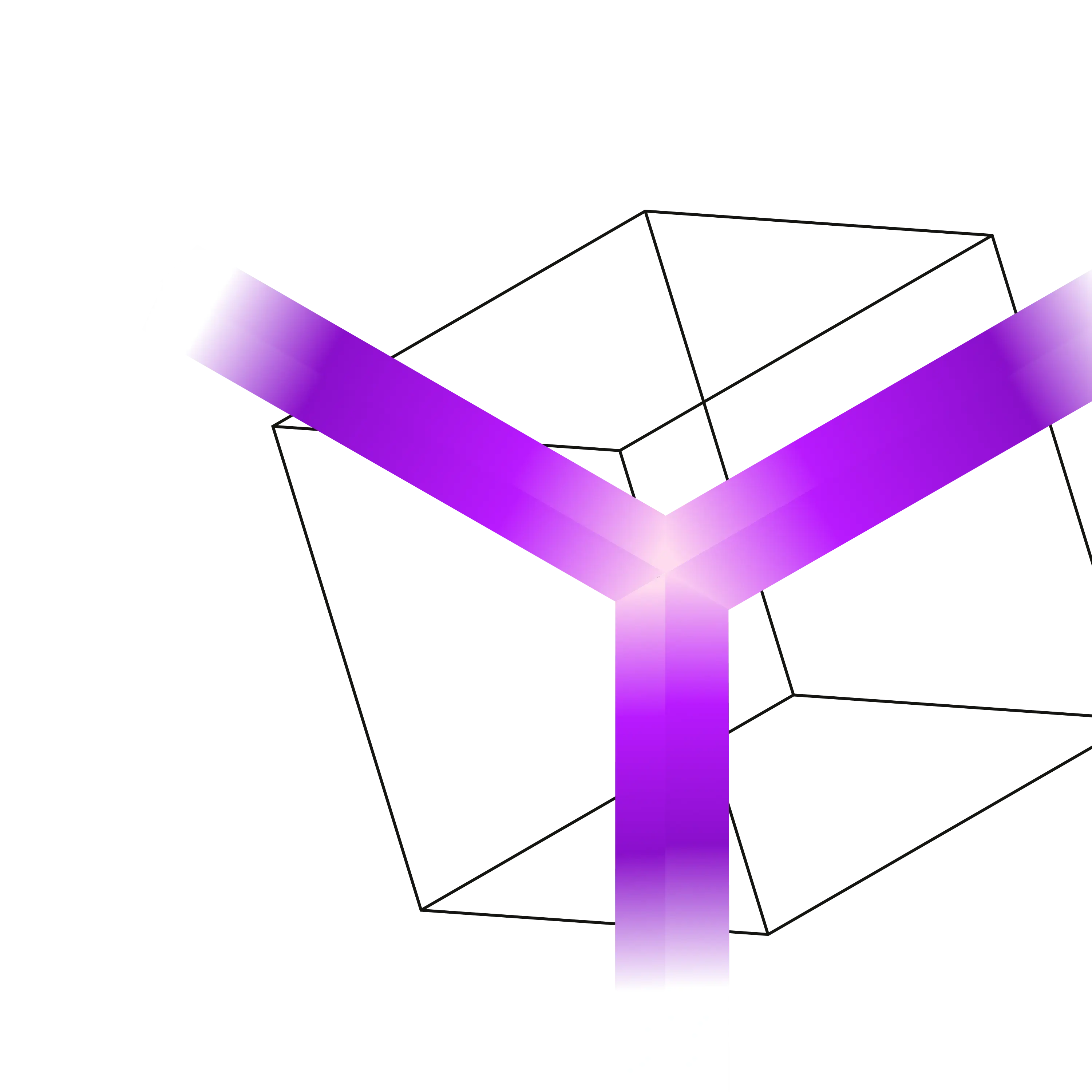
Rendered 3D geometric solids: translucent purple ribbons inside thin black wireframe cubes (home cards, closing CTA), blue glass bursts and cubes with lime faces (EOR hero, CTA), soft gradients, no outlines except the wireframe.



Full spec
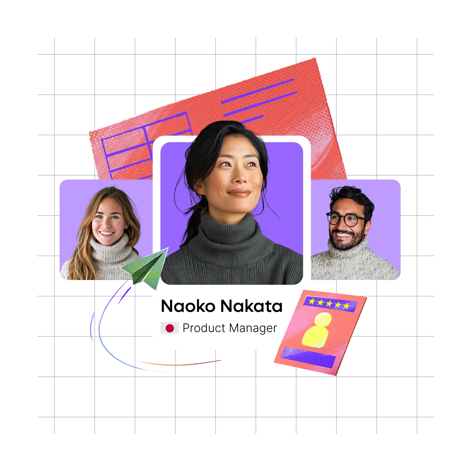
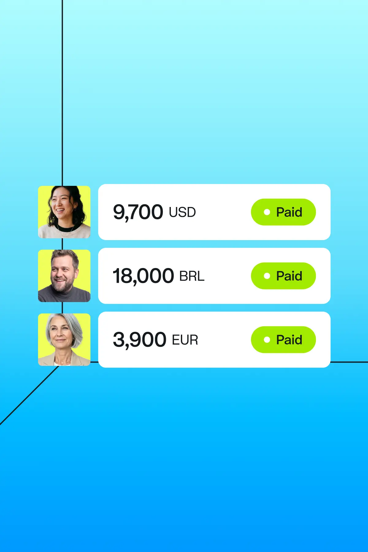
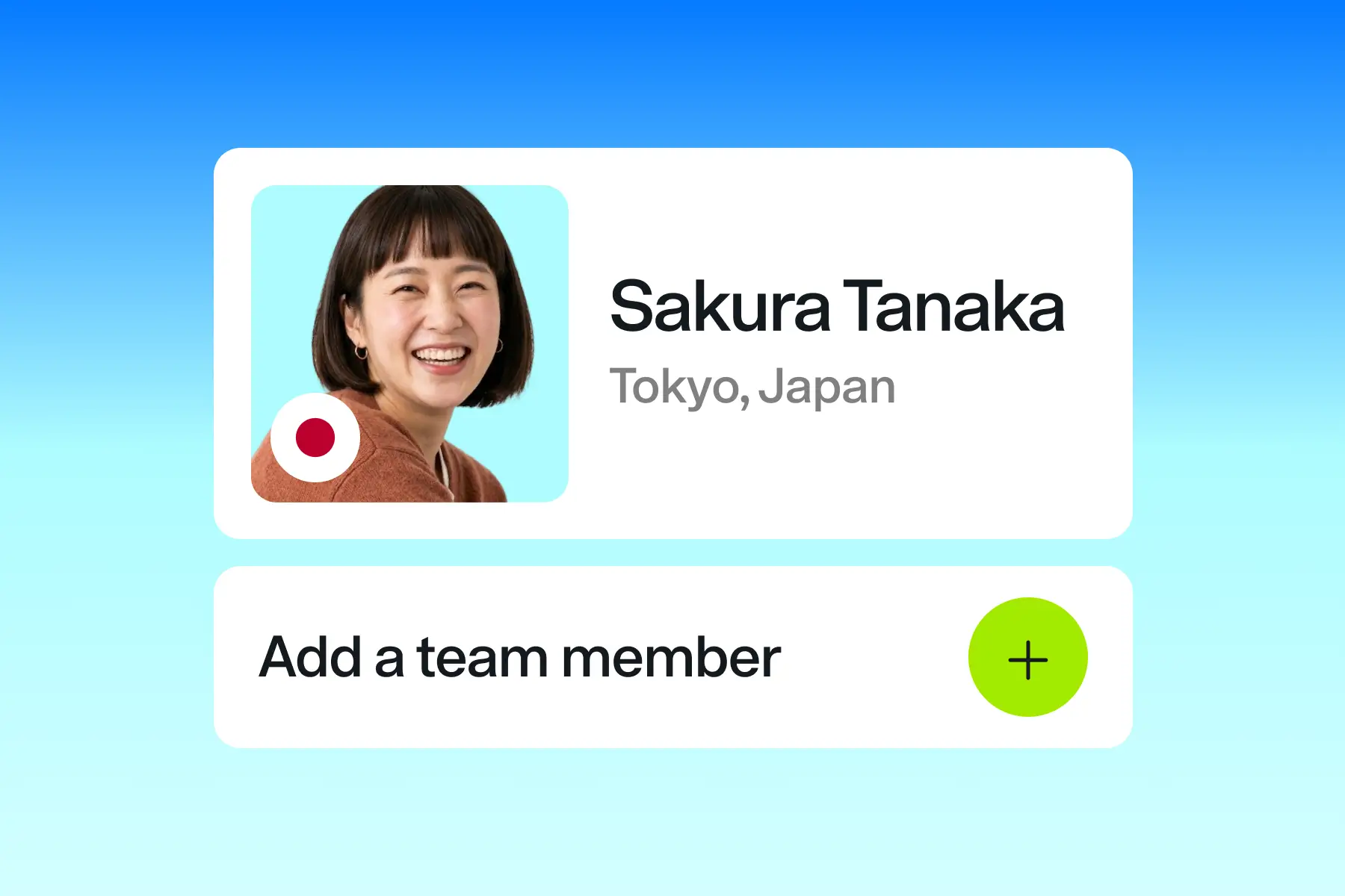
Rendered 3D geometric solids: translucent purple ribbons inside thin black wireframe cubes (home cards, closing CTA), blue glass bursts and cubes with lime faces (EOR hero, CTA), soft gradients, no outlines except the wireframe. About page uses softer collage illustrations (glass hands holding a lime coin on a grid). Product UI cards (payslips, employee cards with 'Paid' lime pills) sit on gradient tiles.
Photography
Secondary.

Full spec
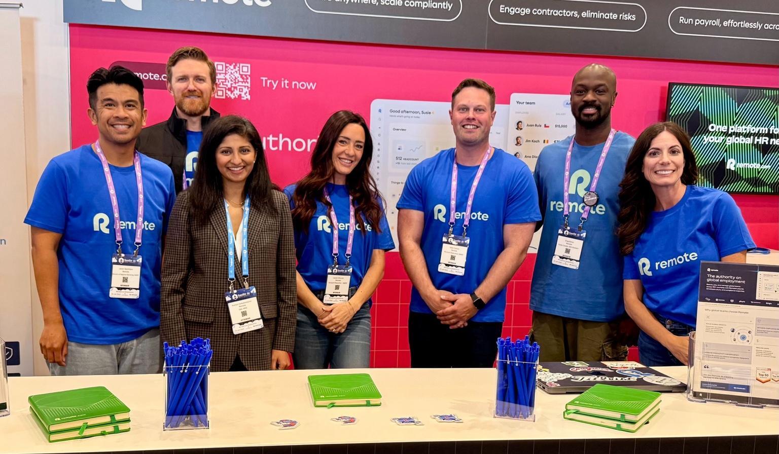
Secondary. Leadership portraits are black-and-white cut-outs on a saturated purple disc over lilac tiles. People in product UI are small colour headshots in rounded squares. Case-study thumbnails are mostly customer logos on dark brand-coloured grounds; one real event photo (team in blue Remote T-shirts at a booth). Photos never sit behind text.
- Portraits cut out, monochrome, on a purple disc
- Photos stay inside cards or UI, never full-bleed behind copy
Interface & layout
The page, band by band
Nav
Logo strip
Value cards
Statement
Products
Proof stair
Partners
Segments
Testimonials
G2 rating
Resources
FAQ
Buttons
Full spec
Full-width gradient bands; content in a 1089-1168px container; section intros centered in a 644px column, otherwise left-aligned heads over 3-4 column card grids; generous 112px section padding; dark footer card inset with 64px margins.
Measured from remote.com/%20and%20four%20inner%20pages,%20measured%202026-11-10's Computed styles and bounding boxes of every band at 1440 and 390, read with headless Chromium after removing the cookie-consent DOM (#ccc), never by accepting it.
Spacing
| Measure | Desktop | Phone |
|---|---|---|
| Page margin | 64px | 16px |
| Section padding | 112px | 64px |
| Hero text width | max 644px, centered | full width |
| Card gap | 24px | 24px |
| Navigation | 80px | 80px |
Type, at size
Statement head
Rotina · 88.32px (phone 36.8) · line 0.9 · tracking -5.32px · weight 750
Stat numeral
Rotina · 72px (phone 53.3) · line 0.96 · tracking -4.4px · weight 750
Hero head
Rotina · 56px (phone 28) · line 1 · tracking -2.7px · weight 750
Section head
Rotina · 44px (phone 26) · line 1.03 · tracking -2.1px · weight 750
Compact section head
Rotina · 36px (phone 24) · line 1.05 · tracking -1.6px · weight 750
Feature card head
Rotina · 28px (phone 21) · line 1.07 · tracking -1.1px · weight 750
Card head
Rotina · 20px (phone 17) · line 1.09 · tracking -0.75px · weight 750
Testimonial quote
Rotina · 24px (phone 19) · line 1.08 · tracking -0.94px · weight 350
FAQ question
Rotina · 16px · line 1.1 · tracking -0.45px · weight 750
Body and lead
Rotina · 16px · line 1.5 · tracking -0.4px · weight 450
Stat label
Rotina · 16px · line 1.5 · tracking -0.4px · weight 350
Small
Rotina · 14px · line 1.5 · tracking -0.25px · weight 450
Footer and legal
Rotina · 12px · line 1.5 · tracking -0.15px · weight 450
Phone menu item
Rotina · 32px · line 1 · tracking -0.85px · weight 750
Cards
LabelCard title, one line
One or two sentences on what this does for the reader.
LabelCard title, one line
One or two sentences on what this does for the reader.
Translucent white (rgba 255,255,255,0.3), no shadow; the 1px hairline is a masked ::before ring (padding 1px, mask-composite exclude) whose gradient depends on the ground: on TINTED grounds (value cards, testimonials, resources) 196deg #FFFFFF 6% to #CCCCCC 95%; on WHITE grounds (products, partners, segments) 196deg #14191E at 20% alpha 6% to #14191E at 30% alpha 95%, a visible grey outline all round. Media sits inside at 8px radius or bleeds off the bottom/right edge
- Shadow
- None on cards (box-shadow none); depth comes from translucent white cards (rgba(255,255,255,0.3)) over gradient grounds.
- Density
- Airy: 112px vertical section padding on desktop, centered 644px text column for section intros, 4-up card grids inside a 1089-1168px container.
- Buttons
- Rectangles, radius 6px, 48px tall, padding 12px 24px, Rotina 16px 400 with a trailing → arrow on primary CTAs. Solid: #14191E fill, #FAFAFA text. Outline: transparent with a 2px inset #14191E stroke and #14191E text ('Get started', 'See all'). On dark grounds (top of the hero, dark cards) the solid button inverts to #FAFAFA fill with #14191E text. Hover animates corner 'notches' (site classes btn__notch--tl/--br) and the fill.
Page anatomy
How Remote’s own landing pages are built, observed on remote.com, 2026-11-10. The full measurements are in spec.md.
- Navigation
- Transparent sticky header that sits on the hero gradient at rest and turns into a frosted inset bar after scroll
- Hero
- Full-bleed vertical gradient band with the giant lowercase wordmark across the top and a centered head, lead and two buttons below it
- Customer logo strip
- One row of customer logos scrolling sideways right under the hero
- Value cards
- Four short value props in translucent cards with crystal art bleeding off the bottom
- Statement band
- The one wry line at 96px with five glossy product icons floating around it
- Products
- Centered intro, then a 2-row product card grid: one wide feature card plus four product cards with UI screenshots
- Proof stair
- Centered intro with a compliance check row, then four big stats in a stepped line frame on a lime wash
- Partner cards
- Left-aligned head and four cards: three HR-platform integrations and one dark blue developer card
- Segments
- Left head and three audience cards with wireframe-cube art on the right half
- Testimonials
- Left head with See all on the right, then a paged carousel of large quote cards that runs off the right edge
- G2 rating
- Two columns: head with G2 badge left, a three-row ratings table with hairline rules right
- Resources
- Head with See all, then one large article card left and two text cards stacked right
- FAQ
- Head left, accordion of six questions right, the first one open
- Closing CTA
- Rounded purple card with a big off-white head, two inverted buttons and cropped crystal art
- Footer
- Footnotes on the purple gradient, then a rounded near-black panel with the big off-white wordmark, app badges and five link columns, then a legal bar on the gradient
In use
Full spec
Website observed in the extract step; social post anatomy observed on Remote's public Instagram (formats step, 2026-11-10).
Our setting for each format
| Format | Loudness | Must appear | What varies |
|---|---|---|---|
| Landing page | Transparent sticky 80px header (ink or off-white wordmark top-left, 16px nav, #14191E or #FAFAFA 'Book a demo →' button); hero on a dark-to-vivid-to-cyan vertical gradient with a centered or left 56-72px Rotina 700 head ending in a period, one-line lead, black solid + outline button pair; customer logo strip; translucent white card grids on cyan/white washes; one 96px wry statement among floating glass crystals; 4-up 72px stat row; G2 rating table; FAQ cards; a rounded vivid CTA card; gradient diving dark into the rounded #14191E footer card with the big wordmark. | ||
| Social post | The giant wordmark spans the top as a banner, a 2-3 line sentence-case headline sits under it, one product UI proof (card, chip list or map) fills the middle, and the ground is flat lime or a site ramp. | Ground: flat lime #A2EB00 (olive #2C3E00 type and wordmark), the blue ramp (cyan #AEFCFF wordmark, white headline) or the olive-to-lime ramp (lime wordmark, white headline). Proof: a form card, chip list or pixel map. CTA button optional on an organic post (the ads carry one). Variant: small wordmark top left plus 4-5 staccato headline lines filling the canvas (google-4). | |
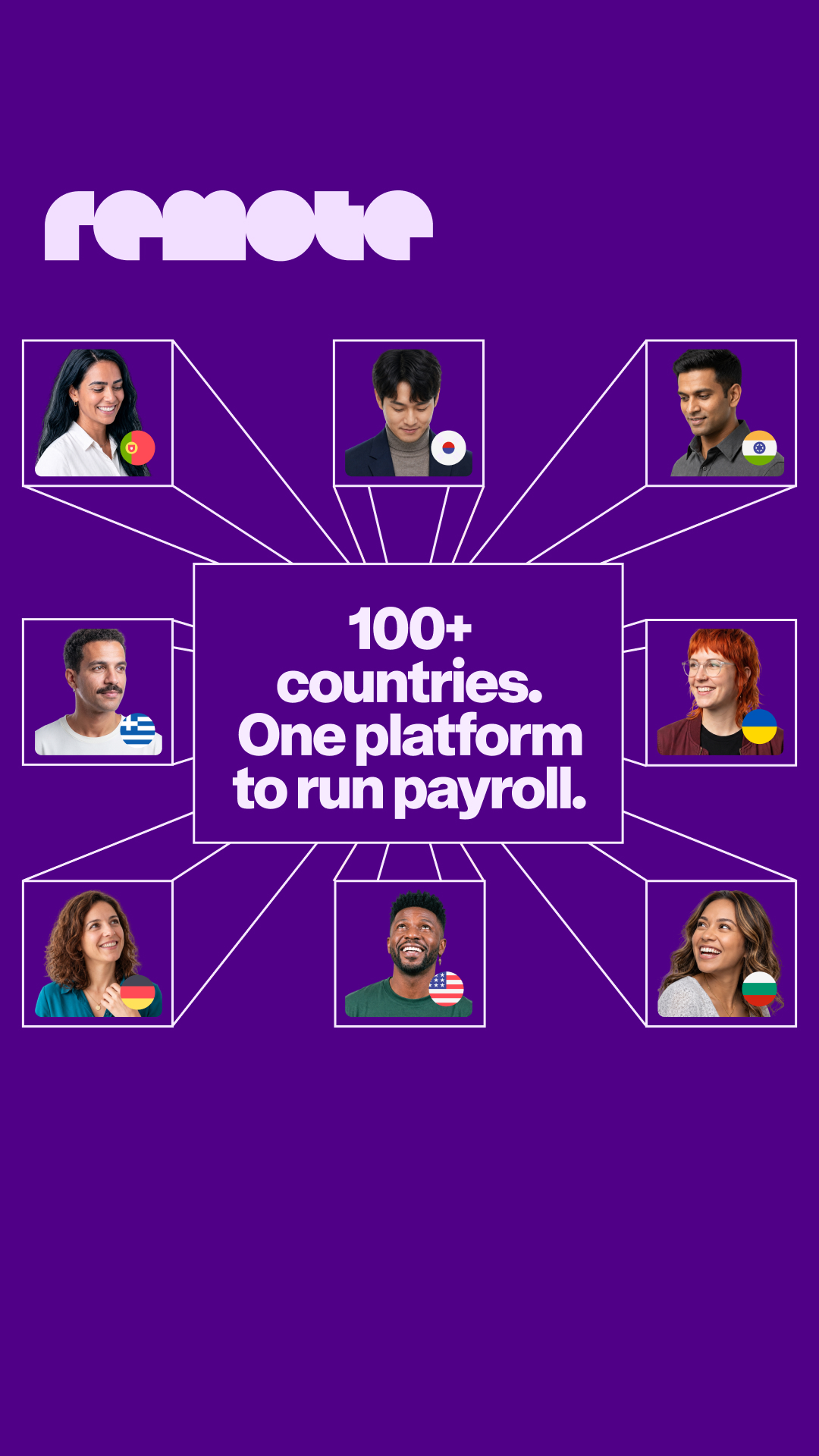
| Social post, portrait | Full-bleed vertical ramp from the site palette (navy #00285A > sea blue #057AFF > cyan #AEFCFF, or purple), one huge left-aligned Rotina 700 headline in the top half, rendered glass/wireframe art bleeding off the bottom; or a flat lime/yellow ground with an ink headline inside a thin wireframe box and the wordmark bottom-left. | Ramp family (blue, purple) or flat lime; headline only (carousel opener) or headline + wordmark; wordmark-only brand card on a ramp. | |
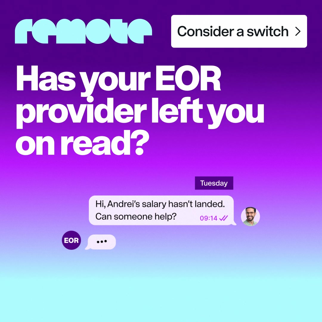
| Paid social ad | Wordmark banner on top, 2-3 line wry headline, one product UI proof, ink "verb →" button bottom right, on lime or a site ramp. | Small-logo variant: white R+remote logo top left, button top right, larger bold headline, one product card (invoice, payslip) bleeding off the bottom, on a purple ramp or dark aubergine. | |
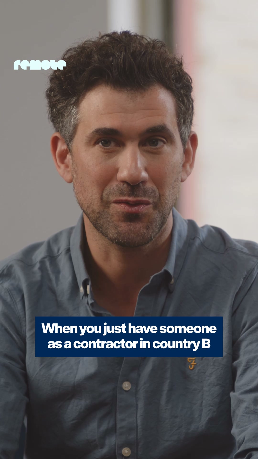
| Brand campaign ad: "For a world that works" | Full-bleed documentary photo of a worker, the wordmark full-width on top in one accent color, a thin white rectangle holding a 3-line "X in <city> / Y in <city> / Paid through Remote" stack, the tagline "For a world that works" in the accent color, a solid accent button. | Accent color per creative: lime, orange, cyan, or pink-on-red for the end card; feed (tagline lower left, button lower right) or story (both centred low). | |
| Customer quote ad | Outline double quote marks, the quote left-aligned with its key phrase on a highlight bar, name / title / customer logo lower left, cut-out portrait lower right on circles or blobs, R+remote logo top right. | Royal blue ground with yellow accents, or pale mint with blue accents. | |
| App store screenshot | Flat sea blue or purple ground, 2-line bold white feature headline top left ("Manage tasks on the go"), a phone with the real app screen rising from the bottom edge. | Wordmark only on the first screen; a navy diagonal slab or faint wireframe lines behind. |
Ads

Rules
Do
Don’t
Steal this kit
Your name and logo, Remote’s system.
Comes with you
- Color roles and how much of each
- Type pairing, with open fonts
- Voice rules the writing check enforces
- Icon, photo, illustration and motion recipes
- The strategy frame, to fill with yours
Stays yours
- Your name and logo
- Your proof: numbers, customers, quotes
- Your purpose and claims. Theirs aren’t yours to make
Talk about my brand Use this brand in Claude
Hand it to a developer
- spec.mdEvery value and rule
- tokens.cssCSS variables
- tokens.jsonDesign tokens (DTCG)
- kit.jsonWhat our engines read
Your brand next
Get your brand audit Put your brand in Claude What goes in a brand book
What Remote doesn’t publish
- No brand, press-kit or media-kit page: /brand, /press, /newsroom, /media-kit, /press-kit, /brand-assets and /media all return 404 (checked 2026-11-10). No published logo rules, clear space, color names or voice guidance.
- Rotina is proprietary; Geist (the site's own fallback) is the stand-in, calibrated per size on 2026-11-10 (kit.typography.*.calibration); its x-height stays about 5.5% taller, so follow the explicit line breaks in the page anatomy.
- Screenshots in ref/ are dimmed by the cookie banner's rgba(0,0,0,0.4) overlay above the fold: the hero wordmark looks grey-teal there but its fills are pale cyan (~#C1FAFE-#C7FAFE). Read colors from measure/ and the probe, not ref/ pixels.
- Deck and Email: the site shows no decks or emails; left for the examples step. Social posts were found on Instagram (see the Social post rows); X returned 403. LinkedIn (organic posts and ad library) was skipped by rule.
- G2 rating differs by page (4.5 on home, 4.8 on pricing/EOR); quote the one on the page you cite.
- The '47% average compliance cost reduction' carries an asterisk whose footnote was not resolved on the home page.
- Bossa is declared in the CSS but not seen in use on the sampled pages; its role is unknown.
- Library (2026-11-10): Remote publishes no pattern/texture files (its backgrounds are CSS gradients; read them from the palette, do not draw image patterns), almost no documentary photography (only leadership cut-out portraits, one OOH campaign photo and generic stock on enterprise/careers, left out), no full-screen product screenshots (product appears as cropped UI cards on gradients), no downloadable icon set beyond inline SVG, and no press kit. The EOR hero cubes exist only as a WebGL model, so the library holds a render.
- Hero ambient layer: the live hero runs two looping CSS animations (a blurred gradient overlay floating 0-110px over 2.8s and a drifting cyan radial over 5s); the book gives the measured static ramp at the lower turn of the float, which is what every reference capture shows. The statement block also scales 0.92 to 1.0 as it scrolls into the centre of the viewport; the book gives the 0.92 state (all captures).
Each value is marked published, observed, our reading or our recipe, with its source. Checked 2026-11-10. Not affiliated with Remote.