Save time and money
(paraphrase) the founding mission, written on a Post-it: save companies time and money Observed
Brand book
Ramp looks like a calm, expensive tool rather than a bank: lots of white, quiet type and real product, so the one lime button and the product itself do the selling. Our reading

what sits inside the frames: live product UI, the black card, customer portraits or video, or editorial covers on the blog
approximate share of the 13,905px desktop homepage (band grounds from measure/home-desk.json plus inset frames seen in the slices).
#E4F222 appears only on the primary CTA (and app icon), always with a #0C0A08 label.
Every line is Lausanne (or Figtree stand-in) 400; no bold; sentence case.
Section heads pair an ink clause with a 60%-ink clause; no other grays or colours for emphasis.
White page with 12px #F4F2F0 frames and 1px warm hairlines; only the bar and footer are dark #1A1919.
Imagery is Ramp UI, the black card or named customers; no stock illustration.
Full lockup, black or white, clear space = lockup height; never the wordmark alone or recoloured.
Every number is one Ramp states (85,000+, $12B+, 27M+, 200+); yields only with their footnotes and date.
Time is money. Save both. Observed
(paraphrase) the founding mission, written on a Post-it: save companies time and money Observed
(paraphrase) cards, expenses, procurement, bill pay, accounting, banking and 200+ integrations in one place, replacing systems "that never spoke" Observed
(paraphrase) agents code transactions, chase receipts and review expenses around the clock and learn from every team Observed
(paraphrase) banking, cards and bill pay for startups, with yield on cash and $350K+ in partner perks so founders focus on building Observed
(paraphrase) Co-founders Eric Glyman and Karim Atiyeh started Ramp seven years ago with that mission; by October 2026 85,000 businesses use it and the company calls this "the end of the beginning".
Category. (paraphrase) finance operations platform: corporate cards plus software for all non-payroll spend; newer copy says "the AI finance platform" and "one platform for the agentic era" Observed
(paraphrase) Ramp is the finance operations platform built to save businesses time and money. It combines corporate cards with modern software for all non-payroll spend, automating expenses, payments, accounting and reporting so finance teams can focus the business on what matters.
Time is money. Save both. Observed
Cards, expenses, bill payments, and banking* – in the blink of AI. Observed
One platform for all of finance. Agents for every workflow, working 24/7. Observed
Built on the intelligence of 85k+ finance teams. One platform for the agentic era. Observed
Scale the team. Shrink the paperwork. Observed
We've got the receipts. Observed
Setting finance free to build healthier businesses. Observed
Ramp Finance for Startups Observed
Put your runway to work Observed
Built for building, not busywork Observed
Stop managing finances. Start building Observed
Start for free. Scale with Intelligence. Observed
We only hire builders Observed
plainconfidentdry-wittedoutcome-led
saveautomateagentsplatformvelocitybusywork
Source: ramp.comramp.com/startupsramp.com/about-us
Source: ramp.comramp.com/startupsramp.com/blog/ramp-at-60-billion







The press page (ramp.com/press > Media resources > Download) ships a September 2026 media kit: black and white full lockups as SVG, PNG and PDF, the black card, and founder portraits, with a short README of logo rules. No separate glyph file is supplied and the README forbids using the wordmark alone.
(our reading) a lowercase, light wordmark matches the plain voice; the glyph reads as a ramp going up
Lowercase "ramp" wordmark followed by an angled two-stroke glyph, warm black #0C0A08 in the press kit. In the nav it is 75x20px, currentColor, at both widths; white in the footer. The glyph alone appears only as the favicon and app icon, black on a solar disc.
Source: ramp.com/pressassets.ramp.com/nextjs/ramp_september_2026_media_kit.zipramp.com
(our reading) a single acid accent on a neutral page makes the next step unmissable
White page, warm-gray #F4F2F0 frames and inputs, #0C0A08 text with a 60% tone for secondary clauses, #1A1919 for the announcement bar, footer and dark buttons. Solar #E4F222 fills primary CTAs only (hero email bar, nav See a demo, Explore Ramp Intelligence, Switch in days). Spring blue #5683D2 appears in product UI and on the customers page.
Source: ramp.comramp.com/customers
Time is money. Save both.
(our reading) one light weight keeps a dense product story calm and premium
| Their face | Use | License | Open stand-in |
|---|---|---|---|
| TWK Lausanne | commercial (Weltkern); not open. Stand-in: Figtree, calibrated in the anatomy step | ||
| TWK Lausanne | commercial; not open |
Lausanne 400 only, sentence case. Display 64/64 hero, 48/50 section, 40/42, 28/32, 24/28 card titles; body 16/22, 14/20, 13/19; tiny 10px uppercase ticker labels at +0.18px. Phone: 40, 34, 28, 22, 20.
Source: ramp.com
Do #E4F222 fill with #0C0A08 400-weight label; 52px tall, 8px radius in the hero email bar, 43px/6px elsewhere; no other saturated colour on the page chrome.
Solar lime is the only accent · primary CTAs, favicon disc, tiny UI highlight chips
Do Lausanne 400, sentence case; first clause #0C0A08, second clause the same ink at 60% (#0C0A0899), on one or two lines: "One platform for all of finance." then hushed "Agents for every workflow, working 24/7.".
Two-tone headlines · every section H2 and every product card title
Do Lausanne 400 only, tight leading at display (64/64, 48/50), tracking ~0; hierarchy by size and the 60% tone, never by weight.
One light weight for everything · all text, 10-64px
Do white #FFFFFF page; inset #F4F2F0 panels with 12px radius and 1px #D2CECB or rgba(33,33,33,0.1) hairline; 64px page margins at 1440 (1312 content), 16-17px on phone.
Warm gray frames on white · hero media frame, product cards, logo grid, testimonial and CTA panels
Do real Ramp UI and the black Visa card on a stippled dot field; small uppercase 10px ticker labels with gray counter chips ("AGENTS AT WORK TODAY:"), blue file pills, a cursor.
Live product as the hero · hero frame, product cards, "Systems that never spoke"
Do #1A1919 40px announcement bar (white 14px text) above a white nav; #1A1919 footer with rounded top corners, white 60% links in six columns, email bar with solar CTA.
Near-black footer and bar · announcement bar and footer
Specimens use sample copy, not Ramp’s.
Email-capture bar (input + solar button inside a #F4F2F0 rounded field), small uppercase ticker with gray counter chips, stippled dot fields, corner arrow buttons on cards, text links with a small arrow at 60% ink, marquee testimonial cards (white, 12px radius, hairline), rounded-top dark footer.
Lucide/Feather-style outline glyphs on a 24 grid, stroke 2, round caps: chevrons in the nav, arrows after links and in card corners, close icon in the bar.
Lucide/Feather-style outline glyphs on a 24 grid, stroke 2, round caps: chevrons in the nav, arrows after links and in card corners, close icon in the bar. currentColor.
Source: ramp.com
Little conventional illustration.
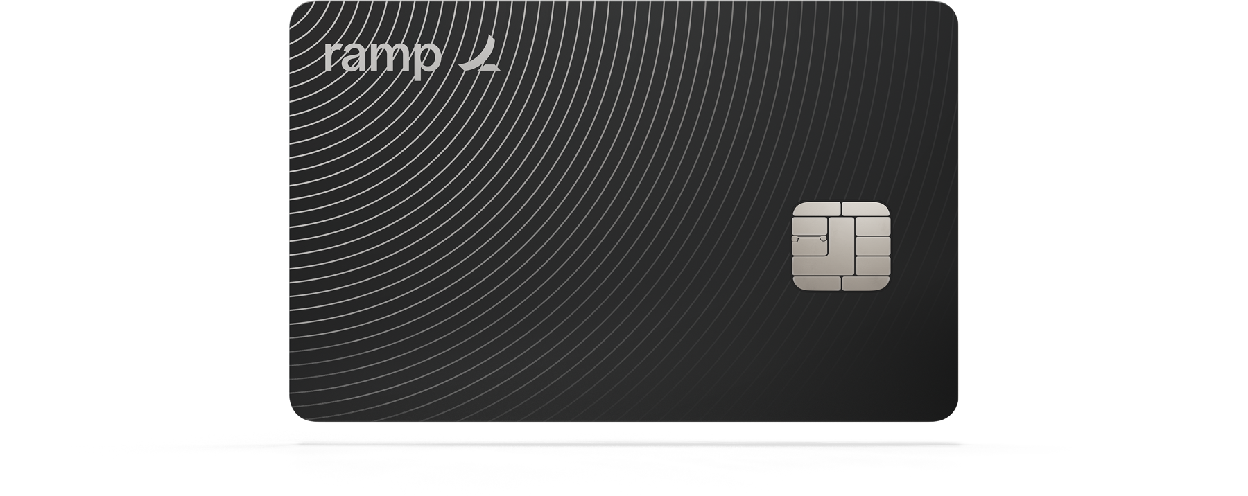

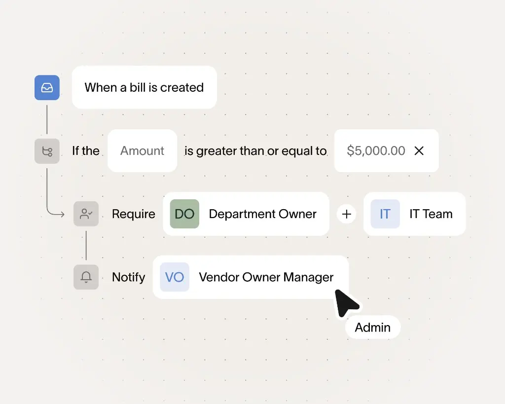


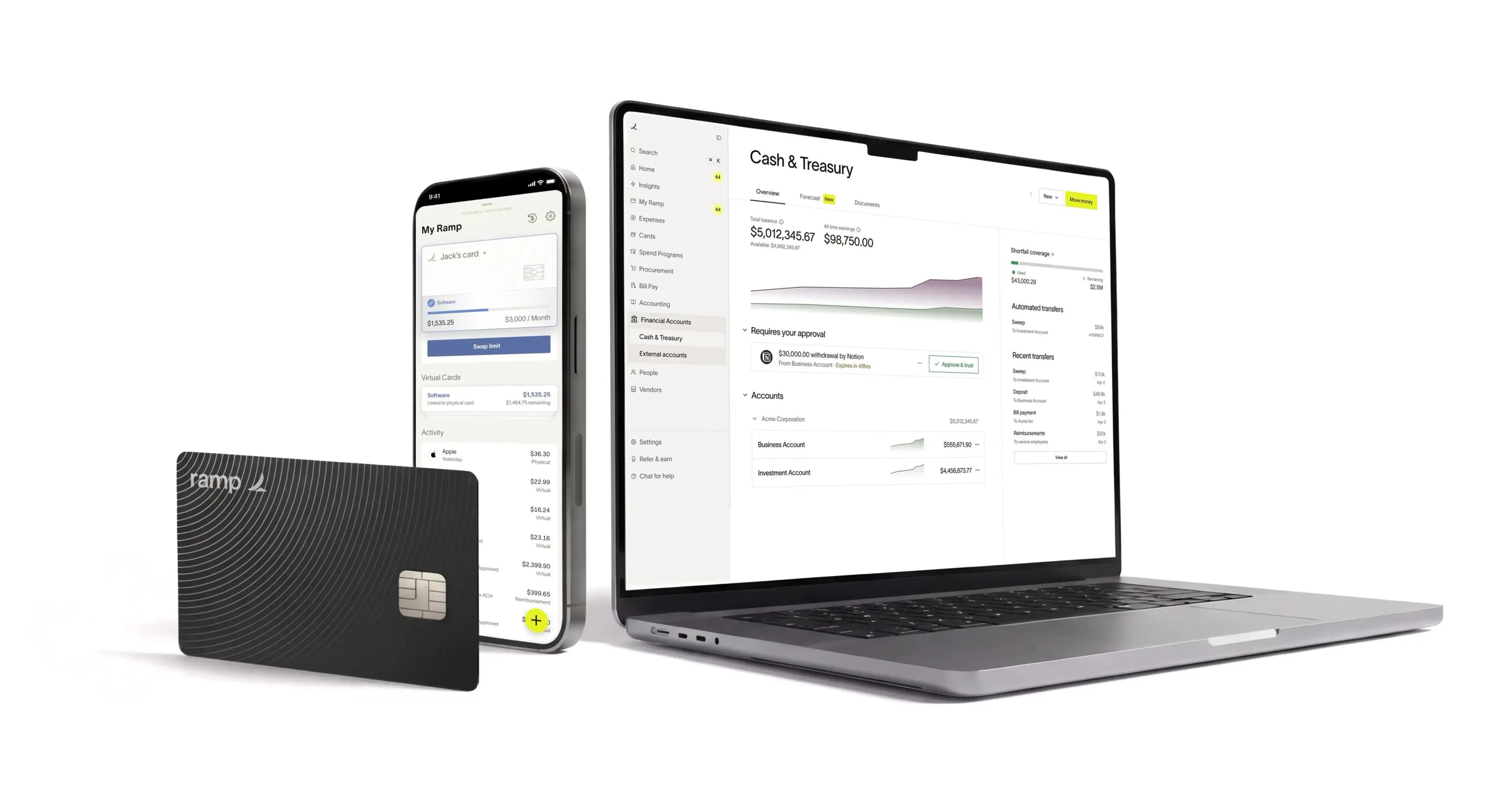
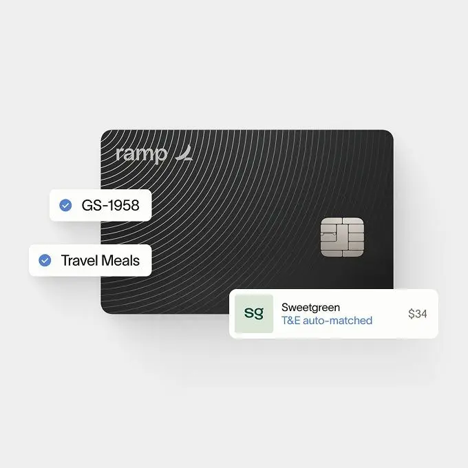
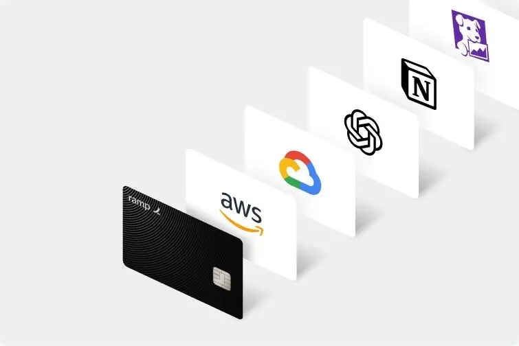
Little conventional illustration. Imagery is product: Ramp UI panels on warm gray, the black engraved Visa card, stippled dot globes and fields, isometric tiles of partner logos. Blog covers range wider (giant Lausanne type, prisms, 3D keycaps).
Source: ramp.comramp.com/startupsramp.com/pressramp.com/blog
(our reading) named, real customers carry the proof
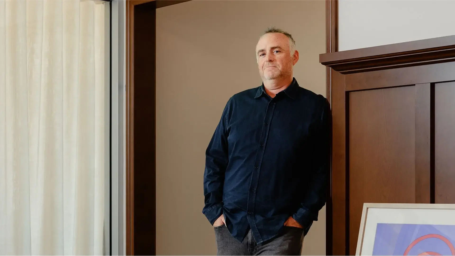







Real customers and Ramp people, candid or interview-style, in warm natural-light interiors; full colour, no heavy grading. Customer photos sit inside 12px frames with the customer logo and a stat or name overlaid in white (or lime on video). Press portraits are on dark gray or white studio grounds.
Source: ramp.comramp.com/startupsramp.com/about-usramp.com/press
1312px content at 1440 (64px margins); 16-17px margins on phone. Left-aligned hero over a full-width media frame; centred section heads; 2- and 3-up card grids with 24px gaps; generous white space between sections (~128px).
Measured from ramp.com's computed styles of every band at 1440 and 390 (measure/), CSS custom properties and page probes with headless Playwright.
| Measure | Desktop | Phone |
|---|---|---|
| Navigation | px | px |
H1
TWK Lausanne · 64px (phone 40) · line 1 · tracking -0.01px · weight 500
Section H2
TWK Lausanne · 48px (phone 34) · line 1.042 · tracking -0.01px · weight 500
Prompt H2
TWK Lausanne · 40px (phone 28) · line 1.05 · tracking -0.005px · weight 500
Lead / story H3
TWK Lausanne · 28px (phone 22) · line 1.143 · weight 500
Card title / closing line
TWK Lausanne · 24px (phone 20) · line 1.167 · weight 500
CTA panel title
TWK Lausanne · 20px (phone 18) · line 1.3 · weight 500
Hero subhead
TWK Lausanne · 18px (phone 17) · line 1.333 · weight 500
Body / links / buttons
TWK Lausanne · 16px (phone 15) · line 1.375 · weight 500
Nav, attribution, quote cards
TWK Lausanne · 14px · line 1.429 · weight 500
Fine print / disclosures
TWK Lausanne · 13px (phone 12) · line 1.462 · weight 500
Eyebrow / counter labels
TWK Lausanne · 10px · line 2.2 · tracking 0.18px · weight 500
How Ramp’s own landing pages are built, observed on ramp.com/%20measure/home-desk.json,%20home-phone.json%20and%20headless%20Playwright%20probes%20at%201440x900%20and%20390x844%20(2026-11-05), 2026-11-05. The full measurements are in spec.md.
Source: ramp.com
how the brand carries across formats
| Format | Loudness | Must appear | What varies |
|---|---|---|---|
| Landing page | White page, #1A1919 announcement bar, white nav with solar "See a demo" and dark "Get started". Left-aligned 64px Lausanne 400 headline in two beats, one-line subhead, email bar with solar CTA, then a full-width #F4F2F0 frame of live product. Logo grid, two-tone section heads, 2-3 up product cards, customer quote rows, closing "Time is money. Save both." email bar, dark footer. | ||
| Social post | One ground (full solar #E4F222 with ink type, or the navy-to-pale-blue gradient with white type), a 2-line Lausanne 400 (Figtree 500 stand-in) headline top left at 96-120px, one sub line, the black card (product-black-card-1800.png) lower centre about 740px wide, and a small legal line at the foot. No button, no lockup outside the card. | Second family (linkedin-5, linkedin-6): dark-green grain or navy gradient, white lockup 180px top left, 2-line white headline at about 100px, sub at 55% white, one real Ramp UI panel lower centre instead of the card. One headline word may be italic (meta-4). Starter: post-1080.html (family A), post-1080-b.html (family B). | |
| Not observed: no Ramp marketing email was available. Carry the landing-page rules (white, Lausanne 400 stand-in, solar CTA, dark footer) and confirm with a real send. | |||
| Paid social ad | Paid offer and product ads on Meta and LinkedIn. One ground (solar #E4F222, #1A1919, a navy-to-pale-blue or dark-green grain gradient, or a full-bleed scene), a top-left headline, one product visual, a solar button or none. | ||
| Paid ad: customer story (Denver Broncos series) | Scoped to the co-branded Broncos campaign; do not reuse its navy/orange or serif for other customers. | ||
| Video thumbnail: OnRamp 2026 sessions | Series template for the OnRamp 2026 event sessions only. | ||
| Video thumbnail: customer story |
Source: ramp.com/press
Your name and logo, Ramp’s system.
Talk about my brand Use this brand in Claude
Get your brand audit Put your brand in Claude What goes in a brand book
Each value is marked published, observed, our reading or our recipe, with its source. Checked 2026-11-05. Not affiliated with Ramp.
Tell us what you want to make. We’ll talk through how to put these ideas to work for your brand.