Surface what matters
Understand critical feedback trends and act fast on new opportunities. Productboard includes citations for every finding, so decisions are always backed by evidence. Observed
Brand book
Productboard looks like a calm, evidence-first workspace for product teams: white space and real product UI carry the argument, and the blue-to-purple gradient marks the AI/agentic promise without dark or loud surfaces. Our reading

the pastel wash behind each band (violet glow orbs, blue-lilac gradient, flat #F8F8F8 panel or #EDF6FF) changes per section
approximate share of the 11,906px desktop home page from band grounds in measure/home-desk.json.
Real files from the media kit; color lockup on white, black & white on busy or colored grounds; never recolored, rotated or stretched.
At most one phrase per headline in linear-gradient(-90deg, #9C46F1, #0071E1); the rest #0D181E.
#0071E0/#0071E1 on buttons, links and the footer slab; yellow and red only inside the logomark; no dark bands.
One sans family (eina or Plus Jakarta Sans at the same weights): 600 heads, buttons, nav and chips; 400 body and leads; never 500 or 300; text-wrap: balance on h1/h2; slight negative tracking at 36px+; uppercase only for small eyebrows.
12px-radius buttons and media, rounded inset panels, soft cool shadows; no sharp corners or heavy borders.
Real product UI on pastel washes; people only as named customers on plain light grounds; no stock.
Every number is one the site states (6000+ product teams, $125M Series D, customer results) or the customer's own.
Verb-first sentence-case heads, "you" for the reader, serial commas, no exclamation marks.
The agentic product management system for product teams: from customer signal to delivery-ready spec to measured launch (paraphrase) Observed
Understand critical feedback trends and act fast on new opportunities. Productboard includes citations for every finding, so decisions are always backed by evidence. Observed
Go from new idea to delivery-ready in a fraction of the time. Productboard’s built-in agent handles all the information synthesis so you can focus on the decisions only you can make. Observed
Close the loop between what you specified, what you shipped, and whether it actually worked. Productboard surfaces post-launch learnings that directly inform your roadmap. Observed
clarify the objectives behind the work (paraphrase)
Observedlearn from the best and hone the craft (paraphrase)
Observeddeep empathy for users, prospects, colleagues and candidates (paraphrase)
Observedshare goals, successes and failures openly (paraphrase)
Observedone team on a common mission, wherever people are (paraphrase)
ObservedCategory. Agentic product management ("the first agentic system purpose-built for product makers") Observed
Productboard draws from your customer signals, codebase, and strategy to ensure every product decision is grounded, every spec is delivery-ready, and every launch informs your roadmap.
Where 100x product makers do their best work Observed
Agentic product management, built for product teams Observed
Intelligence meets product management workflows Observed
Ready to ship faster and build smarter? Observed
Designed in California. Made all over the world. Observed
Official Productboard logos and brand colors Observed
clearconfidentpracticalcustomer-led
Source: productboard.com/%20measure/home-desk.json%20+%20home-phone.json%20(2026-11-10)productboard.com/%20measure/pricing-desk.json%20+%20pricing-phone.json%20(2026-11-10)productboard.com/%20measure/customers-desk.json%20+%20customers-phone.json%20(2026-11-10)productboard.com/media-kit
Source: productboard.comproductboard.com/pricingproductboard.com/customers


Lockup = three-triangle "vessel" mark (blue diamond #0071E1, yellow #FFC600 top, red #F84136 bottom) + lowercase "productboard" wordmark in #0D0E11.
Lockup = three-triangle "vessel" mark (blue diamond #0071E1, yellow #FFC600 top, red #F84136 bottom) + lowercase "productboard" wordmark in #0D0E11. Mono version splits the mark into black triangles. The media kit offers color and black & white lockups and icons in SVG, PNG, PDF, EPS.
Source: productboard.com/media-kit
White carries the page; #F8F8F8 for the nav pill; the big feature panel is lavender-gray #F1F1F8 at rest (it cross-fades #F8F8F8 -> #EDF6FF -> #F1F1F8 as each block scrolls in); pale blue-lilac gradients and violet glow orbs for atmosphere.
White carries the page; #F8F8F8 for the nav pill; the big feature panel is lavender-gray #F1F1F8 at rest (it cross-fades #F8F8F8 -> #EDF6FF -> #F1F1F8 as each block scrolls in); pale blue-lilac gradients and violet glow orbs for atmosphere. Blue #0071E0 lives on buttons, links, the active tab and the footer slab only. Purple appears only inside the gradient phrase, glows and the role eyebrows. Yellow and red appear only in the logomark. Published Midnight #000C2C is not used on the pages read; ink is #0D181E.
Source: productboard.com/%20measure/home-desk.json%20+%20home-phone.json%20(2026-11-10)productboard.com/media-kit
Where 100x product makers do their best work
One family, eina: 600 for heads AND for every button label, nav link, tab and chip; 400 for leads, body and footer/legal links; 700 for small uppercase eyebrows.
One family, eina: 600 for heads AND for every button label, nav link, tab and chip; 400 for leads, body and footer/legal links; 700 for small uppercase eyebrows. Heads tighten slightly at large sizes (-0.96px at 48px, -0.72px at 36px). Every h1/h2 uses text-wrap: balance. Centered heads for section intros; left-aligned heads inside feature bands, cards and the case-study quote. Stand-in Plus Jakarta Sans at the same weights (600/400), never lighter.
| Their face | Use | License | Open stand-in |
|---|---|---|---|
| eina 600 | self-hosted, not open; stand-in Plus Jakarta Sans 600 (calibrated 2026-11-10 on the live page: ink within 2%) | ||
| eina 400 | self-hosted, not open; stand-in Plus Jakarta Sans 400 (calibrated 2026-11-10 on the live page) |
Source: productboard.com/%20measure/home-desk.json%20+%20home-phone.json%20(2026-11-10)
Do background linear-gradient(-90deg, #9C46F1 0%, #0071E1 100%) clipped to text (blue at the left, purple at the right); rest of the headline #0D181E eina 600.
Blue-to-purple gradient phrase · One phrase in most home/pricing/customers headlines: "100x product makers", "Fortune 500 and high-growth", "ship faster", "Customer-centric", "enterprise-grade"
Do #F8F8F8, 1400x64 on a 1440 viewport, inset 20px from top and sides, 20px radius; color lockup left, menu centre, Sign In + small blue Request a demo right. Phone: vessel mark only + Request a demo + menu.
Floating gray nav pill · Every page, top
Do #0071E0 rounded panel 1400 wide inset 20px from the sides and bottom, 20px radius, 80px top and bottom padding. Left column (x130, 680 wide): copyright, origin line, then legal links in rows; socials right, vertically centred. 324 tall with two legal rows (the reference capture); 364 when the US-only third row "Do Not Sell or Share My Personal Information" shows. White eina 400 16/24 text; plain white 24px LinkedIn/X/Facebook glyphs with no circle or ring (invisible 40x40 hit boxes).
Inset blue footer slab · Every page, bottom, after a white link-column footer
Do Orbs: 800x800 divs with radial-gradient(circle, rgba(178,123,255,0.8) 0%, rgba(239,160,254,0) 70%), no blur; hero orb 1 centre x160 y448 opacity 0.5, orb 2 centre x1488 y768 opacity 0.6 (see kit.spec.page.hero.glow). Bands: linear-gradient(90deg, #FFFFFF 0%, #EAF5FF 22%, #F2E4FF 100%).
Soft violet glow and pale gradient bands · Hero corners (violet orbs), "Purpose-built" / "Customer-centric" bands, pricing hero
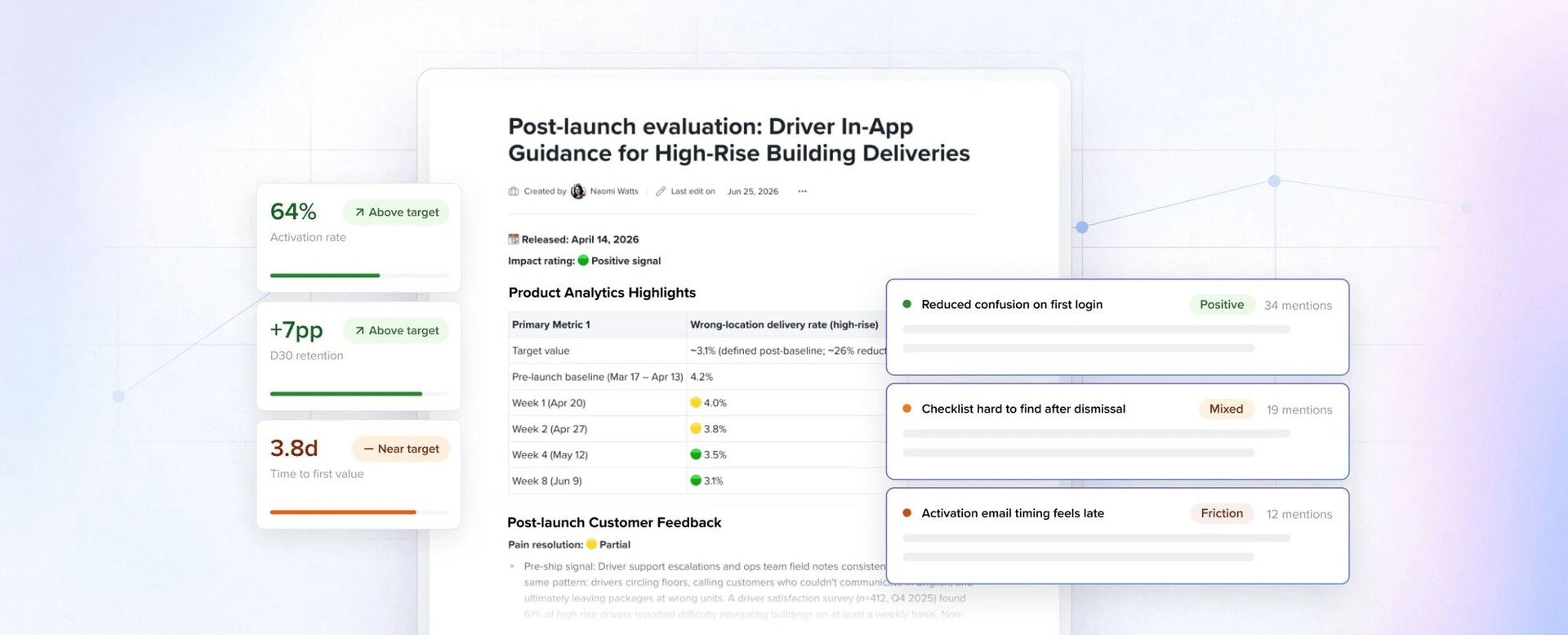
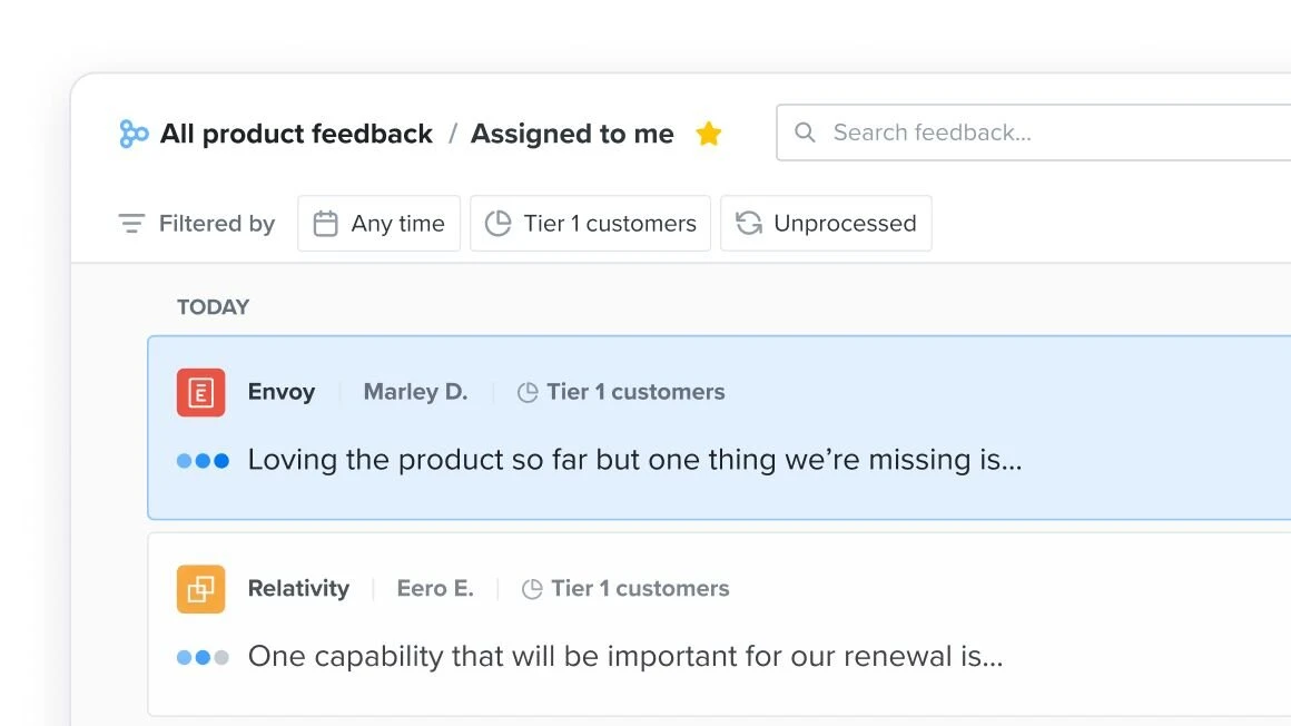
Do Crisp light product UI (white cards, 1px borders, small colored status chips) layered over a white panel washed with blue and lilac at the edges; 12px radius; cards shadowed 0 3px 10px rgba(27,37,45,0.15).
Product UI on pastel glow panels · Home feature tabs, Collaborative cards, Customer-centric cards
Do 3D satin ribbon in white, silver gray and indigo-blue sweeping along the bottom edge of a white card. Carousel slides: 1180x477 box at card-local top 120, object-fit FILL. Closing CTA: fills the 1400x364 band, object-fit COVER centred, so only the band’s lower edge and far-right fold show. Never cover-crop the carousel ribbon; never let ribbon art rise into the upper half of a card.
Glossy ribbon wave · Behind the roadmap carousel card and the closing "Ready to ship faster" card on home
Specimens use sample copy, not Productboard’s.
Floating rounded nav pill, rounded section panels inset 20px from the viewport (gray feature panel, blue footer slab), white 12px cards with 1px #DDDDE4 border or soft shadow, pill-shaped tab switcher with one blue active chip, carousels with round white arrow buttons and dot pagers, dashed table rules on pricing.
Source: productboard.com/%20measure/home-desk.json%20+%20home-phone.json%20(2026-11-10)productboard.com/%20measure/pricing-desk.json%20+%20pricing-phone.json%20(2026-11-10)
Thin outline line icons with rounded ends, used small (16-24px) in nav menus, pricing info/check marks and the platform diagram.

Thin outline line icons with rounded ends, used small (16-24px) in nav menus, pricing info/check marks and the platform diagram. Checkmarks in #0071E0.
Three kinds: (1) glossy 3D satin ribbon waves in white, silver and indigo-blue along card edges; (2) soft blue-violet gradient glows and posters; (3) flat diagrams of outline icons on pale gray arcs with blurred purple, pink and blue blobs.




Three kinds: (1) glossy 3D satin ribbon waves in white, silver and indigo-blue along card edges; (2) soft blue-violet gradient glows and posters; (3) flat diagrams of outline icons on pale gray arcs with blurred purple, pink and blue blobs. Resource cards (customers page) use pastel isometric/particle illustrations on a white-to-lilac ground.
Photography is limited to people in customer proof: head-and-shoulders portraits of named customer leaders on plain white or light gray studio grounds (some candid), natural color, cropped tight in a 12px-radius frame to the left of a case-study block.






Photography is limited to people in customer proof: head-and-shoulders portraits of named customer leaders on plain white or light gray studio grounds (some candid), natural color, cropped tight in a 12px-radius frame to the left of a case-study block. Customer-story covers on /customers set portraits into dark violet title cards. No lifestyle, office or stock photography on the pages read; product UI does the visual work.
1440 desktop: content 1180px wide (130px margins; 110px padding inside inset panels), centered intro heads over left-aligned feature blocks, generous 80-120px vertical padding. Phone 390: 20-30px gutters, everything stacks, CTAs stay 48px.
Measured from productboard.com home, media kit, pricing, customers, careers (headless, 1440 and 390, 2026-11-10)'s computed styles of every band at 1440 and 390 from npm run fidelity -- measure productboard, plus pixel samples of the captured screenshots.
| Measure | Desktop | Phone |
|---|---|---|
| Page margin | 130px | 30px |
| Section padding | 80px | 48px |
| Hero text width | max 708px, centered | full width |
| Card gap | 20px | 20px |
| Navigation | 64px | 64px |
Hero headline
eina 400 · 60px (phone 30) · line 1.2 · weight 600
Section headline
eina 400 · 48px (phone 30) · line 1.25 · tracking -0.96px · weight 600
Card / band headline
eina 400 · 36px (phone 24) · line 1.222 · tracking -0.72px · weight 600
Card title, logo-wall head
eina 400 · 24px (phone 18) · line 1.333 · weight 600
Lead paragraph
eina 400 · 20px (phone 16) · line 1.5 · weight 400
Body
eina 400 · 16px · line 1.5 · weight 400
Role eyebrow (uppercase)
eina 400 · 14px · line 1.429 · weight 700
CASE STUDY label (uppercase)
eina 400 · 16px · line 1.5 · weight 700
Button label
eina 400 · 16px · line 1.5 · weight 600
Tab chip, small button, nav link (14px); nav menu items are 16/24 600
eina 400 · 14px · line 1.429 · weight 600
Footer column head
eina 400 · 16px · line 1.5 · weight 600
One or two sentences on what this does for the reader.
One or two sentences on what this does for the reader.
images inside cards take radius 20 20 0 0; carousel card 20px radius; case-study card 12px radius (both computed 2026-11-10)
How Productboard’s own landing pages are built, observed on productboard.com/%20(measure/home-desk.json%20+%20home-phone.json%20(2026-11-10);%20ref/home-desk-fold.png,%20ref/home-desk-full.png,%20ref/home-phone-fold.png%20pixel%20samples%20(2026-11-10)), 2026-11-10. The full measurements are in spec.md.
Source: productboard.com/%20measure/home-desk.json%20+%20home-phone.json%20(2026-11-10)
From productboard.com home, media kit, pricing, customers and careers (2026-11-10). Social post row added 2026-11-10 from the site's own og:image share cards (ref/og/); no deck or email evidence. Examples pass 2026-11-10: Social post re-measured from organic Instagram posts; Paid social ad, Event card and Video thumbnail rows added from ref/examples/ (Meta Ad Library, Google Ads Transparency, Instagram, /events/).
| Format | Must appear | What varies |
|---|---|---|
| Landing page | White page with the floating #F8F8F8 nav pill. Centered hero: eina 600 60/72 two-line H1 in #0D181E with one gradient phrase, a 20/30 lead line, one blue 48px "Request a demo >" button, then a 12px-radius product video frame; violet glow orbs at the edges, avatar cursors floating beside the headline. Logo bar under "Trusted by Fortune 500 and high-growth companies". Big inset lavender-gray #F1F1F8 panel (cross-fading per block) with a sticky white tab tray and three left-aligned feature blocks (48px head, 20px lead, outline "Learn more ->" right, UI on a pastel panel below). Centered "Intelligence meets..." head over a white carousel card with ribbon wave. White case-study card (portrait, CASE STUDY eyebrow, customer logo, blue button, large quote, logo tabs). Closing white CTA card with gradient phrase. Pale blue-lilac gradient bands for feature cards. White link-column footer, then the inset blue slab. Voice: the homepage voice (sentence case, verb-first heads, one gradient phrase, closing question); Title Case only on listing pages. Full anatomy in kit.spec.page. | |
| Social post | Left-aligned layout on one left margin: lockup, headline and the proof block all start at x=104White ground with one soft lilac glow from the top-right corner; the rest stays whiteTitle Case navy headline, three to four lines, no gradient phraseOne proof element under the headline: the customer's portrait tile with name and title, or a product-UI cardNo button and no URL on the image; a thin arrow bottom-right is the only pointer | Blog listicle / guide teaser (observed, instagram-2, Sep 22 2026): midnight #000C2C ground with a violet glow top-right and blue bottom-left, white lockup top-left at 59/65 about 220px wide, two-line sentence-case white head about 51px, a 3x2 grid of white 12px-radius cards (pastel icon tile, magenta-to-blue numeral 01-06, bold title, three-line body) from y=316 to 1162, and a full-width magenta-to-blue pill CTA bar with white text and an arrow at the bottom, 57px marginsEvent recap (observed, instagram-3): a real event photo inset with rounded corners inside a thin white-to-violet-to-blue gradient frame, no added wordsWithout a customer: a product-UI card from the supplied assets takes the portrait tile's place at the same left marginLink share card (observed, og:image on the homepage, /blog/ and 6 posts, ref/og/): no headline; a product-UI card or abstract diagram on near-white with a blue glow in one corner and violet in the opposite, or the color lockup centred over one sentence. Use only for a link preview, not a post |
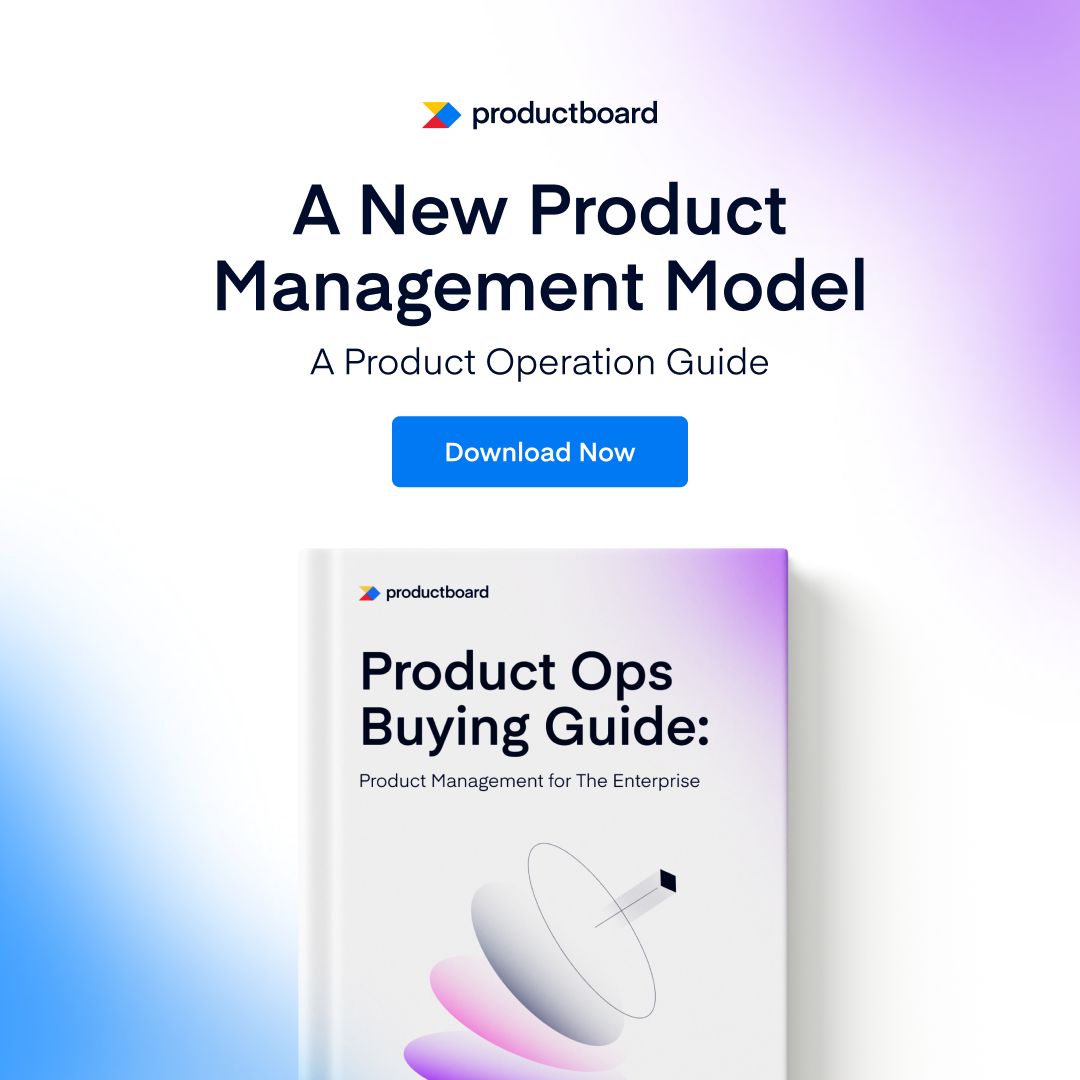
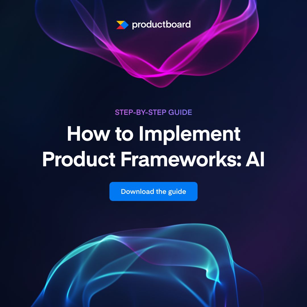
| Paid social ad | Everything centred on x=540Title Case headline, two lines, no gradient phraseOne filled blue button with the action (Download Now, Download the guide, Get the guide)The offer object (ebook cover or guide visual) in the lower half, bleeding off the bottomWhite ground with two soft corner glows, centre white | Dark variant (observed, meta-4): midnight ground with glossy magenta ribbon art from the top and cyan from the bottom, white lockup, uppercase violet eyebrow (STEP-BY-STEP GUIDE), white head, blue buttonIllustrated variant (observed, meta-5): top 42% pale gray with faded UI rows and a violet AI chip tile, lower block with lockup, uppercase violet eyebrow, black head and a violet buttonSubline (observed, meta-2/3): one 34px line naming the asset type, e.g. "A Product Operation Guide" |
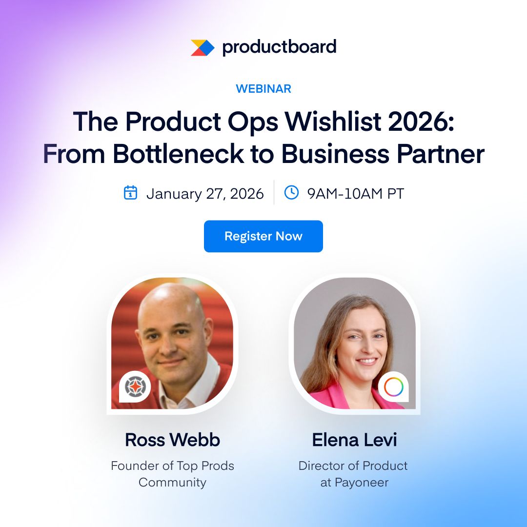
| Event card | Centred columnUppercase blue eyebrow naming the series (FORGE 3.0 · LIVE VIRTUAL WORKSHOP, MEETUP, LIVE Q&A)Date row with blue calendar and clock or pin iconsSpeaker portraits with name and title, company named | Live Q&A landscape (observed, event-4): left column text, cropped Spark UI card fading off the right edgeCo-hosted meetup: partner logo beside the lockup and a small company badge on each portrait |
| Video thumbnail | A real Spark UI frame, the Spark bolt, or one person with one chat bubbleNo added headline or button on the frame | Vertical recordings sit pillarboxed in black on the 16:9 frame |
Source: productboard.com/media-kit
Your name and logo, Productboard’s system.
Talk about my brand Use this brand in Claude
Get your brand audit Put your brand in Claude What goes in a brand book
Each value is marked published, observed, our reading or our recipe, with its source. Checked 2026-11-10. Not affiliated with Productboard.
Tell us what you want to make. We’ll talk through how to put these ideas to work for your brand.