Better products, faster
PostHog helps engineers build better products, faster. Published
Brand book
Handmade on purpose. PostHog spends its color, humor and craft on things AI and stock can't fake (hand-drawn hogs, custom faces, a desktop-OS website, odd synthetic data) and keeps the layout plain and solid so the craft reads as taste, not polish. Our reading

How loud a piece gets: from a plain RoundHog page with Red links to a full Squeak headline, saturated hog art and hard-shadow stickers. The guide ties the volume to context (product UI quiet, merch and thumbnails loud), not to a numbered level.
Source: posthog.com/handbook/brand/in-practiceposthog.com/handbook/brand/visual-identity
Our engine's setting, built from their rules.
Remove the logo. Does it still feel like PostHog? (the guide's own test): RoundHog, warm off-white, a hog, a press-down button, honest copy.
How would this be received on Hacker News? If it would get roasted as spin, vague or try-hard, change it.
Put another SaaS logo on it. If it still fits, it's generic: blobs, stock art and template layouts go back.
For merch: would someone who doesn't work at PostHog actually want this?
PostHog is the context layer for your product: it ingests and stores your analytics, errors, replays and business data so you and your agents can query it and make changes (paraphrase of the frame). Published
PostHog helps engineers build better products, faster. Published
Analytics, errors, replays, logs and business data already live in PostHog, so issues come with their context and feed the self-driving loop. Published
No patching separate services together or paying for each; when builders and their agents need a capability, it's already there. Published
Engineers talk to customers; support are former engineers; sales focus on implementation, not steak dinners. Published
Sign up and use every feature for free; usage-based pricing, no loss leaders, no sleazy tactics. Published
Your product's context layer
Join 500,000+ teams already shipping with PostHog.
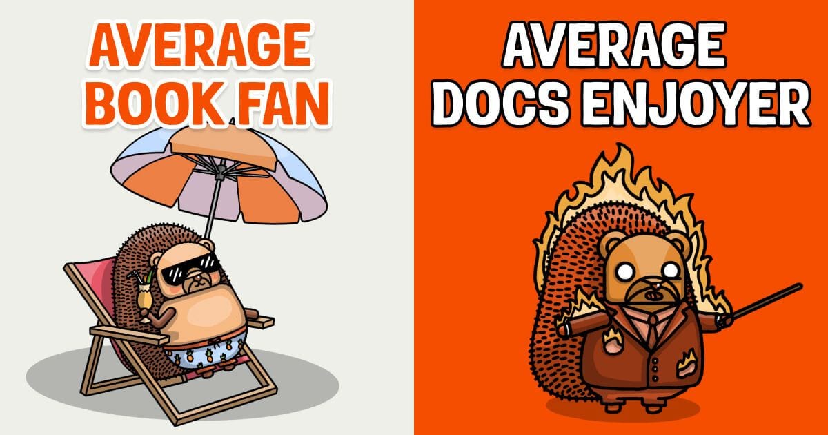
AVERAGE DOCS ENJOYER
PostHog treats brand as a growth engine: its users recommend it. It competes for attention with cat videos rather than B2B rivals, so it chose to be weird, honest and handmade. The logo was rounded in 2021 and given its gradient in 2026; posthog.com is built to look like an operating system, and every hedgehog is drawn by its in-house graphics team rather than generated.
Category. Your product's context layer; a platform that makes your product self-driving Published
Separate point services patched together and billed separately.Defensive, revenue-optimizing, boring B2B SaaS competitors.Enterprise-first vendors selling with steak dinners.
PostHog is your product's context layer: developer tools (AI observability, product analytics, session replay, feature flags, experiments, error tracking, logs and more) that ingest and store the data agents need to diagnose problems and ship fixes, tied together by a data warehouse and CDP, and steered from Slack, the web app, PostHog Desktop or the MCP.
Make your product self-driving Published
Your product's context layer Observed
Ship, measure and iterate – all on one platform. Published
Built for engineers who ship fast Published
PostHog frames itself as 'the context layer for your product' and insists the customer's product is what becomes self-driving. A four-step ladder (get data in, query with your agent, give it to your agent to act on, let PostHog self-drive) organizes the products, and a 'What we are not' list bans analytics platform, collection-of-tools and enterprise-first framing.
Source: posthog.com/handbook/brand/foundationsposthog.com/handbook/brand/overview
The handbook gives one frame (context layer), a standard 'About PostHog' paragraph embedded in every blog post, five reasons people pick PostHog, and paired headline examples. The homepage leads with 'Your product's context layer' and proof like 500,000+ teams and 97% of users paying nothing.
Source: posthog.com/handbook/brand/foundationsposthog.com/handbook/brand/toneposthog.com
Feature flags that don't slow you down
Supercharge your feature delivery workflow
Can't connect. Check your API key and try again.
An error has occurred. Please contact support.
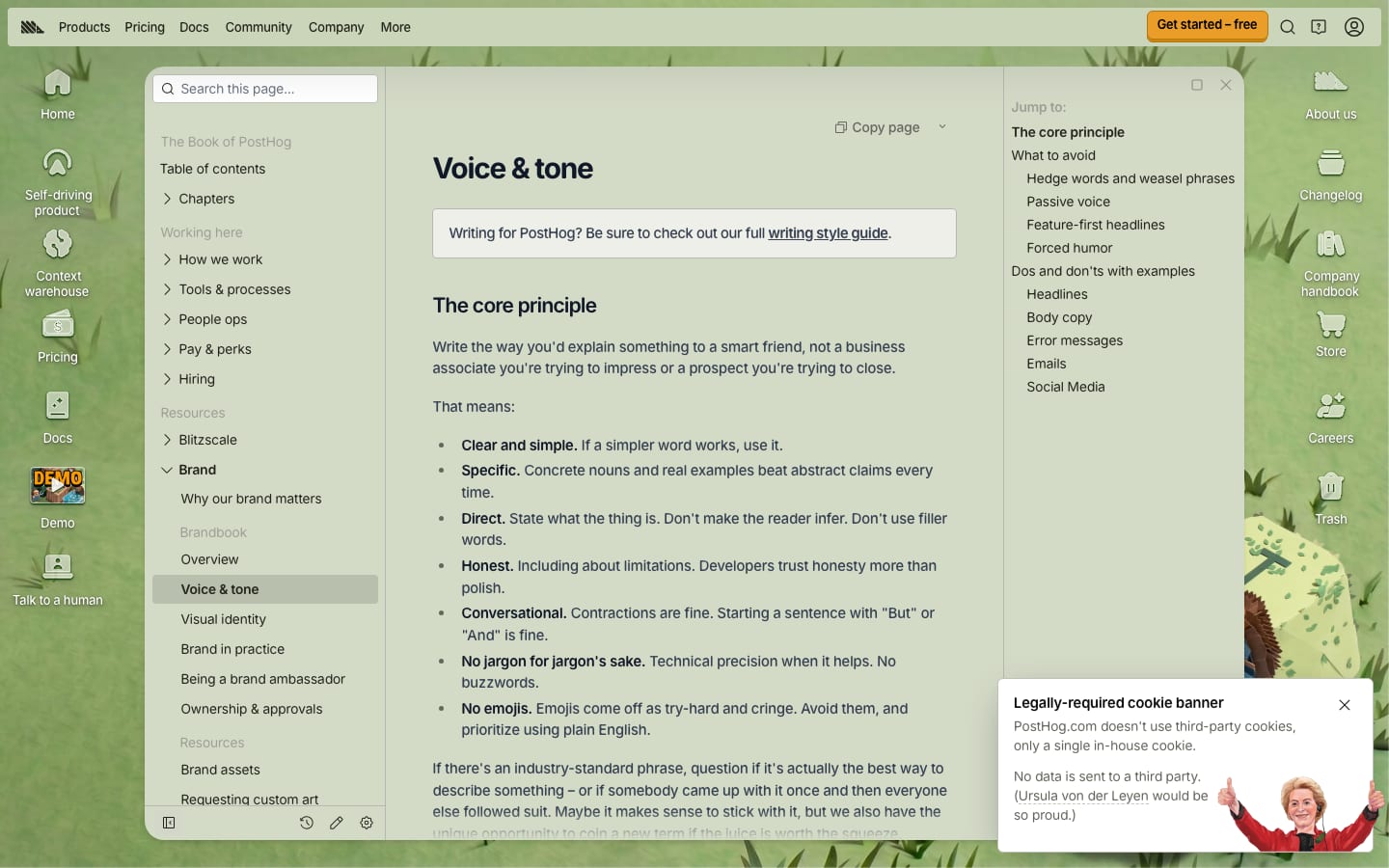
Engineers reward honesty and wit and punish corporate fluff; the rules make 'human' checkable.
OpinionatedHumanDirectHonestSlightly weird
Eight is/is-not pairs (opinionated, not diplomatic-to-nothing; slightly weird, not try-hard; playful, not childish). The tone page says write for a smart friend, lists weasel words with replacements, bans emojis and passive voice, and gives do/don't tables for headlines, body, errors, emails and social. The style guide adds sentence case, American English, Oxford comma and spaced en dashes.
usesusespeed upsimplifyproductsapps
helps you toempowersenables you to unlockleveragesutilizestreamlinerobustbest-in-classholisticseamlesssynergyanalytics platformproduct improvement platformdev tool platformself-driving productemojisem dash (—)Official PostHog <your product> (third parties)
Source: posthog.com/handbook/brand/foundationsposthog.com/handbook/brand/tone
| Traits | Opinionated, Human, Slightly weird, Thoughtful, Direct, Honest, Playful, Approachable |
|---|---|
| Case | sentence case |
| Spelling | American English |
| Dash | spaced en dash |
| Comma | Oxford |
| Emojis | none |
Source: posthog.com/handbook/brand/toneposthog.com/handbook/brand/foundationsposthog.com/handbook/content/posthog-style-guideposthog.com/handbook/brand/ambassadorposthog.com/handbook/brand/in-practice


Official files from brand.posthog.com/logo (built from the @posthog/brand <Logo> component; 22 files in all). None of the downloaded SVGs use currentColor: the mono files are hard-filled #000 or #fff, and the standard file uses gradient fills with a #111 wordmark. The React <Logo variant="mono"> and <Logo.Wordmark> do draw with currentColor when no color is passed. PostHog trademarks under PolyForm Strict 1.0.0; shown for reference, not affiliated.
PostHog
PostHog
A single default plus strict substitutions (white on dark, print without gradients) keeps the gradient mark intact everywhere.

| Clear space | height of the P |
|---|---|
| Minimum | 80px wide (full logo) |
| Badge minimum | 100×50px |
| Default | standard gradient, landscape |
| Embroidery | logomark only |
Six variants: standard (gradient, landscape, the default), dark (black), light (white, for dark grounds), logomark alone (small sizes), stacked, and 4-color print. brand.posthog.com ships 22 files including square and circle avatar canvases. The mark was rounded in 2021 and given gradients with no gaps between the hedgehog's body bars in 2026.
Source: posthog.com/handbook/brand/visual-identityposthog.com/handbook/brand/assetsbrand.posthog.com/logobrand.posthog.com/badges
Read the docs
Payment failed
Fewer colors used consistently make a stronger identity, and opacity steps keep two color schemes manageable.
| Ground (light) | #EEEFE9 |
|---|---|
| Text (light) | #151515 at 90% |
| Links | Red #F54E00, 95%, semibold |
| Dividers | dashed #D0D1C9 / #4B4B4B |
A deliberately small palette with light and dark schemes: warm off-white #EEEFE9 ground, near-black #151515 text, #E5E7E0 accent, dashed dividers, and Red #F54E00, Yellow #DC9300 and Blue #1D4AFF. Links use Red. Color lives in illustration; backgrounds are solid. brand.posthog.com separately publishes 12 package colors (blue, cobalt, coral, tangerine...) with lighter/darker tones.
Not published: color proportions; CMYK/Pantone equivalents (confirm with the design team); status colors; contrast ratios.
Source: posthog.com/handbook/brand/assetsposthog.com/handbook/brand/visual-identitybrand.posthog.com/colorsgithub.com/PostHog/posthog.com/blob/master/tailwind.config.js%20(observed%20in%20code,%202026-10-30)
Make your product self-driving
Documentation style guide
Documentation Style Guide
Strict roles let the playful faces stay special while RoundHog keeps everything else readable.
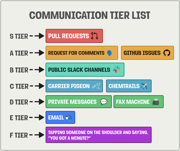
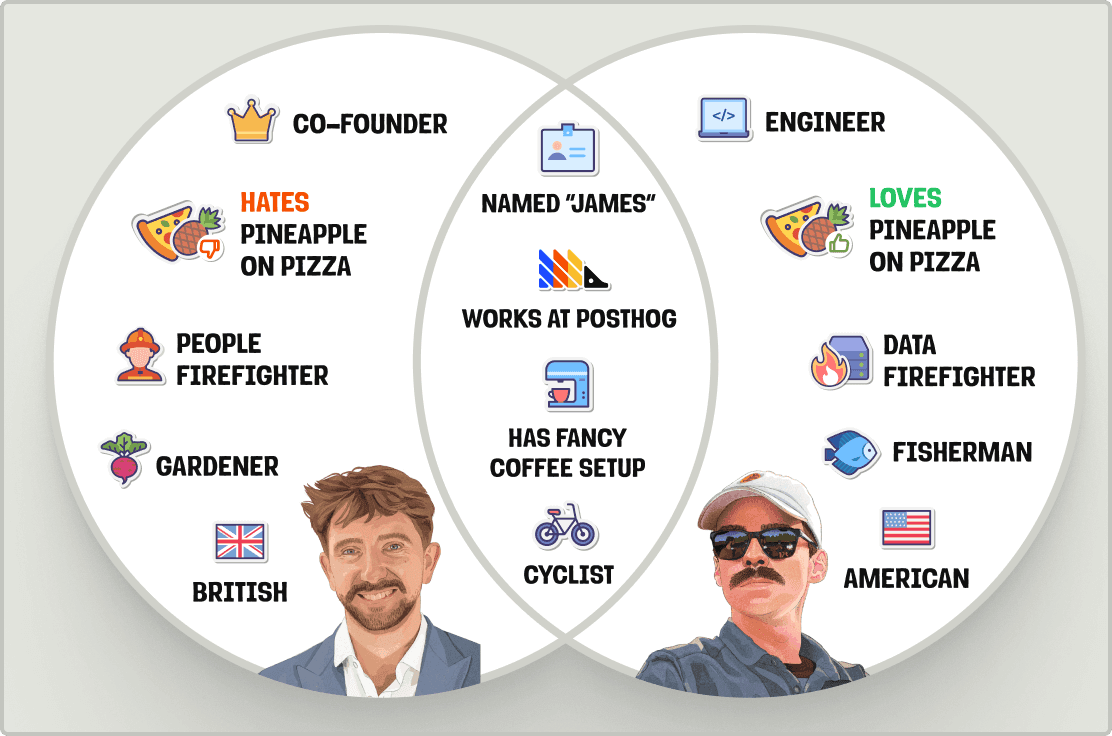
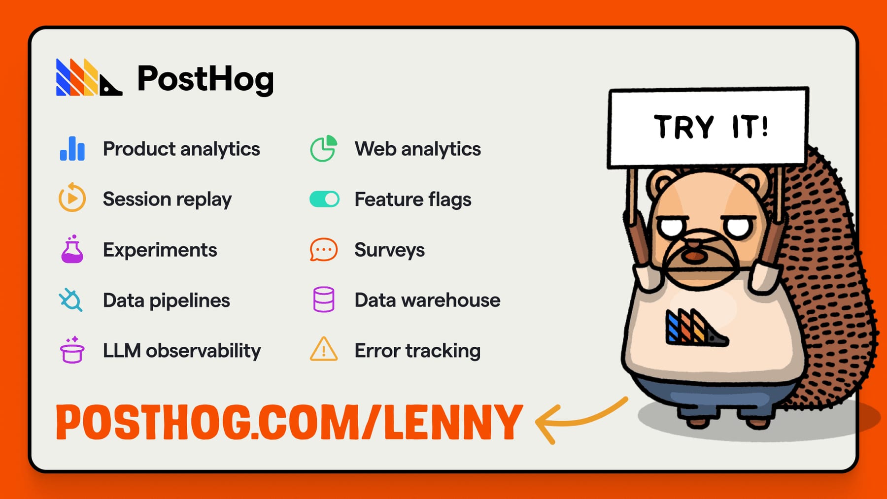
| Their face | Use | License | Open stand-in |
|---|---|---|---|
| RoundHog | Titles Bold (800), links and paragraphs under large headers SemiBold (700), body Regular (400); Medium 500 exists | Proprietary: PostHog's own face. The woff2 files are public at brand.posthog.com and in @posthog/brand, but under the PolyForm Strict License 1.0.0 (no use in other projects) | Figtree Calibrated 2026-10-30 against RoundHog as served on posthog.com: Figtree sets the hero headline at 99.6% of its width and matches its ink at bold weights; body runs lighter, so it is set at 560. |
| RoundHog | Regular and Regular Italic for body | Proprietary (PolyForm Strict 1.0.0) | Figtree Same as display. |
| Source Code Pro | Code on posthog.com (observed in tailwind.config.js); the guide names no mono face | Open (SIL OFL 1.1) | Source Code Pro It is the site's own code face. |
| Squeak | Marketing headlines with hedgehog art: Bold, uppercase, -2% tracking, 100% leading | Proprietary / not public (internal file) | Rubik Inferred, not calibrated (Squeak is not served on the homepage fold): Rubik ExtraBold in caps has the same soft-cornered, chunky feel. |
| Loud Noises | Only for words hogs hold or say, uppercase | Proprietary / not public (internal file) | Permanent Marker Inferred, not calibrated (Loud Noises is not public): hand-lettered marker caps, like the sign lettering in the guide's example. |
| RoundHog weights | 400 / 500 / 700 (SemiBold) / 800 (Bold), plus italics |
|---|---|
| Squeak | Bold, uppercase, -2% tracking, 100% leading |
| Loud Noises | uppercase |
| Code | Source Code Pro (site, observed) |
| Stand-ins | Figtree (calibrated against RoundHog), Rubik and Permanent Marker (inferred) |
Three faces, each with one job. RoundHog (rounded sans) sets everything on posthog.com: Bold for titles, SemiBold for links and paragraphs under large headers, Regular for body. Squeak is the uppercase Bold display face for marketing headlines with hedgehog art. Loud Noises is only for what hogs hold or say. RoundHog's files are public at brand.posthog.com but under PolyForm Strict.
Source: posthog.com/handbook/brand/visual-identityposthog.com/handbook/brand/assetsposthog.com/handbook/brand/assetsbrand.posthog.com/fontsgithub.com/PostHog/posthog.com/blob/master/src/components/Layout/Fonts.css%20(observed%20in%20code,%202026-10-30)posthog.com/handbook/brand/in-practice
AVERAGE DOCS ENJOYER
Average docs enjoyer
A hedgehog with a Squeak headline · marketing headlines, ads, social, event signage, stickers, thumbnails
The lifted, pressable button · every CTA on posthog.com
SHIP IT
SHIP IT
White border and hard drop shadow · stickers, merch graphics, team crests, YouTube thumbnails
Your product's context layer
The website as an operating system · posthog.com
Read the docs
Read the docs
Opacity instead of more colors · text, links, charts
Specimens use sample copy, not PostHog’s.
Each element is handmade and slightly odd, which the guide's 'remove the logo' test asks for.

| Divider | dashed |
|---|---|
| Web shadow | smooth (values not published) |
| Merch shadow | hard |
| Button | face lifted 2-4px over a darker plate (code) |
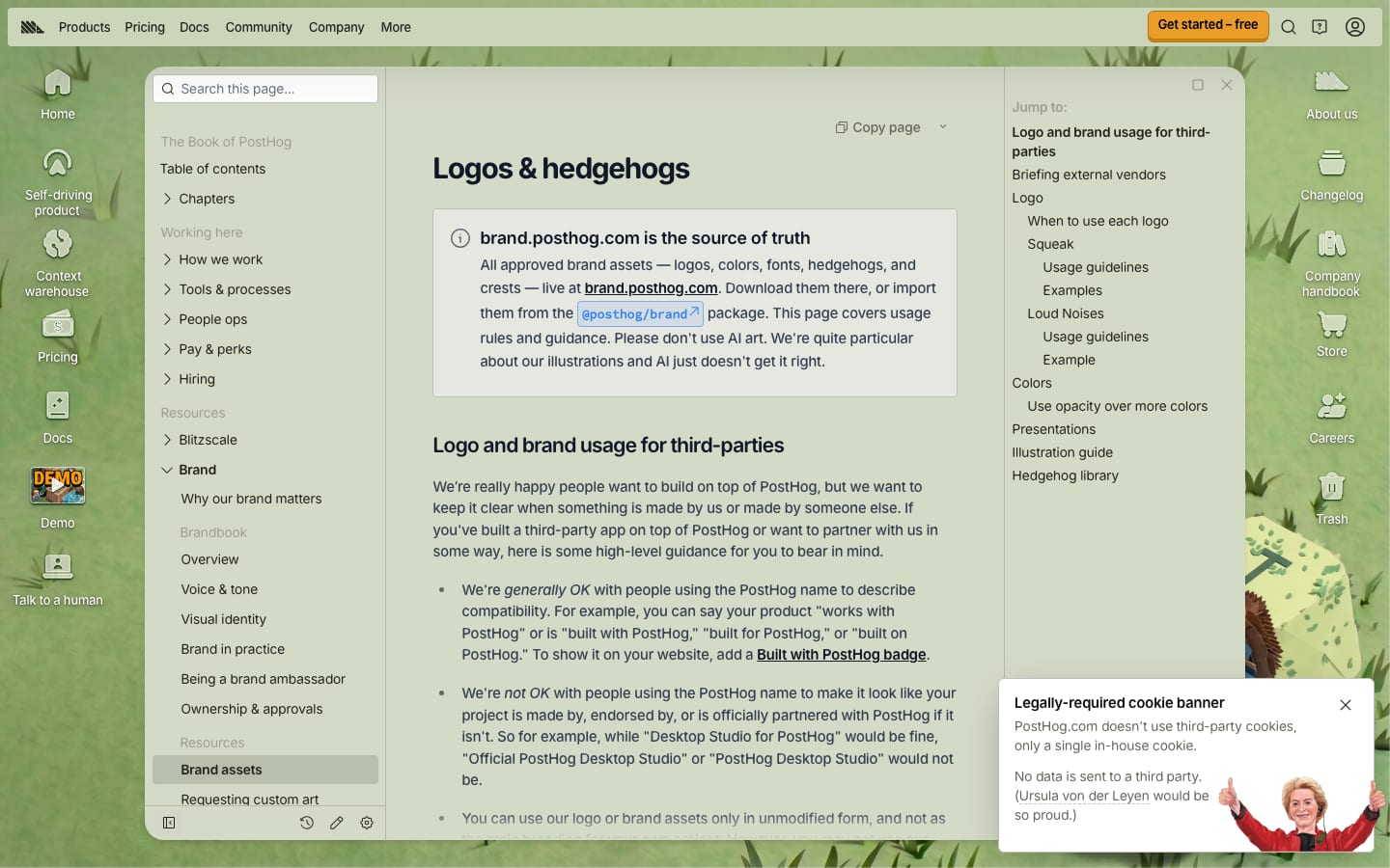
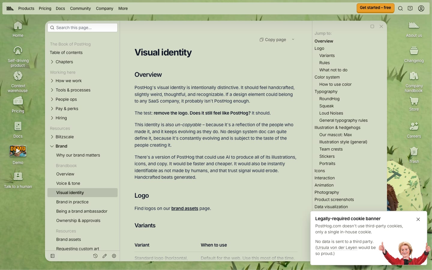
What makes it PostHog without the logo: hand-drawn hogs, Squeak caps, dashed divider lines, smooth shadows on web cards, hard drop shadows and white die-cut borders on stickers and merch, lifted 3D buttons that press down, team crests, and a website built as an operating system with windows and desktop icons.
Source: posthog.com/handbook/brand/visual-identityposthog.com/handbook/brand/visual-identityposthog.com/handbook/brand/visual-identityposthog.com/handbook/brand/in-practiceposthog.com/handbook/engineering/posthog-com/how-posthog-website-worksgithub.com/PostHog/posthog.com/blob/master/src/components/CallToAction/index.tsx%20(observed%20in%20code,%202026-10-30)
Three icon families: Central Icon System outlined vector icons (1.5px) for product UI, an icons8 sticker pack for casual contexts, and OS-style icons for the website desktop.
| Product UI | Central Icon System, outlined, 1.5px |
|---|---|
| Casual | icons8 sticker pack |
| Website desktop | OS-style icons |
| Grid | not published |
Source: posthog.com/handbook/brand/visual-identityposthog.com/handbook/brand/in-practice
Hand-drawn hogs are the most recognizable thing PostHog has and can't be faked by AI, which keeps the trust signal.
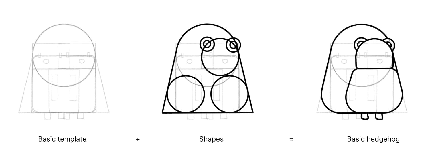
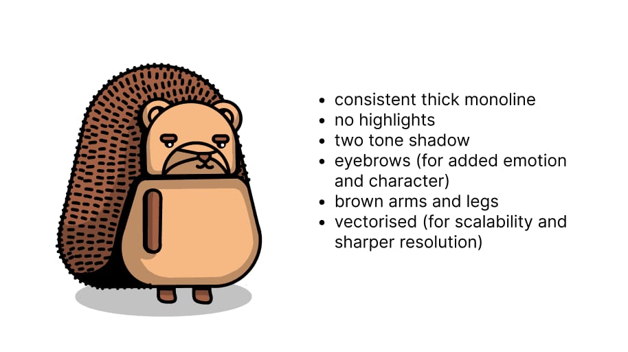


| Line | consistent thick black monoline |
|---|---|
| Shading | two-tone shadow, no highlights |
| Library | 160 hoggies, 59 crests (brand.posthog.com) |
| Format | vector (SVG) |
Max the hedgehog and his friends: thick black monoline with consistent weight, beige body, brown spines, arms and legs, two-tone shadow, no highlights, expression from the eyebrows. Faces left, right or front, never profile or back. 160+ approved hogs and 59 team crests live at brand.posthog.com. Portraits of people are hand-drawn too.
Source: posthog.com/handbook/brand/visual-identityposthog.com/handbook/brand/assetsposthog.com/handbook/brand/assetsbrand.posthog.com/hoggiesposthog.com/handbook/brand/art-requests
Photography is secondary to illustration.
Photography is secondary to illustration. When used, it's candid and real (real team, real situations). Product screenshots carry the 'show, don't tell' load: synthetic data with easter eggs, captured in light and dark mode at @2x, in landscape and portrait for heavy-traffic placements.
| Export | @2x |
|---|---|
| Modes | light + dark, paired |
| Variants | up to 4 (landscape/portrait × light/dark) |
Source: posthog.com/handbook/brand/visual-identityposthog.com/handbook/brand/visual-identityposthog.com/handbook/brand/visual-identity
Understated by rule: better no animation than one slightly off.
Understated by rule: better no animation than one slightly off. Buttons don't animate on hover-in, lift slightly on hover and press down on click. Characters use puppet rigging with shadows that move with them, and art animates in then eases out to a still frame.
| Hover-in | instant |
|---|---|
| Click | press down |
| Characters | puppet rig, end on a still |
| Durations | not published |
Source: posthog.com/handbook/brand/visual-identityposthog.com/handbook/brand/visual-identityposthog.com/handbook/content/posthog-style-guidegithub.com/PostHog/posthog.com/blob/master/src/components/CallToAction/index.tsx%20(observed%20in%20code,%202026-10-30)
The guide sets principles, not a grid: content first, art supports it, deliberate type hierarchy readable at every viewport, short paragraphs, one next action per page. posthog.com is an OS metaphor: a menu bar, desktop icons and app windows; product pages run as slide-deck windows.
Measured from posthog.com/handbook/brand/overview's PostHog's public handbook brand pages (read from their Markdown source in PostHog/posthog.com, branch master, contents/handbook) and embedded images, plus brand.posthog.com and the PostHog/brand package (logos, colors, RoundHog), and posthog.com's tailwind.config.js, Fonts.css, global.css and CallToAction for code tokens; fetched 2026-10-30.
| Measure | Desktop | Phone |
|---|---|---|
| Page margin | 8px | 0px |
| Hero text width | max 474px, centered | full width |
| Navigation | px | px |
Hero H1
RoundHog · 36px (phone 30) · line 40px (phone 36px) · tracking -0.9px · weight 800
Section H2
RoundHog · 30px · line 40px · tracking -0.75px · weight 700
Panel H2 (Ask PostHog anything)
RoundHog · 24px · line 32px · tracking -0.6px · weight 700
Lead / hero paragraph
RoundHog · 17px · line 25.5px · weight 500
Body / prose
RoundHog · 18px · line 27px · weight 500
Secondary body (join line, panel paragraph)
RoundHog · 18px · line 27px · weight 500
Card title
RoundHog · 18px · line 28px · weight 700
Small UI text (checks, tabs, ticker, card bullets)
RoundHog · 14px · line 20px · weight 500
Cookie title
RoundHog · 15px · line 18.75px · weight 600
Cookie body
RoundHog · 14px · line 20px · weight 400
Menu bar + desktop icon labels
RoundHog · 13px · line 13px menu / 16.25px icon labels · weight 500
Button label (large / small)
RoundHog · 15px · line 26.67px (small 13px/19.5px) · weight 700
Product link (panel)
RoundHog · 12px · line 16px · weight 600
How PostHog’s own landing pages are built, observed on posthog.com, 2026-10-30. The full measurements are in spec.md.
Source: posthog.com/handbook/brand/in-practiceposthog.com/handbook/brand/designing-posthog-websiteposthog.com/handbook/engineering/posthog-com/how-posthog-website-works
How our engine applies PostHog's system to each format. This is our recipe built from their rules, not something PostHog publishes. Level = how much hog art, Squeak and color the format carries (0 plain, 5 full).
| Format | Loudness | Must appear | What varies |
|---|---|---|---|
| Landing page | Warm off-white #EEEFE9 ground, RoundHog sentence-case headlines left-aligned, #151515 text at 90%, Red links, one orange lifted press-down CTA as the single next action, gradient logo top left, short specific paragraphs; build the structure from kit.spec.page once the homepage anatomy is merged | one hog illustration beside the hero; the OS window frame; a dark-mode version with #151515 ground and white logo | |
| Deck | One idea per slide, few words, PostHog palette, RoundHog text | Squeak for punchy moments, hogs from the library | |
| Social post | Short, specific, reactive; no emojis; no corporate congratulations | Squeak headline with hog art | |
| YouTube thumbnail | Bold and readable small, PostHog palette, illustrated elements, hard drop shadow | Squeak text overlay | |
| Merch and stickers | Something people outside PostHog would want; limited palette; hard drop shadow; die-cut white border; logomark for embroidery | full hog illustrations for all-over print | |
| Poster | One message, one big visual; 300 DPI, CMYK confirmed with design, 3mm bleed, 5mm safe zone; review in #design-review | Squeak headline with a hog | |
| Website voice, slightly more casual; RoundHog-like sans, Red links | a small hog | ||
| Product UI and errors | Clarity over cleverness; RoundHog titles and buttons, system body font, Central 1.5px icons; errors say what happened and what to do | a tasteful nod in empty states |
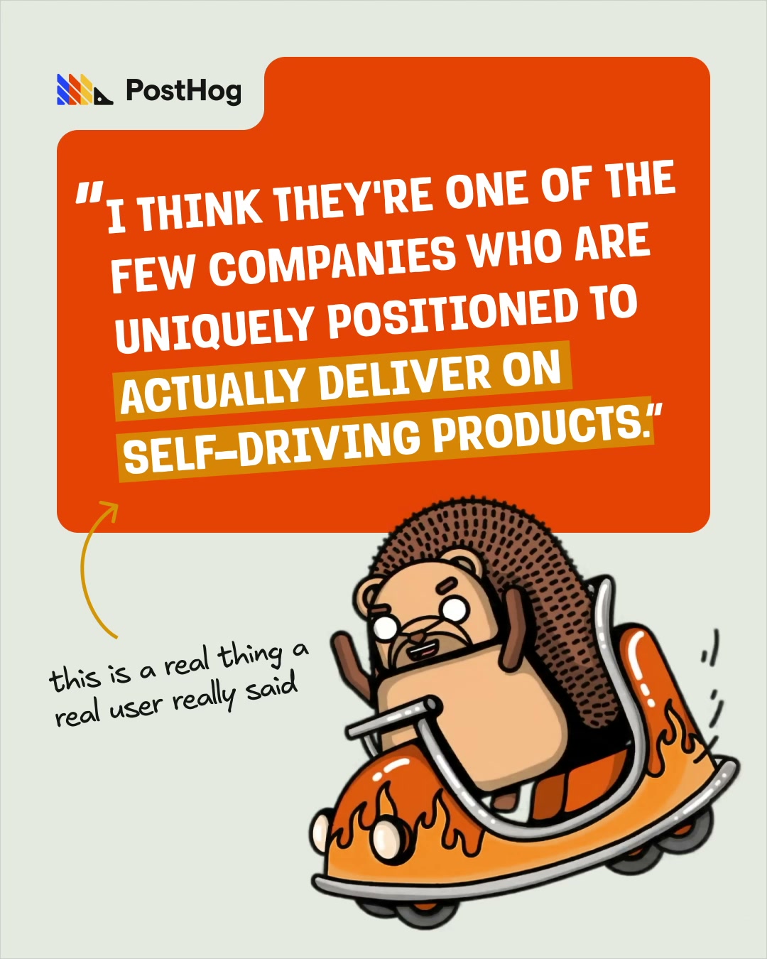 self driving rtg jul2026Meta, LinkedIn · Jul 2026 – now
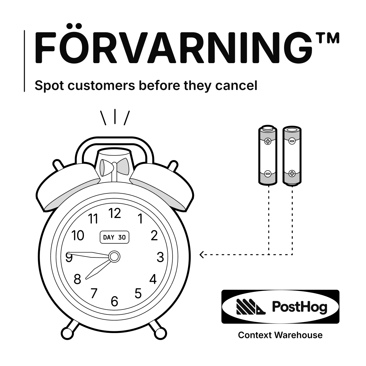 Context warehouseMeta · Sep 2026 – now
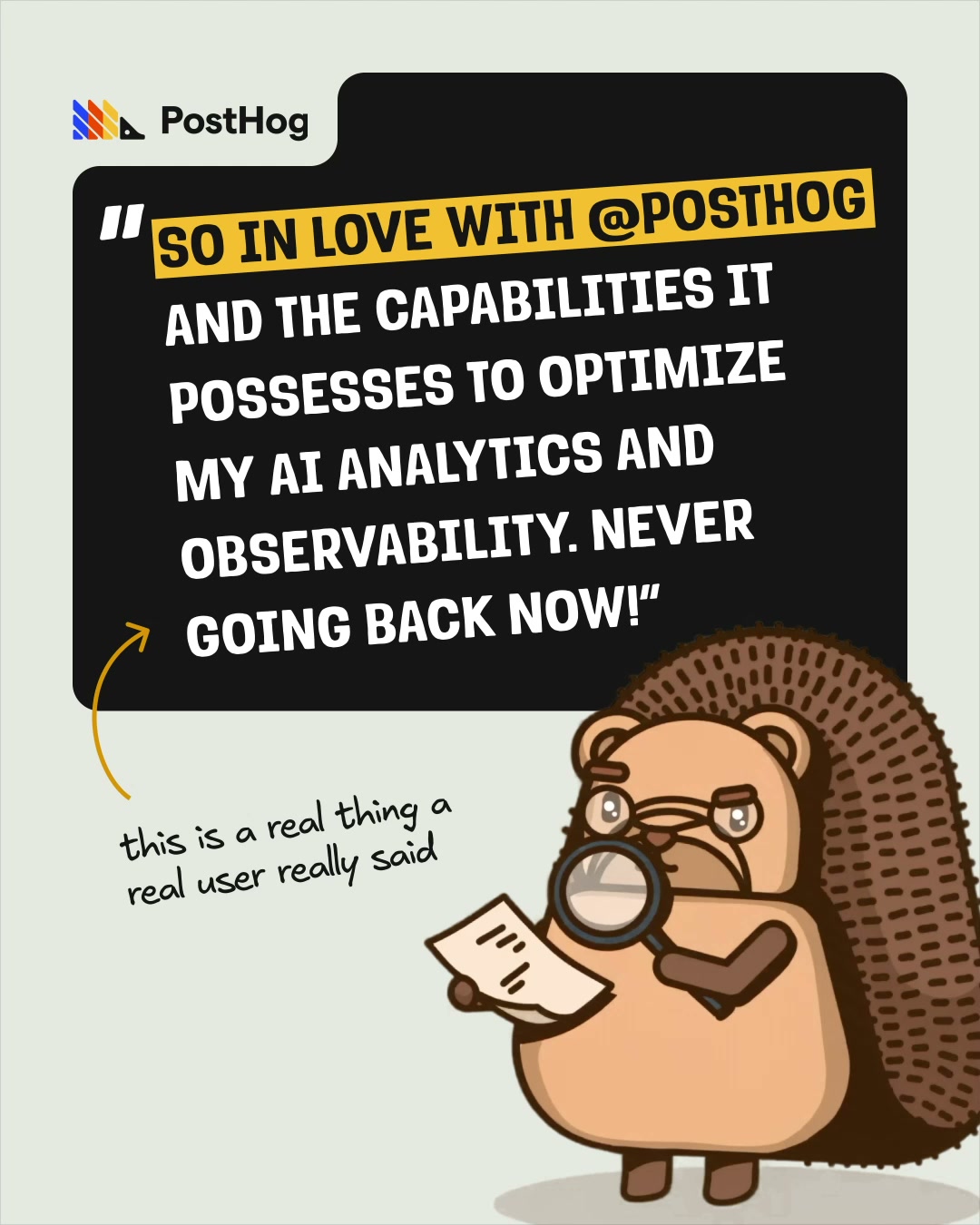 Ai observabilityMeta · Sep 2026 – now
 Start hereMeta · Oct 2026 – now
Source: posthog.com/handbook/brand/visual-identityposthog.com/handbook/brand/foundationsposthog.com/handbook/brand/toneposthog.com/handbook/brand/assetsposthog.com/handbook/brand/in-practice
Your name and logo, PostHog’s system.
Use this kit for my brand Use this brand in Claude
Get your brand audit Put your brand in Claude What goes in a brand book
Each value is marked published, observed, our reading or our recipe, with its source. Checked 2026-10-30. Not affiliated with PostHog.