Recognition
One national, unified identity people recognise instantly and trust as the NHS. Published
Brand book
Recognition is the brand. The NHS doesn't try to be distinctive in each piece; it tries to be the same everywhere, so blue, white and a plain Frutiger sentence instantly say "this is the NHS, you can rely on it". Our reading
Supporting colour tiers, photography and graphic devices let an NHS organisation differ from other NHS organisations, never from the NHS.
Our engine's setting, built from their rules.
Cover the logo. It should still read as NHS: blue and white dominant, Frutiger-like sans, plain sentence-case words.
Read it aloud to one person. Sentences under 20 words, no "should", no jargon.
The national health service for England, recognised instantly by its blue and white identity and trusted as an official source of care and information. Our reading
One national, unified identity people recognise instantly and trust as the NHS. Published
Applied the same way everywhere, so people know they can rely on the quality of care wherever they access it. Published
Clear, factual, accessible information that helps people manage their health. Published
Accessible to all: imagery and words reflect the diversity of patients, the public and staff. Published
A single NHS Identity was introduced in England in 1999. Research shows people see the NHS as one national, unified service and want its identity applied consistently; that consistency reassures them about the quality of care.
NHS value from the NHS Constitution
PublishedNHS value from the NHS Constitution
PublishedNHS value from the NHS Constitution
PublishedNHS value from the NHS Constitution
PublishedNHS value from the NHS Constitution
PublishedNHS value from the NHS Constitution
PublishedCategory. Public national health service (England) Published
Private healthcare providers and non-NHS health information sources (the identity exists to distinguish the NHS from them).
The NHS Identity is the visual signpost to NHS organisations and services in England, introduced in 1999 so people can recognise information that comes from an official NHS source. It is managed by NHS England on behalf of the Department of Health and Social Care.
NHS website for England Observed
Find information and services to help you manage your health Observed
The identity is a signpost, not a campaign: its job is to show that something comes from the NHS. The homepage leads with what the reader can do (find information and services) rather than a slogan.
Source: england.nhs.uk/nhsidentity/why-its-importantengland.nhs.uk/nhsidentity/identity-guidelines/visual-styles-graphic-devices-and-straplinesengland.nhs.uk/nhsidentity/identity-guidelines/who-cannot-use-the-nhs-identitynhs.uk
Health information is read by worried people; calm, plain, precise words lower anxiety and raise understanding.
ClearReassuringPersonalFactualEmpowering
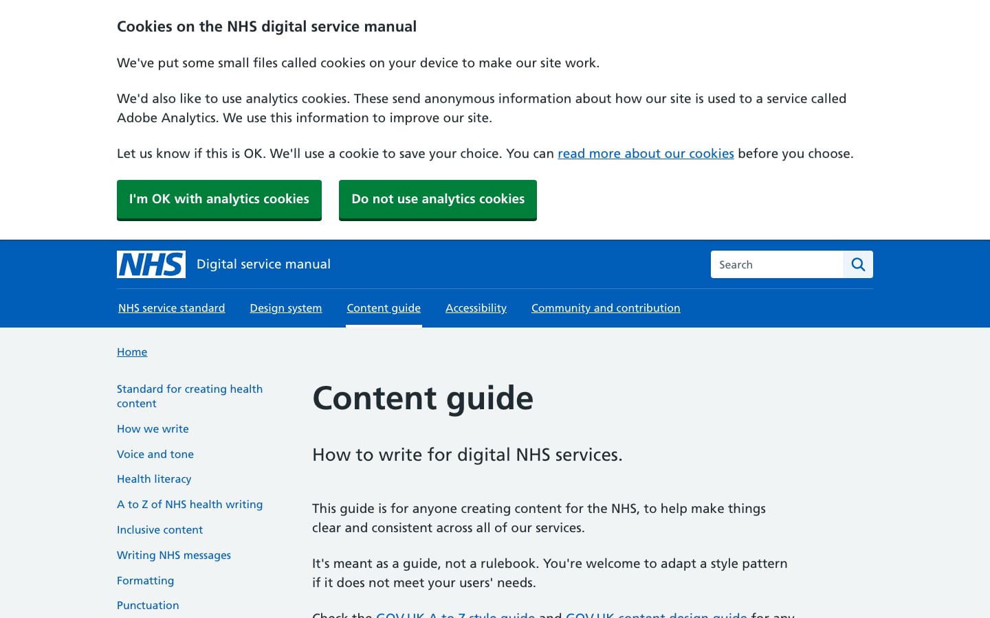
Two published sources agree: the identity guide asks for clear, concise, honest, respectful, accessible writing that could be read aloud to one person; the service manual sets a neutral, factual, calm and reassuring voice that is personal and empowering. Tone flexes by the reader's situation.
yougethavefind
should (patronising)don't / can't (use do not, cannot)block capitalsmetaphors"a good chance of recovery" (vague)"approved", "endorsed", "certified" by the NHS (suppliers)
| Voice | neutral, factual, calm, reassuring, personal |
|---|---|
| Reading age | 9 to 11 (11 to 14 for hard clinical content) |
| Sentence | up to 20 words |
| Paragraph | up to 3 sentences |
| Case | sentence case |
| Apostrophes | straight |
Source: england.nhs.uk/nhsidentity/identity-guidelines/tone-of-voiceservice-manual.nhs.uk/content/voice-and-toneservice-manual.nhs.uk/content/how-we-writeservice-manual.nhs.uk/content/punctuationservice-manual.nhs.uk/content/numbers-measurements-dates-time
The NHS logo is a UK trade mark and copyright of the Secretary of State for Health and Social Care. Its use is restricted to NHS organisations and permitted providers; we describe it and link to the guidelines, never re-host it. A visitor who steals this kit keeps their own logo. Not affiliated with the NHS. The header lozenge used in our blind build is not re-hosted here.
98% of the public recognise it; consistency is what makes it a trust mark.
| Clear space print | 1 × logo height |
|---|---|
| Clear space digital | 0.5 × logo height |
| Desktop | 40px high, 30px margin |
| Tablet | 35px high, 20px margin |
| Mobile | 30px high, 15px margin |
| Minimum digital | 30px high |
| A4 print | 10mm logo and margin |
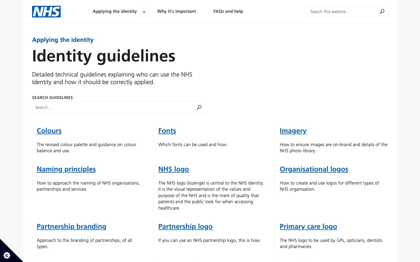
The NHS logo (the lozenge) is the white letters NHS in a solid NHS Blue rectangle. It is the only logo the NHS in England uses; alternative logos for teams, buildings or programmes are not permitted. Use of the identity is restricted: NHS organisations must use it; third-party providers only on the NHS services they deliver; suppliers and endorsements may not use it at all.
Source: england.nhs.uk/nhsidentity/identity-guidelines/nhs-logoengland.nhs.uk/nhsidentity/identity-guidelines/who-can-use-the-nhs-identityengland.nhs.uk/nhsidentity/identity-guidelines/who-cannot-use-the-nhs-identityengland.nhs.uk/nhsidentity/identity-guidelines/visual-styles-graphic-devices-and-straplines
87% of people spontaneously recall blue and white when asked about the NHS; the tiers let organisations differ from each other without differing from the NHS.
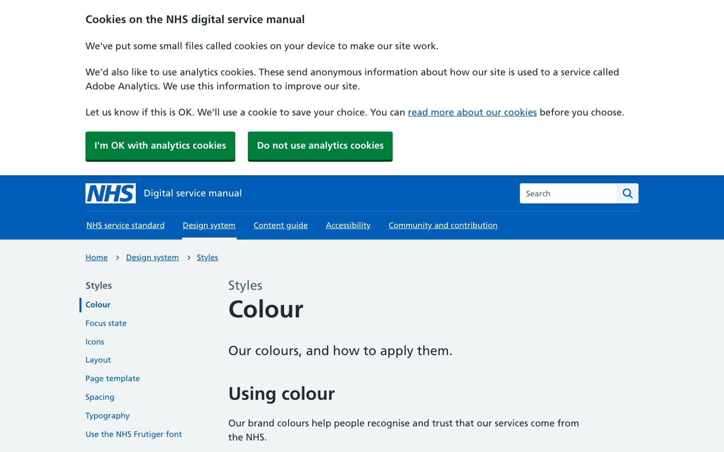
| NHS Blue | #005EB8 · Pantone 300 · RAL 5017 |
|---|---|
| Text online | #212B32 |
| Page ground online | #F0F4F5 |
| Button | #007F3B |
| Focus | #FFEB3B |
| Contrast | WCAG 2.2 AA minimum, AAA where possible |
NHS Blue #005EB8 and white dominate; four supporting levels follow in decreasing emphasis: Level 1 blues, Level 2 neutrals, Level 3 support greens, Level 4 highlights (minimal, never large blocks). Online, NHS.UK frontend maps this to a digital palette: text #212B32, secondary text #4C6272, grey-5 #F0F4F5 page ground with white cards and alternating white bands, links NHS Blue, buttons green #007F3B, focus yellow #FFEB3B.
Not published: exact proportions of the emphasis chart (shown as a chart, no percentages); a hex for Euro Ambulance Yellow (RAL 1016 only).
Source: england.nhs.uk/nhsidentity/identity-guidelines/coloursservice-manual.nhs.uk/design-system/styles/colourgithub.com/nhsuk/nhsuk-frontend/blob/main/packages/nhsuk-frontend/src/nhsuk/core/settings/_colours-palette.scssgithub.com/nhsuk/nhsuk-frontend/blob/main/packages/nhsuk-frontend/src/nhsuk/core/settings/_colours-applied.scss
NHS website for England
Frutiger was designed for legibility at a distance and at small sizes; people now associate it with the NHS.
| Their face | Use | License | Open stand-in |
|---|---|---|---|
| Frutiger 65 Bold (web: Frutiger W01 600) | Titles and headings | Proprietary (Monotype). NHS England sub-licenses three weights to NHS organisations in England only | Istok Web Same x-height and cap height as Frutiger, humanist shapes, headings within 1% of its width and ink (see typography.calibration). Not yet in the Steal type library; added with this book. |
| Frutiger 55 Roman (web: Frutiger W01 400) | Body copy and lists | Proprietary (Monotype); NHS England sub-licence | Istok Web Same x-height and cap height as Frutiger, humanist shapes, headings within 1% of its width and ink (see typography.calibration). Not yet in the Steal type library; added with this book. |
| None (system monospace for code) | Code samples only | n/a | JetBrains Mono |
| Real face | Frutiger 45 Light, 55 Roman, 65 Bold |
|---|---|
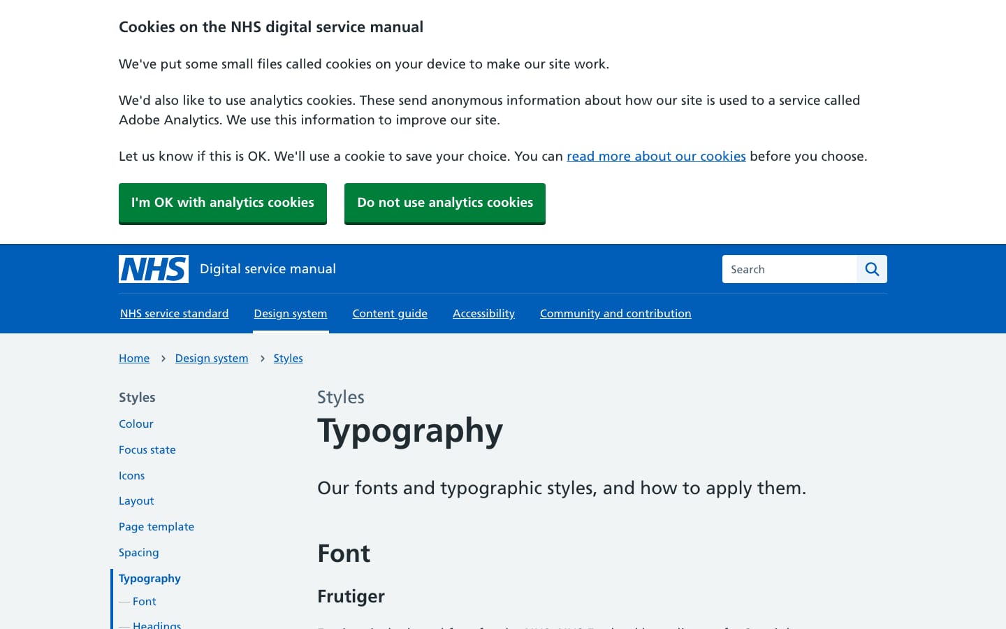
| Web family | "Frutiger W01", Arial, sans-serif |
| Weights online | 400, 600 |
| Scale (tablet+) | 64/70, 48/54, 36/42, 26/32, 22/30, 19/28, 16/24, 14/24 |
| Scale (mobile) | 48/54, 32/38, 27/33, 22/29, 19/27, 16/24, 14/24, 12/20 |
Frutiger since 1999: 65 Bold for titles, 55 Roman for body, 45 Light for very large titling. Arial is the secondary font when Frutiger is unavailable. No other fonts, even for children's materials (foreign-language fonts excepted). Online: Frutiger W01 at 400 and 600, with a published responsive scale (64/48/36/26/22/19/16/14 at tablet and up).
Source: england.nhs.uk/nhsidentity/identity-guidelines/fontsservice-manual.nhs.uk/design-system/styles/typographygithub.com/nhsuk/nhsuk-frontend/blob/main/packages/nhsuk-frontend/src/nhsuk/core/settings/_typography.scssgithub.com/nhsuk/nhsuk-frontend/blob/main/packages/nhsuk-frontend/src/nhsuk/core/settings/_globals.scss
Do solid #005EB8 band, white lozenge logo top left at 40px high, white underlined nav links; no graphic devices or straplines at the top of the page.
NHS Blue header · top of every NHS web page
Do #F0F4F5 page ground; white cards with 1px #D8DDE0 border and a 3px #D8DDE0 underline shadow, square corners.
Grey page, white square cards · content sections
Do green #007F3B circle with a cut-out arrow, then bold blue text.
Green action link · links that start a task or service
Specimens use sample copy, not NHS’s.
Restraint keeps every NHS organisation recognisably part of one service.
The identity deliberately has few graphic elements: the logo, NHS Blue fields and Frutiger do the work. Organisations may add graphic devices, straplines and imagery for a visual style, but not near the logo, and on websites the top of the page stays clear of them. Online, the signature elements are functional: the solid NHS Blue header, white square cards on a grey-5 ground, green circle-arrow action links, blue chevron-in-circle cards, the 4px yellow focus ring.
Source: england.nhs.uk/nhsidentity/identity-guidelines/visual-styles-graphic-devices-and-straplinesservice-manual.nhs.uk/design-system/styles/iconsnhs.uk
Icons signpost actions, never decorate.
| Sizes | 20 / 24 / 32px |
|---|---|
| Action link | green arrow in a circle |
| Primary card | blue chevron in a circle |
A small functional set in NHS.UK frontend: left/right arrows, right arrow in a circle (action links that start a service), right chevron in a circle (primary cards), tick and cross, search, user, plus BSL icons.
Source: service-manual.nhs.uk/design-system/styles/iconsgithub.com/nhsuk/nhsuk-frontend/blob/main/packages/nhsuk-frontend/src/nhsuk/core/settings/_globals.scssengland.nhs.uk/nhsidentity/identity-guidelines/visual-styles-graphic-devices-and-straplines
The identity governs colour, not drawing style.
No illustration style is published. The colour palette applies to illustrations (skin tones excepted).
Source: england.nhs.uk/nhsidentity/identity-guidelines/coloursengland.nhs.uk/nhsidentity/identity-guidelines/imagery
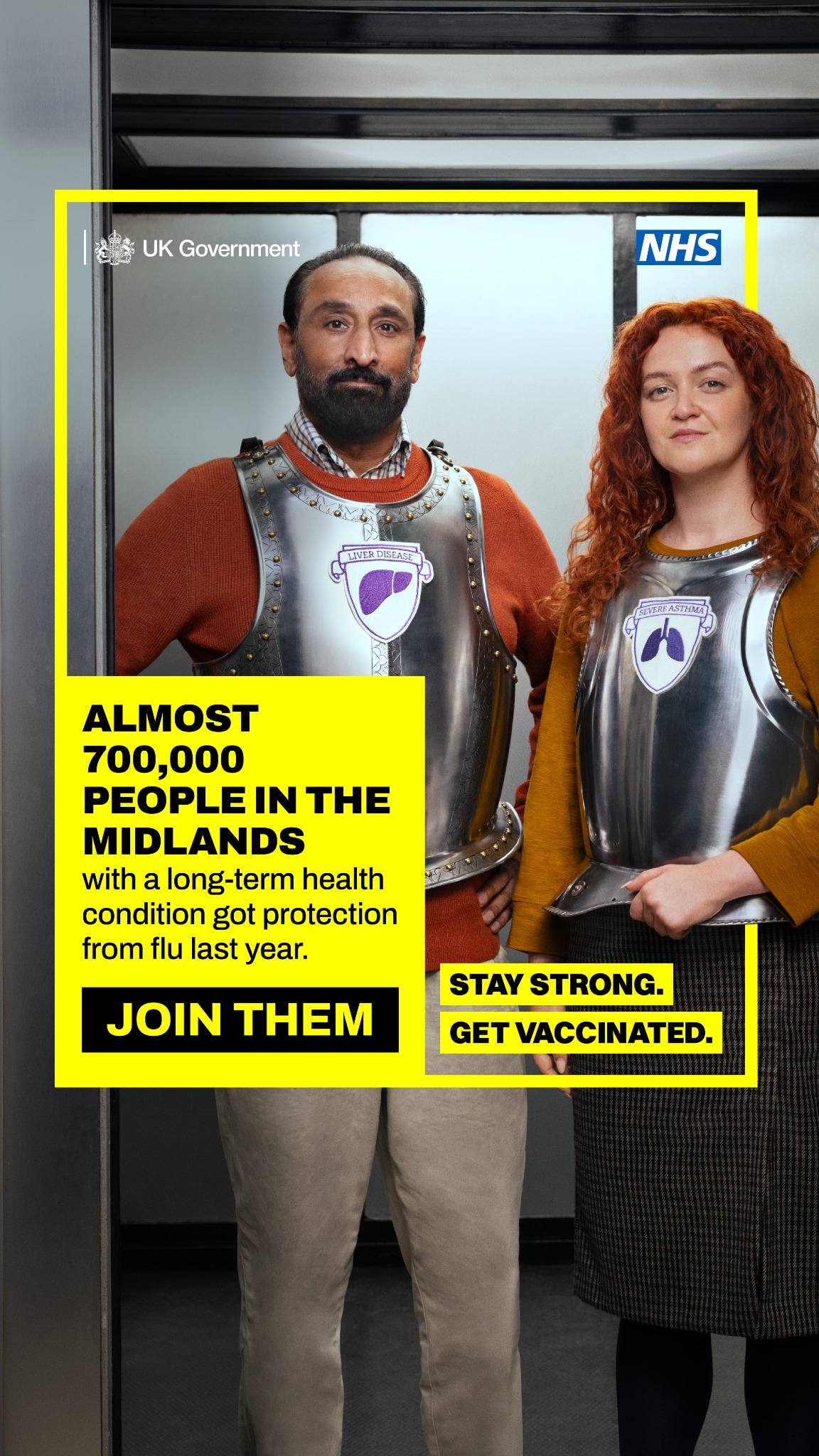
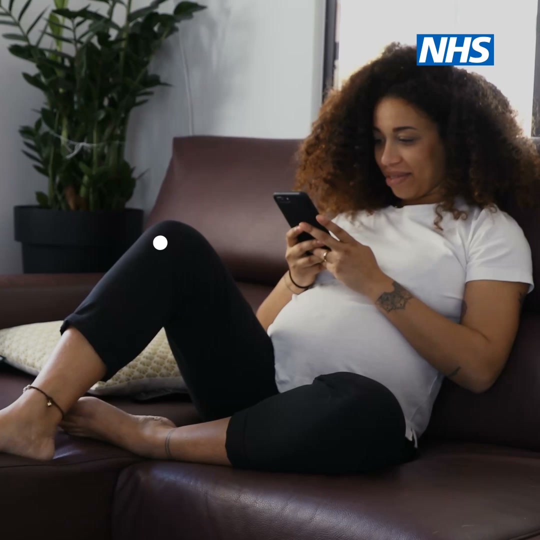
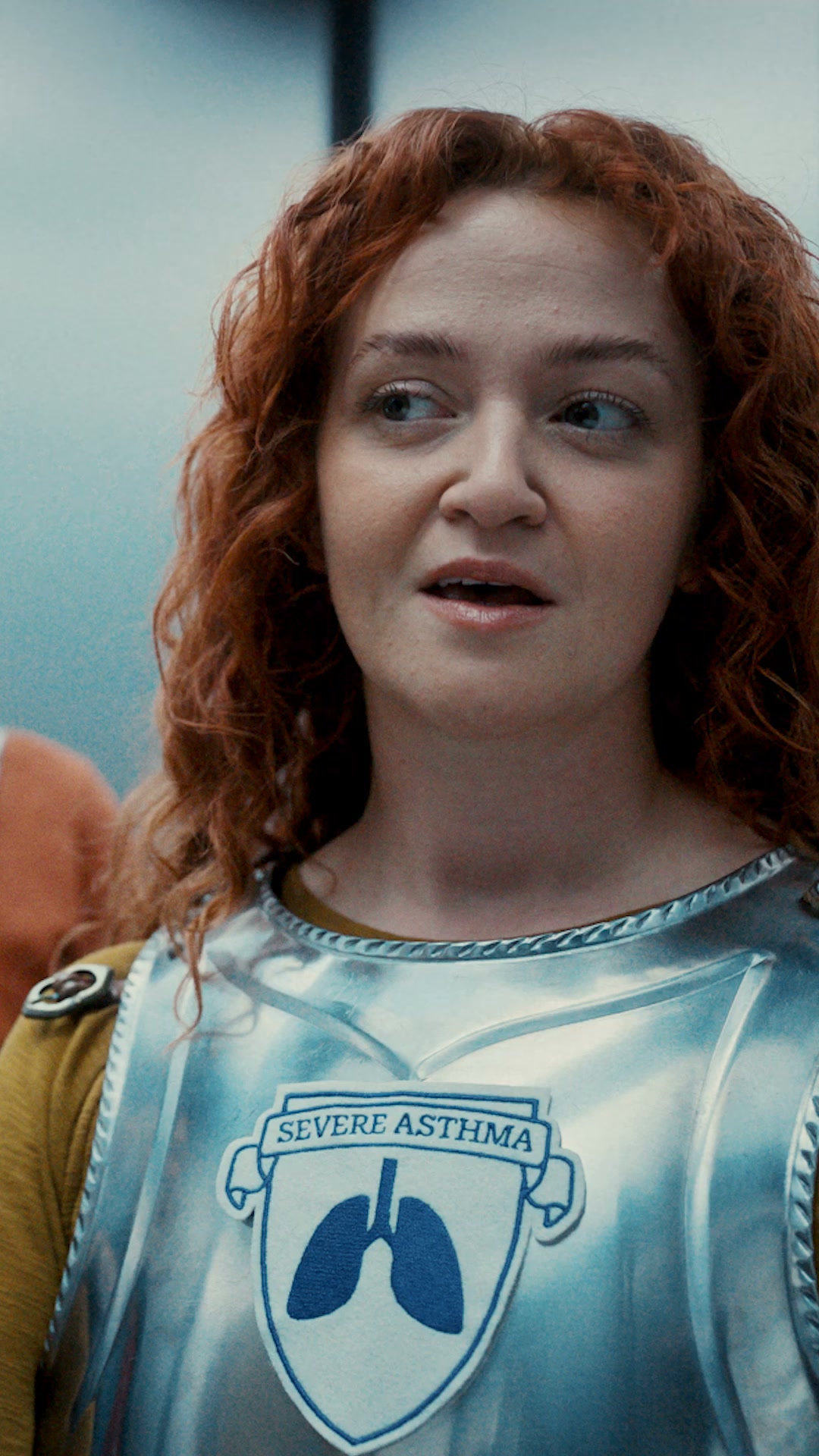
Images express the NHS values: everyone counts, people at the heart of care.
Photography must reflect the diversity of patients, public and staff, show the NHS treating and preventing ill health, look professional, and feature real NHS patients and staff where possible, with consent. The palette does not apply to portrait photography; abstract images must follow it.
Source: england.nhs.uk/nhsidentity/identity-guidelines/imageryengland.nhs.uk/nhsidentity/identity-guidelines/colours
—
Not published. Neither the identity guidelines nor the service manual define a motion system.
Mobile-first, single column up to wider layouts; 960px default max page width; lines of text 70 to 80 characters; breakpoints 320/641/769/990px; 32px gutter; 4px-based spacing scale 4–64px that tightens on small screens.
Measured from england.nhs.uk/nhsidentity/identity-guidelines's Identity law from the NHS Identity Guidelines; digital application from the NHS digital service manual and NHS.UK frontend; page anatomy measured on www.nhs.uk (Wayback snapshot 2026-10-26)..
| Measure | Desktop | Phone |
|---|---|---|
| Page margin | 240px | 16px |
| Section padding | 64px | 48px |
| Card gap | 32px | 32px |
| Navigation | 128px | 128px |
Hero caption
Frutiger 55 Roman (web: Frutiger W01 400) · 32px (phone 24) · line 1.125 · weight 700
Hero headline
Frutiger 55 Roman (web: Frutiger W01 400) · 43.2px (phone 32) · line 1.125 · weight 700
Section H2
Frutiger 55 Roman (web: Frutiger W01 400) · 36px (phone 27) · line 1.167 · weight 700
Card heading (link)
Frutiger 55 Roman (web: Frutiger W01 400) · 26px (phone 22) · line 1.231 · weight 700
Action link
Frutiger 55 Roman (web: Frutiger W01 400) · 22px (phone 19) · line 1.636 · weight 700
Body
Frutiger 55 Roman (web: Frutiger W01 400) · 19px (phone 16) · line 1.474 · tracking 0.29px · weight 400
Nav / footer / small
Frutiger 55 Roman (web: Frutiger W01 400) · 16px · line 1.5 · tracking 0.24px · weight 400
How NHS’s own landing pages are built, observed on nhs.uk/%20(Wayback%20snapshot%2020261026012022,%20measured%202026-10-31), 2026-10-31. The full measurements are in spec.md.
Source: service-manual.nhs.uk/design-system/styles/layoutservice-manual.nhs.uk/design-system/styles/spacinggithub.com/nhsuk/nhsuk-frontend/blob/main/packages/nhsuk-frontend/src/nhsuk/core/settings/_globals.scssgithub.com/nhsuk/nhsuk-frontend/blob/main/packages/nhsuk-frontend/src/nhsuk/core/settings/_breakpoints.scss
How our engine applies the NHS system to each format. Our recipe from their rules, not something the NHS publishes. Level = how much colour beyond blue and white.
| Format | What they did | Source |
|---|---|---|
| website | nhs.uk: NHS Blue header with the lozenge top left, grey-5 page, white square cards, green action links, Frutiger throughout. | nhs.uk |
| signage | Frutiger Bold titles, Roman supporting copy, organisational logo. | england.nhs.uk/nhsidentity/identity-guidelines/fonts |
| leaflets and reports | Bold titles, Roman body, Light lead-ins; logo top right. | england.nhs.uk/nhsidentity/identity-guidelines/fonts |
| social media | Cover photo with the visual style or plain NHS Blue, no text; digital exclusion zone around the logo. | england.nhs.uk/nhsidentity/identity-guidelines/visual-styles-graphic-devices-and-straplines |
| Format | Loudness | Must appear | What varies |
|---|---|---|---|
| Landing page | Build it the way nhs.uk is built (kit.spec.page): solid NHS Blue header, grey-5 #F0F4F5 page, white square cards, Frutiger (stand-in) 600 headings in sentence case, #212B32 text, NHS Blue underlined links, green circle-arrow action links; logo top left in the header at 40px high on desktop | which sections and how many cards | |
| Slides | White or NHS Blue grounds, Bold titles, plain sentences | one support colour as an accent | |
| Print / poster | Logo top right with its margin, NHS Blue dominant, Frutiger Bold titles | photography and one graphic device | |
| Social | Digital exclusion zone around the logo; no text on cover images | visual style or plain NHS Blue |
Source: england.nhs.uk/nhsidentity/why-its-important/identity-policy-and-principlesengland.nhs.uk/nhsidentity/identity-guidelines/who-can-use-the-nhs-identityengland.nhs.uk/nhsidentity/identity-guidelines/who-cannot-use-the-nhs-identityengland.nhs.uk/nhsidentity/identity-guidelines/coloursengland.nhs.uk/nhsidentity/identity-guidelines/fontsengland.nhs.uk/nhsidentity/identity-guidelines/nhs-logo
Your name and logo, NHS’s system.
Use this kit for my brand Use this brand in Claude
Get your brand audit Put your brand in Claude What goes in a brand book
Each value is marked published, observed, our reading or our recipe, with its source. Checked 2026-10-31. Not affiliated with NHS.