Build a better web
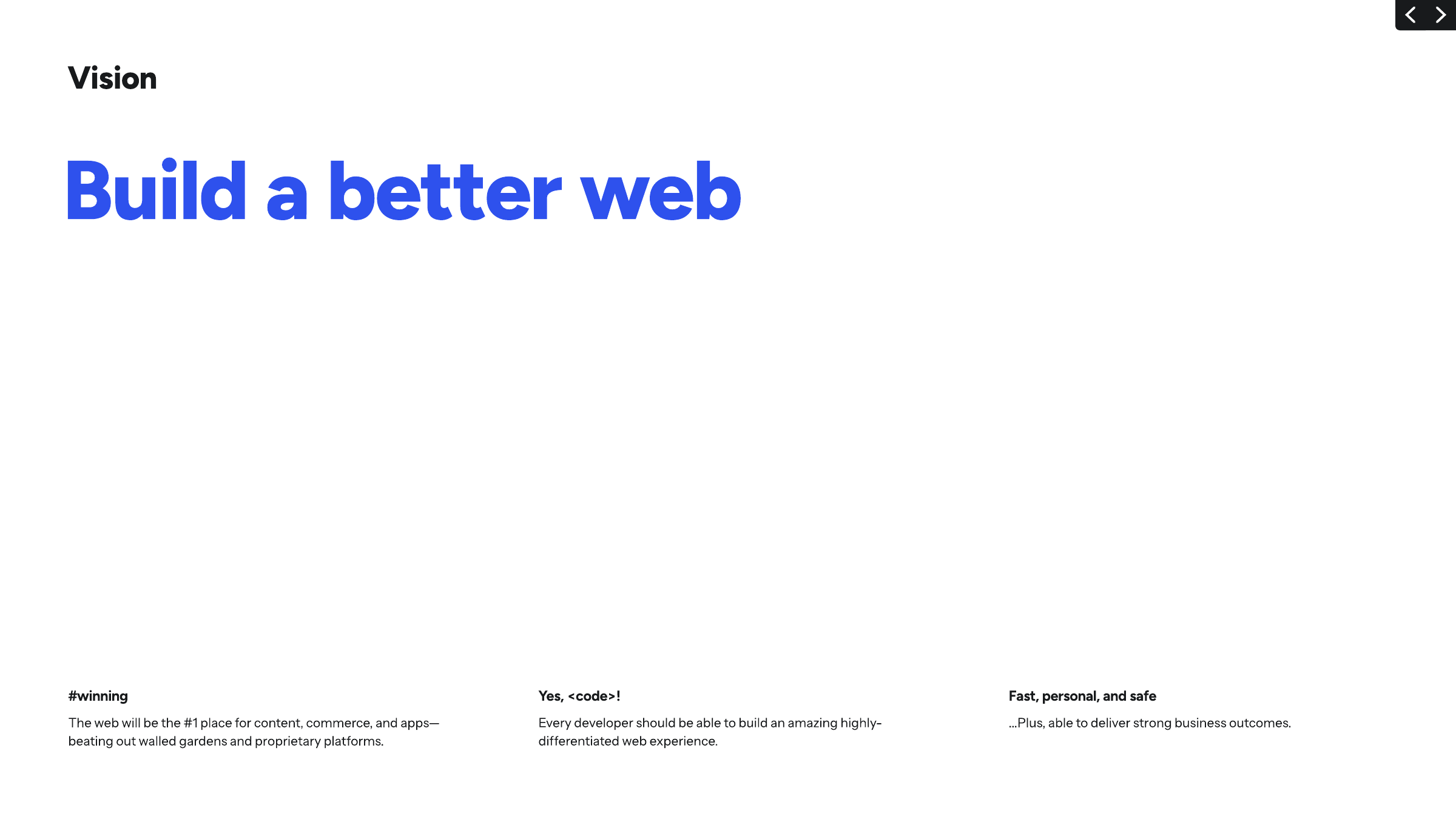
The web will be the #1 place for content, commerce and apps, beating walled gardens and proprietary platforms. Published
Brand book
A developer platform that looks like a friendly tool: black-like neutrals and white, one bright teal spark, one blue accent, monospace labels, and a hand-drawn, slightly playful illustration layer. Our reading

Ground (white, #12181F, Teal 900 gradient, or blue-purple glow), illustration subject, and the secondary colours for gradients and data.
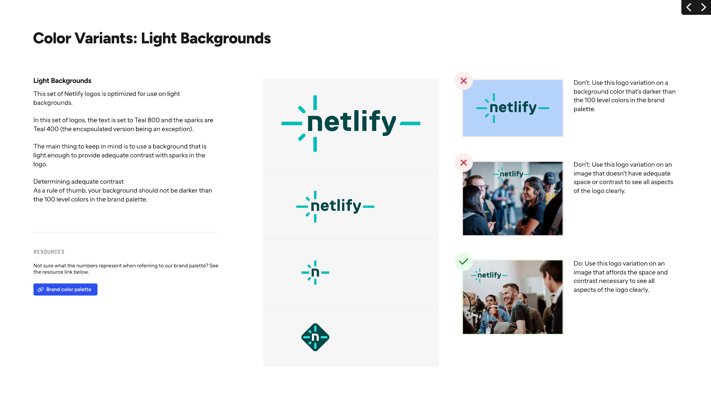
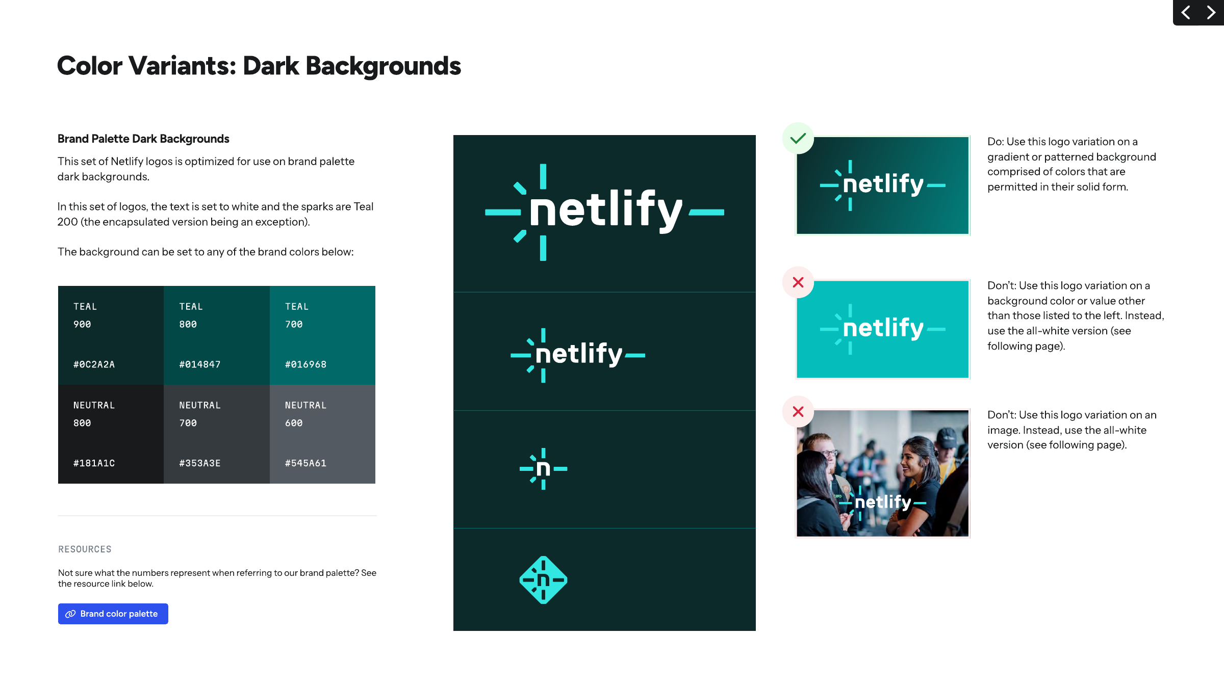
A supplied spark file in the set that matches the ground: light set on grounds no darker than the 100 level, dark set on the listed Teal or Neutral darks, all-white on gradients and photos (pp.14-16). Never retyped, never a background.
Bright Teal 200/400 lives in the logo sparks and the primary pill; Teal 900 may carry a dark ground, but teal is used sparingly outside the logo (p.20).
Static text is Neutral 800 #181A1C or white, never #000000; Blue 700 #2E51ED marks emphasis, eyebrows and links (p.20).
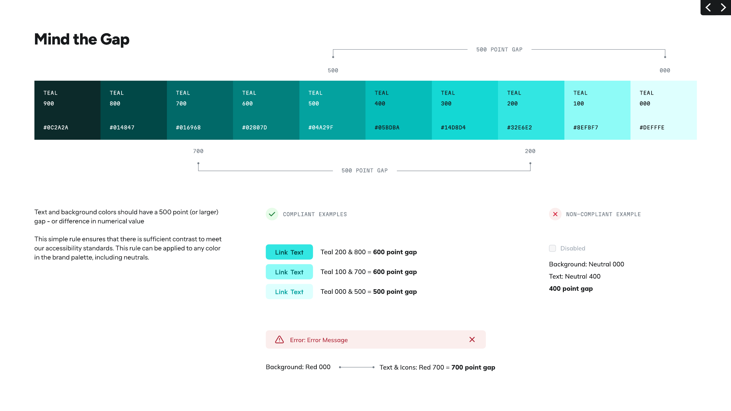
Every text and ground pair sits 500 or more ramp steps apart (p.24).
Figtree heads, Instrument Sans body, Martian Mono for code, eyebrows and attributions (pp.26-29).
Each section opens with a short uppercase mono eyebrow over a short sentence-case head (observed on netlify.com).
One big line, the rest meaningfully smaller, lines under 65 characters, one CTA (pp.30, 32).
Only the numbers Netlify states (10M+ developers, 60M+ apps deployed, 99.99% uptime); no invented metrics.
Create with AI or code, deploy instantly on production infrastructure. One platform to build and ship.
The web will be the #1 place for content, commerce and apps, beating walled gardens and proprietary platforms. Published
Every developer should be able to build an amazing, highly differentiated web experience: fast, personal and safe, with strong business outcomes. Published
Netlify connects APIs and developer tools with opinionated infrastructure for simple, yet powerful workflows. Published
Not building middleware, coordinating with DevOps, or maintaining custom servers and infrastructure. Published
Push your ideas to the web
Build your way. Ship on one platform.
Every building block. One platform to run it all.
Prompt. Preview. Repeat.
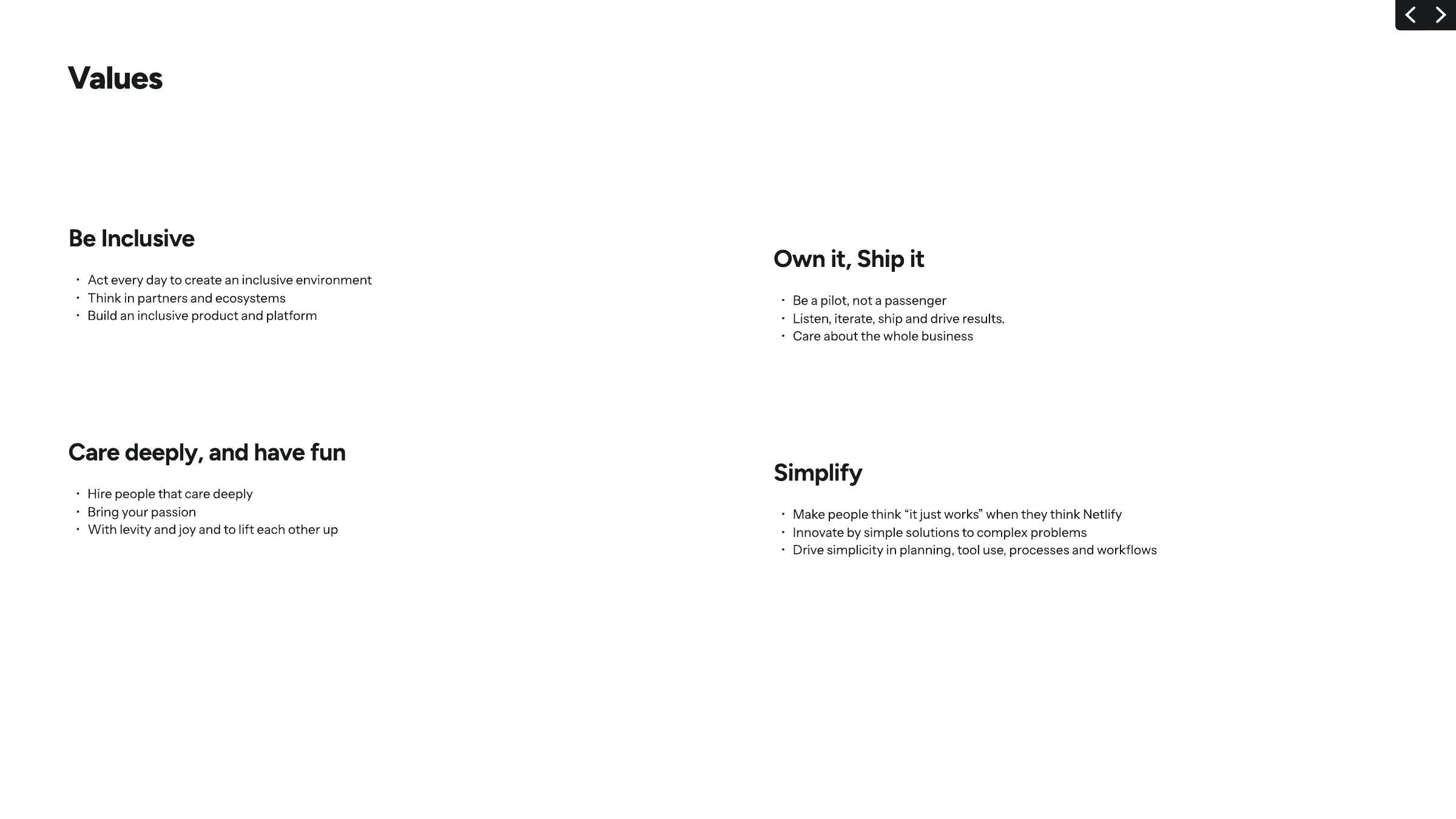
Act every day to create an inclusive environment; Think in partners and ecosystems; Build an inclusive product and platform.
PublishedBe a pilot, not a passenger; Listen, iterate, ship and drive results; Care about the whole business.
PublishedHire people that care deeply; Bring your passion; With levity and joy and to lift each other up.
PublishedMake people think "it just works" when they think Netlify; Innovate by simple solutions to complex problems; Drive simplicity in planning, tool use, processes and workflows.
PublishedCategory. Web development platform: build, deploy and scale web apps (AI agents, serverless, global delivery) on one platform
Netlify is the most popular way to build, deploy and scale modern web applications. Home to millions of developers and thousands of enterprises, Netlify is the platform of choice for running modern composable web applications in production, from global corporate sites to complex e-commerce and SaaS applications.
Build a better web Published
Let's build a better web together Published
Push your ideas to the web Observed
Build your way. Ship on one platform. Observed
Every building block. One platform to run it all. Observed
Build a better web
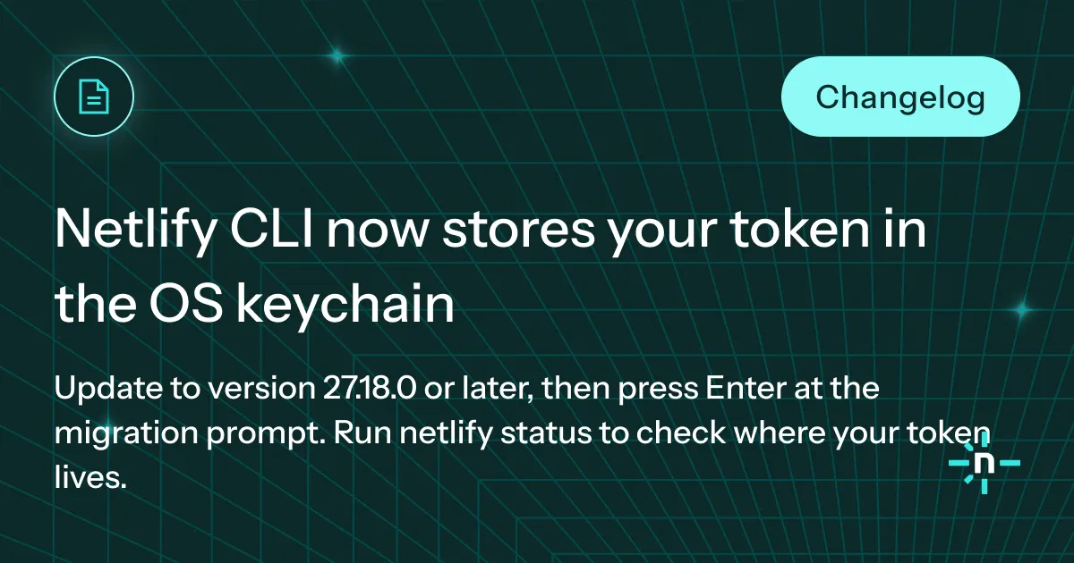
Netlify CLI now stores your token in the OS keychain
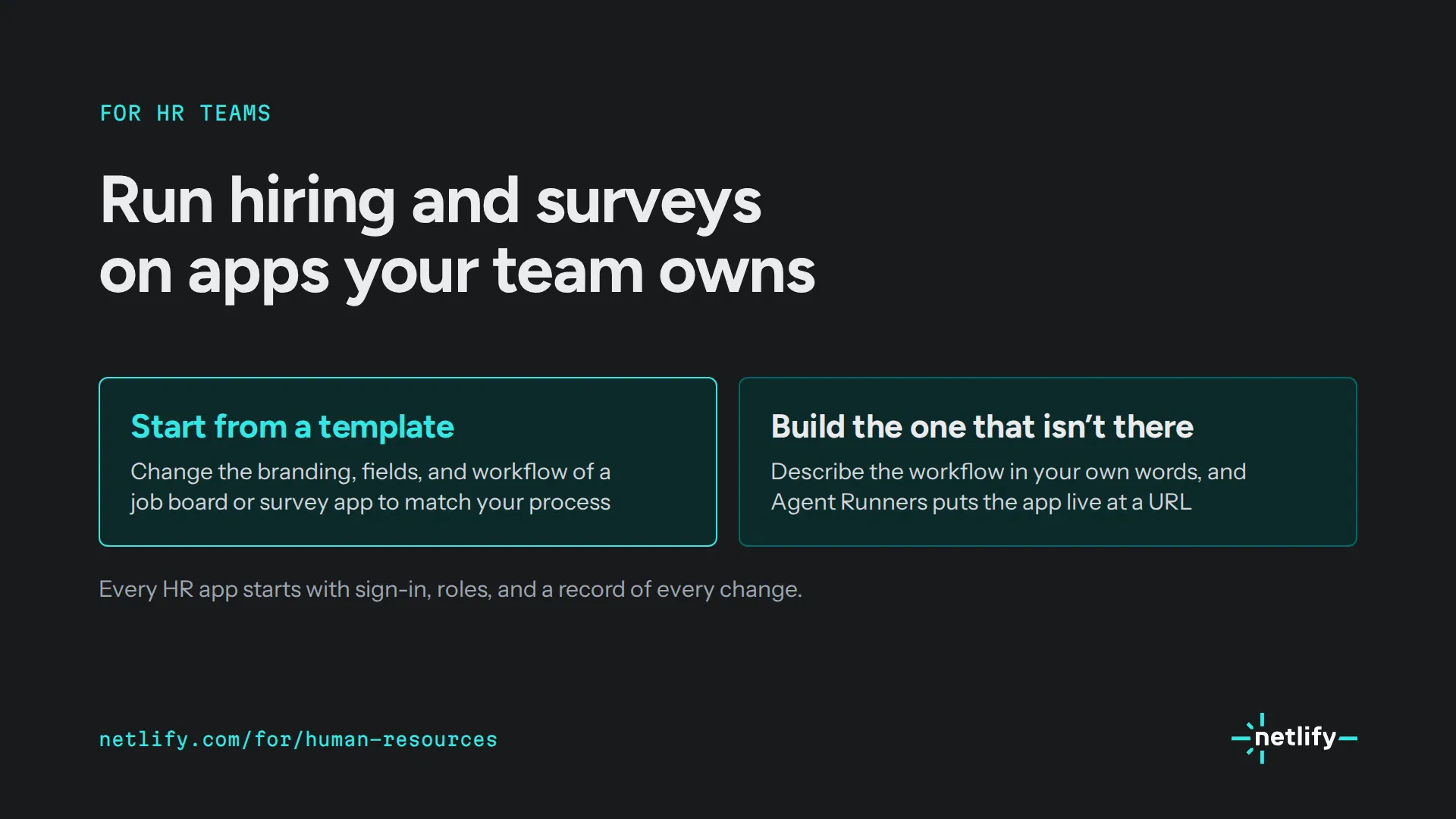
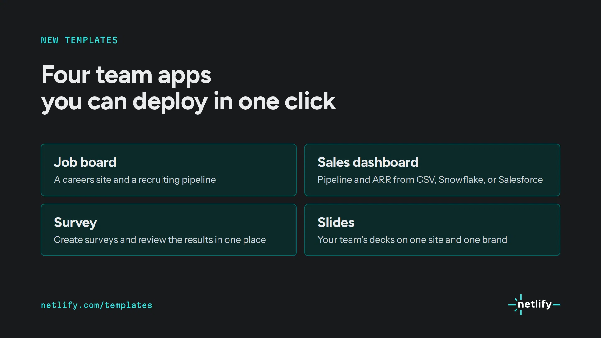
Run hiring and surveys on apps your team owns
Netlify's People team built its own survey app with prompts
Start your way.
Start Your Journey With Netlify Today!
Netlify CLI now stores your token in the OS keychain
Exciting news: a game-changing upgrade for developers
Auto-deploy on every push. Every PR gets a preview URL.
Seamlessly accelerate your deployment workflows
Our innovative platform empowers teams to seamlessly accelerate web delivery.
Deploy directly from your working directory. No login required to start.
We are thrilled to announce an exciting new integration!
Ship to Netlify from inside Antigravity
Developers skim; "get right to the point" (p.32).

DirectDeveloper-plainOptimisticInclusiveLight-hearted
The guide publishes no tone-of-voice rules. Its Brand Story (vision, mission, values) gives the substance. Site copy is short, declarative and builder-to-builder.
buildshipdeploypreviewdevelopersthe webAI agentsDeploy Preview
| Heads | sentence case, period at end (site) |
|---|---|
| Eyebrows | mono caps, 1-2 words |
| CTAs | verb first: Start building, Request a demo |
Source: guide.pdf p.5, p.6, p.7, p.32netlify.com


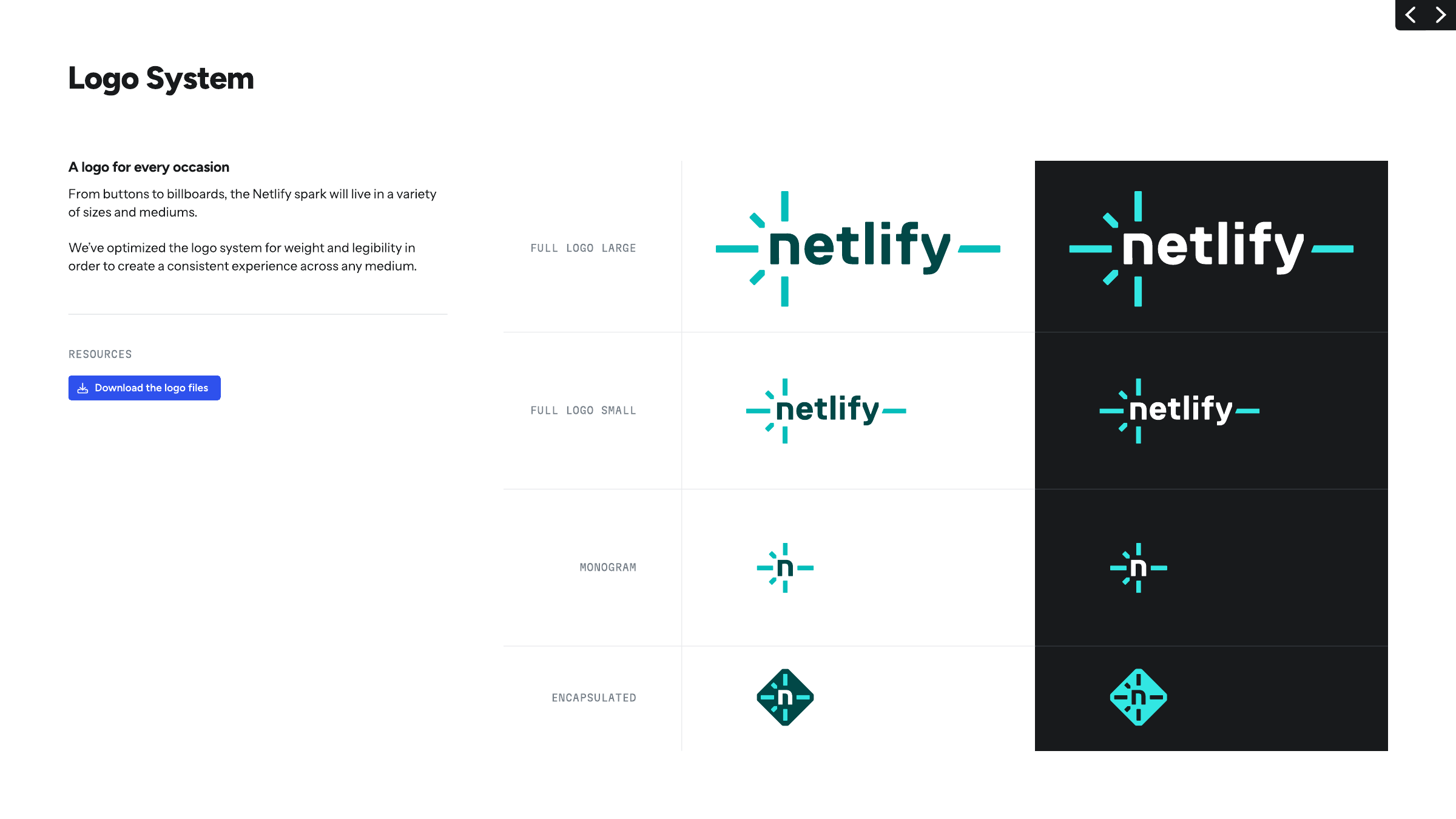
Weight-tuned large and small cuts keep the thin spark bars legible from buttons to billboards; the colour sets exist so the sparks always have contrast.


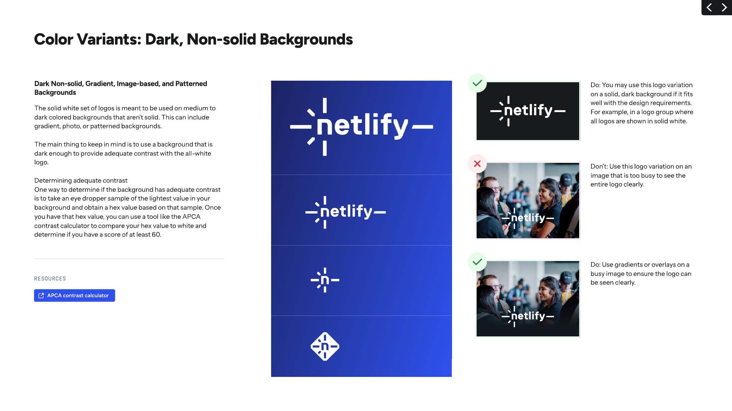
| Lockups | Full large, full small, monogram, encapsulated |
|---|---|
| Light set | Type Teal 800 #014847, sparks Teal 400 #05BDBA |
| Dark set | Type white, sparks Teal 200 #32E6E2 |
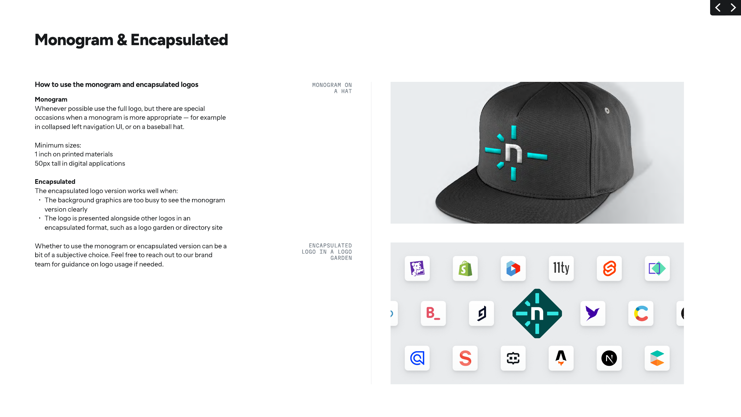
| Encapsulated (light) | Teal 800 diamond, Teal 200 sparks, white n |
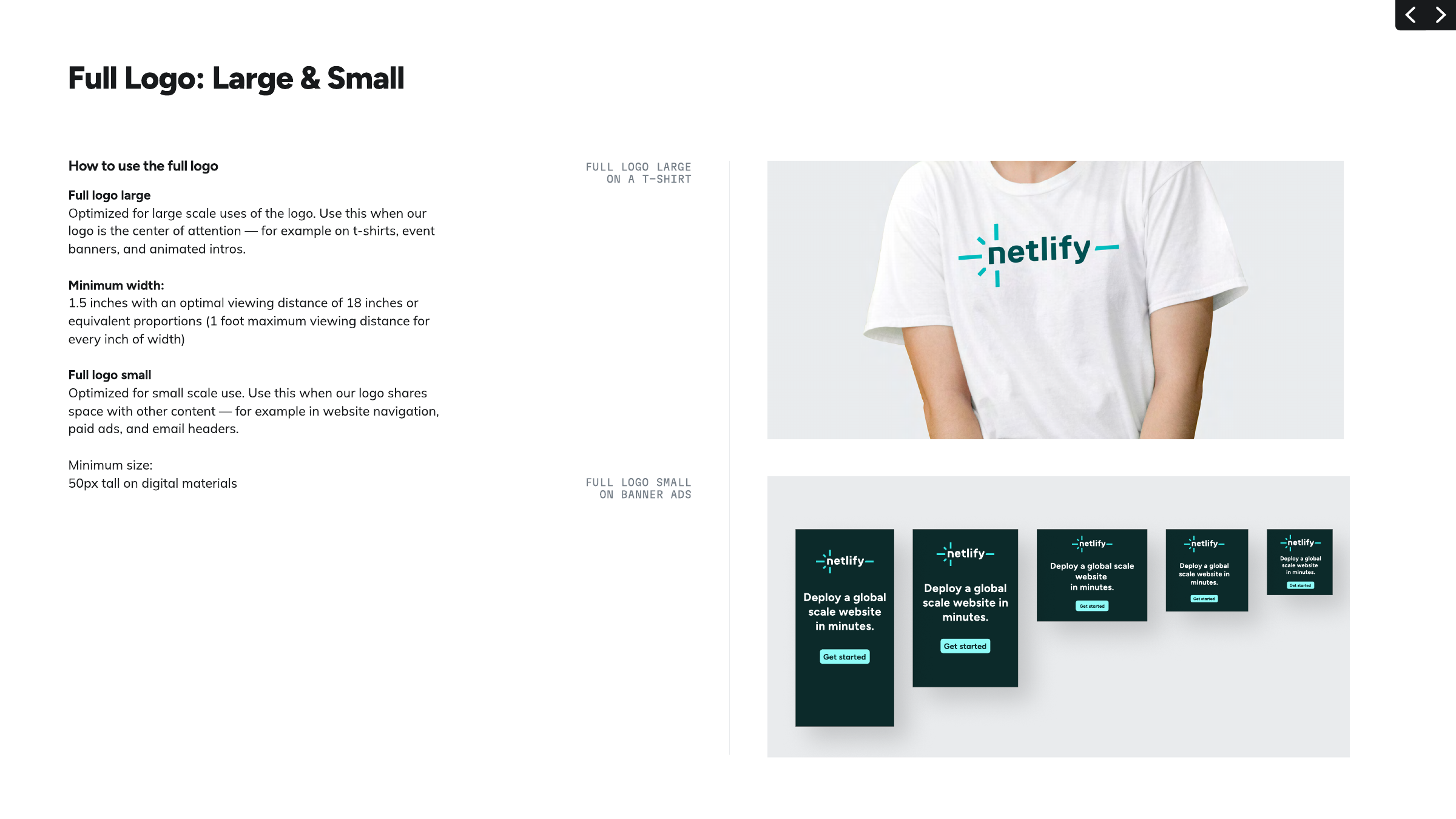
| Full small min | 50px tall digital |
| Full large min | 1.5 in wide at 18 in viewing |
| Monogram min | 1 in print, 50px digital |
| Encapsulated min | not published |
| Clear space | not published |
| White-logo contrast | APCA 60+ vs lightest ground sample |
One logo, the Netlify spark, in four lockups. They are full logo large, full logo small (optimised for weight and legibility at each scale), monogram ("n" with sparks) and encapsulated (monogram knocked out of a rounded diamond). Each comes in a light-ground set (Teal 800 type, Teal 400 sparks), a dark-ground set (white type, Teal 200 sparks) and an all-white set. The site header uses the small full-colour logo on white.
Source: guide.pdf p.10, p.11, p.12, p.13, p.14, p.15, p.16, p.17, p.18netlify.com/aboutnetlify.com/assets/logos/netlify-logo-full.zipnetlify.com/assets/logos/netlify-logo-monogram.zipnetlify.com/assets/logos/netlify-logo-encapsulated.zip
One lightness scale across hues lets anyone pick an accessible pair by arithmetic (500 steps apart) instead of a contrast checker; teal stays special by staying scarce.
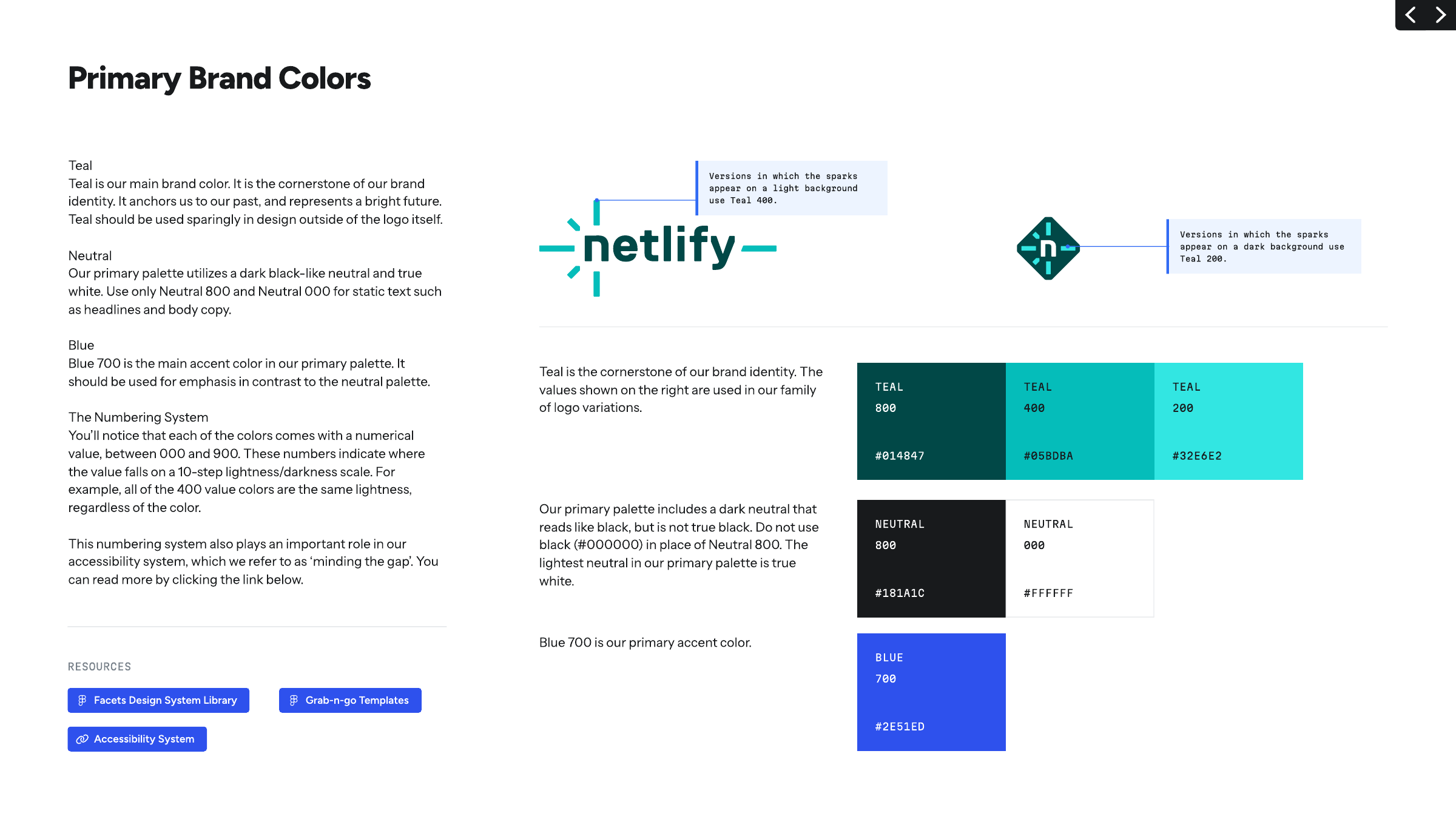
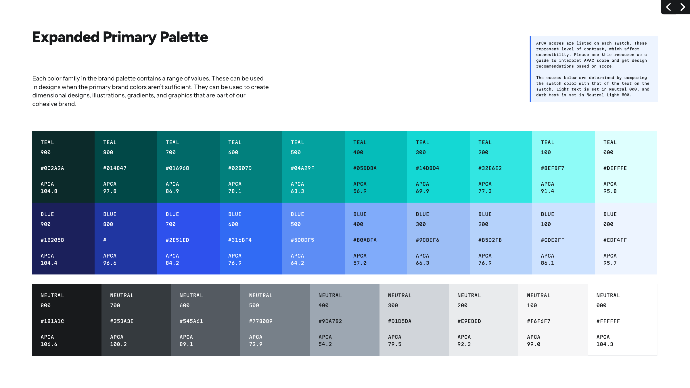
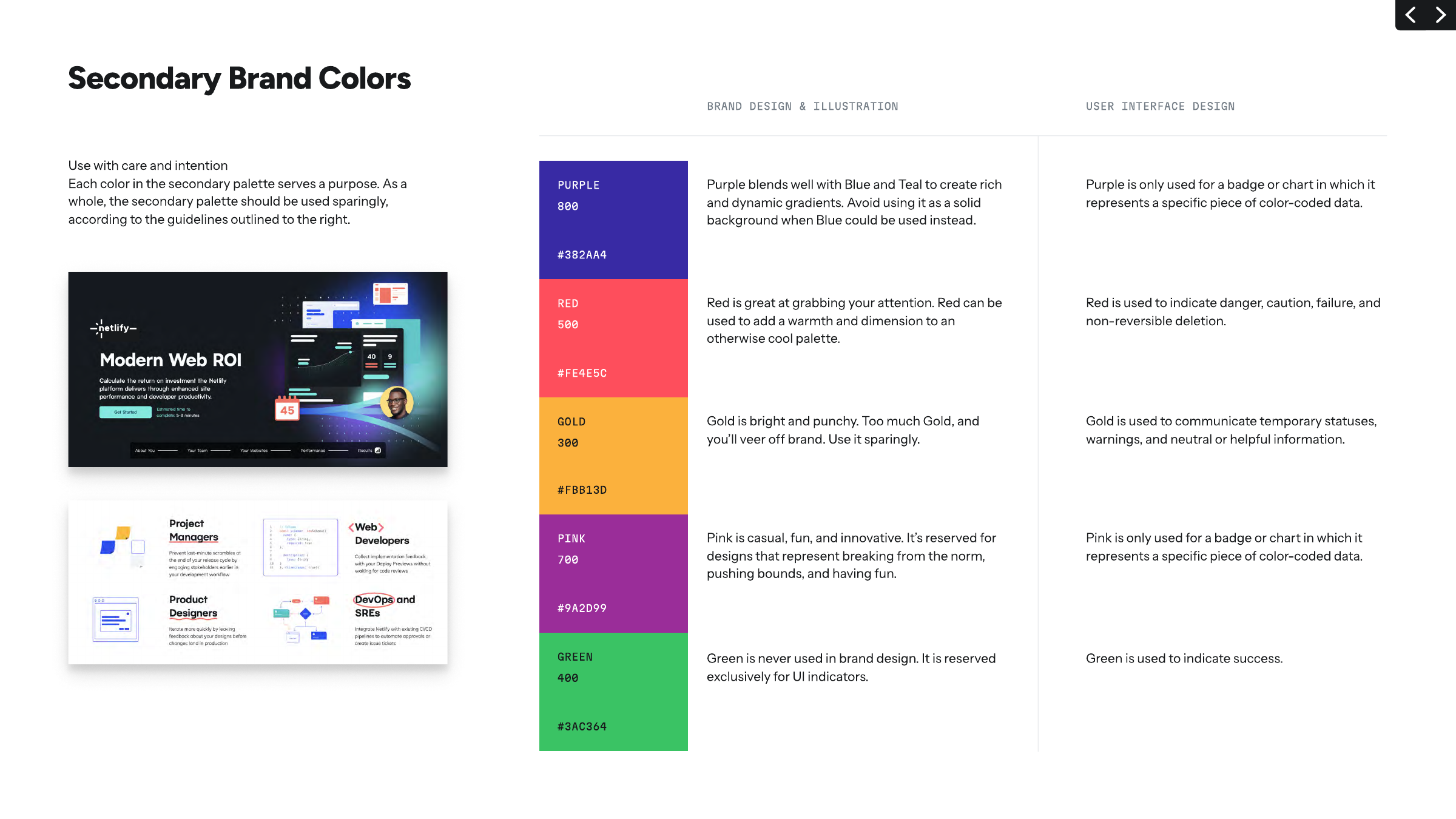
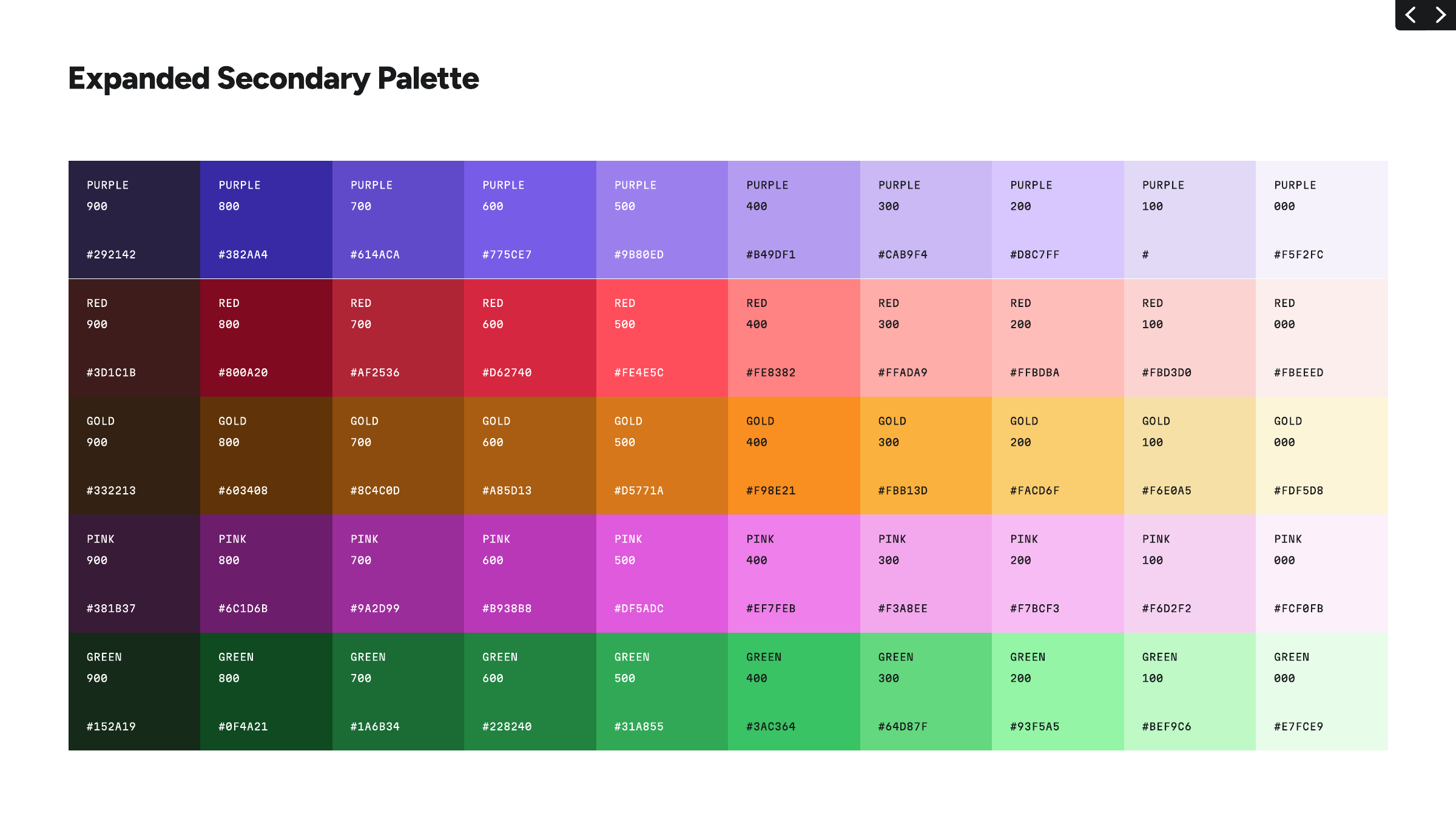
| Teal 800 / 400 / 200 | #014847 / #05BDBA / #32E6E2 |
|---|---|
| Neutral 800 / 000 | #181A1C / #FFFFFF |
| Blue 700 | #2E51ED |
| Purple 800 | #382AA4 |
| Red 500 | #FE4E5C |
| Gold 300 | #FBB13D |
| Pink 700 | #9A2D99 |
| Green 400 | #3AC364 |
| Numbering | 000 (lightest) to 900; same number = same lightness across hues |
| Contrast rule | >= 500-step gap; APCA scores printed per swatch |
| Blue 800, Purple 100 | blank in the guide; site tokens #2036A1, #E2D9F7 |
Teal is the cornerstone and Blue 700 the single accent. The primary palette is Teal (mostly in the logo), a black-like Neutral 800 with true white for text, and Blue 700 as the single accent; five secondary hues (Purple, Red, Gold, Pink, Green) each with one job in brand design and another in UI. Every family is a 10-step ramp (000-900) on one shared lightness scale, which powers the Mind the Gap contrast rule. The site follows it: white pages, Neutral 700/800 text, Blue 700 eyebrows and links, Teal 200 CTAs, dark #12181F and Teal 900 bands.
Source: guide.pdf p.19, p.20, p.21, p.22, p.23, p.24computed styles and CSS tokens (--ntl-*) on https://www.netlify.com/, headless Chromium 2026-11-17
Build a better web
A rounded geometric head face echoes the logo's rounded lowercase; a mono third face signals a developer product and carries the labels.
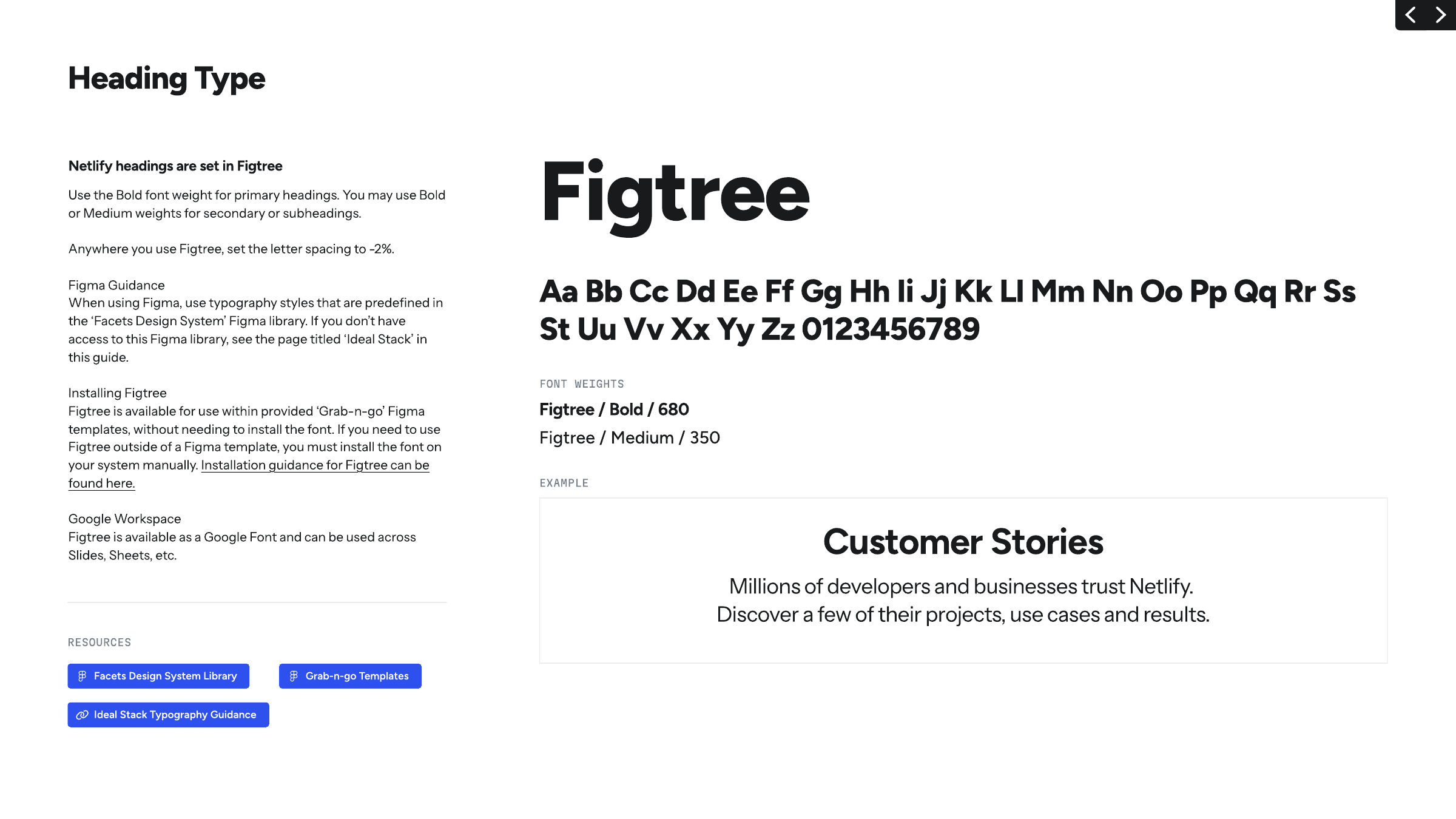
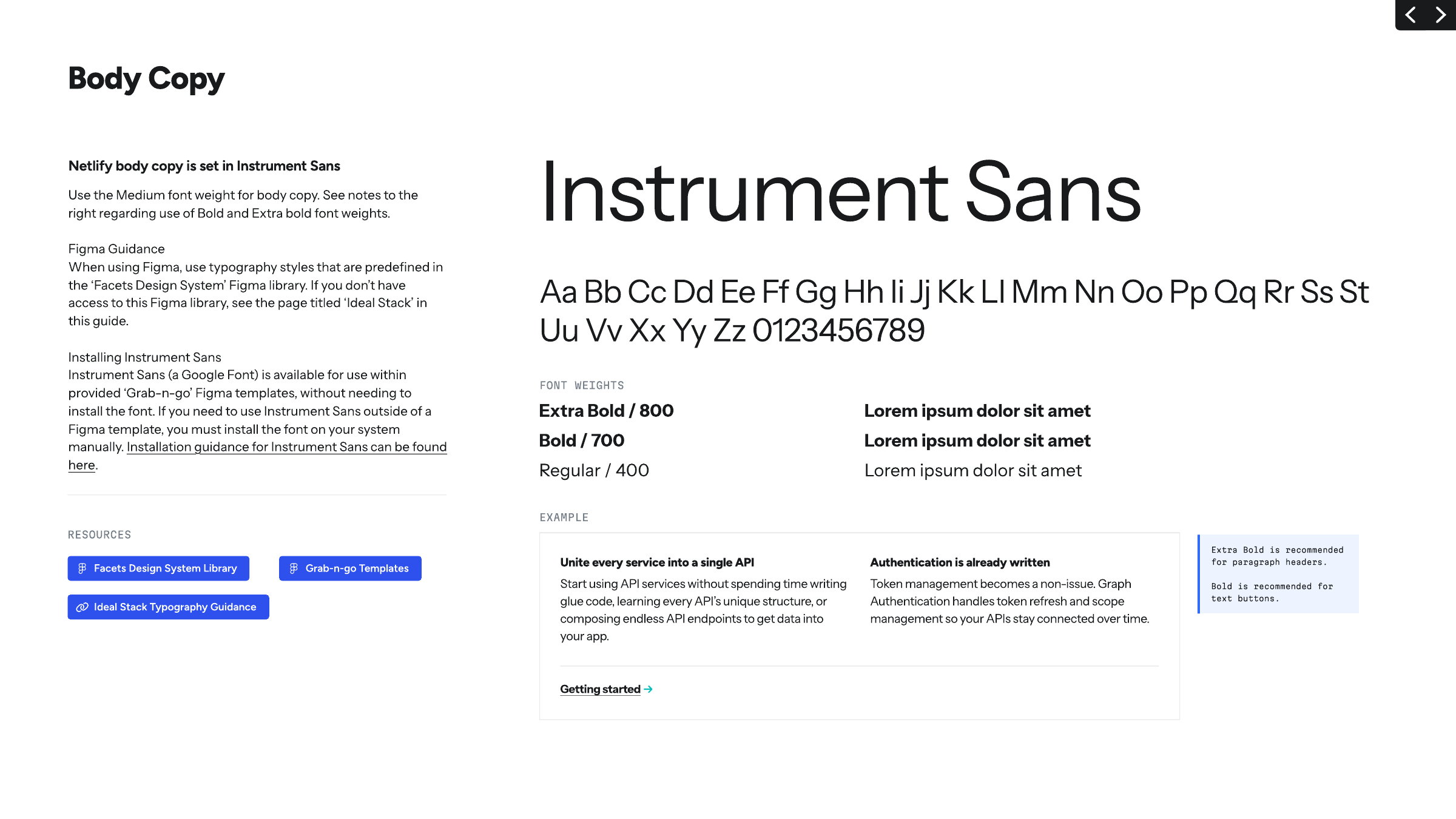
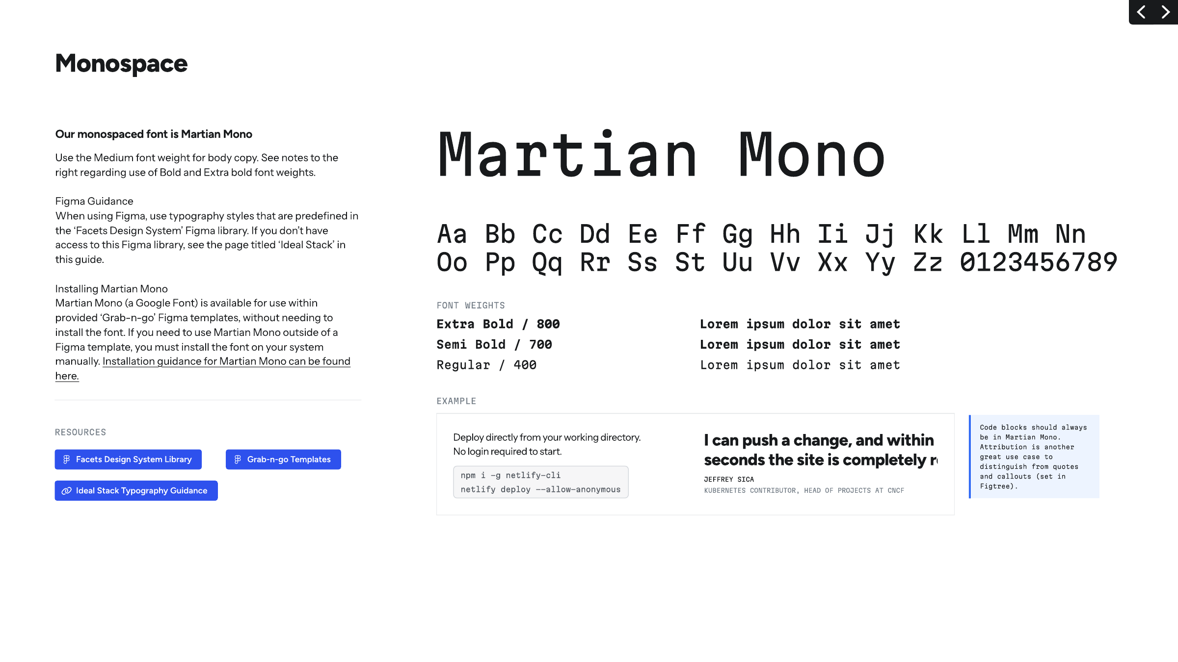
| Their face | Use | License | Open stand-in |
|---|---|---|---|
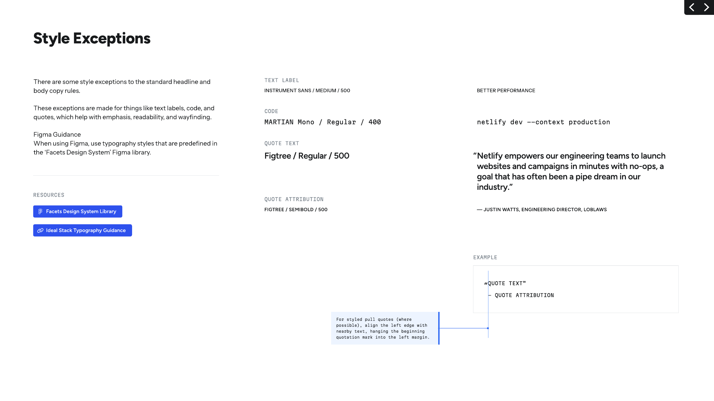
| Figtree | Every head, pull quotes, buttons | SIL OFL 1.1 (Google Font); the site's own variable woff2 ships with this book in fonts/ | Figtree itself The real face is open; no stand-in needed. |
| Instrument Sans | Body, intros, nav, paragraph headers (800), text labels (500 caps) | SIL OFL 1.1 (Google Font); the site's own variable woff2 files (roman and italic) ship with this book | Instrument Sans itself The real face is open; no stand-in needed. |
| Martian Mono | Code, eyebrows, attributions, labels | SIL OFL 1.1 (Google Font); the site's own woff2 files ship with this book | Martian Mono itself The real face is open; no stand-in needed. |
| Custom logotype | Logo only | Logo artwork; use the official files |
| Display | Figtree, Bold ("680") / Medium ("350") in the guide; site 800/700 |
|---|---|
| Body | Instrument Sans 400 16/24 |
| Mono | Martian Mono 400 (eyebrows 14px caps) |
| Tracking | Guide -2% on Figtree; site computes normal |
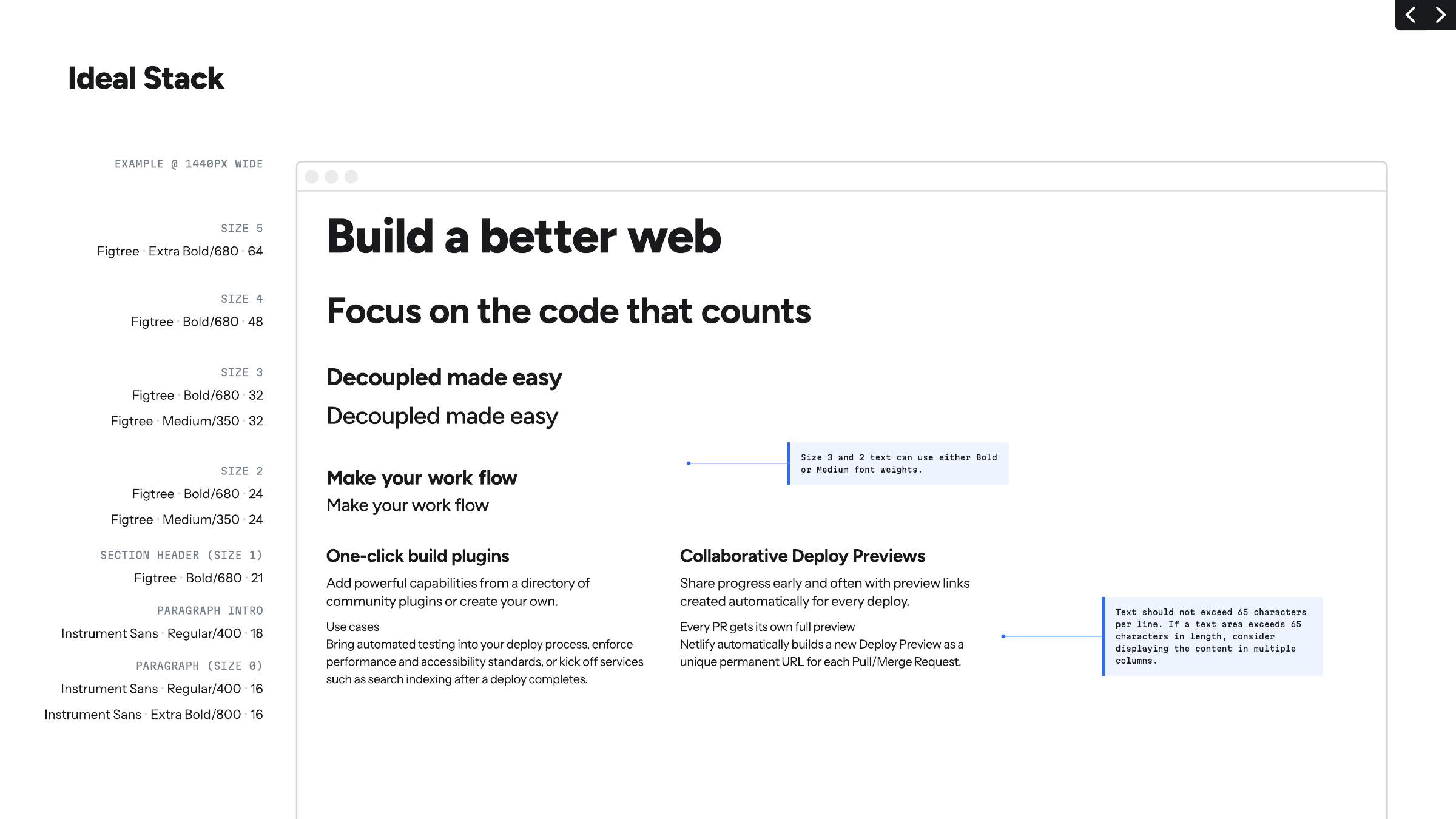
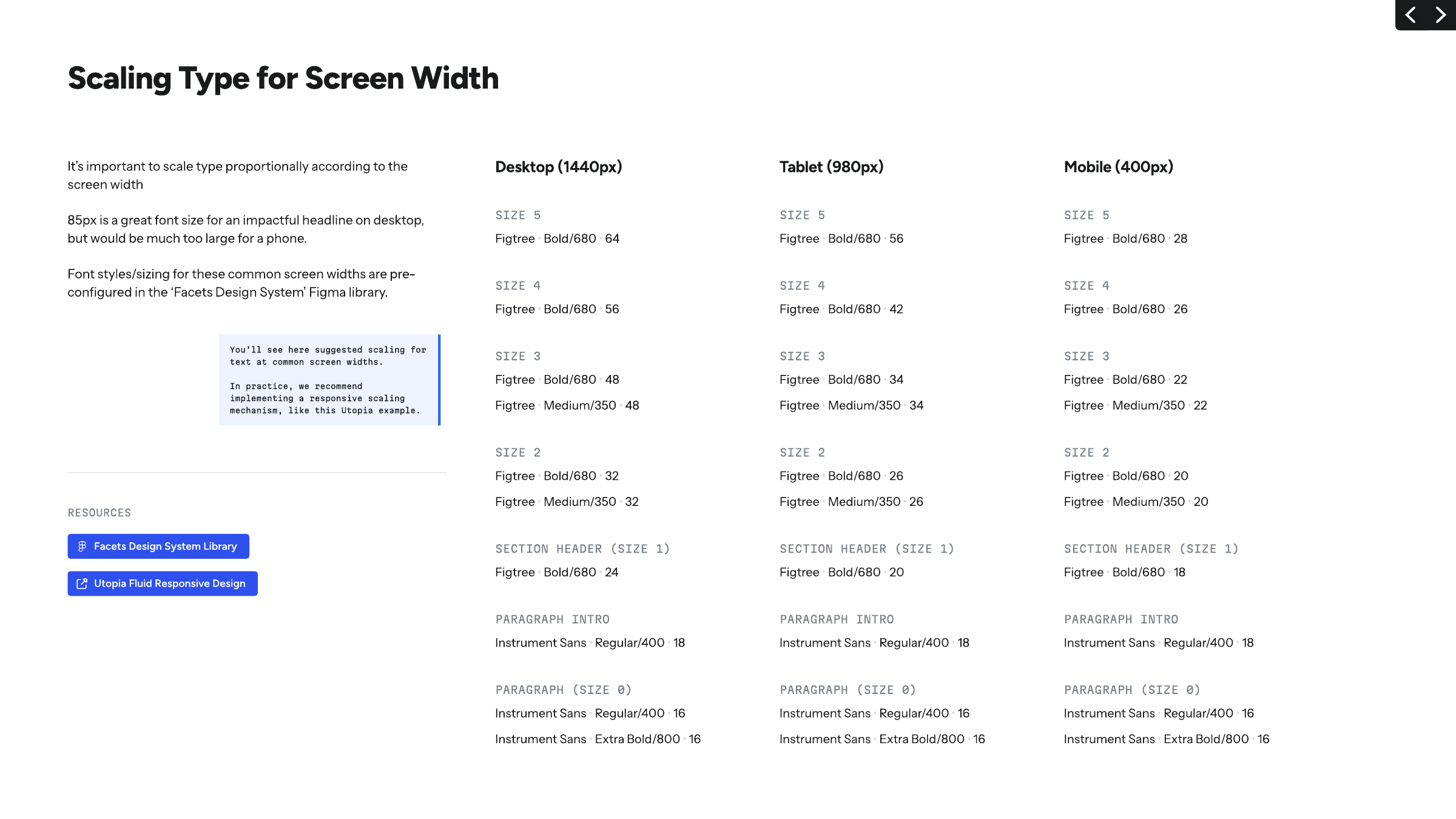
| Desktop scale | 64 / 56 / 48 / 32 / 24 / 18 / 16 |
| Mobile scale | 28 / 26 / 22 / 20 / 18 / 18 / 16 |
| Site H1 | Figtree 800 64/70.4 |
| Site section head | Figtree 800 64/70.4 (32/35.2 in panels) |
| Site card head | Figtree 700 24/26.4 |
| Line height tokens | heading 1.1, text 1.5, snug 1.35, relaxed 1.65 |
| Fluid tokens | display-2xl clamp(40px, ..., 64px); display-lg clamp(32px, ..., 48px); display-sm clamp(24px, ..., 32px) |
Three open Google faces. Figtree (geometric, friendly) for heads, Instrument Sans for body, Martian Mono for code, labels and attribution. The guide publishes an Ideal Stack at 1440 and a responsive scale for desktop, tablet and mobile. The live site sets heads heavier (800) than the guide's Bold and at normal tracking; eyebrows are uppercase mono.
Source: guide.pdf p.25, p.26, p.27, p.28, p.29, p.30, p.31computed styles and CSS tokens (--ntl-*) on https://www.netlify.com/, headless Chromium 2026-11-17netlify.com/_astro/%20(woff2%20files)
Do Short rounded bars converging on the lowercase wordmark (or the "n"): Teal 400 sparks with Teal 800 type on light; Teal 200 sparks with white type on dark; all-white on gradients and photos. The spark "represents the convergence of the technologies and people behind every web experience".
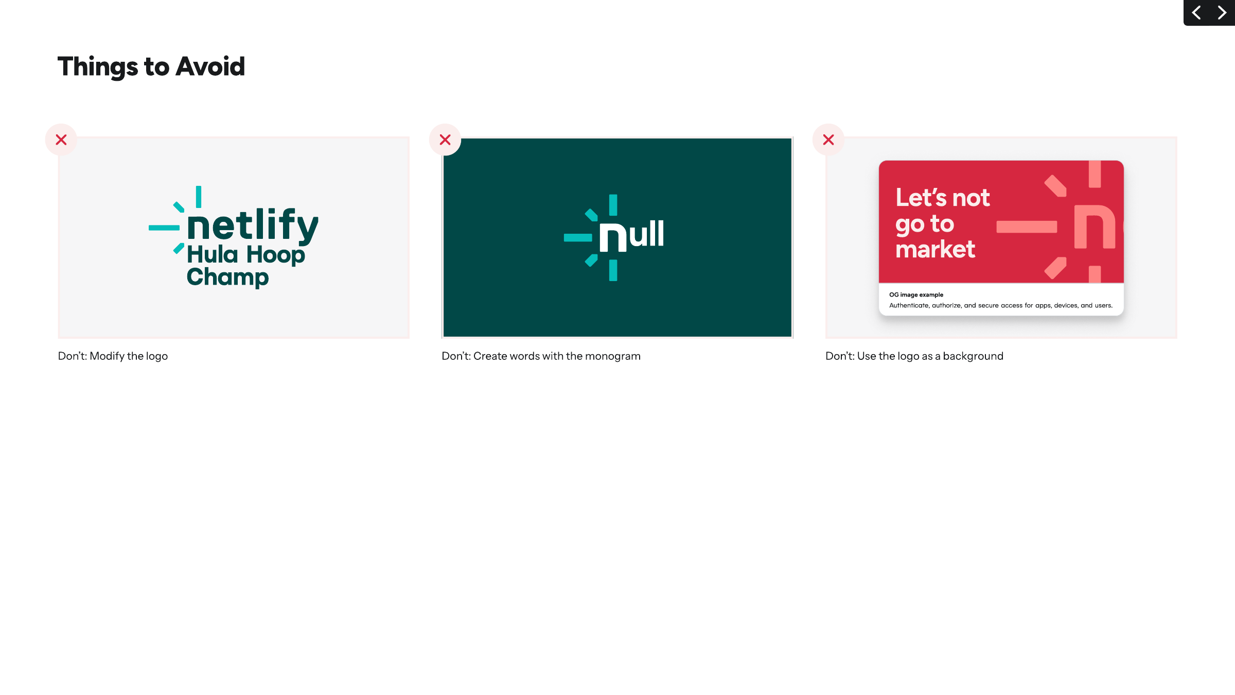
The spark · The logo on every surface; never a background, never a builder for other words
Teal 200 on Teal 800: a 600-step gap
Neutral 400 on white: only 400 steps
Mind the Gap · Every text/background pair in brand and UI design
Do Martian Mono 400, 14px, uppercase: Blue 700 on light, Teal 200 on dark; then a Figtree 800 head. The guide itself labels figures in small uppercase grey mono (pp.11, 12, 13, 17).
Mono eyebrow over a Figtree head · Above every section head on the site; guide labels and swatch captions
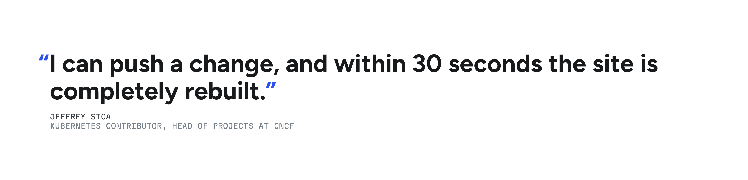
“Ship the change, not the ceremony.”
Hanging quote mark · Pull quotes (home testimonial, customer stories)
Do Hand-drawn, wobbly single-weight outline illustrations (browsers, charts, gauges, clouds, plugs) in Teal 200 #32E6E2 on a Teal 900 gradient panel; the hero star mascot is Gold 300/400 with a Teal 200 wand-star.
Teal line drawings on deep teal · Home switchback panels (workflow, platform, scale); the hero uses the same hand-drawn style in white on #12181F with the orange star mascot
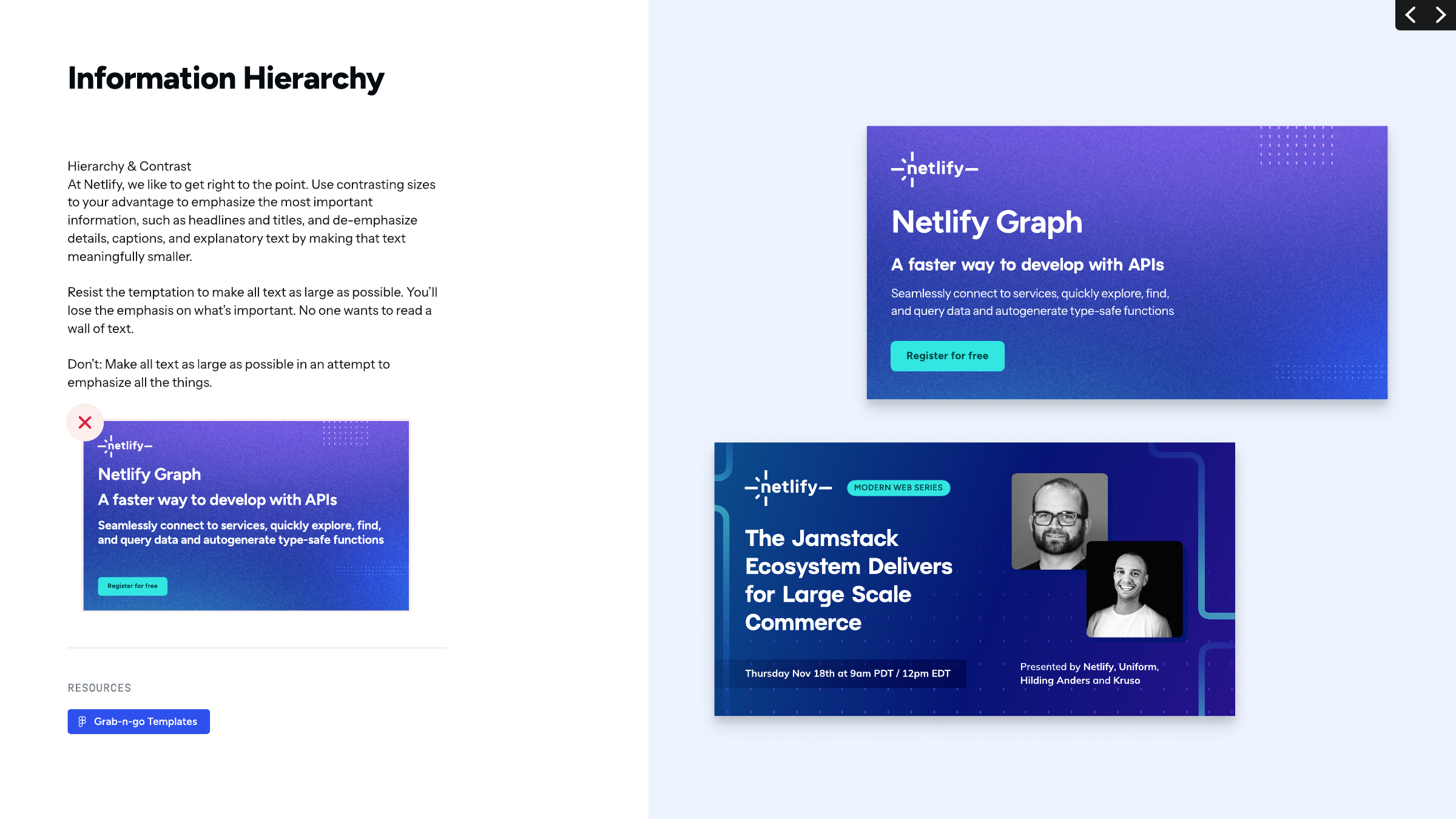
Do Deep Blue 900/Purple grounds lit by soft blurred blobs of Blue 700, Teal 200 and Purple (the guide's embedded blob images), with small square dot-grid patches in corners; white Figtree heads, Teal 200 CTA. Purple 800 is the colour that blends Blue and Teal gradients (p.22).
Glow gradients with dot grids · Promo, webinar and partner graphics in the guide; the OG image
Specimens use sample copy, not Netlify’s.
Dark glowing grounds and code-like details read as a developer platform; white cards keep marketing pages light.

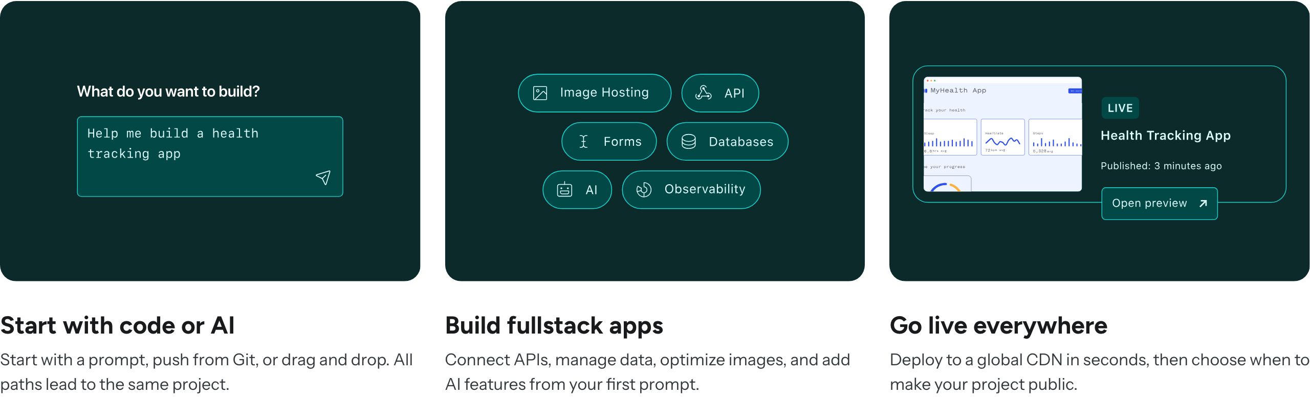

| Glow blobs | Blurred Blue 700, Teal 200 and Purple shapes (guide images img-032-176..190) |
|---|---|
| Dot grid | Small square dots in tight grids, corners of promo cards (pp.17, 32) |
| Panel gradient (site) | linear-gradient(248deg, #09181B 8%, #0C2A2A 57%) |
| Card border (site) | 1px Neutral 200 #E9EBED, hover Neutral 300 |
| Radii (site) | 2/4/6/12/16/30px, pill 360px |
| Shadows (site) | light: 0 2px 4px #33373b14, 0 1px 10px #33373b0f |
The guide shows its graphic elements but does not specify them. It shows soft glow gradients (blurred blobs of Blue, Teal and Purple) on deep blue grounds, square dot-grid patches, white cards with soft drop shadows, Teal 200 rounded CTA buttons, Blue 000 spread grounds. On the site: hairline-bordered white cards, dark Teal 900 gradient panels with translucent list rows, a dashed rounded frame around the hero illustration, a tabbed code panel with a Blue 700 border and a #060B10 code ground.
Source: guide.pdf p.17, p.22, p.32computed styles and CSS tokens (--ntl-*) on https://www.netlify.com/, headless Chromium 2026-11-17
Icons stay small and take the link colour, so they mark what is clickable and never compete with the type or the spark (our reading of the site; the guide publishes no icon rules).
| Card icon | 24px solid glyph, Blue 700 #2E51ED |
|---|---|
| Link arrow | 14px, square line caps, currentColor |
| Tab icon | 16px; Blue 700 active, Neutral 700 idle |
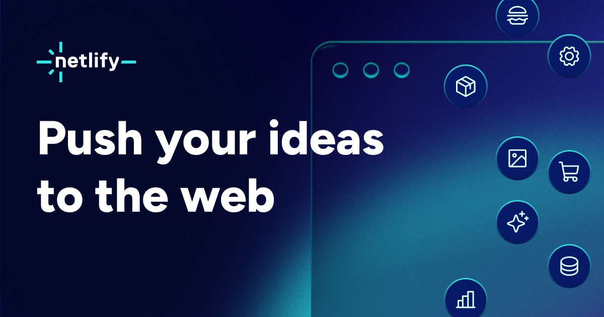
The guide shows no icon set. On the site: small solid glyph icons in currentColor (Blue 700 on light, Teal 200 on dark), north-east arrows after text links, Blue 700 check marks in feature lists; the OG image uses white line icons in dark circles.
Source: computed styles and CSS tokens (--ntl-*) on https://www.netlify.com/, headless Chromium 2026-11-17
The hand-drawn line and the mascot carry the values' "levity and joy" (p.7) into a technical product.

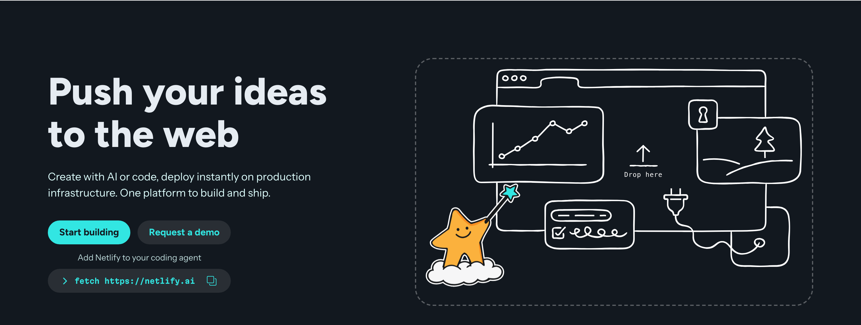

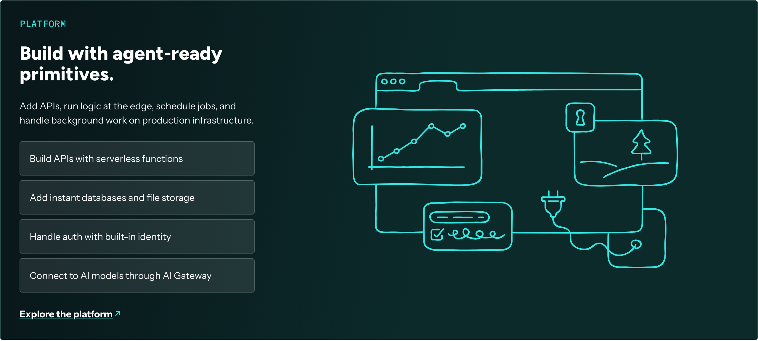
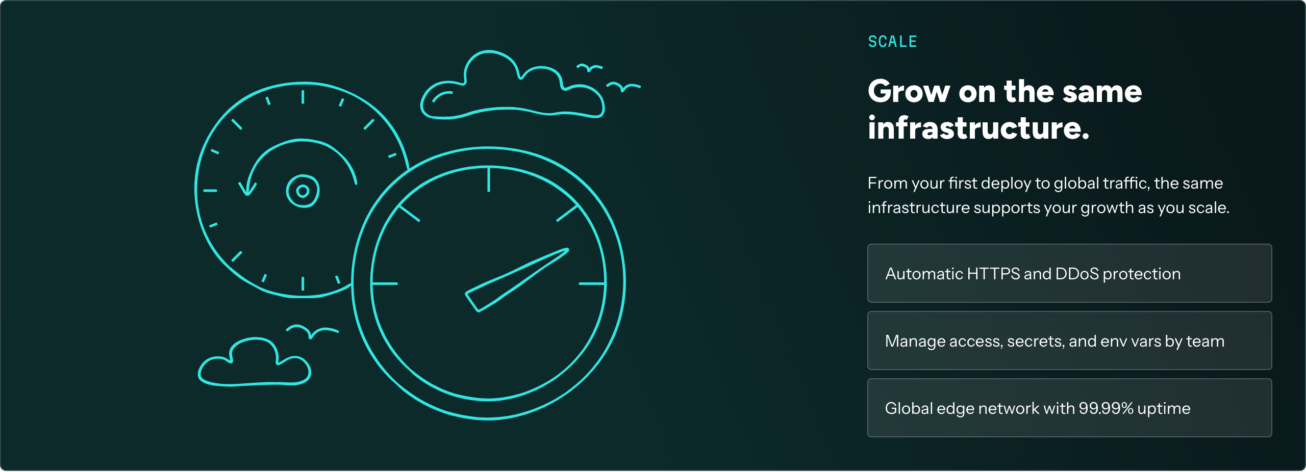
| Line colour | Teal 200 #32E6E2 or white |
|---|---|
| Stroke | single weight, hand-drawn wobble, rounded ends |
| Mascot | Gold 300/400 star, white cloud, Teal 200 star wand |
Two families. Guide: flat product-UI illustrations with small blue/teal/orange shapes on white (persona grid, p.22) and glowing UI-card compositions on dark (p.22). Site: hand-drawn wobbly line art (browser windows, charts, plugs, gauges, clouds) in white on #12181F in the hero, in Teal 200 on Teal 900 panels, plus a smiling Gold star mascot with a teal wand-star.
Source: guide.pdf p.7, p.21, p.22netlify.com/%20(switchback-1.svg,%20switchback-2.svg%20and%20switchback-3.svg%20from%20the%20site's%20images%20folder;%20the%20hero%20illustration%20is%20inline%20SVG%20in%20.n-page-hero-graphic)
Real people at real events support "Be Inclusive" and "Care deeply, and have fun".


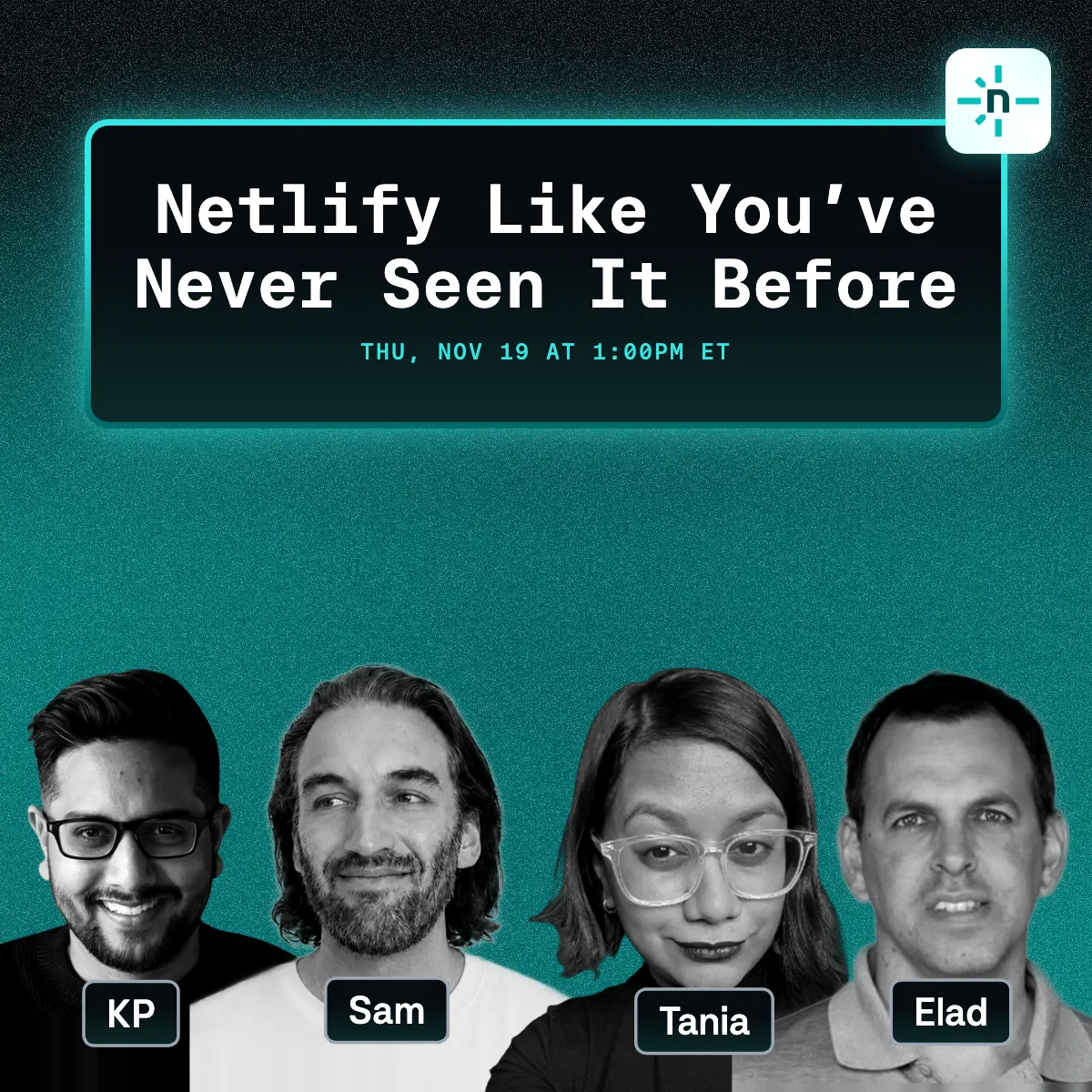
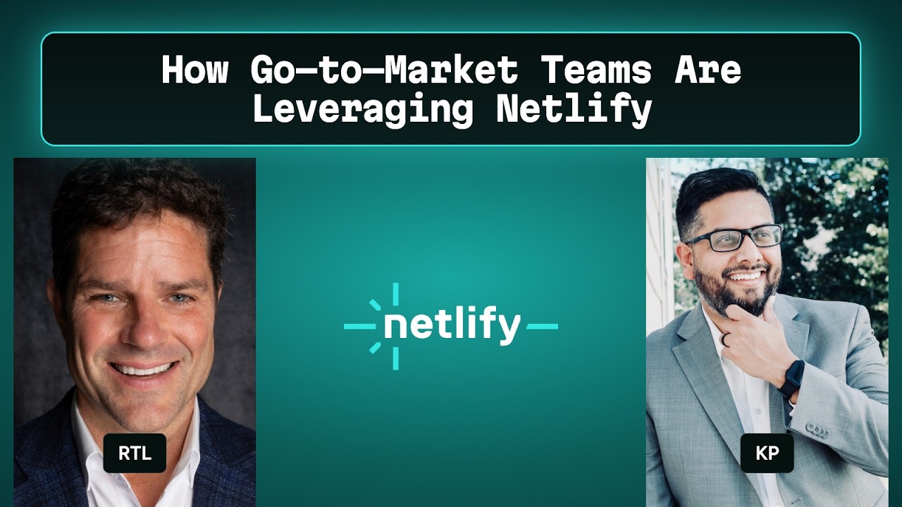
| Subject | People at developer events, candid |
|---|---|
| Treatment | Natural colour; headshots greyscale on promo cards (p.32) |
Photography appears only as examples. The guide's photos are candid, warm, shallow-depth-of-field event shots of developers talking and laughing (pp.14, 16), merch mockups (t-shirt, cap) and greyscale speaker headshots on a webinar card (p.32). The site's customer pages use customer logos on brand-colour tiles rather than photos.
Source: guide.pdf p.14, p.16, p.32
The guide's spreads put text left and figures right. Each has a wide left text column (label + paragraph + Resources buttons), figures right, mono captions; generous white space. Ideal Stack at 1440 with multi-column text past 65 characters. Site: 1280px content (--ntl-page-content-max-width 80rem) with 32px gutters, 96px section padding, centred heading blocks, 2-up cards, alternating text/illustration switchback panels.
Measured from guide.pdf p.10, p.11, p.12, p.13, p.14, p.15, p.16, p.17, p.18, p.20, p.21, p.22, p.23, p.24, p.26, p.27, p.28, p.29, p.30, p.31, p.32; computed styles and CSS tokens (--ntl-*) on https://www.netlify.com/, headless Chromium 2026-11-17's headless Chromium at 1440x900 and 390x844, page scrolled top to bottom, cookie banner and Ask Netlify widget ignored; y values are page coordinates at 1440 unless marked phone.
| Measure | Desktop | Phone |
|---|---|---|
| Page margin | 80px | 32px |
| Section padding | 96px | 96px |
| Hero text width | max 560px, centered | full width |
| Card gap | 24px | 24px |
| Navigation | 74px | 74px |
Hero H1 and every section H2 (Figtree 800, normal tracking, sentence case; #E6ECF2 on the #12181F hero, #181A1C on white)
Figtree · 64px (phone 40.82) · line 1.1 · weight 800
Testimonial pull quote (Figtree 700, Blue 700 curly quotes)
Figtree · 48px (phone 32.55) · line 1.1 · weight 700
Switchback and tab panel H3 (Figtree 800; white on the teal panels, #353A3E in the tab panel)
Figtree · 32px (phone 24.27) · line 1.1 · weight 800
Start-your-way card headline (Figtree 700 #181A1C)
Figtree · 32px (phone 24.27) · line 1.1 · weight 700
Stat value (Figtree 700 #181A1C, line-height 1)
Figtree · 32px (phone 24.27) · line 1 · weight 700
How-it-works step H3 (Figtree 700 #181A1C)
Figtree · 24px (phone 20.14) · line 1.1 · weight 700
Use-case tab label (Figtree 600)
Figtree · 18px · line 1.1 · weight 600
Nav and utility links (Figtree 600 #353A3E)
Figtree · 16px · line 1.5 · weight 600
Pill button label (Figtree 700, line-height 1)
Figtree · 16px · line 1 · weight 700
Lead under a heading (Instrument Sans 400; #353A3E on white, #DEFFFE on the hero)
Instrument Sans · 18px · line 1.5 · weight 400
Body, card text, list rows (Instrument Sans 400 #353A3E; white on teal panels)
Instrument Sans · 16px · line 1.5 · weight 400
Underlined action link (Instrument Sans 500 #353A3E, underline in Blue 700, 14px north-east arrow)
Instrument Sans · 16px · line 1.5 · weight 500
Announcement bar (600 #F6F6F7), footer links and legal (400 #545A61)
Instrument Sans · 14px · line 1.5 · weight 400
Footer column heading (Instrument Sans 800 #545A61)
Instrument Sans · 16px · line 1.5 · tracking -0.4px · weight 800
Section eyebrow (Martian Mono 400 uppercase; #2E51ED on white, #32E6E2 on teal panels) and testimonial attribution
Martian Mono · 14px · line 1.1 · weight 400
Code panel text and its uppercase heading strip (Martian Mono 400)
Martian Mono · 16px · line 1.5 · weight 400
CLI snippet in a card and the hero agent command (Martian Mono; 400 in the card, 700 at 12/12 in the hero pill)
Martian Mono · 12px · line 1.5 · weight 400
One or two sentences on what this does for the reader.
One or two sentences on what this does for the reader.
White card, 1px #E9EBED border, radius 6, padding 24, no shadow, no hover change. Inside: 24px Blue 700 icon, 30px gap, headline Figtree 32/35.2 w700, 24px gap, body 16/24, then the action link pinned to the card bottom.
How Netlify’s own landing pages are built, observed on headless Playwright (Chromium) computed styles of https://www.netlify.com/ at 1440x900 and 390x844 after full scroll, 2026-11-17; measure/home-desk.json, measure/home-phone.json; tmp/an/home-desk.json, tmp/an/home-phone.json, 2026-11-17. The full measurements are in spec.md.
Source: guide.pdf p.30, p.32, p.34computed styles and CSS tokens (--ntl-*) on https://www.netlify.com/, headless Chromium 2026-11-17



From the guide's own mockups and www.netlify.com. The guide shows banner ads, promo/webinar cards, cobrand cards, OG cards and merch; it publishes no format specs.
| Format | Loudness | Must appear | What varies |
|---|---|---|---|
| Landing page | White page under a sticky header (Blue 700 announcement bar + white nav, small full-colour logo, Teal 200 pill "Sign up"); a #12181F hero with a Figtree 800 64px head in #E6ECF2, Instrument Sans 18px #DEFFFE lead, Teal 200 pill primary and #292F35 secondary pill, and a white hand-drawn illustration with the gold star in a dashed frame; a scrolling black logo strip; mono eyebrow + Figtree 800 64px head blocks (left-aligned, one centred); hairline white cards with Blue 700 icons; Teal 900 gradient switchback panels with Teal 200 line art; a hanging-quote testimonial; tabs with a code panel; stats row; light footer. Full anatomy: kit.spec.page. | Hero illustration subject; number of switchbacks; whether a code panel appears. | |
| Display banner ad | Teal 900 ground, small full-colour dark logo top centre, white Figtree head ("Deploy a global scale website in minutes."), small Teal 200 "Get started" button. | Sizes from skyscraper to small square. | |
| Webinar / promo card | Deep blue or purple glow-gradient ground with corner dot grids; small white logo top left; one big white Figtree head, a smaller sub, short body; Teal 200 CTA; strong size contrast. | Speaker headshots (greyscale) and a mono pill tag such as "MODERN WEB SERIES". | |
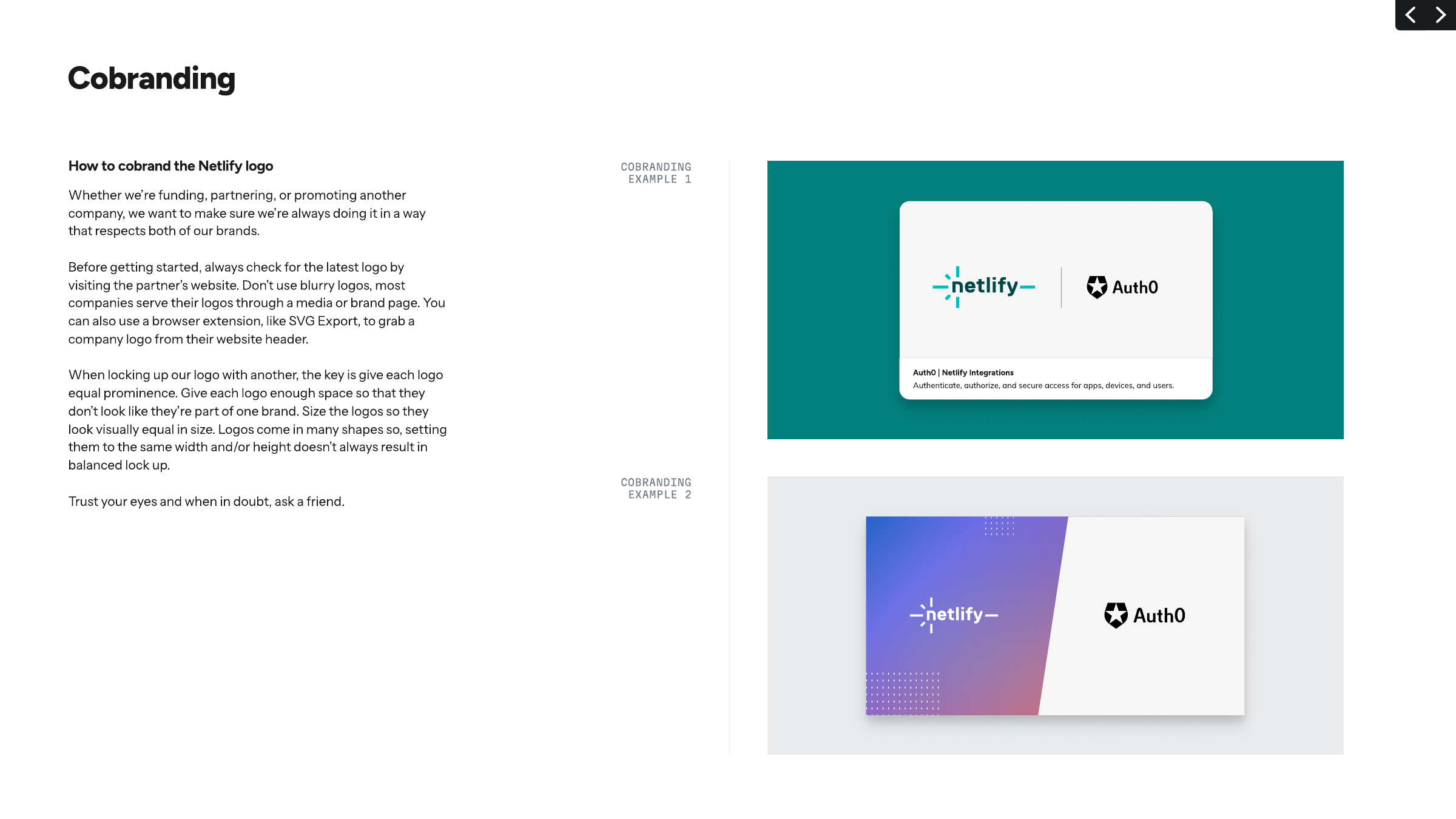
| Cobrand / integration card | Netlify logo and partner logo at equal optical size, separated by a thin vertical rule, on a white card; caption strip below. | Card on a Teal ground or split with a purple-blue gradient panel holding the white logo. | |
| Merch | Full logo large on t-shirts and banners; monogram on caps. | Garment colour, with the matching logo set. | |
| OG image | Dark navy-to-teal glow ground, white-type full-colour logo top left, two-line white Figtree head, product UI or icon tiles at right. | Headline. | |
| Social post | Product-news card: dark teal ground with a faint perspective grid and sparkles, a circled line icon top left, a Teal 100 "Changelog" pill top right, one two-line white headline starting "<Thing> is now ...", one or two plain lines under it, the monogram small bottom right. No people, no button. | Pill label and icon; headline words; sub of one or two lines; the 1920x1080 dark card (Announcement card, dark) is the same news at slide size. | |
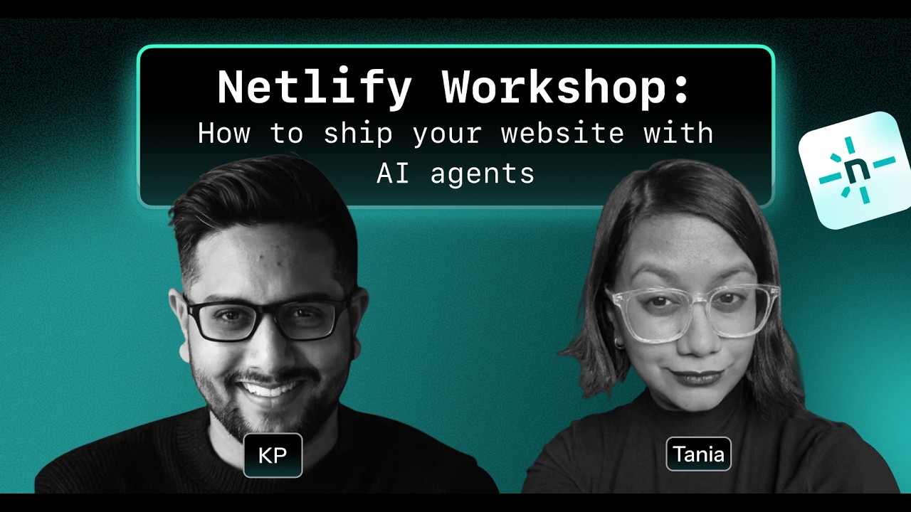
| Event post, square | Dark-to-teal gradient ground with grain, one black "terminal window" title box with a glowing Teal 200 border and Martian Mono bold type, the monogram on a light rounded tile at its top-right corner, the hosts as greyscale cutouts or ringed circles with small dark name tags. No button, no URL on the image. | People layout: 2 to 4 greyscale cutouts along the bottom edge, or ringed circles scattered under the box; one or two text lines in the box (date or subtitle).; HR-style variant: colour circles with teal rings instead of cutouts. | |
| Announcement card, dark | Near-black #181A1C ground, a mono teal caps eyebrow, a two-line white Figtree head, then 2 to 4 dark-teal cards in a row or 2x2 (first or last one teal-bordered), a mono teal URL bottom left and the wordmark bottom right. | Number of cards (2 to 4), card labels in mono caps, three big stat numbers for a customer story. | |
| Video thumbnail | Teal gradient ground, a black mono title box with a glowing teal border across the upper part, the hosts large below it (greyscale cutouts, or colour photos at the edges) with dark name tags, the monogram on a light tile at the title box's top-right corner. | Title one or two lines plus an optional subtitle in the box; one to six people; a guest portrait on each side with the wordmark between. |
Source: guide.pdf p.12, p.13, p.14, p.15, p.16, p.18, p.20, p.22, p.24, p.26, p.30
Your name and logo, Netlify’s system.
Talk about my brand Use this brand in Claude
Get your brand audit Put your brand in Claude What goes in a brand book
Each value is marked published, observed, our reading or our recipe, with its source. Checked 2026-11-17. Not affiliated with Netlify.
Tell us what you want to make. We’ll talk through how to put these ideas to work for your brand.