Explore
Exploring the unknown in air and space: missions to the Moon, Mars, Titan and beyond. Observed
Brand book
The picture is the brand. NASA keeps its interface almost colorless and square so that the most striking photographs anyone publishes do the work; the marks are protected by law, so the system is recognisable from the photographs, the bold sans and the red arrows alone. Our reading
which photographs, and how many card rows
Our engine's setting, built from their rules.
Cover the logo. It should still read as this system: photography in square cards under a black skrim, white Inter Bold, red arrow badges, caps mono labels.
No meatball, worm, seal, orbit, vector or star motif, and no lettering that resembles the Insignia typeface or the Worm.
No wording that implies NASA approval ("official NASA", "NASA approved").
If the page is colorful without its photos, remove color from the UI.
The United States civil space and aeronautics agency, showing the public what it is exploring right now. Our reading
Exploring the unknown in air and space: missions to the Moon, Mars, Titan and beyond. Observed
Technology and aeronautics research for the benefit of humanity. Observed
Sharing discovery with the public: daily imagery, open galleries, newsletters and live video. Observed
Journey to Titan
Explore the Universe from your Inbox
More Topics from NASA
The agency was created under the National Aeronautics and Space Act of 1958. Its Insignia ("meatball") was designed by NASA employee James Modarelli and adopted in 1959; the Logotype ("worm") by Richard Danne and Bruce Blackburn replaced it from 1976 to 1992, when the Insignia was reinstated as the official identifier.
Category. U.S. government agency for aeronautics and space (the agency name itself). Published
Not published.
NASA explores the unknown in air and space, innovates to benefit humanity and inspires the world through discovery (paraphrase of the footer mission line).
Explore the Universe from your Inbox Observed
NASA publishes no messaging framework. On nasa.gov the message is the work itself: a mission headline in the hero, then news, video, missions and imagery. The footer carries one mission line: explore, innovate, inspire.
Source: nasa.gov/%20(2026-10-30)nasa.gov/nasa-brand-center/advertising-guidelinesnasa.gov/nasa-brand-center
Wonder in one line, facts everywhere else keeps a government voice credible and still human.
PlainCuriousFactualInvitational
No voice guide is published. The homepage hero invites the reader directly ("your name can!"), while news and the footer stay third person and factual; labels are terse mono metadata.
NASA approvedofficial NASAgenuine NASAauthentic NASAtrusted by
Not published: a voice or tone guide.
Source: nasa.gov/%20(2026-10-30)nasa.gov/nasa-brand-center/images-and-medianasa.gov/nasa-brand-center/advertising-guidelines
The marks are described, not shown: see the Insignia, Logotype and violation images on NASA's brand guidelines page (https://www.nasa.gov/nasa-brand-center/brand-guidelines/). The NASA Insignia, Logotype and Seal are protected under 14 CFR 1221 and may not be used without NASA's permission. Not affiliated with NASA. This kit carries no NASA mark.
One protected mark with strict construction keeps a federal identifier unmistakable; the worm returns as a nostalgic supplement.
| Protected space | 1N from the sphere |
|---|---|
| Configuration clear space | 2N |
| Versions | full-color, one-color, one-color with white rule, mono-color with white rule |
| Minimum size | see the guide image (value not given in text) |
The Insignia ("meatball", James Modarelli, 1959; reinstated 1992) is NASA's official identifier and must appear on all agency publications. It has four versions: full-color, one-color, one-color with white rule, mono-color with white rule. The Logotype ("worm", Danne and Blackburn, 1975) is a supplemental graphic for large, bold uses, always with the Insignia nearby except on merchandise. The Seal is reserved for the Administrator.
Source: nasa.gov/nasa-brand-center/brand-guidelinesnasa.gov/nasa-brand-centernasa.gov/nasa-brand-center/merchandise-approvals
Featured News
Keeping the interface neutral lets mission photography be the color; the reds mark only the actions.
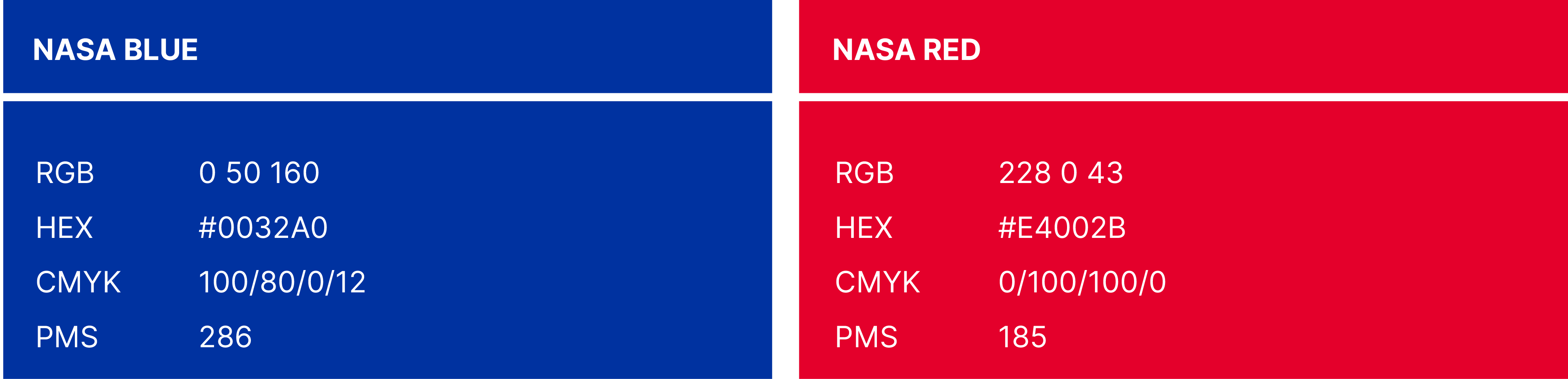
| NASA Blue | #0032A0 · RGB 0 50 160 · CMYK 100/80/0/12 · PMS 286 |
|---|---|
| NASA Red | #E4002B · RGB 228 0 43 · CMYK 0/100/100/0 · PMS 185 |
| Silver ground | PMS 877 (no hex published) |
| Site action reds | #D83933 button, #F64137 arrow badge (observed) |
The guide publishes two colors, both for the Insignia: NASA Blue #0032A0 (PMS 286) and NASA Red #E4002B (PMS 185), plus preferred grounds of white, black, grey or silver PMS 877. The website (Horizon Design System) is almost colorless: black, white, near-black #17171B and greys, with color supplied by photography and two UI reds, #D83933 for the solid button and #F64137 for arrow badges.
Not published: color proportions; a UI or web palette (the site colors are observed); a hex for PMS 877.
Source: nasa.gov/wp-content/uploads/2023/07/nasa-insignia-colorguide.pngnasa.gov/nasa-brand-center/brand-guidelinesnasa.gov/%20(2026-10-30)
Explore the Universe from your Inbox
Journey to Titan
NASA
Three open faces with clear jobs: a tall-x-height screen sans for hierarchy, a readable neutral body face, and a mono that makes numbers and labels feel technical.


| Their face | Use | License | Open stand-in |
|---|---|---|---|
| Inter | Display and headings (Horizon Design System) | SIL Open Font License 1.1 (Google Fonts) | Inter NASA publishes Inter itself as its web face; no stand-in needed. |
| Public Sans | Body copy | SIL Open Font License 1.1 (Google Fonts) | Public Sans Published web face. |
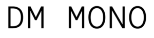
| DM Mono | Numbers and small labels | SIL Open Font License 1.1 (Google Fonts) | DM Mono Published web face. |
| Helvetica and Garamond | Print; Helvetica required for the identifier configuration and the web address | commercial (Linotype); not in this kit |
| Display | Inter 700 |
|---|---|
| Body | Public Sans 400 / 700 |
| Labels | DM Mono 500 uppercase, +3.5px |
| Helvetica, Garamond |
Print: Helvetica and Garamond are recommended; Helvetica is required for the identifier configuration and the web address. Digital: the Horizon Design System uses Inter for display and headings, Public Sans for body and DM Mono for numbers and small labels, all open Google Fonts. On nasa.gov, Inter 700 sets headings, Public Sans 400/700 sets body and news titles, DM Mono 500 uppercase with 3.5px tracking sets metadata.
Source: nasa.gov/nasa-brand-center/brand-guidelinesnasa.gov/%20(2026-10-30)
Journey to Titan
Photo under a black skrim · hero, news cards, mission and topic cards
Recently Published
Red arrow badge · every text link and card
4 MIN READ
Mono metadata · eyebrows, content types, read times, dates, counts
NASA Missions
Black and white rhythm · band order
Specimens use sample copy, not NASA’s.
The imagery is unmatched, so the system frames it and gets out of the way.
Without the logo, NASA's web pages read through four moves: full-bleed space and flight photography under a diagonal black skrim, white Inter Bold titles on the dark corner, a small red round arrow badge after every link, and tracked caps mono metadata. Bands alternate black, white and near-black.
Source: nasa.gov/%20(2026-10-30)nasa.gov/nasa-brand-center/brand-guidelines
Icons stay functional so photography carries the emotion.
Icons are small utility glyphs: a 20px red circle with a white arrow for links, 16px circled content-type icons, chevrons in menus and white social glyphs in 32px dark circles.
Not published: an icon grid, stroke or library.
Source: nasa.gov/%20(2026-10-30)
Primary-source imagery is the agency's strongest proof and needs no styling.
NASA's own mission imagery fills every slot: telescope images of nebulae, rovers, spacecraft, astronauts, aircraft and Earth. Photos are cropped to fill, never framed or rounded; captions credit NASA/Name.
Source: nasa.gov/nasa-brand-center/images-and-medianasa.gov/nasa-brand-center/advertising-guidelinesnasa.gov/%20(2026-10-30)
Motion is a control, not decoration.
The only motion on the homepage is the hero carousel: slides advance on a timer shown as a ring around a round thumbnail, with a pause button.
Not published: motion principles, durations or easing.
Source: nasa.gov/%20(2026-10-30)
A 1296px content width with 72px margins at 1440, 72px vertical padding on every band, 4-column card grids with 20px gaps and a 640px full-bleed hero. Phone stacks everything in one column with 24-40px gutters.
Measured from nasa.gov's NASA Brand Center guideline pages read 2026-10-30; the Insignia palette read from the published color guide image (https://www.nasa.gov/wp-content/uploads/2023/07/nasa-insignia-colorguide.png); homepage measured with computed styles at 1440 and 390 on 2026-10-30.
| Measure | Desktop | Phone |
|---|---|---|
| Page margin | 72px | 24px |
| Section padding | 72px | 72px |
| Hero text width | max 696px, centered | full width |
| Card gap | 16px | 16px |
| Navigation | 86px | 86px |
Hero H1
Inter · 72px (phone 35.2) · line 1.05 · weight 700
Subscription H2
Inter · 56px (phone 36) · line 1.1 · weight 700
Featured News H2 / feature story H2
Inter · 48px (phone 33.6) · line 0.95 · weight 700
Image Of The Day H2
Inter · 41px (phone 29) · line 0.95 · weight 700
Section H2 (NASA Missions, More NASA Images, More Topics)
Inter · 40px (phone 24) · line 1 · weight 700
Featured video H2
Inter · 36px (phone 29) · line 1.05 · weight 700
Topic card title
Inter · 29px (phone 22) · line 1.05 · weight 700
Header link (Recently Published, Discover More, Sign Up)
Inter · 22.4px · line 1 · weight 700
Nav item
Inter · 17.6px · line 1 · weight 600
Text link (Mission Overview, Learn More)
Inter · 16px · line 1 · weight 600
Footer link
Inter · 14.4px · line 1.2 · weight 400
News card title
Public Sans · 22px (phone 18) · line 1.05 · weight 700
Lead
Public Sans · 18px (phone 16) · line 1.25 · weight 700
Body
Public Sans · 16px (phone 14.4) · line 1.65 · weight 400
Small news title
Public Sans · 14px (phone 12) · line 1.25 · weight 700
Footer legal and meta
Public Sans · 14.4px · line 1.2 · weight 400
Mono label
DM Mono · 11.2px · line 1 · tracking 3.5px · weight 500
How NASA’s own landing pages are built, observed on nasa.gov, 2026-10-30. The full measurements are in spec.md.
Source: nasa.gov/%20(2026-10-30)
Participation turns a distant mission into a personal one with one action. Our reading
How our engine applies NASA's web system to each format. This is our recipe from their published rules and observed site, not something NASA publishes. Level = how much photography and red the format carries (0 plain, 5 full-bleed photo everywhere).
| Format | What they did | Source |
|---|---|---|
| vehicles | The Worm logotype on a bus, a bold application the guide shows. | nasa.gov/nasa-brand-center/brand-guidelines |
| architecture | The Insignia assembled on the exterior of a Langley Research Center building (Brand Center photo). | nasa.gov/nasa-brand-center |
| Format | Loudness | Must appear | What varies |
|---|---|---|---|
| Landing page | Build it the way nasa.gov is built (kit.spec.page): black nav with centred logo slot, 640px full-bleed photo hero under the 65.99deg black skrim with a 72px Inter Bold headline and one #D83933 button, black/white/#17171B bands with 72px padding, square photo cards, red arrow badges on every link, DM Mono metadata; the org's own logo, no NASA mark | which bands and how many cards | |
| Deck | Black or white slides, one full-bleed photo per section opener with the black skrim, Inter Bold titles, mono labels | charts in white and greys with red highlights | |
| Social post | Full-bleed photo, skrim, white Inter Bold line, mono label | crop | |
| Black header, white body, Public Sans text, one red button | one hero photo | ||
| Article page | White page, Inter Bold title, Public Sans body, mono meta line, credited photos | image count |
Source: nasa.gov/nasa-brand-center/brand-guidelinesnasa.gov/nasa-brand-centernasa.gov/nasa-brand-center/advertising-guidelinesnasa.gov/nasa-brand-center/images-and-medianasa.gov/nasa-brand-center/merchandise-approvals
Your name and logo, NASA’s system.
Use this kit for my brand Use this brand in Claude
Get your brand audit Put your brand in Claude What goes in a brand book
Each value is marked published, observed, our reading or our recipe, with its source. Checked 2026-10-30. Not affiliated with NASA.