Find the gaps
A ten-minute Skills Scan shows where AI skills gaps block productivity, before any training is chosen. Observed
Brand book
It mixes a cold-tech signal (aurora gradients, mono labels, acid lime) with warm, editorial and human cues (serif accent words, warm neutrals, crowds of real learners) to say AI adoption is a people problem, which is exactly its pitch: the layer between AI tools and people. Our reading

The gradient art: its hue mix (orange-violet, lime-violet, teal-green) and whether it fills a hero, a card or the frame behind a product screen.
Source: multiverse.iomultiverse.io/employers/case-studiesmultiverse.io/events-webinars
Our engine's setting, built from their rules.
#D6EE40 appears only on the primary CTA pill + square arrow tile (and carousel dots); no other accent fills.
Every major head is Saans/Instrument Sans 400 with a few words in the Ionic/Besley serif; never bold, never coloured.
Each section head has an uppercase mono eyebrow with the ring-square marker.
Grounds are #FFFFFF, #F8F5F1, #F0ECE1, #2E2C2A, #232220 or #1A1917; no cool greys or pure black fills.
Colour comes from the supplied grainy gradient files and warm candid photos, never flat CSS gradients or stock illustration.
Short sentence-case declaratives with periods, British spelling, AI adoption framed as a people problem; numbers only from the site.
The AI adoption layer between the AI tools an employer has bought and the people who use them: find the skills gaps, train in the flow of work with expert coaches, and prove the return. Observed
A ten-minute Skills Scan shows where AI skills gaps block productivity, before any training is chosen. Observed
Learning and coaching run inside the tools teams already use, so new skills land in real deliverables. Observed
Every learner gets a dedicated expert coach, backed by Atlas, the AI coach, inside their actual work. Observed
Adoption and return are reported per learner, team and organisation, not licences bought or attendance. Observed
Every team has AI. Few master it.
You bought AI. The productivity never showed up.
Tech should make humans smarter. Not the other way around.
Humans first, in the AI era.
Multiverse made its name proving apprenticeships could transform careers inside big companies; that engine now underpins the AI Adoption Layer between human intelligence and tech progress.
Category. AI adoption / workforce upskilling platform (apprenticeships, coaching, Mastry platform) Observed
Strategy consultanciesSoftware vendors
Multiverse is the upskilling platform for AI and tech adoption. Multiverse has partnered with over 1,500 companies to deliver a new kind of learning that’s transforming the workforce through tech skills.
Every team has AI. Few master it. Observed
Multiverse is the AI Adoption Layer Observed
The missing layer between the AI tools you’ve invested in and the people who bring them to life. Observed
Tech should make humans smarter. Not the other way around. Observed
The layer where AI ambition becomes AI adoption Observed
AI adoption starts with a skills scan Observed
Ten minutes to see the gaps. One demo to see how we close them. Observed
Humans first, in the AI era. Observed
Equip the workforce to win in the AI era Observed
Introducing Mastry: go from AI ambition to AI adoption → Observed
Winners and watchers. An AI divide is emerging.
We measure adoption, not attendance.
Building your AI-ready engineering team
The Levy: what’s changing & myths busted
Every team has AI. Few master it.
Unlock the Power of AI Across Your Enterprise!
We measure adoption, not attendance.
We measure adoption, not attendance. We measure impact, not activity. We measure outcomes, not inputs.
Unlock the power of AI with our revolutionary upskilling platform!
Every team has AI. Few master it.
Track training completions and attendance across your organisation.
We measure adoption, not attendance.
Our AI-powered learning solutions drive digital transformation at scale.
You bought AI. The productivity never showed up.
plainspokenconfidenthuman-firstpunchy
AI Adoption LayerAI adoptionskills gapsin the flow of workyour peoplemeasurable outcomesupskillcapabilityworkforce
Source: multiverse.iomultiverse.io/about/our-missionmultiverse.io/employers/how-it-works
Source: multiverse.iomultiverse.io/about/our-missionmultiverse.io/employers/how-it-worksmultiverse.io/events-webinarsmultiverse.io/resources/ebooks-guides




The live site uses the wordmark in ink or white only; the ultra-blue files still sit in the press-page media kit.
One flat colour, ink or white, and never boxed.
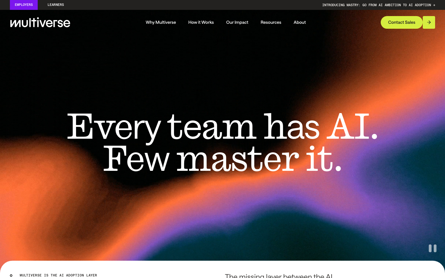
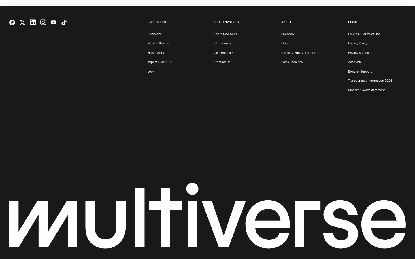
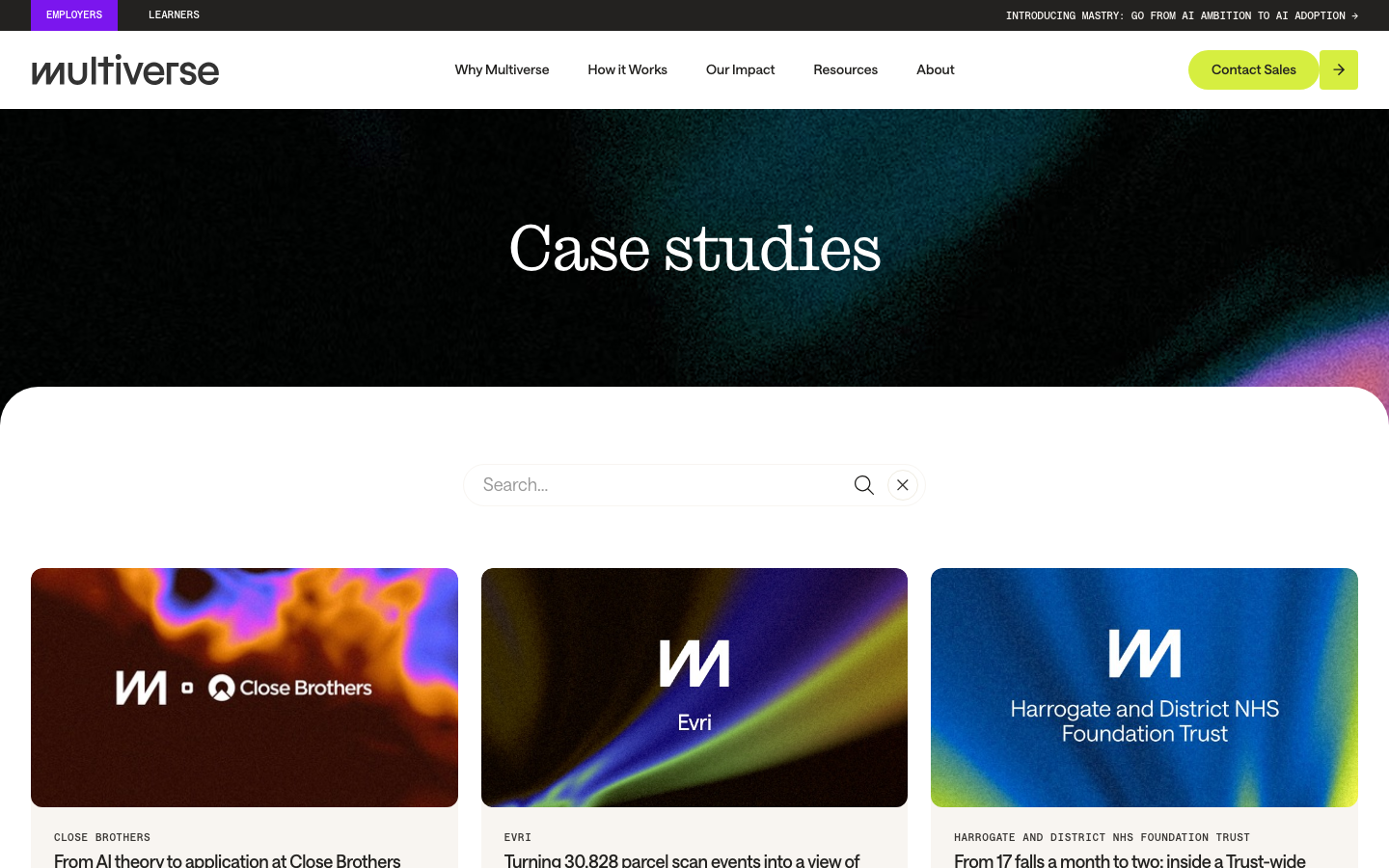


One flat colour, ink or white, and never boxed. The lowercase wordmark with its slanted zigzag m sits 197x32 at 32px from the left in the nav: white over the dark hero and gradient art, ink #232220 on white inner-page navs. The footer repeats it at the full 1376px content width. The m alone is the favicon, the product-UI badge and the mark beside customer logos on case-study art. The media kit (linked from the press page) still ships an ultra-blue #4A5FF7 wordmark and a hexagon symbol that the site no longer uses; no clear-space or minimum-size rule is published.
Source: multiverse.iomultiverse.io/employers/case-studiesmultiverse.io/about/press-mediadrive.google.com/drive/folders/1www-ZqfjRPakLi-UzP7ydEjS-62nAoKfmultiverse.io/events-webinars
The layer where AI ambition becomes AI adoption
Warm neutrals do the work and lime is the only accent.
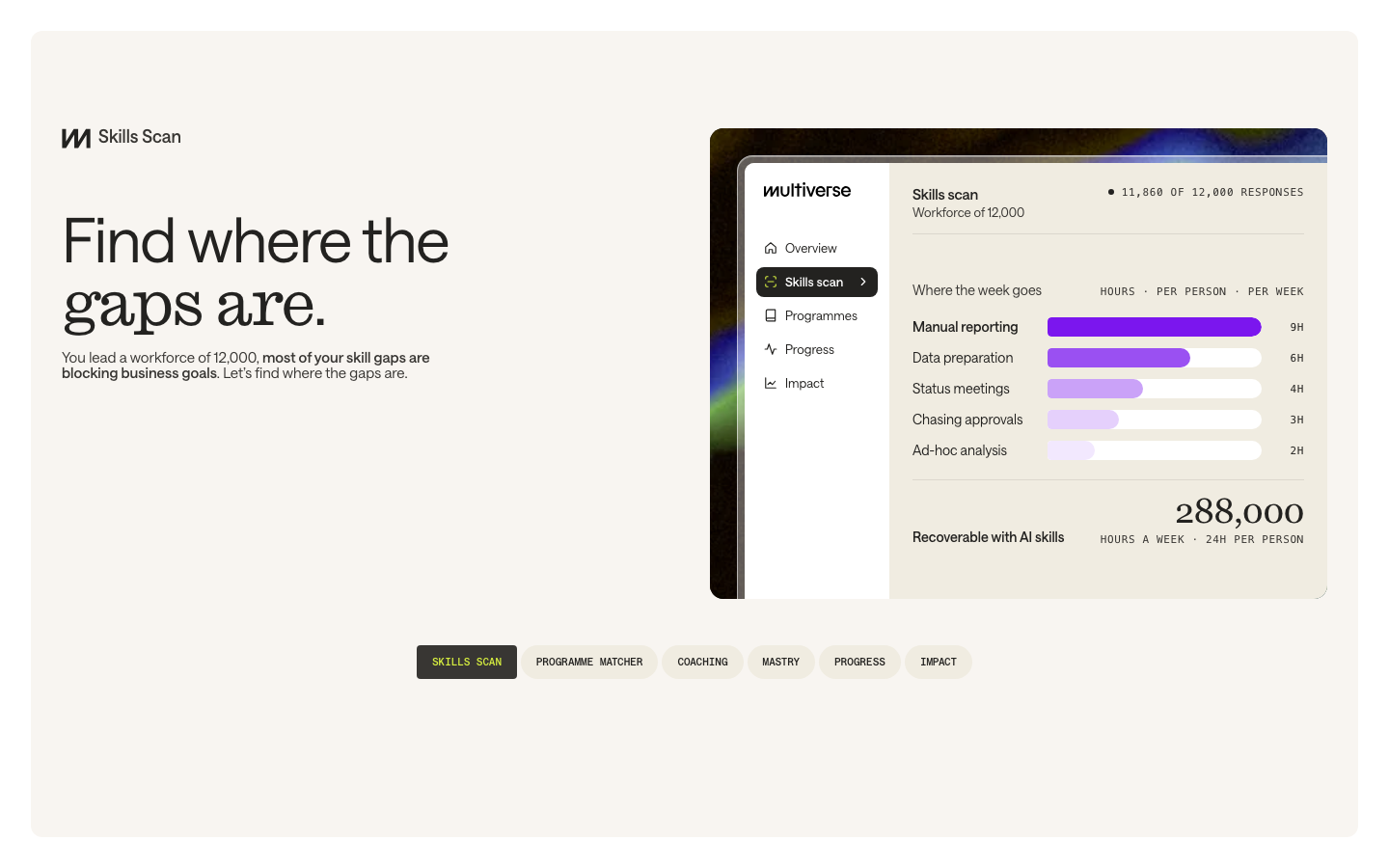

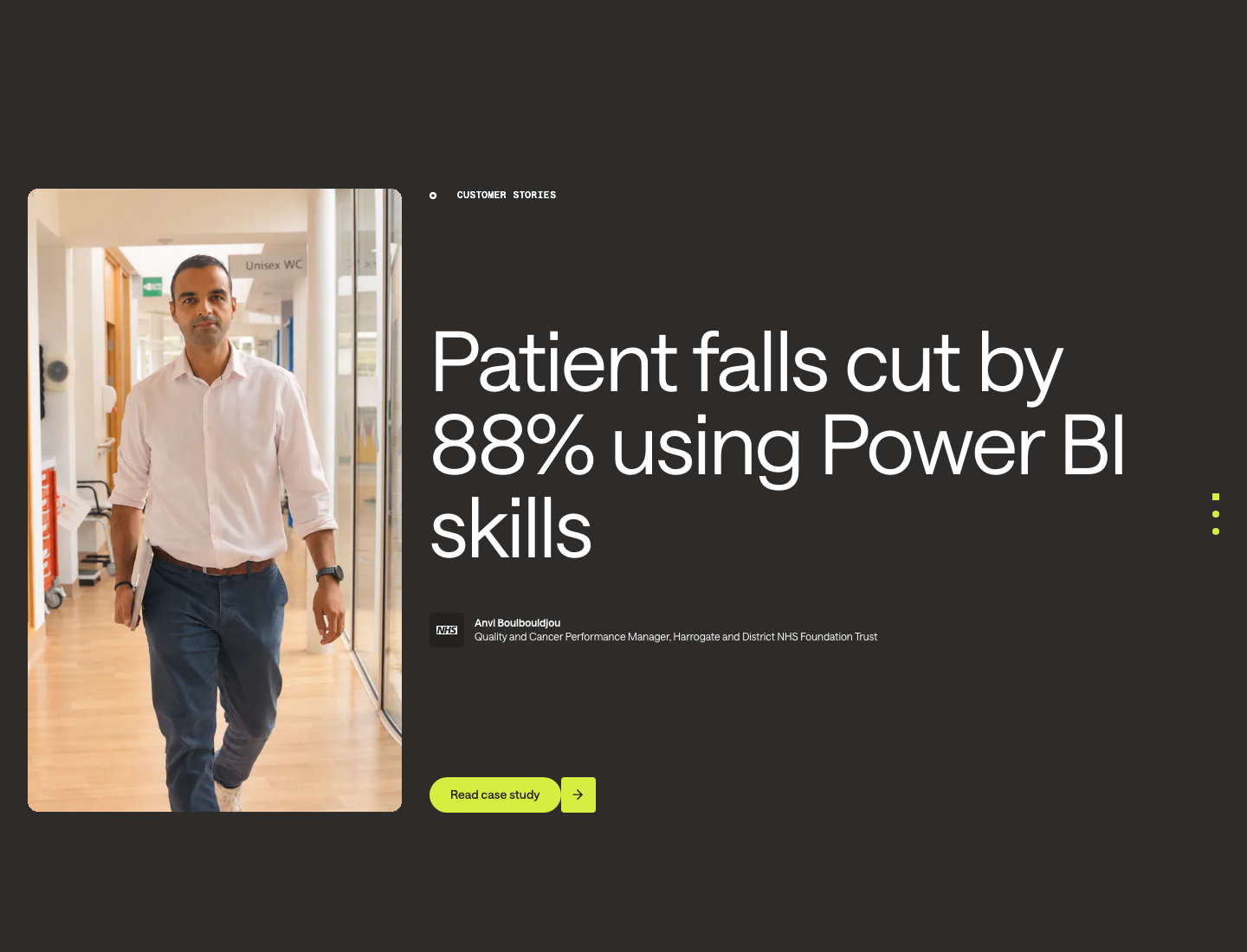
Warm neutrals do the work and lime is the only accent. White, warm white #F8F5F1 and parchment #F0ECE1 carry the light bands; #232220 ink, #2E2C2A charcoal and #1A1917 footer black carry the dark ones; body copy is #383633. Lime #D6EE40 appears only on the primary pill and its arrow tile, carousel dots, active chip text and the phone menu tile. Violet #7B16EE marks only the active EMPLOYERS tab. Every other colour on the page arrives through grainy aurora gradients and warm photography.
Source: multiverse.iomultiverse.io/about/our-missionmultiverse.io/employers/case-studies
Every team has AI. Few master it.
One grotesk does everything, and a serif takes a few chosen words.

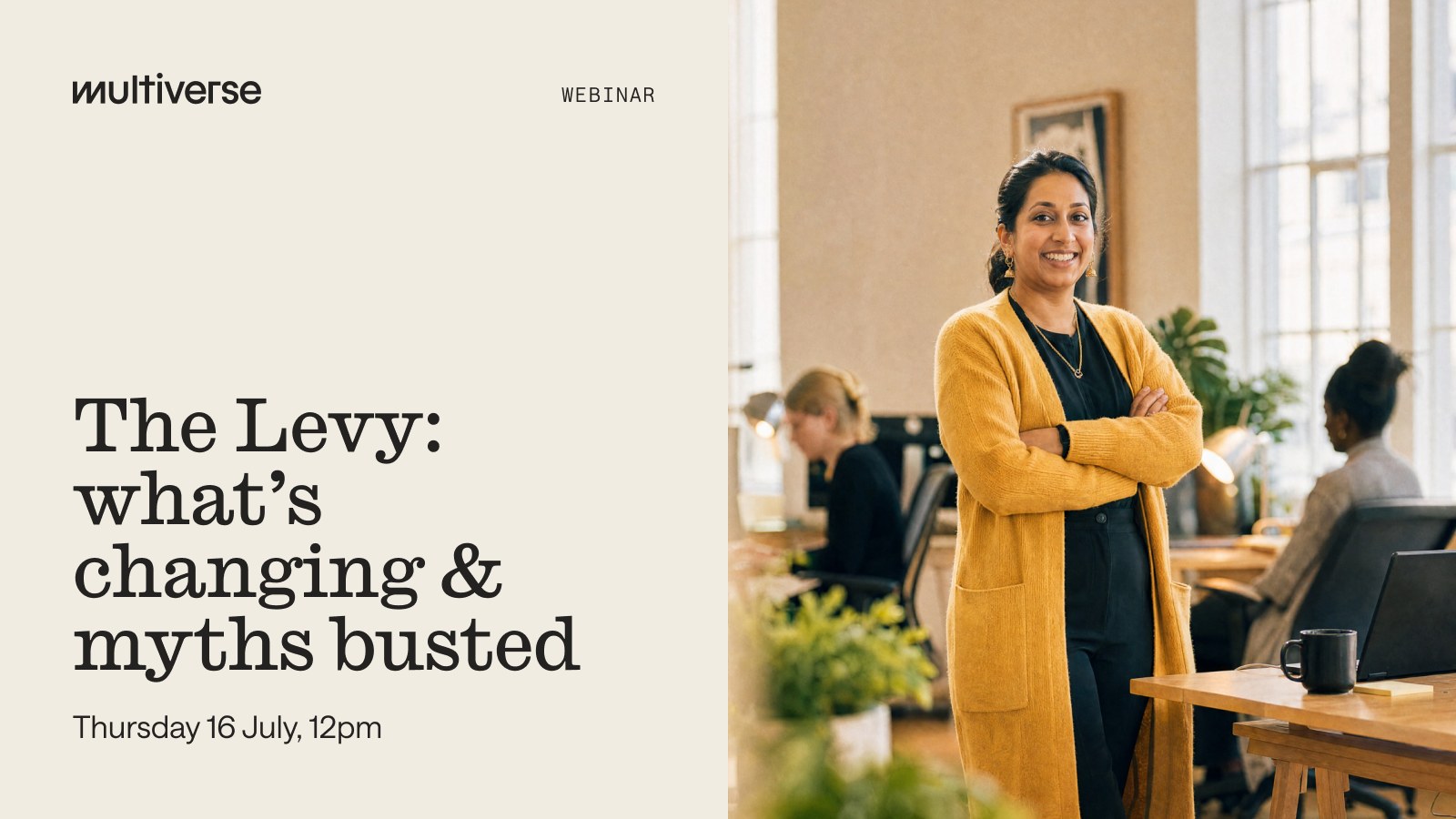
One grotesk does everything, and a serif takes a few chosen words. Saans 400 sets heads (112 hero, 96 stats, 64 sections, 48 cards; -0.02em; line-height 0.9 to 1.0) and body (24/18/15). Caslon Ionic Light replaces the last two or three words of most heads at the same size. Saans Mono 500 at 11px uppercase sets eyebrows, tabs and labels. Webinar and event cards set the whole title in Caslon Ionic; report covers use Saans. Open stand-ins: Instrument Sans, Besley and Chivo Mono.
| Their face | Use | License | Open stand-in |
|---|---|---|---|
| Saans | Commercial (Displaay); not open | Instrument Sans Commercial face; Instrument Sans was the closest of 18 open grotesks by rendered width, x-height and ink. | |
| Saans | Commercial (Displaay) | Instrument Sans Same face as display. | |
| Saans Mono | Commercial (Displaay) | Chivo Mono Closest of 14 open monos. | |
| Caslon Ionic | Commercial (Commercial Type) | Besley Open Clarendon with matching x-height and colour. |
Source: multiverse.iomultiverse.io/events-webinarsmultiverse.io/resources/ebooks-guides
Do Head set in Saans 400 (stand-in Instrument Sans) with chosen words in Caslon Ionic Light (stand-in Besley 400) at the same size and tracking, sentence case, period at the end. Home H1 112/100.8 white, centred, mixes letter by letter. Section heads 64/64 ink, left-aligned; the serif usually takes the last two or three words (gaps are / of the future / within a year).
Heads that switch faces mid-line · Every H1/H2 on home, about, why and how pages
Do Soft blurred bands of orange, violet, teal and lime-green on black or deep brown, with visible film grain; full-bleed in heroes (852px desktop), 12px-radius cards elsewhere. Use the supplied files: gradient-hero.jpg, gradient-cta.jpg, gradient-impact-hub.webp, gradient-workforce-2030.webp.
Grainy aurora gradients · Home hero video, closing CTA band, update cards, case-study covers, frames behind every product UI screenshot
Do #D6EE40 pill radius 100px, padding 12px 24px, Saans 14 w500 #232220, 41px tall; directly right of it a 40x41 #D6EE40 tile, radius 4px, with an ink 11px arrow (icon-arrow-right-ink.svg). Lime appears nowhere else as a fill except carousel dots and the phone menu tile.
Lime pill plus square arrow tile · Nav Contact Sales, Read case study, About Us (on dark), Book a demo, Load more
Do Saans Mono 11/15.4 w500 uppercase, 0.06em tracking, ink (white on dark), preceded by an 8px marker: a filled circle with a square cut out (icon-eyebrow-marker-ink.svg), 24px gap. Often sits at the top-left of a two-column band while the head sits low on the right.
Mono eyebrow with ring-square marker · Above every section head (THE ADOPTION GAP, WHAT WE DO, CUSTOMER STORIES, UPDATES)
Do White #FFFFFF alternating with warm off-white #F8F5F1, parchment #F0ECE1, charcoal #2E2C2A and ink #232220 bands; footer #1A1917 with the wordmark spanning the full 1376px content width at the bottom.
Warm neutrals, not grey · Every page
Do The band after a dark or gradient hero starts 40px early: a 40px-tall #FFFFFF strip with 40px top corners (rendered; CSS declares 80px on the 40px strip) so it curves up over the hero.
Light band rising over the dark hero · Home, customers and press heroes
Specimens use sample copy, not Multiverse’s.
A handful of small, exact parts recur on every page.
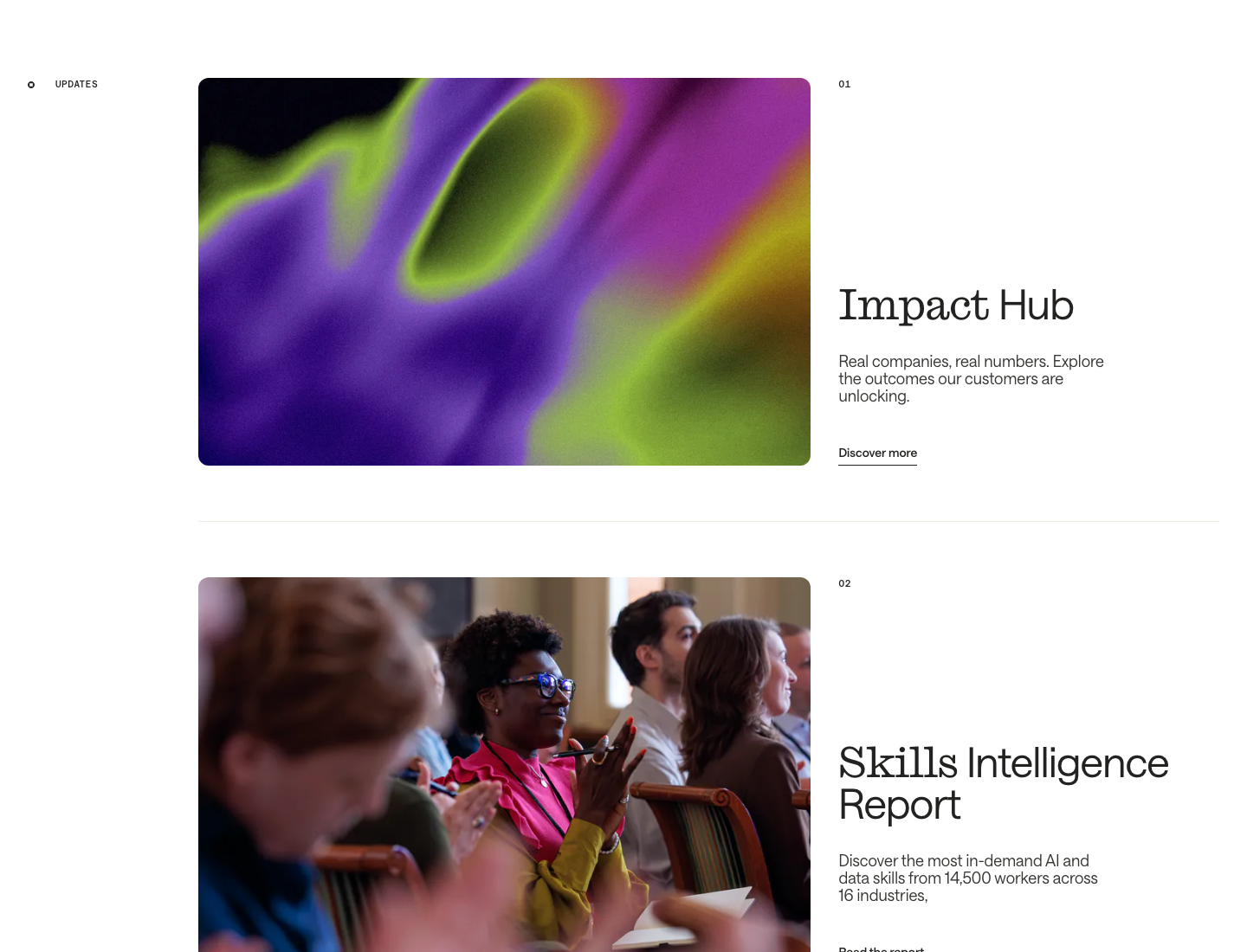
A handful of small, exact parts recur on every page. The ring-square eyebrow marker; the lime pill with its square arrow tile; underlined text links on a 1px rule; mono tab pills (parchment, active ink with lime text); a pager of three dots where the active one is square; 01/02/03 mono row numbers; a white band with rounded top corners that rises over the hero; a scrolling logo marquee; the full-width footer wordmark.
Icons are rare, thin and single-colour.


Icons are rare, thin and single-colour. The interface uses an 11px solid arrow (in the lime tile), 1.2px round-cap chevrons, the 8px ring-square eyebrow marker, a search magnifier and white social glyphs in the footer, all in the text colour. The programmes page adds lime shape glyphs whose count marks the apprenticeship level. Product UI carries its own thin outline icons.
Source: multiverse.iomultiverse.io/employers/programmesmultiverse.io/about/press-media
The homepage uses no drawn illustration; its art is grainy aurora gradient.
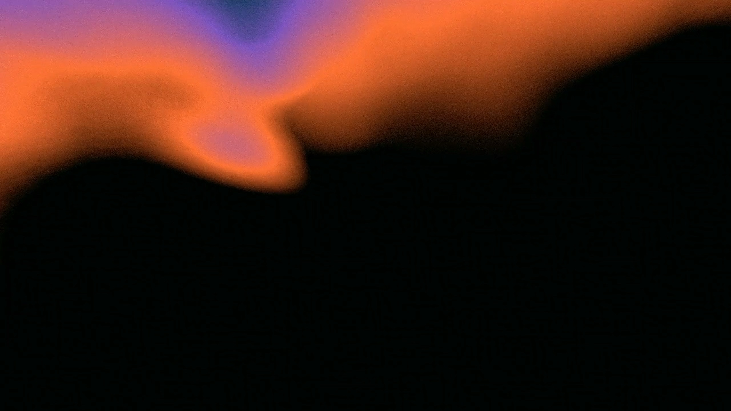
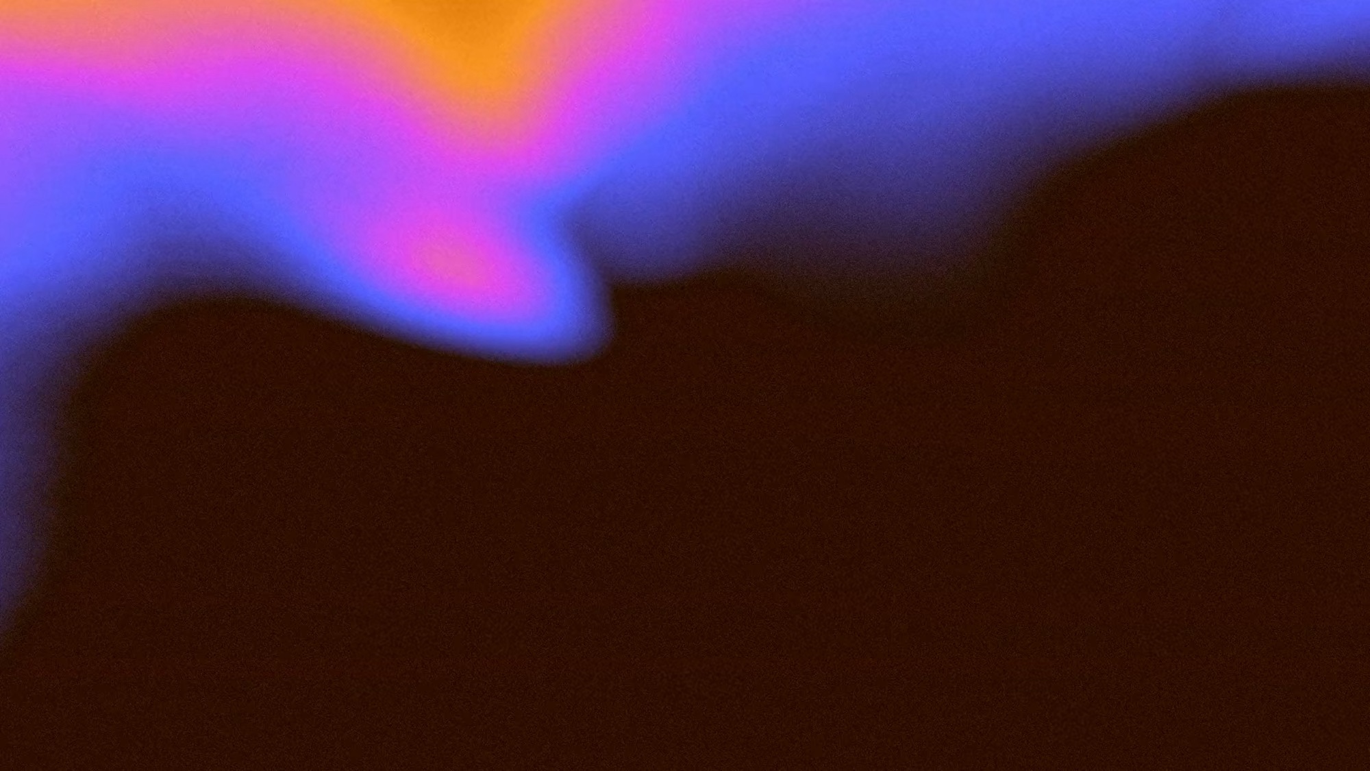
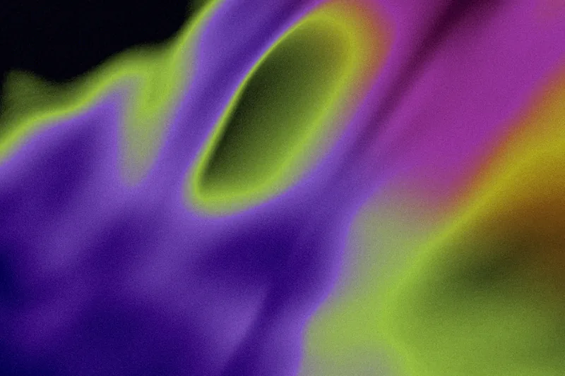
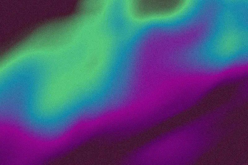
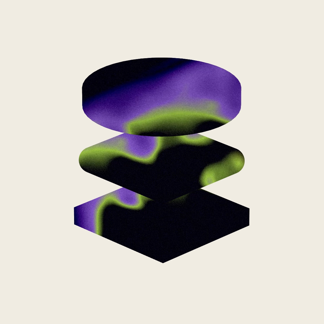
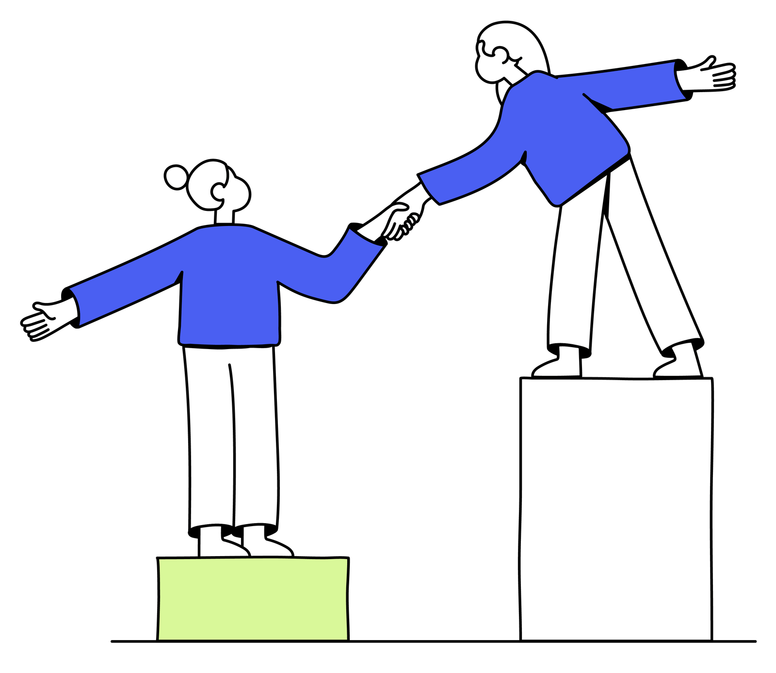

The homepage uses no drawn illustration; its art is grainy aurora gradient. Blurred bands of orange, violet, teal and lime on black or brown fill the hero, the closing band, update cards and the frames behind every product screen, plus one 3D stack of slabs cut from the same gradient. Secondary pages (careers, learning science, the levy guide, press) keep an older line-art family: black-outline hands and figures with ultra-blue #4A5FF7 sleeves and pale lime fills, on white, lilac or blue tiles, in the media kit’s blue.
Source: multiverse.iomultiverse.io/about/our-missionmultiverse.io/careers/mobility-and-inclusionmultiverse.io/about/learning-sciencemultiverse.io/employers/the-apprenticeship-levy
Candid, warm photographs of real people at work.



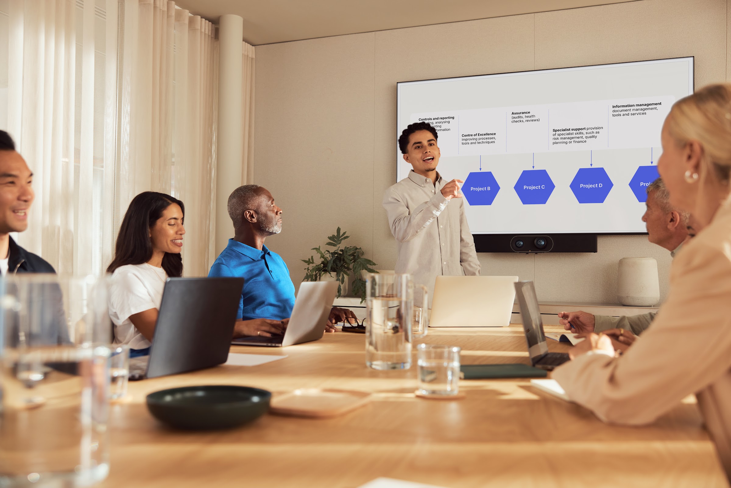

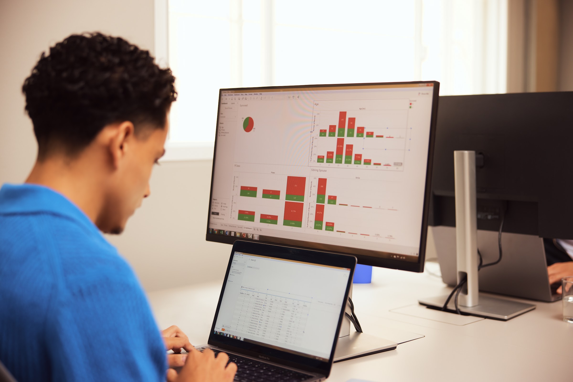
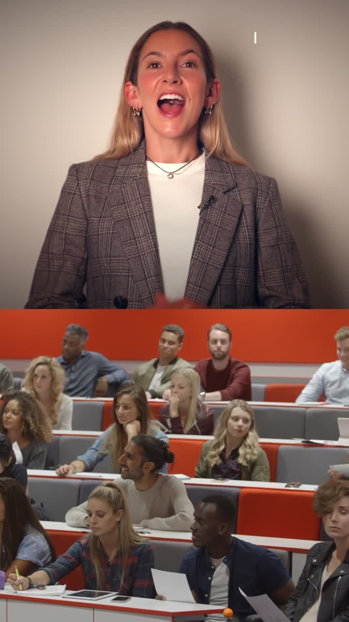
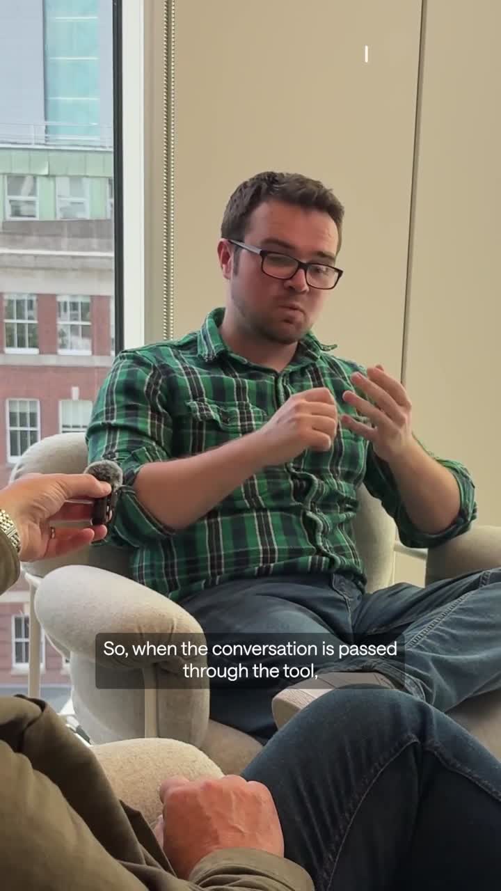
Candid, warm photographs of real people at work. Dense crowds of smiling young professionals, NHS staff in scrubs, teams around laptops on sofas and in meeting rooms: warm grade, soft daylight, diverse casts, nobody posing to camera except leadership headshots and webinar speakers. Photos sit as 12px-radius cards beside text, tall portrait crops in the results and story stacks, and full-bleed crowds on About. They are never darkened or tinted.
Source: multiverse.iomultiverse.io/about/our-missionmultiverse.io/events-webinarsdrive.google.com/drive/folders/1www-ZqfjRPakLi-UzP7ydEjS-62nAoKf
Two-column bands on a 1440 grid, with the eyebrow high and the head low. Max width 1440px with 32px side margins (16px phone) and a 32px column gap; breakpoints 991, 767 and 479. In each band the mono eyebrow sits top-left, the head sits low in its column and a 12px-radius media card fills the other side. 128px spacer bands separate sections. A full-bleed 852px gradient hero with a centred H1 is followed by a white band that curves up over it, under a 32px mono type-switch bar and an 81px nav.
Measured from multiverse.io's .
| Measure | Desktop | Phone |
|---|---|---|
| Page margin | 32px | 16px |
| Section padding | 128px | 80px |
| Navigation | 113px | 113px |
Home hero H1 (mixed sans/serif letters)
Saans · 112px (phone 56) · line 0.9 · tracking -2.24px · weight 400
Section head (mixed, serif on the last words)
Saans · 64px (phone 36) · line 1 · tracking -1.28px · weight 400
Results stat / story head
Saans · 96px (phone 44) · line 1 · tracking -1.92px · weight 400
Updates row head
Saans · 48px (phone 28) · line 1 · tracking -0.96px · weight 400
Mega-menu title
Saans · 32px (phone 24) · line 1 · tracking -0.64px · weight 400
Mega feature card head
Saans · 18px · line 1 · tracking -0.36px · weight 500
Statement lead
Saans · 24px (phone 20) · line 1.1 · weight 400
Section paragraph
Saans · 18px · line 1.1 · weight 400
Carousel / demo paragraph
Saans · 15px (phone 16) · line 1.1 · weight 400
Product label (Skills Scan)
Saans · 18px · line 1.1 · weight 500
Nav link
Saans · 14px (phone 16) · line 1.18 · weight 500
Button label
Saans · 14px (phone 13) · line 1.18 · weight 500
Text link label (1px underline)
Saans · 14px (phone 13) · line 0.9 · weight 500
Story attribution name / role
Saans · 12px (phone 10) · line 1.375 · weight 600
Mega-menu description
Saans · 12px (phone 10) · line 1.1 · weight 400
Mono eyebrow, uppercase caps
Saans Mono · 11px · line 1.4 · tracking 0.66px · weight 500
Tab chip / top-bar tab, uppercase caps
Saans Mono · 11px · line 1.4 · weight 500
Footer column label, uppercase caps
Saans Mono · 11px · line 1.4 · tracking 0.66px · weight 500
Footer link (fine print)
Saans · 11px · line 1.5 · weight 400
How Multiverse’s own landing pages are built, observed on multiverse.io, 2026-11-17. The full measurements are in spec.md.
Source: multiverse.iomultiverse.io/about/our-missionmultiverse.io/employers/case-studies
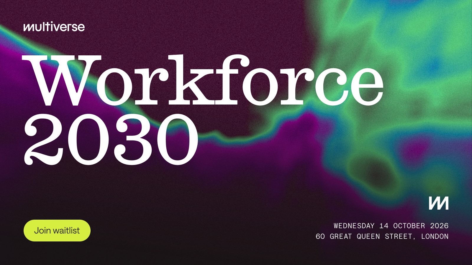
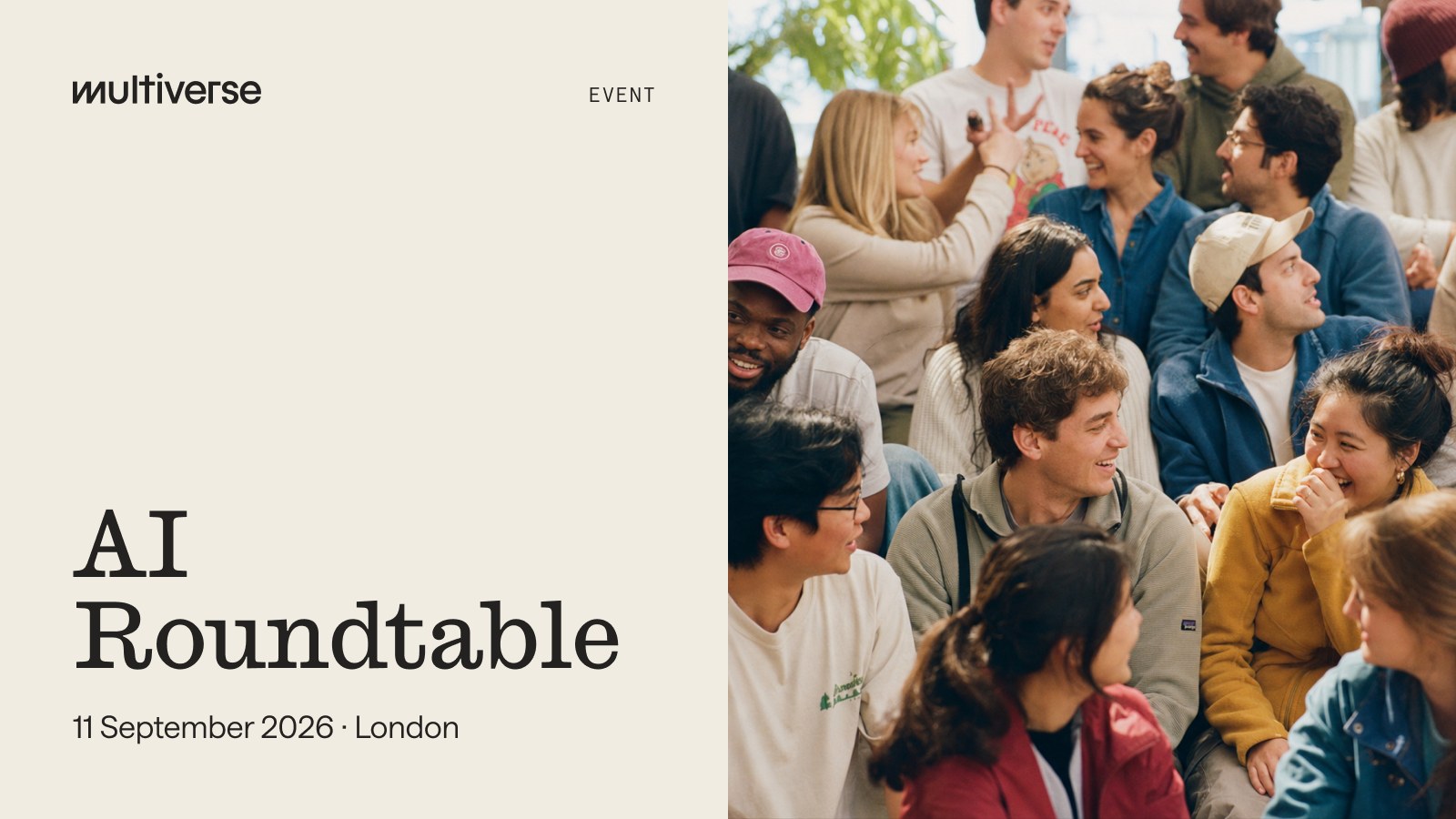
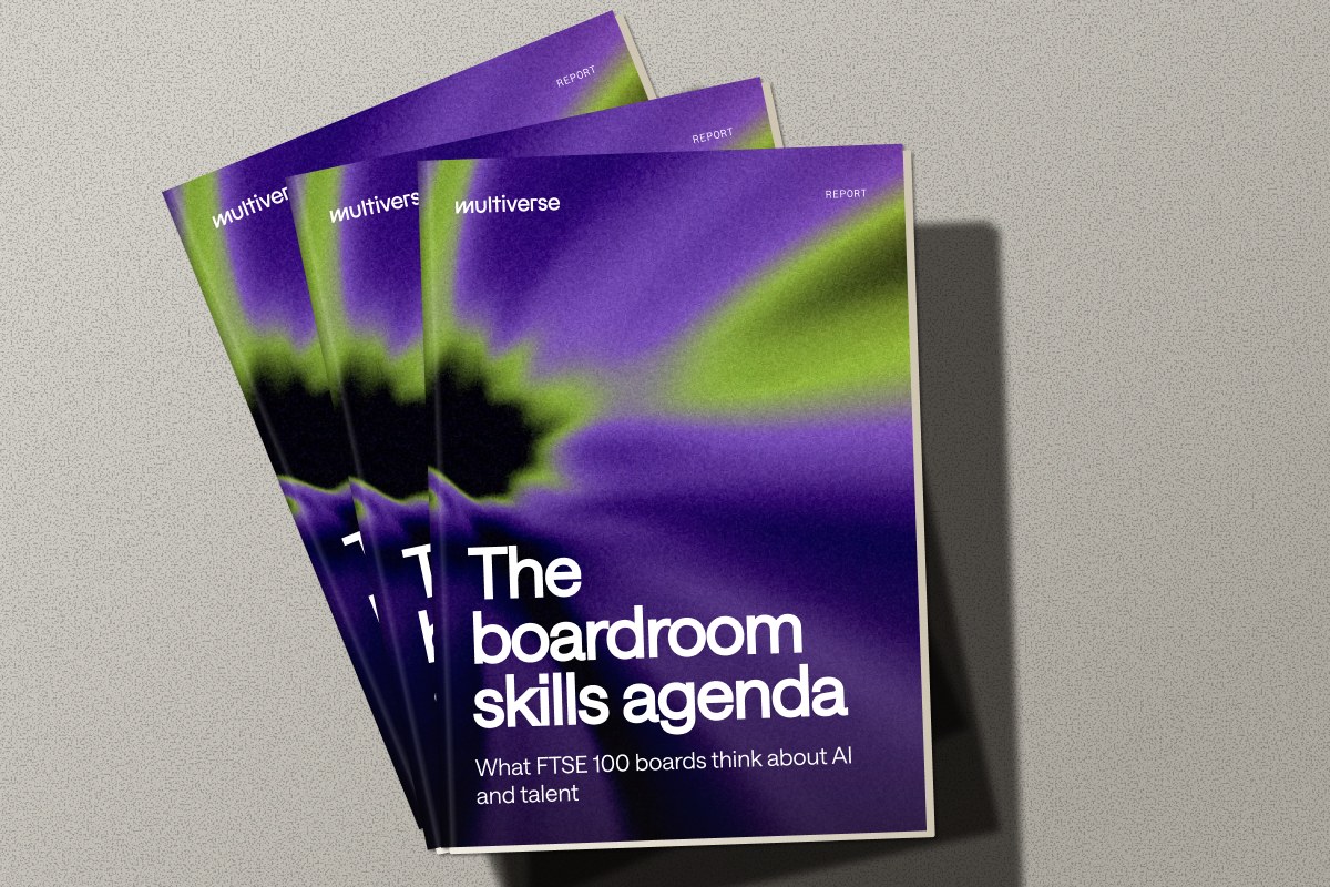
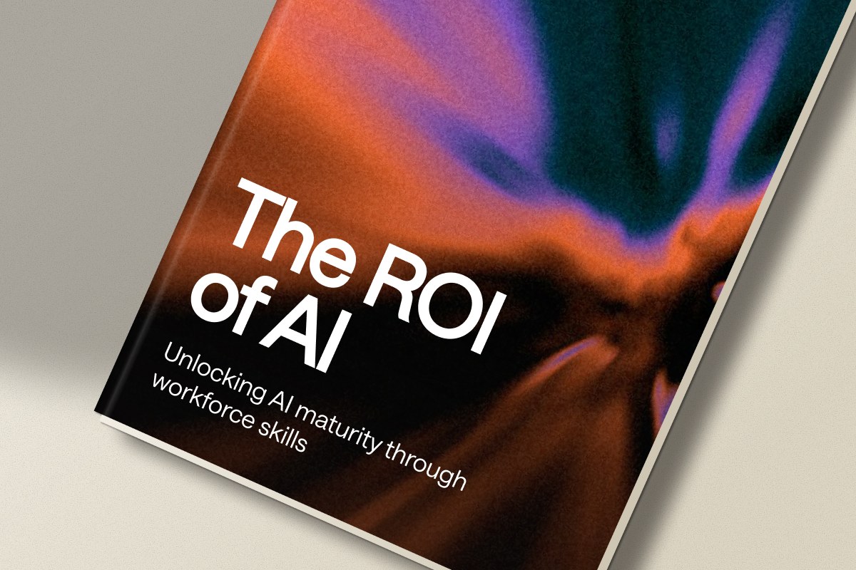


Formats are observed on the site and its share, event, report and video pieces (17 measured, 2026-11-17). Social posts and ads were not reachable (Instagram and X walled to headless clients, Meta ad withheld, LinkedIn not opened, no Google or TikTok ads), so the Social post row is derived from the closest observed family. Deck and Email rows are left out.
| Format | Loudness | Must appear | What varies |
|---|---|---|---|
| Landing page | Mixed Saans/Ionic head, lime pill + arrow tile, mono eyebrow with ring-square, warm neutral bands, grainy gradient art | Gradient hue and where it sits (hero, card, UI frame) | |
| Social post | Full-bleed grainy aurora gradient, white type only, wordmark or mixed-face head, nothing else | Gradient hue family (orange-violet, violet-lime, green-red, green-magenta); brand card vs headline post. Closest observed family (no organic posts or offer ads reachable): the 16:9 event splash, full-bleed aurora gradient with the white Caslon Ionic title large and left, wordmark top-left, mono date line, no photo; its title is the only headline voice seen outside the homepage. | |
| Webinar card (series) | Cream left half, wordmark top-left, mono label top-right, Caslon Ionic title lower-left, one date line, one colour photo of a person right half | Which person photo; title length (2 to 4 lines); label WEBINAR or EVENT | |
| Event splash | Full-bleed grainy aurora gradient, white Caslon Ionic title large and left, wordmark top-left, mono date line | Hue family (violet-teal-green, green-brown); lime pill button present or absent; where the date block sits | |
| Report cover card | Hardback mockup tilted on a flat grey or cream surface with a soft shadow, cover carries wordmark, mono type label, big Saans title and a one-line subtitle | Cover family: aurora gradient or cream with a rounded colour photo; one cover or a fan of 2 to 3 | |
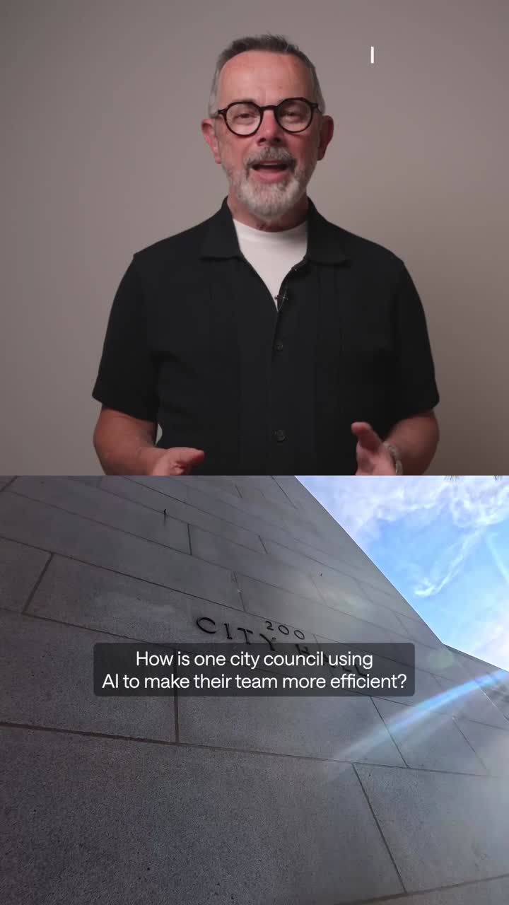
| Video thumbnail | Ultra-blue field or a studio photo of one person; a short Saans title, a lime or white second line; the wordmark or m monogram | Family: ultra-blue title card (lime hexagons) or person photo with a label card or name slab | |
| Link share card | Full-bleed grainy aurora gradient, white wordmark spanning the full width at the bottom, nothing else | Hue family |
Source: multiverse.io/about/press-mediadrive.google.com/drive/folders/1www-ZqfjRPakLi-UzP7ydEjS-62nAoKfmultiverse.iomultiverse.io/about/our-missionmultiverse.io/events-webinarsmultiverse.io/resources/ebooks-guides
Your name and logo, Multiverse’s system.
Talk about my brand Use this brand in Claude
Get your brand audit Put your brand in Claude What goes in a brand book
Each value is marked published, observed, our reading or our recipe, with its source. Checked 2026-11-17. Not affiliated with Multiverse.
Tell us what you want to make. We’ll talk through how to put these ideas to work for your brand.