Inference
Accelerating inference from endpoint to engine Observed
Brand book
Modal looks like a well-made developer tool at night: dark, quiet and precise, so the one green phrase and the glowing glyph art read as the product 'coming alive'. The glyphs are its infrastructure made visible: thousands of small units assembling into one shape. Our reading

The art in the hero and feature panels: glyph-particle shapes on hero pages, isometric line diagrams or live product UI on feature panels, photos and doodles only on /company.
Source: modal.commodal.com/products/platformmodal.com/companymodal.com/customers
Our engine's setting, built from their rules.
spec.md's generic Design fundamentals line "Buttons and chips with 16px labels: #000000 on #7FEE64" does not apply to Modal. Every button and chip is a light #E3E5E1 pill with #10120F text (primary) or a 5% white blurred pill with #E3E5E1 text (secondary), as measured; #7FEE64 never fills a button or chip. Where the fundamentals and the measured components disagree, the measured components win.
Page grounds are #040804 (raised #10120F/#131412), never pure #000000 or neutral grey; light bands only #E3E5E1/#DADED7.
Each display head has at most one #7FEE64 phrase; green appears elsewhere only in eyebrows, the announcement bar and the logo.
Primary CTA is a #E3E5E1 48px-radius pill with #10120F 500 text, 36px tall; secondary is a 5% white blurred pill.
ABC Diatype (or its calibrated stand-in) at 400/500 only, sentence case, -0.01em at display sizes; mono only for diagram labels and code.
Panels and images use 7px radius and 1px rgba(255,255,255,.05) edges; no shadows or thick borders.
Imagery is glyph-particle green art, isometric 1px line diagrams with one node hue, product UI, or real Modal people; never stock photos or generic 3D.
The logo is a press-kit SVG (dark- or light-background version), unaltered, colour mark greens intact.
Every number (20+ clouds, $30 / month, 1M+ sandboxes, customer stats) is one Modal states, with its source.
The cloud platform for production AI: code-defined, serverless GPU and CPU infrastructure for inference, training, sandboxes and batch, billed by the second. Our reading
Accelerating inference from endpoint to engine Observed
Reinforcement learning and research at scale Observed
Computers for agents Observed
Build complex, compute-heavy applications. Observed
The platform for production AI
Cloud infrastructure for teams that develop, train, and serve AI applications at scale.
Container infrastructure that won’t box you in
Ship your first app in minutes
'We're focused on developer experience at our core' (/company); infrastructure defined in Python code (paraphrase).
ObservedWent deep and built its own file system, container runtime, scheduler and image builder (paraphrase).
ObservedUsage-based pricing; never pay for idle resources (paraphrase of /pricing and /company).
ObservedCategory. Cloud infrastructure for AI ('The platform for production AI') Observed
Modal is cloud infrastructure for teams that develop, train, and serve AI applications at scale. It built its own file system, container runtime, scheduler and image builder, bills by the second, and is based in New York, Stockholm, San Francisco and London. (paraphrase)
The platform for production AI Observed
Cloud infrastructure for teams that develop, train, and serve AI applications at scale. Observed
Container infrastructure that won’t box you in Observed
Ship your first app in minutes Observed
Making cloud development work like magic Observed
The next great companies run on Modal. Observed
Cloud infrastructure designed for AI workloads Observed
Pricing as magical as our product Observed
Trusted infrastructure for untrusted agents Observed
Capacity that scales with your ambition
Production-ready from day one
Modal crosses $1B in Annualized Run Rate and raises $750M Series D
Making cloud development work like magic
The next great companies run on Modal.
Cloud infrastructure designed for AI workloads
Pricing as magical as our product
Trusted infrastructure for untrusted agents
Container infrastructure that won’t box you in
Container Infrastructure That Won't Box You In!
Infrastructure spanning 20+ clouds
Infinitely scalable, blazing-fast infrastructure
Pay by the second
Flexible, customer-centric pricing solutions
Blazing-fast GPUs at massive scale!
Fan out over thousands of GPUs, fully parallel, no job orchestration to manage.
Sandboxes at unprecedented scale!
Create over a million Sandboxes in under a minute, and run up to 1M concurrently.
plainspokentechnicalconfidentquietly playful
productionAI workloadsinfrastructureGPUsSandboxesFunctionsautoscalinginferencetrainingRLagentsper-secondscale
exclamation marks in heads (the only '!' seen is the 'We're hiring!' pill)Title Case headsall-caps heads (caps appear only in tiny DM Mono diagram labels)bold body copygreen button text on dark
Source: modal.com
Source: modal.commodal.com/products/platformmodal.com/companymodal.com/customersmodal.com/pricingmodal.com/products/sandboxes


Green blocks beside a geometric wordmark.
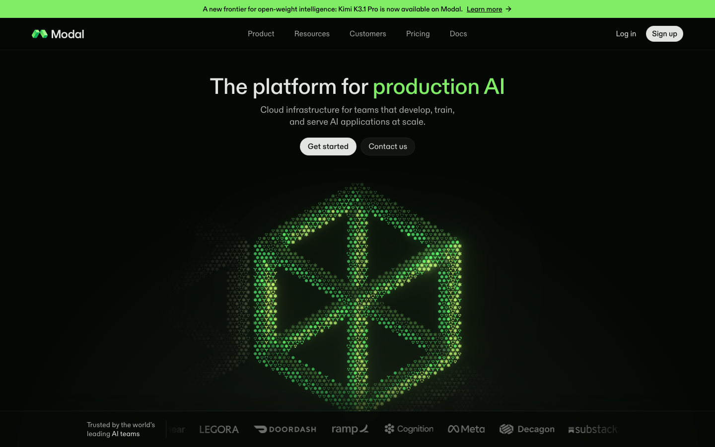
Green blocks beside a geometric wordmark. A two-part logo: the green 'blocks' mark (two hexagonal blocks built from flat and gradient green facets) and a geometric 'Modal' wordmark. On the dark site the nav pairs the colour mark with a one-colour #E3E5E1 wordmark; the footer uses the wordmark alone in #DADED7. The press kit (modal.com/brand) supplies the primary logo for dark and light backgrounds, one-colour white and black versions, and the mark alone in colour, white and black, each as SVG, PNG and PDF.
Source: modal.com/brandmodal.com
The platform for production AI
The platform for production AI
Near-black with a green cast, a warm off-white ink and one bright green.
Near-black with a green cast, a warm off-white ink and one bright green. #040804 covers most of every page; #10120F and #131412 raise feature bands and cards; #E3E5E1 and #DADED7 sage bands carry customers and blog. #7FEE64 appears in small doses: the announcement bar, one head phrase and eyebrows. Five secondary hues appear only inside diagrams, code and tags.
Source: modal.com
The platform for production AI
One grotesk for everything.
One grotesk for everything. ABC Diatype (Dinamo, commercial), real Diatype weight 500 for display and 400 for everything else (build with Hanken 540 and 420), with tight tracking only at display sizes (-0.01em) and +0.15px at 15px (build: Hanken 0). 'cv11' is always on (slashed zero). DM Mono with ss02 labels diagrams; Fira Mono sets code.
| Their face | Use | License | Open stand-in |
|---|---|---|---|
| ABC Diatype 500 | Hero and section heads, stats, primary button text | commercial (Dinamo Typefaces) | Hanken Grotesk 540 Calibrated on modal.com: Hanken 540 at Diatype tracking -0.01em matches Diatype 500 line width within 0.4-1.3% and ink within 1%; x-height 0.493 vs 0.485em. Inter (the legacy --font-sans token) is 7% wide and rejected. |
| ABC Diatype 400 | Leads, body, feature heads, nav, secondary buttons | commercial (Dinamo Typefaces) | Hanken Grotesk 420 Calibrated on modal.com: Hanken 420 at Diatype tracking -0.01em matches Diatype 400 width within 0.4% and ink within 2%. |
| DM Mono 400 (ss02) | Diagram labels (TRAINER, INFERENCE, SANDBOXES), code card on home | SIL OFL 1.1; the site's own file ships in fonts/dm-mono-400.woff2 | DM Mono itself Open license; no stand-in needed. |
| Fira Mono 400/500 | Code samples on product pages | SIL OFL 1.1; the site's own files ship in fonts/ | Fira Mono itself Open license; no stand-in needed. |
| Custom logotype | Logo only | Logo artwork; use the press-kit files | none Never set the wordmark in a font. |
Source: modal.com
Ship your next model in minutes
Ship your next model in minutes
One green phrase in a near-black page · home, platform, company, customers and pricing H1s; closing 'Ship your first app in minutes' on every page; share image
Do Large 3D shapes (an isometric cube, the logo's two hexagonal blocks, a frame) built from thousands of tiny glyphs (hexagons, asterisks, Y-shapes, dots) in greens #7FEE64 to #09AF58 with soft glow on #040804, fading to grey glyphs at the edges. The same glyphs, at 12px, are the eyebrow icons.
Glyph-particle forms · home hero cube (557px), /products/platform hero, og share image, 'Customers use Modal for' ticker dots, world map in the Capacity band, home customer quote card
Light pill buttons · every hero and every section CTA; nav Sign up
Do Full-width #7FEE64 strip, 36px tall, padding 8px 16px, centered 14px weight 500 black text with an underlined 'Learn more' and a right arrow. The only full-bleed green on the site.
Green announcement bar · top of every page, above the nav
Do A 12px green glyph (asterisk, diamond, hexagon, cube) centred in a 20x20 tile (4px padding, 4px radius, rgba(158,251,135,0.10) on dark / rgba(18,79,17,0.10) on light, with a 50% blurred copy of the glyph behind), 6px, then a 13/20 label in #7FEE64 (#124F11 on light): build Hanken 540 at +0.26px (real Diatype 500 is +0.39px). 16px above a left-aligned 38px section head.
Eyebrow glyph labels · home Product, Platform, Cloud-substrate, Built for the enterprise; Customers and Blog on light bands; /customers hero
Do 1px #E3E5E1 isometric line drawings (circle and box, stacked plates, hexagon around a cube, a GPU fan) with corner nodes as small filled dots in a single secondary hue per drawing (#56D8FF, #FB7455 or #AD75F7), inside #10120F or #131412 panels with 7px radius and 1px rgba(255,255,255,.05) edges.
Isometric line diagrams with one hue of node dots · home Platform band (three numbered columns), /products/platform feature panels
Specimens use sample copy, not Modal’s.
Thin, precise containers.


Thin, precise containers. Feature panels are #10120F/#131412 rectangles with 7px corners and 1px rgba(255,255,255,.05) edges; feature columns separated by 1px vertical rules; numbered columns ('1', '2', '3') in the Platform band. Pills for every button and for the 'Frontier model APIs' chips. Blog tags are small tinted rectangles (#FB7455 at 20% with #A02F16 text; a lime tint with #124F11 text).
Source: modal.commodal.com/customers
Thin outline icons, one per feature.


Thin outline icons, one per feature. Lucide outline icons at 16px with 2px strokes (24 viewBox) in #E3E5E1 mark each feature head (one named icon per feature: plug, server, square-dashed-bottom-code, sliders-horizontal, git-branch, share-2, waypoints, cpu, container, funnel, refresh-ccw, panels-top-left in the workload blocks; globe, scaling, cpu, activity in Capacity; shield-check, chart-no-axes-combined, gauge in Enterprise). Section eyebrows use Modal's own 12px solid glyphs (asterisk, diamond, hexagon) in #7FEE64, the same glyphs that make up the particle art.
Source: modal.com
Three families.
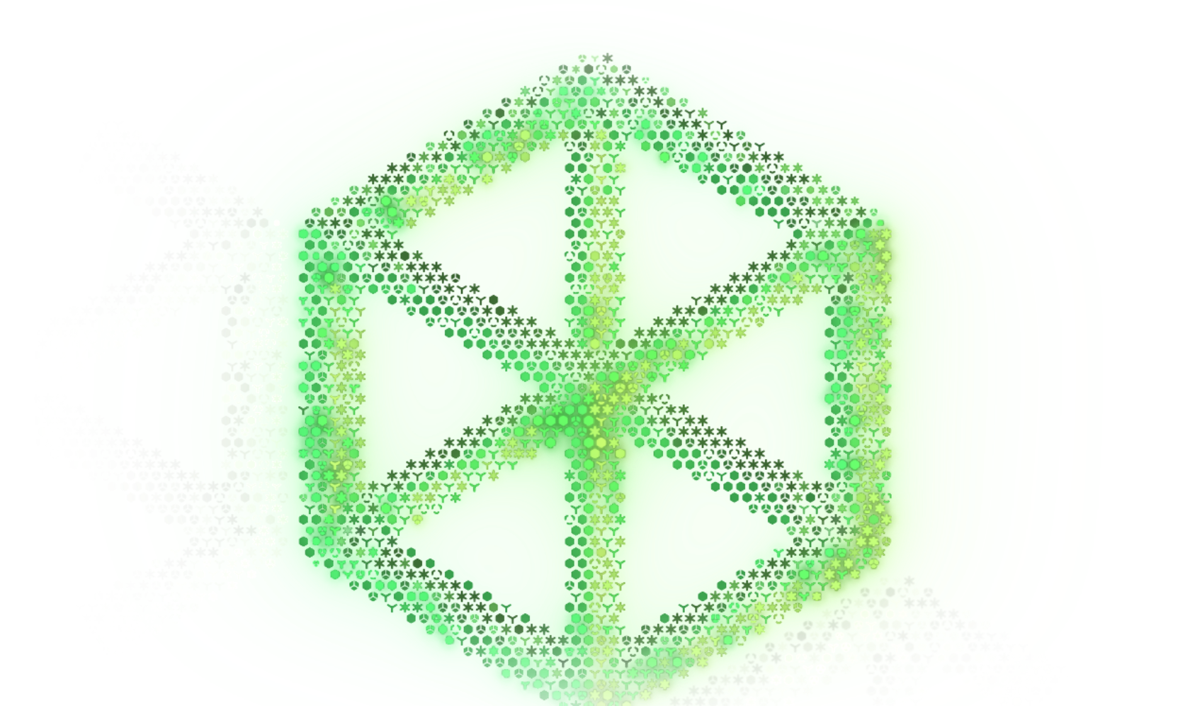
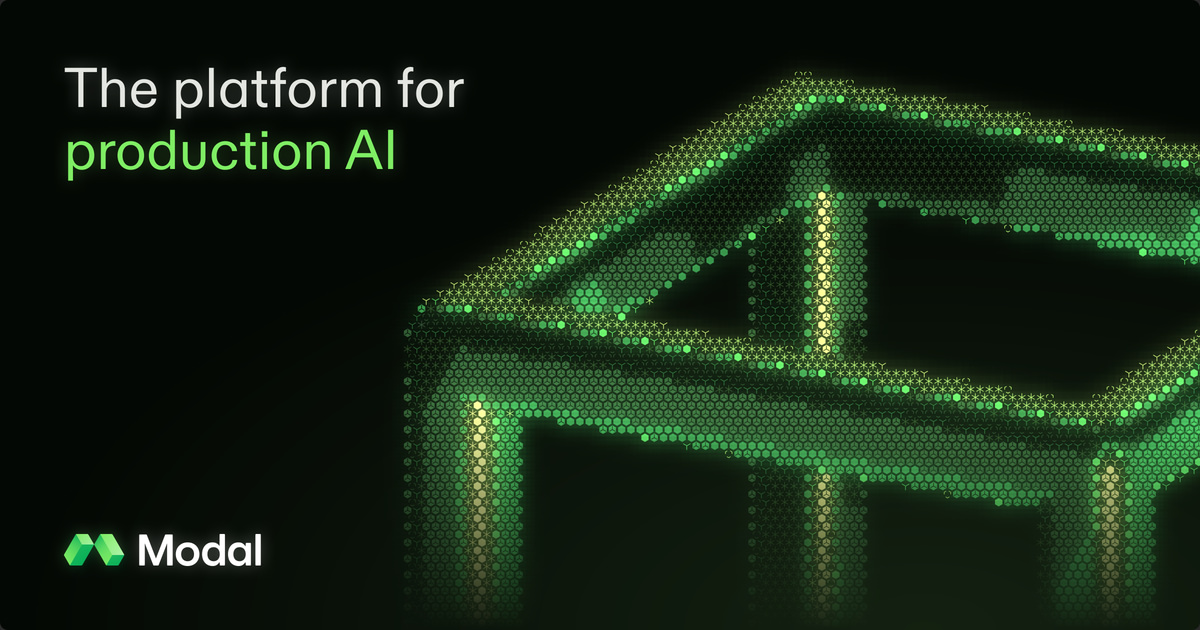


Three families. (1) Glyph-particle 3D forms in glowing greens on black: the home cube, the platform hero blocks, the share image, the world map. (2) Isometric 1px line diagrams with one hue of node dots, in dark panels. (3) Hand-drawn mascot doodles in mint (#DDFFDC) outline ('Mo and Dal', a cloud character), only on /company. Product UI (audit logs, container charts, GPU usage) is drawn as live-looking interface in the brand greys with orange/green data lines. Blog covers are green abstract textures or a dark dotted grid with partner logos.
Source: modal.commodal.com/products/platformmodal.com/company
Rare and human.


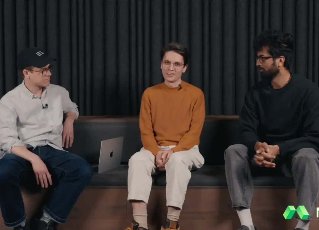
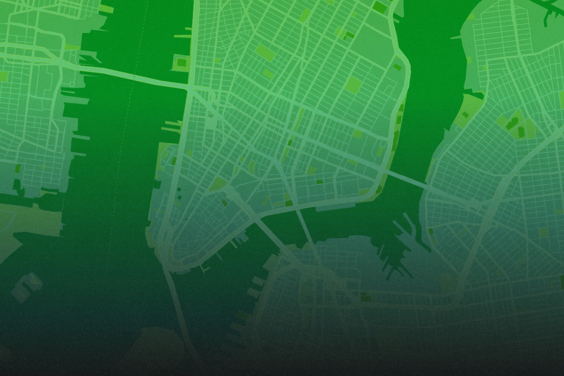

Rare and human. Real people only: the founders (with Akshat's dog) against a white roll-door wall, a two-person studio portrait on white, a team group outdoors at dusk, a team walk in Modal T-shirts; customer video stills (Applied Compute, Ramp) in story cards. Natural colour, documentary, unretouched. City maps for offices are tinted bright green. Photos sit in 7px-radius frames on the dark page, captioned in small grey text.
Dark, left-aligned and spacious after a centred hero. Announcement bar (36px), then a nav with logo left, five links centred, Log in + Sign up right. Centred hero head, sub and pill pair over glyph art, then a logo marquee. Below, sections are left-aligned in a 1312 container (64px side margins at 1440): eyebrow, 38px head, Learn more pill, then 3-4 column feature grids or a text column beside a 7px dark panel. Section padding is 144px top and bottom (--spacing-v2-section). Light sage bands for customers and blog. Every page ends on the same 'Ship your first app in minutes' band and footer.
Measured from modal.com's computed styles and :root custom properties measured in headless Chromium at 1440x900 and 390x844 on 2026-11-17 (measure/*.json, re-checked live for the marquee, phone Product block, closing art and phone tracking).
| Measure | Desktop | Phone |
|---|---|---|
| Page margin | 64px | 24px |
| Section padding | 144px | 72px |
| Hero text width | max 595px, centered | full width |
| Card gap | 20px | 20px |
| Navigation | 64px | 64px |
Hero and closing head (text-v2-h0)
ABC Diatype 500 · 45px (phone 37) · line 1.07 · tracking -0.9px · weight 540
Hero and closing head, phone
ABC Diatype 500 · 37px · line 1.08 · tracking -0.74px · weight 540
Inner page H1 (/company)
ABC Diatype 500 · 64px (phone 40) · line 1 · tracking -0.64px · weight 540
Section head (text-v2-h1)
ABC Diatype 500 · 38px (phone 31) · line 1.16 · tracking -0.76px · weight 540
Section head, phone
ABC Diatype 500 · 31px · line 1.16 · tracking -0.31px · weight 540
Quote and story title (text-v2-h2)
ABC Diatype 400 · 28px (phone 21) · line 1.29 · tracking -0.28px · weight 420
Lead / block head (text-v2-p-large)
ABC Diatype 400 · 18px (phone 17) · line 1.33 · tracking -0.18px · weight 420
Body (text-v2-p-regular)
ABC Diatype 400 · 16px · line 1.5 · tracking -0.16px · weight 420
Small (text-v2-p-small)
ABC Diatype 400 · 15px · line 1.47 · weight 420
Trust line
ABC Diatype 400 · 14px · line 1.29 · weight 420
Eyebrow / caption (text-v2-c)
ABC Diatype 500 · 13px (phone 12) · line 1.54 · tracking 0.26px · weight 540
Announcement
ABC Diatype 500 · 14px · line 1.43 · tracking -0.14px · weight 540
Mono diagram label
DM Mono 400 (ss02) · 12px · line 1.2 · tracking 0.36px · weight 400
How Modal’s own landing pages are built, observed on modal.com, 2026-11-17. The full measurements are in spec.md.
Source: modal.com


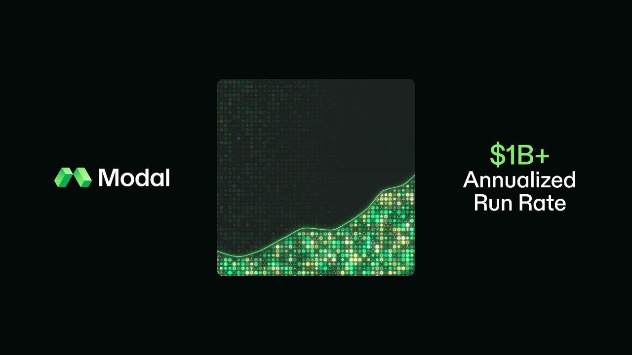
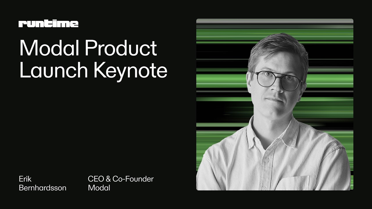
From four captured pages plus /pricing, /products/sandboxes, /products/inference, /startups and /blog, the home og:image and three blog covers (2026-11-17). No deck or email examples were found on Modal's own domains. Examples pass (2026-11-17): Meta no Modal advertiser, Google 8 ads (7 text-only, 1 video), LinkedIn and Milled walled, TikTok none, X and Instagram unavailable; YouTube thumbnails and the Runtime badge kept in ref/examples/. Loudness is our engine setting for each format, built from these observed pieces.
| Format | Loudness | Must appear | What varies |
|---|---|---|---|
| Landing page | #7FEE64 announcement bar, dark #040804 nav with colour mark + wordmark left, links centred, Log in + Sign up pill right. Centred hero: 45/48 head with one #7FEE64 phrase, 18/24 #A8ABA6 sub, Get started + Contact us pills, glyph-particle art below, logo marquee. Then left-aligned sections on #040804/#10120F with glyph eyebrows, 38px heads, feature grids with Lucide icons, dark 7px panels holding line diagrams or product UI; a #E3E5E1 customers band and #DADED7 blog band; closing 'Ship your first app in minutes' band and five-column footer. | Which art fills the hero and panels (glyph form, line diagram or product UI); light customer and blog bands sit only near the foot | |
| Social post | near-black ground with Modal's own type and logo only; one headline, sentence case, Diatype (Hanken 540 stand-in); colour mark + #E3E5E1 wordmark lockup | art or no art: glyph-particle form (campaign) vs plain type card (news); green phrase optional on news cards (blog cards use none); observed closest announcement family (YouTube thumbnail, 16:9, not a post layout): near-black ground, colour mark + wordmark left, rounded glyph-art tile centre, one green stat right ("$1B+ Annualized Run Rate"); the brand shipped no organic post or offer ad to measure (observed 2026-11-17) | |
| Share card (link preview) | Near-black ground, Diatype head in #E3E5E1, the colour mark + wordmark; either the glyph-particle art (home og:image) or the hairline frame with four corner glyphs (blog cards) | Art card or news card; the green phrase appears only on the art card; pure #000000 is allowed on the blog template only | |
| Video thumbnail: Runtime 2026 talk card | Near-black ground, the pixel 'runtime' wordmark top-left, a 2 to 4 line Title Case talk title, the speaker's black-and-white portrait right on the green glitch-stripe ground, name and role in two small columns | Title length and the speaker; never a Modal logo, green phrase, button or URL on the card |
Source: modal.commodal.com/products/platformmodal.com/companymodal.com/customersmodal.com/brand
Your name and logo, Modal’s system.
Talk about my brand Use this brand in Claude
Get your brand audit Put your brand in Claude What goes in a brand book
Each value is marked published, observed, our reading or our recipe, with its source. Checked 2026-11-17. Not affiliated with Modal.
Tell us what you want to make. We’ll talk through how to put these ideas to work for your brand.