Captions
Your workspace for making video: generate footage, edit, and refine the details in an app built for creative work (paraphrase). Observed
Brand book
Mirage sells AI that makes video, so the site behaves like a piece of footage rather than a software page: lit by a day-cycle video whose tints colour the whole page, set in an editorial serif, and illustrated with grain and haze instead of UI chrome. Neutral type and buttons keep the creator's work as the colour. Our reading

The ambient light: the hero video's time of day (and each page's hero image) sets how warm or cool the tints, the mesh horizons and the dark run are; About and Research use an orange-to-pink haze, Tesseract a sunlit room, home a dusk desert.
Our engine's setting, built from their rules.
Mark and wordmark in one colour: white on dark, charcoal #1D1F20 on light; nothing else.
Statement heads are the soft serif, sentence case, ending in a period; buttons, body and card heads are the sans.
Buttons are charcoal or white 12px-radius rectangles with a right arrow; no coloured buttons or links.
Warm sun and cool sky appear only as hazes, mesh horizons and in imagery, never as flat fills behind text.
Photos are warm, natural-light and cinematic; illustrations are grainy cyan/peach haze, never crisp vectors.
Copy keeps the person directing and refining; output stays editable; no hype or exclamation marks.
Only figures Mirage states (250 million videos made in Captions); no invented metrics.
AI-native creative tools that let one person direct a whole production across video, motion and sound, while keeping control of the details (paraphrase of the home hero). Observed
Your workspace for making video: generate footage, edit, and refine the details in an app built for creative work (paraphrase). Observed
Professional creative tools for your AI agent: video, designs, 3D scenes and sound in one editable project (paraphrase). Observed
Bring video generation and captioning into your own product and workflows (paraphrase). Observed
In-house multimodal foundation models that generate footage and expressive speech, trained on curated, licensed audio-video data (paraphrase). Observed
The team builds the Captions app, Mirage foundation models and the Mirage API; formerly known as Captions, it rebranded in 2025 to reflect a wider mission and product suite (paraphrase).
The team is united by a belief that rigor and taste belong together (paraphrase).
ObservedModels are built with the products they power and ship quickly against real user signals (paraphrase; research principle).
ObservedCurated, licensed audio-video data with attention to rights, safety and brand control (paraphrase; research principle).
ObservedCategory. AI creative tools for video, motion and sound; About calls Mirage an AI video company. Observed
Mirage builds AI-native creative tools for video, motion and sound: the Captions app, Tesseract for AI agents, Mirage APIs and its own foundation models. Formerly known as Captions, it rebranded in 2025 and is based in New York City (paraphrase of the home hero and About page).
Mirage builds AI-native creative tools. Observed
We're making it possible for one person to direct an entire creative production. Our tools bring together video, motion, and sound—with control over the details. Observed
Create your way. Observed
Making a video shouldn't mean learning five different apps. Observed
Powerful tools, thoughtfully designed. Observed
The engine powering our creative tools. Observed
Research that expands what you can create. Observed
Already part of how millions create. Observed
A creative studio built around you. Observed
Help build the next generation of creative tools. Observed
Introducing Tesseract, the creative suite built for agents. Observed
The creative suite built for your AI agent. Observed
Pioneering the future of content creation Observed
Mirage | AI Creative Tools for Video, Motion & Sound Observed
Work in our app, direct your AI agent, or build with our APIs. Observed
Your workspace for making video. Observed
Professional creative tools for your AI agent. Observed
Bring video into your product. Observed
Creative tools should make your next move clear. Observed
The whole performance, generated. Observed
CalmCraftedConfidentCreator-first



Mark of five stacked horizontal ellipses, widest in the middle, beside a rounded sentence-case 'Mirage' wordmark.
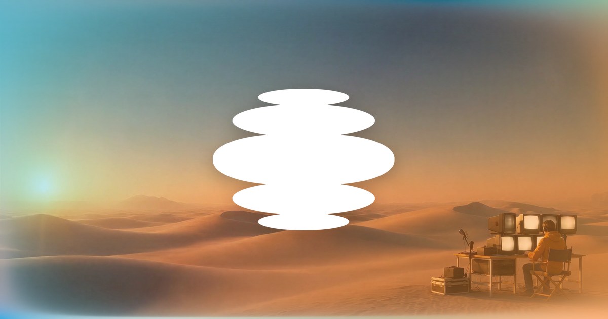
Mark of five stacked horizontal ellipses, widest in the middle, beside a rounded sentence-case 'Mirage' wordmark. One colour only: white on dark, charcoal #1D1F20 on light. The mark appears alone as the favicon, the app icon (on charcoal), centred large on the home share card and on the Tesseract title card in the home video.
Near-neutral UI (charcoal, warm white, a dusk navy and a near-black night run) with colour supplied by light: the hero video's day cycle sets four ambient tints (light, dark, sun, sky) that fill the mesh horizons and wash the sections at 7-10%.
Near-neutral UI (charcoal, warm white, a dusk navy and a near-black night run) with colour supplied by light: the hero video's day cycle sets four ambient tints (light, dark, sun, sky) that fill the mesh horizons and wash the sections at 7-10%. Imagery carries cyan and peach. The site stylesheet also defines a larger token set (sky #A6ECFF, peach #FFCA9F, sunset #F99F3F, pink #FF9BB2, air #EFFBFF and others) that the company pages barely use.
Mirage builds AI-native creative tools.
Two families: Exposure, a soft, heavy-reading serif, for H1/H2 statements (68px hero, 40-53px sections, normal tracking, 1.16-1.28 leading); Denim INK, a rounded grotesk, for leads (21/30), card heads (25-29px weight 400), body (17-19px), buttons (16-17px weight 400-500), eyebrows (11px uppercase) and footer.
Two families: Exposure, a soft, heavy-reading serif, for H1/H2 statements (68px hero, 40-53px sections, normal tracking, 1.16-1.28 leading); Denim INK, a rounded grotesk, for leads (21/30), card heads (25-29px weight 400), body (17-19px), buttons (16-17px weight 400-500), eyebrows (11px uppercase) and footer. Some secondary pages (Research, many Tesseract sections) set big heads in the sans instead.
| Their face | Use | License | Open stand-in |
|---|---|---|---|
| Exposure | Page H1s and section H2s, 40-68px desktop, weight 400 | Not an open font (licence not stated on the site); stand-in Fraunces 750, font-variation-settings 'opsz' 72, 'SOFT' 100, letter-spacing 0, calibrated to Exposure's width and ink (see kit.typography.display). Request Exposure files and a web licence from Mirage for a production build. | |
| Denim INK | Body, leads, product and card heads, buttons, nav, footer; also large heads on Research and Tesseract sections | Not an open font; stand-in Figtree 400 at -0.018em, calibrated to line width and ink (see kit.typography.body) |
Do Full-bleed looping video 1440 x 900 on a #151722 ground, darkened at the top by a scrim (rgba(8,9,12) 50% to 0 at 82%; phone scrim 55% / 50% at 62% / 0 at 82% / 55% at 94%), resting on the violet dusk frame, never the orange sunset poster. Head in the display serif 68px / 78.8px, white, left-aligned at x 80px, 180px from the top, max about 1000px wide, two lines; a 21/30 white lead beneath (630px wide); one white 12px-radius button plus a text link with arrow. Press logos run as a greyed marquee near the bottom under 'AS FEATURED IN' 11px uppercase..
Full-bleed cinematic hero video with a serif statement · Home hero (desert at dusk, a figure at a desk of glowing CRT monitors); Tesseract hero (sunlit living room); the home share card
Do Exposure serif (stand-in Fraunces 750 with 'opsz' 72 and 'SOFT' 100, letter-spacing 0), weight 400 that reads heavy with soft ball terminals, sentence case with a closing period, 40-68px desktop at 1.16-1.28 leading, text-wrap: balance on centred and night-run heads, charcoal #1D1F20 on light or white on dark; product names, card heads and UI stay in the Denim INK sans.
Soft heavy serif for every statement head · Page H1s and section H2s across home, About, Tesseract and the share cards
Do Full-width SVG of four blurred, overlapping hill paths (sun, sky, haze, ink) over a light rectangle, Gaussian blur 38, preserveAspectRatio none; 340px tall desktop (240px phone) into the night run, 320px (230px) rotated 180 degrees on the way back out; a 262px three-path version (sun, sky, light, blur 30) along the bottom of the hero. The exact path data is in kit.spec.page (sections 'Mesh horizon in' and hero 'horizon glow'); copy it, never approximate it with gradients or ellipses. Fills follow the hero's day cycle; at rest (dusk hold, what the reference shows): light #F6F9FE, sun #9A85C8, sky #5E90D5, haze #8CB0E1, ink #070B18.
Ambient mesh horizons between light and dark runs · Home: between the light product run and the night run (340px) and back (320px); along the bottom of the hero
Do Soft-focus, stippled/dithered forms (hands framing a shot, cards, a cube, sound waves, circuits, faces) in sky cyan and peach/orange on white, edges dissolving into grain; hero grounds as an orange-to-pink haze fading to white.
Grainy cyan-to-peach haze imagery · Research thumbnails, About and Research illustrations, the vision band, the About and Research hero grounds
Do Sticky bar inset 20px from the top and sides (1400 x 74 desktop), large rounded corners, backdrop blur 14px with saturate 1.4 and white inset highlights; logo left (white on dark heroes, charcoal on light), three centred links (Products, Research, Resources), one outline button right (Talk to Sales or Get Captions).
Floating frosted nav bar · Every page
Do Product shown as light UI cards (timelines, layer lists, an @Tesseract prompt pill with a round send button) floating over a blurred cyan/peach glow, 12-16px radius, soft drop shadow; dark-run variant puts them in a charcoal panel.
Floating editable-project UI on a soft haze · Home design and runtime sections; Tesseract overview
Specimens use sample copy, not Mirage’s.
Floating frosted nav; mesh-horizon SVG transitions; faint radial washes in sun and sky; hairline dividers on the night run; product art floating on blurred glow with soft shadows; large figure (250 million) set in the sans at about 40px over a small caption; a 'New' pill chip with a pale sky dot-label on Tesseract.
Outline arrows and chevrons at 1.25px stroke with rounded caps, in the text colour, after every CTA; solid social glyphs (LinkedIn, X, TikTok, Instagram, YouTube) in the footer.
Outline arrows and chevrons at 1.25px stroke with rounded caps, in the text colour, after every CTA; solid social glyphs (LinkedIn, X, TikTok, Instagram, YouTube) in the footer. No illustrative icon set.
Grainy, stippled, soft-focus forms in sky cyan and peach/orange on white: hands framing a shot, stacked media cards with a play button, a cube, sound-wave bars, circuit blocks, a laptop, voice and face portraits dissolving into dots.
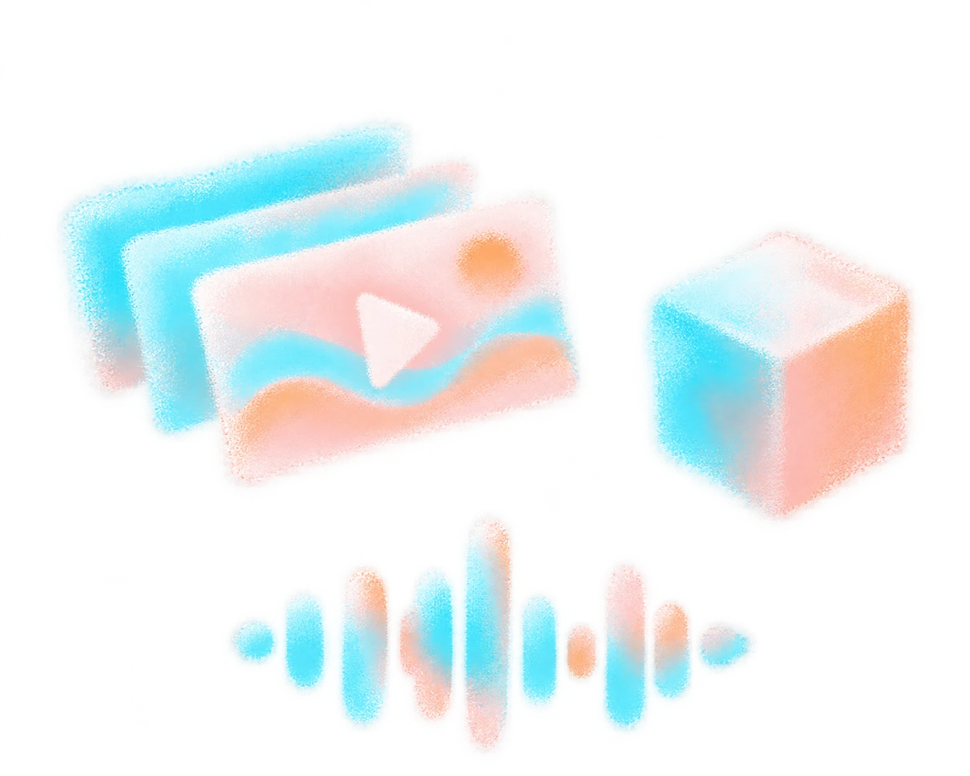

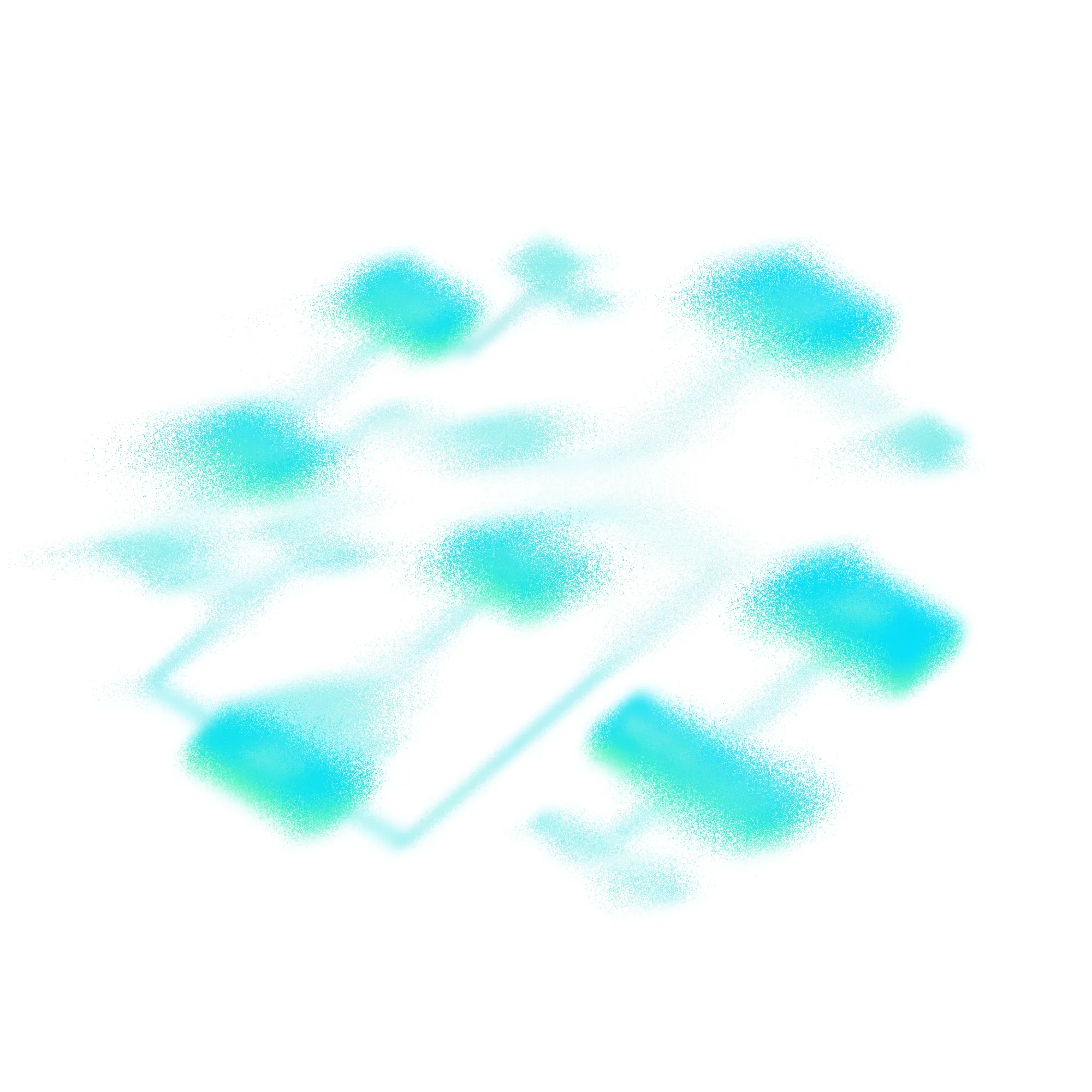


Grainy, stippled, soft-focus forms in sky cyan and peach/orange on white: hands framing a shot, stacked media cards with a play button, a cube, sound-wave bars, circuit blocks, a laptop, voice and face portraits dissolving into dots. Edges dissolve into noise; nothing is outlined.
Warm, natural-light, cinematic stills and video: a dusk desert with a figure at a desk of glowing CRT monitors (home hero), an older man in a sunlit living room gesturing at a floating glass curve (Tesseract), real candid team photos in the New York office, founders' headshots against warm bookshelves.
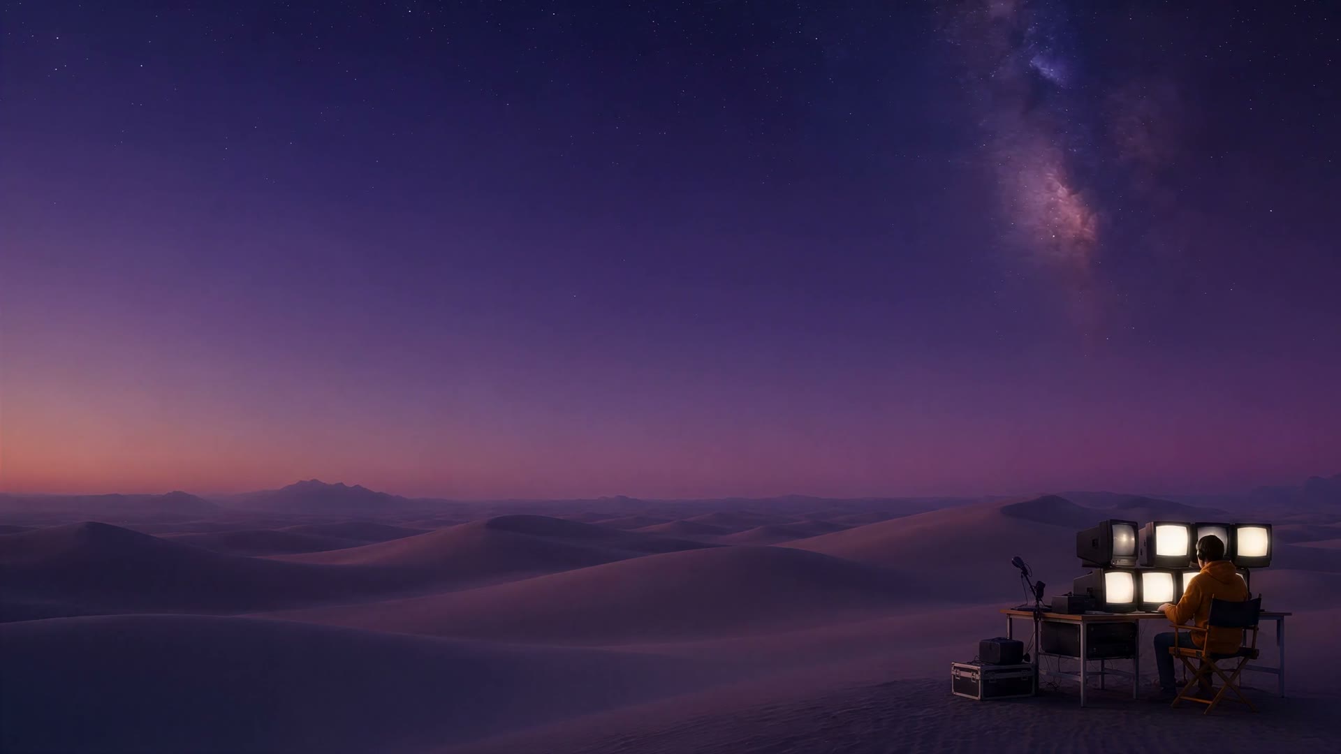


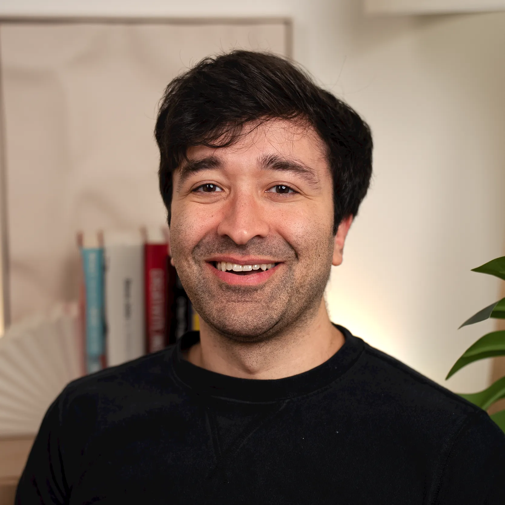
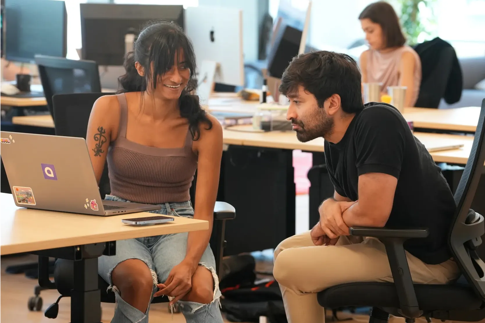

Warm, natural-light, cinematic stills and video: a dusk desert with a figure at a desk of glowing CRT monitors (home hero), an older man in a sunlit living room gesturing at a floating glass curve (Tesseract), real candid team photos in the New York office, founders' headshots against warm bookshelves. People are shown working or creating, framed wide or mid-shot; photos sit in 12-24px rounded frames, never under body text except the hero head on its scrim.
1200px centred content column (x 120 desktop; hero text at x 80), alternating runs: dark video hero, light run, mesh horizon, night run of three sections split by hairlines, mesh horizon back, light run, white footer whose rounded top is invisible (the light run fades to white above it). Sections are two-column (text left, art right or the reverse) or a centred head with a full-width 24px-radius video. Generous 120-150px vertical spacing.
Measured from 's .
| Measure | Desktop | Phone |
|---|---|---|
| Page margin | 120px | 24px |
| Hero text width | max 1000px, centered | full width |
| Navigation | 74px | 74px |
Hero H1
Exposure · 68px (phone 38.8) · line 1.16 · weight 750
Section H2 (light, centred)
Exposure · 52px (phone 36) · line 1.25 · weight 750
Team H2
Exposure · 53px (phone 35) · line 1.25 · weight 750
Proof and vision H2
Exposure · 43px (phone 35) · line 1.21 · weight 750
Night-run H2
Exposure · 40px (phone 31) · line 1.28 · weight 750
Big figure
Denim INK · 64px (phone 52) · line 1.2 · tracking -1.73px · weight 400
Product name
Denim INK · 29px · line 1.3 · tracking -0.58px · weight 400
Product tagline
Denim INK · 25px (phone 23) · line 1.32 · tracking -0.57px · weight 400
Research card title
Denim INK · 25px (phone 24) · line 1.28 · tracking -0.74px · weight 400
Lead
Denim INK · 21px (phone 18) · line 1.48 · tracking -0.42px · weight 400
Body / card copy
Denim INK · 19px (phone 17) · line 1.47 · tracking -0.41px · weight 400
Caption / small copy
Denim INK · 17px (phone 16) · line 1.5 · tracking -0.42px · weight 400
Button label
Denim INK · 17px · line 1.41 · tracking -0.35px · weight 400
Nav link
Denim INK · 16px · line 1.3 · tracking -0.4px · weight 500
Eyebrow
Denim INK · 11px · line 1.45 · tracking -0.37px · weight 400
Footer head
Denim INK · 16px · line 1.15 · tracking -0.3px · weight 500
Footer link
Denim INK · 16px · line 1.15 · tracking -0.26px · weight 400
Legal
Denim INK · 14px · line 1.3 · tracking -0.3px · weight 400
How Mirage’s own landing pages are built, observed on mirage.app, 2026-11-10. The full measurements are in spec.md.
How the system carries across formats, from mirage.app pages and its own share images only.
| Format | Loudness | Must appear | What varies |
|---|---|---|---|
| Landing page | Floating frosted nav; full-bleed cinematic hero video with a white serif statement head left, white lead and a white 12px button plus arrow link; as-featured logo marquee; light run with serif section heads and product rows; mesh horizon into a near-black night run of two-column sections with floating UI art; mesh horizon back to warm white; a big figure proof band; careers band with rounded photo strip; white footer with 40px top corners. | Hero footage and the ambient sun/sky tint it sets | |
| Social post | Two kinds only, as on the share cards: a typographic post (flat Air ground, small sans label, two-to-three-line charcoal serif statement with a closing period, one sans fragment line) or a photo post (full-bleed cinematic frame with the white mark centred and no text). No button. | Which kind; the photo (any supplied cinematic still); the label (product name or the charcoal logo). Closest observed family (no organic announcement posts or single-image offer ads were found; Meta ads are all video and Google ads are text): the YouTube product-announcement thumbnails, cyan-to-peach gradient with the name and rounded photo cards (https://www.youtube.com/watch?v=SVb44_lLp-o). | |
| Share card (Open Graph) | Either a cinematic photo with the white mark centred, or a pale ground with a big charcoal serif head; no buttons | Photo card (company) or typographic card (product) | |
| Paid social ad: app install video (Captions) | Vertical 9:16 video whose first frame is a creator talking to camera, with a before/after pair of the same clip as two rounded cards across the top third and one big burned-in caption word mid-frame. No logo, no brand gradient on frame. | Language; the labels (After/Before, antes/después) or none; caption style (white bold, yellow heavy, script); a screen-recording variant of the dark app menu | |
| Video thumbnail: product/company announcement | The sky-to-sun gradient (cyan #03DCFF top to peach/orange #FAAC64 bottom) or a bleached peach haze as the ground; the product name or mark + wordmark large; rounded photo/UI cards of generated people as the visual. One name, no sentence. | Wordmark centred alone (rename) vs product name left with photo cards right vs cards only; a cinematic object photo whose screen carries the gradient (Tesseract) | |
| Video thumbnail: Unfiltered series | Scoped to the Unfiltered series only: hosts photographed together, a two-line white serif statement or question centred at the top over a dark blurred cyan/pink glow. | Colour photo vs black-and-white photo | |
| Video thumbnail: how-to tutorial (Captions era) | Presenter cut-out with a soft white outline glow on one side; pale cyan/pink/peach gradient ground; a three-line near-black sans Title Case head on the other side with one phrase on a solid highlight block (white, green or yellow); small cyan line icons and sparkles. | Presenter left or right; highlight colour; the feature icon | |
| App store screenshot (Captions) | Near-white #F7FDFF top fading to pale cyan #C5F3FF at the base; a centred two-line charcoal sans head (sentence case, no period) at the top; one phone mockup in the lower two-thirds that fades into the cyan base. | Lowercase "captions" wordmark above the head on the first screen; a "Trusted by" logo row; chat bubbles or clips overlapping the phone edge |
Your name and logo, Mirage’s system.
Talk about my brand Use this brand in Claude
Get your brand audit Put your brand in Claude What goes in a brand book
Each value is marked published, observed, our reading or our recipe, with its source. Checked 2026-11-10. Not affiliated with Mirage.
Tell us what you want to make. We’ll talk through how to put these ideas to work for your brand.