Devices and offers
Surface, Xbox and Microsoft 365 sold directly, with plain price offers Observed
Brand book
Calm by default, unmistakable in the details. Microsoft keeps the page quiet (white and ice grounds, plain sentence-case Segoe, one blue) so the four-square logo, product photos and rounded Fluent shapes carry the recognition. Our reading

From product UI (Fluent tokens: 4px radius, 32px buttons, #0F6CBD) to marketing pages (24px-radius cards, 40px buttons, #0078D4, gradient grounds): the same type, color logic and voice at different softness.
Microsoft publishes no color percentages. This split is our reading of microsoft.com on 2026-10-29: warm-white and ice gradient grounds and white cards dominate, navy type, blue only on actions, a gray footer..
Two scoped voices. The levels are our reading, not a Microsoft scale (0 = plainest).
Our engine's setting, built from their rules.
Cover the logo. Segoe-like type in sentence case, soft white cards, navy text and one blue should still read as Microsoft.
Every text pairing meets 4.5:1 (3:1 for large text), and color never carries meaning alone.
No Microsoft name used as a verb, noun or pun, and nothing implies endorsement.
One Microsoft across every device: products, AI and stories presented in one calm, familiar system (our reading of the Fluent principles and the homepage). Our reading
Surface, Xbox and Microsoft 365 sold directly, with plain price offers Observed
AI shown through real customer and community stories Observed
Research on how attackers work and how to build resilience Observed
Hi there, welcome to Microsoft
Find what you need faster with AI-powered suggestions
What will you do with all this power?
Surface Laptop Ultra
Microsoft redrew its logo in 2012, the first change in 25 years: a four-square symbol and a Segoe logotype meant to move across PCs, phones, tablets and TVs (paraphrase of the launch post). Fluent 2 is the design system that carries that one look across Windows, web, iOS and Android today.
Adapt to the device and build on what people already know; reuse native patterns most of the time (paraphrase).
PublishedKeep people in flow; less visual clutter keeps them calm and confident (paraphrase).
PublishedInclude a range of abilities and perspectives early; everyone should feel they belong (paraphrase).
PublishedSignature experiences in color, sound, illustration and icons make products feel like one Microsoft (paraphrase).
PublishedCategory. Software, cloud, devices and AI for people and organizations (paraphrase of the homepage nav: Microsoft 365, Azure, Copilot, Windows, Surface, Xbox). Observed
Unnamed: microsoft.com names no competitors.
Microsoft's mission is to empower every person and every organization on the planet to achieve more (quoted from the About page).
Empower every person and every organization on the planet to achieve more Published
Hi there, welcome to Microsoft Observed
Unmistakably Microsoft Published
Go further with Copilot
Your perfect companion
Save up to $100.00 on select Surface Pro, 12-inch (1st Edition)
Get to know AI and Copilot
When disaster strikes, HASTE can help
When global trade gets messy, AI is here to help
Designing datacenters using lessons from nature
Microsoft Digital Defense Report 2026
Powering every play
Delivering Copilot for everyone
Microsoft leads with its mission ('empower every person and every organization on the planet to achieve more') and, on the homepage, with a greeting rather than a slogan. The homepage sells devices with plain offers and explains AI through real stories.
Find your next PC
Click here to Excel at productivity!
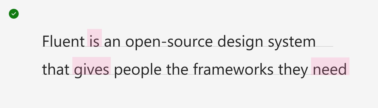
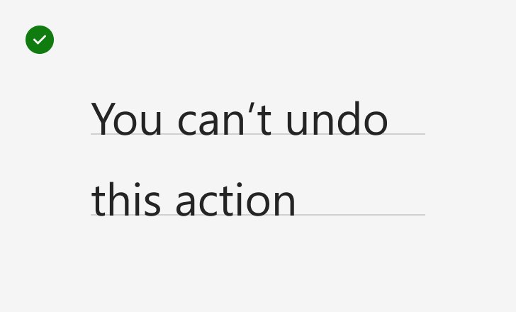
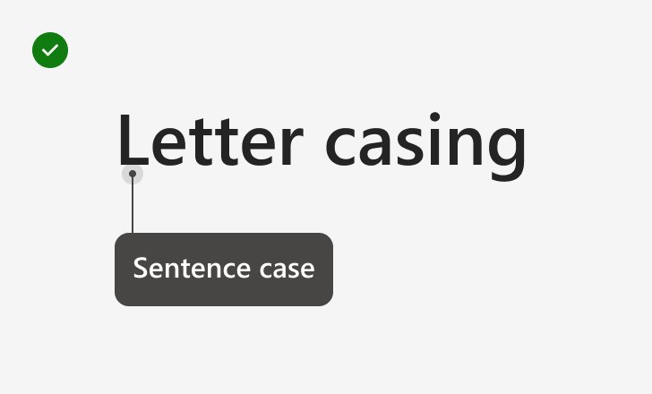
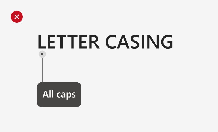
Plain sentence-case text is easier to read and to localize (Fluent says so for capitalization).
PlainFriendlyHelpful
Fluent's content design asks for plain, conversational, second-person writing in sentence case, present tense and active voice, with sparse punctuation and no exclamation points. The homepage is warmer ('Hi there') but just as plain.
Shop nowLearn moreRead the storyRead the articleRead the reportJoin nowFind your next PCHelp me choose a PCyouyour
exclamation points (except true celebration)ALL CAPS for emphasis'Click here' linksMicrosoft names used as verbs, nouns or punsdirectional words such as 'above' or 'below'
Source: fluent2.microsoft.design/design-principlesfluent2.microsoft.design/content-design
| Case | sentence (web, Windows, Android); title case on iOS and macOS |
|---|---|
| Person | second person |
| Exclamation points | celebration only |
Source: fluent2.microsoft.design/content-designmicrosoft.com/en-us/legal/intellectualproperty/trademarks/usage/general

Logos shown from Microsoft's own header file and Brandfetch for reference. Microsoft's trademark guidelines say its logos can't be used without a license.
Microsoft
Microsoft
The 2012 logo was built to move across every screen and to show a range of products in one symbol (launch post).
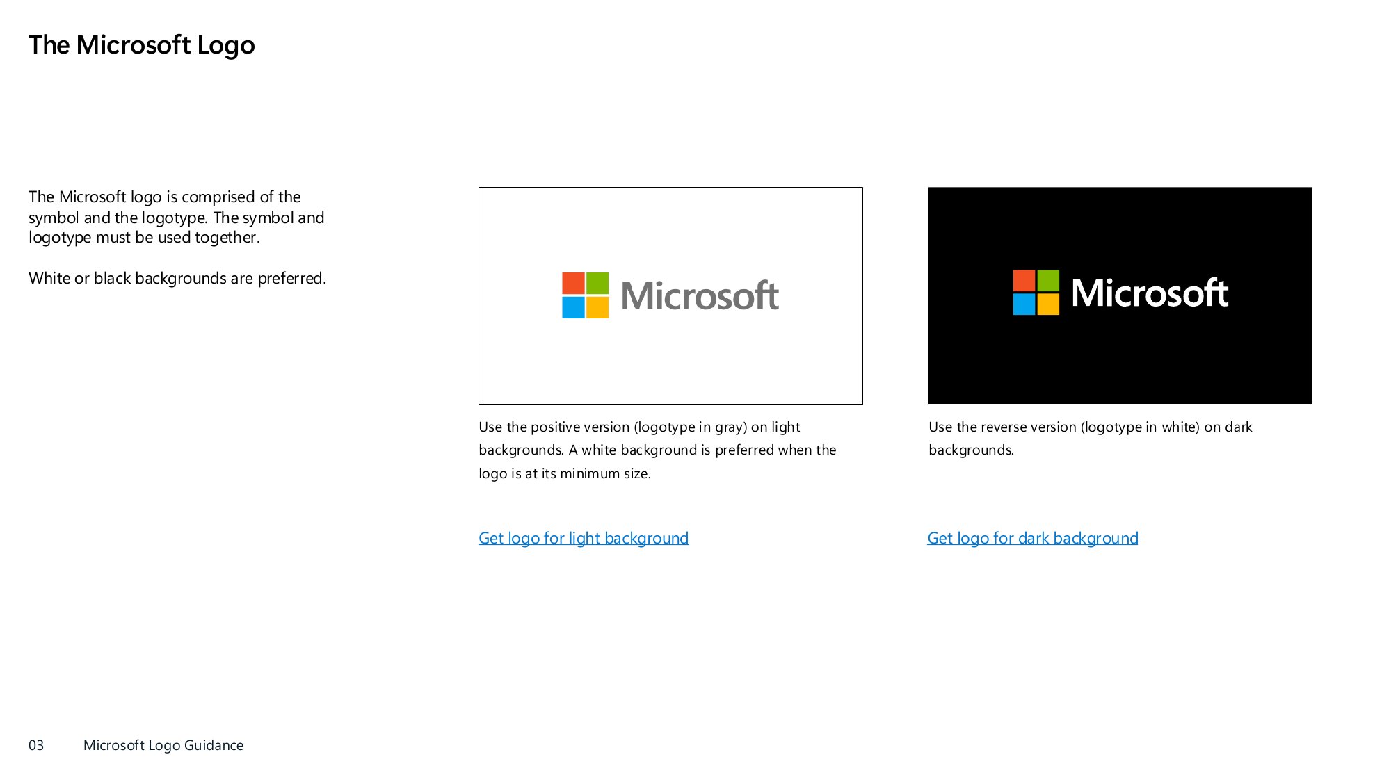
| Squares | #F25022, #7FBA00, #00A4EF, #FFB900 |
|---|---|
| Logotype | #737373 (positive), white (reverse) |
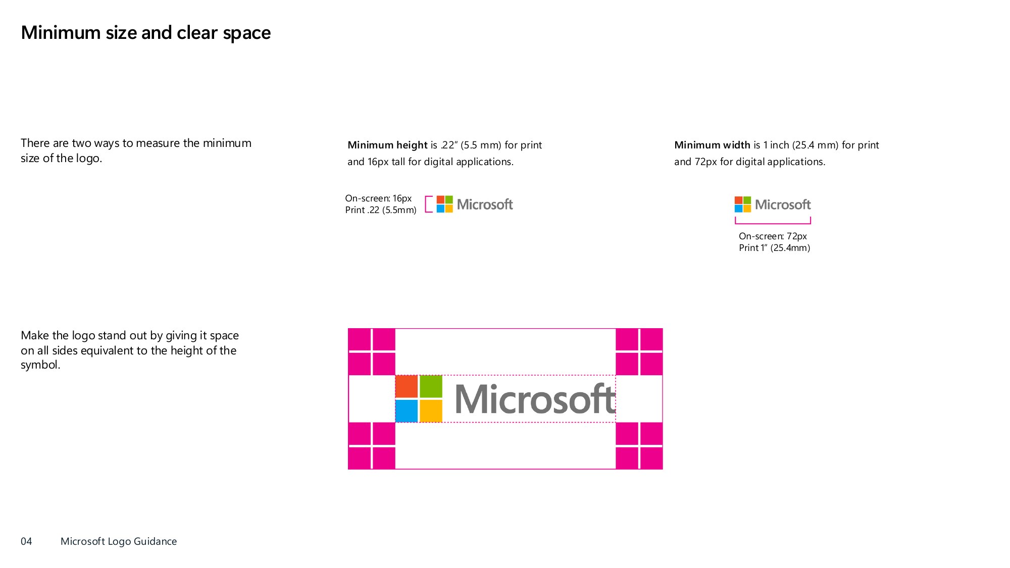
| Clear space | 1x symbol height |
| Minimum on screen | 16px tall / 72px wide |
| Third-party use | license required in most cases |
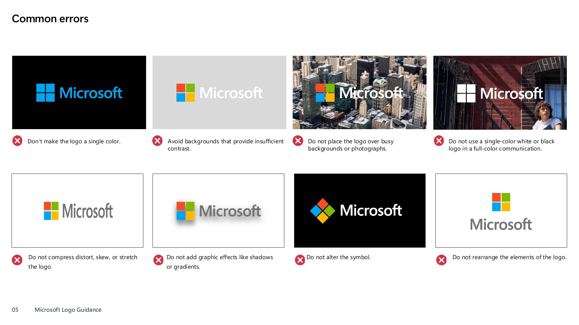
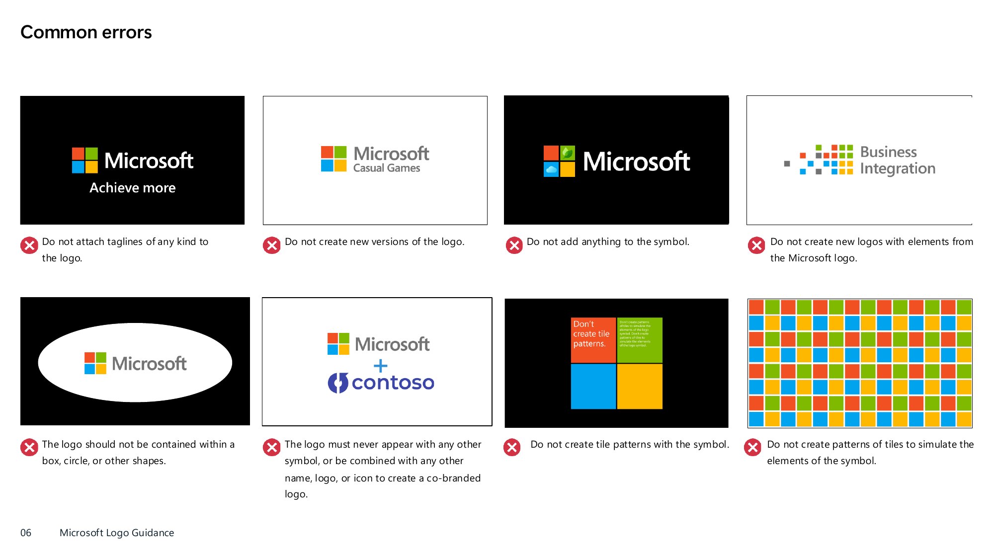
The Microsoft logo is a four-square symbol (red, green, blue, yellow) plus the 'Microsoft' logotype set in Segoe; they always appear together. Use the positive version (gray logotype) on light grounds, the reverse (white logotype) on dark. White or black grounds are preferred.
Source: cdn-dynmedia-1.microsoft.com/is/content/microsoftcorp/microsoft/mscle/documents/legal/intellectualproperty/trademarks/Microsoft_logo_third_party_usage_guidance_.pdfmicrosoft.com/en-us/legal/intellectualproperty/trademarks/usage/generalblogs.microsoft.com/blog/2012/08/23/microsoft-unveils-a-new-look
Read the story
Lighter neutrals focus attention; keeping blue for actions makes the next step obvious.
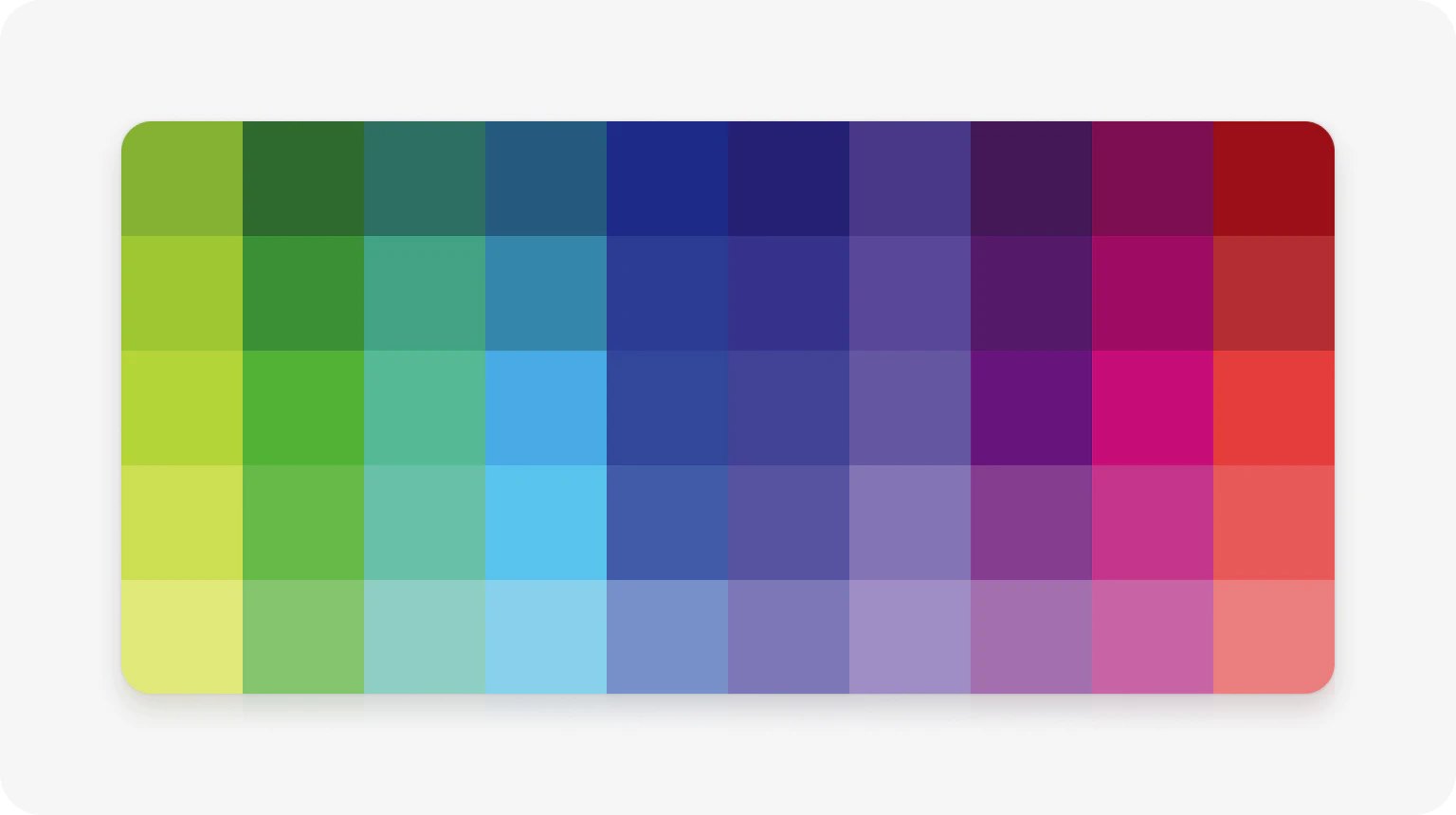
| Action blue (site) | #0078D4 |
|---|---|
| Fluent brandWeb 80 | #0F6CBD |
| Headline ink | #0E1726 |
| Neutral foreground 1 | #242424 (grey 14) |
| Background 2 | #FAFAFA (grey 98) |
Fluent defines three palettes: neutral (black, white, grays for surfaces and text), shared (for avatars, badges, calendars and status) and brand (product colors). Brand color is for prominence and anchoring, not large surfaces. microsoft.com runs on white cards, warm-white and ice gradient grounds, navy type and one action blue (#0078D4).
Not published: percentages or ratios of color use; a marketing palette separate from Fluent's UI tokens.
Source: fluent2.microsoft.design/colorfluent2.microsoft.design/color-tokensgithub.com/microsoft/fluentui/blob/master/packages/tokens/src/global/brandColors.tsgithub.com/microsoft/fluentui/blob/master/packages/tokens/src/global/colors.tsmicrosoft.com/en-us
Empower every person and every organization on the planet to achieve more
Get to know AI and Copilot
GET TO KNOW AI AND COPILOT
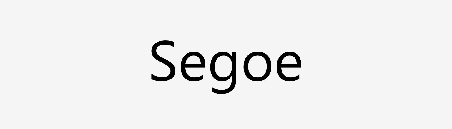
One humanist superfamily, tuned per size, stays readable across every platform and keeps Microsoft recognizable.
| Their face | Use | License | Open stand-in |
|---|---|---|---|
| Segoe UI Variable Display | Headlines at 500, card titles at 600 | Proprietary (Microsoft); ships with Windows, not licensed for third-party web embedding | Hanken Grotesk Closest rendered width to Segoe of 18 open faces (mean 0.75%, ink within 4%), measured 2026-10-29 |
| Segoe UI Variable Text / Segoe UI | Body 16/24, buttons 15/22 600, header 13px, footer 11px | Proprietary (Microsoft) | Hanken Grotesk Same calibration; one family keeps Segoe's single-superfamily system |
| Display | 68/92 Semibold |
|---|---|
| Large Title | 40/52 Semibold |
| Title 1 | 32/40 Semibold |
| Subtitle 1 | 20/26 Semibold |
| Body 1 | 14/20 Regular |
| Caption 1 | 12/16 Regular |
| Homepage h1 | 62/72 weight 500, -1.55px |
| Stand-in | Hanken Grotesk (calibrated) |
Segoe is Microsoft's signature typeface ('friendly and legible'); Fluent's web ramp runs from Caption 2 (10/14) to Display (68/92 Semibold). microsoft.com uses Segoe UI Variable Display and Text at weight 500 for big headlines with negative tracking, 600 for card titles and buttons, 400 for body.
Source: fluent2.microsoft.design/typographymicrosoft.com/en-us
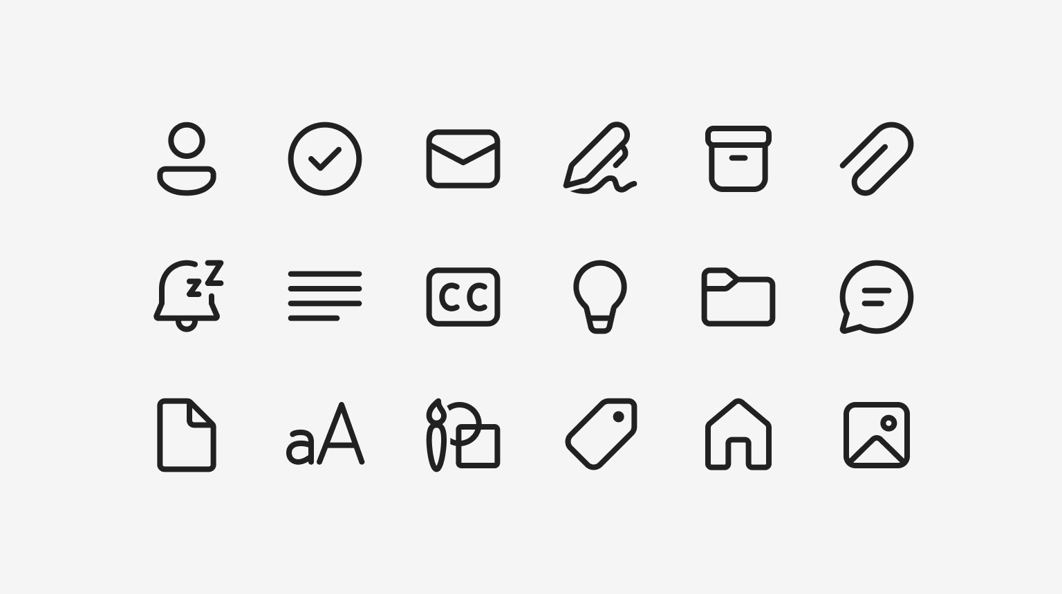
Literal, single-color outline icons stay recognizable and leave color to meaning.
| Themes | regular, filled |
|---|---|
| Library | github.com/microsoft/fluentui-system-icons (MIT) |
| Quick-link icon | 32px (observed) |
| Carousel arrow | 24px (observed) |
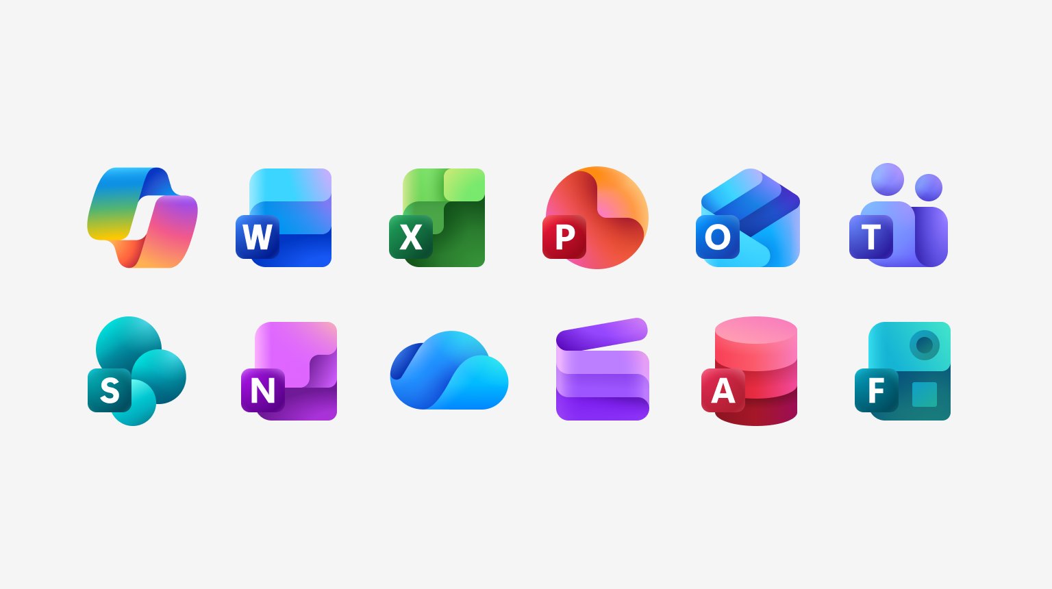
Three collections: Fluent system icons (MIT-licensed, regular and filled themes), product launch icons (Microsoft apps) and file type icons. System icons are literal metaphors named for the object. microsoft.com uses 32px navy outline icons for quick links and 20-24px icons in controls.
Source: fluent2.microsoft.design/iconographymicrosoft.com/en-us
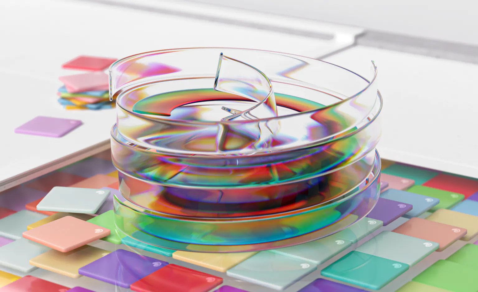
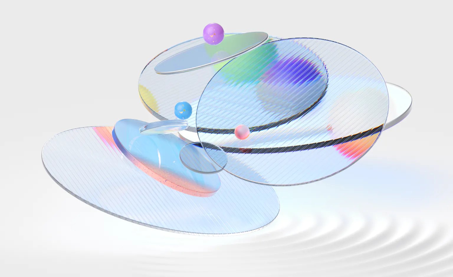
Product-born art (Bloom) carries the brand into marketing without a separate drawing style.
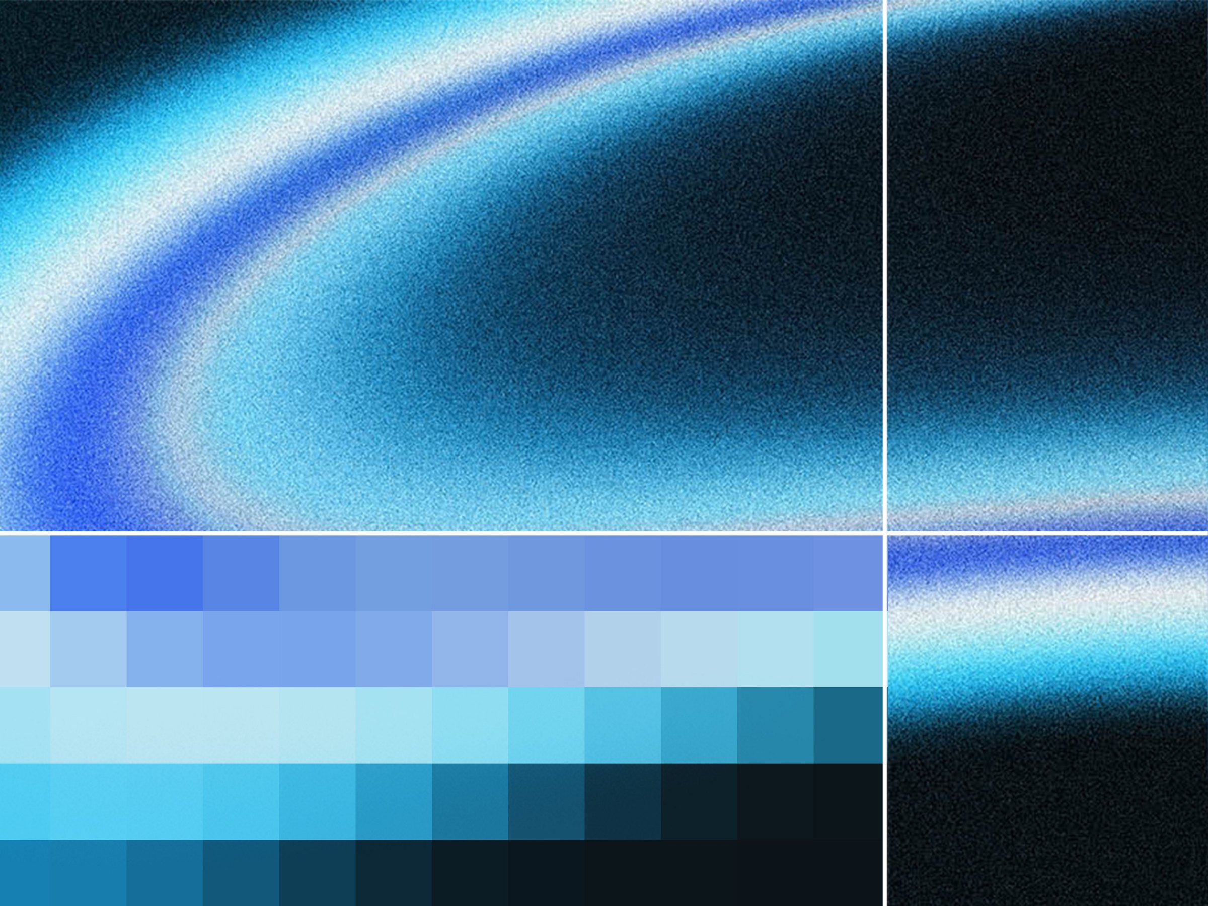
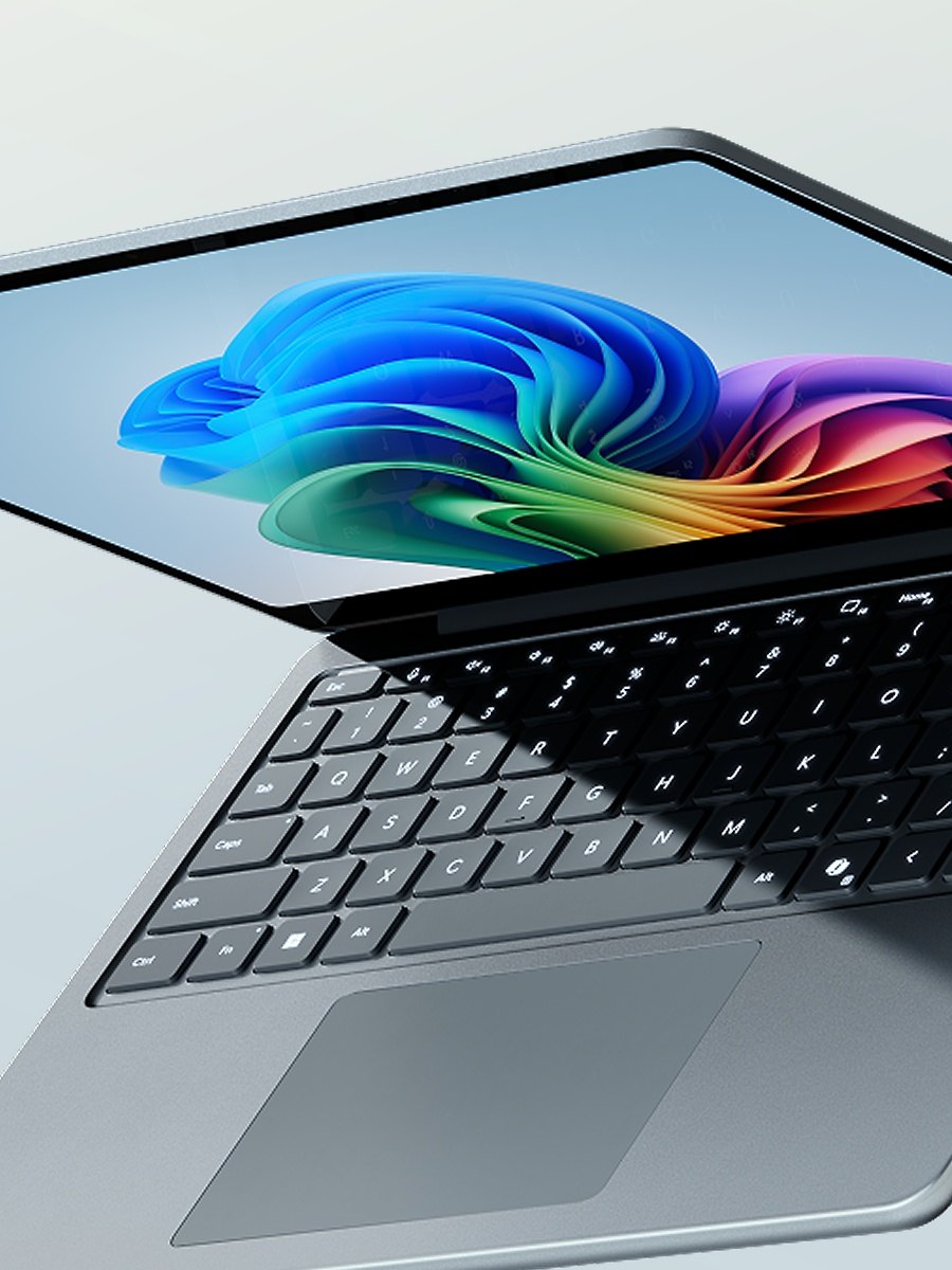
Fluent's public site names illustration as a signature experience but publishes no illustration guide. On microsoft.com, illustration appears as product art: the Windows 11 Bloom on device screens and abstract generated art for reports (the Digital Defense Report's blue glow and pixel grid).
Not published: an illustration style guide on the public Fluent site.
Source: fluent2.microsoft.design/design-principlesmicrosoft.com/en-us
Clean product shots sell; real people make AI concrete.
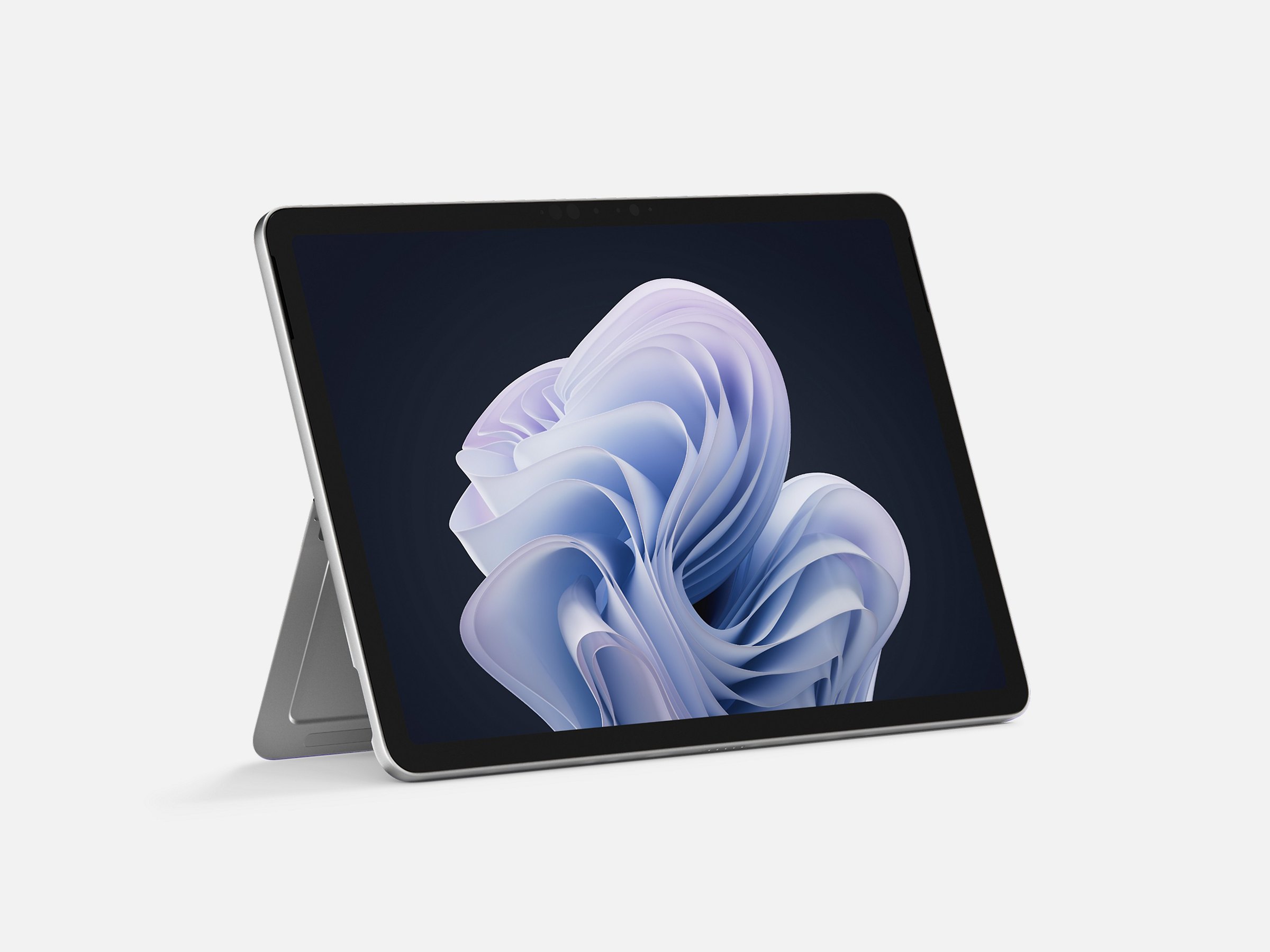
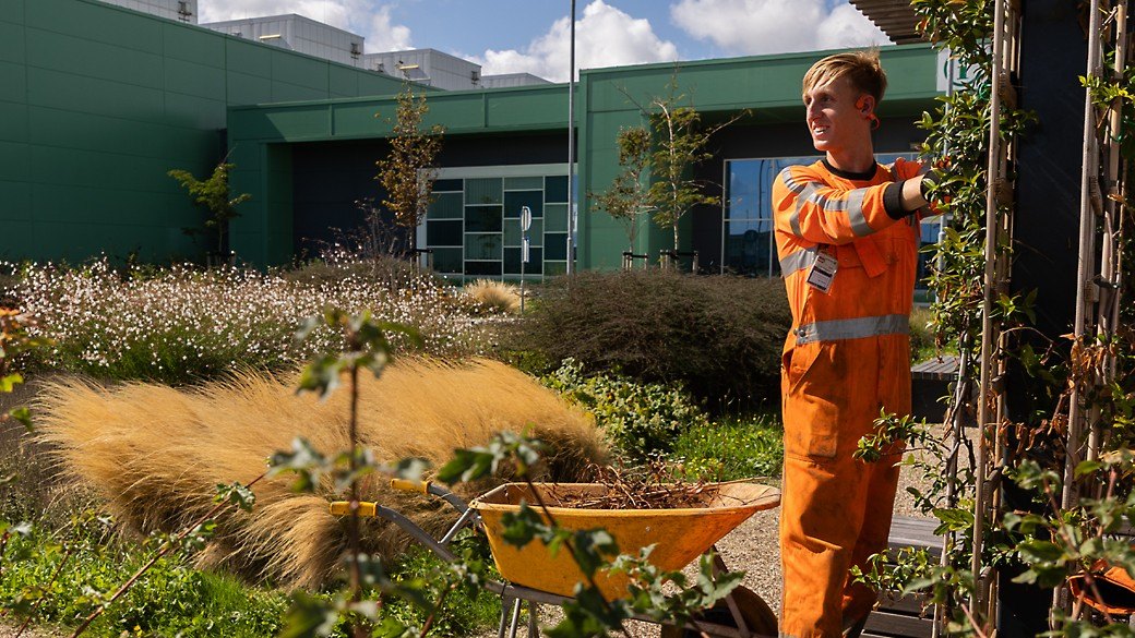
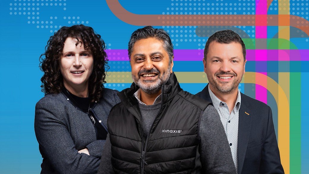
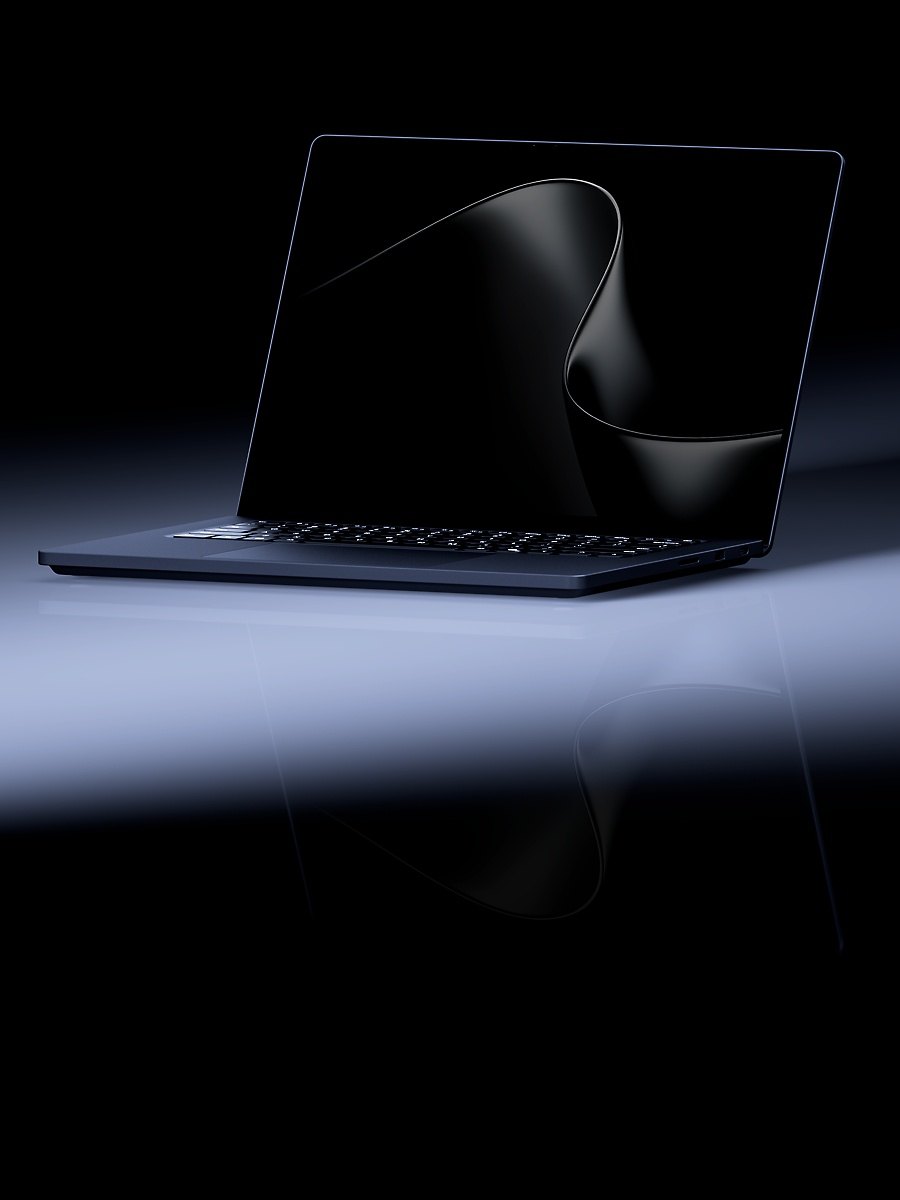
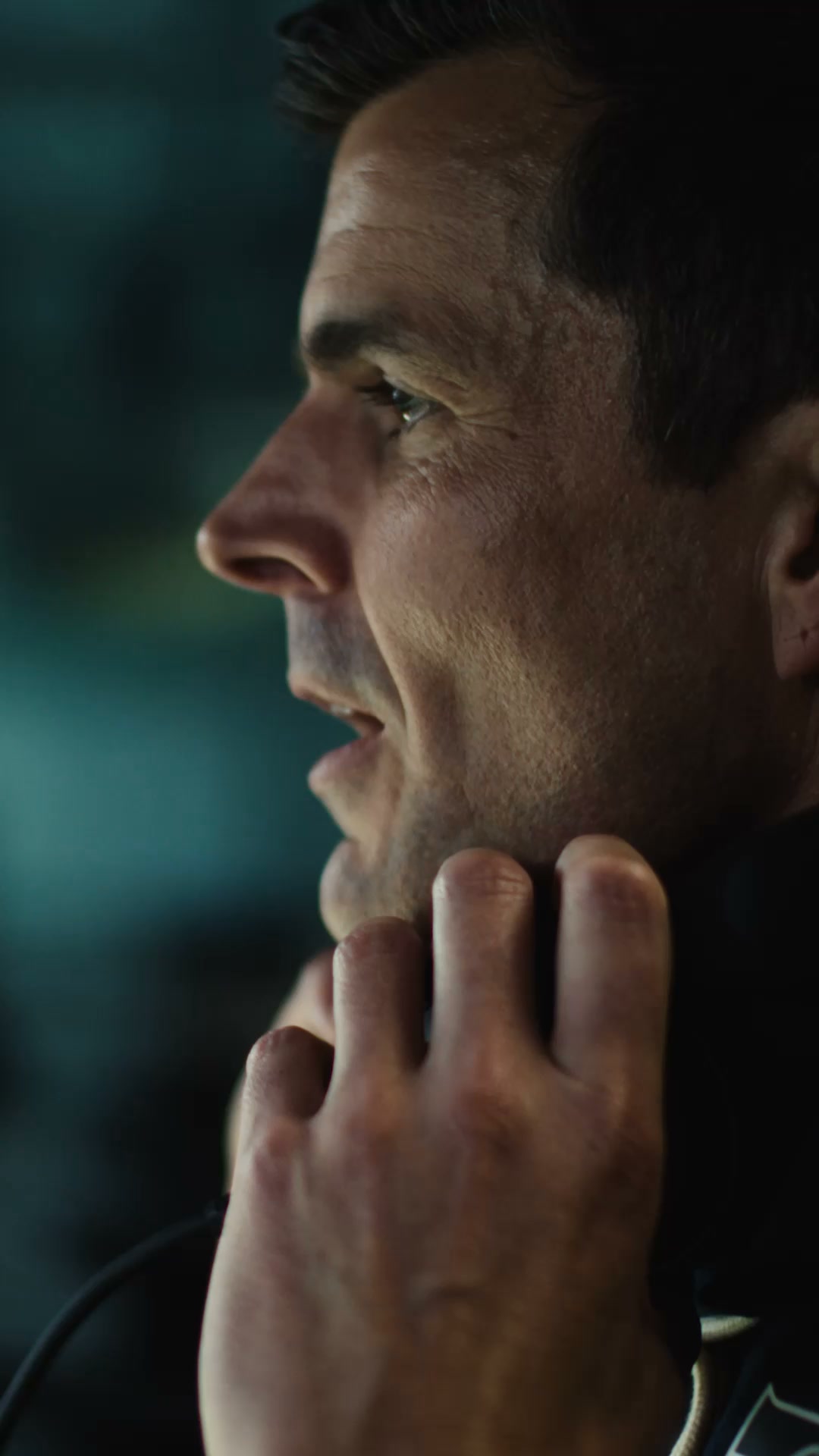
Two kinds on the homepage: studio product photography (Surface, Xbox, accessories) on soft gray or dark grounds, and documentary photos of real people and places for AI stories (disaster response, supply chain, datacenter landscapes). Always in rounded frames.
Not published: a public photography guide.
Source: microsoft.com/en-usmicrosoft.com/en-us/legal/intellectualproperty/copyright/permissions
Physical, quick motion explains change without making people wait.
| Decelerate mid | cubic-bezier(0,0,0,1) |
|---|---|
| Accelerate mid | cubic-bezier(1,0,1,1) |
| Easy ease | cubic-bezier(0.33,0,0.67,1) |
| Normal | 200ms |
| Slow | 300ms |
Fluent motion is functional, natural, consistent and appealing. Durations run 50-500ms; easing uses decelerate curves to enter, accelerate to exit, and easy-ease within the screen. Top-level page changes fade. Provide a no-motion setting.
Source: fluent2.microsoft.design/motiongithub.com/microsoft/fluentui/blob/master/packages/tokens/src/global/curves.tsgithub.com/microsoft/fluentui/blob/master/packages/tokens/src/global/durations.ts
Microsoft
Microsoft
The four-square symbol, gray logotype · top-left of every page header (108x23 at 1440), favicon and the logo sign-off
Surface Laptop Ultra
Surface Laptop Ultra
Staggered dark promo cards · the homepage hero carousel under the AI search field
Read the story
Soft white cards with a Fluent shadow · every content block below the hero
Hi there, welcome to Microsoft
WELCOME TO MICROSOFT!
Greeting plus AI question field · the top of the homepage hero
Specimens use sample copy, not Microsoft’s.
Fluent spaces on a 4px base unit with a 12-column grid and named breakpoints. Corner radii: 4px default, 2px under 32px, 8px and 12px for large components. Elevation pairs a key and an ambient shadow. microsoft.com goes softer: 24px-radius white cards on gradient and ice grounds, 72px page margins, 1296px content width.
Measured from 's .
| Measure | Desktop | Phone |
|---|---|---|
| Page margin | 72px | 16px |
| Card gap | 24px | 24px |
| Navigation | 54px | 54px |
Hero greeting (h1)
Segoe UI Variable Display · 62px (phone 40) · line 1.16 · tracking -1.55px · weight 500
Section headline (h2)
Segoe UI Variable Display · 48px (phone 32) · line 1.17 · tracking -1.2px · weight 500
Card and banner headline
Segoe UI Variable Display · 32px (phone 24) · line 1.25 · tracking -0.8px · weight 500
Feature card title (h3)
Segoe UI Variable Display · 20px (phone 18) · line 1.4 · tracking -0.3px · weight 600
Body
Segoe UI Variable Text / Segoe UI · 16px · line 1.5 · tracking -0.48px · weight 400
Italic prompt
Segoe UI Variable Text / Segoe UI · 16px · line 1.5 · tracking -0.48px · weight 400
Button label
Segoe UI Variable Text / Segoe UI · 15px · line 1.47 · tracking -0.3px · weight 600
Suggestion pill
Segoe UI Variable Text / Segoe UI · 15px · line 1.47 · weight 400
Tag
Segoe UI Variable Text / Segoe UI · 14px · line 1.43 · tracking -0.48px · weight 600
Header link
Segoe UI Variable Text / Segoe UI · 13px · line 1.2 · weight 400
Footer heading
Segoe UI Variable Display · 15px · line 1.33 · tracking -0.375px · weight 600
Footer link
Segoe UI Variable Text / Segoe UI · 11px · line 1.45 · tracking -0.48px · weight 400
Fluent Display (reference)
Segoe UI Variable Display · 68px · line 1.35 · weight 600
How Microsoft’s own landing pages are built, observed on microsoft.com/en-us, 2026-10-29. The full measurements are in spec.md.
Source: fluent2.microsoft.design/layoutfluent2.microsoft.design/shapesfluent2.microsoft.design/elevationmicrosoft.com/en-us
One simple symbol scales from a favicon to a TV sign-off and reads across every product. Our reading
It sells AI through people's ambitions rather than features. Our reading
Abstract light-and-color art signals security research without stock imagery. Our reading
How our engine applies Microsoft's system to each format. This is our recipe built from Fluent, the logo guidance and microsoft.com, not something Microsoft publishes. Level = how expressive (0 plainest).
| Format | What they did | Source |
|---|---|---|
| website | microsoft.com homepage: greeting and AI field, staggered dark promo cards, soft white cards on gradient and ice grounds, #0078D4 buttons, gray UHF footer (observed 2026-10-29). | microsoft.com/en-us |
| product UI | Fluent 2 components across Windows, web, iOS and Android: 4px radius, Segoe, neutral surfaces, brand blue for primary actions. | fluent2.microsoft.design |
| legal and partner | Trademark and logo guidance for third parties: logo only with a license, names as adjectives, no implied endorsement. | microsoft.com/en-us/legal/intellectualproperty/trademarks/usage/general |
| TV | 2024 Super Bowl Copilot spot. | blogs.microsoft.com/blog/2024/02/07/delivering-copilot-for-everyone |
| Format | Loudness | Must appear | What varies |
|---|---|---|---|
| Landing page | White 54px header with the logo top left, centered 62px weight-500 Segoe greeting or headline, warm-white-to-ice gradient ground, white 24px-radius cards with shadow4, #0078D4 40px buttons with 8px radius, 16/24 navy body, #F2F2F2 footer | a staggered dark promo carousel or an AI question field in the hero; which story and banner bands follow | |
| Deck | White slides, Segoe stand-in in sentence case, logo positive on white, blue only on the ask | one product photo or abstract art panel per slide in a rounded frame | |
| Proposal page | Homepage voice, white cards on ice, one blue next-step button | a banner card with a 4:3 image | |
| White ground, navy text, one #0078D4 button, plain second-person copy | a 16:9 hero photo | ||
| Social post | One product or story photo, short sentence-case line, no logo alteration | dark gradient overlay like the promo cards | |
| Error message | Plain language, what happened and what to do, no exclamation point | none |
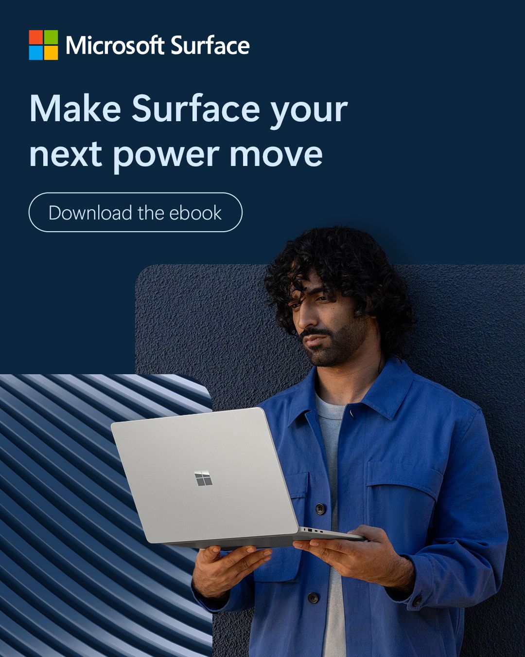
 https://ad.doubleclick.net/ddm/trackclk/B36650923Meta · Oct 2026 – now
 Mcaps Design that delivers 3 ways Surface devices accelerateLinkedIn · Oct – Nov 2026
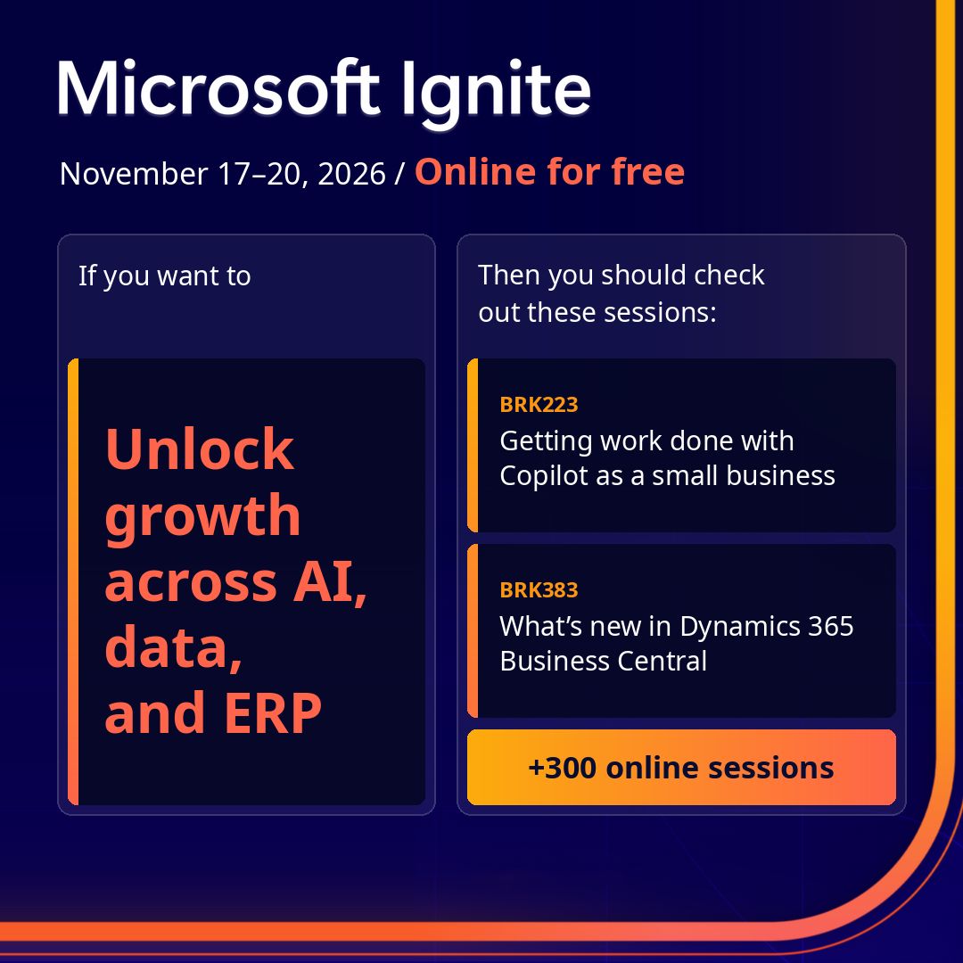
 You’re choosing how people work, how they use AI and how…LinkedIn · Oct – Nov 2026
 WelcomeLinkedIn · Oct – Nov 2026
Source: microsoft.com/en-us/legal/intellectualproperty/trademarks/usage/generalcdn-dynmedia-1.microsoft.com/is/content/microsoftcorp/microsoft/mscle/documents/legal/intellectualproperty/trademarks/Microsoft_logo_third_party_usage_guidance_.pdf
Your name and logo, Microsoft’s system.
Use this kit for my brand Use this brand in Claude
Get your brand audit Put your brand in Claude What goes in a brand book
Each value is marked published, observed, our reading or our recipe, with its source. Checked 2026-10-29. Not affiliated with Microsoft.