Depth
a system that rewards depth, nuance and time well spent over sensational, surface-level stories Published
Brand book
Medium earns recognition by getting out of the way: a cream page, one GT Super sentence, one black pill, and a wordmark in black or white. Color lives only in illustration, so the words always come first. Our reading

Illustration and color: from none (product, reading) to a two-color collage on the homepage to the full secondary palette in brand campaigns.
Our engine's setting, built from their rules.
For people who want to read and write with depth, Medium is the member-supported home for human writing, where anyone can find readers without ads or a following. Our reading
a system that rewards depth, nuance and time well spent over sensational, surface-level stories Published
text first: human writing without ads, spam or fraud, in an internet full of AI-generated content Published
anyone can publish and find readers without building a following first Published
funded by members instead of ads or selling data; part of each membership goes to the writers you read Published
Human stories & ideas
A place to read, write, and deepen your understanding
Everyone has a story to tell
Support human stories
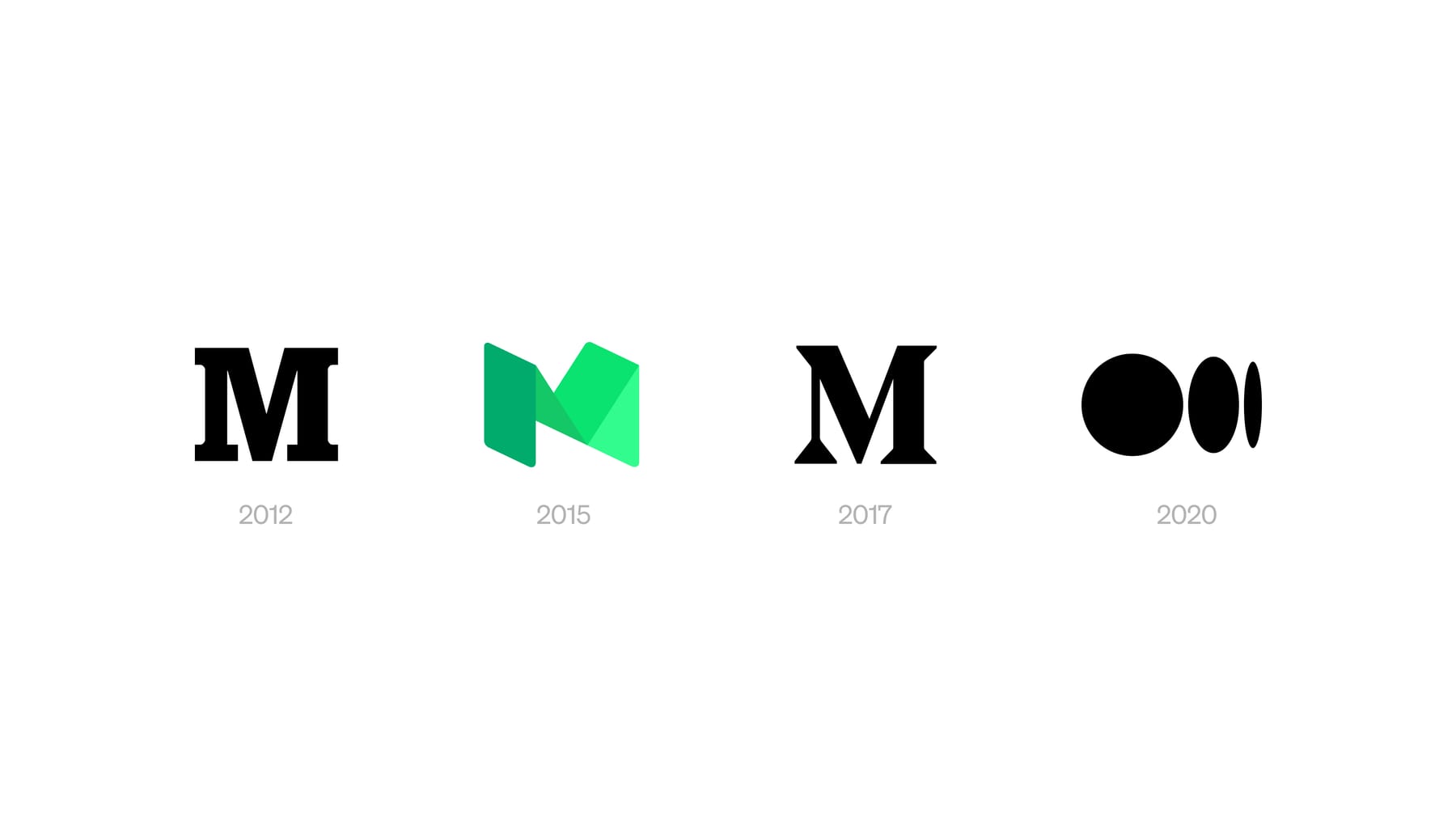
Founded in 2012 as an open publishing platform: a blank page anyone can write on. Rebranded with COLLINS in 2020 (new wordmark, ellipsis symbol, word-built illustrations); in 2024 dropped the symbol and kept the GT Super-derived wordmark alone, to put text first.
words can divide or empower, so the product rewards depth and nuance
Publishedthoughtful conversation over drive-by takes; the design stays quiet so the writing leads
Publishedopen platform regardless of background, affiliation or expertise; the brand takes a back seat to writers
Publishedsupported by members; quality comes first
PublishedCategory. open platform for reading and publishing human writing Published
Medium is a home for human stories and ideas.
Human stories & ideas
A place to read, write, and deepen your understanding
Everyone has a story to tell
Support human stories
Unlock a world of wisdom
Beyond the obvious.
A writing platform keeps its own voice quiet so writers are heard (our reading of the 2020 post: the brand should never get in the way).
plainwarmthoughtfulcandid
Product voice is spare and declarative ("Human stories & ideas", "Start reading"). The about page speaks in we/you about depth, nuance and writing that matters. Design posts are candid and wry about Medium's own history.
humanstoriesideasreadwritedeepenunderstandingdepthnuancewritersmemberswisdom
| Tone guide | not published |
|---|
Source: medium.com/about%20(Our%20story;%20read%202026-10-30)medium.com/membership%20(read%202026-10-30)medium.design/about-mediums-new-ish-logo-458885b2d8ab%20(Jason%20Combs,%20Oct%2031%202024;%20read%202026-10-30)medium.com/%20(Playwright,%20Chromium%20UA%20Chrome%20130%20Mac,%201440x900%20and%20390x844,%20plus%20768/1024/1280/1920%20and%20a%20320-1600px%20width%20sweep,%202026-10-30)
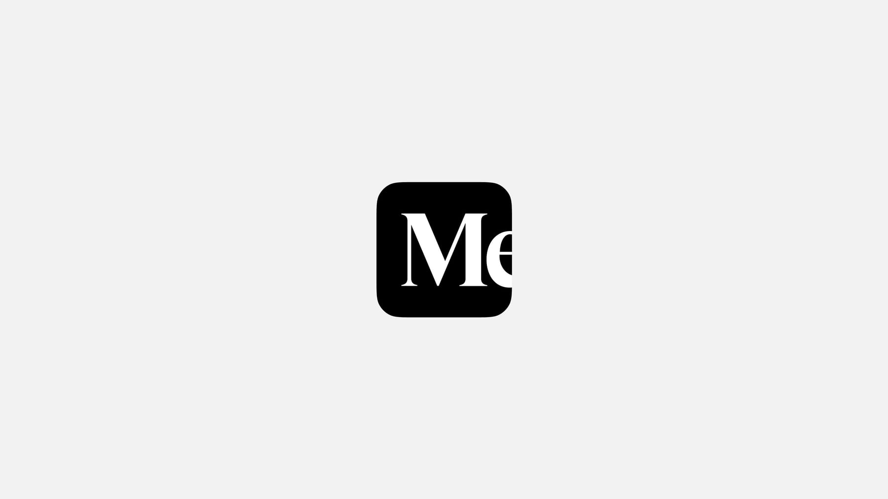
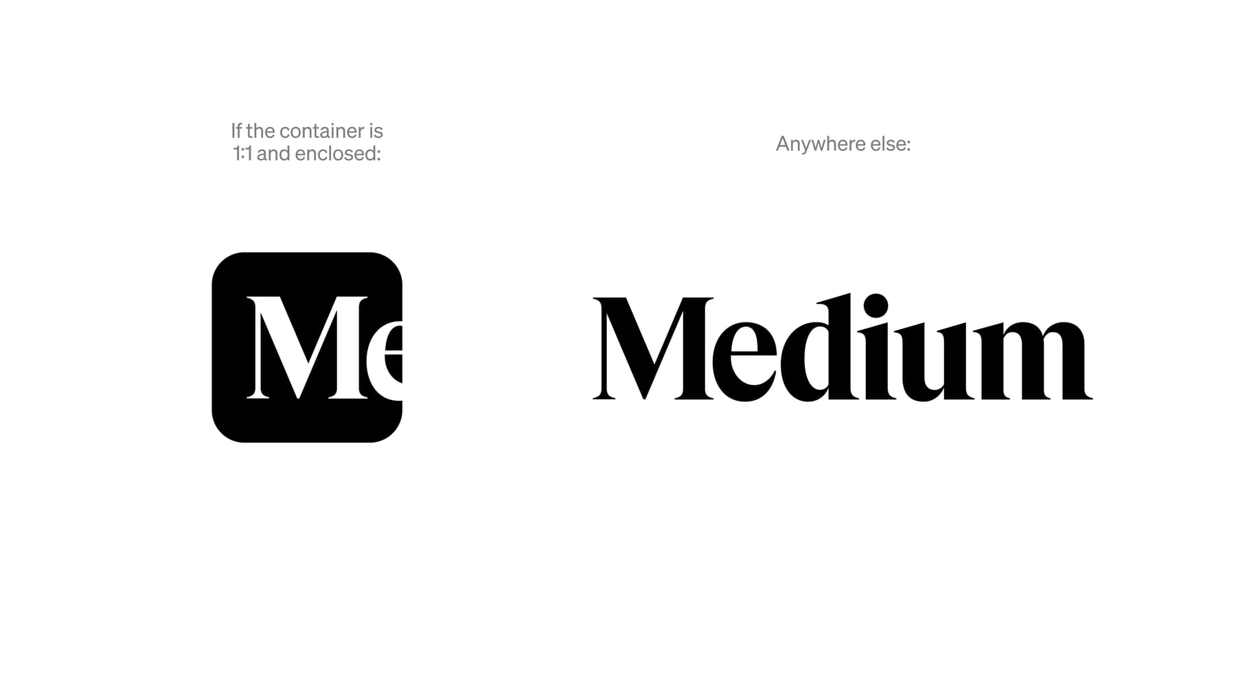
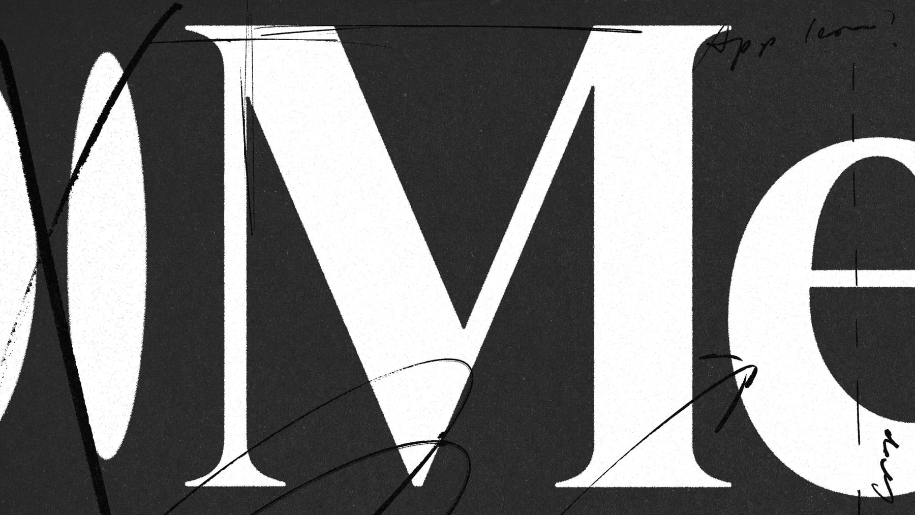
Using the wordmark alone is, in Medium's words, an embrace of the human-typed word; the cropped "Me" implies more beyond the frame and nods to first-person writing (published).
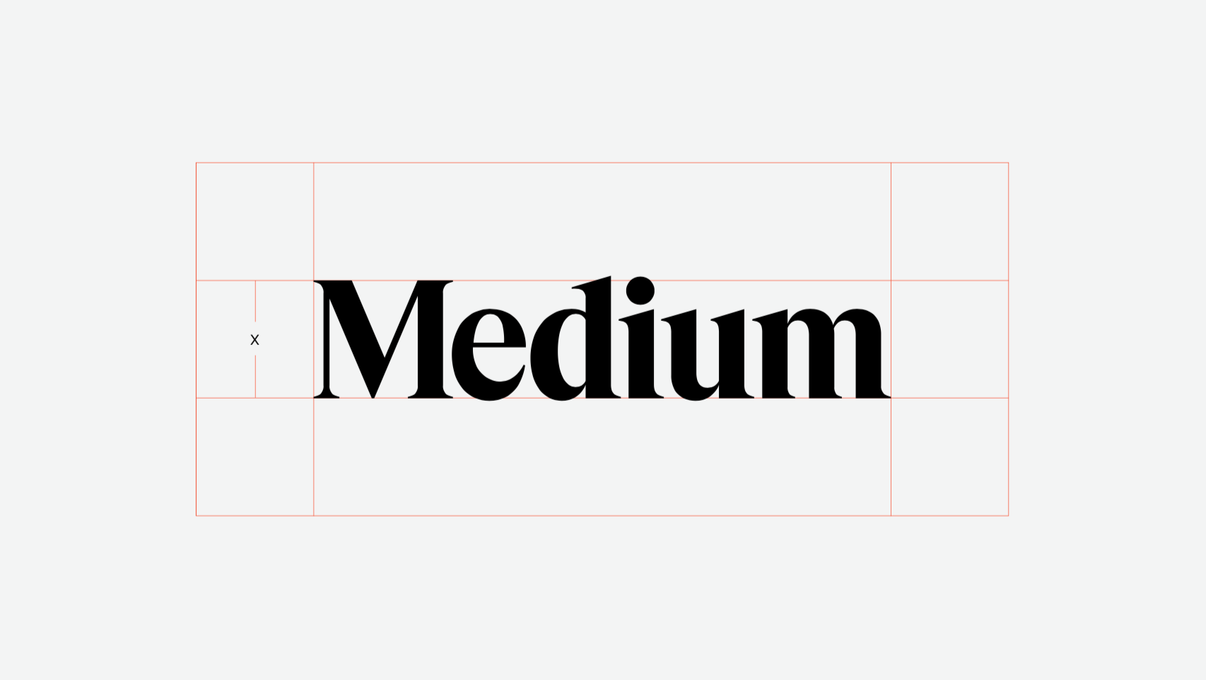
| Primary | Wordmark only, black or white |
|---|---|
| Clear space | X = wordmark height, all sides |
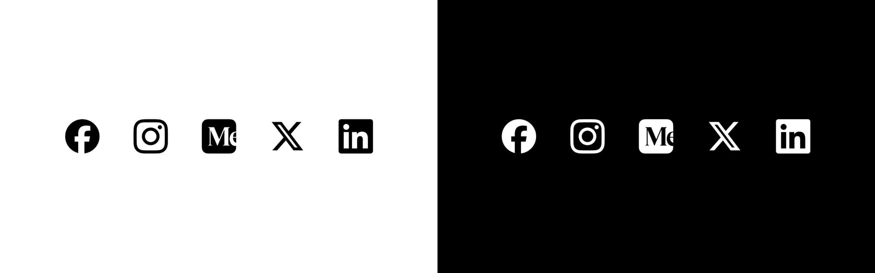
| Icon | "Me" crop, 1:1 enclosed containers only |
| Min size | not published |
| On site | 112.3x25, #242424 (observed) |
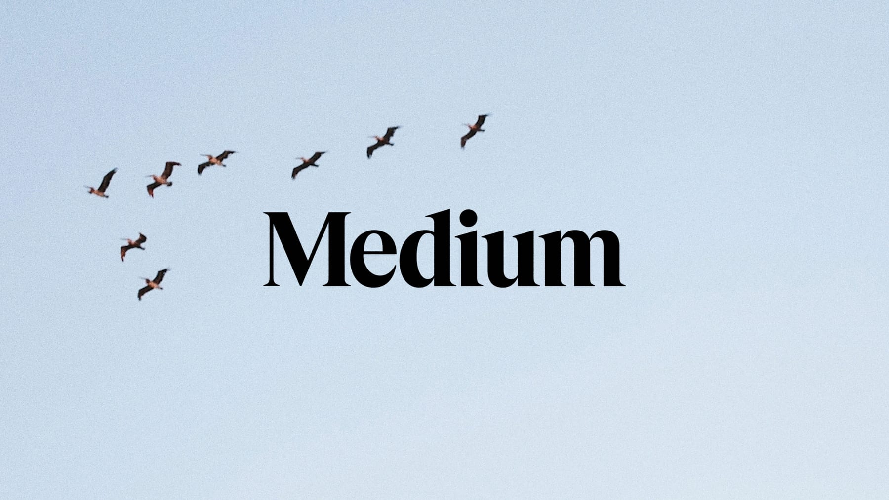
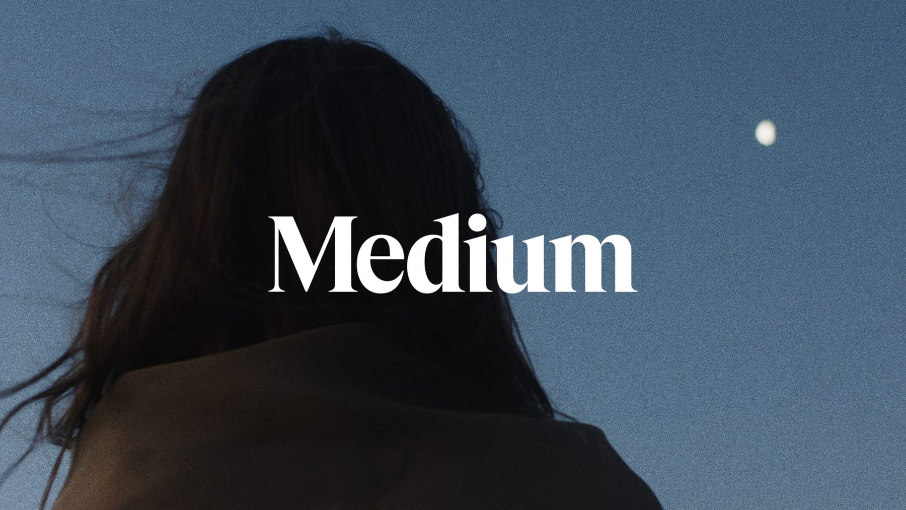
Medium signs with its wordmark alone: a custom serif modified from GT Super, smoother and tighter than its 2017-2020 predecessor. The 2020 ellipsis symbol was dropped in 2024. In square, enclosed spaces Medium crops the wordmark so the M is centred and the e runs off the edge. On the homepage the wordmark is an inline SVG, 112.3x25, filled #242424.
Source: medium.design/logos-and-brand-guidelines-f1a01a733592%20(Medium%20Logo%20and%20Usage%20Guidelines,%20last%20updated%20Oct%2030%202024;%20read%202026-10-30)medium.design/about-mediums-new-ish-logo-458885b2d8ab%20(Jason%20Combs,%20Oct%2031%202024;%20read%202026-10-30)blog.medium.com/a-more-expressive-medium-starting-with-medium-63b562206d8f%20(Karene%20Tropen,%20Oct%2014%202020;%20read%202026-10-30)
Start reading
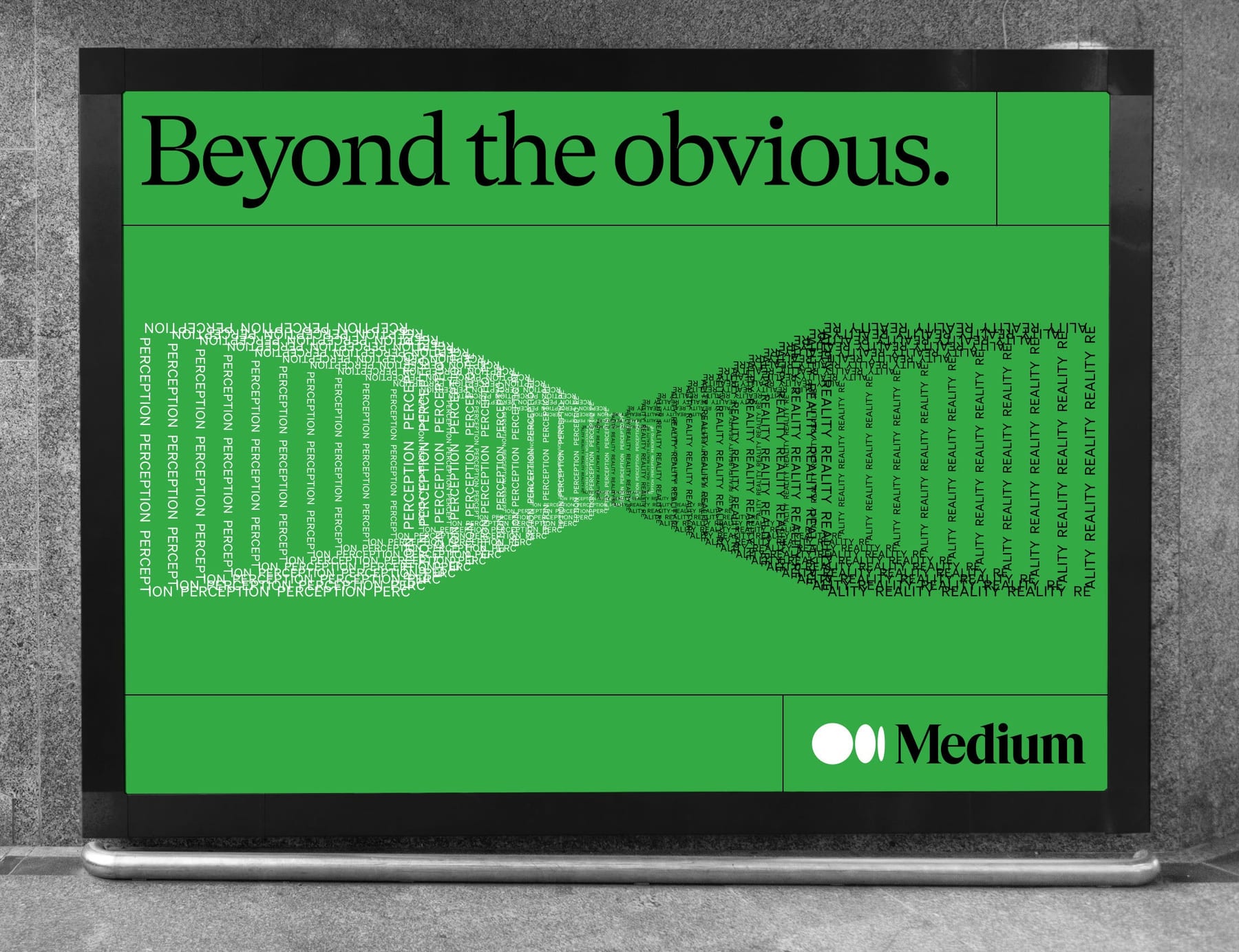
Medium describes itself as a blank canvas for other people's writing, which black and white represent; the secondary palette stands for the range of perspectives (published, 2020).
| Ground | #F7F4ED |
|---|---|
| Text | #242424 |
| Headline | #000000 |
| Button | #191919, hover #080808 |
| Muted | #6B6B6B |
| Illustration | #34AA45 + #242424 |
| Dark mode | #171717 / #121212 / #E5E5E5 / #D2D2D2 |
The brand leans on black and white; color is reserved for marketing illustration. The logged-out homepage (2026-10-30) is one warm cream #F7F4ED ground with #242424 ink, a #000000 headline, #191919 pill buttons and #6B6B6B footer links. The only hue on the page is the illustration green #34AA45. Dark mode swaps to #171717 / #121212 grounds, #E5E5E5 text and white pills.
Source: blog.medium.com/a-more-expressive-medium-starting-with-medium-63b562206d8f%20(Karene%20Tropen,%20Oct%2014%202020;%20read%202026-10-30)medium.com/%20(Playwright,%20Chromium%20UA%20Chrome%20130%20Mac,%201440x900%20and%20390x844,%20plus%20768/1024/1280/1920%20and%20a%20320-1600px%20width%20sweep,%202026-10-30)medium.com/%20with%20prefers-color-scheme:%20dark%20(Playwright,%201440x900,%202026-10-30)
Human stories & ideas
Human stories & ideas
HUMAN STORIES & IDEAS
COLLINS chose GT Super for its 70s-80s editorial roots and big x-height, readable on small screens; Söhne was already Medium's supporting face and stayed for its clarity (published, third-party interview).
| Their face | Use | License | Open stand-in |
|---|---|---|---|
| GT Super (Grilli Type) | Commercial (Grilli Type); not supplied. Stand-in Newsreader 380 opsz 72 (OFL), -0.042em, same px sizes | ||
| Söhne (Klim Type Foundry) | Commercial (Klim); not supplied. Stand-in Geist 400 (OFL), -0.012em |
| Display | GT Super 400 -> Newsreader 380 opsz 72 |
|---|---|
| UI | Söhne 400 -> Geist 400 |
| Reading | Source Serif 20/32 |
| Hero | 120/100, -6.6px (80/72 phone) |
| Subline | 22/28 |
GT Super (Grilli Type) for headlines, Söhne (Klim) for everything else; story bodies in Source Serif. On the homepage GT Super runs at 120px with a 100px line box and -0.055em tracking; Söhne at 22, 20, 14 and 13px, all weight 400.
Source: the-brandidentity.com/feed/collins-refresh-medium-keeps-one-eye-future-editorial-origins/%20(The%20Brand%20Identity,%20Nov%203%202020,%20quoting%20COLLINS;%20read%202026-10-30)medium.design/about-mediums-new-ish-logo-458885b2d8ab%20(Jason%20Combs,%20Oct%2031%202024;%20read%202026-10-30)medium.com/%20(Playwright,%20Chromium%20UA%20Chrome%20130%20Mac,%201440x900%20and%20390x844,%20plus%20768/1024/1280/1920%20and%20a%20320-1600px%20width%20sweep,%202026-10-30)medium.com/blog/a-more-expressive-medium-starting-with-medium-63b562206d8f%20(a%20live%20story%20page,%20computed%20styles%20at%201440,%202026-10-30)
Human stories & ideas
One GT Super sentence owns the first screen · the hero of every logged-out marketing page
Start reading
Black pill, plain label · every primary action (nav and hero)
Do One #F7F4ED ground from top to bottom; structure comes only from two 1px #242424 full-bleed rules (under the nav, above the footer). No cards, shadows, gradients or panels.
Cream page held by hairlines · nav, hero and footer
Do The GT Super-derived Medium wordmark with no symbol, black (#242424 on the site) or white only, clear space = its height on all sides; in a 1:1 enclosed container use the cropped "Me" icon instead.
Wordmark alone, black or white · nav and anywhere the brand signs
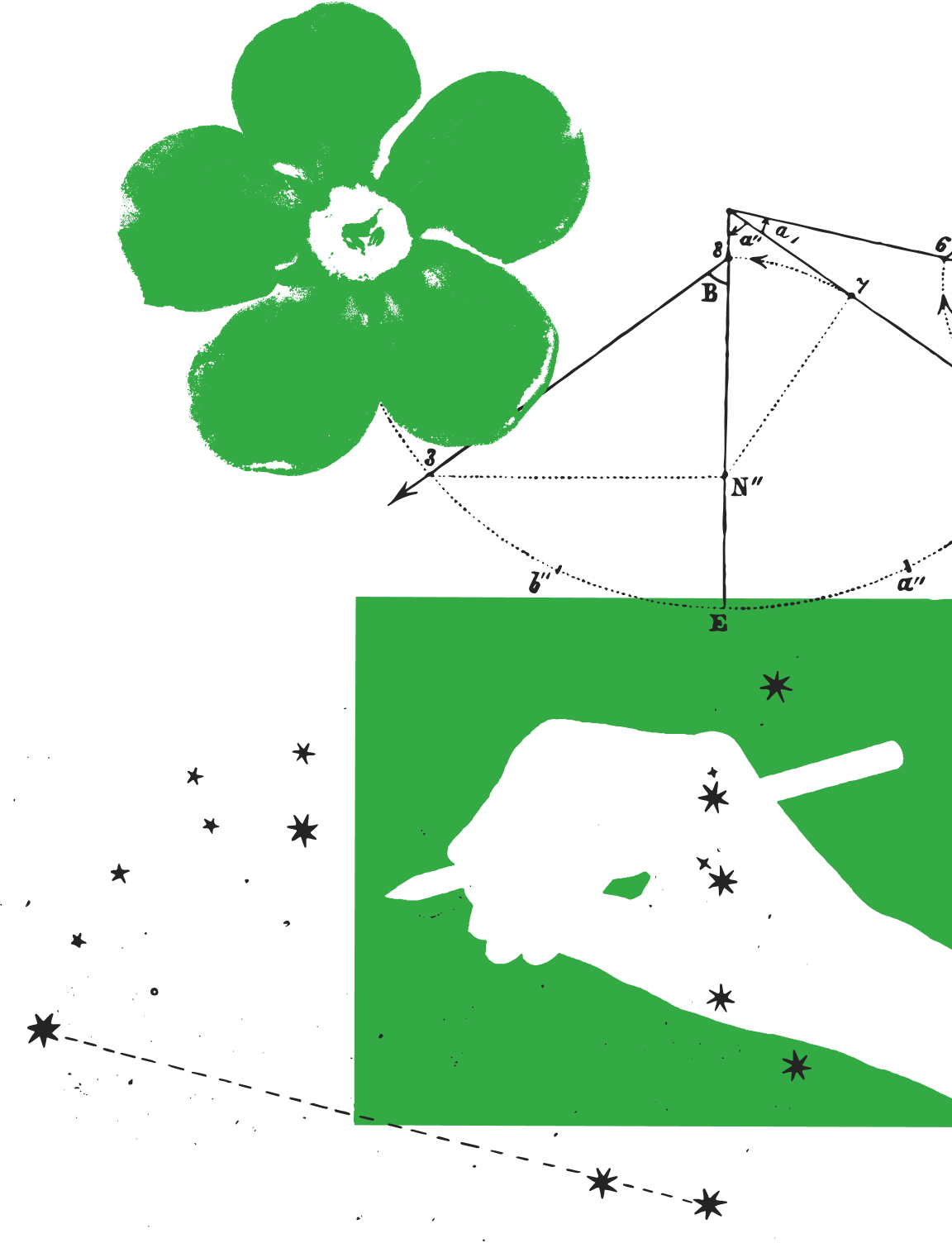
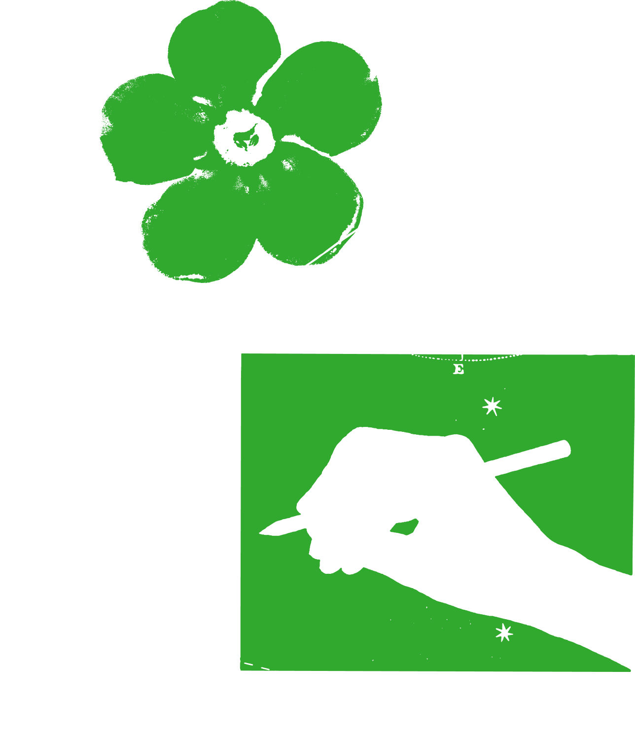
Do A still collage of flat #34AA45 green shapes (a flower, a rectangle with a hand holding a pencil cut out of it) and #242424 engraving-style linework (a geometry diagram with lettered points, dotted arcs, eight-point stars, dashed line) with a grainy printed edge; 460x600, cropped by the viewport's right edge; transparent background over the cream.
Printed two-color collage bleeding off the edge · the right side of the desktop hero only
Specimens use sample copy, not Medium’s.
Text first (published, 2024).
| Rule | 1px solid #242424, full bleed |
|---|---|
| Radius | pill buttons only |
There is no decorative device in the UI: the signature is restraint. Two full-bleed 1px #242424 rules frame the page; the only graphic is the hero illustration.
Source: medium.com/%20(Playwright,%20Chromium%20UA%20Chrome%20130%20Mac,%201440x900%20and%20390x844,%20plus%20768/1024/1280/1920%20and%20a%20320-1600px%20width%20sweep,%202026-10-30)medium.design/about-mediums-new-ish-logo-458885b2d8ab%20(Jason%20Combs,%20Oct%2031%202024;%20read%202026-10-30)
| Icon system | not published |
|---|
Source: medium.design/logos-and-brand-guidelines-f1a01a733592%20(Medium%20Logo%20and%20Usage%20Guidelines,%20last%20updated%20Oct%2030%202024;%20read%202026-10-30)medium.com/%20(Playwright,%20Chromium%20UA%20Chrome%20130%20Mac,%201440x900%20and%20390x844,%20plus%20768/1024/1280/1920%20and%20a%20320-1600px%20width%20sweep,%202026-10-30)
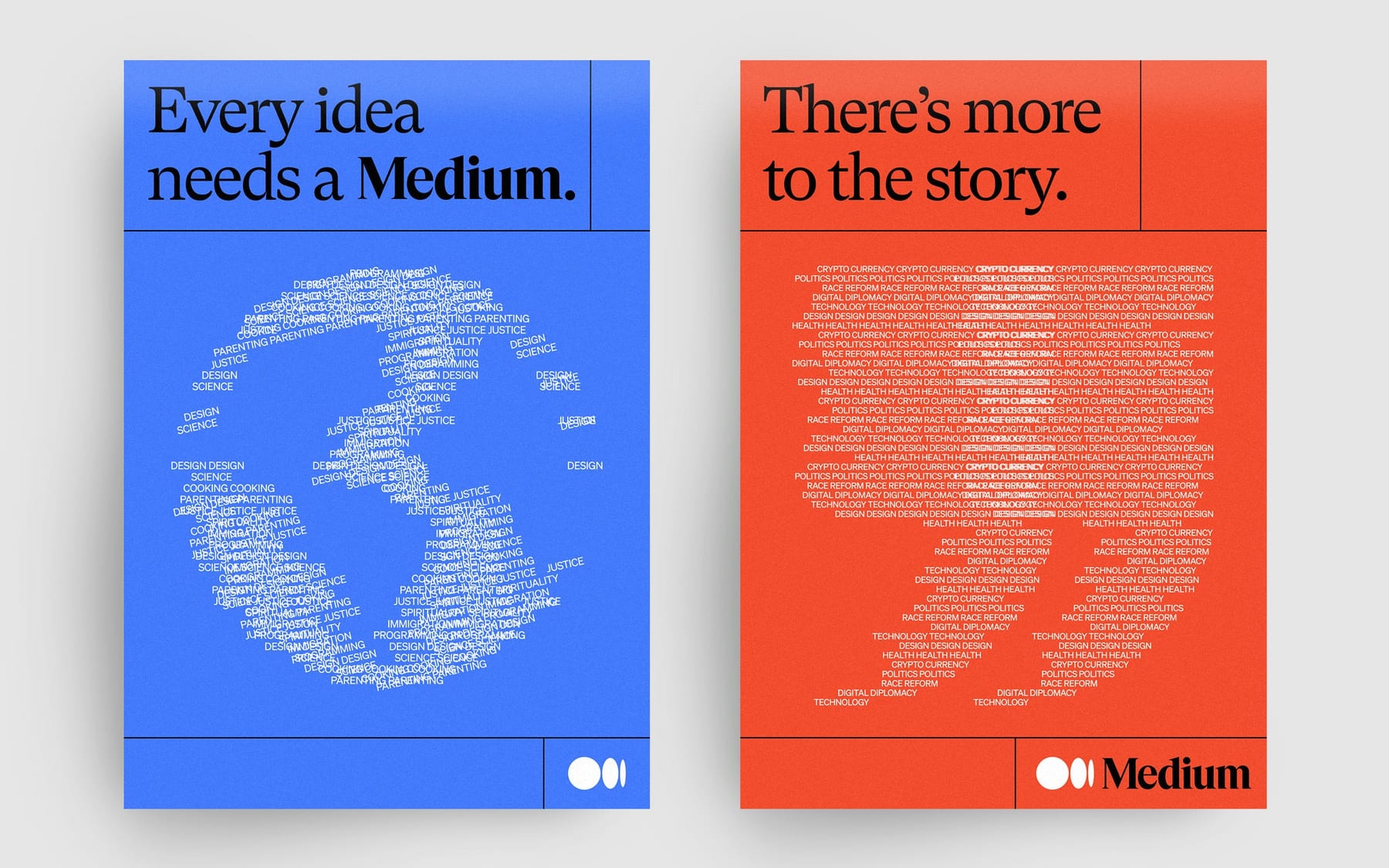
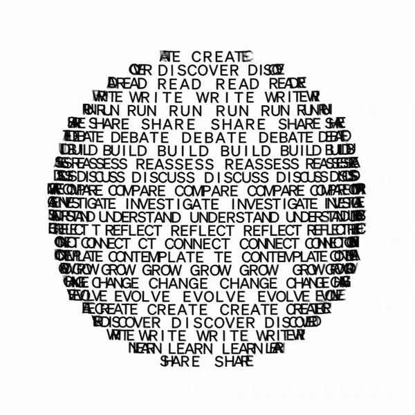
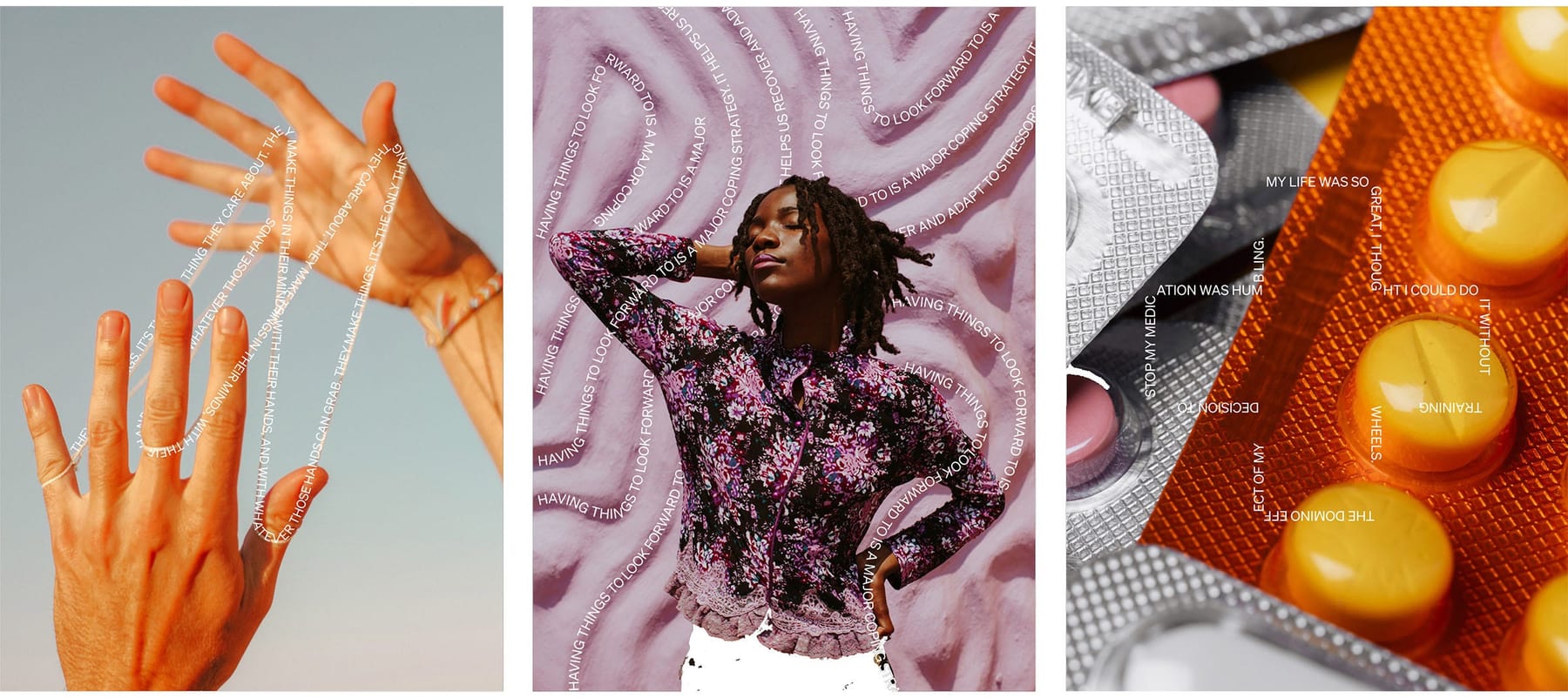
Words building images showed what happens on Medium (published, 2020); the newer, warmer style matches the human-writing positioning (published, 2024; no rules for it yet).
| Hero image | 460x600, right-edge bleed |
|---|---|
| Inks | #34AA45, #242424 |
| Phone | hidden |
Two eras. 2020 (COLLINS): "language as illustration", images built from letters and words, sometimes 3-D or moving, sometimes interlaced with photography, inspired by concrete poetry. 2024 on: Medium says it is moving away from those ASCII-style text illustrations toward a warmer, more human approach on the logged-out homepage and blog images. The current homepage collage: flat green #34AA45 shapes with grainy printed edges plus black engraving-style diagram linework, on transparent, 1152x1504 source shown at 460x600.
Source: blog.medium.com/a-more-expressive-medium-starting-with-medium-63b562206d8f%20(Karene%20Tropen,%20Oct%2014%202020;%20read%202026-10-30)medium.design/about-mediums-new-ish-logo-458885b2d8ab%20(Jason%20Combs,%20Oct%2031%202024;%20read%202026-10-30)itsnicethat.com/news/collins-medium-rebrand-graphic-design-191020%20(It's%20Nice%20That,%20Oct%2019%202020;%20read%202026-10-30)the-brandidentity.com/feed/collins-refresh-medium-keeps-one-eye-future-editorial-origins/%20(The%20Brand%20Identity,%20Nov%203%202020,%20quoting%20COLLINS;%20read%202026-10-30)medium.com/%20(Playwright,%20Chromium%20UA%20Chrome%20130%20Mac,%201440x900%20and%20390x844,%20plus%20768/1024/1280/1920%20and%20a%20320-1600px%20width%20sweep,%202026-10-30)
| Principles | not published |
|---|
The homepage is exactly one screen at every width: fixed 76px nav, a cream hero field filling the viewport minus a 69px footer, and the footer. Content sits in a 1192px container (64/48/24px margins); the hero text block is vertically centred; the illustration hangs off the right viewport edge on desktop.
Measured from medium.com/%20(logged%20out)'s Playwright Chromium computed styles at 1440x900 and 390x844, plus 768, 1024, 1280, 1920 and a 4px-step width sweep 320-1600 for breakpoints, 2026-10-30.
| Measure | Desktop | Phone |
|---|---|---|
| Page margin | 64px | 24px |
| Hero text width | max 720px, centered | full width |
| Navigation | 76px | 76px |
Hero headline (h2), "Human / stories & ideas"
GT Super (Grilli Type) · 120px (phone 80) · line 100px · tracking -6.6px · weight 400
Hero subline (h3)
Söhne (Klim Type Foundry) · 22px · line 28px · weight 400
Hero CTA label (Start reading)
Söhne (Klim Type Foundry) · 20px · line 28px · weight 400
Nav links and the Get started label
Söhne (Klim Type Foundry) · 14px · line 20px · weight 400
Footer links
Söhne (Klim Type Foundry) · 13px · line 20px · weight 400
Story title (reading page, not on the homepage)
Söhne (Klim Type Foundry) · 42px · line 52px · tracking -0.462px · weight 700
Story subtitle
Söhne (Klim Type Foundry) · 22px · line 28px · weight 400
Section heading inside a story
Söhne (Klim Type Foundry) · 20px · line 24px · weight 600
Story body text (reading serif)
GT Super (Grilli Type) · 20px · line 32px · tracking -0.06px · weight 400
Byline and meta (read time, date)
Söhne (Klim Type Foundry) · 14px · line 20px · weight 400
How Medium’s own landing pages are built, observed on medium.com/%20(logged%20out), 2026-10-30. The full measurements are in spec.md.
The illustrations show what Medium does: language that clarifies and expands ideas (published). Our reading
Puts the typed word first in an internet full of spam and AI content (published). Our reading
Where the system shows up and how loud it gets.
| Format | What they did | Source |
|---|---|---|
| App icon / favicon / official avatar | The cropped "Me" icon, black or white | medium.design/logos-and-brand-guidelines-f1a01a733592%20(Medium%20Logo%20and%20Usage%20Guidelines,%20last%20updated%20Oct%2030%202024;%20read%202026-10-30) |
| App splash | Wordmark types on, under one second | medium.design/about-mediums-new-ish-logo-458885b2d8ab%20(Jason%20Combs,%20Oct%2031%202024;%20read%202026-10-30) |
| Press and banner images | Wordmark on photo or colored ground, clear space = its height | medium.design/logos-and-brand-guidelines-f1a01a733592%20(Medium%20Logo%20and%20Usage%20Guidelines,%20last%20updated%20Oct%2030%202024;%20read%202026-10-30) |
| Format | Loudness | Must appear | What varies |
|---|---|---|---|
| Landing page (medium.com logged-out homepage, as the live site builds it) | Exactly kit.spec.page, in this order and nothing more: fixed cream nav (wordmark; Our story, Membership, Write, Sign in; Get started pill), one-screen cream hero (GT Super 120/100 headline in two hand-broken lines, Söhne 22/28 subline, one 196x46 #191919 Start reading pill, the 460x600 illustration flush right on desktop only), footer strip of grey links under a 1px #242424 rule. Stand-ins Newsreader 380 opsz 72 (-0.042em) and Geist 400 (-0.012em) at the measured px. Product voice: three-word headline, sentence case, verb buttons. Labels verbatim. The illustration from study.slot_assets | The headline and subline copy; the illustration subject (keep two inks, printed texture, right-edge bleed) | |
| Story / article page | Söhne title 42/52 700, Source Serif 20/32 body at a 680px measure, #242424 on white, wordmark in the nav | Writer's own images; no brand illustration | |
| Brand campaign (posters, out of home, social) | GT Super headline in sentence case, wordmark black or white with clear space = its height | Secondary color grounds and illustration (hexes not published: take them from the campaign source, never invent) | |
| App icon, avatar, favicon | Cropped "Me" icon, black or white, only in 1:1 enclosed containers | none | |
| Deck or proposal page | Cream or white ground, GT Super titles, Söhne text, one near-black pill or none, wordmark alone (our recipe) | One illustration per section at most, two inks |
Source: medium.design/logos-and-brand-guidelines-f1a01a733592%20(Medium%20Logo%20and%20Usage%20Guidelines,%20last%20updated%20Oct%2030%202024;%20read%202026-10-30)medium.design/about-mediums-new-ish-logo-458885b2d8ab%20(Jason%20Combs,%20Oct%2031%202024;%20read%202026-10-30)blog.medium.com/a-more-expressive-medium-starting-with-medium-63b562206d8f%20(Karene%20Tropen,%20Oct%2014%202020;%20read%202026-10-30)medium.com/%20(Playwright,%20Chromium%20UA%20Chrome%20130%20Mac,%201440x900%20and%20390x844,%20plus%20768/1024/1280/1920%20and%20a%20320-1600px%20width%20sweep,%202026-10-30)
Your name and logo, Medium’s system.
Use this kit for my brand Use this brand in Claude
Get your brand audit Put your brand in Claude What goes in a brand book
Each value is marked published, observed, our reading or our recipe, with its source. Checked 2026-10-30. Not affiliated with Medium.