Power the digital economy
Bold ideas delivered through critical payments technology and services. Published
Brand book
Everything on the page is a circle or part of one, so the brand is recognizable even where the logo isn't. Our reading

Photography and the campaign it serves (sport, travel, partnerships) change; the frame around them does not.
Source: mastercard.com/us/en.html
Our engine's setting, built from their rules.
Every Mastercard is spelled Mastercard
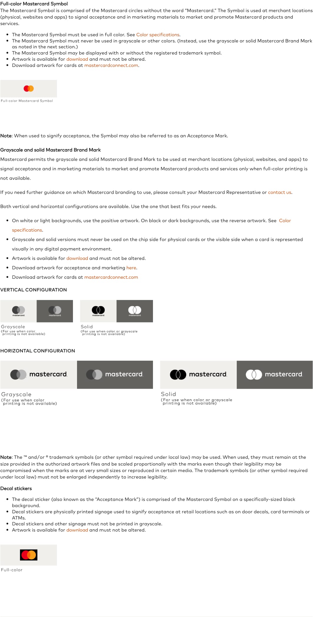
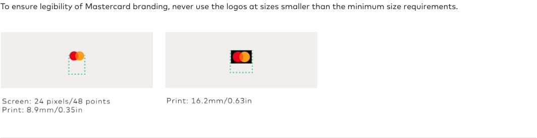
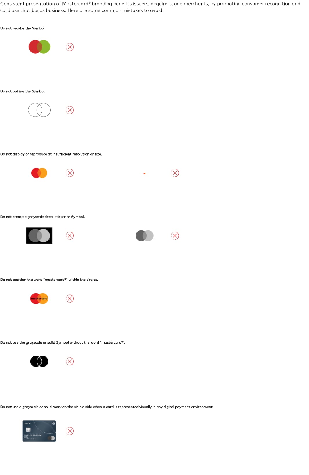
full color, clear space 1/4 circle, at least 24px
no rectangular photos
A global technology company in the payments industry. Observed
Bold ideas delivered through critical payments technology and services. Published
Unlocking the potential of every individual and business. Published
Economic sustainability through people, prosperity and the planet. Published
A multisensory brand (sight, sound, touch) that signals a secure payment. Published
Powering economies and empowering people
Unlocking potential for people, businesses and governments, all around the world.
Together the possibilities are priceless
Innovative solutions for a safer, smarter, digital economy.
Born in 1966 as the Interbank Card Association, renamed MasterCard International, simplified by Pentagram in 2016 and, from 2019, signed by the circles alone.
Create value, grow together, move fast for customers and each other
PublishedCategory. Payments network and technology Observed
Other card networks and payment options (the Brand Center requires parity with all other acceptance marks)
Mastercard is a global technology company in the payments industry, powering economies and empowering people in more than 210 countries and territories.
Priceless Observed
Together the possibilities are priceless Observed
Powering economies and empowering people Observed
Benefits and services that support your ambitions
Find a card that's right for you
Pay your way
Modern ways to pay, home and away
Experiences that ignite your passions
The homepage speaks in promises to three audiences (people, businesses, governments) and threads the word priceless through every section: "Together the possibilities are priceless", Priceless Experiences, priceless.com. Sections are organised by audience (business and government solutions, cards and benefits, experiences), each with an eyebrow naming it.
Source: mastercard.com/us/en.htmlmastercard.com/us/en/for-the-world/about-us.htmlmastercard.com/us/en/personal/experience-mastercard/multisensory-branding.html
A payments brand earns trust by sounding calm: the homepage never hypes, and the partner rules never hedge.
optimistichumanassured
Warm, assured and plain on marketing pages; legal and exact (must, never, always) in the Brand Center. No exclamation marks, no jargon on the homepage, sentence case throughout.
pricelesspossibilitiesconnectempowerunlocktrustsecuretogether
MasterCardMaster Cardcheapfree money
Source: mastercard.com/us/en.htmlmastercard.com/us/en/personal/experience-mastercard/multisensory-branding.html
Source: mastercard.com/brandcenter/us/en/brand-requirements/mastercard.htmlmastercard.com/us/en.html
The site uses the Symbol only. Brand Mark files (with the word) are on the Brand Center download page under the Artwork Download Agreement.
In 2019 Mastercard dropped the name from the mark for many uses because the circles alone are recognized; the Brand Center history page records the move.
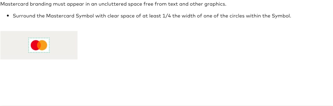
| Clear space | 1/4 of one circle's width |
|---|---|
| Minimum size (screen) | 24 px / 48 pt |
| Minimum size (print) | 8.9 mm / 0.35 in |
| Decal minimum | 16.2 mm / 0.63 in |
| Wordmark | FF Mark, lowercase c (Pentagram) |
The Mastercard Symbol (two interlocking circles, red and yellow with an orange overlap) is used on its own; the word mark appears only in the Brand Mark versions (horizontal and vertical) that pair the circles with a lowercase "mastercard". Grayscale and solid Brand Marks exist for one-color reproduction only, always with the word.
Source: mastercard.com/brandcenter/us/en/brand-requirements/mastercard.htmlmastercard.com/brandcenter/us/en/brand-history.htmlpentagram.com/work/mastercard
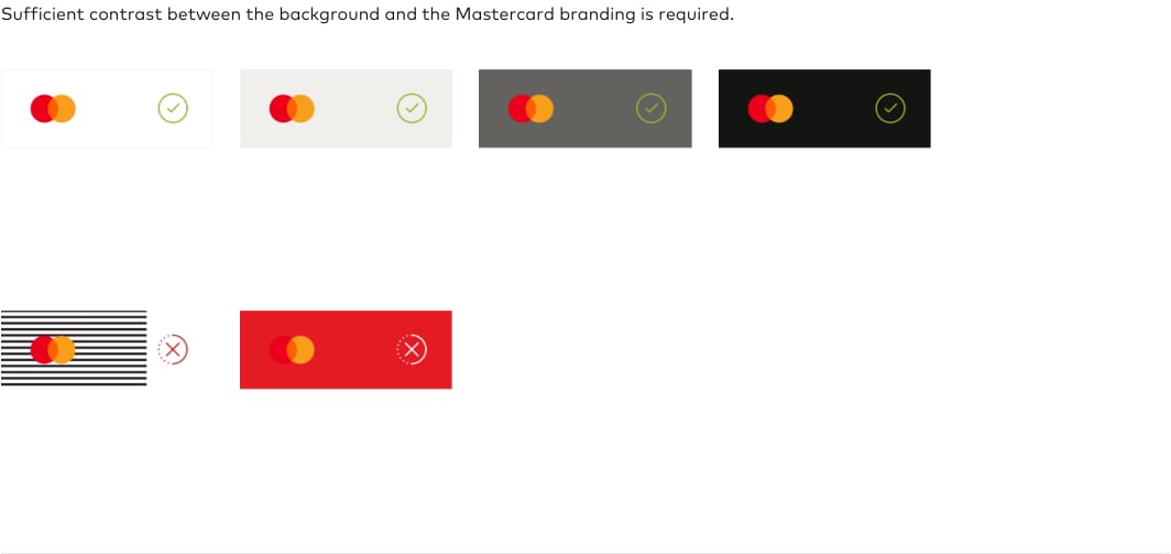
Keeping the interface neutral lets the red-yellow circles stay the only saturated brand color, so the Symbol always reads first.
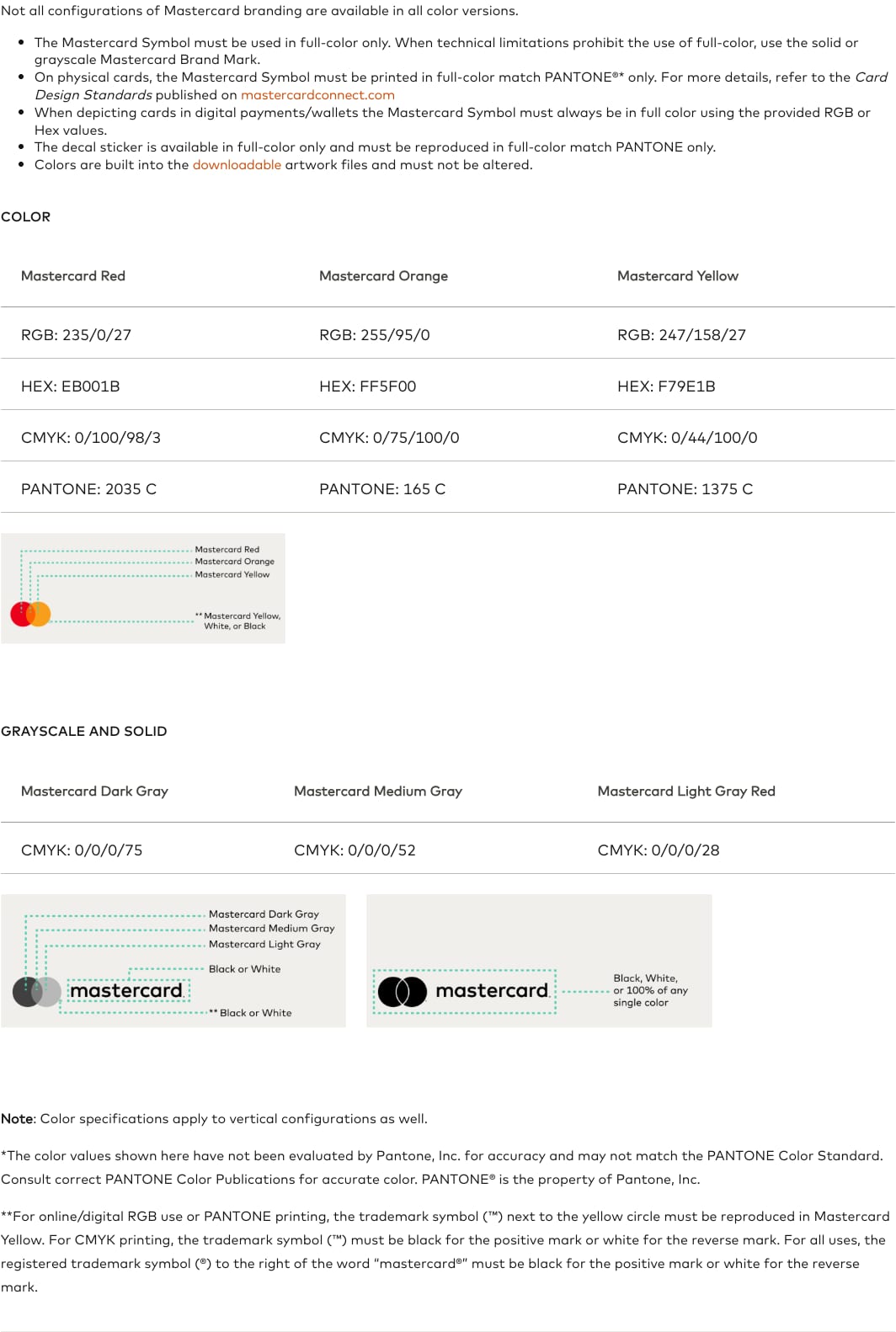
| Mastercard Red | #EB001B / PANTONE 2035 C |
|---|---|
| Mastercard Orange | #FF5F00 / PANTONE 165 C |
| Mastercard Yellow | #F79E1B / PANTONE 1375 C |
| Dark Gray | CMYK 0/0/0/75 |
| Medium Gray | CMYK 0/0/0/52 |
| Light Gray | CMYK 0/0/0/28 |
Three published logo colors live only in the Symbol. The homepage itself is warm and nearly colorless: a #F3F0EE canvas, one ink #141413 for all text, a lighter #FCFBFA panel, a #141413 footer, and a single UI orange #F37338 for dots, outlines and active states. Color comes from photography.
Not published: UI palette (canvas, ink, UI orange are observed); color proportions; hex values for the grays.
Source: mastercard.com/brandcenter/us/en/brand-requirements/mastercard.htmlmastercard.com/us/en.html
Priceless
Mark's round letters echo the circles; Pentagram notes each letter contains a portion of the circle.
| Their face | Use | License | Open stand-in |
|---|---|---|---|
| FF Mark (served as mccom on mastercard.com) | Headlines and titles at weight 500 (Medium): 120, 64 and 36px, sentence case | Commercial (FontFont, now Monotype); not open, not ours to ship | Kumbh Sans Open (SIL OFL) geometric sans with round bowls, double-storey a and single-storey g like Mark. Rendered against the live face: 500 at 0 tracking sets within 1% of Mark Medium at -0.02em and matches its ink (20.4 vs 20.5). |
| FF Mark Book (mccom 450) | Lead and body at 450 (Book), buttons and nav at 500, eyebrows at 700 Bold uppercase | Commercial (FontFont, now Monotype); not open | Kumbh Sans Same family keeps the one-family system; 400 at +0.02em matches the lead line width (790 vs 789px) and 700 at +0.06em matches the eyebrows. |
| Real face | FF Mark (commercial) |
|---|---|
| Stand-in | Kumbh Sans (SIL OFL) |
| Headline | 120 / 64 / 36px, weight 500 |
| Body | 20px/26px lead, 16px small |
One family does everything: FF Mark, a geometric sans with circular bowls chosen in the 2016 identity (Pentagram), served on the site as the custom web font "mccom". Weights 450 (body), 500 (headlines, nav, buttons) and 700 (uppercase eyebrows). Headlines are huge (120px); the real face runs -0.02em tracking, which the Kumbh Sans stand-in replaces with 0 (it sets about 5% narrower).
Not published: a public type scale; sizes are observed.
Source: pentagram.com/work/mastercardmastercard.com/us/en.html
Do photos are masked to circles (square sources) or stadiums (radius 999px); panels and the hero frame take 80px corners; buttons and labels are pills; buttons on photos are white circles. The shape language comes from the two interlocking circles of the Symbol.
Circles and stadiums · every photo, panel and control on the homepage
Do 1px #F37338 circle outlines the size of a photo, offset beside it, and 1px orange stadium outlines around row cards; one line weight only.
Thin orange orbits · services zigzag and the Cards and benefits rows
Do 120px sentence-case headline over 3-4 lines, weight 500, left aligned, after an orange-dot eyebrow, then one 20px lead line.
One giant headline per section · section heads
Do the full-color circles with no word mark, at 54x40 in the nav and centered in the hero resting frame; clear space at least a quarter of one circle's width.
The Symbol speaks alone · nav and hero
Specimens use sample copy, not Mastercard’s.
Repeating the Symbol's geometry makes any page recognizable without the logo.
The circle is the system: circular and stadium photo masks, pill buttons and labels, 80px-cornered panels, round icon buttons, thin orange orbit circles, and a large circles line drawing in the ground. Pentagram describes the circles being used in infinite arrangements.
Source: mastercard.com/us/en.htmlpentagram.com/work/mastercard
Icons stay utilitarian so photos and circles carry the brand.
Small monoline glyphs (arrows, north-east external-link arrow, chevrons, magnifier, play, pause) from an icon font, always in ink or white, often inside a circle.
Not published: icon grid, stroke and library.
Source: mastercard.com/us/en.html
Not published; our reading is that real people carry the human-centered positioning.
The homepage uses no illustration: photography, video and the circle line drawings fill every visual slot.
Not published: an illustration style.
Source: mastercard.com/us/en.html
People-first photography carries "empowering people"; warm hues keep photos in key with the logo colors.
Warm, natural-light photos of real people mid-moment (paying, shopping, working, driving), shallow depth of field, skin tones and warm oranges and yellows echoing the Symbol; cropped into circles and stadiums. Campaign stills (Messi, MrBeast) for partnerships.
Not published: a photography guideline.
Source: mastercard.com/us/en.html
Mastercard publishes that a recognizable sound and feel increase assurance at checkout (3.4x per its study).
The brand moves in three senses: a sonic mnemonic (six notes) and the Checkout Sound and Animation at payment, a haptic vibration sequence, and on the site a video loop that opens on the Symbol, autoplaying carousels and fills that grow from the center.
Source: mastercard.com/us/en/personal/experience-mastercard/multisensory-branding.htmlmastercard.com/brandcenter/us/en/brand-requirements/mastercard.htmlmastercard.com/us/en.html
A 1240px column on a warm canvas, 100px margins, a two-column split at x 837/869, 120px vertical rhythm, one floating pill nav, and full-bleed rounded frames inset 24px.
Measured from mastercard.com/us/en.html's computed styles and bounding boxes read with Playwright (Chrome, 1440x900 and 390x844) on 2026-10-31, plus the published Brand Center requirements.
| Measure | Desktop | Phone |
|---|---|---|
| Page margin | 100px | 20px |
| Section padding | 120px | 64px |
| Hero text width | max 608px, centered | full width |
| Card gap | 80px | 80px |
| Navigation | 88px | 88px |
Section headline (Together the possibilities..., Benefits and services...); phone line-height 1.1
FF Mark (served as mccom on mastercard.com) · 120px (phone 48) · line 1 · weight 500
Hero H1 and Priceless headline; phone line-height 1.1
FF Mark (served as mccom on mastercard.com) · 64px (phone 48) · line 1 · weight 500
Card and row titles
FF Mark (served as mccom on mastercard.com) · 36px (phone 24) · line 1.2 · weight 500
Carousel title pill
FF Mark (served as mccom on mastercard.com) · 36px (phone 24) · line 2 · weight 500
Lead paragraph
FF Mark Book (mccom 450) · 20px · line 1.3 · tracking 0.4px · weight 400
Small copy (row descriptions)
FF Mark Book (mccom 450) · 16px · line 1.4 · tracking 0.32px · weight 400
Button label
FF Mark Book (mccom 450) · 16px · line 1 · weight 500
Nav label
FF Mark Book (mccom 450) · 16px · line 1 · weight 500
Eyebrow (uppercase)
FF Mark Book (mccom 450) · 14px (phone 12) · line 1 · tracking 0.84px · weight 700
Carousel category pill
FF Mark Book (mccom 450) · 16px (phone 14) · line 1 · weight 500
Footer help line and phone accordion heads
FF Mark Book (mccom 450) · 20px · line 1.2 · weight 500
Footer links and legal
FF Mark Book (mccom 450) · 14px · line 1 · weight 500
How Mastercard’s own landing pages are built, observed on mastercard.com/us/en.html%20(2026-10-31), 2026-10-31. The full measurements are in spec.md.
Source: mastercard.com/us/en.html
How loud the system gets by format.
| Format | Loudness | Must appear | What varies |
|---|---|---|---|
| Landing page | Build it the way the US homepage is built (kit.spec.page): #F3F0EE canvas, floating white pill nav with the Symbol, an 80px-corner hero frame, 120px sentence-case headlines after orange-dot eyebrows, circle and stadium photos, pill buttons, thin #F37338 outlines, #141413 footer | which sections and photos; how many cards | |
| Payment acceptance (checkout, POS) | full-color Symbol at parity with other marks, minimum 24px, clear space, last four digits beside stored cards | horizontal or vertical Brand Mark | |
| Partner marketing | Mastercard-supplied artwork unaltered; name written Mastercard | layout is the partner's | |
| Sonic and haptic | Checkout Sound and Animation only as confirmation; contact Mastercard to use | none |
Source: mastercard.com/brandcenter/us/en/brand-requirements/mastercard.html
Your name and logo, Mastercard’s system.
Use this kit for my brand Use this brand in Claude
Get your brand audit Put your brand in Claude What goes in a brand book
Each value is marked published, observed, our reading or our recipe, with its source. Checked 2026-10-31. Not affiliated with Mastercard.