Find work
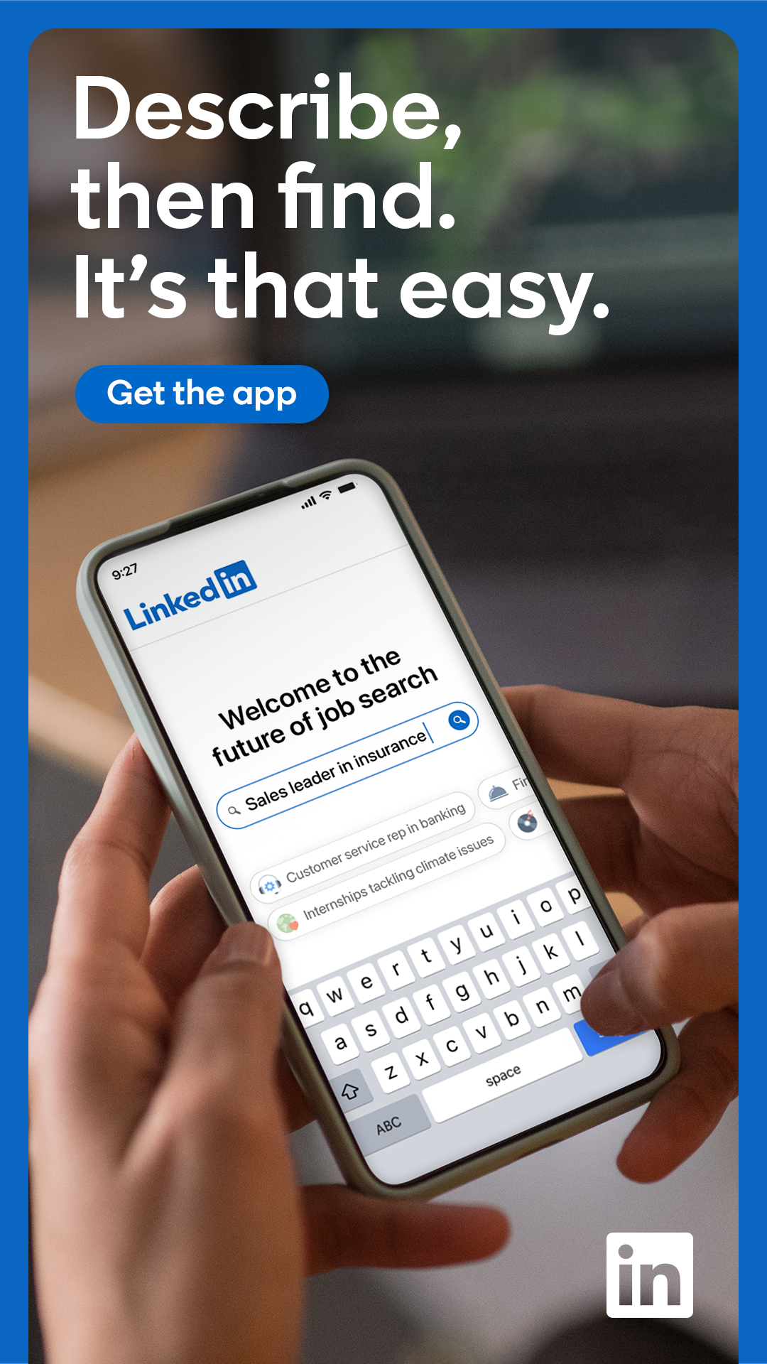
Jobs and internships by role, and an Open to Work signal for recruiters. Observed
Brand book
One blue for everything you should do, set in calm warm neutrals with real people in circles. Our reading

Which bands and how many chips; illustration or photo per band.
Source: linkedin.com/%20(2026-10-31)
Our engine's setting, built from their rules.
Cover the logo. A single blue for actions, warm greys, regular-weight system type, outline pills and people in circles should still read as LinkedIn.
Count filled blue elements: more than one per screen and it no longer looks like LinkedIn.
The world's largest professional network: where people find jobs, grow their network and learn skills. Published
Jobs and internships by role, and an Open to Work signal for recruiters. Observed
Find the people you know and message them; conversations lead to opportunity. Observed
Courses by topic through LinkedIn Learning. Observed
Expert posts curated by topic, plus daily games to keep in touch. Observed
LinkedIn began in co-founder Reid Hoffman's living room in 2002 and launched on May 5, 2003. It earns from subscriptions, advertising and recruiting, and joined Microsoft in December 2016. Its 2020 redesign aimed to make the product warmer and simpler and to put the community at the center, with new illustrations of people of every ability, background and industry.
Solves a real problem members and customers face (paraphrase).
PublishedIntuitive, accessible, reliable for every member worldwide (paraphrase).
PublishedEquitable outcomes, respects privacy, builds trust (paraphrase).
PublishedCategory. Professional network Published
Job boards, personal networks and course sites used separately (our reading).
LinkedIn is the world's largest professional network, with more than 1 billion members in more than 200 countries and territories. Its vision is to create economic opportunity for every member of the global workforce. Founded in 2002 and launched May 5, 2003, it has been part of Microsoft since December 2016.
Discover new opportunities Observed
Explore jobs and grow your network Observed
Welcome to your professional community Observed
Connect to Opportunity Published
The guest homepage sells four jobs to be done, each as a band: find content, find a job, hire, choose software, play, signal Open to Work, connect, learn. Each is one verb-first H2 and a field of chips or one control.
Source: linkedin.comabout.linkedin.com
Professional but human: the 2020 redesign aimed for warmer and simpler.
HelpfulPlainWarmEncouraging
No voice guide is published. The homepage voice is plain, second person and encouraging; the published brand rules govern how the LinkedIn name is written.
opportunityprofessionalconnectnetworkskills
LinkdinLinkedIn's (third-party possessive)[in]-wordplay!
Source: design.linkedin.com/design-principleslinkedin.com/blog/member/product/a-new-look-for-linkedin-from-the-inside-out
Source: brand.linkedin.com/business-books-and-media-usagebrand.linkedin.com/in-logolinkedin.com/blog/member/product/a-new-look-for-linkedin-from-the-inside-outlinkedin.com/%20(2026-10-31)


Logo files are the ones linkedin.com itself serves, for the build only. LinkedIn allows the full logo only under licence; stealing this kit never brings these files with it.
A single blue box is recognizable at icon size, so the brand controls the full wordmark tightly and lets members carry the bug.


| Clear space | one [in] Logo height/width |
|---|---|
| Minimum | [in] portion 21px screen; 0.25 in / 6.35mm print |
| Colors | blue preferred; white or black |
| Ground | solid white preferred; solid light ground allowed |
| Format | transparent PNG, other formats on request |
Two marks: the LinkedIn Logo (Linked + [in] box) and the [in] Logo alone. The full logo is licence-only; members may use the [in] Logo to link to their profile, on business cards, in email signatures, with their QR code or in a row of social icons.
Source: brand.linkedin.com/linkedin-logobrand.linkedin.com/in-logo
Join now
A single blue owns every action and the logo, so the warm neutrals around it read calm and the blue reads as "do this".
The guidelines name no hex values; they set blue as the preferred logo color on white and allow blue, black or white for the [in] Logo. On the site, LinkedIn Blue #0A66C2 is the only saturated UI color; grounds are white, a warm grey #F3F2F0 and sand #F1ECE5/#EAE6DF; text is 90/75/60% black; rust #B24020 marks editorial headlines.
Not published: any hex, CMYK or Pantone value; color ratios.
Source: brand.linkedin.com/linkedin-logobrand.linkedin.com/in-logolinkedin.com/%20(2026-10-31)
Discover new opportunities
The platform feels native on every device and loads nothing.
| Their face | Use | License | Open stand-in |
|---|---|---|---|
| System UI font (SF Pro / Segoe UI / Roboto) | Headlines 400 | System fonts, already on the device: no licence or download needed | Roboto Roboto is in LinkedIn's own stack (Android) and the closest open width match; pages should use the system stack itself. |
| System UI font | Body 400, controls 600 | System fonts, no licence needed | Roboto |
No typeface is published. linkedin.com uses the system UI stack (SF Pro, Segoe UI, Roboto...). Headlines are regular 400, never bold; every control is 600.
Not published: a brand typeface or scale.
Source: linkedin.com/%20(2026-10-31)
Do Only the primary action is filled LinkedIn Blue #0A66C2; every other control is a transparent 24px-radius pill with a 1px inset ring.
One blue pill · nav Join now and the closing Get started
Do A wrapping field of outline pills in the right column beside a short H2, ending in a blue Show all.
Chip wall · topic, job, software and game bands
Do Real people photographed at work, cropped to a circle, sometimes huge and cut by the page edge.
Circle-cropped photo · carousel and Who is LinkedIn for
Do Flat, warm, muted palette (sand, terracotta, sage, teal, pale blue), diverse people working; no outlines, soft shapes.
Warm flat illustration · hero, tiles, closing city
Do H2s on the editorial bands go #B24020, the body stays black.
Rust editorial headlines · grey and sand bands
Specimens use sample copy, not LinkedIn’s.
Few, soft devices keep the attention on people and actions.
Outline pills, circle-cropped photos, flat warm illustrations and full-bleed warm grounds. No gradients, shadows or borders on the page; rings are 1px inset shadows.
Source: linkedin.com/%20(2026-10-31)
Icon + label reads instantly at a glance.
Solid 24px glyphs (rocket, people, play screen, briefcase, puzzle) in 60% black over 12px labels.
Not published: an icon grid or stroke rules.
Source: linkedin.com/%20(2026-10-31)
LinkedIn says its illustrations show people of different abilities, backgrounds and industries so everyone can see themselves, and each has a dark-mode version.
Flat, warm vector scenes of diverse people at work and at home: muted sand, terracotta, sage, teal and pale blue, no outlines.
Source: linkedin.com/blog/member/product/a-new-look-for-linkedin-from-the-inside-outlinkedin.com/pulse/introducing-dark-mode-linkedina-night-day-difference-george-penstonlinkedin.com/%20(2026-10-31)
Shows the community, not the product chrome.
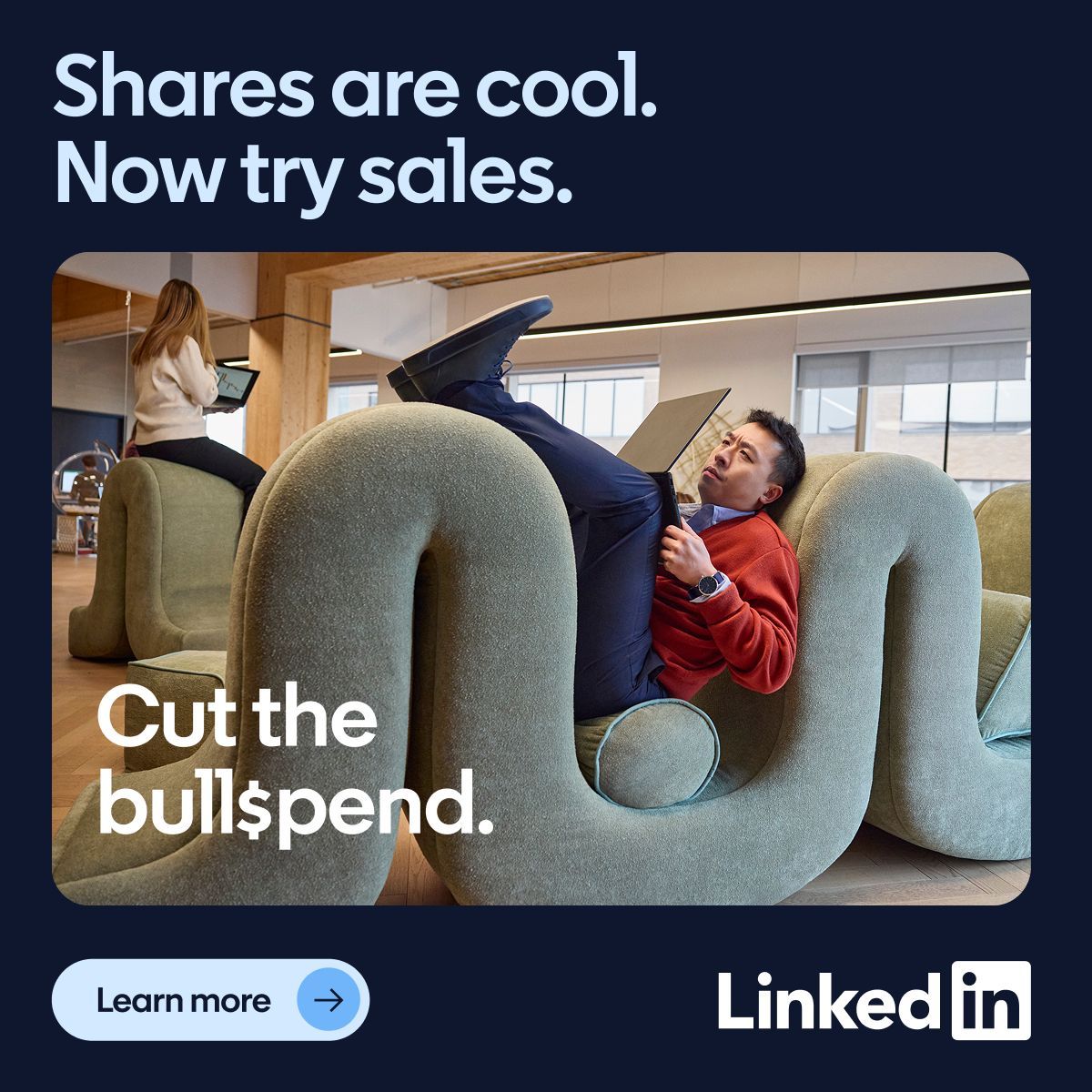
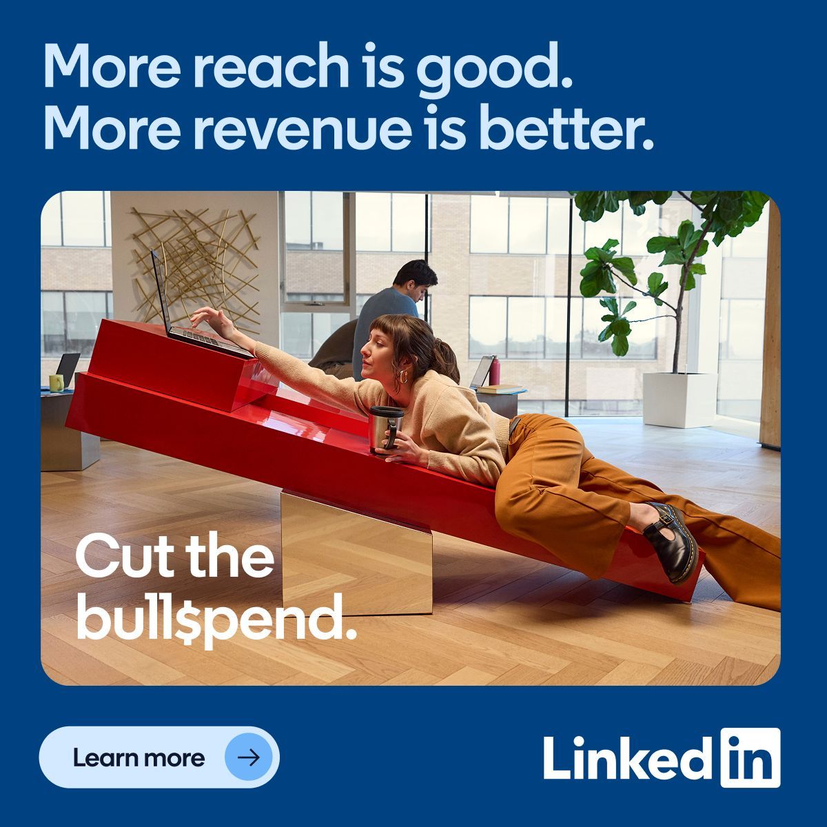
Real people working together in natural light, warm tones, cropped to circles on the homepage; rectangular with a diagonal color wedge on the brand site.
Not published: a photography guide.
Source: linkedin.com/%20(2026-10-31)brand.linkedin.com/linkedin-logo
Not published.
Not published. The homepage has one carousel and color-only hovers.
Not published: durations, easing.
Source: linkedin.com/%20(2026-10-31)
A 1128px column with 156px margins at 1440; most bands are a 429px text column beside a right column of chips or media.
Measured from linkedin.com's Measured with Playwright (headless Chrome) on the guest homepage at 1440 and 390, 2026-10-31; logo, name and trademark rules from brand.linkedin.com..
| Measure | Desktop | Phone |
|---|---|---|
| Page margin | 156px | 16px |
| Section padding | 60px | 56px |
| Hero text width | max 429px, centered | full width |
| Card gap | 16px | 16px |
| Navigation | 80px | 80px |
Hero H1 / closing H2
System UI font (SF Pro / Segoe UI / Roboto) · 48px (phone 32) · line 1.25 · weight 400
Section H2
System UI font (SF Pro / Segoe UI / Roboto) · 32px (phone 24) · line 1.25 · weight 400
Lead / carousel body / link rows
System UI font · 20px (phone 16) · line 1.5 · weight 400
Buttons, chips
System UI font · 16px (phone 14) · line 1.5 · weight 600
Footer column head
System UI font · 16px · line 1.25 · weight 600
Footer link
System UI font · 14px · line 1.25 · weight 600
Nav label, legal
System UI font · 12px · line 1.25 · weight 400
How LinkedIn’s own landing pages are built, observed on linkedin.com, 2026-10-31. The full measurements are in spec.md.
Source: linkedin.com/%20(2026-10-31)
It makes a utility feel like a community. Our reading
How our engine applies LinkedIn's look to each format. This is our recipe from the observed site, not something LinkedIn publishes. Level = how much color the format carries (0 plain, 5 full).
| Format | What they did | Source |
|---|---|---|
| social icon row | Members may place the [in] Logo in a row of social icons in blue, black or white on any background color. | brand.linkedin.com/in-logo |
| Format | Loudness | Must appear | What varies |
|---|---|---|---|
| Landing page | Build it the way linkedin.com is built (kit.spec.page): white sticky nav with icon links and blue pills; 48px regular sentence-case H1 left with an illustration bleeding right; alternating white and warm grey (#F3F2F0) full-bleed bands of H2-left / chips-right; rust (#B24020) editorial headlines on grey and sand bands; circle-cropped people photos; a closing 48px headline with one blue Get started; grey directory footer and white legal row. System UI font, 400 heads, 600 controls. | which bands, chips or tiles; illustration or photo per band | |
| Deck | White slides, regular-weight headlines, one blue accent per slide, people in circles | warm grey section dividers | |
| Proposal page | White ground, plain second-person copy, one blue pill CTA | a grey band for the plan | |
| Social post | One warm flat illustration or circle photo, short verb-first line | sand or grey ground |
Source: brand.linkedin.com/business-books-and-media-usagebrand.linkedin.com/badges-and-programsbrand.linkedin.com/en-us
Your name and logo, LinkedIn’s system.
Use this kit for my brand Use this brand in Claude
Get your brand audit Put your brand in Claude What goes in a brand book
Each value is marked published, observed, our reading or our recipe, with its source. Checked 2026-10-31. Not affiliated with LinkedIn.