Purpose-built
Designed for the job of building product, so the tool does the heavy lifting instead of everyone inventing workflows. Published
Brand book
Quality you feel, not see. Linear removes everything competing for attention (color, borders, icons, coined words) so that density reads as calm and the product itself is the brand. Our reading

Light or dark ground, and how much product UI imagery a piece carries.
Our engine's setting, built from their rules.
Cover the mark. It should still read as Linear: near-monochrome neutral ground, Inter Display headline, dim chrome around one focused content area, and a few plain words.
Put another project tool's logo on it. If the calm, the restraint and the plain copy don't feel out of place, it's generic, and it goes back.
Remove one border, icon or color. If nothing is lost, leave it out.
A purpose-built system for product development, where teams and agents work in one shared, structured environment (paraphrase). Observed
Designed for the job of building product, so the tool does the heavy lifting instead of everyone inventing workflows. Published
Cycles, small issues and repeated launches keep teams moving without sprinting. Published
Care for the smallest details; quality you feel rather than see. Published
One structured environment where people and AI agents work together. Observed
Founded in 2019 by Karri Saarinen, Jori Lallo and Tuomas Artman. Linear announced the company before the product existed, then launched again at seed, at general availability with pricing, and at Series A. It redesigned its UI in 2024, rebuilt Liquid Glass its own way for mobile in 2025, and refreshed toward a calmer, warmer interface in 2026.
Keep the people doing the work productive before producing perfect reports (paraphrase).
PublishedOpinionated software over endlessly flexible software (paraphrase).
PublishedA steady cadence, not a rush to the end (paraphrase).
PublishedTie daily tasks to long-term goals (paraphrase).
PublishedUse common words; projects are projects (paraphrase).
PublishedThe tool works for you; remove work around work (paraphrase).
PublishedEasy to start, more powerful as you scale (paraphrase).
PublishedMaking a decision often matters more than the perfect answer (paraphrase).
PublishedCategory. Product development system (formerly issue tracking); the 2024 redesign framed the move from issue tracker to a system for product development. Published
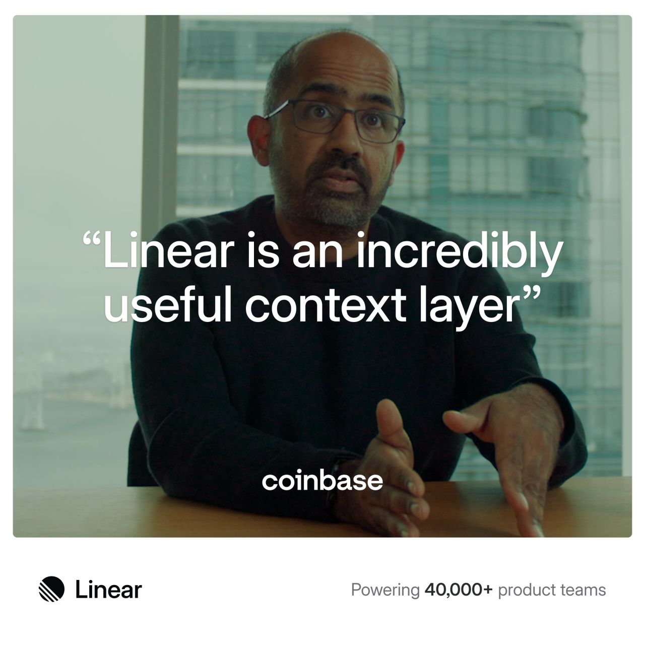
Linear is a purpose-built system for product development where teams and agents work together in one shared, structured environment. Founded in 2019, it is used by more than 40,000 companies, including OpenAI, Coinbase and Ramp, to plan, build and ship products.
The product development system for teams and agents Observed
Building tools for the next era of product development Observed
Built for the future. Available today. Observed
No messaging framework is published. The About page frames Linear as a new kind of product tool for teams and agents; the Method supplies the principles behind the claims.
Source: linear.app/aboutlinear.app/methodlinear.app/method/introduction
A tool that sells focus and clarity has to sound focused and clear.
PlainDirectCalmCraft-minded
The Method and design posts write plainly and briefly, state opinions with reasons, credit named people, and avoid jargon. Titles are sentence case (observed 2026-10-30).
purpose-builtmomentumcraftqualityissuesprojectscyclesproduct development
Linear appuser stories (as a working method)invented jargon for ordinary things
Source: linear.app/brandlinear.app/now/how-we-redesigned-the-linear-uilinear.app/now/behind-the-latest-design-refreshlinear.app/method/introduction
| Naming | Linear (company and app); Linear Method |
|---|---|
| Case | sentence case (observed) |
| Person | we / you (observed) |
Not published: a voice or tone guide; banned-word list; punctuation and spelling rules.
Source: linear.app/brandlinear.app/method/introductionlinear.app/method/write-issues-not-user-storieslinear.app/now/how-we-redesigned-the-linear-uilinear.app/now/behind-the-latest-design-refresh


Official files from Linear's brand-asset download on linear.app/brand. Wordmark: 400x100 viewBox; logomark 100x100. Allowed uses: wordmark wherever space allows; logomark for tight layouts and logo grids; icon for company references and chips with a corner radius. Clear space and minimum size are not published beyond 'plenty of space'.
A monochrome mark works on any ground, and the stripes read as motion without needing color.
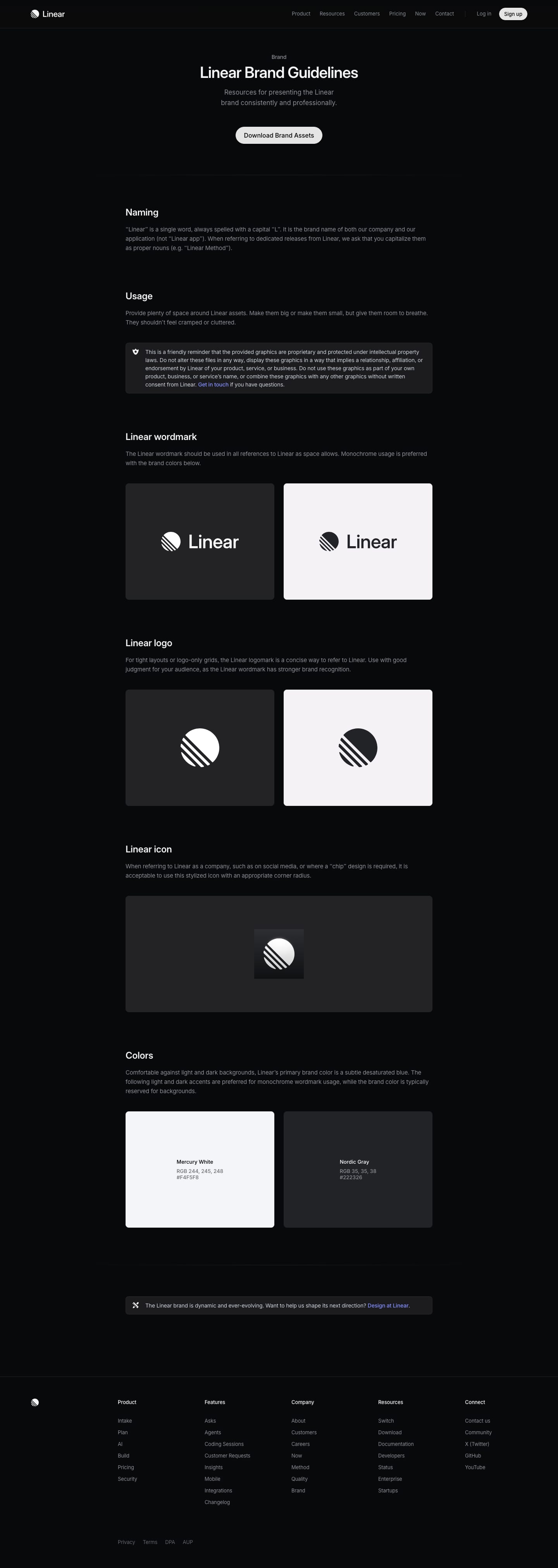
| Lockups | wordmark; logomark; icon |
|---|---|
| Color | monochrome: #F4F5F8 or #222326 |
| Clear space | not published ('plenty of space') |
| Minimum size | not published |
| Files | SVG + PNG, light and dark |
Three marks ship in the asset download: the wordmark (logomark plus 'Linear'), the logomark alone (a disc crossed by diagonal stripes), and a stylized icon for social and chip uses. All are shown in one color, white on dark or Nordic Gray on light.
Not published: clear-space measurement; minimum size; placement rules; co-branding lockups; icon corner radius value.
Source: linear.app/brand
Generated, near-neutral grounds keep a dense interface calm and let content carry the color.


| Mercury White | #F4F5F8 / RGB 244 245 248 |
|---|---|
| Nordic Gray | #222326 / RGB 35 35 38 |
| Theme inputs | base, accent, contrast (LCH) |
| Brand blue | not published |
The guide publishes two colors, Mercury White #F4F5F8 and Nordic Gray #222326, as light and dark accents for the monochrome wordmark. It describes the primary brand color as a subtle desaturated blue reserved for backgrounds, without a value. Product themes are generated in LCH from base, accent and contrast; the 2026 refresh moved the default themes from a cool blue-ish gray toward a warmer, less saturated gray. linear.app renders on a near-black ground (observed 2026-10-30; values in the anatomy step).
Not published: the primary brand blue's hex; accent or status colors; color proportions.
Source: linear.app/brandlinear.app/now/how-we-redesigned-the-linear-uilinear.app/now/behind-the-latest-design-refreshlinear.app/now/styling-linear-for-the-future-stylex
The product development system for teams and agents
One neutral, highly legible family suits a dense tool; the display cut adds character only where headings need it.
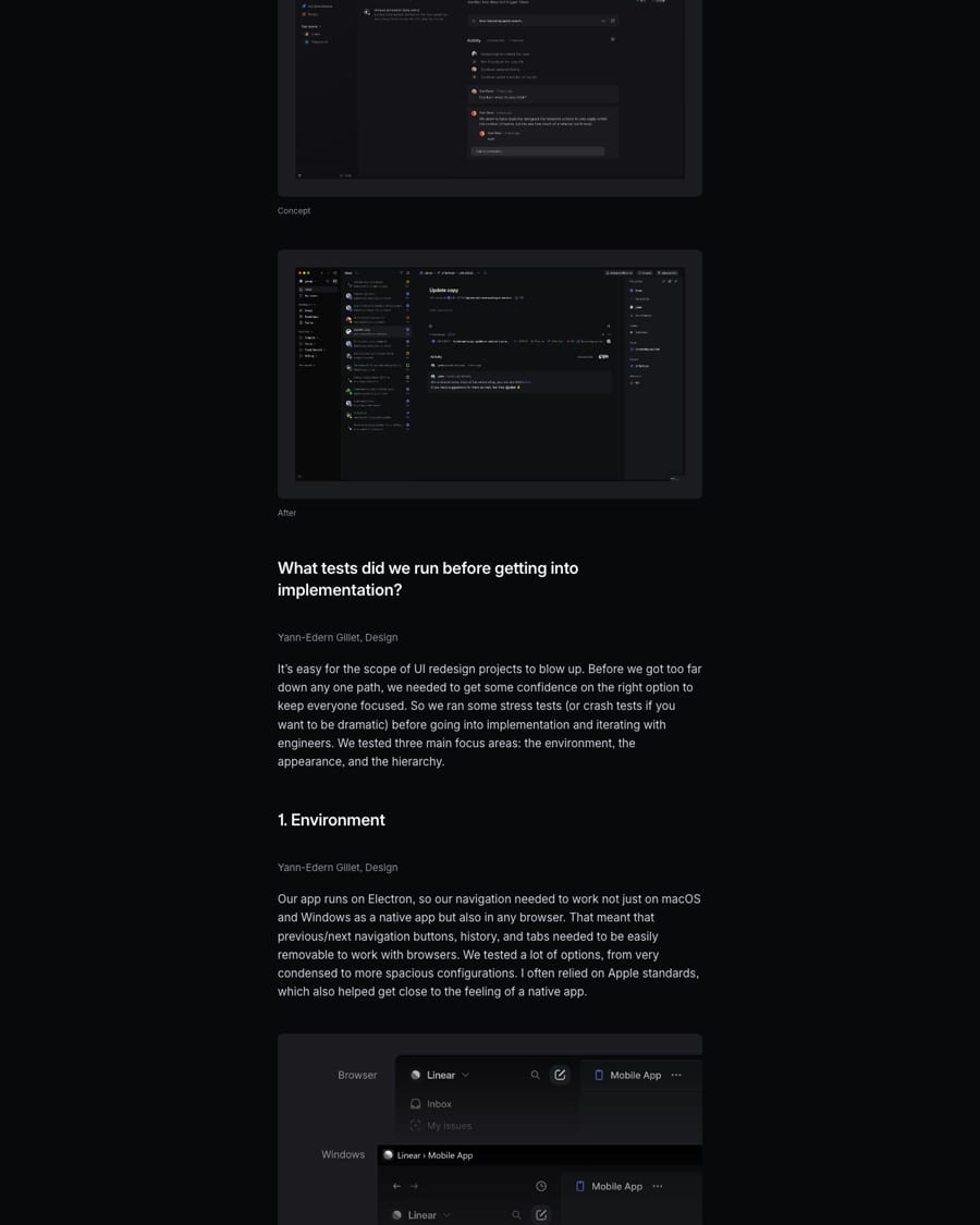
| Their face | Use | License | Open stand-in |
|---|---|---|---|
| Inter Display | Headings, for expression with readability | Open (SIL OFL 1.1) | |
| Inter | All other text | Open (SIL OFL 1.1) | |
| Berkeley Mono | 12px uppercase eyebrows, figure labels, dates and code in product mock-ups | Proprietary (US Graphics Company); stand-in IBM Plex Mono, SIL OFL 1.1 | IBM Plex Mono Berkeley Mono is commercial. IBM Plex Mono has the identical 0.600em advance, ink within 4% and x-height within 0.4% (calibration in kit.typography.mono). |
| Headings | Inter Display (published) |
|---|---|
| Text | Inter (published) |
| Licence | SIL OFL 1.1 (open) |
| Site weights | 400 / 510 / 590 (observed) |
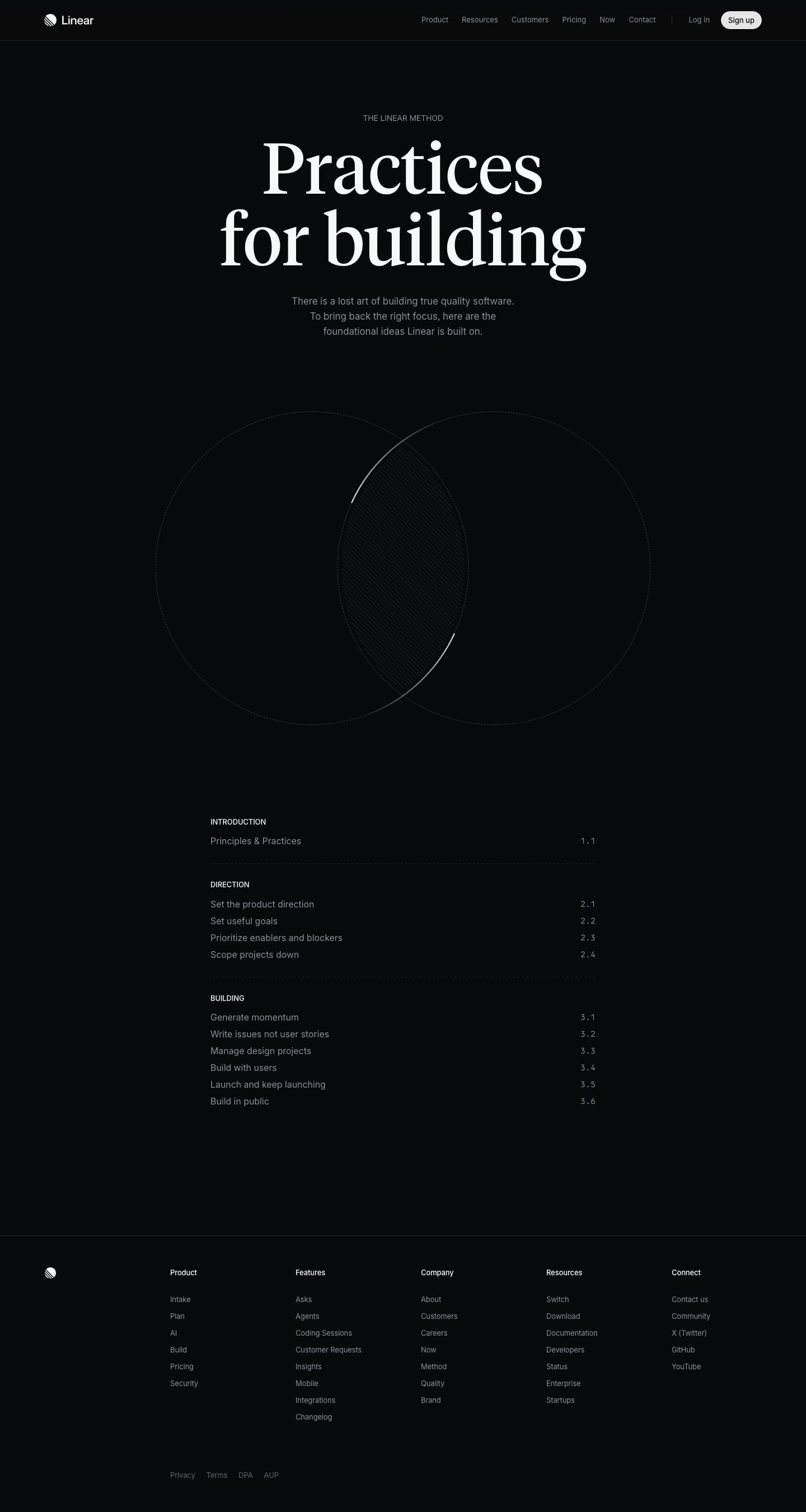
Inter throughout. The 2024 redesign set headings in Inter Display for expression and kept regular Inter for the rest. On linear.app the face loads as Inter Variable with headings at weights 510-590 and tight negative tracking (observed 2026-10-30). The Method page's large title uses a serif, Tiempos Headline (observed 2026-10-30), an editorial exception.
Not published: type scale; weights per role; leading and tracking; a mono face; use of the Tiempos serif.
Source: linear.app/now/how-we-redesigned-the-linear-uilinear.app/brandlinear.app/method
Do wordmark (or logomark in tight layouts) in one color only, Mercury White #F4F5F8 on dark or Nordic Gray #222326 on light, with generous empty space around it, big or small. One mark per surface.
Monochrome mark with room to breathe · every logo placement
Do navigation and supporting chrome a few notches dimmer than the main content; compact tabs with rounded corners; fewer, smaller icons; borders rounded and low contrast so structure is felt rather than seen.
Chrome recedes, content leads · interfaces, product shots and UI-like layouts
Do neutral grays derived from base, accent and contrast in LCH, with little blue in the calculation for a timeless, neutral look; the 2026 refresh shifted toward a warmer, less saturated gray that stays crisp.
Generated neutral themes · grounds and surfaces in light and dark
Do each section shows a real-looking slice of the app (thread, board, timeline, agent panels, diff) on #0F1011 panels with 1px white-8% borders, grain and a corner glow, bleeding off one edge and fading into the #08090A ground. One illustration per section.
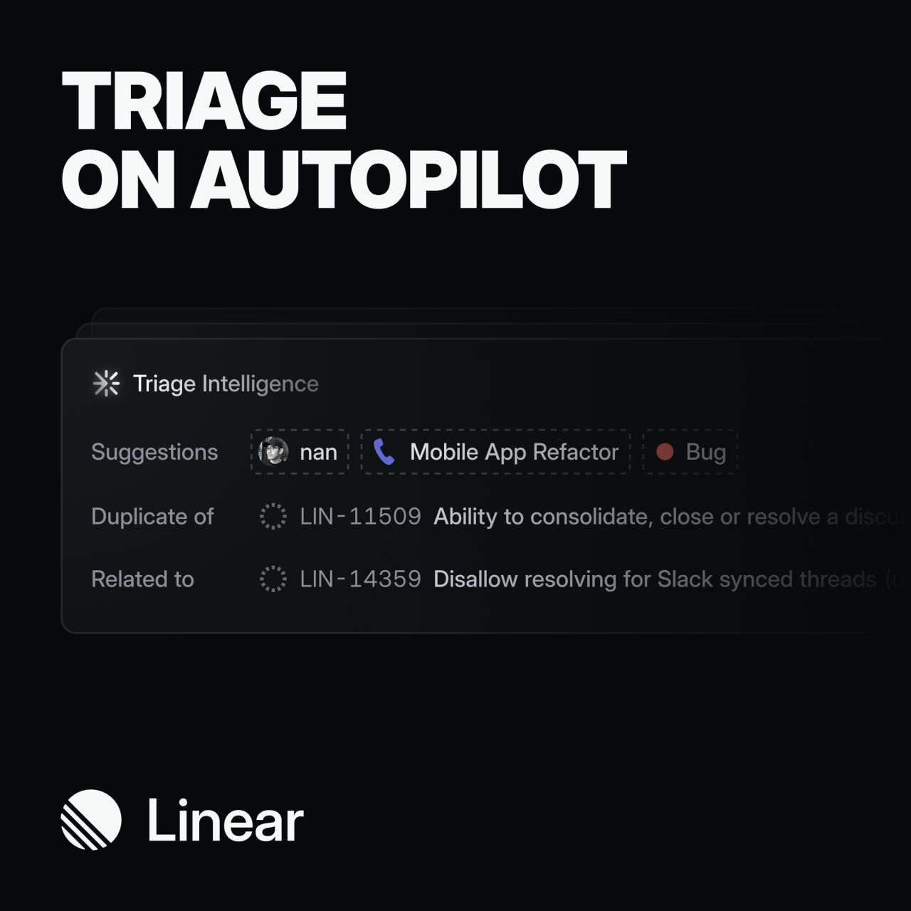
Product UI is the illustration · hero and every feature section
Do #F7F8F8 headlines, #D0D6E0 leads and small titles, #8A8F98 body and links at rest, #62666D arrows, eyebrows and legal; emphasis comes from stepping up the ramp, never from colour.
Four-step grey text ramp · all copy on dark
Specimens use sample copy, not Linear’s.
Every element is tuned to recede so the work leads; depth comes from light, not ornament.
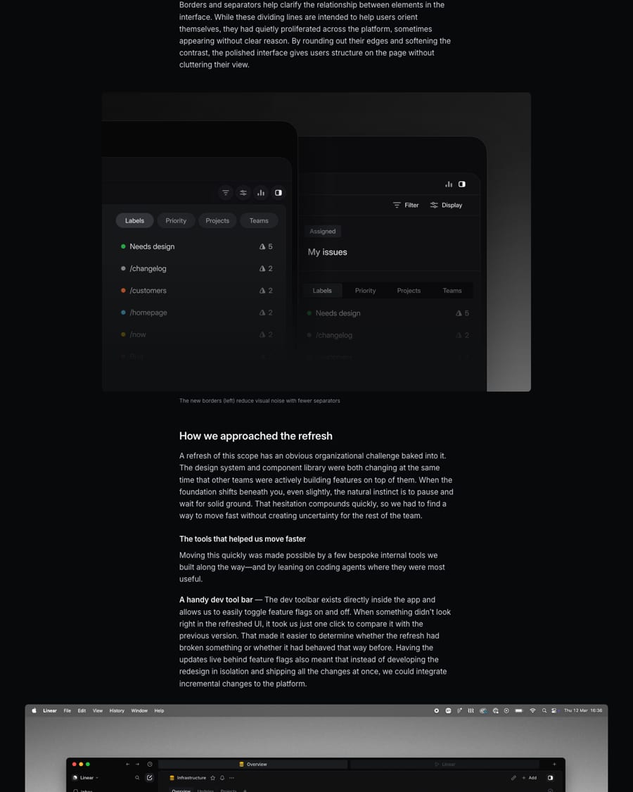
The design posts describe the graphic system through the interface: an inverted-L chrome around the main view, compact rounded tabs, few low-contrast rounded borders, and, on mobile, a custom glass material with blur, gradient and a moving specular highlight but no refraction.
Not published: border widths; radius values; shadow or elevation values.
Source: linear.app/now/behind-the-latest-design-refreshlinear.app/now/how-we-redesigned-the-linear-uilinear.app/now/linear-liquid-glass
Icons should help recognition without competing for attention.
Icons identify projects, issues, initiatives and statuses at a glance. The 2026 refresh cut their number, shrank them and removed colored team-icon backgrounds.
Not published: icon grid; stroke weight; sizes; icon library name.
Showing the product itself is the proof.
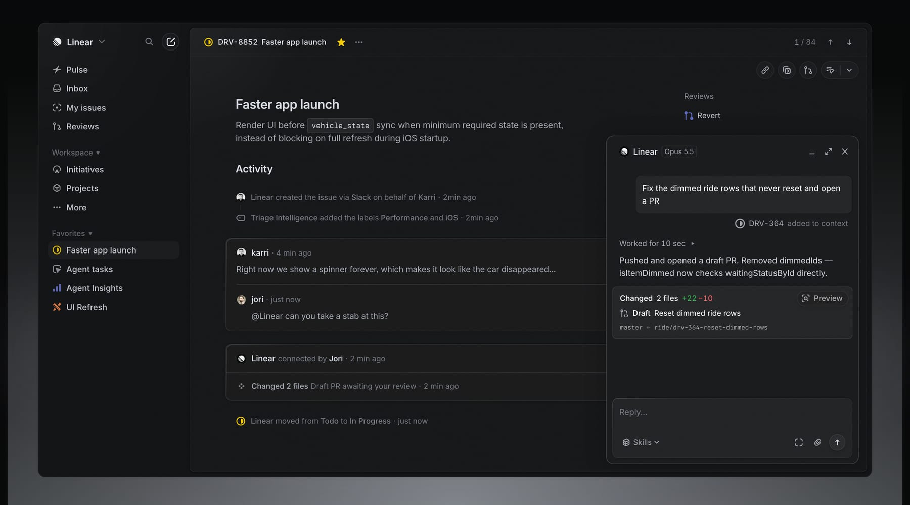
No illustration style is published. Linear's marketing and posts show product UI renders, often dark and softly lit, rather than illustration (observed 2026-10-30).
Not published: illustration style; characters; diagram style.
Source: linear.applinear.app/now/behind-the-latest-design-refresh

Not published: photography style; treatment; crops.
Motion as physical feedback, not decoration.
No motion values are published. The posts describe motion qualitatively: on mobile, touched elements lift slightly, over-scroll distorts the view, scroll edges blur progressively, and highlights shift with movement.
Not published: easing curves; durations.
The app uses an inverted-L chrome (sidebar plus top bar) controlling the main view, with structured layouts for list, board, timeline, split and fullscreen. The redesign aligned labels, icons and buttons across sidebar and tabs and leaned on Apple standards for a native feel. The brand page centers a single narrow column on a dark ground (observed 2026-10-30).
Measured from linear.app's Measured on https://linear.app/ at 1440x900 and 390x844 with Playwright computed styles, hover probes and 2x captures, 2026-10-30; guide values from https://linear.app/brand.
| Measure | Desktop | Phone |
|---|---|---|
| Page margin | 80px | 24px |
| Section padding | 128px | 40px |
| Hero text width | max 1280px, centered | full width |
| Card gap | 8px | 8px |
| Navigation | 73px | 73px |
Prefooter H2
Inter Display · 72px (phone 38) · line 1 · tracking -1.584px · weight 510
Hero H1
Inter Display · 64px (phone 38) · line 1 · tracking -1.408px · weight 510
Section H2 / statement
Inter Display · 48px (phone 24) · line 1 · tracking -1.056px · weight 510
Quote
Inter · 32px (phone 24) · line 1.125 · tracking -0.704px · weight 400
Section lead
Inter · 24px (phone 15) · line 1.33 · tracking -0.288px · weight 400
Body / small title
Inter · 15px · line 1.6 · tracking -0.165px · weight 400
Prefooter button
Inter · 16px · line 2.75 · weight 510
Attribution
Inter · 14px · line 1.5 · tracking -0.182px · weight 400
Nav / footer link
Inter · 13px · line 1.5 · weight 400
Mono eyebrow / date
Berkeley Mono · 12px · line 1.4 · weight 400
How Linear’s own landing pages are built, observed on linear.app, 2026-10-30. The full measurements are in spec.md.
Source: linear.app/now/how-we-redesigned-the-linear-uilinear.app/now/behind-the-latest-design-refreshlinear.app/brand
How our engine applies Linear's system to each format. Our recipe from their published rules, not something Linear publishes. Level = how much beyond the neutral ground and type a format carries.
| Format | Loudness | Must appear | What varies |
|---|---|---|---|
| Landing page | Build it the way linear.app is built (kit.spec.page, from the anatomy step): neutral ground, monochrome wordmark top left with space around it, Inter Display sentence-case headline, Inter body, product UI imagery, dim chrome, few low-contrast borders | light or dark ground; which sections and how much UI imagery | |
| Deck | Neutral ground, monochrome mark, Inter Display headings, one idea per slide in plain words | dark or light; product screenshots | |
| Proposal page | Neutral ground, Inter, plain brief copy, sourced claims only | one product image | |
| Social | Icon with a corner radius as the avatar; monochrome mark; plain headline | product UI crop |
Source: linear.app/brand
Your name and logo, Linear’s system.
Use this kit for my brand Use this brand in Claude
Get your brand audit Put your brand in Claude What goes in a brand book
Each value is marked published, observed, our reading or our recipe, with its source. Checked 2026-10-30. Not affiliated with Linear.