Groceries from the stores you trust, fast
(paraphrase) delivery or pickup from local grocers to chain stores, same-day Observed
Brand book
Instacart looks like fresh produce on a kitchen counter: a cream and kale base that feels trustworthy, with carrot and lime used like garnish, so the food and the people in the photos supply the colour. Our reading

the ground and produce: each piece picks a produce colour (Honeydew, Butter, Cantaloupe, Spinach) and a food photo or watercolour to go with it
the guide's Color Usage Bar: intended balance across primary (Honeydew, Cantaloupe, Kale, Spinach), spot (Carrot, Lime), secondary and exclusive colours. Observed pages differ: company.instacart.com/press is about 44% Cashew, 35% #EEE6DA, 19% Kale; the www.instacart.com storefront is about 92% white, 6% Kale, 2% #F7F5F0 header (measure/*-desk.json).
Full-colour logo only on Cashew, Kale, photography or footage; single-colour Kale on light produce grounds; single-colour white on dark, never on Cashew.
Carrot #FF7009 and Lime #0AAD0A appear only as small emphasis, never as a ground or body copy.
Every colour is a published Instacart colour; no tints, shades or brightness changes; Banana only for deals, Watermelon and Mint only for seasonal.
Titles in heavy Instacart Sans (or the calibrated stand-in); subtitle at half the title size; body at a third or smaller; no orphans, widows or uneven breaks.
Every text pairing meets WCAG AA; neutrals never set headlines or CTAs.
Candid, warm, mid-moment and real; splash images leave negative space for the logo; no staged stock look.
Numbers come from Instacart's own pages with their scope; offers keep their footnotes; the pending DoorDash deal is never stated as done.
The largest online grocery marketplace in North America Observed
(paraphrase) delivery or pickup from local grocers to chain stores, same-day Observed
(paraphrase) personal shoppers pick with care, real-time chat, 100% quality guarantee Observed
(paraphrase) Marketplace, Enterprise platform and Ads let retailers and brands compete online Observed
(paraphrase) a mission to create a world where everyone has access to the food they love, through hunger-relief partners Observed
(paraphrase) Founded in 2012 by Apoorva Mehta, Max Mullen and Brandon Leonardo to deliver from local grocers in the Bay Area, Instacart went nationwide and into Canada in 2017, listed on NASDAQ in 2023 and now builds grocery technology and AI for retailers.
Category. (paraphrase) online grocery marketplace for shoppers; grocery technology company for retailers and brands Published
(paraphrase) Instacart is a leading grocery technology company partnering with more than 2,200 retail banners (nearly 100,000 stores) to change how people shop for groceries from retailers they trust, while creating flexible earning for shoppers. Through Instacart Marketplace, Instacart Enterprise and Instacart Ads it powers ecommerce, fulfillment, in-store technology, AI and advertising. Maplebear Inc. is the registered corporate name.
Order groceries for delivery or pickup today Observed
Grocery delivery you can count on Observed
The largest online grocery marketplace in North America Observed
Delivering the future of grocery Observed
Welcome to the Instacart Media Hub Observed
Get your groceries delivered. Published
Explore this week's offers Published
warmplainspokenplayfulfood-first
freshgroceriesdeliveredsavecaredelightflavor
Source: heyitsinstacart.com/colorheyitsinstacart.com/logoheyitsinstacart.com/layout
Source: instacart.comheyitsinstacart.com/brandelementcompany.instacart.com/pressfacebook.com/ads/library







The brand guide is public at heyitsinstacart.com (brand.instacart.com redirects there; company.instacart.com/press links to it as 'View Brand Guidelines'). Its Login button and 'View Image Library' and 'Download the Assets' links go to an Orange Logic DAM that needs an account, so the logo files here are the www.instacart.com SVGs plus the guide's own PNG images.
(published) 'our most recognizable brand asset'
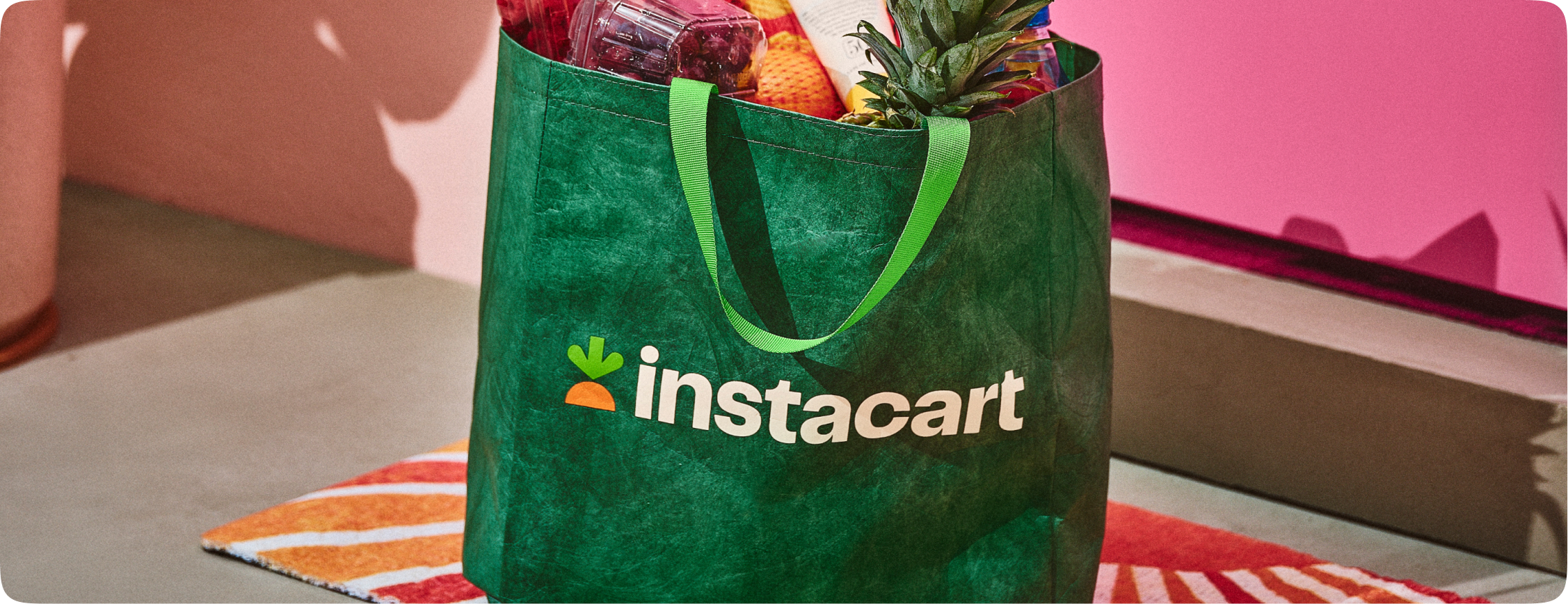
Lowercase 'instacart' wordmark in Kale with the grounded carrot to its left (Lime top, Carrot base). Four colourways: full-colour dark (primary, on Cashew), full-colour light (secondary, Cashew wordmark on Kale), single-colour Kale (on lighter colours such as Cantaloupe), single-colour white (on darker colours, never on Cashew). A use matrix assigns each colourway to hero, product, campaign, film, seasonal, presentations, splash and partnerships.
(published) 'Inspired by the freshness at the heart of Instacart'
Published system: primary (Carrot FF7009, Lime 0AAD0A, Kale 003D29, Cashew FAF1E5, Honeydew C5FF96, Cantaloupe FFBB6E, Spinach 3A682F), secondary (Matcha, Granny Smith, Butter, Mushroom, Tangerine), exclusive (Banana for affordability; Watermelon and Mint for seasonal) and neutrals (Dark Chocolate, Cashew 80 to 00). Each comes with HEX, RGB, Pantone and CMYK, and approved type pairings must meet WCAG AA. The company site uses Cashew and Kale; the storefront adds its own UI greens and greys.
Source: heyitsinstacart.com/color
Order groceries for delivery or pickup today
(published) 'Care as Voice.
(published) 'Care as Voice. Type that balances trust with a touch of delight.'
| Their face | Use | License | Open stand-in |
|---|---|---|---|
| Instacart Sans | proprietary (Instacart); not open. Stand-in: Onest at the same weight, final px in spec.type (about 1.08x the Instacart Sans px; re-measured 2026-11-10) | ||
| Instacart Sans | proprietary; not open. Stand-in: Onest 400 at the final px in spec.type (about 1.08x; re-measured 2026-11-10) | ||
| Instacart Contrast | proprietary; not open. Stand-in: DM Serif Display at 1.2x size (calibrated 2026-11-10) |
Instacart Sans everywhere: heavy titles with tight leading, subtitles at half the title size, body at a third or smaller. The guide's specimens are Kale on Honeydew or white. The company site also loads Instacart Contrast, a high-contrast serif, for its press hero.
Source: heyitsinstacart.com/typographycompany.instacart.com/press
Do Kale #003D29 dark ground or text; Cashew #FAF1E5 light ground; Carrot #FF7009 and Lime #0AAD0A only as small spot moments (the symbol, one highlighted word). Intended balance: 40% primary, 20% spot, 30% secondary, 10% exclusive (published usage bar).
Kale and Cashew, with spot Carrot and Lime · every brand-led surface: guide hero bands, company site, logo tiles, Big Green Bag
Do Lime three-lobed top over a Carrot half-disc that sits flat on the baseline; full colour on Kale or Cashew; single-colour Kale or white only for contrast.
The grounded Carrot · logo, app icon, footer, standalone symbol on Kale or Cashew
Do Kale bag with the full-colour logo centred and prominent; produce spilling from the top; illustrated bags built from modular fruit, hands and containers.
Big Green Bag · photography, illustration, packaging, splash screens
Do Title at X, subtitle at X/2, body and annotation at X/3 or smaller; tight leading; even line breaks; Kale on Cashew/Honeydew/Butter, Cashew or Butter on Kale or photos.
Heavy Instacart Sans titles, subtitle at half size · posts, banners, guide examples
Do Logo top-aligned and centred, typically 1/4 of the frame width (down to 1/6 or 1/8), leaving the middle open for type and product; seven placement options.
Logo top-centre at a fraction of the frame · posts and ads
Do 30px corner radius with 100% corner smoothing on rounded boxes.
Rounded 30px tiles · cards, image tiles, guide examples
Specimens use sample copy, not Instacart’s.
The guide names its Distinctive Brand Elements, each with a 'Care' line: Color (Care with Flavor), Typography (Care as Voice), Illustration (Care through Expression), Motion (Care in Energy), Carrot (Care from Structure), Photography (Care in Reality), Big Green Bag (Care in delivery).
Source: heyitsinstacart.com/brandelementheyitsinstacart.com/biggreenbag
Brand communications use hand-drawn line icons in Dark Chocolate (lightbulb, map pin, target, globe, storefront, dollar badge, check, stopwatch) and chunky illustrated app-style icons with Lime and Carrot accents.
Brand communications use hand-drawn line icons in Dark Chocolate (lightbulb, map pin, target, globe, storefront, dollar badge, check, stopwatch) and chunky illustrated app-style icons with Lime and Carrot accents. The storefront uses solid 24px UI glyphs.
Two styles.
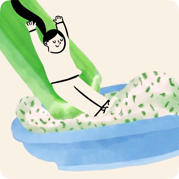
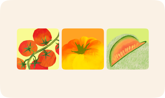


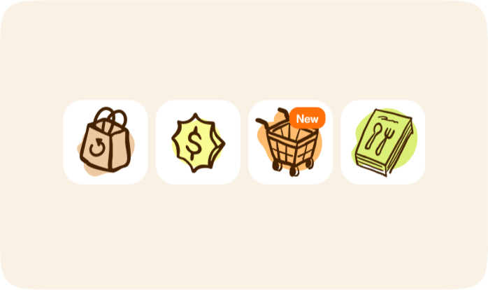
Two styles. Watercolour: loose, saturated fruit and vegetables (tomatoes, peppers, melon) and people with ink outlines and colour washes on Cashew. Line drawing: confident single-weight dark-brown outlines (a hand holding a dragon fruit) over watercolour fills. Bag illustrations are modular: fruit, hands and containers can be repositioned or recoloured.
Source: heyitsinstacart.com/brandelementheyitsinstacart.com/colorheyitsinstacart.com/biggreenbag
(published) 'A candid, human lens that captures warmth, care, and in-between moments'
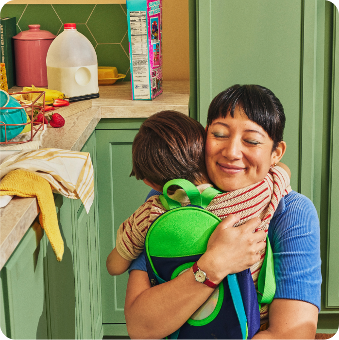

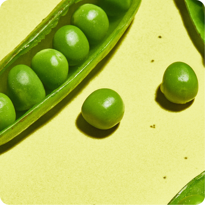

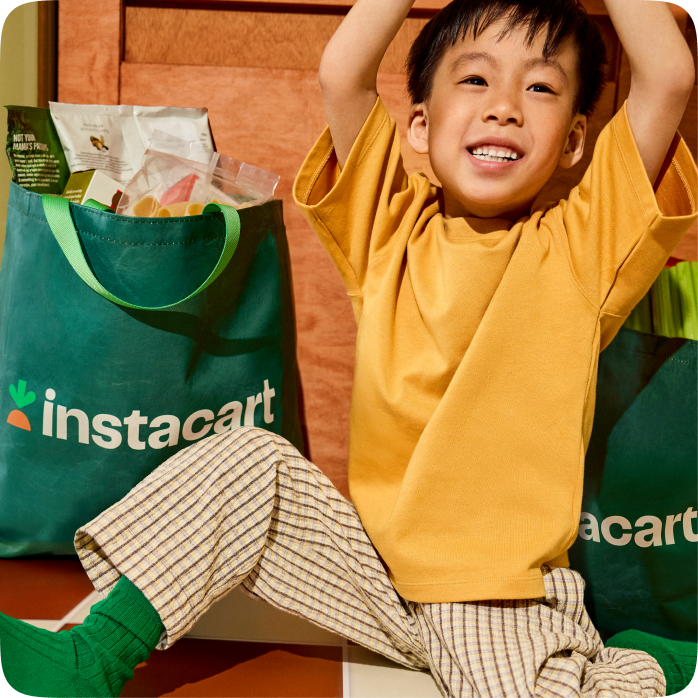
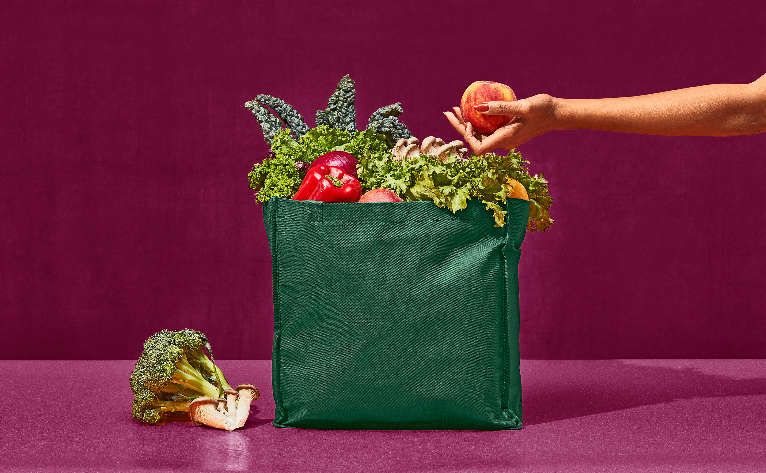
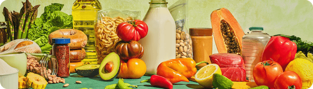
Warm, saturated, daylight colour. Three published uses: Brand Forward (candid people mid-moment: a parent hugging a child in a green kitchen, a woman biting a peach against leaves); Splash Screen (bold produce close-ups like peas on yellow, with negative space for the logo); Functional (CPG-style product on a coloured sweep with scattered ingredients). Photos sit in 16-30px rounded tiles; the Big Green Bag recurs.
Source: heyitsinstacart.com/photographycompany.instacart.com/pressinstacart.com
Intentional asymmetry with consistent margins; three alignments (left for longer copy, centred for short lines, offset when playful); logo top-centre at about 1/4 frame width; seven logo placements; 2, 4, 6 and 8 column grids with gutters equal to margins; rounded boxes at 30px radius with 100% smoothing. Company site: 90px side margins and 128px vertical section padding at 1440 (measure/press-desk.json).
Measured from heyitsinstacart.com's brand guide (heyitsinstacart.com) read in headless Playwright; its own image files downloaded; www.instacart.com and company.instacart.com computed styles in measure/.
| Measure | Desktop | Phone |
|---|---|---|
| Page margin | 144px | 16px |
| Section padding | 100px | 60px |
| Hero text width | max 384px, centered | full width |
| Card gap | 24px | 24px |
| Navigation | 80px | 80px |
Hero H1
Instacart Sans · 28px (phone 26) · line 1.179 · weight 600
Section H2 (centred)
Instacart Sans · 28px (phone 26) · line 1.179 · weight 600
Section H2, stats and FAQ (#343538)
Instacart Sans · 28px (phone 25) · line 1.179 · weight 600
Rail H2 (carousel)
Instacart Sans · 26px · line 1.077 · weight 700
List / banner H2
Instacart Sans · 22px (phone 19.5) · line 1.136 · weight 600
FAQ question
Instacart Sans · 30px (phone 26) · line 1.067 · weight 400
Stat value
Instacart Sans · 28px (phone 30) · line 1.179 · weight 600
Stat caption
Instacart Sans · 25px · line 1.12 · weight 400
Card title / store name
Instacart Sans · 18.5px (phone 15.5) · line 1.081 · weight 600
Body / card text
Instacart Sans · 15px (phone 13) · line 1.333 · weight 400
Button, chip, tile name
Instacart Sans · 15px (phone 13) · line 1.333 · weight 600
Footer column heading
Instacart Sans · 18.5px (phone 15.5) · line 1.081 · weight 600
Fine print
Instacart Sans · 13px (phone 11) · line 1.231 · weight 400
How Instacart’s own landing pages are built, observed on instacart.com, 2026-11-10. The full measurements are in spec.md.
Source: heyitsinstacart.com/layoutcompany.instacart.com/press
how the brand carries across formats
| Format | Loudness | Must appear | What varies |
|---|---|---|---|
| Landing page | Brand-led (company.instacart.com): Cashew #FAF1E5 page, Kale text, sticky Cashew header with the lockup at left and Kale nav; hero with a large Instacart Contrast H1 left and a 16px-rounded photo right; a Kale pill CTA; alternating #EEE6DA sections with 44px Instacart Sans H2s and carousels; one Kale band with a white pill; a centred 'Get in touch' block; a Kale footer with Cashew text. Consumer storefront (www.instacart.com): white shopping UI with a Kale hero band, white 26px 600 headline and a #108910 pill CTA beside a rounded food photo. | ||
| Social post | Offer layout: the instacart lockup top-centre, a centred 2-line headline under it, a small centred terms line, and an image band filling the bottom 40-50% (grocery still-life bleeding off the bottom edge, or a photo under a convex arched top). | Ground: Cashew #FAF1E5, a textured pale lime (nearest Granny Smith #DBEF77) or a photographed textile; partner offers swap the lockup for 'instacart | hairline | partner logo'; 4:5 (1080x1350) runs the same stack with up to 4 headline lines (see 'Paid social ad, 4:5 offer'). | |
| Brand-guide produce post (published layout examples) | One produce-colour ground (Butter, Honeydew, Cantaloupe) or a full-bleed food photo; the lockup top-centre (or top-left on photos); a 2-3 line heavy Instacart Sans headline; cut-out produce bleeding off the edges; 30px rounded corners. | Alignment can be centred (short lines), left (photo ground) or offset (playful); single-colour Kale logo on light produce grounds, Cashew/white on photos. Scope: the guide's own layout examples; live offer ads use the Social post family instead. | |
| Social post, portrait | A full-bleed warm overhead food photo; a serif headline in Butter #F9FB93 directly on the photo; no logo, no button. | Headline top-left (recipe cut) or a centred stack over the dish (list cut); one secondary line or none; 9:16 reel covers centre a 2-3 line headline. | |
| Deck | Guide presentation example: a Granny Smith #DBEF77 slide with a large Lime number ('02') and a three-line Kale key message top-left; data slide with a big photo tile and Tangerine progress bars. The logo matrix says to use the full-colour dark logo on internal presentations. | ||
| Guide 'Growth & Lifecycle' and CRM examples: Cashew card, full-colour logo at 1/4 width (medium, 'product surfaces, and CRM'), centred Kale headline 'Short and sweet headline', Kale pill 'Shop now', product cut-outs below. | |||
| Paid social ad, 4:5 offer | Lockup top-centre, a centred heavy headline stack, a small terms block, and a food band rising from the bottom edge (still-life or arc with a portrait). | Saver Stores cut: textured pale lime ground, Kale type, up to 4 headline lines with a size-graded stack; Instacart+ cut: Cashew ground, plum type and lockup, magenta arc. | |
| Video ad thumbnail | A cinematic, warmly lit staged scene (retro kitchen, holiday table, kale close-up) with no overlay headline; the claim, when present, is an in-scene prop (newspaper headline '$5 FLAT DELIVERY FEE ON INSTACART SAVER STORES', a 'NO MARKUPS' price tag); a small Cashew instacart lockup top-right; legal terms in two small centred lines at the bottom. Spots on YouTube show the Big Green Bag as the brand mark in the scene. | ||
| App Store screenshot | Alternating Kale and Honeydew grounds; a 1-3 line centred heavy Instacart Sans headline at the top (light green on Kale, Kale on Honeydew); a phone frame with real app UI below, cropped off the bottom edge, with one white UI card breaking out past the frame; the lead screen swaps the phone for a photo with retailer logos in white circles. | ||
| YouTube recipe thumbnail | Scoped to the recipe video series: a tight, warm close-up of the finished dish on a real surface, often with a hand in frame; no type and no logo on the thumbnail (the title carries the words). |
Source: heyitsinstacart.com/biggreenbagheyitsinstacart.com/color
Your name and logo, Instacart’s system.
Talk about my brand Use this brand in Claude
Get your brand audit Put your brand in Claude What goes in a brand book
Each value is marked published, observed, our reading or our recipe, with its source. Checked 2026-11-10. Not affiliated with Instacart.
Tell us what you want to make. We’ll talk through how to put these ideas to work for your brand.