Illumio Insights
Identify lateral movement, detect attacks, and stop breaches instantly at cloud scale. Observed
Brand book
Illumio sells calm in a field that sells fear: white space, light type and engineered isometric shapes say "contained and under control", while a single hot orange marks where to act. Our reading

The hero art: Forrester ribbons, a robotic hand, a book cover or storytelling cubes rotate through the carousel and campaigns while type, colour and layout stay put.
Source: illumio.com
Published intended balance; the live site runs whiter (about 80% white, 11% #1A2C32, 8% orange on the home page).
Our engine's setting, built from their rules.
Every orange, at every size, is #FF5500 as measured on illumio.com, with #FFFFFF labels on #FF5500 buttons. No darker substitute such as #C43F00: set --accent-text and --accent-fill to #FF5500.
Buttons, the glyph and at most one or two key words are #FF5500; all other type is #313638 on white or white on #1A2C32.
Heads are FK Grotesk Light (stand-in Host Grotesk 300, calibrated) with the stand-in letter- and word-spacing from the Typography table; no bold display heads; emphasis by orange colour.
Buttons, cards and image frames have 0 radius; decoration comes from isometric hexagons, parallelograms and dot grids.
4:1 lock-up, one glyph of clear space, one of the four published colourways; never recoloured, stretched or inline with text.
Safeguard Green and Risk Red only in diagrams; Chartreuse only as fine lines; Purple only in product illustration.
Proof points only from illumio.com (Forrester Wave Q3 2026, Gartner Peer Insights 4.8, Fortune 100, eBay 3,000 servers); no invented numbers.
Short sentence pairs or verb triads, sentence-case heads, category words (breach containment, AI security graph, Zero Trust); no exclamation marks in heads.
Illumio is the first and only platform built for breach containment. Powered by an AI security graph. Enabling your Zero Trust journey. Observed
Identify lateral movement, detect attacks, and stop breaches instantly at cloud scale. Observed
Secure critical assets, workloads, and devices across your hybrid, multi-cloud environment. Observed
Assess risk. Define security controls. Contain the attack. Observed
Breaches are inevitable. Disasters are optional.
The world leader in breach containment. Built on AI. Made for Zero Trust.
Illumio: The Breach Containment Company
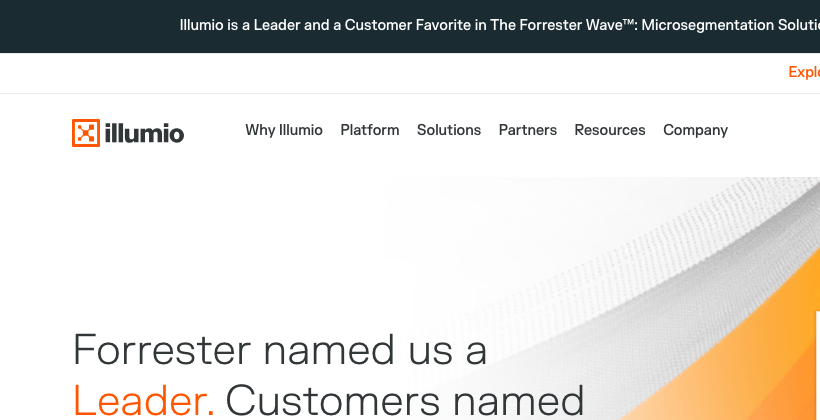
Forrester named us a Leader. Customers named us a Favorite.
Delivering meaningful outcomes that protect customers and drive their success (paraphrase).
ObservedActing with urgency and executing with focus, determination and grit (paraphrase).
ObservedPutting Illumio and the team before self so everyone can learn and do their best work (paraphrase).
ObservedCategory. Breach containment (microsegmentation plus cloud detection and response) Observed
Illumio presents itself as the leader in ransomware and breach containment: its platform, powered by an AI security graph, finds and contains threats across hybrid multi-cloud environments so attacks stop spreading before they become disasters (paraphrase of the "About Illumio" press boilerplate).
Breaches are inevitable. Disasters are optional. Observed
The world leader in breach containment. Built on AI. Made for Zero Trust. Observed
Illumio: The Breach Containment Company Observed
Forrester named us a Leader. Customers named us a Favorite. Observed
The world leader in breach containment Observed
Where breaches meet their end Observed
Make sure breaches never happen? Good luck with that. Observed
Assume Breach. Minimize Impact. Increase Resilience. Observed
Zero Trust, zero hassle Observed
The world leader in breach containment
Where breaches meet their end
Make sure breaches never happen? Good luck with that.
Assume Breach. Minimize Impact. Increase Resilience.
Zero Trust, zero hassle
Breaches are inevitable. Disasters are optional.
Stop every breach before it ever happens!
Identify lateral movement, detect attacks, and stop breaches instantly at cloud scale.
Unleash the magic of AI-powered next-gen cyber defense.
Make sure breaches never happen? Good luck with that.
Hackers are coming for you. Are you ready?
Our cutting-edge solution prevents 100% of cyberattacks!
Breaches are inevitable. Disasters are optional.
Leverage our robust platform to optimize your security posture.
See risk, set policy, and prevent lateral movement
assuredbluntplainspokenoptimistic about resilience
breach containmentAI security graphZero Trustlateral movementhybrid multi-cloudmicrosegmentationcyber resiliencecontainIllumineer (careers)
exclamation marks in headlinesrounded, playful "AI magic" languageprevention-only promises (the brand says breaches are inevitable)
Source: measure/home-desk.json + home-phone.json, about, news, platform (2026-11-17)illumio.frontify.com/document/428325
| Breaches are inevitable. Disasters are optional. | About page H2; also on Why Illumio and home hero slide 2, www.illumio.com/company/about-illumio |
|---|---|
| The world leader in breach containment. Built on AI. Made for Zero Trust. | Nav mega-menu line on every page, www.illumio.com/ |
| Illumio: The Breach Containment Company | Home H1, hero slide 2, www.illumio.com/ |
| Forrester named us a Leader. Customers named us a Favorite. | Home hero slide 1 head, www.illumio.com/ |
| The world leader in breach containment | About page H1, www.illumio.com/company/about-illumio |
| Where breaches meet their end | Platform page H1, www.illumio.com/illumio-platform |
| Make sure breaches never happen? Good luck with that. | Why Illumio H1, www.illumio.com/why-illumio |
| Assume Breach. Minimize Impact. Increase Resilience. | Press release H2 (WWT ARMOR), www.illumio.com/news/illumio-puts-breach-containment-with-wwts-armor |
| Zero Trust, zero hassle | Why Illumio H2, www.illumio.com/why-illumio |
| Reduce breach risk, prove clear security ROI, and protect the business from day one. | Nav mega-menu, every page, www.illumio.com |
| See risk, set policy, and prevent lateral movement | Home Segmentation band, www.illumio.com |
| Turn lateral movement into a dead end | Approved phrase, www.illumio.com |
Real lines from illumio.com, with where each ran, checked 2026-11-17.
Source: illumio.comillumio.com/company/about-illumioillumio.com/why-illumioillumio.com/illumio-platform


An orange square glyph locked up left of a bold lowercase "illumio" wordmark.


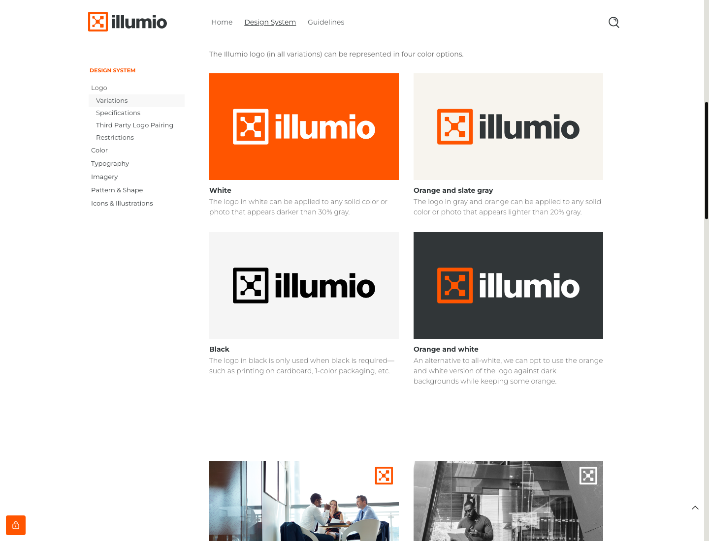


An orange square glyph locked up left of a bold lowercase "illumio" wordmark. The glyph is a framed node-and-connector "X" standing for the Policy Compute Engine and Virtual Enforcement Node joined in a boundary; the wordmark has rounded terminals. On the site: orange glyph + #313638 wordmark at 112x28 top-left of the white nav (x 132 at 1440); all-white lock-up 104x26 in the #1A2C32 footer; the glyph alone as favicon and on press cards.
Forrester named us a Leader. Customers named us a Favorite.
Forrester named us a Leader. Customers named us a Favorite.
Get started with a free trial.
Get started with a free trial.
Orange leads, white and slate carry the page.

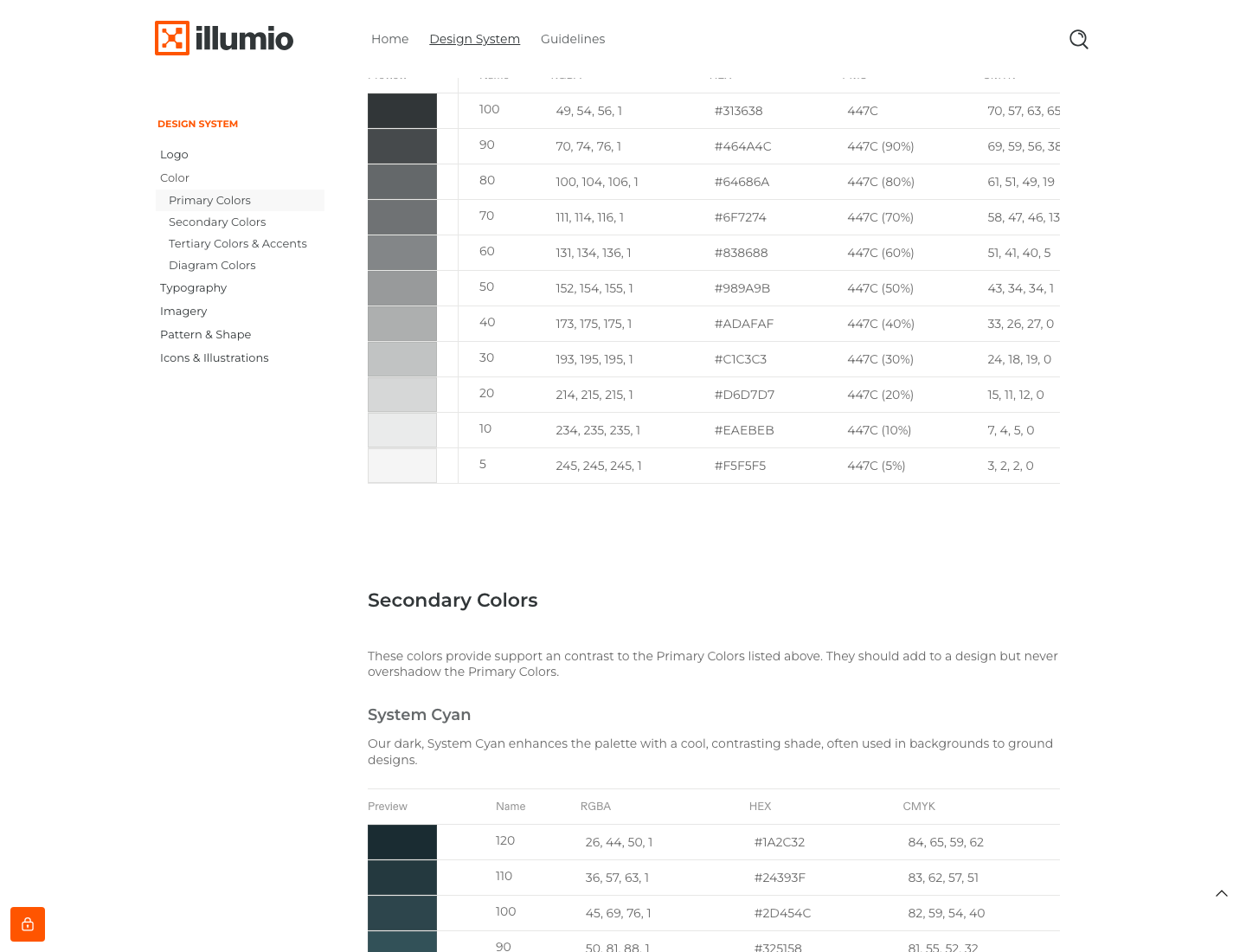
Orange leads, white and slate carry the page. Published as orange-led: Illumio Orange #FF5500 first, then White, Server Slate #313638 and System Cyan #2D454C, with Zero Trust Tan and Cloud Cerulean as soft grounds and Gold/Purple/Chartreuse as sparing accents (the guide’s proportion bar: orange 39%, white 20%, slate 12%, cyan 11%, tan 7%, cerulean 7%, gold 2%, purple 2%, chartreuse under 1%). The live site is white-led: about 80% white ground, #313638 type, #1A2C32 footer (about 11% of the home page), one #FF5500 band (about 8%), orange buttons and words.
Source: illumio.frontify.com/document/428325measure/home-desk.json + home-phone.json, about, news, platform (2026-11-17)
Breaches are inevitable. Disasters are optional.
Where breaches meet their end
Where breaches meet their end
One family, FK Grotesk, used light: Light 300 for every head and the body, Medium 500 for buttons and card titles, Bold for small text links.
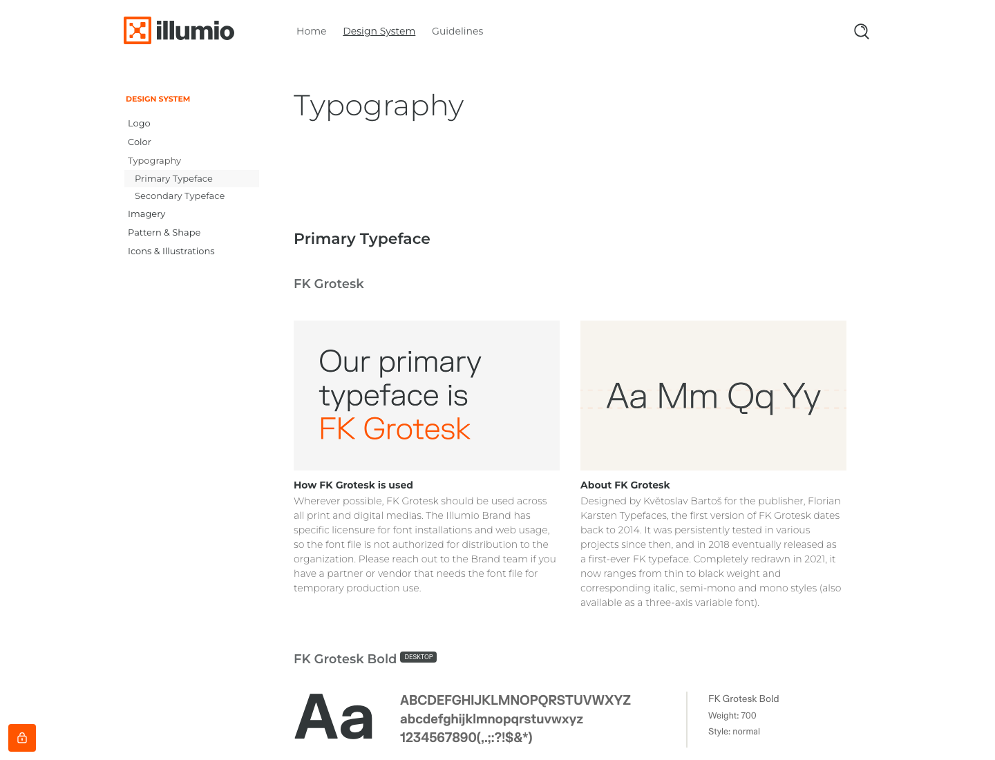
One family, FK Grotesk, used light: Light 300 for every head and the body, Medium 500 for buttons and card titles, Bold for small text links. Heads run 42-49px at 1440 with normal FK tracking (stand-in spacing per the calibration) and 1.16-1.2 leading; body 15.8/20.5. Montserrat is the published fallback for office documents, Arial last.
| Their face | Use | License | Open stand-in |
|---|---|---|---|
| FK Grotesk Light 300 | every head, body copy | commercial (Florian Karsten Typefaces); guide says it may not be redistributed | Hanken Grotesk 300 Open grotesk with similar proportions; to be calibrated by width and ink in the anatomy step |
| FK Grotesk Medium 500 / Bold 700 | buttons, card titles, small text links | commercial | Hanken Grotesk 500/700 same family as the display stand-in |
| Montserrat | published substitute for decks and documents | OFL (Google Fonts) | Montserrat the brand’s own published fallback |
Source: illumio.frontify.com/document/428325measure/home-desk.json + home-phone.json, about, news, platform (2026-11-17)
Do #FF5500 fill, #FFFFFF FK Grotesk Medium 15.8px, padding 14px 21px, radius 0, no border or shadow; on an orange band the button inverts to #FFFFFF fill with #FF5500 text.
Illumio Orange square CTA · header right on every page (Under Attack? / Active Breach? / Explore Insights), every band CTA
Do FK Grotesk Light 300, 42px/1.2 at 1440 (39px at 390), #313638 sentence case, left-aligned in split bands or centred over card rows; one or two words switch to #FF5500 at the same size and weight.
Light head with orange key words · home hero ("Leader." and "Favorite." in orange), section heads site-wide
Do Shapes cut from the 30-degree isometric grid: tall hexagon card grounds 525x604 at 1440; dot grids of 4px squares in #2D454C with a few #FF5500, fading left-to-right over about 440x175; parallelograms in flat #FF5500 or orange-to-white gradient.
Isometric hexagons, parallelograms and dot grids · behind role cards and platform visuals (Zero Trust Tan hexagons #F7F4EE/#F2EDE2), orange/System Cyan dot grids fading at band edges, orange parallelograms bleeding off hero corners, press cards
Do #1A2C32 full-bleed, #FFFFFF text, FK Grotesk Regular 28px "Get started with a free trial." over 6 link columns; orange stays for buttons and labels.
System Cyan dark ground · footer on every page, featured-news band, press-release cards
Do #FF5500 band 440-500px tall at 1440, white FK Grotesk Light 42px head, customer logo in white, photo framed on the right; CTA transparent with white text or white-filled.
Full-bleed orange case-study band · one per page: home (Microsoft), /illumio-platform (eBay), /about (Try Illumio Insights)
Do Glyph #FF5500 (or white on orange) at about 7% of card width, inset about 5% from the bottom-right corner.
Orange glyph-square stamp · logo top-left; on social and press cards the glyph alone sits bottom-right in a small square
Specimens use sample copy, not Illumio’s.
Every shape is cut from a 30-degree isometric grid.

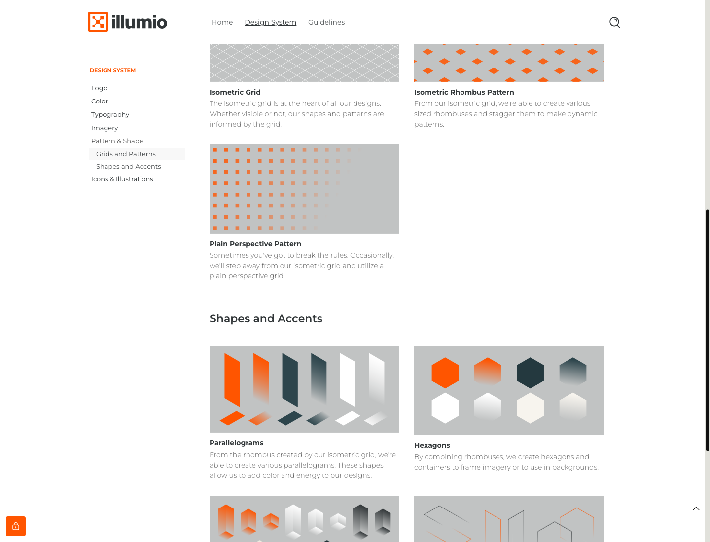

Every shape is cut from a 30-degree isometric grid. Building blocks cut from an isometric grid: rhombus patterns, a plain perspective grid, parallelograms (orange, slate, white, with gradients), hexagons and hexagon containers framing imagery, and thin accent lines. On the site these appear as pale tan hexagon card grounds, orange/cyan dot grids at band edges, and orange parallelograms bleeding off hero corners.
Two published icon families, technical and storytelling.
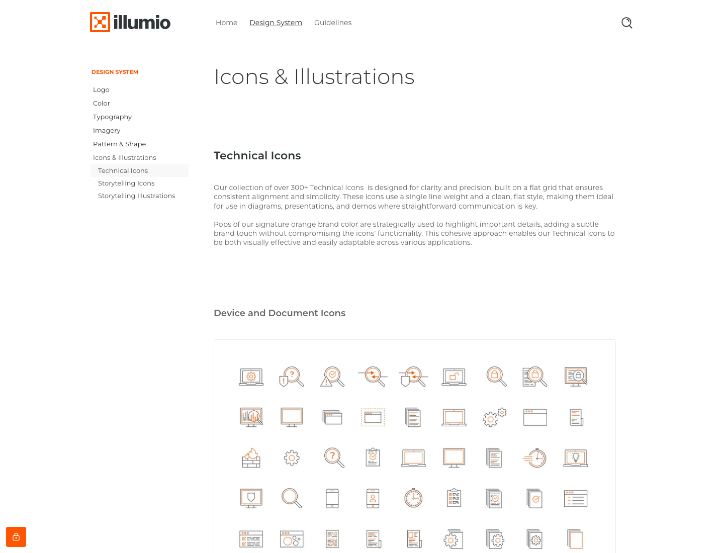
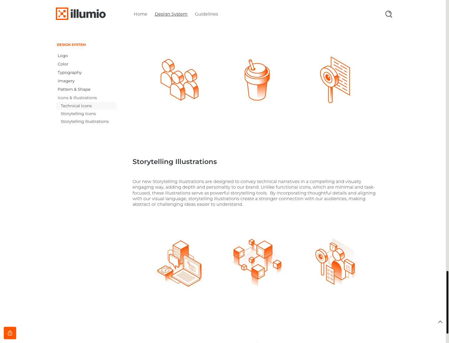
Two published icon families, technical and storytelling. In detail: 300+ technical icons (flat, single line weight, slate with orange pops) for diagrams and demos; storytelling icons (isometric, orange focal colour, varied weights, subtle gradients). Storytelling illustrations extend the isometric style into scenes.
Orange is the focal colour of every illustration.



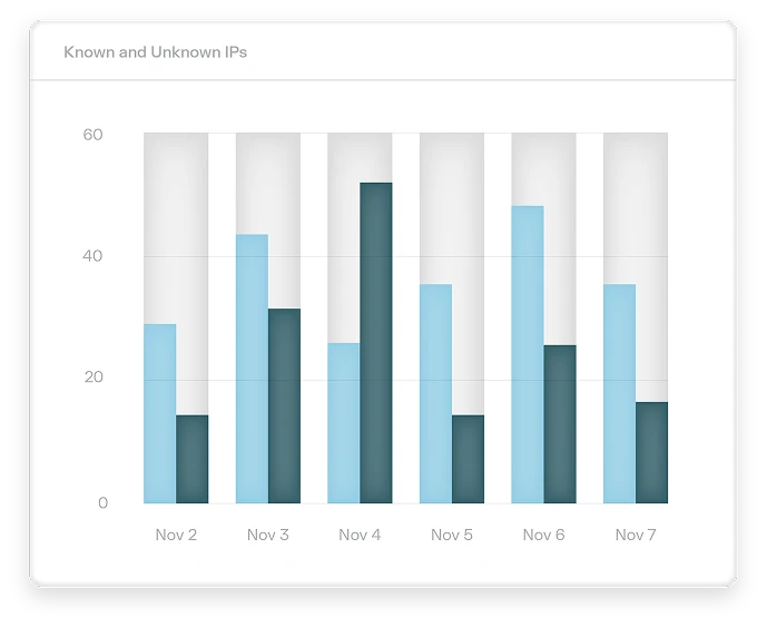
Orange is the focal colour of every illustration. Isometric orange-and-slate line illustrations (media-kit card: monitor, documents and phone in orange outline on a grey ground with cyan parallelograms), 3D-rendered orange/white ribbons and cubes in heroes, and product UI cards (Insights charts in cerulean, cyan and amber) floating on white.
Source: illumio.frontify.com/document/428325illumio.comillumio.com/company/news-awards
Warm photography with an orange accent, in two published families.

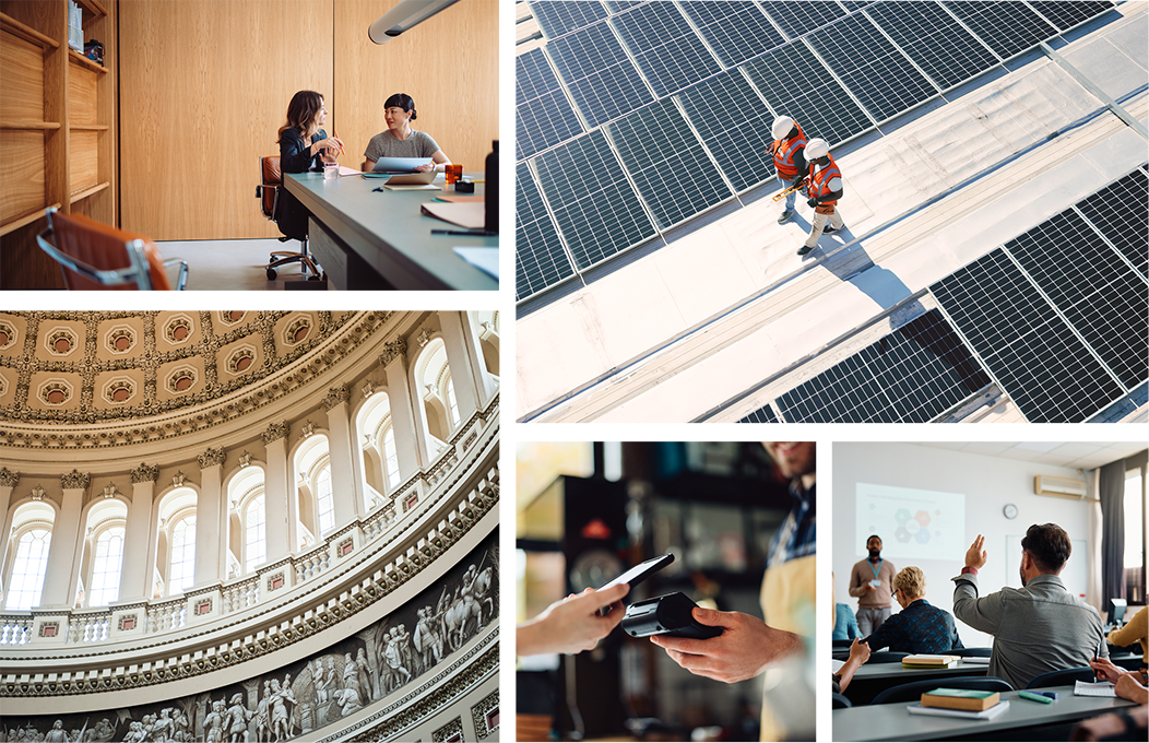
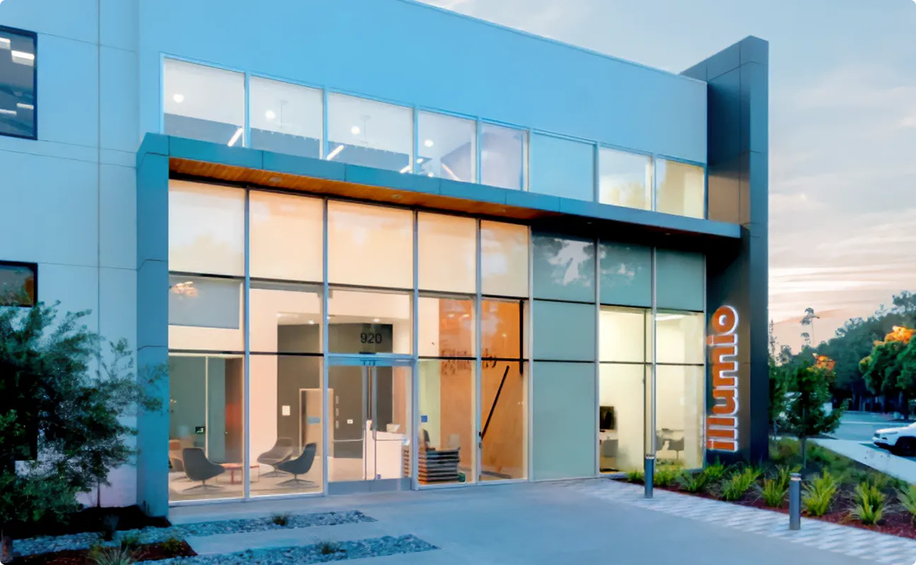
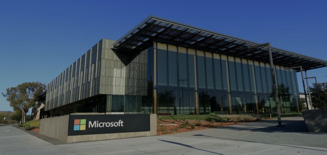

Warm photography with an orange accent, in two published families. Storytelling imagery: AI-built "containment" worlds where orange cubes and blocks sit inside offices, lobbies and civic architecture, warm light, desaturated surroundings. Supporting imagery: real-world warm photos (people at desks, a technician on solar panels, a capitol dome, hands with a phone) with orange/warm accents. On the site: the Illumio office facade with the orange vertical sign, a Microsoft campus photo inside the orange band, a delivery-worker photo in the eBay band.
Source: illumio.frontify.com/document/428325illumio.com/company/about-illumioillumio.comillumio.com/illumio-platform
White pages, split bands and one orange band. White pages on a 1440 grid with 132px side margins at 1440 (26px at 390): announcement bar, utility links, white nav; split bands (text left, visual right) alternate with centred heads over 3-card rows; one orange case-study band, a related-resources row, the #1A2C32 footer.
Measured from 's .
| Measure | Desktop | Phone |
|---|---|---|
| Page margin | 132px | 26px |
| Section padding | 56px | 39px |
| Hero text width | max 532px, centered | full width |
| Card gap | 42px | 42px |
| Navigation | 177px | 177px |
Inner-page H1 / home hero slide 2 (stand-in word-spacing -1.52px)
FK Grotesk Light 300 · 49px (phone 45.69) · line 1.16 · tracking 0.54px · weight 300
Section head / home hero (stand-in word-spacing -1.3px)
FK Grotesk Light 300 · 42px (phone 39.17) · line 1.2 · tracking 0.46px · weight 300
Sub-head / card head large (stand-in word-spacing -1.17px)
FK Grotesk Light 300 · 31.5px (phone 29.38) · line 1.2 · tracking 0.76px · weight 400
Footer lead (stand-in word-spacing -1.04px)
FK Grotesk Light 300 · 28px (phone 26.11) · line 1.2 · tracking 0.67px · weight 400
Card title (stand-in word-spacing -0.97px)
FK Grotesk Light 300 · 21px (phone 19.58) · line 1.2 · tracking 0.53px · weight 600
Hero sub / lead (stand-in word-spacing -0.54px)
FK Grotesk Medium 500 / Bold 700 · 17.5px (phone 16.32) · line 1.3 · tracking -0.05px · weight 300
Eyebrow / category label (stand-in word-spacing -0.65px)
FK Grotesk Medium 500 / Bold 700 · 17.5px (phone 14.69) · line 1.25 · tracking 0.42px · weight 400
Body (stand-in word-spacing -0.49px)
FK Grotesk Medium 500 / Bold 700 · 15.75px (phone 14.69) · line 1.3 · tracking -0.05px · weight 300
Button label (stand-in word-spacing -0.72px)
FK Grotesk Medium 500 / Bold 700 · 15.75px (phone 14.69) · line 1.3 · tracking 0.55px · weight 600
Nav link / utility link / announcement (stand-in word-spacing -0.64px)
FK Grotesk Medium 500 / Bold 700 · 14px · line 1.3 · tracking 0.49px · weight 600
Text CTA (stand-in word-spacing -0.77px)
FK Grotesk Medium 500 / Bold 700 · 14px (phone 13.06) · line 1.3 · tracking 0.62px · weight 700
Footer column label (stand-in word-spacing -0.72px)
FK Grotesk Medium 500 / Bold 700 · 15.75px (phone 14.69) · line 1.2 · tracking 0.55px · weight 600
Footer link (stand-in word-spacing -0.38px)
FK Grotesk Medium 500 / Bold 700 · 12.25px · line 1.3 · tracking -0.04px · weight 300
Legal line (stand-in word-spacing -0.39px)
FK Grotesk Medium 500 / Bold 700 · 10.5px (phone 9.79) · line 1 · tracking 0.25px · weight 400
How Illumio’s own landing pages are built, observed on illumio.com/%20at%201440x900%20and%20390x844,%20headless%20Chromium%20computed%20styles%20(measure/home-desk.json,%20home-phone.json%20and%20live%20probes%20with%20the%20consent%20banner%20and%20Lumi%20widget%20removed),%202026-11-17, 2026-11-17. The full measurements are in spec.md.
Source: measure/home-desk.json + home-phone.json, about, news, platform (2026-11-17)
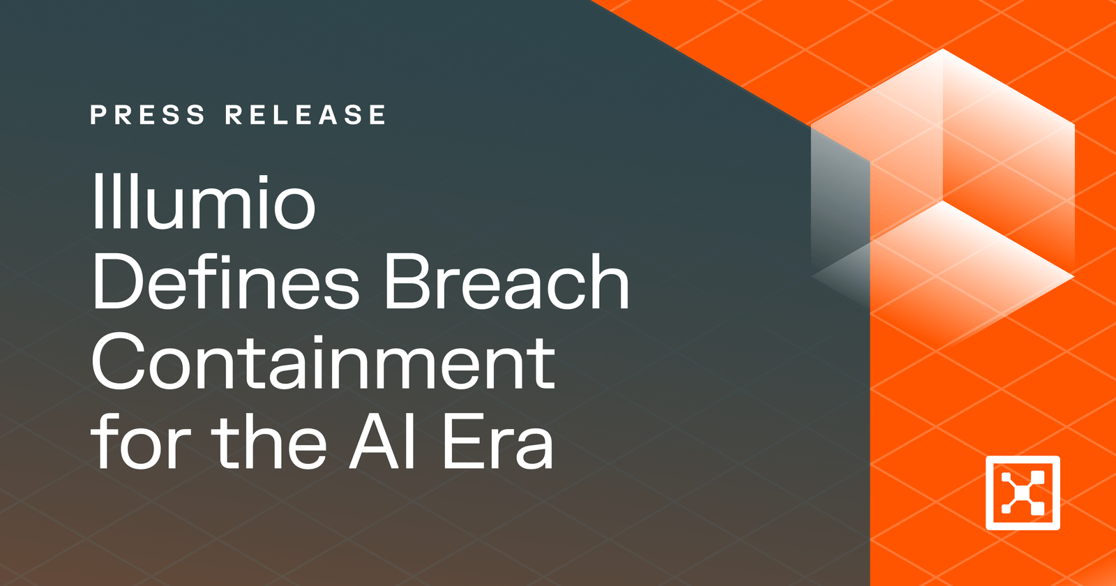

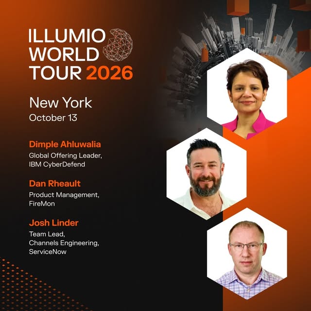
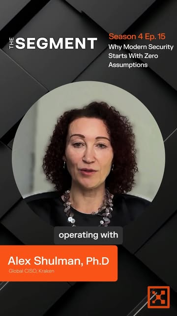

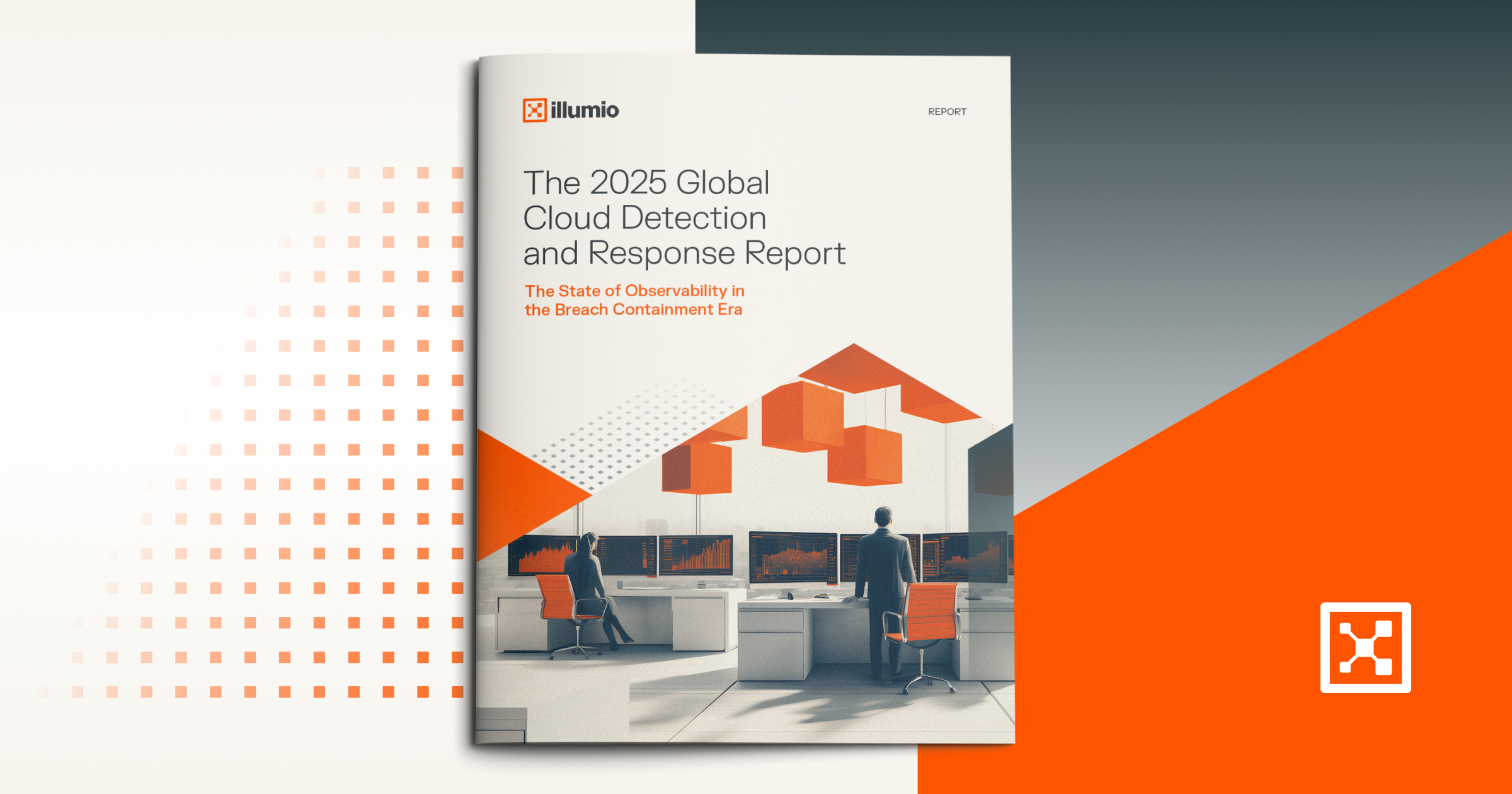
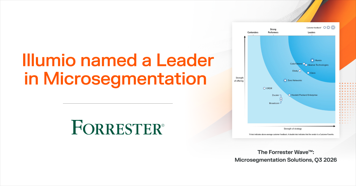
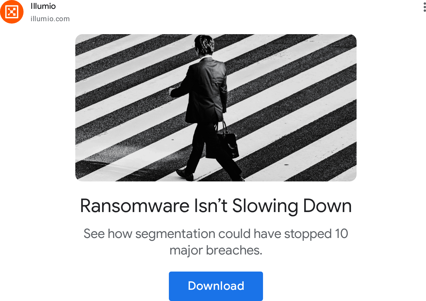
From five illumio.com pages, four press/social share cards, the home og:image, two Google ads and the Illumio brand hub (2026-11-17).
| Format | Loudness | Must appear | What varies |
|---|---|---|---|
| Landing page | one orange square CTA per band, Light 42px heads with one or two #FF5500 key words, tan hexagons behind cards, exactly one full-bleed #FF5500 band, #1A2C32 footer | which split bands and proof (analyst, customer) appear, and their order | |
| Social post | Dark near-black ground lit by Illumio Orange from one corner and one orange slab; FK Grotesk type left in a single column; real people or real product only; one message. | Event posts carry hexagon-cropped speaker photos on the right; award posts are the award artwork centred on the dark ground. | |
| Social post, portrait | The Segment podcast template: dark faceted ground, show wordmark top-left, orange episode label, circular guest portrait, orange name bar bottom-left, glyph stamp bottom-right. | Guest photo and episode topic change; nothing else. | |
| Link-share card (OG / press) | One message per card: small caps label, a light FK Grotesk head, isometric orange shapes on one side, the orange glyph stamp bottom-right. | Ground per family: dark System Cyan gradient with orange isometric field (press release), white with faint isometric grid and partner lock-up (partnership), white with report cover or analyst chart (reports). | |
| Paid ad: search/display | Brand name with the glyph-in-orange-circle avatar, plain benefit copy, one offer. | Image: isometric orange cubes on tan, or black-and-white street photography with a stark crop |
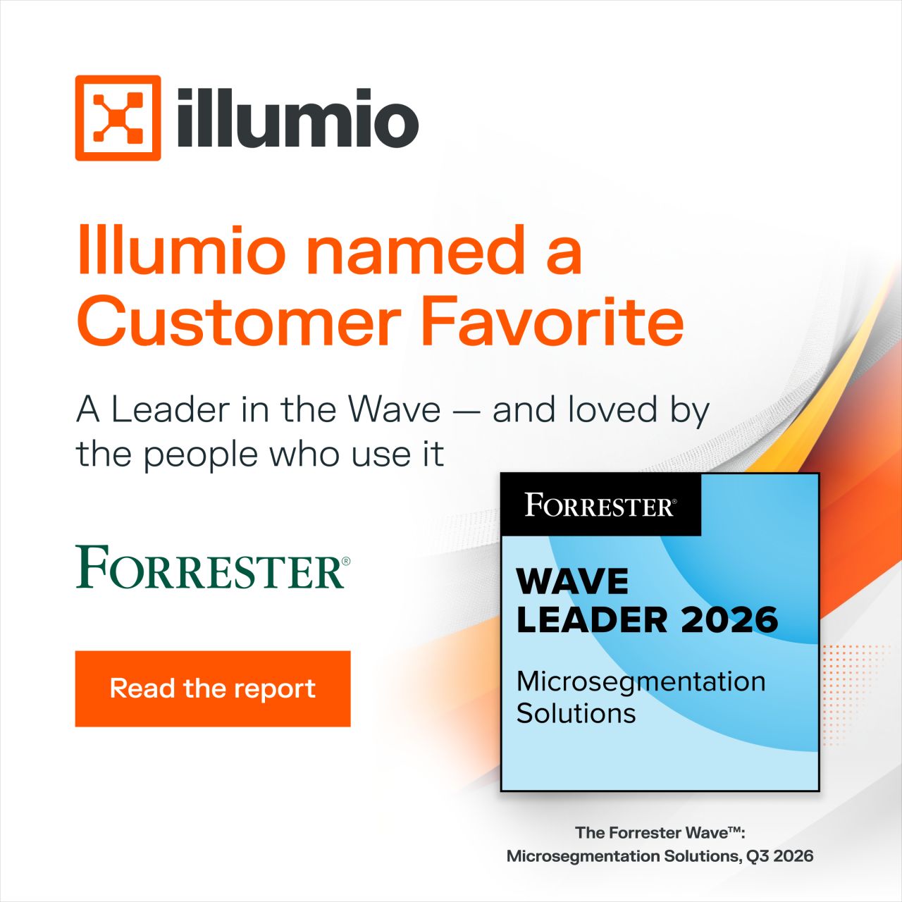 Forrester wave microsegmentationLinkedIn · Sep – Nov 2026
 FY26 Q2 Illumio InsightsLinkedIn · Feb – Jul 2026
 Live Visibility & Microsegmentation Without Depending On…Google · Aug 2023 – now
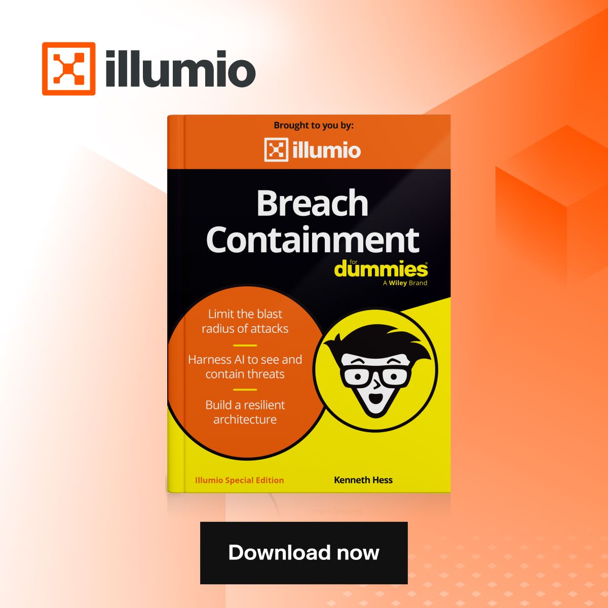 [Free eBook] Download NowLinkedIn
Source: illumio.frontify.com/hub/218823illumio.frontify.com/document/428325illumio.comillumio.com/illumio-platform
Your name and logo, Illumio’s system.
Talk about my brand Use this brand in Claude
Get your brand audit Put your brand in Claude What goes in a brand book
Each value is marked published, observed, our reading or our recipe, with its source. Checked 2026-11-17. Not affiliated with Illumio.
Tell us what you want to make. We’ll talk through how to put these ideas to work for your brand.