Trusted and recognisable
One of the most recognisable and trusted online destinations in the UK since 2012. Published
Brand book
The brand is the task list. GOV.UK earns trust by looking the same everywhere and getting out of the way; the 2025 refresh added exactly one expressive element, the dot, and kept it off the working web pages. Our reading
Expression: the wider palette, the dot and motion move along the inform-to-inspire scale by channel (web least, social most) and by subject (muted for sensitive topics, brighter for positive ones).
Source: brand.design-system.service.gov.uk/introductionbrand.design-system.service.gov.uk/graphic-device/expression
Our engine's setting, built from their rules.
Cover the logo. It should still read as GOV.UK: a solid #1D70B8 block, bold sentence-case white headline, underlined blue links on white, square corners.
No sentence over 25 words, no "please", no buzzwords, no negative contractions.
The single, trusted place for UK government services and information, written in plain English for everyone. Our reading
One of the most recognisable and trusted online destinations in the UK since 2012. Published
On every channel the focus is helping people find what they need from government and complete tasks. Published
Plain English is mandatory so everyone who needs the content can understand it. Published
Every colour pairing must meet WCAG 2.2 AA; meaning is never carried by colour alone. Published
Launched in 2012, GOV.UK replaced hundreds of government websites with one. In 2025 the brand evolved: the header turned Primary blue, the dot in the wordmark rose and turned teal, and a motion language around the dot was added for the app and social.
apply core elements the same way everywhere so people know they are in the right place
Publishedlet the elements flex to the context without losing the identity
Publishedweb informs; app and social can inspire
PublishedCategory. Government services and information platform (web, app, wallet) Published
Individual department websites and unofficial third-party sites (GOV.UK replaced the former).
GOV.UK has been the single home of UK government online since 2012. Its brand was refreshed in June 2025 so it can work beyond the website, in the GOV.UK app, GOV.UK Wallet and social media, while keeping its recognisable, trusted foundations.
The best place to find government services and information Observed
Your government services and information, on the go Observed
No slogans: the homepage leads with one claim ("the best place to find government services and information") and then lists tasks. Every heading is the name of a task or topic; every description is one plain line.
Source: gov.ukbrand.design-system.service.gov.uk/introductionguidance.publishing.service.gov.uk/writing-to-gov-uk-standards/style-guides/a-to-z-style-guide
Many readers have low literacy or English as a second language; specialists also prefer plain English.
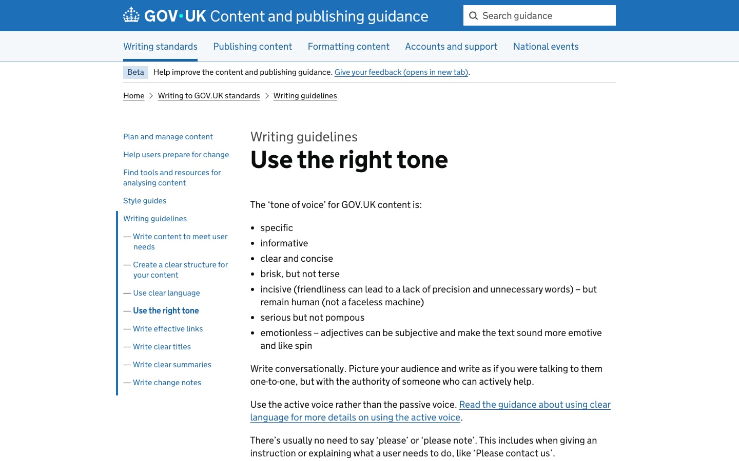
SpecificInformativeClear and conciseBrisk, not terseSerious, not pompous
GOV.UK publishes its tone of voice as a short list: specific, informative, clear and concise, brisk but not terse, incisive but human, serious but not pompous, emotionless. Plain English is mandatory, with a large A to Z style guide behind it.
youbuyhelpaboutcanmustneed
please / please notenegative contractions (can't, don't)block capitalsbuzzwords: deliver, empower, facilitate, leverage-style jargon& (use "and")exclamation marks
Source: guidance.publishing.service.gov.uk/writing-to-gov-uk-standards/writing-guidelines/right-tonebrand.design-system.service.gov.uk/introduction
| Tone | specific, informative, brisk, serious |
|---|---|
| Sentence | split over 25 words |
| Paragraph | max 5 sentences |
| Case | sentence case |
| Numbers | numerals, % sign, 9,000 |
Source: guidance.publishing.service.gov.uk/writing-to-gov-uk-standards/writing-guidelines/right-toneguidance.publishing.service.gov.uk/writing-to-gov-uk-standards/writing-guidelines/clear-languageguidance.publishing.service.gov.uk/writing-to-gov-uk-standards/style-guides/a-to-z-style-guide
The GOV.UK wordmark, crown and royal crest are Crown copyright and restricted to government use; we describe them and link to the guidelines. A visitor who steals this kit keeps their own logo. Not affiliated with GOV.UK or GDS.
The raised dot reads as a connector between government and the UK rather than a web address.
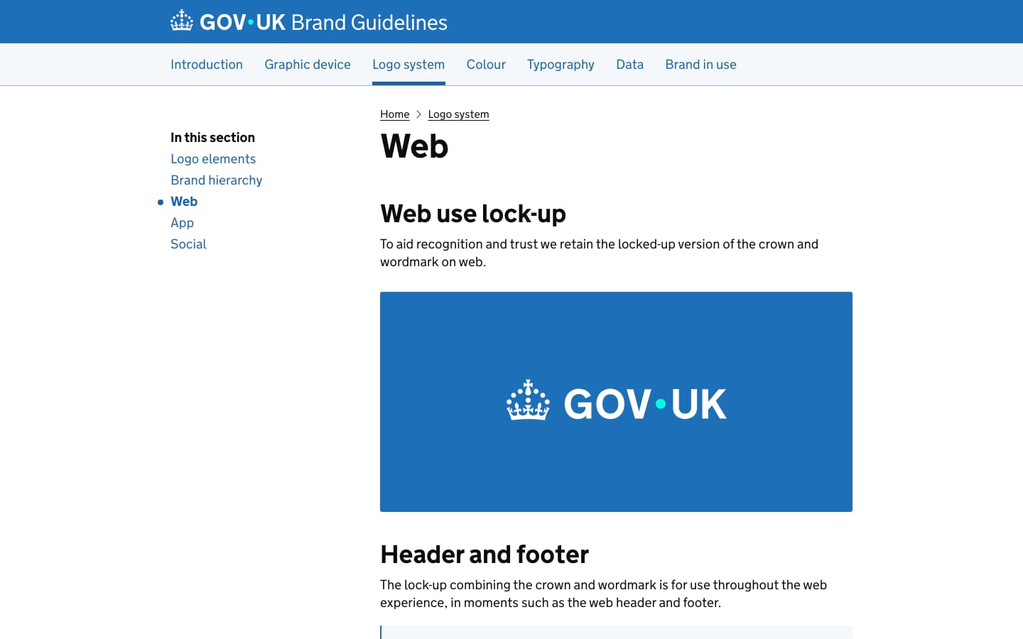
| Wordmark min | 50px wide |
|---|---|
| Crown min | 16px wide |
| Crown gap | 3 crown dots (7px on web) |
| Dot | 2 crown dots (standard crown) |
| Clear space | 1 wordmark dot |
Two elements: the wordmark (primary identifier) and the crown (supporting trust mark). On web they are locked up, crown left of the wordmark. The redrawn wordmark raises the dot to the vertical middle and colours it Accent teal on blue.
Source: brand.design-system.service.gov.uk/logo-systembrand.design-system.service.gov.uk/logo-system/logo-elementsbrand.design-system.service.gov.uk/logo-system/webbrand.design-system.service.gov.uk/logo-system/brand-hierarchy
Using the blue more consistently makes it the visual signature; teal makes the brand feel more modern.
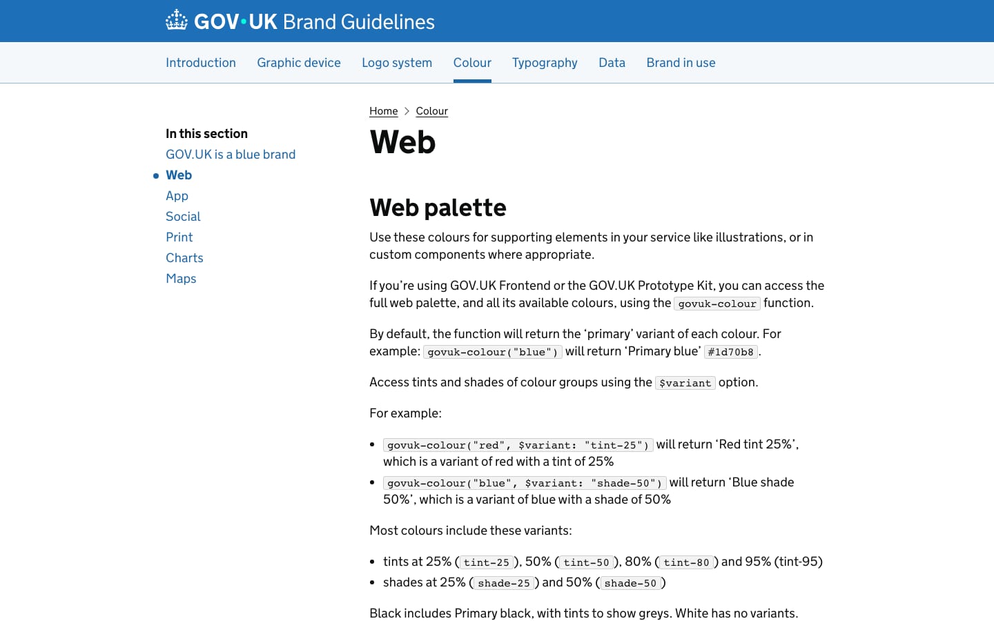
| Primary blue | #1D70B8 · RGB 29 112 184 |
|---|---|
| Accent teal | #00FFE0 |
| Text | #0B0C0C |
| Link | #1A65A6 |
| Focus | #FFDD00 |
| Template bg | #F4F8FB |
GOV.UK is a blue brand: Primary blue #1D70B8 and Accent teal #00FFE0 lead every channel. A four-tier palette (primary, tints, shades, accents) covers blues, greens, teals, purples, magentas, reds, oranges, yellows, browns and neutrals, plus functional colours (text, links, border, focus, error, success).
Not published: colour proportions.
Source: brand.design-system.service.gov.uk/colourbrand.design-system.service.gov.uk/colour/govuk-bluebrand.design-system.service.gov.uk/colour/webdesign-system.service.gov.uk/styles/colour
The best place to find government services and information
Designed to be read at speed; it makes GOV.UK easy to recognise and read on any device.
| Their face | Use | License | Open stand-in |
|---|---|---|---|
| GDS Transport Bold | Headings, links, labels | Crown; for GOV.UK and service.gov.uk only | Roboto Bold width within 1% and ink within 1% of GDS Transport Bold at 19-64px; shares the single-storey g and plain terminals (see typography.calibration). Already in the Steal type library. |
| GDS Transport Light (weight 400 on the site) | Body copy | Crown; GOV.UK only | Roboto 360 Roboto at 360 with -0.01em tracking matches the Light file's width and ink within 1%. |
| None published | Code only | n/a | JetBrains Mono |
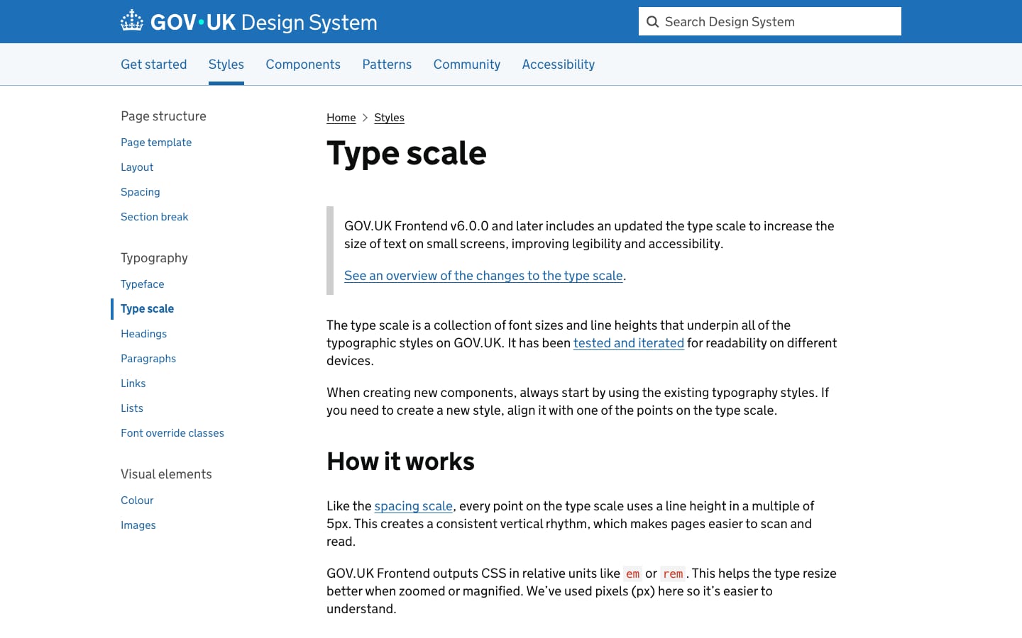
| Real face | GDS Transport Light / Bold |
|---|---|
| Scale (large) | 80/80, 48/50, 36/40, 27/30, 24/30, 19/25, 16/20 |
| Scale (small) | 53/55, 32/35, 27/30, 21/25, 21/25, 19/25, 16/20 |
| Breakpoint | 640px |
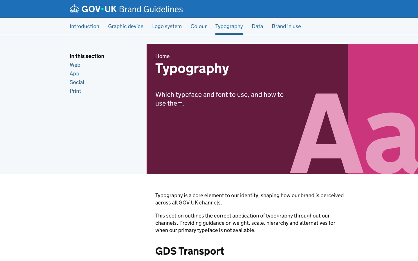
One typeface, GDS Transport, in two weights (light and bold), based on the 1960s Transport road-sign face by Jock Kinneir and Margaret Calvert and adapted by GDS in 2012. The Design System type scale uses line heights in multiples of 5px and enlarges small-screen text from Frontend v6.
Source: brand.design-system.service.gov.uk/typographybrand.design-system.service.gov.uk/typography/webdesign-system.service.gov.uk/styles/typefacedesign-system.service.gov.uk/styles/type-scale
Do header and hero as one uninterrupted #1D70B8 field, white type, the teal dot as the only other colour.
The blue block · top of the homepage
Do Accent teal #00FFE0 circle, vertically centred between GOV and UK; as a device it guides, highlights, informs, illustrates.
The dot · wordmark, and as a graphic device in app and social
Do 4px solid #1D70B8 rule across the column, 60px of space below it to the H2 (desktop).
4px blue section rules · between homepage blocks and above the app promo
Do #1A65A6, 1px underline 3px below the baseline, bold for task links.
Underlined bold blue links · every link
Specimens use sample copy, not GOV.UK’s.
One flexible shape ties every channel together without adding decoration to working pages.
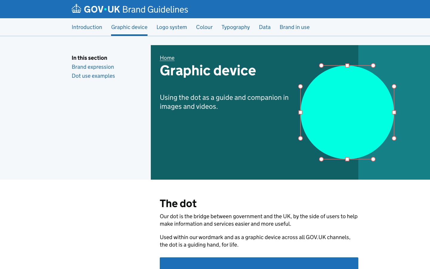
The dot is the one graphic device: a teal circle that guides, highlights (stretching into a lozenge behind a word), informs (growing with a statistic) and illustrates (drawing circle-based icons). On the web homepage the signature elements are functional: the solid blue block, 4px blue section rules, underlined bold links, pale-blue arrow circles and CSS chevrons.
Source: brand.design-system.service.gov.uk/graphic-devicebrand.design-system.service.gov.uk/graphic-device/expressionbrand.design-system.service.gov.uk/graphic-device/dot-use-examples
People read single icons in different ways.
| Action link | 40px #D2E2F1 circle, black arrow |
|---|---|
| Chevron | 7px, 3px #1D70B8 stroke |
| Search | 20px, 3px stroke |
The Design System says avoid icons in most cases; when used, give a visible text label and never let one icon mean two things. The homepage uses only a magnifier, a right arrow in a pale blue circle and a CSS chevron.
Images are visual aids; the text must carry the information.
Illustrations simplify something complex (scanning a passport, finding a reference number). Flat blocks of the GOV.UK palette, few elements, consistent line widths and radii; avoid people, and if shown, show diversity. The brand adds circle-built animated illustrations around the dot for app and social.
Source: design-system.service.gov.uk/styles/imagesbrand.design-system.service.gov.uk/graphic-device/dot-use-examples
Services work best without relying on images.
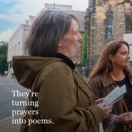
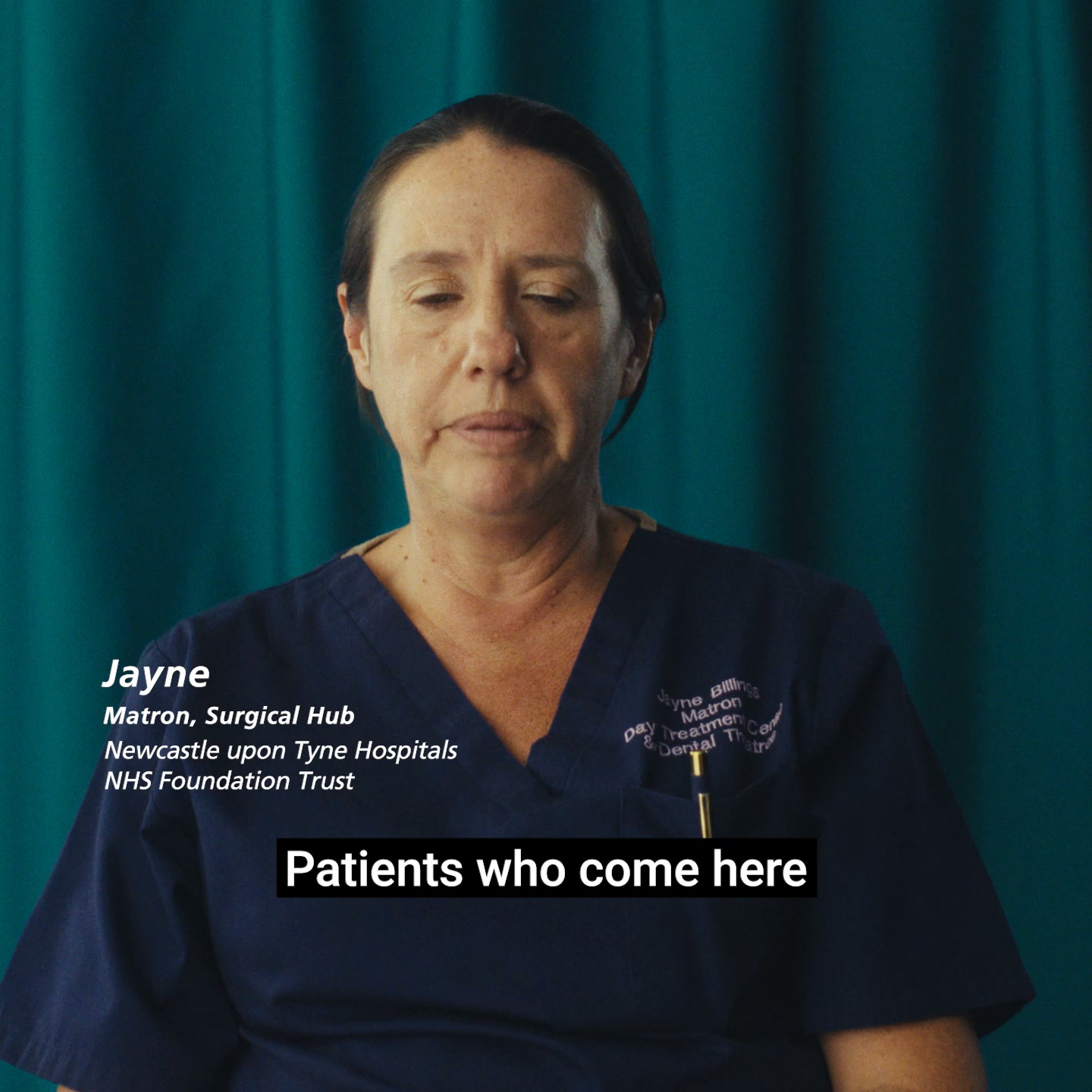
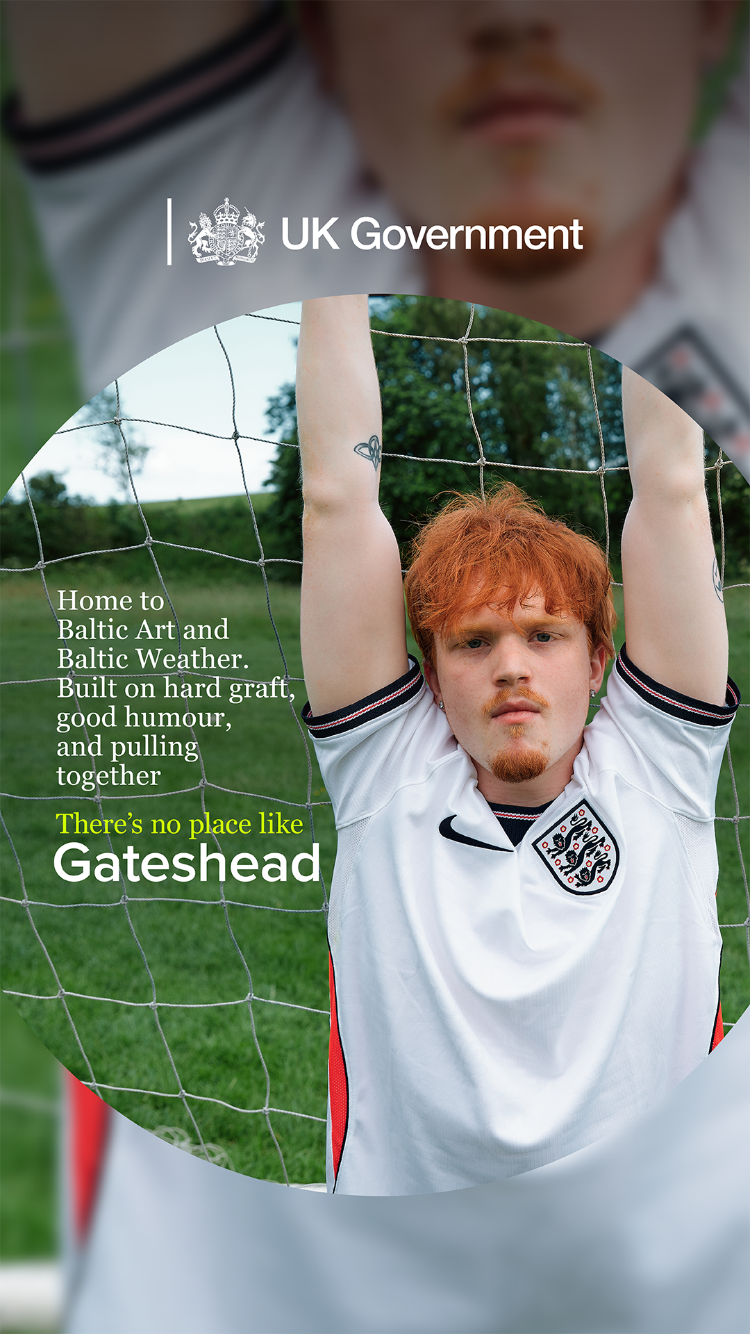
Use photography only when a lifelike representation matters (for example a preview of an uploaded document). The homepage has no photography. Social uses real people (an influencer or presenter) in thumbnails.
Source: design-system.service.gov.uk/styles/imagesbrand.design-system.service.gov.uk/graphic-device/dot-use-examples
Motion adds energy where attention must be won (app, social) and stays out of task pages.
Motion belongs to the dot: wordmark and crown reveals, the splash-screen spiral of coloured dots, and dot behaviours (guides, navigates, highlights, informs, transitions, illustrates). Social end frames share the app splash motion. Durations and easing are not published. The web homepage does not animate.
Source: brand.design-system.service.gov.uk/graphic-device/expressionbrand.design-system.service.gov.uk/graphic-device/dot-use-examplesbrand.design-system.service.gov.uk/logo-system/logo-elements
Mobile first, single column first; default max page width 1020px in the Design System (the homepage container measures 960px of content inside 15px column padding); two-thirds / one-third grid; responsive and static spacing scales from 5px to 60px.
Measured from brand.design-system.service.gov.uk's Brand law from the GOV.UK brand guidelines (brand.design-system.service.gov.uk, June 2025 refresh); web application from the GOV.UK Design System; voice from the GOV.UK writing guidelines; page anatomy measured on www.gov.uk on 2026-10-31..
| Measure | Desktop | Phone |
|---|---|---|
| Page margin | 240px | 24px |
| Section padding | 60px | 28px |
| Card gap | 30px | 30px |
| Navigation | 61px | 61px |
Hero headline
GDS Transport Light (weight 400 on the site) · 64px (phone 40) · line 1.07 · weight 700
Section H2
GDS Transport Light (weight 400 on the site) · 36px (phone 32) · line 1.111 · weight 700
Footer heading
GDS Transport Light (weight 400 on the site) · 24px (phone 21) · line 1.25 · weight 700
Link heading / bold link
GDS Transport Light (weight 400 on the site) · 19px · line 1.316 · weight 700
Body
GDS Transport Light (weight 400 on the site) · 19px · line 1.316 · tracking -0.19px · weight 360
Small (feedback bar, Menu)
GDS Transport Light (weight 400 on the site) · 16px (phone 19) · line 1.25 · tracking -0.16px · weight 360
Search label
GDS Transport Light (weight 400 on the site) · 19px · line 1.316 · weight 700
How GOV.UK’s own landing pages are built, observed on gov.uk/%20(measured%202026-10-31,%20cookie%20banner%20dismissed), 2026-10-31. The full measurements are in spec.md.
Source: design-system.service.gov.uk/styles/layoutdesign-system.service.gov.uk/styles/spacingdesign-system.service.gov.uk/styles/type-scale
How our engine applies the GOV.UK system to each format. Our recipe from their rules and their inform-to-inspire scale, not something GOV.UK publishes.
| Format | What they did | Source |
|---|---|---|
| website | gov.uk: Primary blue header and hero, white page, underlined blue links, lock-up top left, crown and crest in the footer. | gov.uk |
| app | Blue header with the wordmark and teal dot; splash screen with the dot spiral; circle-built onboarding illustrations. | brand.design-system.service.gov.uk/brand-in-use/app |
| social | Full palette and the dot at full volume: circles, lozenge highlights, end frames. | brand.design-system.service.gov.uk/brand-in-use/social |
| product lock-ups | GOV.UK Pay, Notify, Wallet: wordmark + product name, spaced by the dot width. | brand.design-system.service.gov.uk/logo-system/brand-hierarchy |
| Format | Loudness | Must appear | What varies |
|---|---|---|---|
| Landing page | Build it the way gov.uk is built (kit.spec.page): one solid Primary blue header + hero block with a bold white sentence-case H1, white page, 4px blue section rules, bold underlined #1A65A6 links, square corners, Roboto (GDS Transport stand-in) 700/360, pale #F4F8FB footer with a 10px blue top border | which task lists and how many links | |
| Slides | Primary blue or white grounds, bold sentence-case titles, plain sentences | one dot-based highlight per slide | |
| Social | Primary blue and Accent teal lead; the dot used purposefully | wider palette, circle illustrations, lozenge highlights | |
| Print / poster | Blue lead colour, bold titles, AA contrast | one dot device |
Source: brand.design-system.service.gov.uk/brand-in-usebrand.design-system.service.gov.uk/colour/govuk-bluebrand.design-system.service.gov.uk/logo-system/logo-elementsbrand.design-system.service.gov.uk/graphic-device/dot-use-examples
Your name and logo, GOV.UK’s system.
Use this kit for my brand Use this brand in Claude
Get your brand audit Put your brand in Claude What goes in a brand book
Each value is marked published, observed, our reading or our recipe, with its source. Checked 2026-10-31. Not affiliated with GOV.UK.