Elegant and simple
A calm desktop that gets out of the way: one key for overview, launching and search; workspaces for room to breathe. Observed
Brand book
One shared palette and one open typeface across desktop, apps and brand: GNOME looks like its software because the brand is built from the same parts. Our reading

which HIG secondaries and gradients a piece uses
Our engine's setting, built from their rules.
Cover the foot. Blue plus soft rounded triangles, Inter Heavy and a flat HIG-palette illustration should still say GNOME.
Put another Linux desktop's logo on it. If the Blue, the tris and the plain voice feel generic, push the signature back in.
An independent computing platform for everyone. Observed
A calm desktop that gets out of the way: one key for overview, launching and search; workspaces for room to breathe. Observed
Simple, consistent apps for everyday computing, so each new one feels familiar. Observed
Every part of the project is open; the software has no restrictions on use and respects privacy. Observed
The default experience across major Linux distributions, with a developer platform and app store around it. Observed
An independent computing platform for everyone
Room to Breathe
Batteries Included
Founded in 1997 by two students to build a completely free desktop and take on the tech giants of the day. GNOME grew into the user experience for the main Linux distributions, with software used from space-flight control rooms to cars (paraphrase).
Inclusive of abilities, cultures and devices; little specialist knowledge needed (paraphrase).
PublishedDo one thing well; avoid overwhelming people (paraphrase).
PublishedAutomate, cut steps, keep text short (paraphrase).
PublishedPrevent mistakes, allow undo, respect time and attention (paraphrase).
PublishedCategory. Free and open source desktop environment and application platform for Linux Observed
GNOME is a free, open source desktop and app platform, founded in 1997 by Miguel de Icaza and Federico Mena. It provides the user experience for the main Linux distributions, produces around 120 software modules, and is built by a global community of volunteers and paid contributors backed by the non-profit GNOME Foundation.
An independent computing platform for everyone Observed
An easy and elegant way to use your computer Observed
A more elegant way to use your computer Observed
The homepage carries four ideas: elegance (one key, room to breathe), batteries included, an open community to join, and GNOME as the default across Linux. Donations close the page.
Source: gnome.orggnome.org/about
Find and Replace
FIND AND REPLACE
Text written to be translated into many languages has to be short, literal and free of idioms; the warmth lives in the web copy, not the UI.
PlainInclusiveConsiderateWarmOpen
UI writing is neutral, short and strictly capitalized (header vs sentence capitalization). The website is warmer: Title Case headings, short friendly paragraphs ("It's magic.").
i.e.e.g.Gnome (mixed case)
| Headings | Header capitalization |
|---|---|
| Body | Sentence case |
Source: developer.gnome.org/hig/guidelines/writing-style.htmldeveloper.gnome.org/hig/guidelines/typography.htmlfoundation.gnome.org/trademark-and-logo

Official SVGs from foundation.gnome.org (fill black). GNOME is a registered trademark of the GNOME Foundation; third-party logo use needs written permission. Shown for reference; not affiliated.
A single-color mark that is never restyled stays recognizable across a huge volunteer community making their own materials.
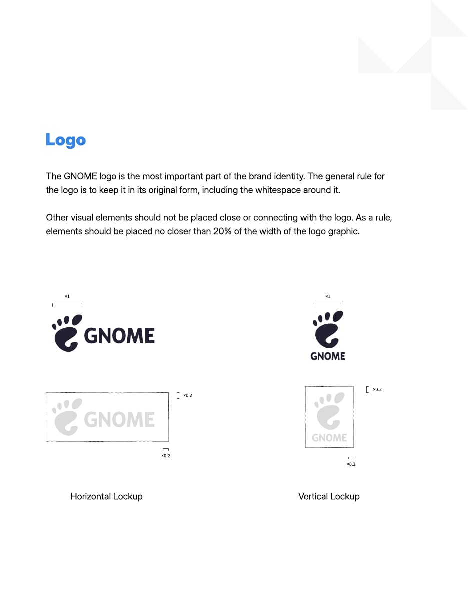
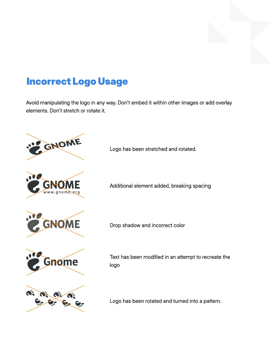
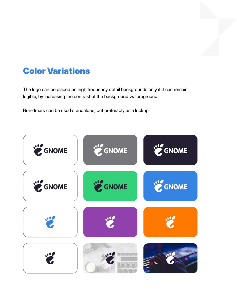
| Lockups | horizontal, vertical |
|---|---|
| Colors | black or white |
| Clear space | 0.2x foot width (brand book); 1/10 (Foundation diagram) |
| Minimum size | not published (keep the letters legible) |
The GNOME foot beside a bold humanist wordmark, in a horizontal or a vertical lockup, only ever black or white. The foot can stand alone, but the lockup is preferred.
Source: foundation.gnome.org/trademark-and-logoGNOME Brand Book rev 2.2 (https://gitlab.gnome.org/Teams/Design/brand/-/raw/master/brand-book.pdf) p.5GNOME Brand Book rev 2.2 (https://gitlab.gnome.org/Teams/Design/brand/-/raw/master/brand-book.pdf) p.6GNOME Brand Book rev 2.2 (https://gitlab.gnome.org/Teams/Design/brand/-/raw/master/brand-book.pdf) p.7
GNOME
GNOME
Sharing one palette between brand, app icons and illustrations makes everything GNOME ships look like one family.
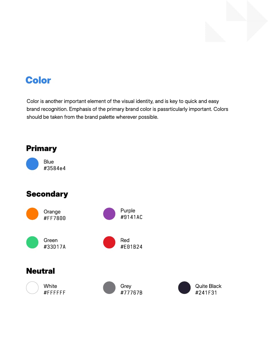
| Primary | Blue #3584E4 |
|---|---|
| Dark mode | HSL luminance x 0.85 |
One primary blue, four bright secondaries, three neutrals, all drawn from the larger HIG palette of nine five-step ramps. The site adds pale blue washes, HIG Blue 5 bands and a blue-to-purple gradient.
Source: brand.gnome.orgdeveloper.gnome.org/hig/reference/palette.htmlGNOME Brand Book rev 2.2 (https://gitlab.gnome.org/Teams/Design/brand/-/raw/master/brand-book.pdf) p.4GNOME Brand Book rev 2.2 (https://gitlab.gnome.org/Teams/Design/brand/-/raw/master/brand-book.pdf) p.10
An independent computing platform for everyone
One open typeface with a heavy weight gives volunteers a free, consistent voice in any medium.
| Their face | Use | License | Open stand-in |
|---|---|---|---|
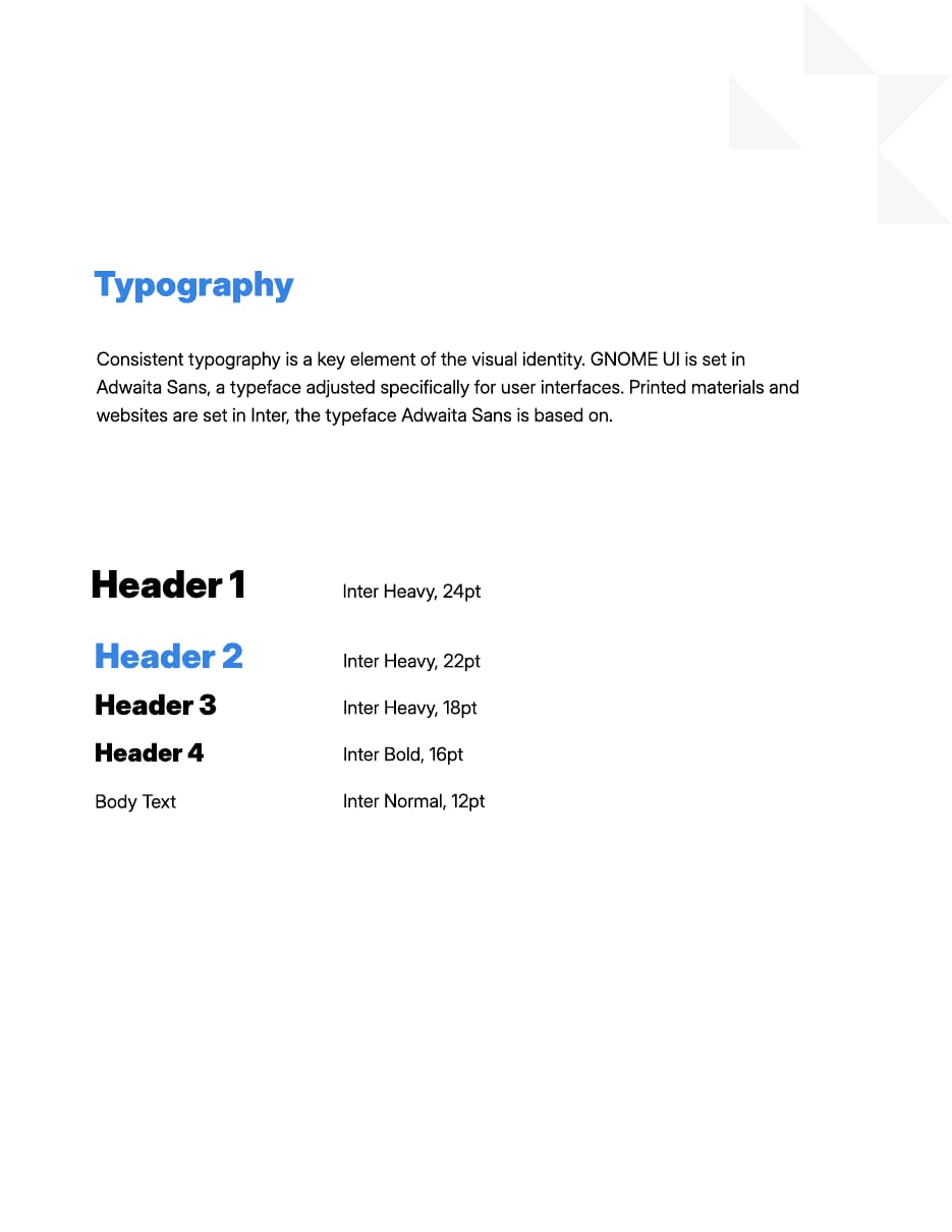
| Inter | Headers Inter Heavy (800-900); website headings 800 | Open (SIL OFL 1.1) | Inter The real face is open |
| Inter | Body Inter Normal 400 | Open (SIL OFL 1.1) | Inter |
| not published | hex values in the brand book | n/a | Source Code Pro |
| Brand face | Inter (OFL) |
|---|---|
| UI face | Adwaita Sans |
| Web H1 | 32.4px 800 |
Inter everywhere outside the UI: Heavy for headers, Bold for small headers, Normal for body. GNOME's UI face Adwaita Sans is built on Inter, so print, web and software feel related.
Source: brand.gnome.orgdeveloper.gnome.org/hig/guidelines/typography.htmlGNOME Brand Book rev 2.2 (https://gitlab.gnome.org/Teams/Design/brand/-/raw/master/brand-book.pdf) p.3
brand.gnome.org
Rounded triangle fragments (tris) · Brand book cover, page corners and back cover; the homepage hero (tris-l.svg, bottom left, 1024px wide)
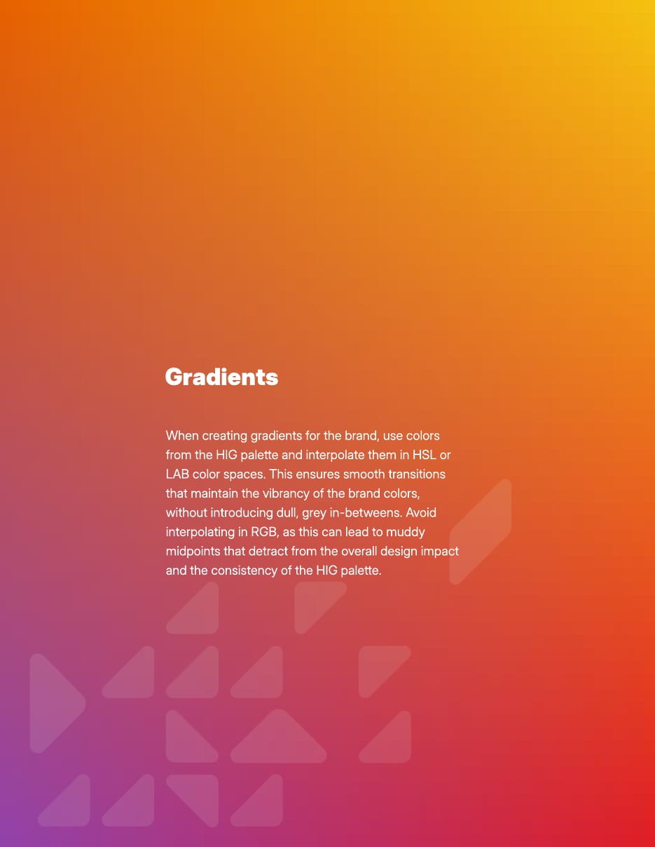
Do Gradients from HIG palette colors, interpolated in HSL or LAB so the midpoint stays vivid. Homepage: radial-gradient(at left top, #1A5FB4, #9141AC).
Vivid HIG gradients · Brand book Gradients page (orange-yellow to red-purple); homepage Support Us band (radial #1A5FB4 to #9141AC)
Do Full-bleed blue with white type and the white logo or tris.
Solid Blue field · Brand book cover and back cover (#3584E4); homepage Get GNOME band in HIG Blue 5 #1A5FB4
Do Computer imagery with everyday objects, HIG palette fills, geometric shapes, flat color with gradients only on curved surfaces, no people or faces.
Full-color flat illustration · Homepage section art (shell.svg, apps.svg, design.svg, circle and flathub tiles)
Specimens use sample copy, not GNOME’s.
The fragments read as GNOME without the foot, and stay quiet enough to sit behind type.
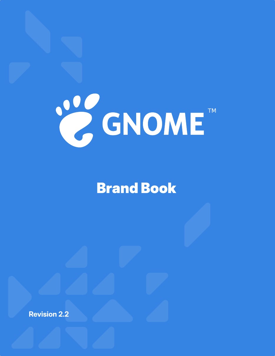

| Tris on light | #1C71D8 at 0.108 |
|---|---|
| Tris on Blue | white, low opacity |
Rounded triangle fragments scattered on a 45° grid at low opacity, solid Blue fields, and vivid HIG gradients.
Source: GNOME Brand Book rev 2.2 (https://gitlab.gnome.org/Teams/Design/brand/-/raw/master/brand-book.pdf) p.1GNOME Brand Book rev 2.2 (https://gitlab.gnome.org/Teams/Design/brand/-/raw/master/brand-book.pdf) p.11gnome.org
Icons recolored by code stay consistent at every size and theme.
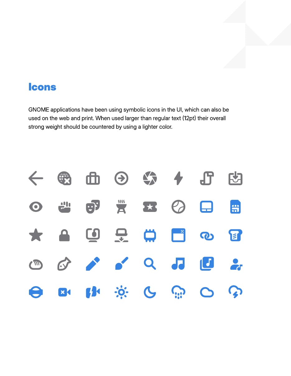
| Symbolic | 16px, 2px stroke |
|---|---|
| App icon | 128px, 2px grid |
Symbolic icons: monochrome, 16px, 2px strokes, orthogonal. App icons: simple geometric objects with a darker front profile, from the HIG palette.
Source: developer.gnome.org/hig/guidelines/ui-icons.htmldeveloper.gnome.org/hig/guidelines/app-icons.htmlGNOME Brand Book rev 2.2 (https://gitlab.gnome.org/Teams/Design/brand/-/raw/master/brand-book.pdf) p.9
Illustration explains concepts where a photo is too specific and a diagram too abstract.
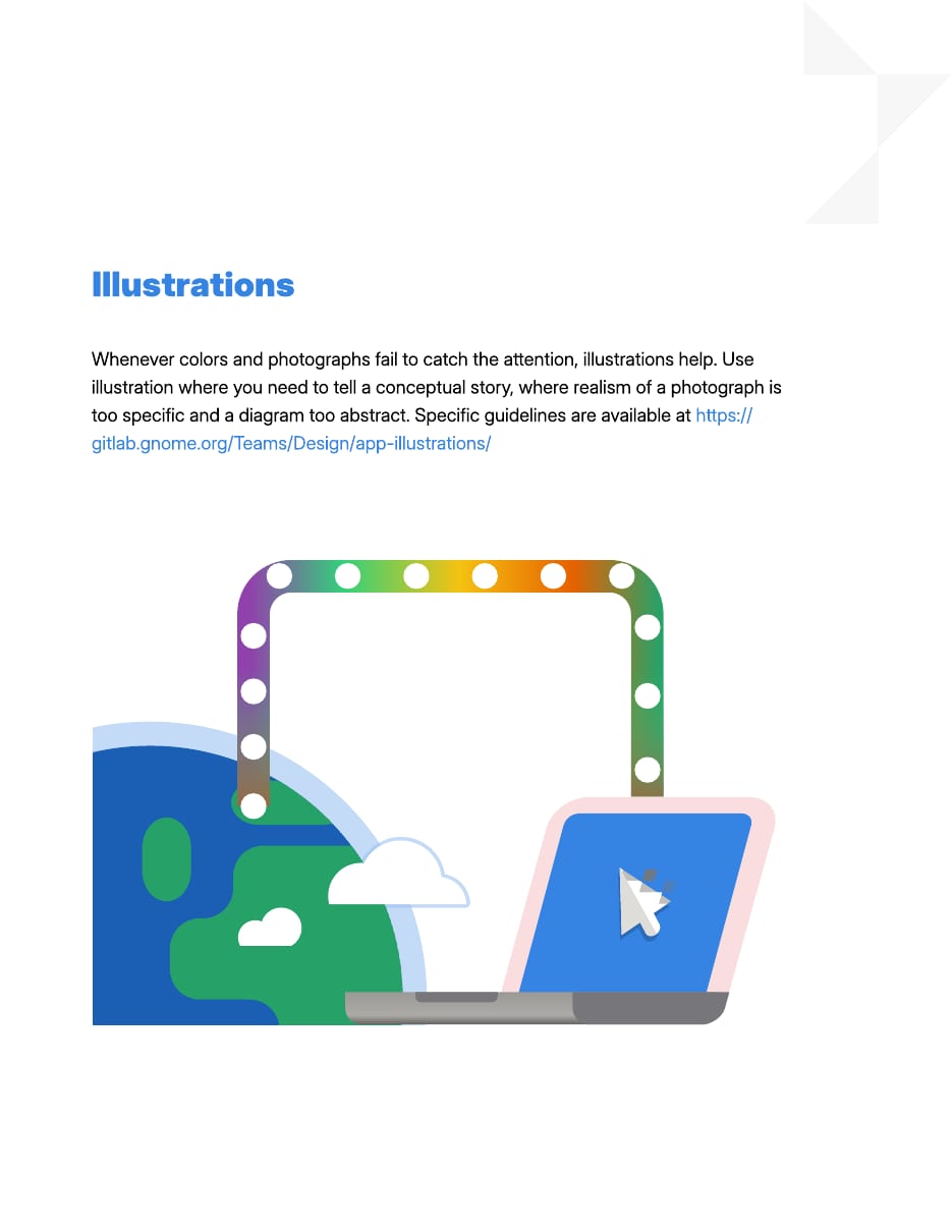
| Styles | full color, blueprint |
|---|
Two styles: full color (computer imagery with everyday objects, flat fills, geometric) and blueprint (low-fidelity blue and white UI sketches).
Source: gitlab.gnome.org/Teams/Design/app-illustrations/-/blob/master/README.mdGNOME Brand Book rev 2.2 (https://gitlab.gnome.org/Teams/Design/brand/-/raw/master/brand-book.pdf) p.8
GNOME prefers product renders and illustration over stock photography.
| Style | not published |
|---|
Not published as a style. The brand book shows the logo on two photos (a desk scene, hands on a backlit keyboard); the homepage uses renders and illustrations, no photos.
Source: GNOME Brand Book rev 2.2 (https://gitlab.gnome.org/Teams/Design/brand/-/raw/master/brand-book.pdf) p.7
Small, springy feedback matches the desktop's feel.
| Ease | cubic-bezier(.17,.89,.32,1.28) |
|---|
No brand motion guidance. The site uses one overshoot ease for button hovers and a scroll-driven 3D laptop lid.
Source: gnome.org
A centred 1116px main column on a 5-column grid with 54px gaps; text half-columns paired with art that bleeds to the page edge; colored full-bleed bands for calls to action.
Measured from gnome.org's computed styles and element boxes measured with Playwright at 1440x900 and 390x844 (light color scheme), plus the site stylesheet www.gnome.org/style.css, on 2026-10-30.
| Measure | Desktop | Phone |
|---|---|---|
| Page margin | 162px | 18px |
| Section padding | 36px | 36px |
| Hero text width | max 517px, centered | full width |
| Card gap | 18px | 18px |
| Navigation | 62px | 62px |
Hero H1 (#subtitle)
Inter · 32.4px (phone 23.4) · line 1.25 · tracking -0.32px · weight 800
Section H2
Inter · 27px · line 1.25 · tracking -0.27px · weight 800
Tile H4
Inter · 21.6px · line 1.25 · tracking -0.22px · weight 800
Wordmark text
Inter · 25.2px · line 1.25 · tracking -0.18px · weight 900
Body / lead
Inter · 18px · line 1.6 · tracking -0.18px · weight 400
Nav link
Inter · 18px · line 1.6 · tracking -0.18px · weight 600
Button label
Inter · 18px · line 1.6 · tracking -0.18px · weight 600
Banner title
Inter · 18px (phone 16.2) · line 1.5 · tracking -0.18px · weight 700
Banner line
Inter · 16.2px (phone 14.4) · line 1.5 · tracking -0.18px · weight 600
Small button (dark tile)
Inter · 14.4px · line 1.6 · tracking -0.18px · weight 600
Inline button
Inter · 16.2px · line 1.6 · tracking -0.18px · weight 600
Footer link
Inter · 18px (phone 14.4) · line 1.8 · tracking -0.18px · weight 600
Copyright
Inter · 12.6px · line 1.6 · tracking -0.18px · weight 400
How GNOME’s own landing pages are built, observed on gnome.org, 2026-10-30. The full measurements are in spec.md.
Source: gnome.org
How our engine applies GNOME's system to each format. Our recipe from their rules, not something GNOME publishes. Level = how much color and pattern a format carries.
| Format | What they did | Source |
|---|---|---|
| brand book / print | Blue cover with white logo and tris; white pages with blue Inter Heavy headings and a tris cluster top right | GNOME Brand Book rev 2.2 (https://gitlab.gnome.org/Teams/Design/brand/-/raw/master/brand-book.pdf) p.1 |
| talk slides | A LibreOffice Impress template is published for GNOME talks | brand.gnome.org |
| Format | Loudness | Must appear | What varies |
|---|---|---|---|
| Landing page | Build it the way www.gnome.org is built (kit.spec.page, website voice): #EEEEEE page, hero fading to #CCDEF9 with faint blue tris bottom-left, black logo top left and two text nav links right, product render, 32px Inter 800 centred H1, #DBE9FA rounded banners; alternating text/art rows with art bleeding off the edge; translucent grey pill buttons; HIG Blue 5 band and a blue-to-purple gradient band; #1A1622 footer | which feature rows and how many tiles | |
| Print / slides | Blue field or white page, Inter Heavy headings (Header 2 in Blue), tris cluster in a corner, logo black or white with 0.2x clear space | secondary color and gradient choice | |
| Social | Blue or HIG gradient ground, white logo, short Title Case line | illustration |
Source: brand.gnome.orgGNOME Brand Book rev 2.2 (https://gitlab.gnome.org/Teams/Design/brand/-/raw/master/brand-book.pdf) p.2foundation.gnome.org/trademark-and-logo
Your name and logo, GNOME’s system.
Use this kit for my brand Use this brand in Claude
Get your brand audit Put your brand in Claude What goes in a brand book
Each value is marked published, observed, our reading or our recipe, with its source. Checked 2026-10-30. Not affiliated with GNOME.