Complete enterprise context
AI is only as good as the company context behind it; Glean connects knowledge across every app and team (paraphrase). Observed
Brand book
Glean sells AI to cautious enterprises, so the frame reads as a sober, ruled document (white, beige, grey, black, weight-400 type, square grid lines) that signals trust and governance, while the gleam renders carry the 'AI' wonder in one contained place. Blue is kept scarce so the wordmark and the one primary action own it. Our reading

The colour of the gleam render: blue-violet by default, shifting to lime, orange or red for events, resources and community bands.
Our engine's setting, built from their rules.
#343CED appears only on the wordmark, the one primary action and text links; everything else is black, grey, white or beige.
All heads and numerals are PolySans (or the stand-in) at weight 400; nothing bold.
Feature heads use a black lead sentence and a #727272 continuation; section heads end with a period.
Hero and feature art is a gleam-style glossy ribbon render (or the brand's own files), with UI on frosted glass; no flat illustrations or stock icons.
Content sits in a column framed by 1px #D8D9DE rules with hairline dividers; no drop shadows.
Buttons are full pills (64px radius), black by default, one per band.
Every stat matches a figure Glean publishes, with its page; ARR figures differ by page ($300M vs >$350M) so cite the one used.
Complete context that makes AI work at enterprise scale. Observed
AI is only as good as the company context behind it; Glean connects knowledge across every app and team (paraphrase). Observed
Pre-connected context sends fewer tokens to models, so AI costs less to run (paraphrase). Observed
Permission-aware answers, observability and governance built in from day one (paraphrase). Observed
Adopted across departments, not a single-team tool (paraphrase). Observed
Open platform with model choice and MCP support (paraphrase). Observed
Arvind Jain saw at Rubrik that employees couldn't find what they needed; Glean began in 2019 as enterprise search and grew into an enterprise AI platform built on company context (paraphrase).
Stay close to real customer problems and follow through (paraphrase)
ObservedTake ownership, simplify, debate then commit (paraphrase)
ObservedQuestion the status quo and give direct feedback (paraphrase)
ObservedShare context openly and support one another (paraphrase)
ObservedCategory. Enterprise AI platform; 'the trusted context and intelligence layer for enterprise AI' (release boilerplate) Observed
Glean is the trusted context and intelligence layer for enterprise AI, grounding an assistant and agents in company data with permissions, governance and security enforced (paraphrase of the 'About Glean' section of the May 28, 2026 release).
Complete context that makes AI work at enterprise scale. Observed
Enterprise AI that understands your company Observed
From knowledge to action. One platform for Enterprise AI. Observed
Work AI that works. Observed
Glean: Work AI for all. Observed
Glean – Enterprise AI that Works Observed
From workplace search to enterprise AI. Observed
ConfidentPlainEnterprise-practicalOptimistic
contextenterprise contextEnterprise AItrustedpermission-awareagentsworkknowledgeenterprise scaleWork AI
Source: glean.comglean.com/aboutglean.com/pressfacebook.com/ads/libraryadstransparency.google.com/advertiser/AR09883156889867386881




One wordmark: lowercase 'glean' in a rounded geometric sans, the 'g' bowl open with a detached curved tail stroke.
One wordmark: lowercase 'glean' in a rounded geometric sans, the 'g' bowl open with a detached curved tail stroke. Electric blue #343CED on white in the header and og:image; dark #272834 in the footer. The 'g' alone, white on a #343CED circle, is the app icon and favicon. A white wordmark appears only inside the Glean:GO 2026 event lockup.
Not published: clear space; minimum size; misuse examples; standalone white or on-dark wordmark file.
Source: glean.com
White (~65%) and warm beige #FBF6F4 (~20%) grounds, #FAFAFA footer, black and #333/#1D1D1D ink, #727272 grey for muted halves and eyebrows.
White (~65%) and warm beige #FBF6F4 (~20%) grounds, #FAFAFA footer, black and #333/#1D1D1D ink, #727272 grey for muted halves and eyebrows. #343CED appears on the wordmark, hero pill, links and active tab only. One dark band: the Work AI Institute block, a black textured ground with white text. All other colour lives in gleam renders.
Source: glean.comglean.com/%20(stylesheet%20staging-glean.shared.*.min.css%20:root%20tokens)
Complete context that makes AI work at enterprise scale.
PolySans throughout at weight 400: Neutral for heads, nav and buttons; Slim for body and feature heads; Neutral Mono for eyebrows and labels; Median on the event banner.
PolySans throughout at weight 400: Neutral for heads, nav and buttons; Slim for body and feature heads; Neutral Mono for eyebrows and labels; Median on the event banner. Heads are sentence case, tightly tracked (-0.04em hero, -0.02em sections) with tight leading (0.96-1.15). PT Serif italic for pull quotes.
| Their face | Use | License | Open stand-in |
|---|---|---|---|
| PolySans Neutral | Heads, nav, buttons, links, numerals at weight 400 | Commercial; open stand-in Geist (calibrated 2026-11-10: width 0.0%, ink -7.4% at 56px) | |
| PolySans Slim | Body, feature heads and bullets | Commercial; open stand-in Hanken Grotesk 400 (calibrated 2026-11-10: width 0.0%, ink -2.7% at 20px) | |
| PolySans Neutral Mono | Eyebrows, stat labels, tabs | Commercial; open stand-in Geist Mono (calibrated 2026-11-10: width -1.5%, ink -11.5% at 16px) | |
| PT Serif Italic | Customer pull quotes | Open (OFL) | |
| PolySans Median | Event banner head ('Elevate your AI expertise') | Commercial |
Source: measure/home-desk.json, measure/home-phone.jsonglean.com/%20(stylesheet%20staging-glean.shared.*.min.css%20:root%20tokens)
Do A short label sentence in black (#000000/#1C1B1B) with a continuation sentence in grey, same face and size (20/24px -0.4px desktop, 15-20px phone). Two layouts, scoped: run-on in one paragraph with the continuation #000000 at 50% (Why pillars, Products cards); stacked as exactly two lines with the explanation in #727272 (Runaway numbered cards, Enterprise rows). Big section heads may be entirely #727272 at 40/41.6px -1.6px..
Two-tone sentence heads · Feature lists, product grid, why-it-matters cards, whole muted section heads
Do 3D glossy translucent ribbons and tubes with fibrous textured surfaces, mostly electric blue to violet over pink/peach gradients, sometimes lime, orange and red. Fills a rounded (8px) panel or bleeds across a band; product UI floats over it on frosted glass (blur 20px, 14px radius)..
Gleam renders · Hero image, half-band beside 'runaway model spend', support band ribbon, footer CTA corner, og:image, resource cards
Do PolySans Neutral Mono 16/16px in #727272 (white on dark), sentence case, often above a 1px rule, then the head below..
Mono eyebrow over a hairline · Hero, customers band, Work AI band, support columns
Do Content column 1376px wide at 1440 (32px outer margin) bounded by 1px #D8D9DE rules left and right; horizontal rules between bands; vertical rule between split halves; stats in a 3x2 grid with 1px #C0C0C0 rules and 8px outer radius..
Hairline-framed column · Every band of the home page
Do Radius 64px pills, PolySans Neutral 16px 400. Black #000000 with white text by default; the hero 'Get a demo' (18px) and event CTAs use #343CED. One CTA per band..
Black pills, one blue · Nav, hero, every section CTA
Do Numbers at 50-66px PolySans Neutral weight 400, tight leading (~0.88), black, with a 16px mono label in #727272 beneath ('Saved per user/year')..
Large light numerals · Stats grid, customer-story metrics
Specimens use sample copy, not Glean’s.
Pill buttons (64px radius), blue circle-arrow text links, 1px hairline frame and dividers, outline icons above rules, 3x2 stats grid with 1px #C0C0C0 rules, accordion of customer stories with circle +/x toggles and logo, tabbed industry panel with mono tabs and a blue underline on the active tab, frosted-glass UI panels over gleams.
Source: glean.com
Filled outline glyphs (Material Symbols style, ~1px strokes) at 24px, black or #1F1F1F: corner expand arrows (Context), 3x3 dot matrix (Intelligence), padlock (Permissions), bolt (Efficiency), lightbulb, overlapping circles, falling trend arrow (Runaway), shield-lock, eye, rosette (Enterprise).
Filled outline glyphs (Material Symbols style, ~1px strokes) at 24px, black or #1F1F1F: corner expand arrows (Context), 3x3 dot matrix (Intelligence), padlock (Permissions), bolt (Efficiency), lightbulb, overlapping circles, falling trend arrow (Runaway), shield-lock, eye, rosette (Enterprise). All supplied as files in icons/. Filled blue circle-arrow link bullets; third-party app logos in full colour inside product UI and on white chips.
Source: glean.com
No flat illustration.



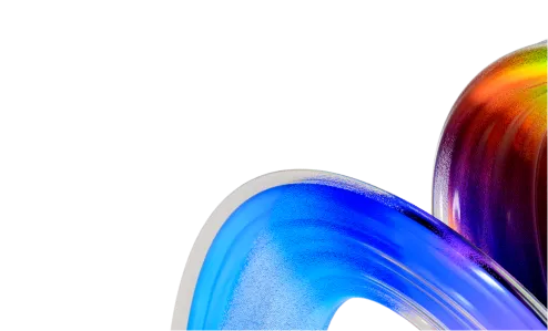

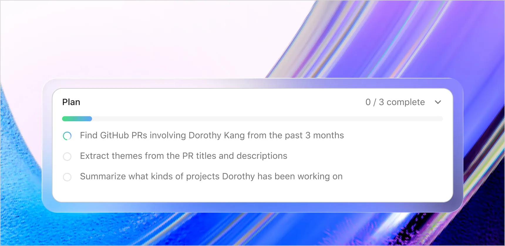
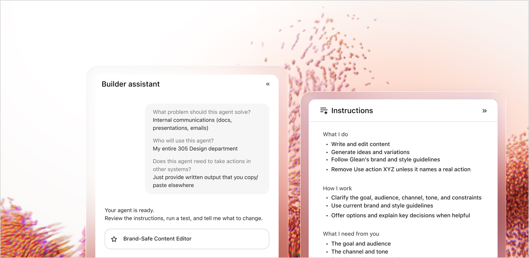

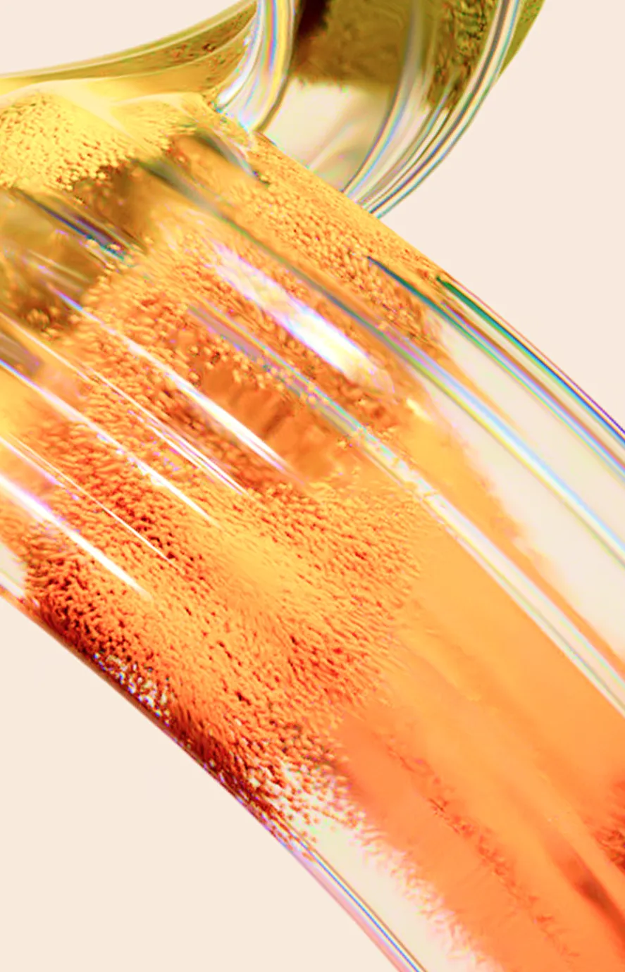
No flat illustration. The brand's illustration is the 'gleam': 3D renders of glossy, translucent ribbons and tubes with fibrous or beaded surface texture, in electric blue and violet over pink-peach gradients, sometimes lime, orange, red. They fill rounded hero panels, half-bands and footer corners, and sit under frosted-glass product UI. A fine dot grid pattern backs the security band.
Source: glean.com
Photography is customer-owned and secondary: story thumbnails in a 3:2-ish crop (sunlit architecture with a blue wall for Booking.com, aerial suburban houses for Zillow, a soft-focus reader holding TIME), autoplay customer videos of offices with a white quote over the bottom, and a warm blurred abstract behind the financial-services tab.


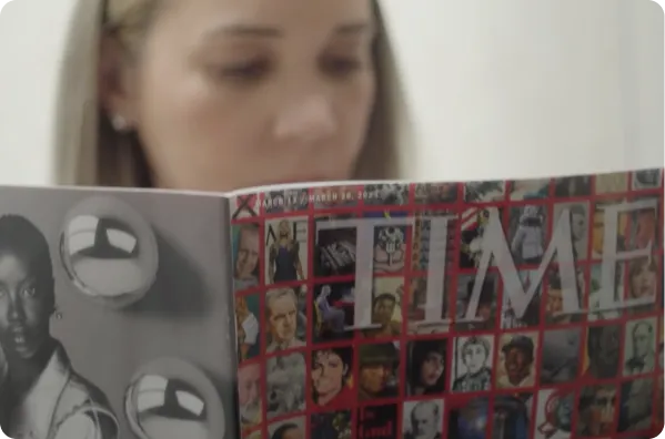
Photography is customer-owned and secondary: story thumbnails in a 3:2-ish crop (sunlit architecture with a blue wall for Booking.com, aerial suburban houses for Zillow, a soft-focus reader holding TIME), autoplay customer videos of offices with a white quote over the bottom, and a warm blurred abstract behind the financial-services tab. Natural colour, no heavy treatment, photos sit beside text, never behind heads except the video quote cards.
Source: glean.com
A 1376px framed column (32px outer margin at 1440) with vertical hairlines, bands separated by horizontal rules. Hero is centered (eyebrow, 56px two-line head, one pill) above a full-width rounded gleam panel. Later bands are left-aligned: head left with CTA right, two-column splits with a vertical rule, 3x2 stats grid, tabbed industry panel, customer accordion, three-column resource cards, five-column footer with an award row. Phone stacks everything single column, heads 24-28px, framing kept.
Measured from www.glean.com home, measured 2026-11-10 (measure/home-desk.json, measure/home-phone.json) and stylesheet's computed styles at 1440 and 390 in headless Chromium plus full-page screenshots, glean.com home, 2026-11-10.
| Measure | Desktop | Phone |
|---|---|---|
| Page margin | 32px | 16px |
| Section padding | 96px | 48px |
| Hero text width | max 768px, centered | full width |
| Card gap | 16px | 16px |
| Navigation | 70px | 70px |
Hero head
PolySans Neutral · 56px (phone 28) · line 0.96 · tracking -2.4px · weight 400
Section head
PolySans Neutral · 40px (phone 28) · line 1.04 · tracking -0.8px · weight 400
Card head (industry card, footer CTA)
PolySans Neutral · 32px (phone 24) · line 1.15 · tracking -0.64px · weight 400
Event banner head (PolySans Median)
PolySans Neutral · 32px (phone 24) · line 1.2 · weight 500
Story / row head
PolySans Neutral · 24px (phone 20) · line 1.25 · tracking -0.48px · weight 400
Resource card title
PolySans Neutral · 20px · line 1.25 · tracking -0.8px · weight 400
Stat numeral
PolySans Neutral · 66px (phone 32) · line 0.88 · tracking -0.025px · weight 400
Story stat numeral
PolySans Neutral · 50px (phone 32) · line 0.88 · tracking -0.09px · weight 400
Live counter digits
PolySans Neutral · 36px (phone 28) · line 1.05 · weight 400
Two-tone feature head
PolySans Slim · 20px (phone 15) · line 1.2 · tracking -0.4px · weight 400
List / lead text
PolySans Slim · 20px (phone 18) · line 1.4 · tracking -0.4px · weight 400
Body
PolySans Slim · 16px · line 1.35 · weight 400
Video quote
PolySans Slim · 24px · line 1.2 · weight 400
Mono eyebrow / tab / stat label
PolySans Neutral Mono · 16px · line 1 · tracking -0.85px · weight 400
Nav link / button label
PolySans Neutral · 16px · line 1.3 · weight 400
Footer link
PolySans Slim · 16px (phone 14) · line 1.3 · weight 400
Cert label / footer AI caption
PolySans Slim · 12px · line 1 · weight 400
Serif pull quote (PT Serif italic)
PolySans Slim · 22px (phone 20) · line 1.3 · weight 400
How Glean’s own landing pages are built, observed on glean.com, 2026-11-10. The full measurements are in spec.md.
Source: measure/home-desk.json, measure/home-phone.json
From glean.com pages and its share images only.
| Format | Loudness | Must appear | What varies |
|---|---|---|---|
| Landing page | White ground framed by 1px #D8D9DE column rules; blue wordmark top-left, text nav with carets, black 'Get a demo' pill right; centered mono eyebrow in #727272, 56px weight-400 two-line period-ended head, one #343CED pill; full-width 8px-radius gleam panel with product UI on frosted glass; logo strip; alternating white/#FBF6F4 bands with two-tone heads, outline icons over hairlines, a 3x2 stats grid of light numerals with mono labels, customer accordion; footer on #FAFAFA with CTA row, link columns and G2 badge row. | Gleam colour per band; which proof (stats, stories, certifications) leads. | |
| Social post | Glean's paid-social card: a rounded card inset on a lighter gradient frame, card ground a lime-to-peach-to-pink gradient, a big purple-to-magenta gradient headline top left ending with a period, one tagline line, a gradient 'Get a demo' pill, the blue wordmark bottom left and one glossy 3D render (mascots, ribbon or the extruded wordmark) in the lower right. | Frame and card hue (lime/peach/pink, mint, blue frame on stories); which render (mascot group, ribbon with an outline-drawn hand, extruded wordmark); pill on organic use or not; a one-line offer instead of the tagline. | |
| Link card (og:image) | Follows the og:image (2404x1260, 1.91:1) and resource card art: a gleam render ground with the blue wordmark or a short head. | Wordmark-only card vs head plus UI chips. | |
| Paid social ad | Same family as the Social post row: rounded gradient card inside a gradient frame, gradient headline with a period, tagline or offer line, gradient 'Get a demo' pill, blue wordmark, one glossy 3D render. | Report lead-magnet variant (meta-3): pale lavender ground, wordmark top right over a thin purple-pink rule, partner logo, 'Report' chip, two-tone black/grey title, device mockup of the report bleeding off the corner; CTA from the platform ('Download'). | |
| Paid display ad | Product-line banner: a rounded light card inside a #343CED blue frame, dot-grid texture with a soft lime/peach/lilac glow, blue wordmark, product label with its icon (Glean Search / Glean Assistant / Glean Agents), a 3-line blue or gradient headline without a period, a #343CED pill 'Get a demo >>', one product UI chip or 3D mascot. | Card tint per product (lime for Search, lilac for Assistant, peach for Agents); wordmark top left or top right; UI chip (search bar, prompt bubble, agent tiles) vs mascot. | |
| Video thumbnail: monthly Drop series | Series card only for monthly product-drop videos: rounded gradient card (lime-peach-pink) on a mint-lilac frame, blue wordmark top centre, 2-line centred bold headline in purple-to-blue gradient, '<Month> Drop <year>' in small blue at bottom centre. | Headline length; gradient direction. | |
| Video thumbnail: Work AI Institute series | Research series card: flat cream ground, series label 'Intelligence: Real and Imagined' top left, a 4-5 line black Title Case headline in the right half, greyscale portrait chips on warm gradient backs scattered left, the Work AI Institute serif lockup bottom left and a seal bottom right. No Glean wordmark. | Number and placement of portrait chips; one greyscale office photo strip. | |
| Video thumbnail: Glean:GO 2026 session series | Event card for Glean:GO 2026 content only: full-bleed grainy gleam render (violet, orange, red), white header row (wordmark left, 'GO' centre, '2026' right), big white bold title left (2 lines), optional speaker list, hairline above a venue row 'Fort Mason / San Francisco, CA / August 26-27'. | Render hue; subtitle line vs speaker list. |
Your name and logo, Glean’s system.
Talk about my brand Use this brand in Claude
Get your brand audit Put your brand in Claude What goes in a brand book
Each value is marked published, observed, our reading or our recipe, with its source. Checked 2026-11-10. Not affiliated with Glean.
Tell us what you want to make. We’ll talk through how to put these ideas to work for your brand.