Human creativity
Developers remain the authors of software even as AI tools change the work. Our reading
Brand book
Developer infrastructure made expressive: a strict grid makes the product feel dependable, while contribution cells expand into playful worlds that show what developers can build together. Our reading

All five attributes remain present, while one or two may lead for a particular audience or task. Expressiveness varies from subtle four-cell branding to key art. Universe identities are event-specific and do not redefine the core brand.
Source: brand.github.com/brand-identity/attributesbrand.github.com/graphic-elements/illustrationbrand.github.com/graphic-elements/texturesbrand.github.com/brand-in-action/experiential
Our engine's setting, built from their rules.
Does the composition still carry GitHub through Mona Sans/Mono, green, contribution-derived geometry and neutral/expressive separation?
Can the chosen intensity be explained by audience, task and context? Technical demos stay precise; community and launch moments can carry more delight.
Can a reader understand the hierarchy, labels and data without relying on color alone?
A developer platform bringing collaboration, AI-assisted coding, automation and security into the work of building software. Our reading
Developers remain the authors of software even as AI tools change the work. Our reading
A shared home for repositories, review and collaboration across the developer community. Our reading
Copilot expands from assistance into tasks, projects and automation. Our reading
Security and quality capabilities support teams building at organizational scale. Our reading
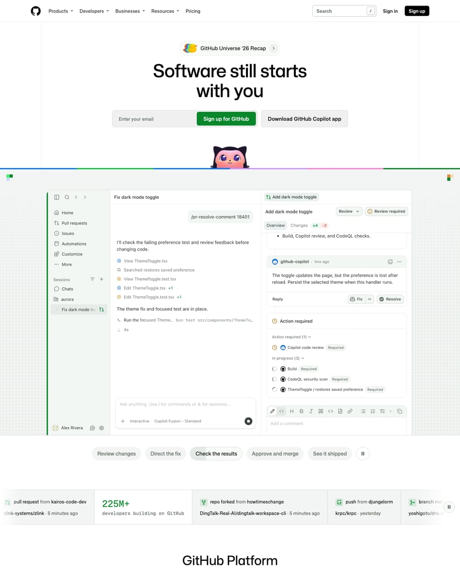
Software still starts with you
GitHub Platform
More ways to use GitHub
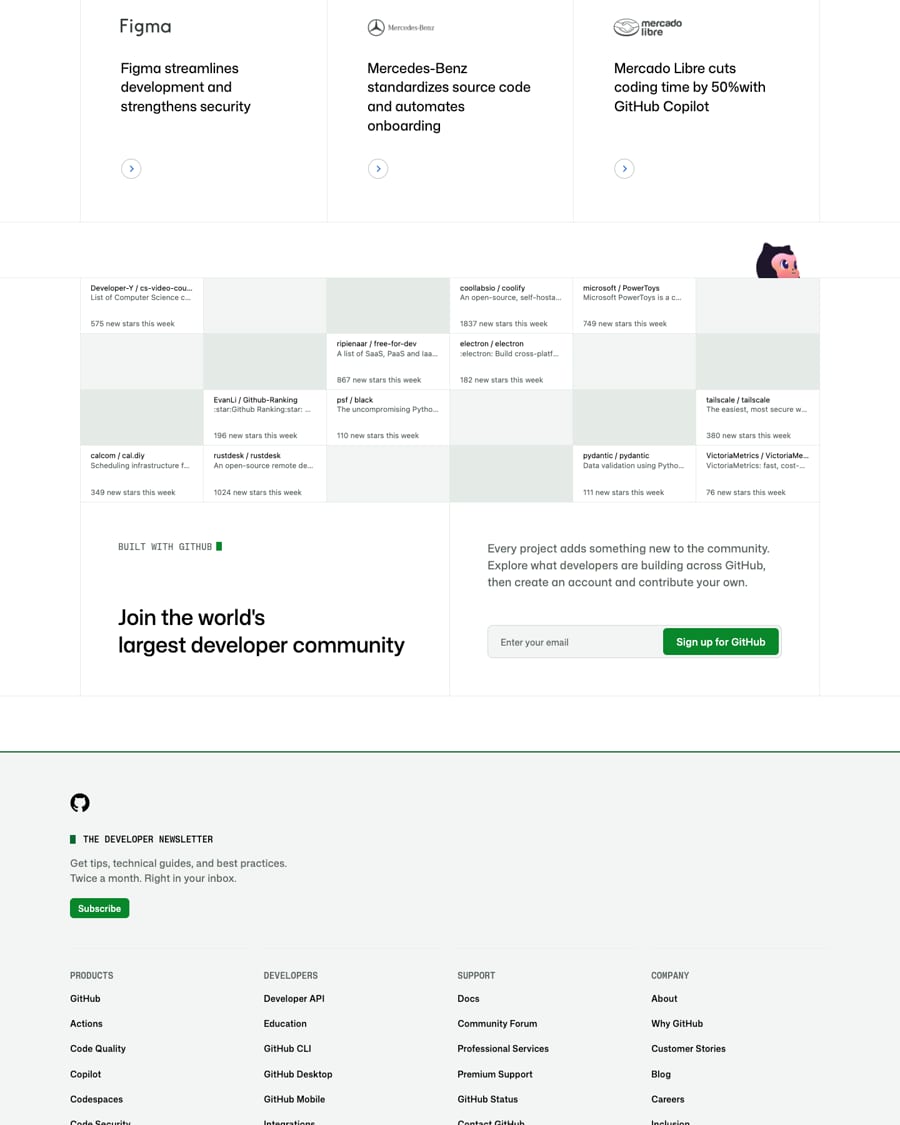
Join the world's largest developer community
The visual language turns developers’ daily contributions into a system of cells, building blocks and shared infrastructure. More expressive layers suggest what developers can create together using GitHub and Copilot.
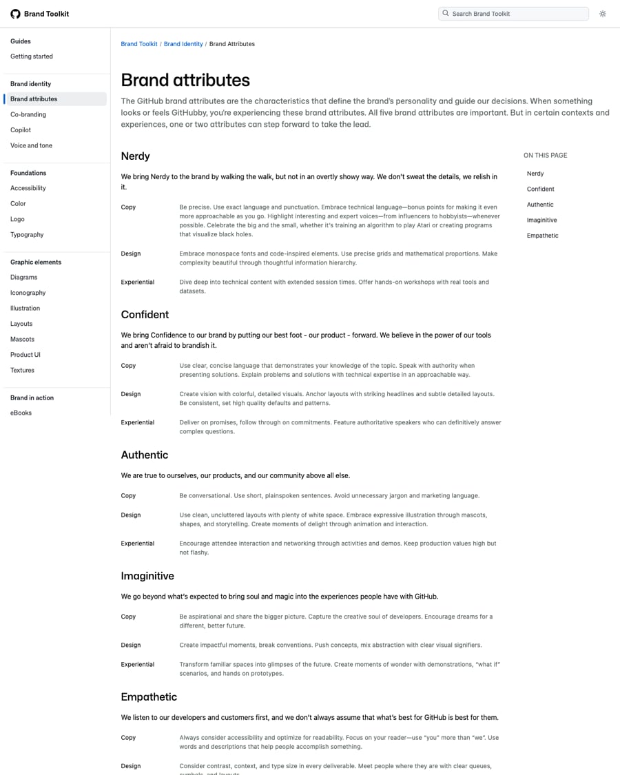
Attend carefully to technical detail and make complexity approachable.
PublishedPut the product forward with consistent quality and clear expertise.
PublishedStay grounded in the product and community, with conversational language and uncluttered design.
PublishedMake room for surprise, creative ambition and unexpected concepts.
PublishedPrioritize readers, accessibility and multiple ways to participate.
PublishedCategory. Developer platform with repository hosting and AI coding agents. Our reading
GitHub supports software development through repositories, code review, collaboration, automation, security tools and AI coding assistance, connecting developers and organizations through a large community.
Software still starts with you Observed
The toolkit states a mission and five brand attributes rather than a complete message architecture. The saved homepage centers developer agency, the GitHub/Copilot platform, enterprise proof and community participation.
Source: brand.github.com/foundations/accessibilitybrand.github.com/brand-identity/attributesgithub.com
Technical confidence works best when it helps a reader do something and makes room for creative ambition.
nerdyconfidentauthenticimaginativeempathetic
The five public brand attributes provide specific copy behaviors. The complete cross-channel voice guide is private and not publicly available. Homepage copy observed on 2026-10-31 gives examples of direct address, practical verbs and developer agency.
GitHubCopilot
Source: brand.github.com/brand-identity/attributes
| Tone | Nerdy / Confident / Authentic / Imaginative / Empathetic |
|---|---|
| Full voice-and-tone guide | not published publicly; linked private document returns 404 |
| Approved / banned lexicon | not published; observed phrases are examples only |
| Homepage evidence | Observed 2026-10-31; screenshots home-desk-00 through home-desk-04 |
Source: brand.github.com/brand-identity/attributesbrand.github.com/brand-identity/voice-and-tonegithub.comprimer.style/brand/components/Button

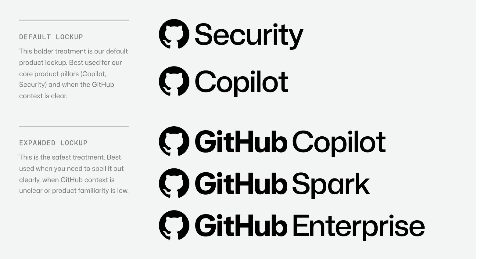

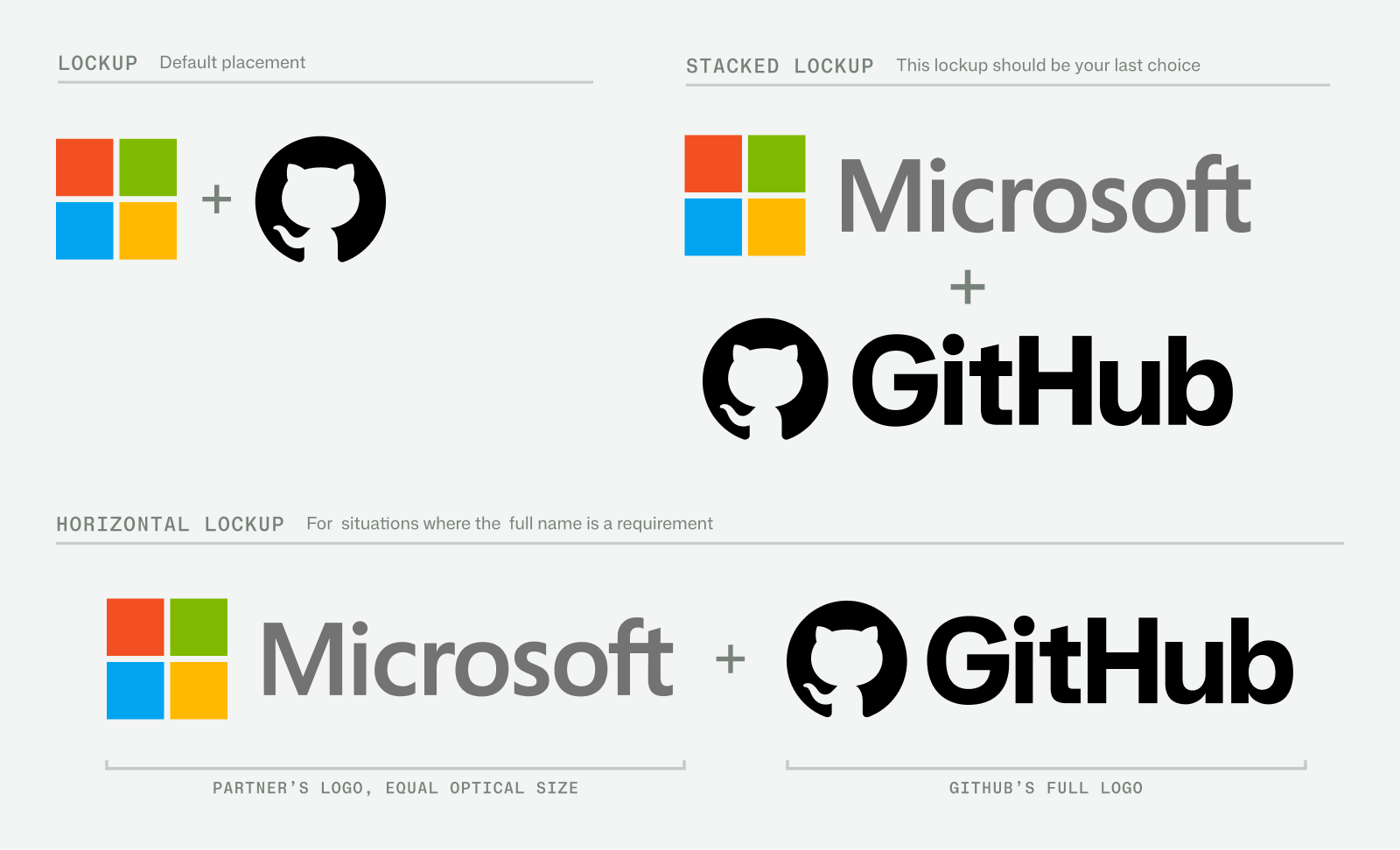
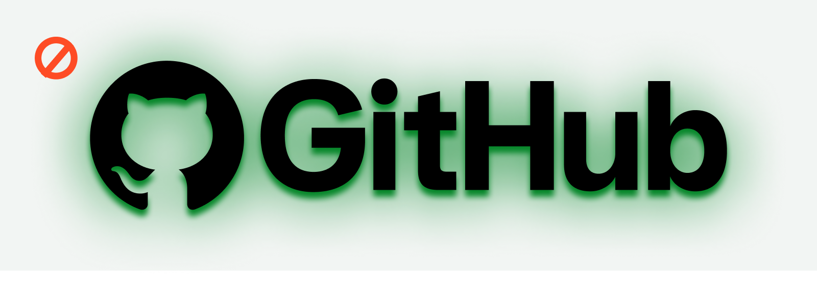
These local files are native toolkit example plates, not extracted production logo SVGs. Several plates contain multiple lockups. Use the official downloadable logo package for production, follow the published legal permissions, and never substitute a mascot.
A stable primary mark makes a broad product and community ecosystem recognizable without flattening product context.
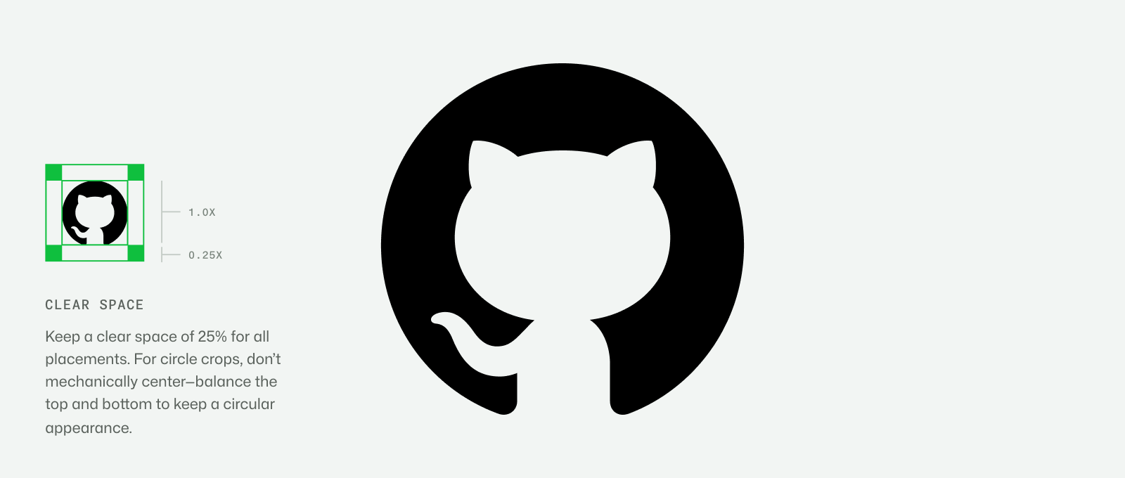

| Clear space | Invertocat: 0.25x on each side, x = mark height (logo-02) |
|---|---|
| Minimum size | not published |
| Lockup-specific spacing | not published beyond the Invertocat plate and co-brand visual examples |
| Product examples | Security; Copilot; GitHub Copilot; GitHub Spark; GitHub Enterprise |
| Co-brand | Equal optical size; symbol form default, full-name horizontal when required, stacked last choice |
The current Invertocat is the primary pictogram; the wordmark lockup provides corporate recognition. Product names can use default, expanded or navigational forms according to context.
Source: brand.github.com/foundations/logobrand.github.com/brand-identity/cobrandingbrand.github.com/brand-identity/copilot
Restraint keeps the interface technical and trustworthy while product-specific colors help identify the subject.
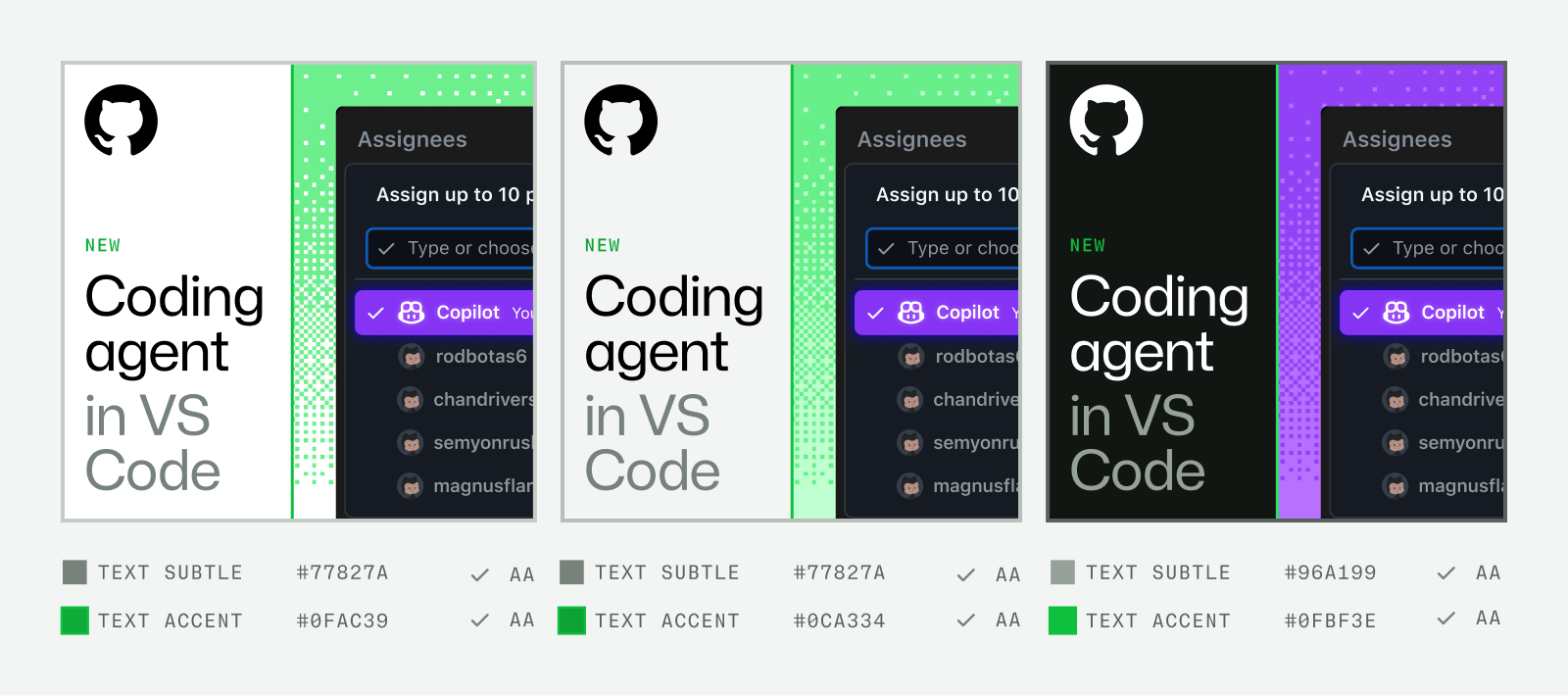
| Core hero | GitHub Green #0FBF3E |
|---|---|
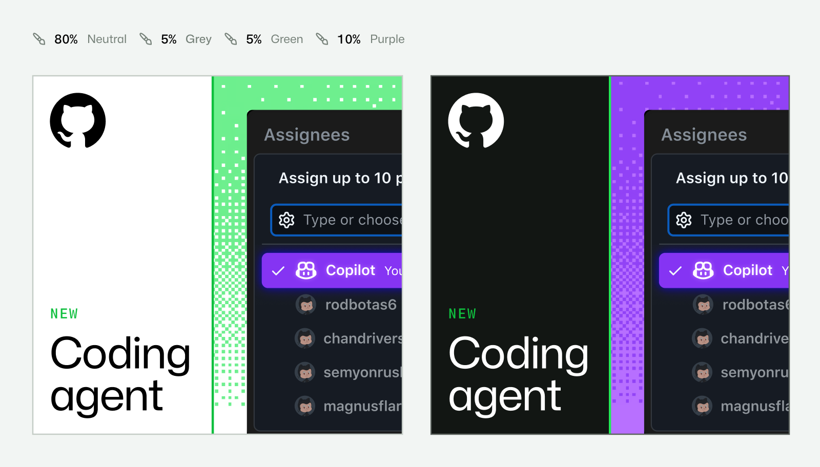
| Copilot hero | Purple #8534F3 |
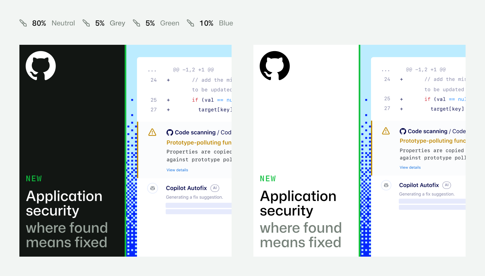
| Security hero | Blue #3094FF |
| Theme ratio | 80% neutral / 5% gray / 5% green / 10% purple or blue, from rendered labels |
| Core-only numeric proportions | not published |
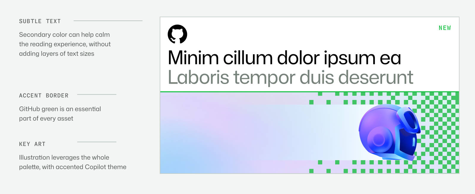
| White/gray subtle copy | #77827A |
| Black subtle copy | #96A199 |
| White text accent | #0FAC39 |
| Gray text accent | #0CA334 |
| Black text accent | #0FBF3E |
| Complete values | See study.swatches / kit.palette.extras; brand swatches and all saved Primer UI scale entries retained separately |
Neutrals carry the bulk of layouts, with GitHub Green as the core hero. Copilot adds purple and warm accents; Security adds blue with lime/warm supporting colors. Primer Brand publishes a separate, broader UI scale.
Source: brand.github.com/foundations/colorbrand.github.com/brand-identity/copilotbrand.github.com/graphic-elements/layoutsbrand.github.com/foundations/accessibilityprimer.style/brand/primitives/color
Software still starts with you
The same family spans expressive headlines and clear information, while mono links the language to terminals and developer practice.
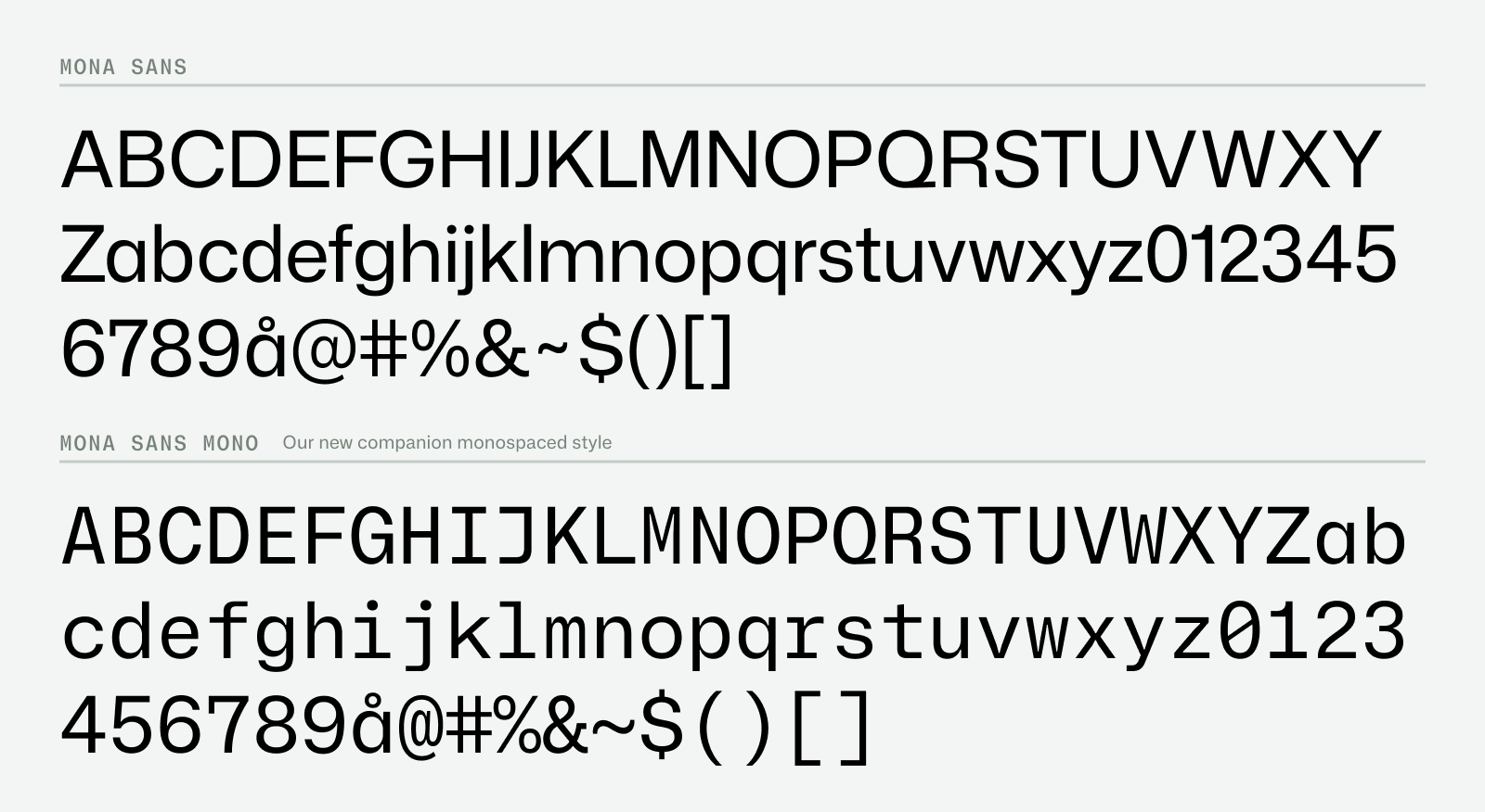
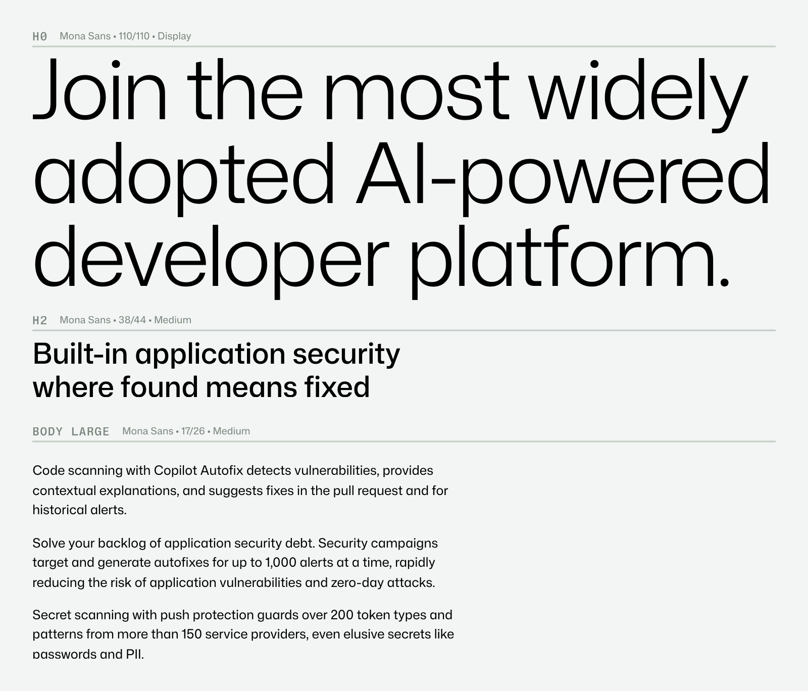
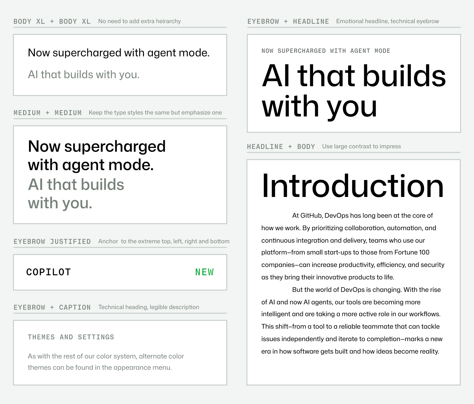
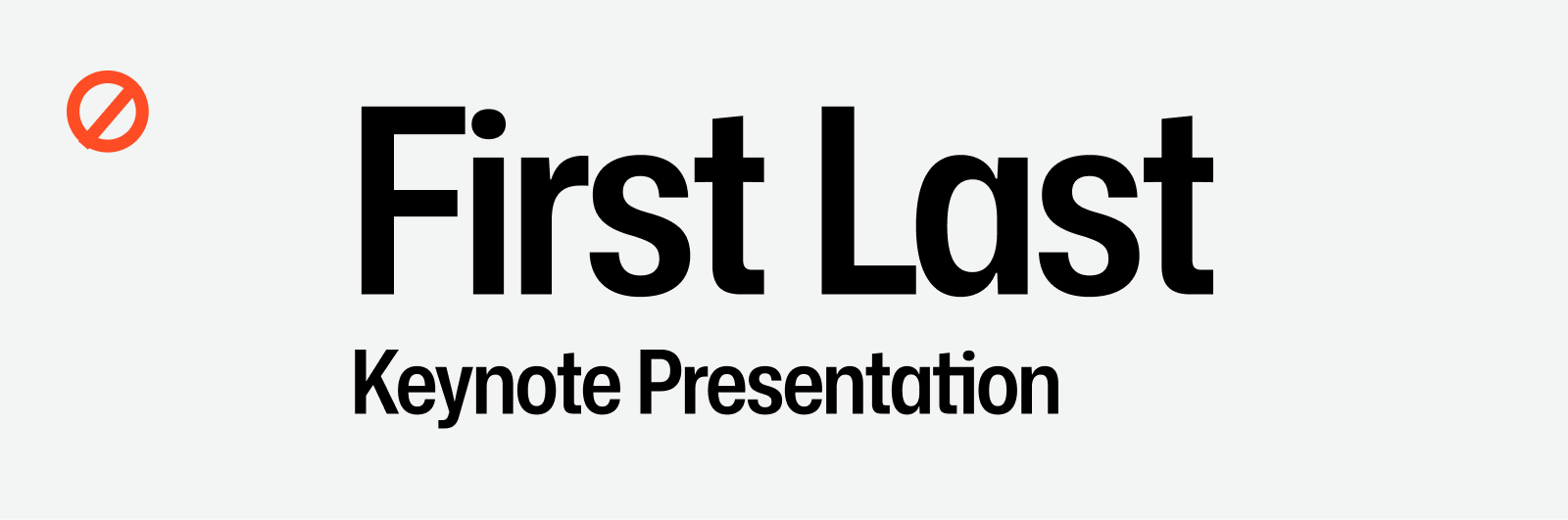
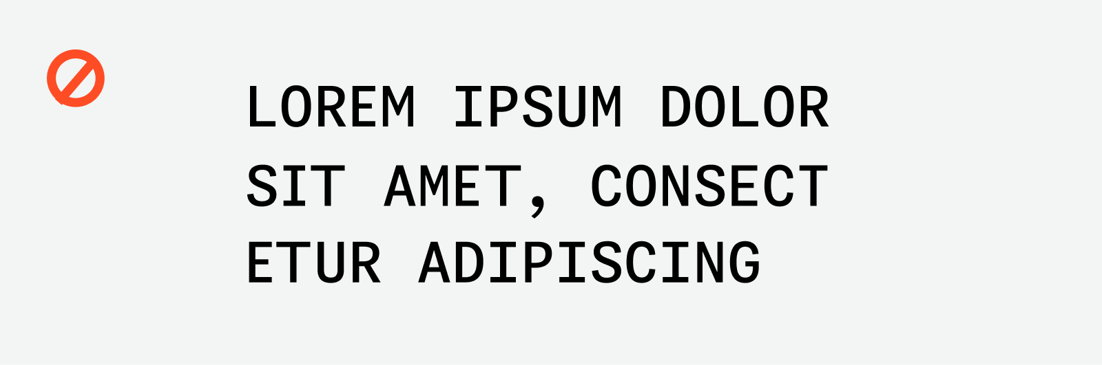
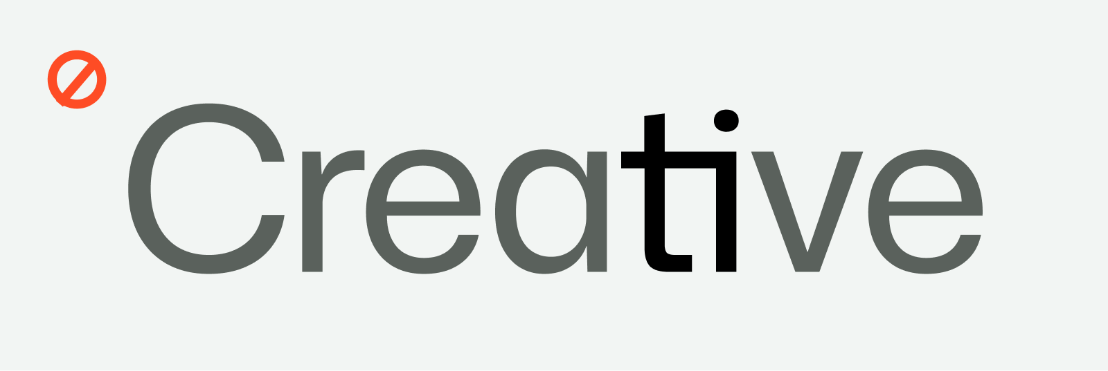
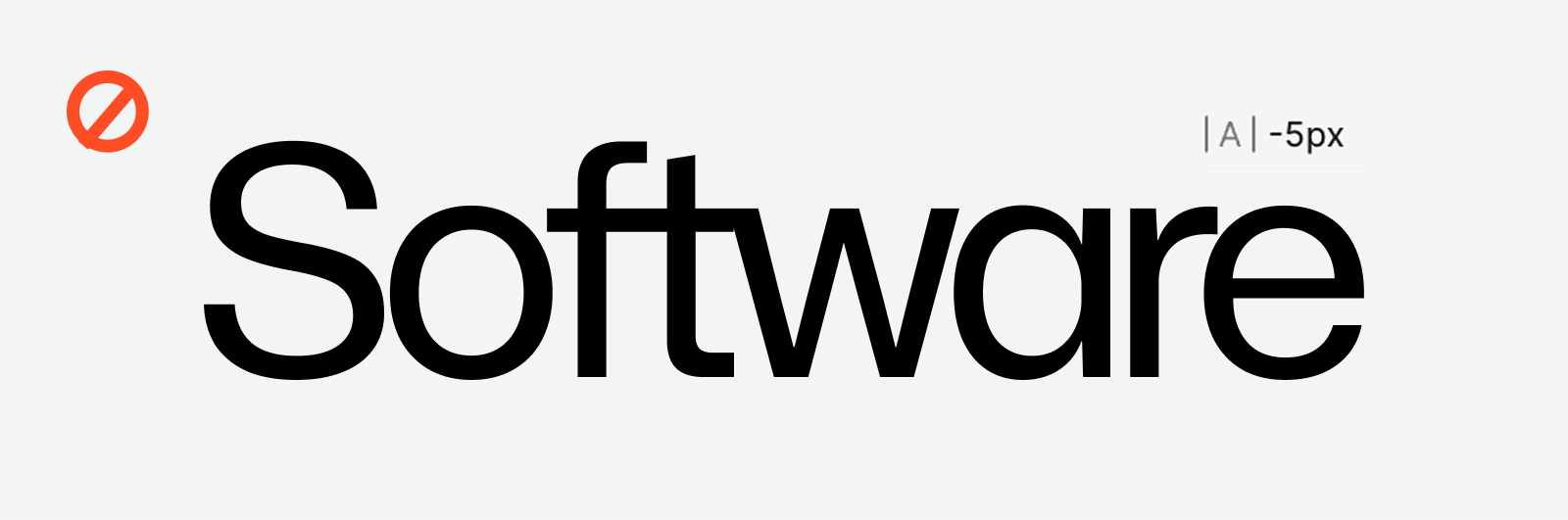
| Their face | Use | License | Open stand-in |
|---|---|---|---|
| Mona Sans | Display headlines and titles; specimen H0 110/110 Display. Keep normal width except special events. | SIL OFL 1.1; real supplied open-source face | No stand-in required; the real family is open source and supplied locally. |
| Mona Sans | Medium headline and body examples; H2 38/44 and Body Large 17/26. Prioritize hierarchy and readability. | SIL OFL 1.1; real supplied open-source face | No stand-in required; the real family is open source and supplied locally. |
| Mona Sans Mono | Short technical eyebrows, captions and terminal-like motion. No uppercase multiline treatments. | SIL OFL 1.1; real supplied open-source face | Geist Mono Mona Sans Mono (OFL, github.com/github/mona-sans) is not on Google Fonts/Fontsource. Geist Mono is the closest open mono by measured metrics (capsize, 2026-10-31): x-height 0.530 vs 0.517 em, cap height 0.710 vs 0.729, advance 0.600 vs 0.618 em. |
| Real faces | Mona Sans; Mona Sans Mono; Mona Sans Italic supplied |
|---|---|
| License | SIL OFL 1.1 |
| H0 specimen | 110/110; Display |
| H2 specimen | 38/44; Medium |
| Body Large specimen | 17/26; Medium |
| Specimen units | not stated in image; preserve printed values without assuming CSS pixels |
| Numerical Display / Mono weights | not published |
| Complete type scale | not published in the supplied material |
Mona Sans is the open-source superfamily; Mona Sans Mono adds the technical voice. The specimens emphasize a large Display title, Medium subheadline/body and short mono labels.
Source: brand.github.com/foundations/typographybrand.github.com/foundations/accessibilitygithub.com/github/mona-sans
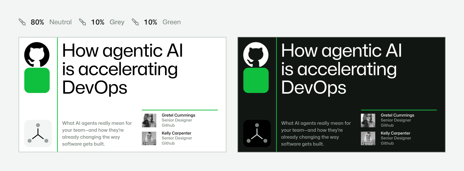
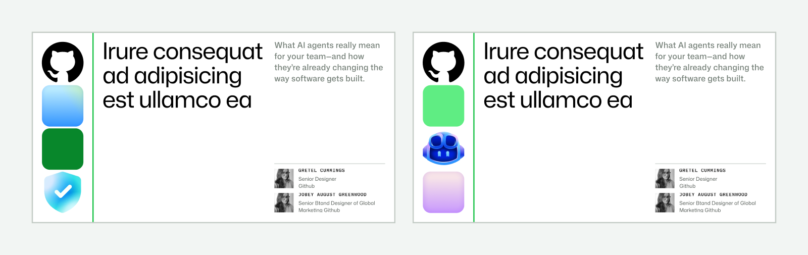
Do Separate text and visuals with one green accent divider. Choose White, Gray or Black text panels, reserving color for the visual..
Neutral text / expressive visual · Core marketing compositions
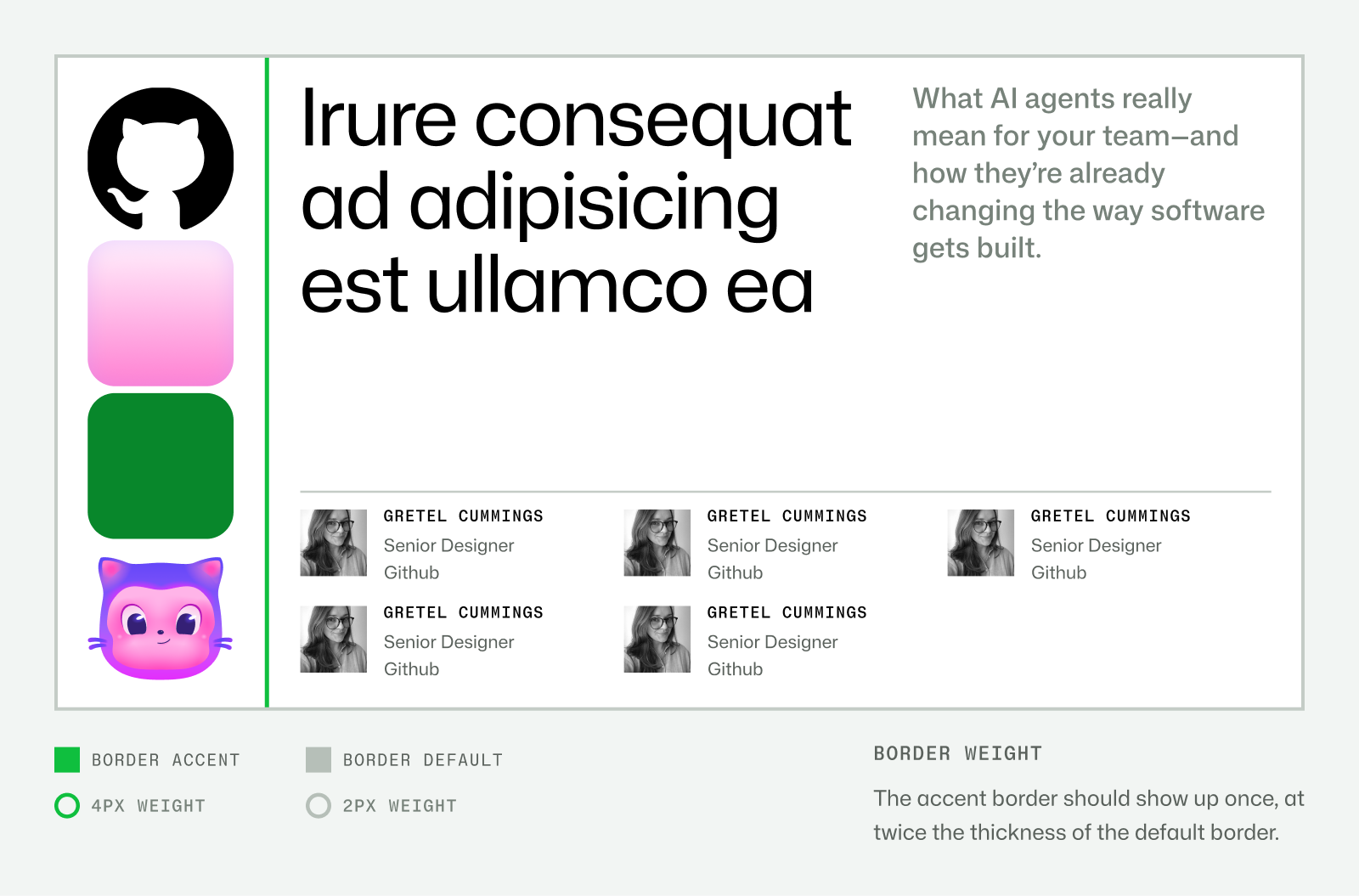
Do Choose primary division and internal margins first. Key art occupies 1/3, 1/2 or 2/3. Default borders 2px; one accent border 4px. Preserve invisible grid through negative space..
Selective visible grid · Layouts, publications, event cards
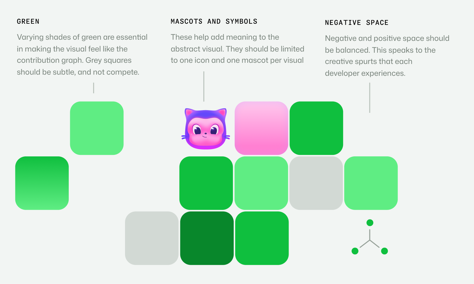
Do Use the provided cell compositions; varying greens, subordinate gray, balanced positive/negative space. Light branding may use four squares in a row or column. In graph visuals, limit to one icon and one mascot, each within a cell..
Contribution graph cells · Light branding, community and creative expression
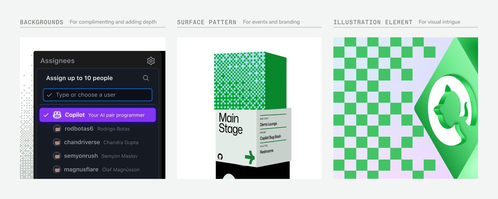
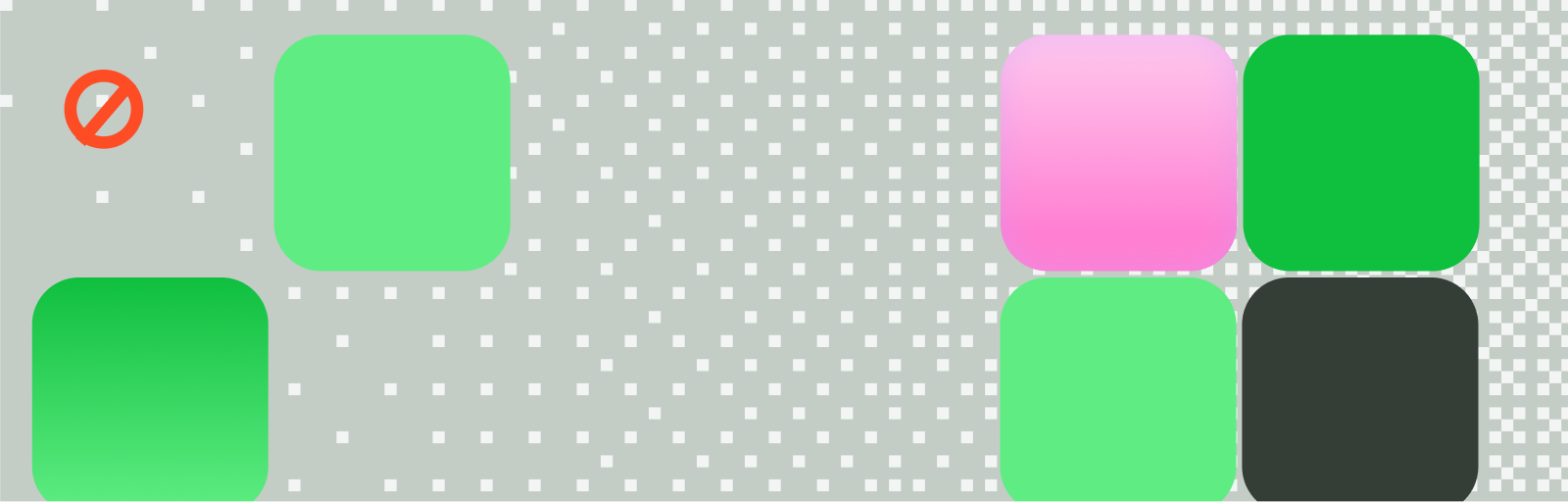
Do Binary on/off abstraction of contribution history. Scale to the application while keeping a wallpaper role; fade away from important UI..
Dither wallpaper · Backgrounds, surfaces and event/environmental pattern
Do Detailed 3D and isometric contribution landscapes; combine solid, cryptographic and transparent blocks with semantic icons. Flat profile is permitted when it tells the story better..
Optimistic daylight building blocks · Key announcement art
Do Mona Sans Mono supports short technical labels; pair with expressive Sans headlines or legible caption copy..
Technical mono detail · Eyebrows, captions and system-like animated text
Specimens use sample copy, not GitHub’s.
The visual vocabulary is native to GitHub’s daily use, so even abstract compositions retain developer meaning.
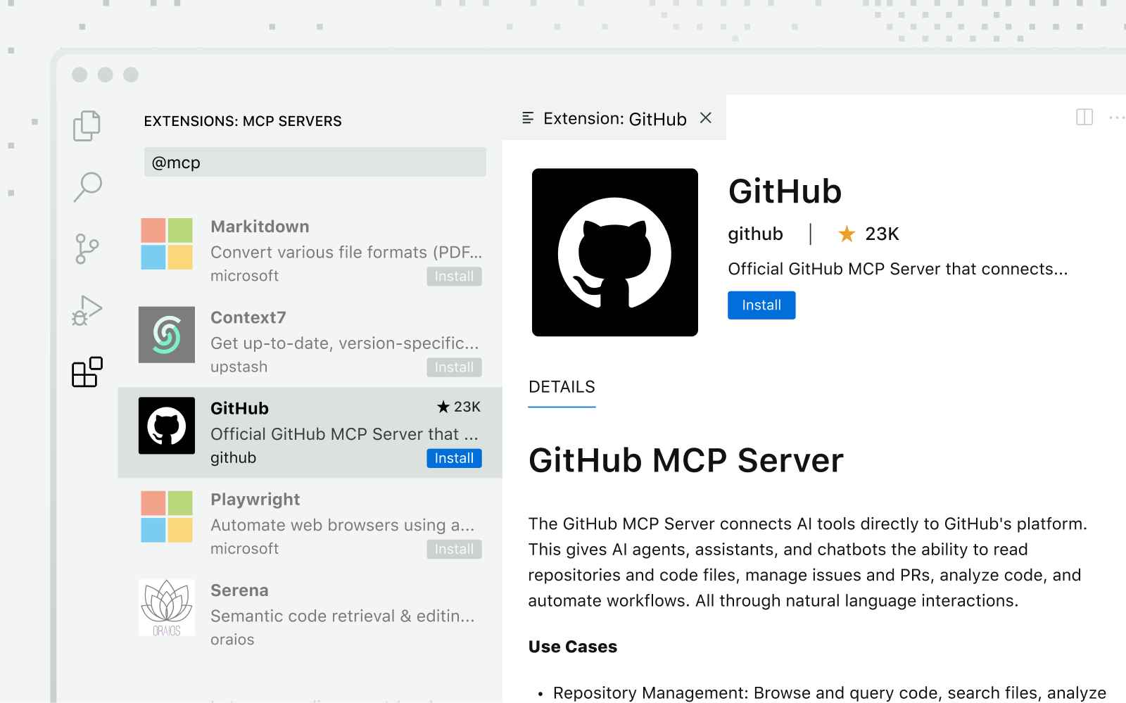
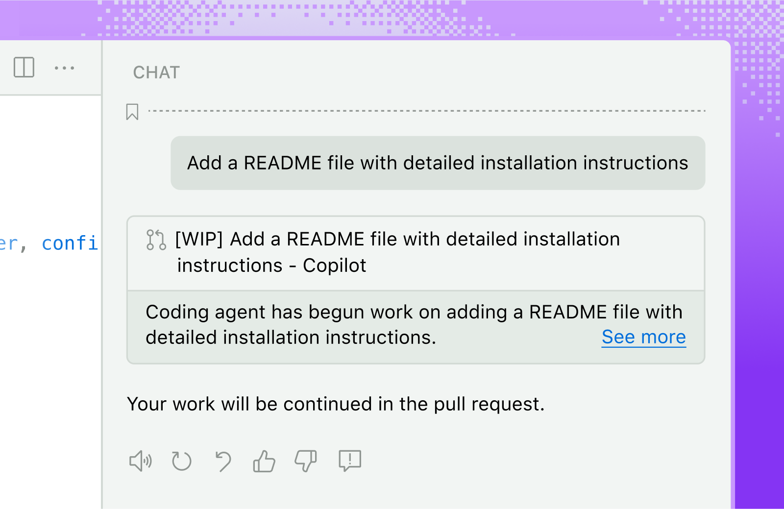
| Light contribution signature | Four squares, row or column |
|---|---|
| Graph art semantic limit | One icon and one mascot per visual (textures-01) |
| UI stroke | Match dither square thickness; numeric value not published |
| Numeric cell size / radius / dither density | not published |
The contribution calendar supplies a recognizable square-cell grammar. Dithering abstracts it into binary wallpaper; product frames, mono details and selective borders add technical structure.
Source: brand.github.com/graphic-elements/texturesbrand.github.com/graphic-elements/product-uibrand.github.com/guides/getting-started
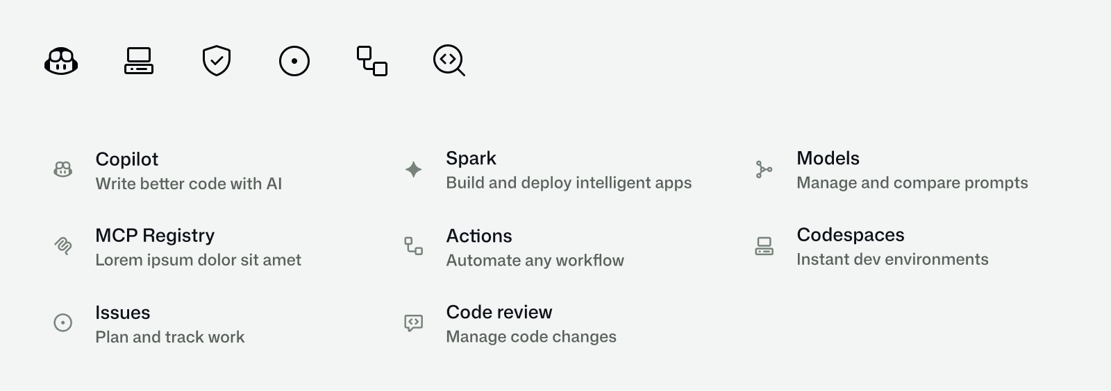
Reusing product symbols builds familiarity; the gitline-derived spot layer adds expression while retaining technical roots.
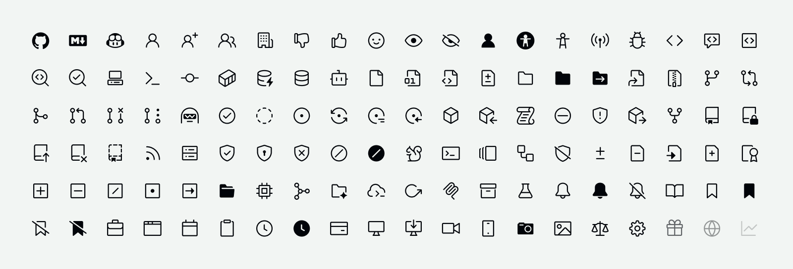
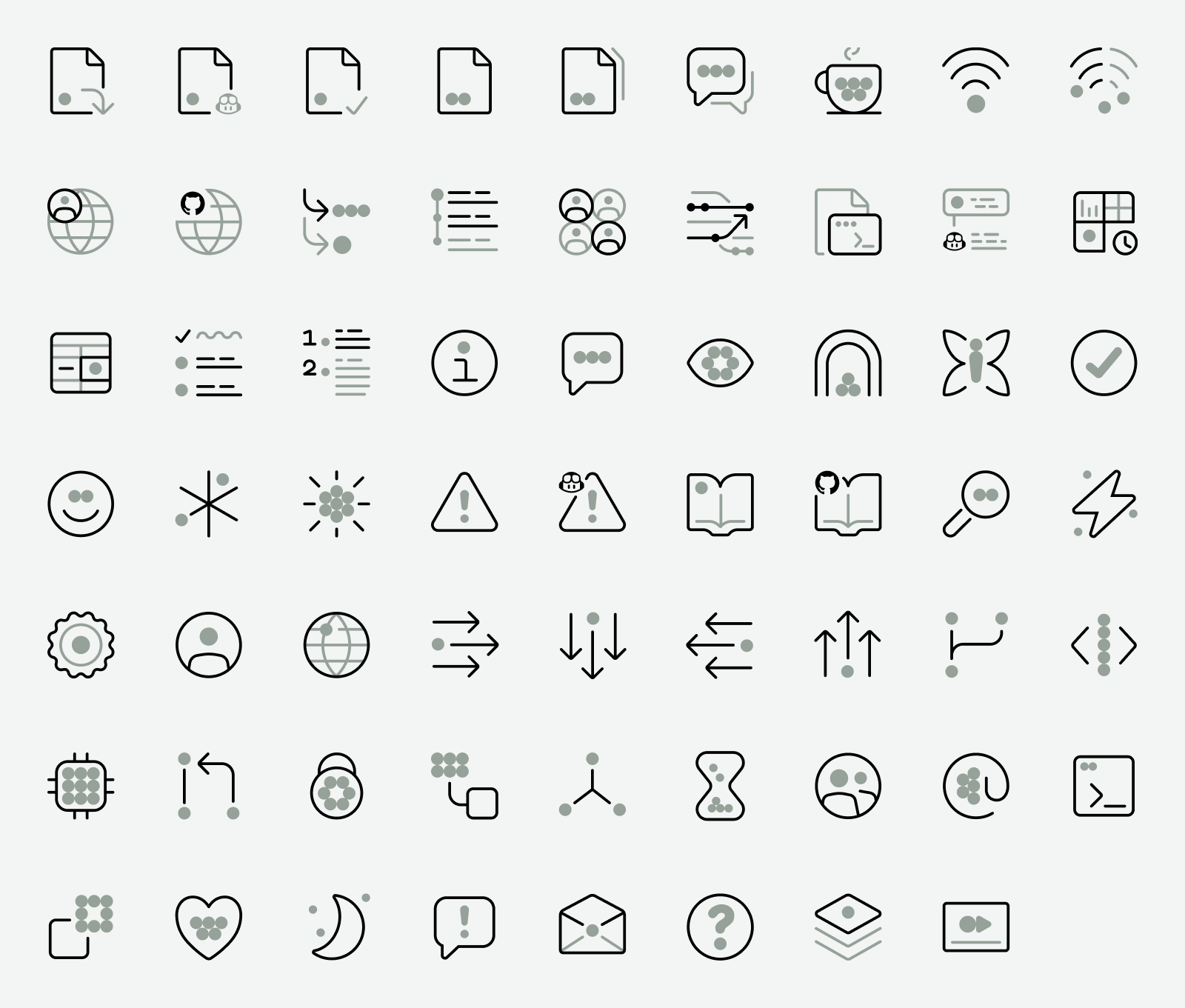
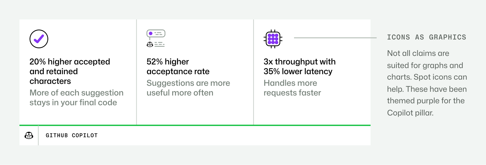
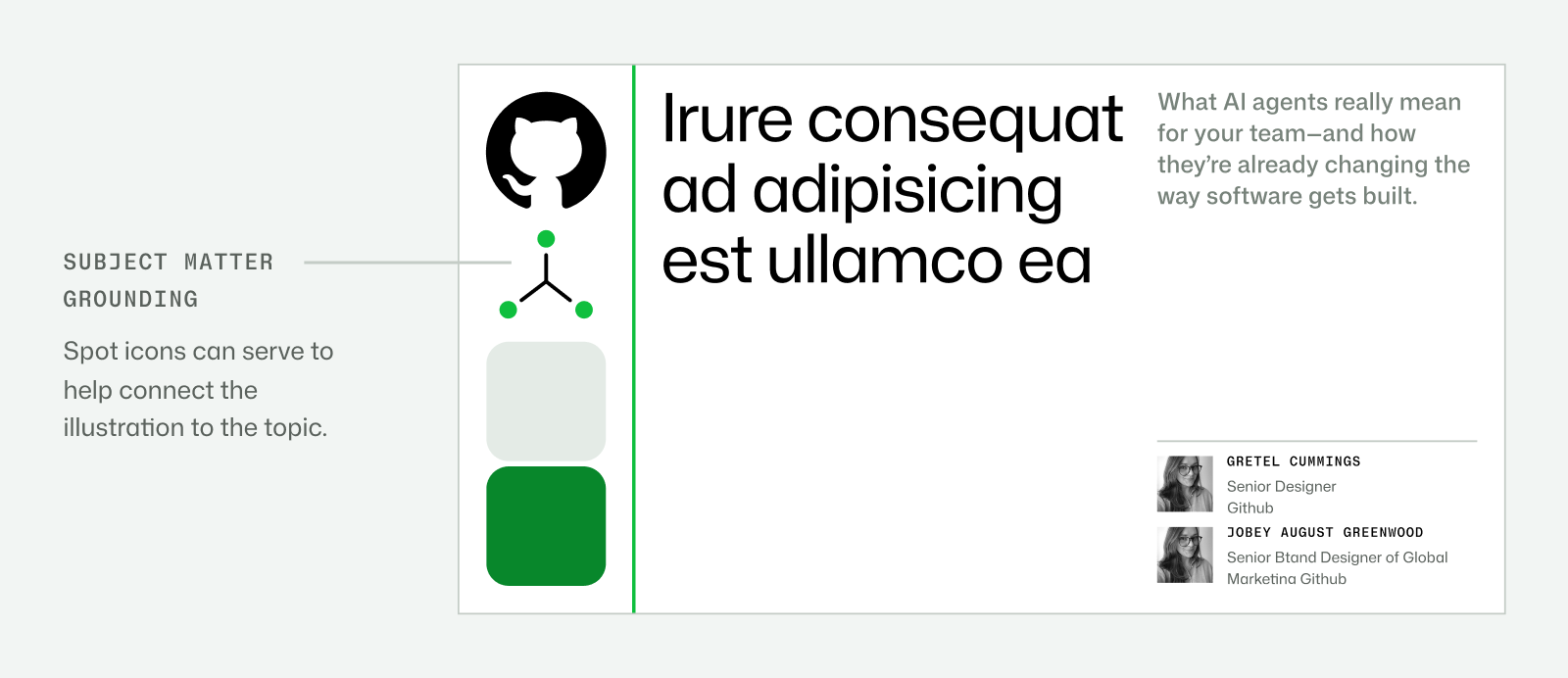

| Default library | Octicons, open source, included in Primer |
|---|---|
| Spot construction | Gitline timeline plus commit-circle geometry |
| Grid / stroke / optical sizes | not published in the supplied pages; toolkit delegates optical size detail to Octicons documentation |
Octicons are the stable default across product and brand. Larger spot icons bend gitline timelines and commit circles into topic-based symbols.
Daily contributions become a world of potential, turning infrastructure into a creative and collaborative story.
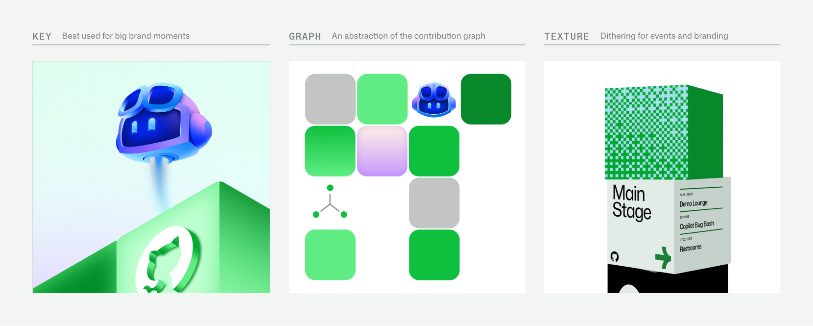
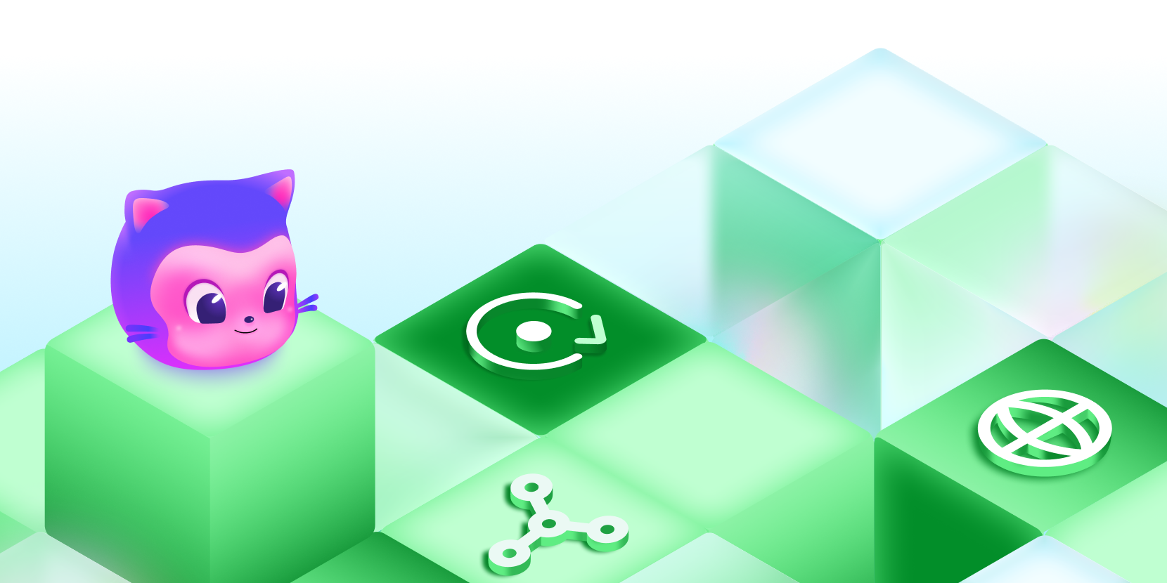
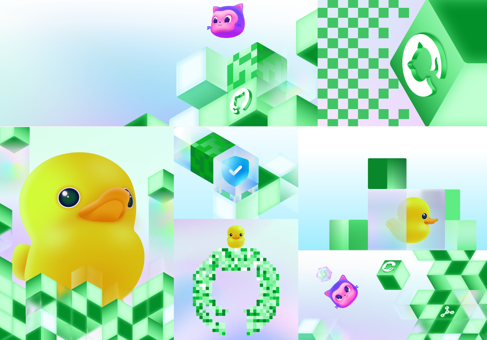
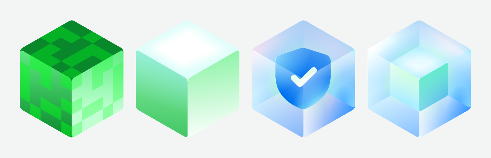
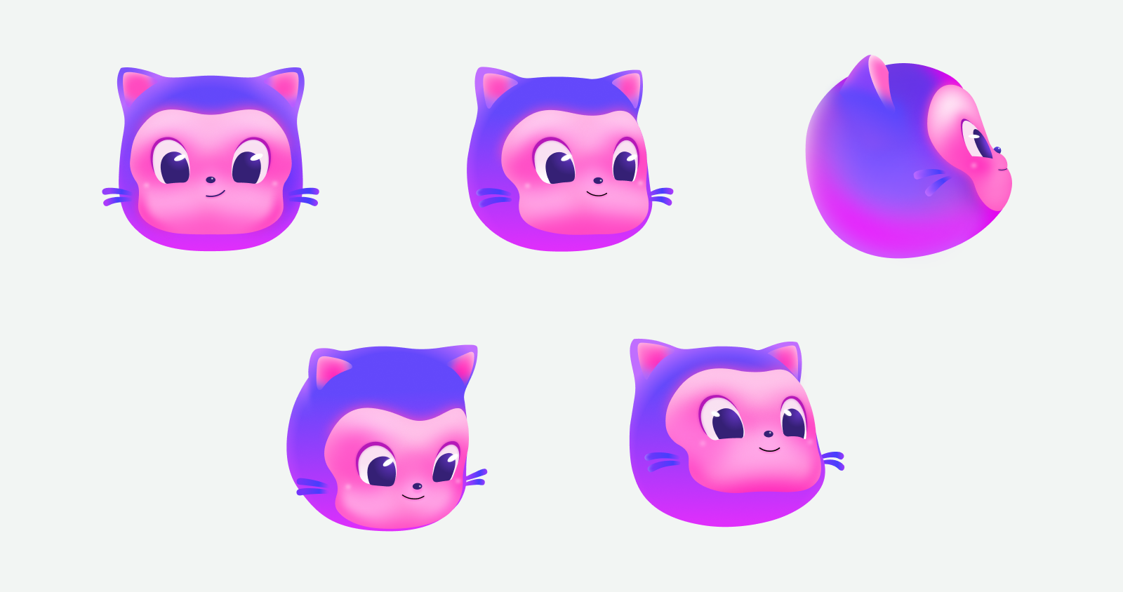
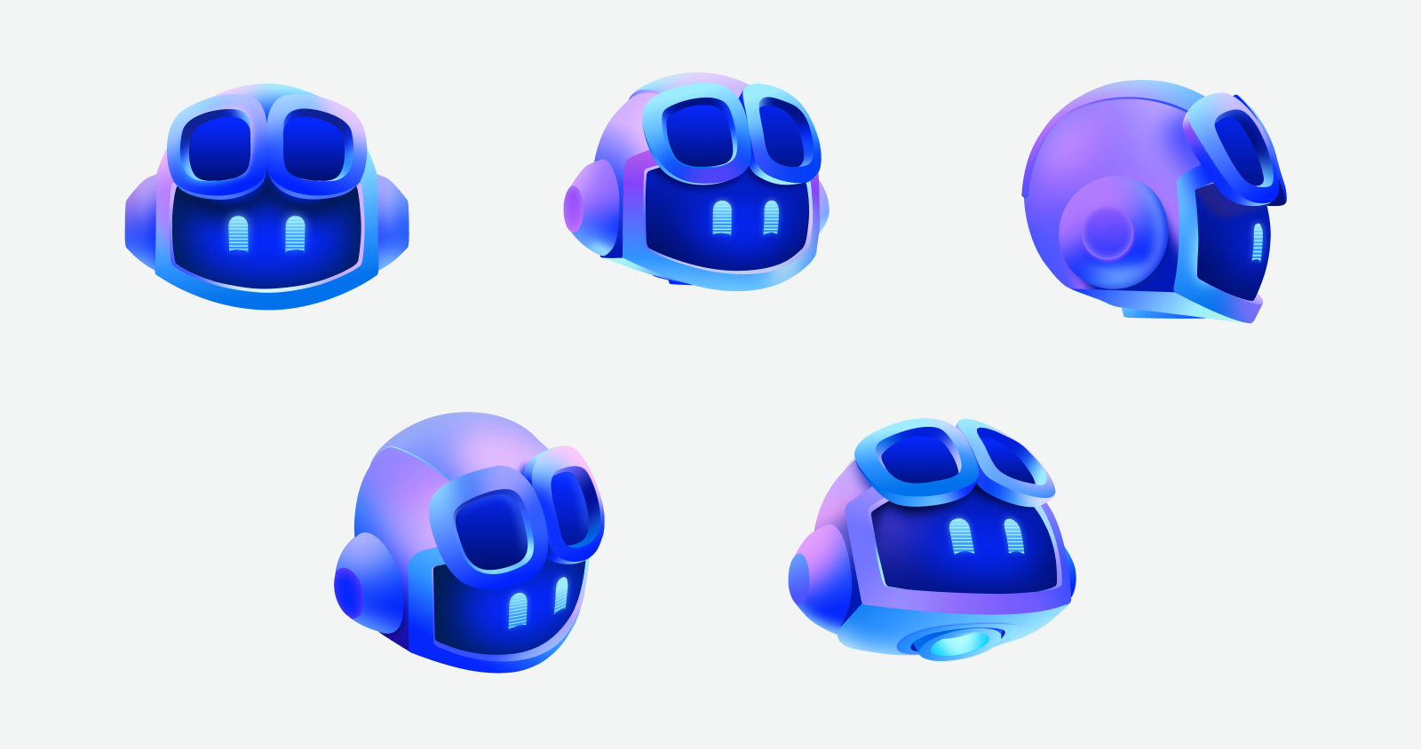
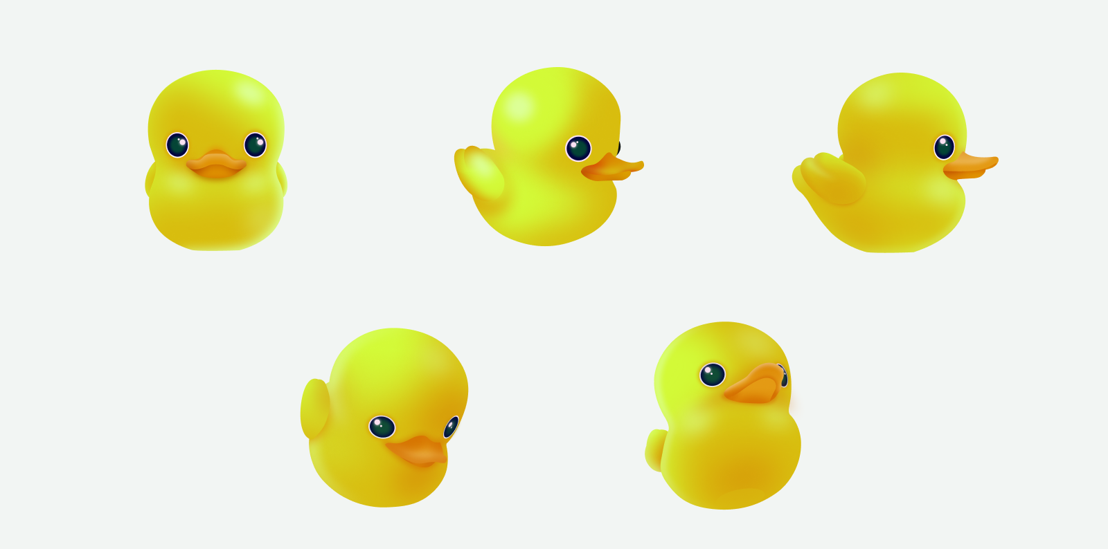
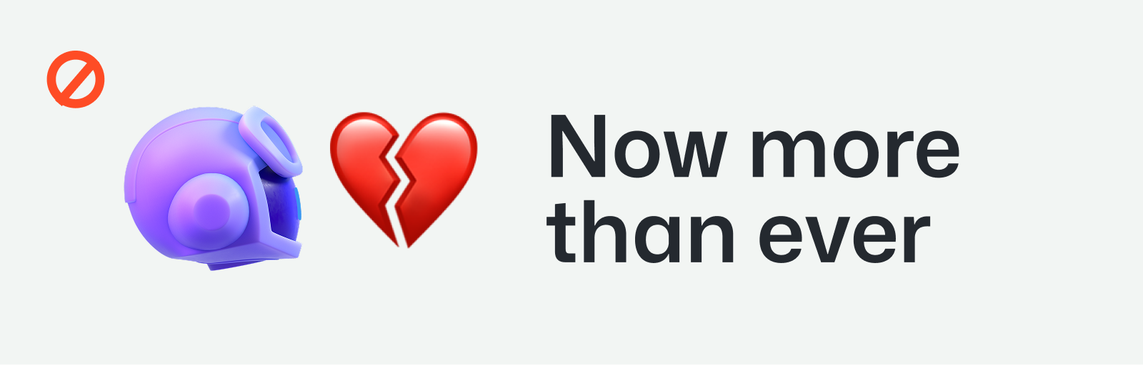
| Illustration levels | Key art / contribution graph / textures |
|---|---|
| Light | Optimistic daylight |
| Mona | Official Octocat mascot; community context |
| Copilot | Cool soft purple/blue shading with pink; AI pair-programmer context |
| Ducky | Rubber-duck debugging reference; least frequent of the three |
| Camera angle / lighting power / material numeric recipe | not published |
Three expression levels span detailed key art, contribution graph compositions and textures. Key art uses daylight 3D contribution landscapes, blocks, semantic icons and selective mascots.
Source: brand.github.com/graphic-elements/illustrationbrand.github.com/graphic-elements/mascotsbrand.github.com/brand-identity/copilot
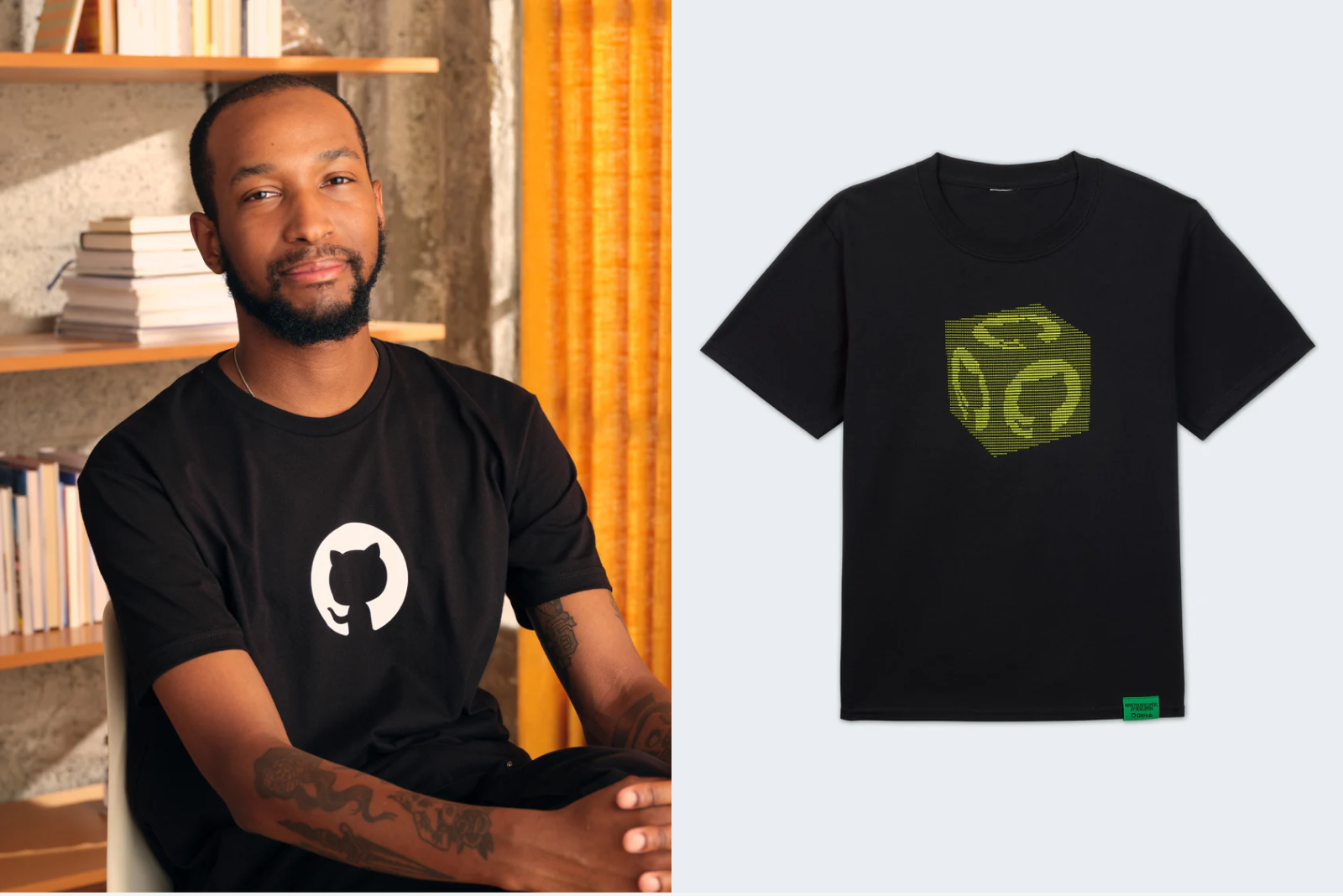
Real people establish credibility while neutral portrait treatments preserve hierarchy beside colorful art.
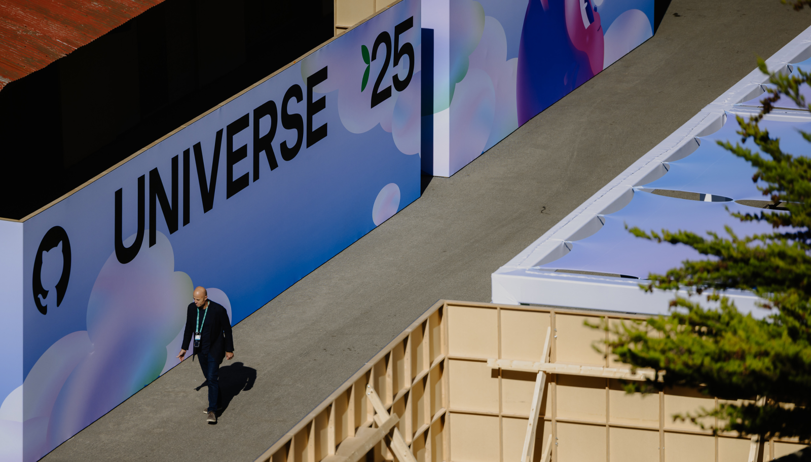
| Standalone photo art-direction chapter | not published |
|---|---|
| Lighting / lens / grading / crop ratios | not published |
| Published portrait treatment | Conditional grayscale for speaker photos mixed with illustration |
The public toolkit provides situational photography guidance and examples rather than a standalone photographic system. Speaker photos may be grayscale when competing with illustration; event photography demonstrates real people in developer environments.
Source: brand.github.com/graphic-elements/layoutsprimer.style/brand/components/Testimonialbrand.github.com/brand-in-action/experiential
Movement should explain interaction and preserve comprehension before adding delight.
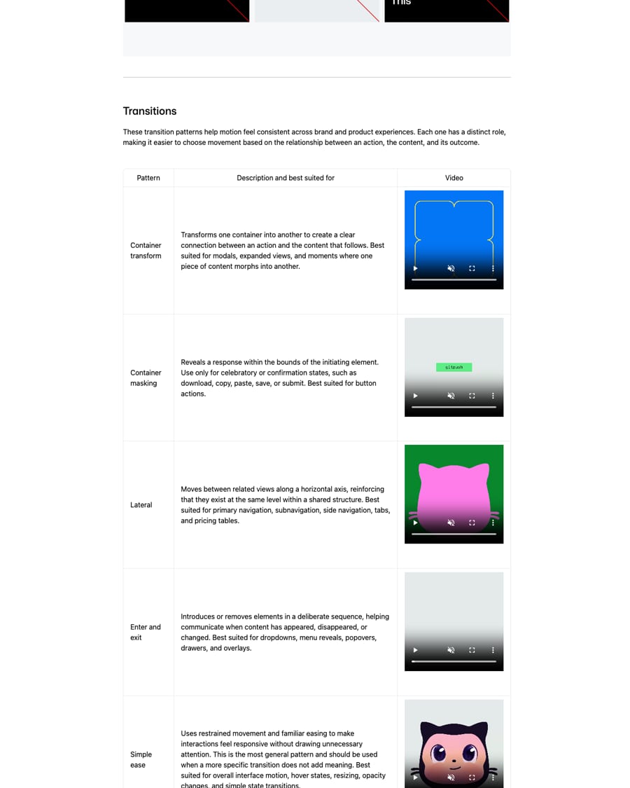

| Outcomes | Facilitate / Engage / Impact |
|---|---|
| Transition patterns | Container transform / Container masking / Lateral / Enter and exit / Simple ease |
| Brand duration / easing curves | not published |
| Primer stagger increment | 100ms; delay increment, not animation duration |
| Logo source file | Available upon request; not publicly supplied here |
Motion balances precise structure with expression. The toolkit names three outcomes and five transition relationships, with terminal-like mono type, Mona Pixels, product demos and event examples.
Source: brand.github.com/motion/principlesbrand.github.com/motion/logobrand.github.com/motion/eventsprimer.style/brand/introduction/animation
A strict primary division and consistent insets define the composition. Only selected grid lines appear; text panels remain neutral and separate from expressive visuals. Primer supplies reusable web patterns.
Measured from brand.github.com's Published guide retained; homepage anatomy added from all ten saved homepage slices, computed bands and Chrome probes observed 2026-10-31. Screenshot resting state takes precedence for animation; headless Chromium missing-video state is not a design state..
| Measure | Desktop | Phone |
|---|---|---|
| Page margin | 128px | 24px |
| Section padding | 88px | 22px |
| Hero text width | max 526px, centered | full width |
| Card gap | 0px | 0px |
| Navigation | 68px | 68px |
Hero H1
Mona Sans · 56px (phone 36) · line 1.1 desktop (61.6px), 1.2 phone (43.2px) · weight 440
Section H2 (GitHub Platform, More ways to use GitHub)
Mona Sans · 40px (phone 28) · line 1.2 · weight 400
Enterprise intro H2 / community H2
Mona Sans · 34px (phone 24) · line 1.3 · weight 400
Testimonial quote
Mona Sans · 32px (phone 24) · line 1.35 · weight 480
Platform product title (GitHub, Copilot)
Mona Sans · 28px (phone 22) · line 1.35 · weight 400
Customer story title
Mona Sans · 22px (phone 20) · line 1.4 · weight 400
Ways product title (Actions, Code Quality...)
Mona Sans · 20px (phone 18) · line 1.3 · weight 400
Body / product description
Mona Sans · 18px · line 1.5 · tracking 0.18px · weight 400
Footer body / testimonial name
Mona Sans · 16px · line 1.5 · tracking 0.24px · weight 400
Button large
Mona Sans · 16px · line 1.5 · tracking 0.16px · weight 500
Button small, nav actions, footer links
Mona Sans · 14px · line 1.5 · tracking 0.21px · weight 500
Nav link
Mona Sans · 14px · line 1.5 · tracking 0.24px · weight 400
Hero tab label
Mona Sans · 16px · line 1.5 · weight 400
Big stat number
Mona Sans · 34px (phone 24) · line 1.3 · weight 400
Ticker stat number
Mona Sans · 28px (phone 22) · line 1.35 · weight 400
Stat caption / eyebrow
Mona Sans · 14px · line 1.5 · tracking 0.21px · weight 400
Legal row
Mona Sans · 12px · line 1.5 · weight 500
How GitHub’s own landing pages are built, observed on github.com (observed 2026-10-31), 2026-10-31. The full measurements are in spec.md.
Source: brand.github.com/graphic-elements/layoutsbrand.github.com/foundations/accessibilitybrand.github.com/brand-in-action/eBooksbrand.github.com/brand-in-action/webprimer.style/brand/components/Heroprimer.style/brand/components/Riverprimer.style/brand/components/CTAFormprimer.style/brand/components/CTABannerprimer.style/brand/components/Bento
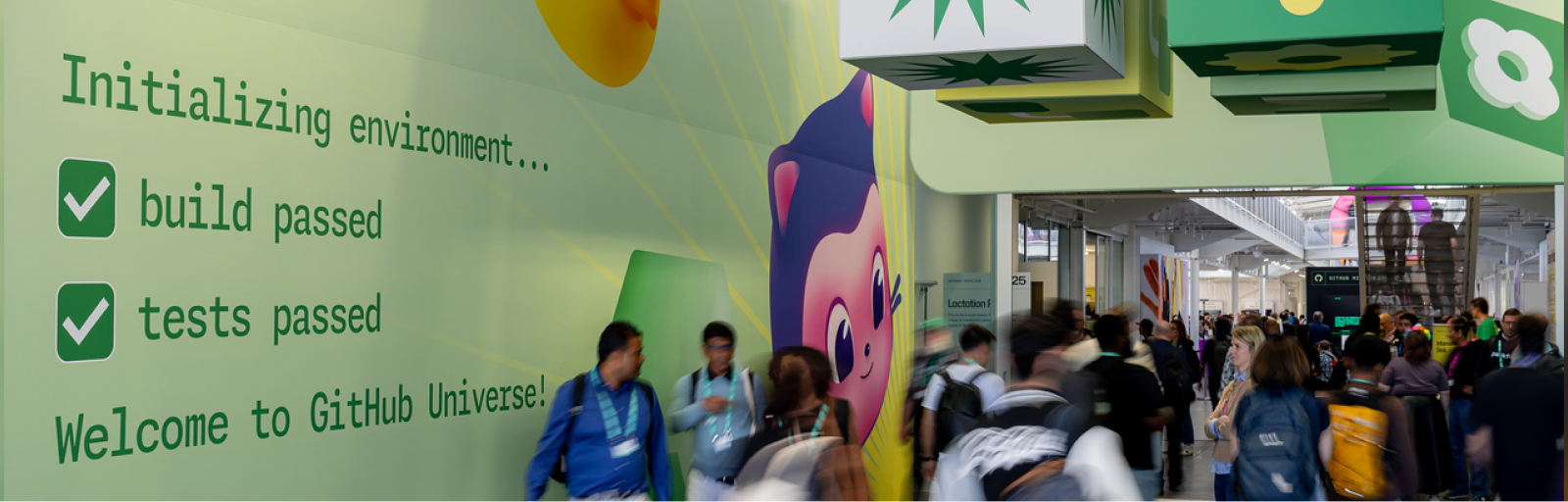
A dedicated event identity creates anticipation while retaining recognition. Our reading
Links a current community moment to the persistent platform story. Our reading
Our application recipe derived from the cited rules. Levels 0–5 express relative visual intensity; these are editorial labels, not GitHub-published measurements. Website page anatomy is deferred.
| Format | What they did | Source |
|---|---|---|
| Web | Built on open-source Primer Brand; toolkit web samples are marked coming soon. | brand.github.com/brand-in-action/web |
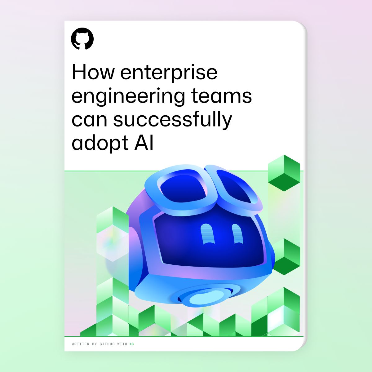
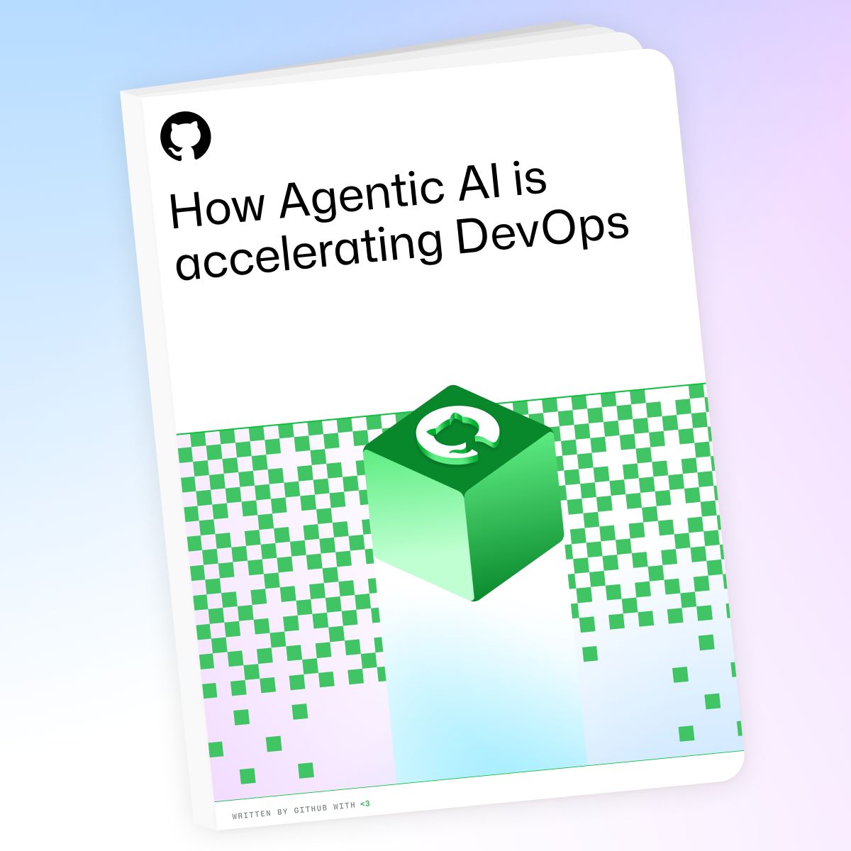
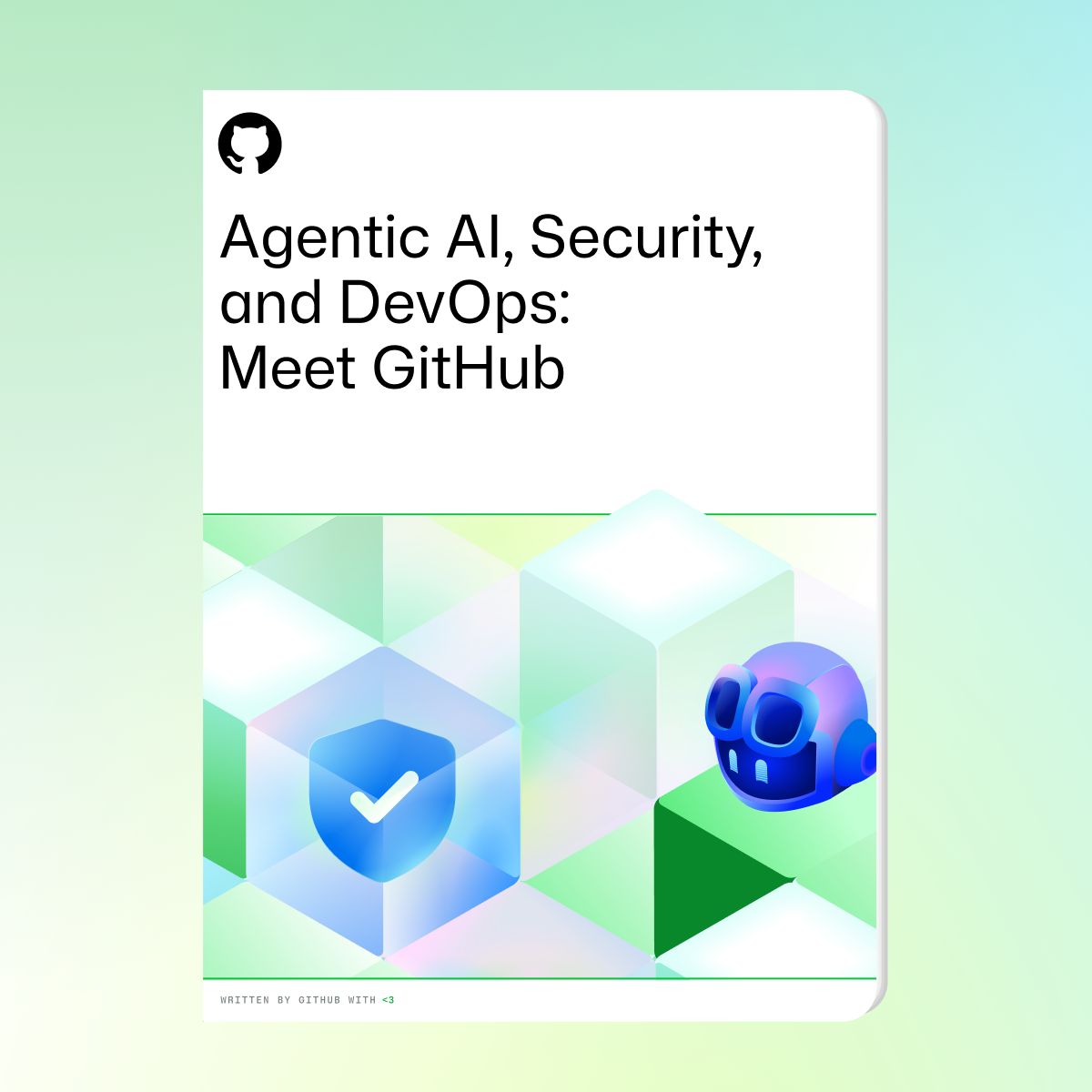
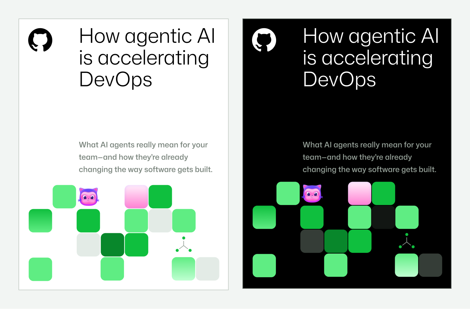
| eBooks | Expressive topic-led covers and restrained reading-led interiors with accessibility requirements. | brand.github.com/brand-in-action/eBooks |
| Social | Announcements follow event/content-specific identity; swag promotions can be expressive with clear branding; other engagement may be human and unbranded. | brand.github.com/brand-in-action/social |
| Experiential | Developer-grounded, welcoming spaces; booths use at least one premium non-printed material and reusable elements. | brand.github.com/brand-in-action/experiential |
| Swag | High-quality fit and material details; stickers and collectibles draw on developer lore. | brand.github.com/brand-in-action/swag |
| Presentations | Use updated templates; PowerPoint template is staff-only. | brand.github.com/brand-in-action/presentations |
| Diagrams | Precise, instructional and readable; color blocking only for clarity or key product pillars. | brand.github.com/graphic-elements/diagrams |
| Format | Loudness | Must appear | What varies |
|---|---|---|---|
| Landing page | Real Mona Sans, neutral reading panels, green connective accents, recognizable product visuals, concise descriptive copy, accessible contrast and CTA hierarchy. Use Primer guidance for Hero, River, forms and proof. | A major announcement may use daylight key art, dither, terminal-like eyebrows or a context-appropriate approved mascot. | |
| Deck | Use the official template where authorized; retain logo, type, grid and neutral copy hierarchy. | Expressive cover and restrained four-cell contribution signature on functional slides. | |
| eBook / whitepaper | Comfortable interior reading, subtle type hierarchy, consistent grid and footer detail, tagged accessible PDF, heading structure and alt text. | Cover can tell the topic through illustration; interior expressive detail stays subordinate. | |
| Social post | Match the audience and content context; event announcements follow their own identity, swag promotions retain clear branding. | Community engagement may be human and unbranded; relevant approved mascots may delight. | |
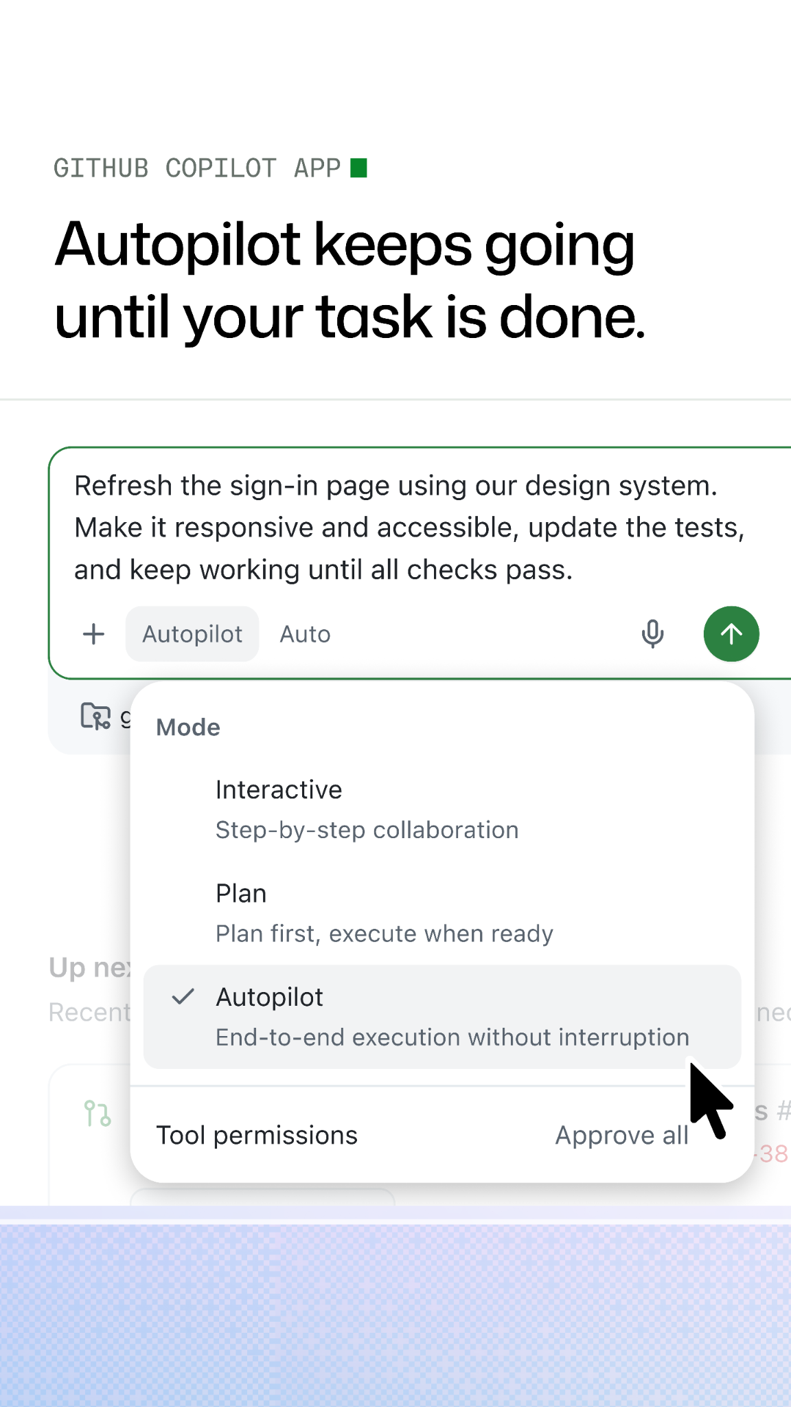
| Technical demo | Accurate product UI, clear primary focal point, readable copy and motion that explains what changed. | Crop and simplify UI while retaining recognizability; use restrained dither support. | |
| Event / booth | Developer culture, accessibility, reusable physical elements and at least one premium non-printed material. | Event-specific identity, tactile play and controlled full-bleed key art; Universe visuals remain event-specific. | |
| Chart / diagram | Clear labels and technical accuracy, sufficient text size, non-color identifiers and alternative descriptions. | Color grouping only where essential; product-theme blocks where they clarify the diagram. | |
| Swag | Quality material and fit; authorized logo/mascot assets and applicable permission review. | Developer lore, collectibles and context-appropriate expressive treatments. |
Source: brand.github.com/foundations/logobrand.github.com/brand-identity/cobrandingbrand.github.com/graphic-elements/mascotsbrand.github.com/foundations/accessibilitybrand.github.com/foundations/typographybrand.github.com/graphic-elements/texturesbrand.github.com/graphic-elements/diagramsbrand.github.com/graphic-elements/product-uibrand.github.com/guides/getting-startedbrand.github.com/brand-in-action/experiential
Your name and logo, GitHub’s system.
Use this kit for my brand Use this brand in Claude
Get your brand audit Put your brand in Claude What goes in a brand book
Each value is marked published, observed, our reading or our recipe, with its source. Checked 2026-10-31. Not affiliated with GitHub.