Model APIs
One API to 1,500+ image, video, audio, 3D and world models, available as models launch (paraphrase). Observed
Brand book
fal sells developer infrastructure for a creative medium, so it dresses plain, figure-led copy in a toy-like, pixel-and-marker visual layer: the chrome says generative media is fun, the white body sections and black buttons say it is serious infrastructure. Our reading

The hero ground colour and its matching ornament palette, per page: olive with cyan and lime (home, About), violet with lavender and cyan (Enterprise), pink with hot pink and red (Pricing).
Our engine's setting, built from their rules.
fal is lowercase everywhere, including sentence starts and the logo.
The hero is one flat saturated ground (olive, violet or pink) with type in a single contrast colour; no gradients or photos behind the head.
Pixels and capsule strokes use the hero's companion colours and crop at the frame edge; they never sit behind body copy.
Buttons 2px radius, chips with a leading dot, cards square with a 1px border; dotted lines split rows. No pills, no shadows.
Focal-style grotesk heads at weight 500 with tight leading; small serif for leads and italic serif for quotes.
Every number is one fal states on its site (2,500,000 developers, 1,500+ models, up to 10x, 99.99%); nothing invented.
Model outputs and grainy gradient art, not stock photos of people.
Webflow-style pages end in the pink footer with the giant black logo.
Measured 0.9 for heads (0.96 tab panel heads, 1.0 row heads) and 1.22 for body wins over the design-fundamentals "watch" advice of 1.2 / 1.47; that advice is generic and does not apply to fal. (https://fal.ai/ (live, headless Chromium at 1440x900 and 390x844, consent rejected, 2026-11-10))
Do not use #568300 on the homepage: no homepage text uses it. Text on white is black, on olive cyan #99EDFF, on black white; muted roles are sage #E5ECE7 chips. The fundamentals line is a contrast-safe suggestion for other formats only. (https://fal.ai/ (live, headless Chromium at 1440x900 and 390x844, consent rejected, 2026-11-10))
The real element is the 37x50 rounded SVG (library/ui-icon-explore-plus-tile.svg) rendered 33x44, 12px right of the sub-head; the earlier "31px square" text was wrong. (https://fal.ai/ (live, headless Chromium at 1440x900 and 390x844, consent rejected, re-measured 2026-11-10 after blind build r1; work-r1/text-*.json, geom-*.json, probe-*.json))
Homepage: 24px light square with a 2x2 pixel block (verified in ref/home-phone-fold.png). ui-icon-menu.svg (two lines) is from /agent. (https://fal.ai/ (live, headless Chromium at 1440x900 and 390x844, consent rejected, re-measured 2026-11-10 after blind build r1; work-r1/text-*.json, geom-*.json, probe-*.json))
Shapes and colours are generated per load. Build the reference: top = one sky-blue line, right = cyan + white "<" chevron, phone = cyan V + white crossing stroke, with the coordinates in kit.spec.page.hero. The supplied files are only stroke-style references. (https://fal.ai/ (live, headless Chromium at 1440x900 and 390x844, consent rejected, re-measured 2026-11-10 after blind build r1; work-r1/text-*.json, geom-*.json, probe-*.json))
Reference segments: sky #3FB5FE y 94-288, white 288-674, cyan #99EDFF 674-784 (desktop only). (ref/home-desk-fold.png pixel column x 19)
All black at rest; none grey. (https://fal.ai/ (live, headless Chromium at 1440x900 and 390x844, consent rejected, re-measured 2026-11-10 after blind build r1; work-r1/text-*.json, geom-*.json, probe-*.json))
Funnel Sans per-role values in kit.spec.type replace the r1 Host Grotesk "site tracking minus 0.0025/0.0315em" rule. (work-r1/fonts.json)
Every 44px button label is 16.3px (Focal 500 16.2857px computed), nav labels 14px; 13.7px is the padding, never a label size. (https://fal.ai/ (live, headless Chromium at 1440x900 and 390x844, DPR 1, consent rejected, re-measured 2026-11-10 after blind build r2; work-r2/e3-desk.json, e3-phone.json, e4.json, e5-*.json))
Funnel Sans 700/400 stays: ink matches Focal within 2% at every role; the remaining difference is Focal's taller caps and ascenders, which no measured open face reproduces without worse line widths (kit.typography.display.calibration). Keep size, weight and tracking as listed. (work-r2/fonts.json, fonts-albert.json)
Source Serif 4 at weight 500, italic for quotes (-0.0094em) and upright for the hero lead and side note (-0.026em); 400 is measurably too light. (work-r2/fonts.json, serif-up.cjs)
The two dotted rules in the tab panel are white on Model APIs and Serverless and olive on Compute; they show on phone too (88px and 53px). Only the head, lead and "Use it to" take the cyan text colour. (https://fal.ai/ (live, headless Chromium at 1440x900 and 390x844, DPR 1, consent rejected, re-measured 2026-11-10 after blind build r2; work-r2/e3-desk.json, e3-phone.json, e4.json, e5-*.json))
Use home-hero-video-stack-at-rest.png at x 1140, y 108; do not simulate the WebGL stack. (ref/home-desk-fold.png; https://fal.ai/ DOM)
Per-line white text highlights over the grain, never an opaque white panel. (https://fal.ai/ (live, headless Chromium at 1440x900 and 390x844, DPR 1, consent rejected, re-measured 2026-11-10 after blind build r2; work-r2/e3-desk.json, e3-phone.json, e4.json, e5-*.json); e4.json CSS rule [data-developer-code-panel] .developer-code-highlight)
Large CTA labels are Focal 500 like every other button: stand-in Funnel Sans 700 (kit.spec.type button-l); the earlier "weight 600" text was wrong. (https://fal.ai/ (live, headless Chromium at 1440x900 and 390x844, DPR 1, consent rejected, re-measured 2026-11-10 after blind build r2; work-r2/e3-desk.json, e3-phone.json, e4.json, e5-*.json))
The full stack for generative media: models, inference, training and GPU infrastructure behind one API (paraphrase of the home hero). Observed
One API to 1,500+ image, video, audio, 3D and world models, available as models launch (paraphrase). Observed
The fal Inference Engine runs diffusion models faster and scales to production volume (paraphrase). Observed
Deploy private or fine-tuned models on on-demand GPUs, priced per output or per GPU hour (paraphrase). Observed
SOC 2, SSO, private deployments, usage analytics and forward-deployed ML engineers (paraphrase). Observed
Founded in 2021 by Burkay Gur and Gorkem Yurtseven after facing AI infrastructure problems at Coinbase and Amazon; built fast inference for generative models so developers can make the next creativity tools (paraphrase).
Take initiative and move quickly (paraphrase).
ObservedListen to each other and keep learning (paraphrase).
ObservedPush AI forward and share knowledge with the community (paraphrase).
ObservedCategory. Generative media platform; the site titles itself creative infrastructure for generative media. Observed
fal is a generative media platform: one API to the leading image, video, audio and 3D models, with fast inference, training and serverless GPU infrastructure to take them to production. Founded in 2021 and headquartered in San Francisco (paraphrase of the home hero and About page).
Your full stack for generative media Observed
Access the world's best generative media models through one API, with fast inference, training, and the infrastructure to take them to production. Observed
Access, deploy and train generative media models. Observed
Explore 1500+ state of the art generative media models Observed
Why choose fal? Observed
Built for enterprise scale Observed
Built with fal, loved by all. Observed
Build, deploy, and train on fal. Observed
Fast, reliable, and cost-efficient. Observed
Build with the fastest inference platform on the planet. Observed
Generative media for enterprise. Observed
Ready to build with generative media? Observed
Ready to transform your enterprise with AI? Observed
Creative infrastructure for Generative Media Observed
FastTechnicalConfidentPlayful
generative mediafull stackinferencefastproductiondeploytrainserverlessmodelsone API


Black mark + lowercase wordmark top-left, always on a small white plate when the hero is coloured; cyan directly on olive in the About build; huge black version in the pink footer; the mark alone as favicon on pink.
Black mark + lowercase wordmark top-left, always on a small white plate when the hero is coloured; cyan directly on olive in the About build; huge black version in the pink footer; the mark alone as favicon on pink. The nav mark rotates.
Flat, saturated, unexpected pairings: olive with cyan and lime, violet with lavender and cyan, pink with hot pink and red.
Flat, saturated, unexpected pairings: olive with cyan and lime, violet with lavender and cyan, pink with hot pink and red. Body sections fall back to white and black. No gradients in the chrome; soft grainy gradients appear only inside image tiles.
Your full stack for generative media
Tight, heavy-ish grotesk heads (Focal 500, 0.9 leading, -0.04em) in sentence case, paired with a small serif for leads and italic serif quotes, and a mono for metadata.
Tight, heavy-ish grotesk heads (Focal 500, 0.9 leading, -0.04em) in sentence case, paired with a small serif for leads and italic serif quotes, and a mono for metadata. Buttons in the same grotesk at 13.7px.
| Their face | Use | License | Open stand-in |
|---|---|---|---|
| Focal | Every head, button, chip and nav link; weight 500 heads, 400 for row heads | Not an open font (licence not stated on the site); open stand-in Funnel Sans (700 for Focal 500, 400 for Focal 400), re-calibrated line by line on fal.ai 2026-11-10 after build r1 (kit.typography.display.calibration) | |
| Focal Text | Card and paragraph copy, 12-16.3px | Not an open font (licence not stated on the site); open stand-in Onest 400, calibrated by rendering on fal.ai 2026-11-10 (kit.typography.body.calibration) | |
| Hal Timezone Mono | Quote attribution tags, model endpoint ids | Not an open font (licence not stated on the site); open stand-in DM Mono 400, calibrated by rendering on fal.ai 2026-11-10 (kit.typography.mono.calibration) | |
| Hal Timezone | Hero leads, side notes, italic customer quotes, About body | Not an open font (licence not stated on the site); open stand-in Source Serif 4, calibrated by rendering on fal.ai 2026-11-10 (kit.typography.serif.calibration) |
Do Full-bleed flat colour, 800px tall on home (597px on secondary pages), with a 96px Focal weight 500 head at 0.9 leading and -0.04em tracking in one contrast colour (cyan #99EDFF on olive, white on violet, black on pink), left-aligned at x 69px; a small serif lead at 13.7px beneath; two rectangular buttons.
One flat saturated hero ground per page · Every hero: home and About olive #403700, Enterprise violet #5718C0, Pricing pink #FFC4D8
Do Crisp-edged square pixels (about 8 to 30px) scattered along the hero bottom edge in the ground's companion colours (lime #ADFF00 and white on olive; lavender #D5BBFF on violet; red #EC0648 and white on pink); pixel-art stickers (dotted pixel silhouettes with a lime outline); and 80px round-cap stroke capsules crossing in X or chevron pairs, cropped by the frame edge.
Pixel scatter and fat capsule strokes · Hero bottoms, the black enterprise band, section edges, the OG share image
Do Each word of a short head sits in its own filled rectangle, no radius, about 6.9px padding: olive #403700 tiles with cyan text alternating with cyan #99EDFF tiles with black or olive text, staggered across the row.
Words in filled tiles · Home quote band (Built with fal, / loved by all.), the OG image icon row
Do Buttons 2px radius, chips 3.4px radius with a leading ● dot, cards 0px with a faint 1px border; list rows and image frames split by 1px dotted or dashed lines; secondary CTA is a dashed-outline box.
Square UI with dotted hairlines · Every button, chip, card and list row
Do A small Hal Timezone serif (13.7px) under 96px Focal heads; customer quotes in 24px italic serif; quote attribution in a cyan-tagged name plus mono role and company tags.
Big grotesk, small serif · Hero leads, side notes, customer quotes, the About page
Do #FFC4D8 band 537px tall on desktop (y 6646-7183, 17.1px padding) under a dotted top rule, six link columns (the first split in two) in 15.2px Focal black, and the black mark plus wordmark at 540 x 217px anchored bottom-right (x 883, y 6949).
Pink footer with a giant logo · Footer on home, pricing and enterprise
Specimens use sample copy, not fal’s.
Pixel scatter (crisp square pixels), pixel-art stickers (dotted silhouettes with lime outline), 80px round-cap capsule strokes in X and chevron pairs, word tiles, ● dot chips, dotted/dashed hairlines, a 7px vertical progress rail at the hero left edge (segments in lime, white, blue/lavender), dashed outlines around image tiles.
Very few: three cyan outline media icons (video camera, speaker, picture) above the home H1 and in the share image; a + tile beside Explore all models; small filled GPU chip squares with dot pips on Pricing.
Feature-card art is soft, grainy airbrushed gradients (lime, cyan, lavender, pink) overlaid with chunky pixel-outlined italic lettering (Lightning-fast inference, h100 h200 99.99% uptime, SOC2 Certification), UI fragments (code, GPU chart, a dotted-outline mark), or dotted label boxes.
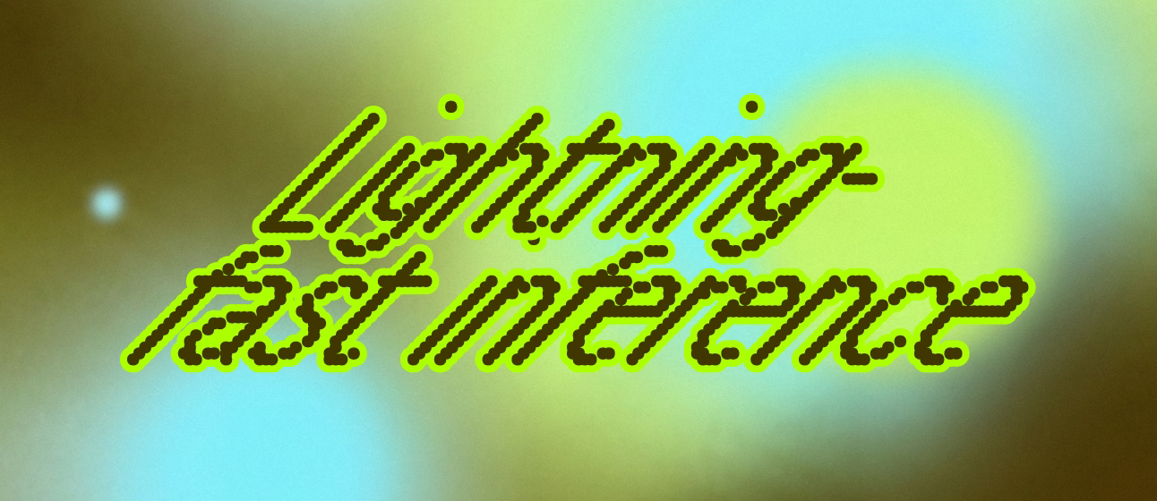

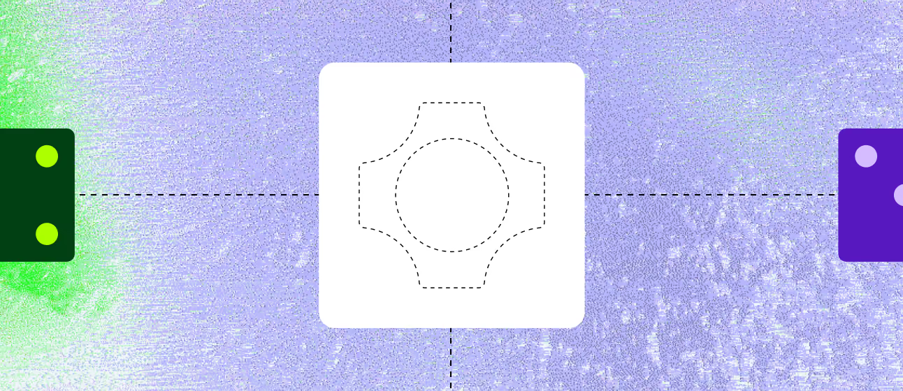




Feature-card art is soft, grainy airbrushed gradients (lime, cyan, lavender, pink) overlaid with chunky pixel-outlined italic lettering (Lightning-fast inference, h100 h200 99.99% uptime, SOC2 Certification), UI fragments (code, GPU chart, a dotted-outline mark), or dotted label boxes. Pixel stickers and capsule strokes are flat vector.
No photographs of people or offices.


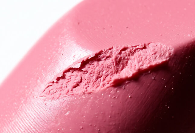
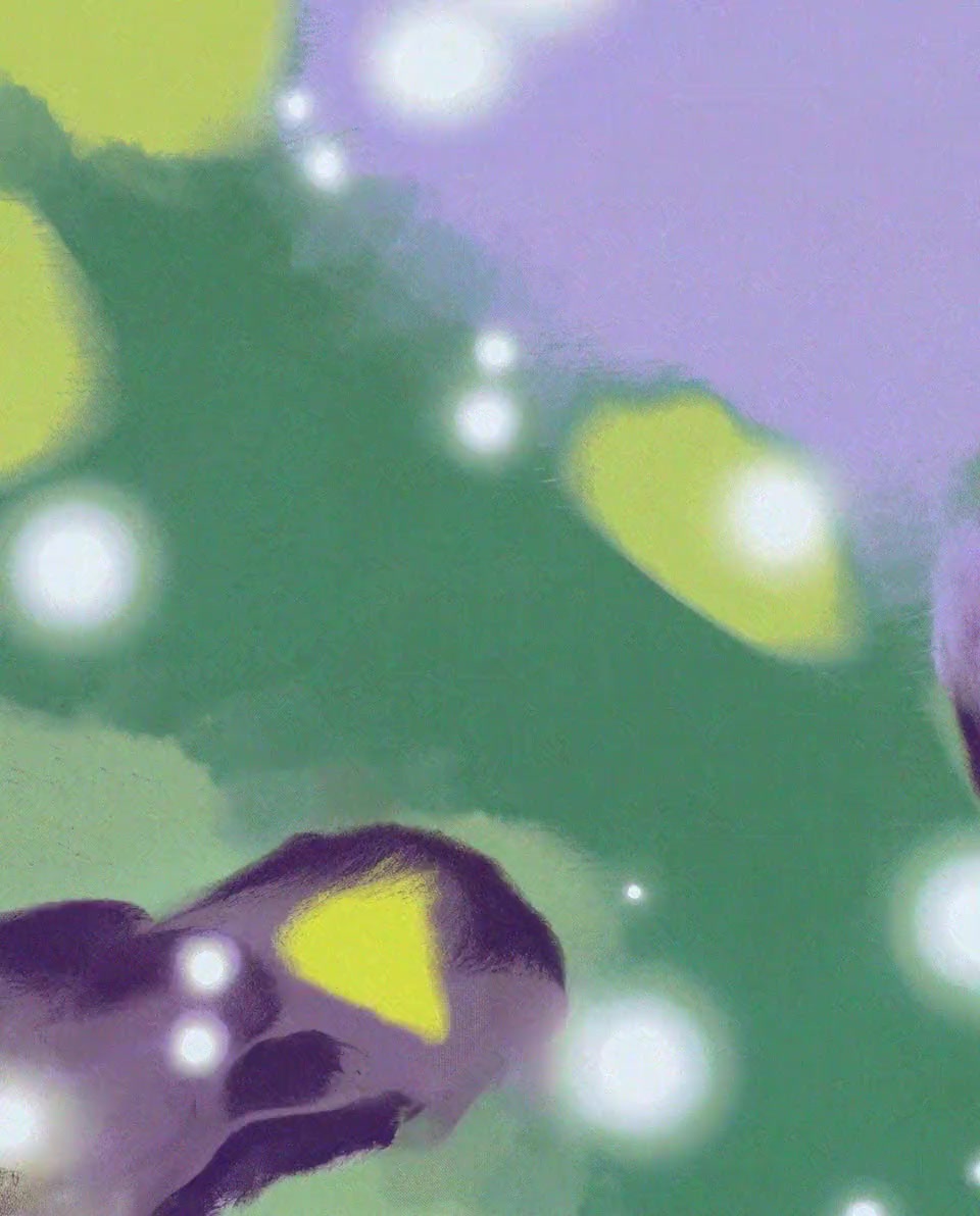
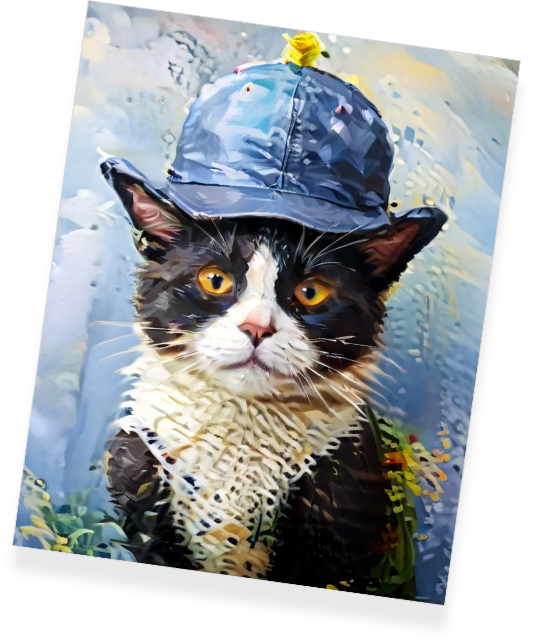
No photographs of people or offices. Imagery is model output: AI-generated stills shown as model-card thumbnails (macro textures, film-like lifestyle frames, 3D terrain), each with the model maker's logo top-left, plus a painterly hero video (purple, green and lime brush shapes) and an oil-painted cat on About. Images sit in square-cornered frames, often with dashed outlines, never behind text.
Left-aligned content on a 69px desktop margin; heads wide, copy narrow (body columns about 350-640px). Full-bleed colour bands alternate with white sections; cards in two-column grids with 1px borders; lists as full-width rows split by dotted lines with head left and copy right. Model cards scroll as a horizontal marquee.
Measured from fal.ai/,%20/pricing,%20/enterprise,%20/about%20(headless%20Playwright,%202026-11-10)'s computed styles and bounding boxes in headless Chromium at 1440x900 and 390x844, consent rejected, page scrolled through once; y values are page coordinates.
| Measure | Desktop | Phone |
|---|---|---|
| Page margin | 69px | 20px |
| Section padding | 137px | 80px |
| Hero text width | max 1029px, centered | full width |
| Card gap | 17px | 17px |
| Navigation | 88px | 88px |
Hero H1
Focal · 96px (phone 48) · line 0.9 · tracking -3.85px · weight 700
Word tile
Focal · 102px (phone 56) · line 0.9 · tracking -4.95px · weight 400
Section H2
Focal · 59.1px (phone 40) · line 0.9 · tracking -1.11px · weight 700
Closing CTA head
Focal · 49.7px (phone 32) · line 0.9 · tracking -0.93px · weight 400
Tab panel head
Focal · 48.9px (phone 28.8) · line 0.96 · tracking -1.01px · weight 400
Enterprise row head
Focal · 41.1px (phone 24) · line 1 · tracking -0.52px · weight 400
Large button label
Focal · 34.3px (phone 24) · line 0.86 · tracking 0.59px · weight 700
Card title (model)
Focal · 27.4px (phone 24) · line 0.9 · tracking -0.38px · weight 700
Card title (feature)
Focal · 16.3px (phone 16) · line 0.96 · tracking -0.22px · weight 700
Body (card copy, band lead)
Focal Text · 16.3px (phone 14) · line 1.22 · weight 400
Body small (model card)
Focal Text · 12px (phone 14) · line 1.22 · weight 400
Button label (44px in-page buttons)
Focal · 16.3px (phone 16) · line 0.9 · tracking 0.05px · weight 700
Nav label (link bar and nav tray buttons)
Focal · 14px · line 1 · tracking 0.06px · weight 700
Chip label
Focal · 13.7px (phone 14) · line 1 · tracking -0.12px · weight 700
Card category tag
Focal · 12px (phone 14) · line 0.9 · tracking 0.06px · weight 700
Serif lead / side note
Focal Text · 13.7px (phone 16) · line 1.25 · tracking -0.36px · weight 500
Quote
Focal Text · 24px (phone 18) · line 1.16 · tracking -0.23px · weight 500
Quote name
Focal Text · 14.4px (phone 16.8) · line 1.1 · weight 500
Quote role / company tag
Hal Timezone Mono · 14.4px (phone 14) · line 1.22 · weight 400
Footer column head
Focal · 15.2px · line 1.26 · tracking 0.08px · weight 700
Footer link
Focal · 15.2px (phone 14.4) · line 0.9 · tracking -0.08px · weight 400
Legal line
Focal · 13.7px (phone 14) · line 1.5 · tracking -0.07px · weight 400
How fal’s own landing pages are built, observed on fal.ai, 2026-11-10. The full measurements are in spec.md.
How the system carries across formats, from fal.ai pages and its own share image only.
| Format | Loudness | Must appear | What varies |
|---|---|---|---|
| Landing page | Floating white 88% nav plates (logo plate, link bar, sage/black button tray) over a full-bleed olive hero with a 96px cyan Focal head, cyan serif lead, lime + white buttons, pixel sticker, capsules, dashed video windows and pixel scatter; white logo marquee with the 2,500,000 counter; tabs over an inset olive panel; model card marquee; 2x2 bordered feature cards with grainy pixel-lettered art; black enterprise band with dotted-rule rows; word-tile quote band; cyan closing CTA card; pink footer with a giant logo. Full anatomy in kit.spec.page. | Hero ground colour and its ornament palette (olive, violet, pink) | |
| Share card (Open Graph) | Olive ground, logo plate, cyan media icons, two-line cyan head, gradient tiles, pixel scatter, capsule strokes | Ground colour per campaign (og videos are named tetradic, spectrum, split orchard) | |
| Social post | Grainy, blurred pastel gradient ground (pink, lavender, cyan, coral; or dark navy to pink); fal mark + lowercase fal wordmark top left, in one solid colour or reversed on a solid plate; a heavy grotesk sentence-case head of 2-4 lines, near-black on light grounds and white on dark; at most one serif subline; one product UI card (white or dark navy, small radius) across the lower half; no button. | Ground hue per ad (seven observed variations). Head may split in two around the card: a question or problem above, the fal Agent answer below (meta-2, meta-5). Logo colour red, blue, pink or white, or reversed on a white or black plate. The UI card shows the product (outputs grid, steps list, timeline, chat, model picker); its content changes, its position does not. fal's own announcement card (Series E & F, ref/social/blog/series-e-f.png) remains the model for a funding or partner announcement: head white on a solid #AB77FF plate over a grainy gradient. | |
| Paid story ad | The square ad family stretched to 9:16: grainy pastel ground, mark + fal top left (or reversed on a red plate), 3-4 line heavy black head, one white or dark UI card from about y 35% to y 92% holding a grid or row of outputs. | Card content: a 3x2 labelled output grid or three dashed-outline ad tiles under a prompt bar. | |
| Video thumbnail: GenMedia Conference 2026 | Series only (GenMedia Conference 2026 talks). Pastel gradient with blurred halftone dots and a concave star shape; "GenMedia Conference 2026" in three small black lines top left; white fal mark + wordmark on a black plate top right; 2-line sentence-case light grotesk talk title left at about y 200-330; speaker names (regular) and roles (small) bottom left; 1-4 B&W portraits in rectangles on the right. | Ground hue per talk (lavender, sky blue, lime, pink). | |
| Video thumbnail: fal Studio fireside chat | Series only (fal Studio). Flat cyan ground (close to #99EDFF); centred black mark + fal with Studio in a serif mono; 2-3 line Title Case heavy black head centred; two guests cut out at the left and right edges; a yellow pixel-dot script line "fal x <guest> fireside chat" slanted across the bottom; small yellow square pixels in the corners. | ||
| Video thumbnail: model tutorial | Full-bleed generated still (often with the host); huge white heavy all-caps model name (about 90-110px) at the top, which the subject may overlap; one handwritten-style white note with an arrow; small white mark + fal (about 90px) bottom left. | A coloured strap under the title (blue, red, orange) for a subtitle. |
Your name and logo, fal’s system.
Talk about my brand Use this brand in Claude
Get your brand audit Put your brand in Claude What goes in a brand book
Each value is marked published, observed, our reading or our recipe, with its source. Checked 2026-11-10. Not affiliated with fal.
Tell us what you want to make. We’ll talk through how to put these ideas to work for your brand.